
These are definitely in the more is more category, and also it’s true that the more you look the more you see - and they are fascinating for both of those reasons. I saw these pieces in Anne Kelly’s ‘Object Series’ at the Harrogate Knit & Stitch show and I was mesmerised.
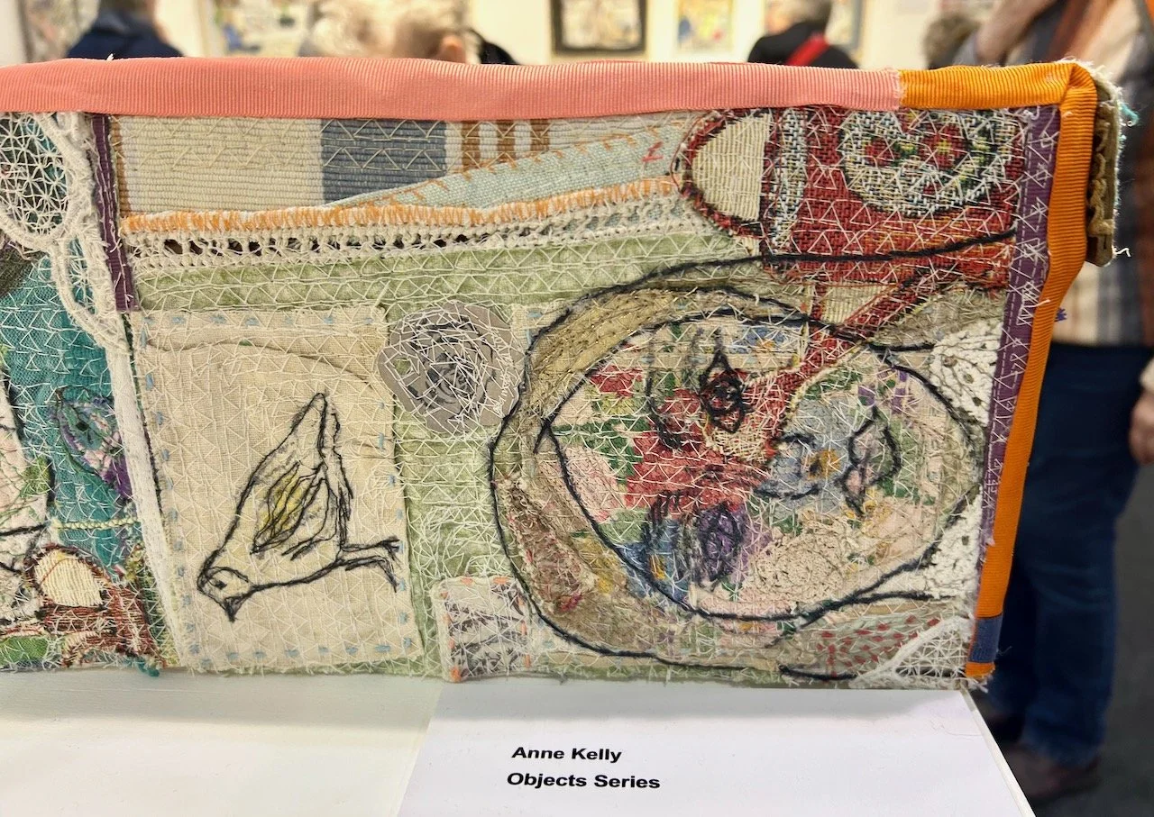
PART OF THE OBJECT SERIES, ANNE KELLY
The blurb explaining these pieces was one of the best I’ve seen. It simply said:
I like to cover objects with textile collage and see them take on a new character and meaning.
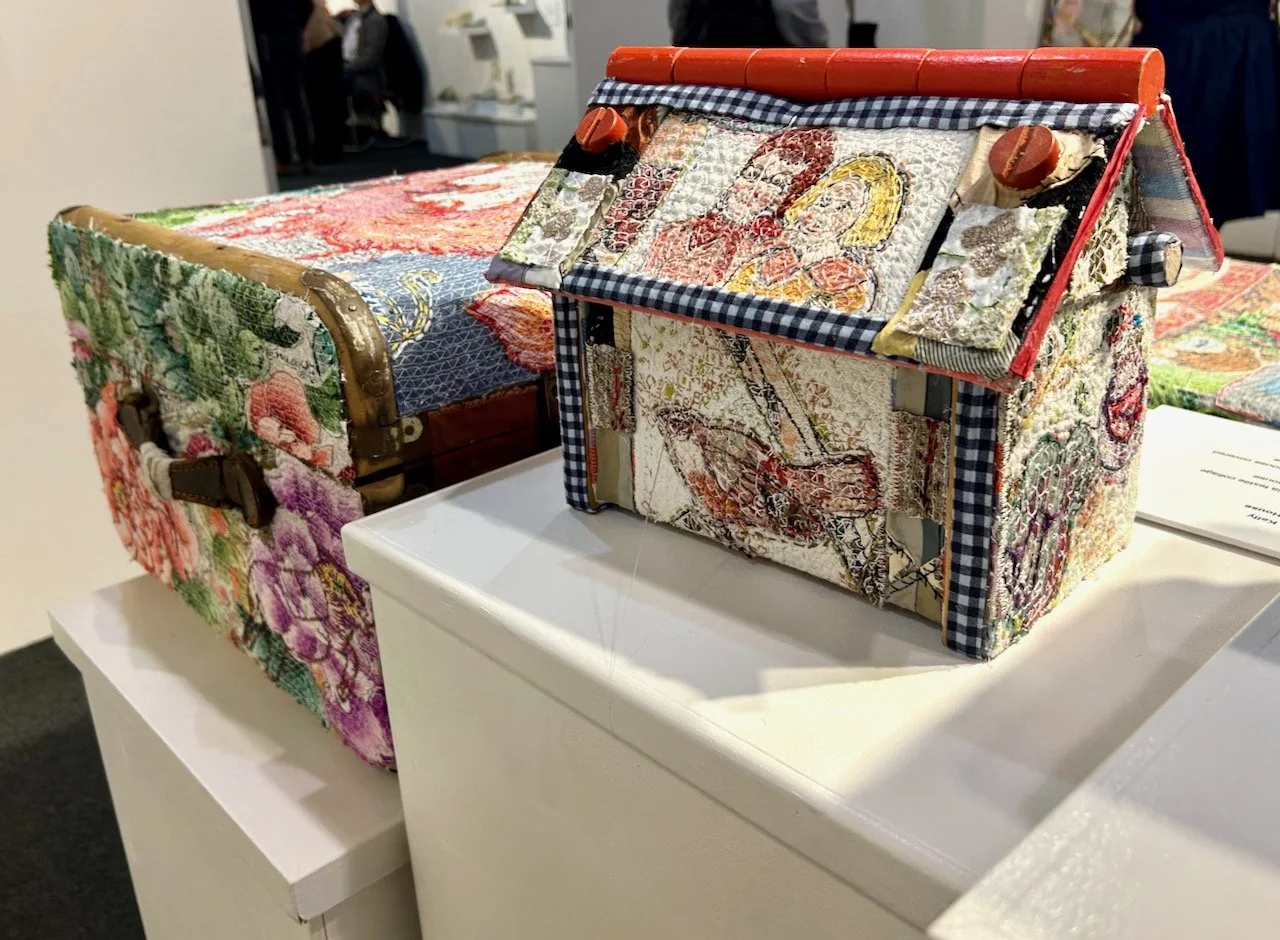
SOME OF THE 'COVERED OBJECTS' BY ANNE KELLY
It’s simply explained, but so accurate, as they do.
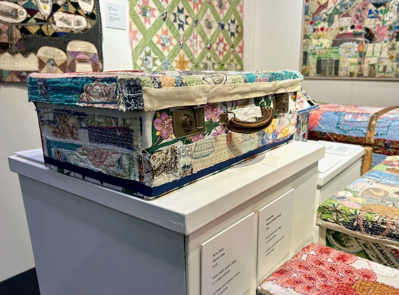
FAMILY CASE, ANNE KELLY
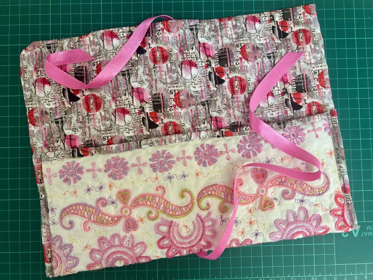
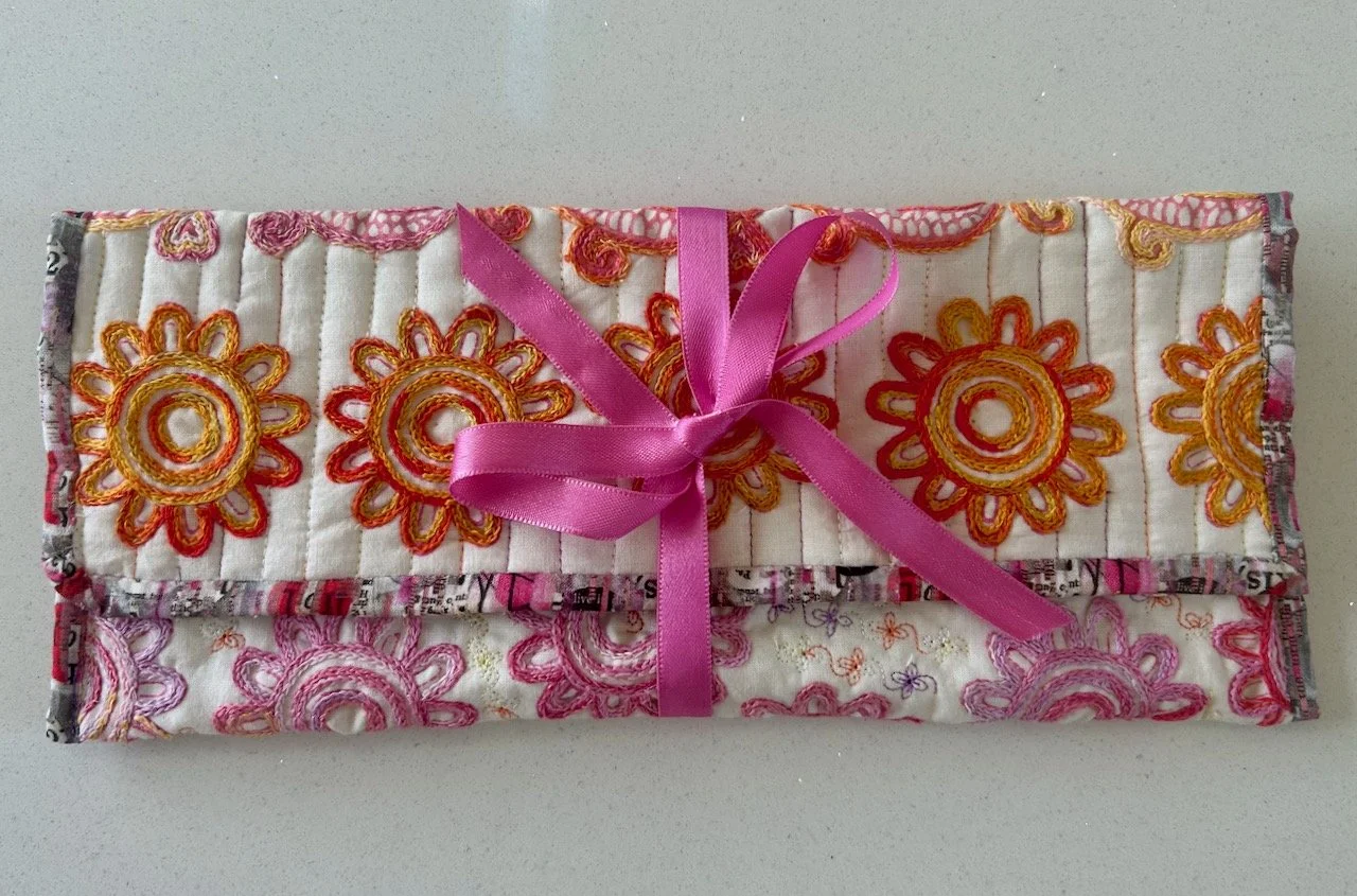
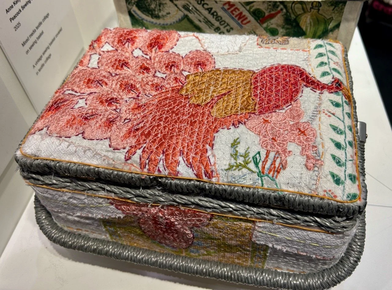
I was particularly taken with the ‘Peacock Sewing Basket’ as I have many photos from different angles, so I know I was. I think my fascination was also because it’s totally transformed one of those ubiquitous woven plastic work boxes that I now quite often see in charity shops, but back in the day they were The Thing to have!
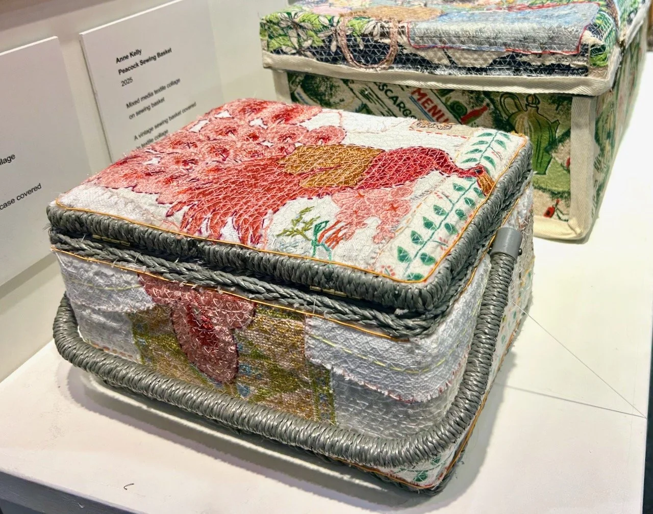
PEACOCK SEWING BASKET, ANNE KELLY
PEACOCK SEWING BASKET, ANNE KELLY
The peacock embroidery is pretty eye-catchingly special too isn’t it?
And there was more exquisite gorgeousness and more covered boxes in this enclosed display cabinet. Just as well as it was enclosed as I think these are just screaming out to be touched, or stroked, in admiration.
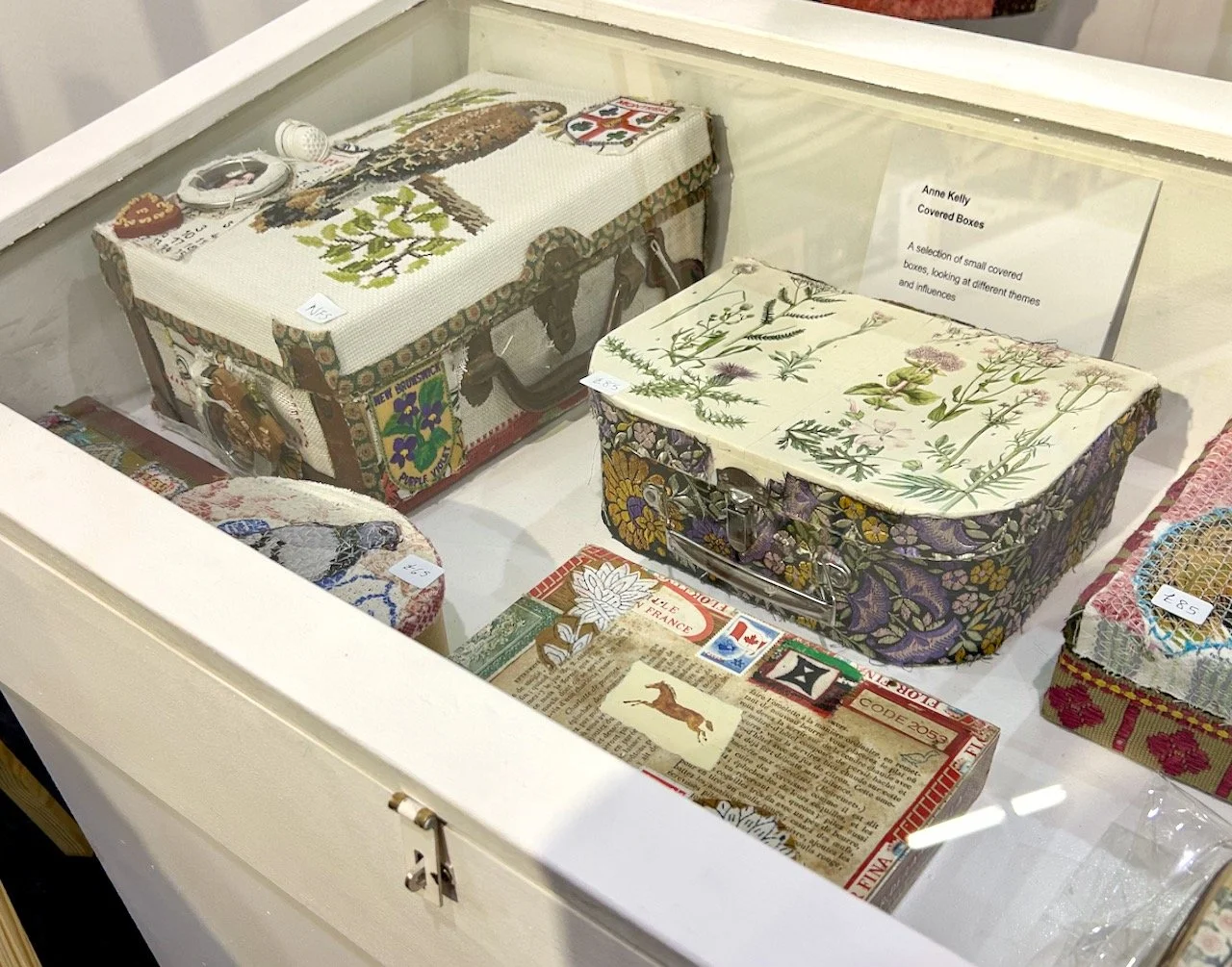
COVERED BOXES, ANNE KELLY
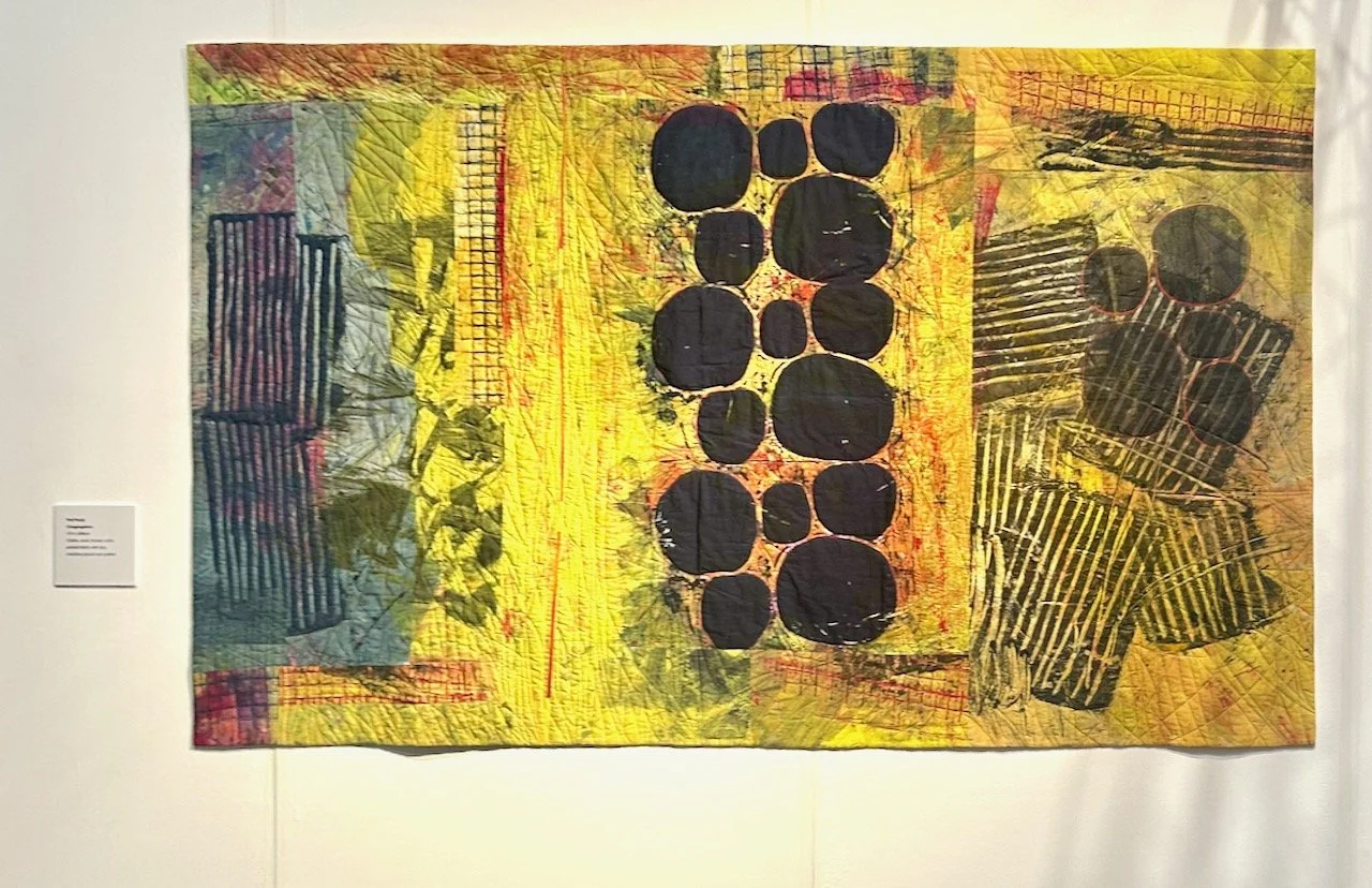
There were also some mixed media textile collages on display, and I’m including a couple of these here too. This one was inspired by a picnic stop in France enroute to a class she was teaching.
PICNIC STOP LIMOGES, ANNE KELLY
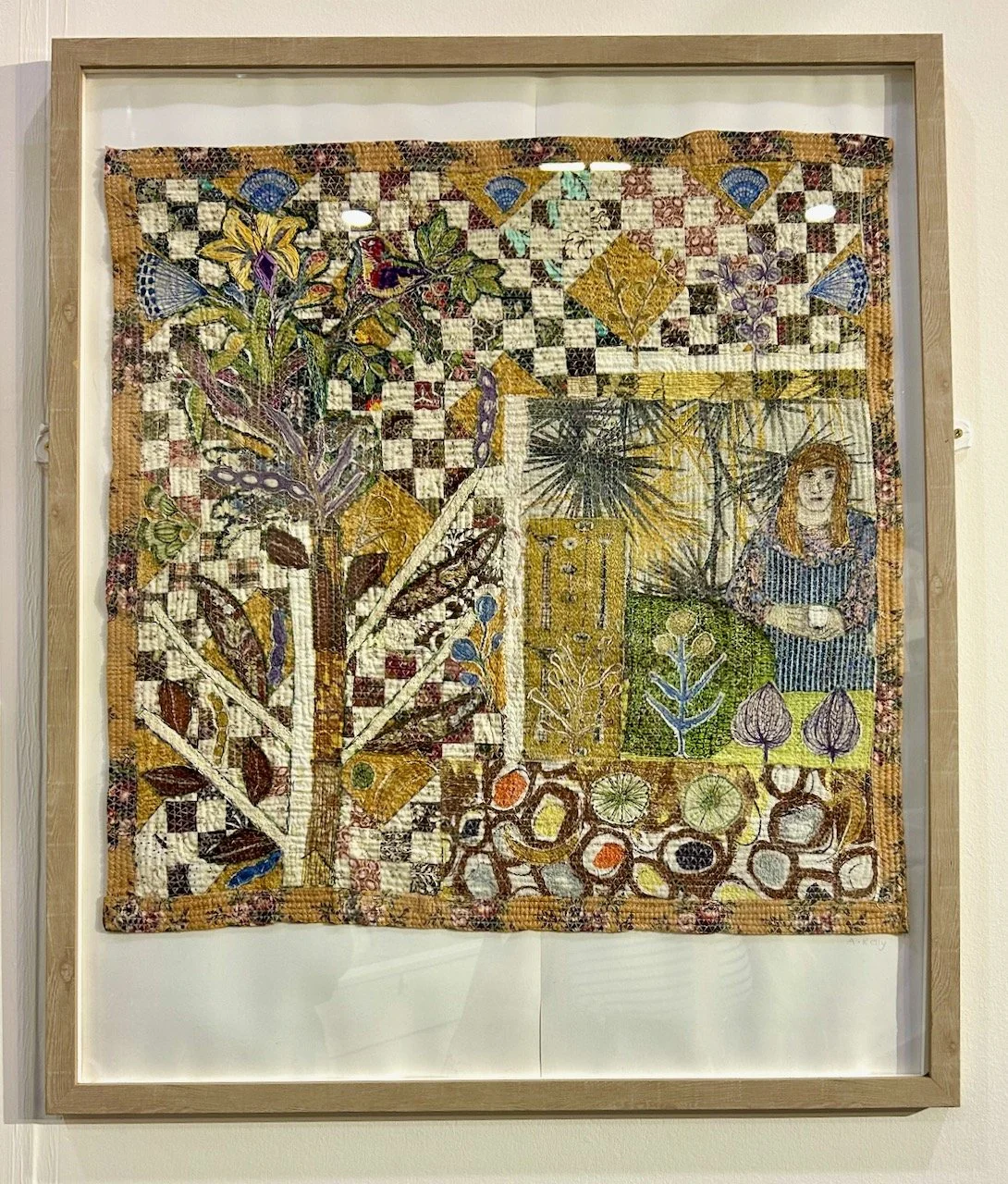
This second one depicts her artist friends ‘at home with their collections and garden’ - so literal but also so interesting.
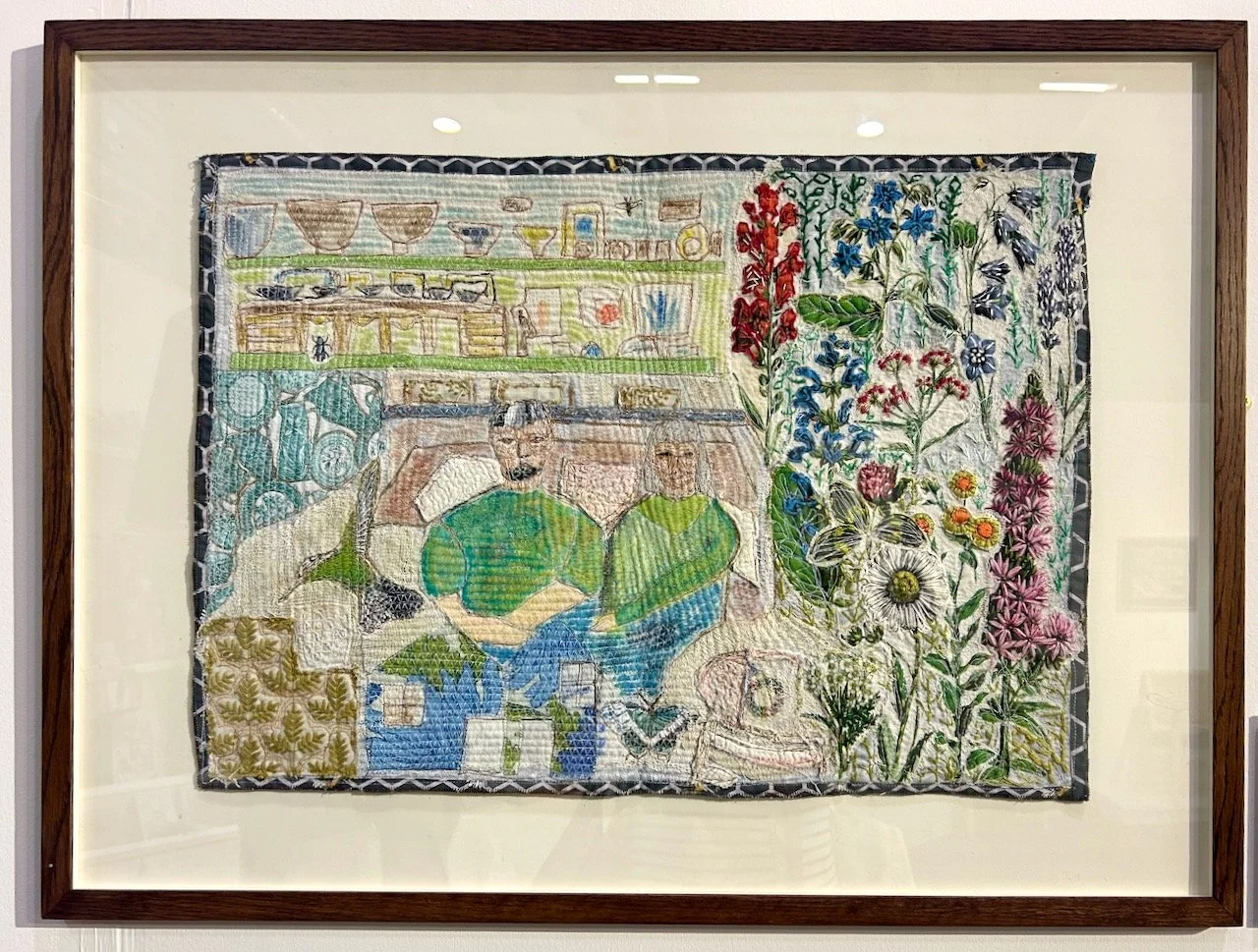
J&K AT HOME, ANNE KELLY