Hidden Depths by AitchBee at the Newark Quilt Show

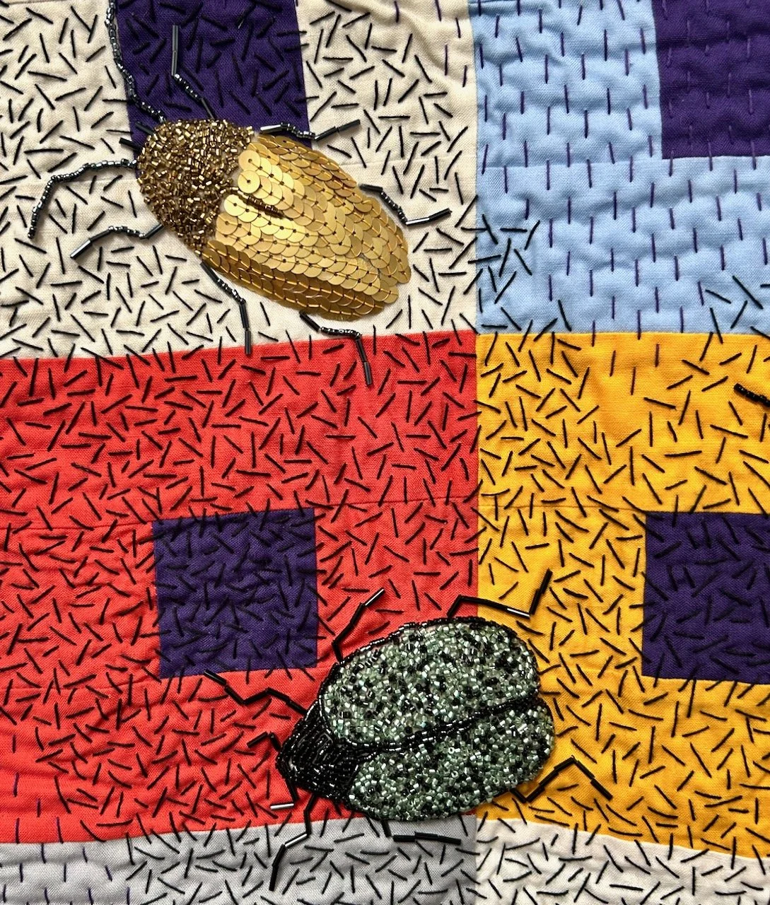
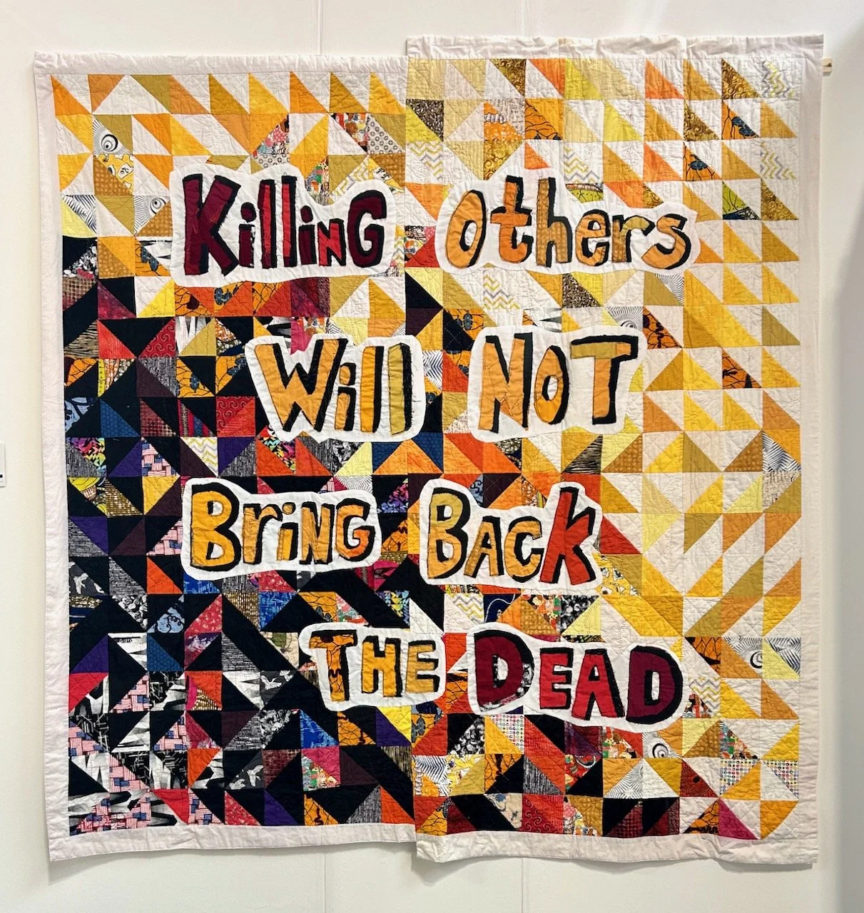
The quilts I’m sharing today from this year’s Newark Quilt Show include the maker’s love of typefaces and letter forms, as well of their fondness for 3D imagery. It won’t be a surprise that AitchBee trained as a graphic designer, but now thinks of themselves as one who works in cloth, enjoying the precise imagery that comes with foundation paper piecing (FPP), which is something I’ve not tried myself yet.

All of the quilts are amazing, and one is my all time favourite from this year’s show. I like its cleverness and spent a fair while looking at it, before I really saw it - and then looking at it through my phone’s camera lens made it so much easier to see, and then you wonder why you never saw it before.

The quilt is called Negative Space, which again is clever and did more than raise a smile.

NEGATIVE SPACE

I’m not sure how well it translates on a screen, so read down each column of letters and hopefully you’ll get it - if not, think of the quilt’s name, and then it should materialise. And of course, then you’ll realise that there isn’t any negative space at all!
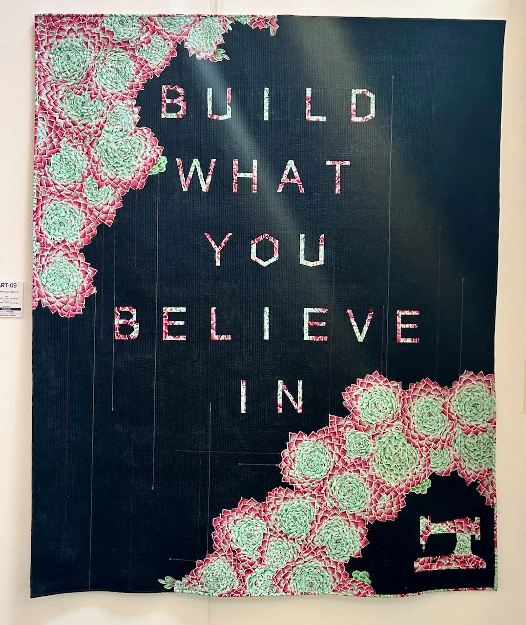
It’s subtle, beautiful and yes, I’d happily have this one anywhere in my house.

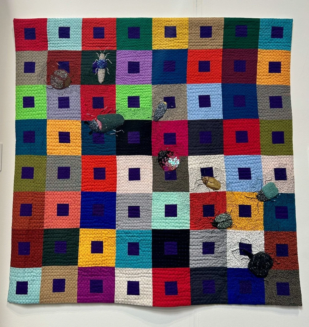
But there were more quilts too, the one below at first you see the cubes, then you look more deeply - and the more you look, the more you see.

NEW PERSPECTIVES

Those small blocks are 1 1/2 versions - now that’s small, and no doubt fiddly.

I’m also a fan of how these are quilted, with multiple vertical lines and it’s something that I hope to replicate on my Essex Linen kisses quilt, but there’s a way to go on that yet though!

OCEAN STAR MIDNIGHT

I love the colours on this one, and it includes FPP blocks ranging from 1 inch to 16 inches across so that’s a good reminder that not all blocks need to be the same size, though of course that makes it a lot easier.

The final quilt I’m sharing from AitchBee is full of colour, and couldn’t be further from the first one in this post colour-wise, but it’s an expansion on that, and includes the whole alphabet.

BLOCK CAPS

This one is an expansion on the Negative Space quilt, and includes the whole alphabet. It was interesting to read that they got stuck on the letter ‘B’ needing to enlist help with it, and a lot of coffee and cake before it looked right. Reassuring too, as it’s good to hear that even quilts which end up looking up as good as this aren’t always plain sailing.

So much inspiration here, and in a completely different way to the other quilts I’ve shared from the show. It almost makes me want to try Foundation Paper Piecing, but I know I really shouldn’t add more to my list, well just yet anyway!

Making my mystery block of the month: February

You’ll have seen that I plan to complete Sherri’s mystery block a month quilt and earlier this week I shared the test blocks which I made into my fourth charity quilt, and today I’m sharing the vintage star block I made for my own quilt.

I’ve chosen the three fabrics with navy backgrounds for my block, and a more densely patterned pale background fabric. Thankfully I remembered my learnings from the test blocks, despite my hesitation to get going with my own block.

I wasn’t sure how this one would go, as I shared in the earlier post that matching the seams on my test blocks had been, well variable. And it’s a great block, but I didn’t find it as enjoyable to make this one, but - spoiler alert - it turned out pretty well and I think it’s probably the best version I’ve done.

Phew. And isn’t that often the way?!

Adding the borders

For this block I’ve used the same fabrics for my borders as for my January block, but I’ve reversed their placement so when the quilt is assembled the greens are together. I suspect that I might need to make some adjustments to the planned layout at some point so that my quilt is wider than it’s long, as I already know that I want to use this on a double bed. It may mean that I make extra blocks at the end of the year, but there’s plenty of time to work that out.

Doesn’t it look great?

I’m really pleased with how it turned out, and like the patterned star against the light background.

And I was even more pleased when I placed it alongside January’s block of the month. I think that when it’s done the quilt is going to be pretty special.

Join me next month to see how I get on with the next mystery block, and check out my posts which contain charity quilts made from the test blocks.

A reminder to 'Stop and Smell the Flowers'

* I was invited to the press preview of Gardeners’ World Live and provided with a pair of tickets to visit the show, therefore all my posts will be marked as 'Ad’ though as usual my views and opinions are very much my own.

Sometimes we all need that reminder don’t we? Whether it’s an actual reminder, or one like that’s prompted by the recent upturn in weather. Stopping and enjoying, let alone smelling the flowers is good for us. Though don’t stop too long at the moment in my garden, or else you’ll see more weeds than I’d like, but of course they have flowers too and are often at this time of year one of the few flowers out so they’re good for our pollinators. Phew, I can leave the weeding for just a little longer then!

But there’s a serious message in this garden which was designed by Julie Haylock. Our world is driven by faceless, fast-paced interaction with technology (and the irony that you’re reading this on my blog isn’t lost on me) but by finding a peaceful sanctuary sitting amongst nature is important for our wellbeing.

In this garden a winding gravel path encourages you to slow down and take in the soft colour palette and fragrance of the flowers, engaging your senses. As you step through the moon gate you’re encouraged to leave behind your busy life to sit for a while and reflect, screened from the world, to focus on the important things: healthy, family and friendship.

What I liked about this garden was the repeating circles, remember in my previous garden we added circles to our lawn, so I think it loosely reminded me of that, and while I like circles in gardens our garden here is the wrong shape for that. Previously our garden was long and thin, so adding circles to the lawn made it appear wider; here our garden is wider than it is long, so circles, or even a large oval would make it appear even more squat and bring the back wall in. Which is a shame, as I know how to do circles!!

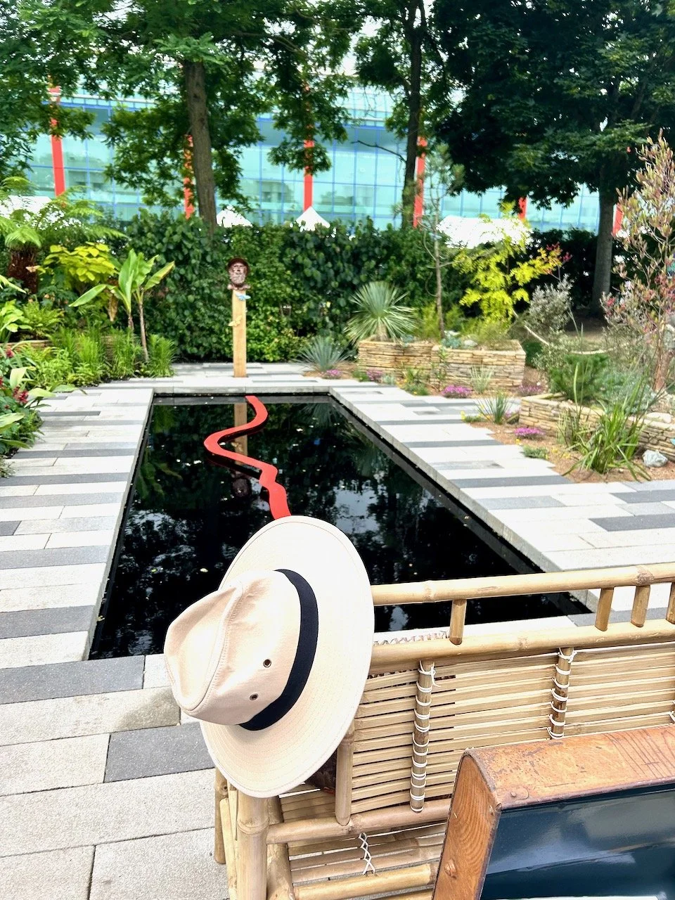
The pond was small and so you can see how introducing a pond as part of the Make a Metre Matter campaign would be completely doable, and I like how it’s above ground level in a corten steel bowl. I also like how its softened with the frothy erigirons, a plant that didn’t transport too well from my London garden so is definitely on my purchase list.

It took me a little while to notice though that the ‘Reflect’ banner was hung the wrong way round for most visitors viewing the garden - maybe intentional, maybe not - but either way it doesn’t detract from the space does it.

This planting is brought to life by the wooden sets providing a path around the water feature - but also the peonies, lavender and many other plants in the pink, blue and purple palette really are calming. I didn’t think a water feature was for me, but maybe I’m having second thoughts - argh! so much choice, that’s really quite the thing when you have a blank landscape. I’m not sure how these designers do it, and for the showcase gardens, how they bring it together in such a short space of time.

But I’m also very glad that they do!

* With thanks to Gardeners’ World for inviting me to Gardeners’ World Live, it was just as good as I expected! I’ll be sharing more from my visit to the show - I hope you enjoy it as much as I do.