Four pink hearts and a hug

I’ve made another quilt as part of my quilting ‘stretch’ project this time using the March block from Sherri at A Quilting Life’s mystery block a month. As I said then I don’t know if I’ll manage to make a quilt a month, but I won’t really know unless I try…

I’m glad that this block was relatively simple to put together as time has been more challenging this month, perhaps the warmer weather or something else, I’m not sure quite why, but I only finished it after a concerted push last night…

My fifth donation quilt

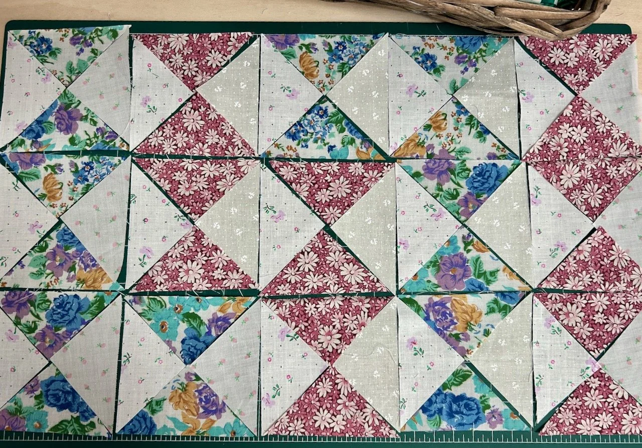
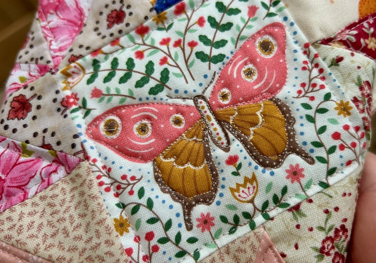
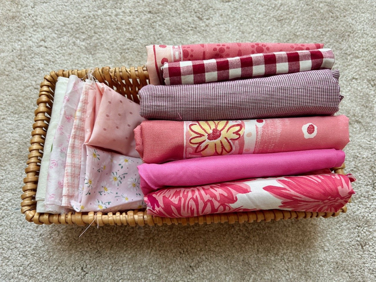
As soon as I saw the centre block was a heart I knew that I’d be using pinks from my stash - but which ones! The pile of pinks on the right of this basket are (from top to bottom) from an old quilt cover, two old shirts, the old quilt cover again, a mystery plain pink and remnants of a much loved Boden sundress. I’ve no recollection of where the plain pink material has come from so perhaps it was part of a mystery bundle I picked up somewhere.

The paler pinks which I’m using for the hearts are likely to be much older and acquired at some point from mum’s stash, and the paler background is from the lining of the sundress. As you’ll see as this post progresses I also added some grey zigzagged material from an old duvet, which was also the backing on last month’s quilt.
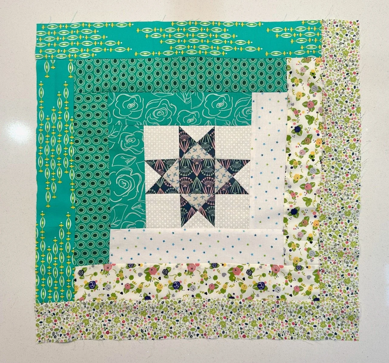
Testing the block

As you know I’m making test blocks ahead of making the block for my mystery block of the month quilt and I’m making these blocks into quilts of their own. And this block has relatively few pieces compared to last month’s vintage star block, and was therefore much easier to put together, phew.

The part that required the most concentration was not to cut the wrong side of the sewn line, but I managed that successfully each time - and tbh it really wasn’t that hard, but that was the potential stumbling block (no pun intended) this month.

And in no time at all I’d added borders to the hearts, and joined the blocks together.

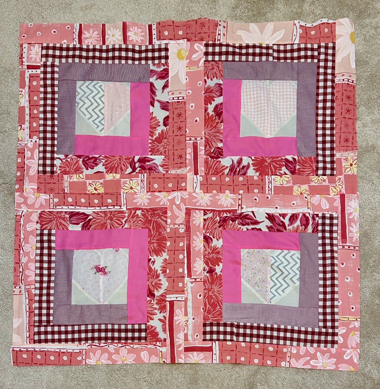
But I felt it wasn’t quite there yet, so left it overnight mulling over which fabrics to use for the borders. In the end I decided on a thinner red checked border before adding more of the multi-patterned pink material from the old duvet cover. I think it needed the bold checked thin border to make it work. I also knew that it needed the stripes to match as best they could to avoid it looking messy.

And with a little bit of luck that worked out.

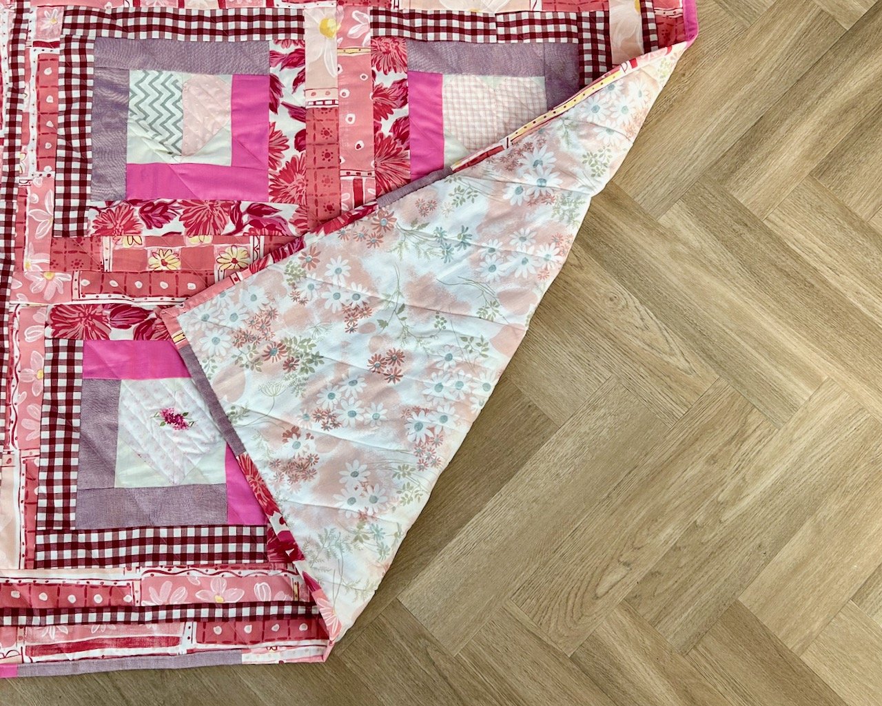
I’ve also changed my mind on which backing to use, originally I thought it would be the multi-patterned pink fabric but I think any more of that would be too much, and so I’ve opted to cut up a paler pink single duvet cover which I bought a couple of years ago on eBay for £1.04 plus postage - as I discovered in the label I’d thoughtfully written for myself when I unfurled the fabric.

Finishing the quilt

I got the quilt to a finished quilt top level in a few days, then it sat for a while waiting for me to assemble it with the batting and backing fabric. In fact I snuck that part in ahead of waiting for family to arrive over Easter, which was a good use of time. Then after the bank holiday I set about quilting it. Remembering that the purpose of these quilts is partly to up my skill levels and to get myself comfortable with both piecing and quilting, as with practice comes a better crafter.

So rather than quilt this one as I have before I decided to quilt it in diagonal rows across the quilt, and then spent ages looking for some masking tape that I was sure I had,. I didn’t find that, but I did find some tape with marked lines on which was probably a better option, or it was once I worked out where to place it most effectively, and so I didn’t sew over it!

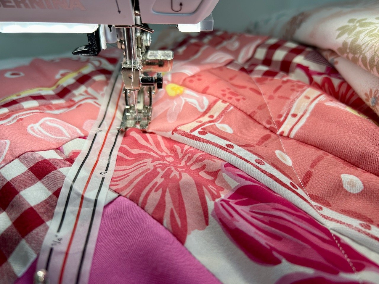
I also wanted to change the density of the quilting on the hearts. I considered a different colour thread, but in the end opted to add quilting lines closer together, using the same approach.

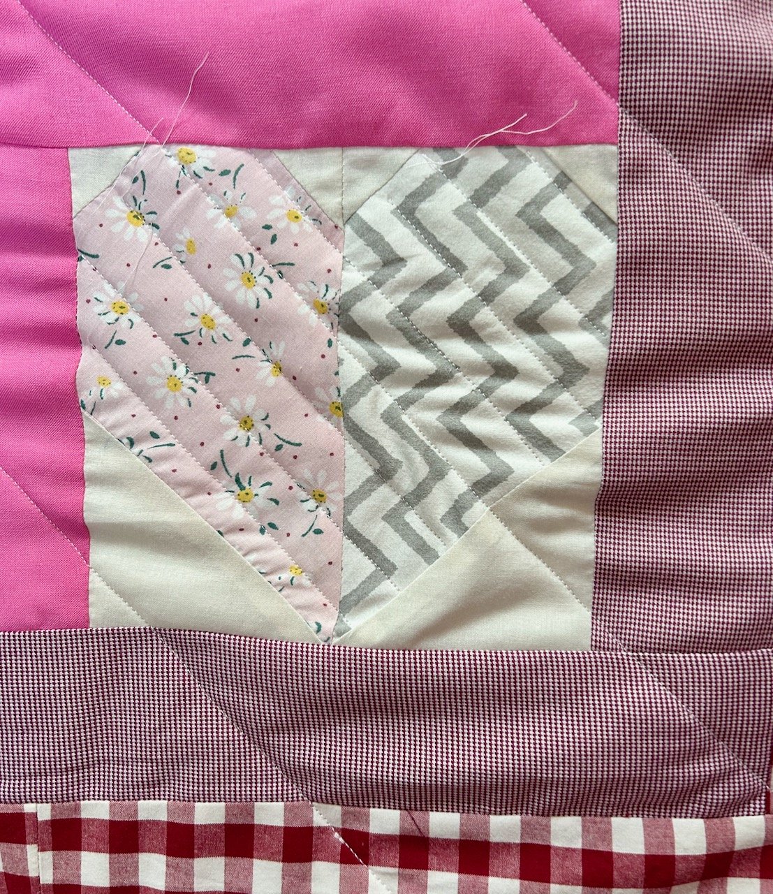
And I’m happy with how this quilting style turned out; the tape worked well and could be easily repositioned for each line of sewing. I didn’t have a plan for the spacing between the lines before I started and worked that out as soon as I started to plan the second line - they’re about 8.5cm apart. Yes they could be more precise, and ideally closer together but it was good to discover this process as I went.

The finished quilt this time with the bottom right hand corner turned back on itself to show the bagain backing fabric

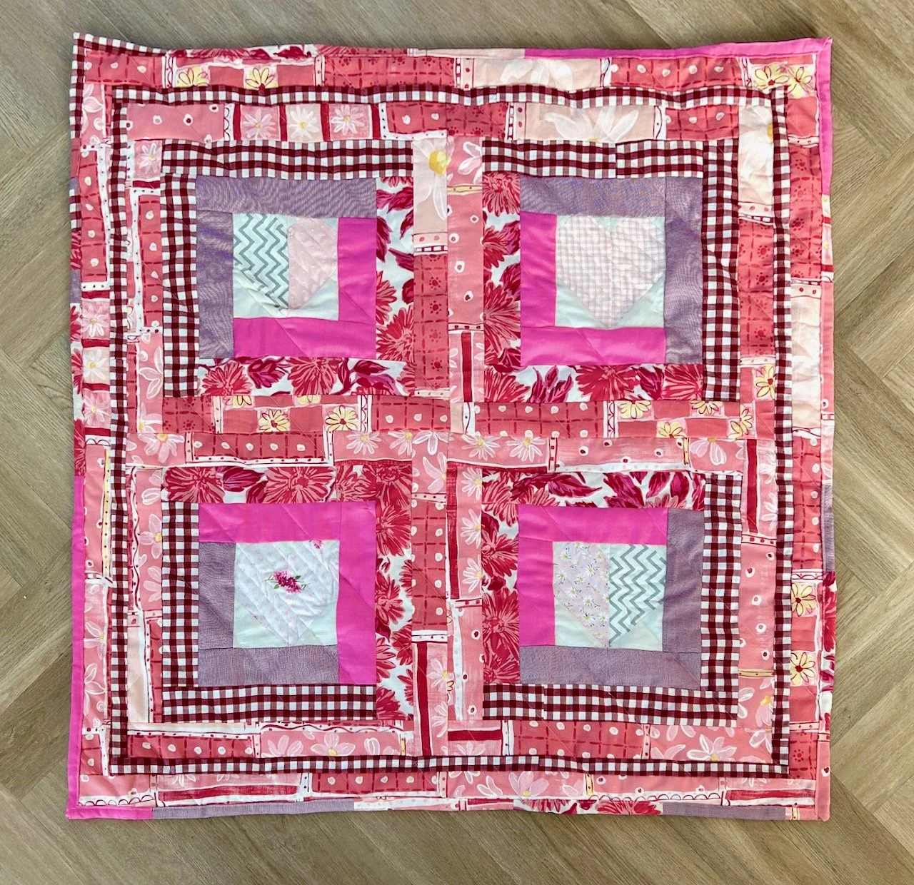
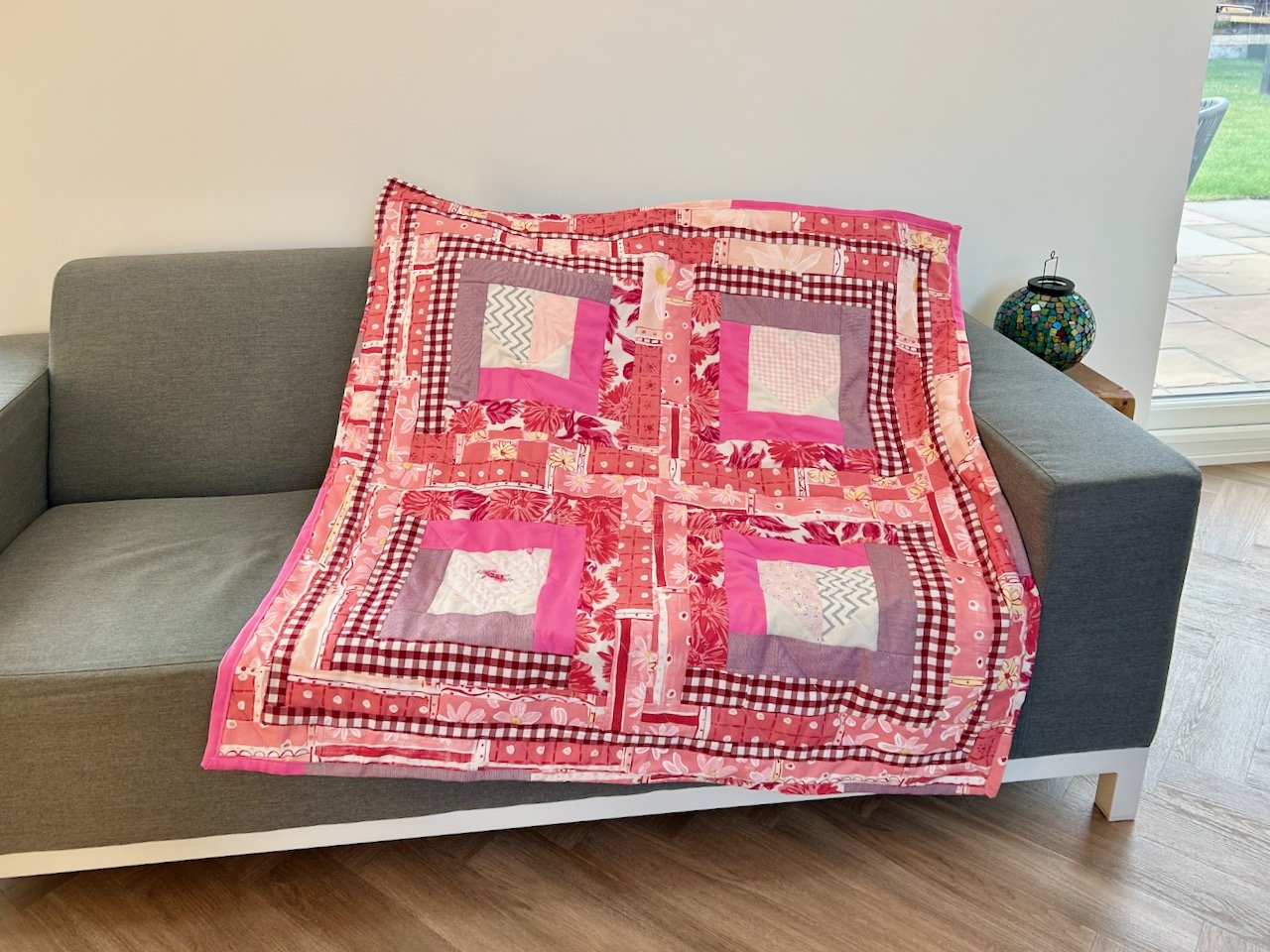
It turned out well didn’t it? And four hearts and a hug seems the perfect title for this one.

You can see my other quilts which I’ve made to donate to Project Linus - a charity whose mission is to provide love, a sense of security, warmth and comfort to children, who are sick, disabled, disadvantaged or distressed through the donation of new, homemade, washable quilts and blankets, including those that are part of this ‘stretch’ project in earlier posts. I’m aiming to publish an update on my progress in the last week of each month for the remainder of 2025.

The second of our black and white pictures

Last Monday I shared more about the first of these photos which now hang framed on our bedroom wall, today I’m revisiting another holiday memory and strangely also from 2014.

It was also a place we were revisiting, but somewhere we’d first visited together in the autumn of 2012. We’d booked a walking holiday on one of the new holiday’s offered as the Rota Vincentina in Alentejo had only recently opened. We weren’t really sure what to expect, but a week away in the relative warmth of Portugal’s sun in mid-October sounded like a good plan. And it was, we had a great holiday in 2012 and fell in love with the region as a whole, and actually with Portugal too.

We vowed to come back, and two years later we did just that. This time our visit was in June, rather than October and instead of walking between hotels we hired a car and based ourselves at the mid-point of the route from that original trip, using that as our base to revisit many of the places we’d visited before, and even retracing our steps along some of the coastal path.

We’d seen some storks near to our hotel on our first trip and we were mesmerised and amazed, and a little bit scared of walking too close! On our second trip we weren’t expecting to see such a fantastic sight as we drove back along a quiet road to our hotel. So we pulled over and had our own personal photo shoot with the, what I imagine, are the proud parents.

Again the photo is great in colour, and it’s full of warmth from the sun but somehow in black and white the main subjects stand out even more.

Portugal is such a beautiful place, and we’ve been back to visit other parts of the country - including Lisbon, Porto and the Douro valley - many times since, but the Alentejo region holds a special place in my heart, and I suspect it’s about time we made another visit there.

But in the meantime we have a second great holiday memory right there on the wall as part of our series of four black and white pictures, and I couldn’t be happier with how it turned out.

The Biba lifestyle brand

The Biba Story exhibition at Zandra Rhodes’ Fashion & Textile museum was definitely worth a visit, and told Barbara Hulanicki’s story through fashion illustrations and some of the wonderful outfits, but it also claimed that Biba was the first world’s lifestyle label, which is quite a claim.

Today our lives are full to the brim of brands which aim to encompass every part of our life, and as with anything some stay around while others come and go. But imagine trailblazing in that area and the reactions you’d get.

As the show notes said ‘Barbara Hulanicki began by ‘dressing the girl in the street; by 1973 she had fashioned Biba into a lifestyle’. The first non-clothing Biba product was a 1967 diary, which included recommendations for other places of interest for Biba customers to visit.

The Biba department store on Kensington High Street had departments for clothes, furnishings, wallpapers and cosmetics all in the distinctive Biba colour palette. By 1973 you could eat, sleep and breathe Biba, from newborn babies to adult, with products for the home and garden - and in-store dining and food for the home too.

And it was great to see some of these items on display.

The display started off as you might expect - a vanity case, some tights and then there were the diaries and address books. An ashtray and matches, plus packs of cards and some lights too - the silver coloured one in the centre caught my eye, reminding me of a lamp I had. On reflection its nothing like this lamp, mine was white ceramic with a frosted glass sphere in front of the female holding up her skirt. I thought it was super elegant, and kept it for many years even though the frosted glass sphere shattered at some point along the way.

Biba was clearly an aspirational brand, just look at those soups: Consommé, Lobster, Vichyssoise, Shark’s Fin, Bird’s Nest and Real Turtle - no mock turtles here! Even the names of those soups transport me back to my childhood, not that I think we ever ate any of those, or maybe we did and it was described by my parents as ‘chicken soup’!

And what decadent jars for the pulses - yellow split peas, chickpeas, red lentils and haricot beans, condiments chutneys, including sweet spiced walnuts.

The booze is also of its time isn’t it - cherry, red currant and blackberry wines (and more which I can’t quite make the labels out), plus of course roasted & salted mixed nuts, or pistachios - all very ‘To the Manor Born’.

But it was the eyeshadow palette that looked most familiar to me, and clearly I’ve never owned one so perhaps mum had one - but as well as the makeup, there’s brushes, creams and potions I’m sure for every conceivable use.

What an absolute discovery of an exhibition, and what a time to experience the start of lifestyle brands as we’re oh so familiar with today.