

I do like a mooch around a good shop when I’m in London, and this trip was no different. After a day in Islington I headed to a haberdashery extraordinaire just off Oxford Street. Now why I’ve just discovered this is a mystery to me, though it’s probably a good thing that I hadn’t found this shop while I actually lived in London!.
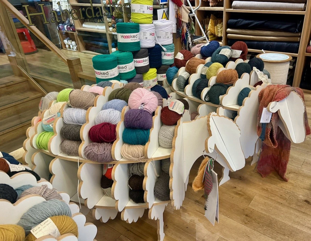
Yes, not that far away from Oxford Circus tube I found myself standing outside MacCulloch & Wallis admiring their window displays, and having an internal smile of how they’d displayed balls of wool on models of sheep.
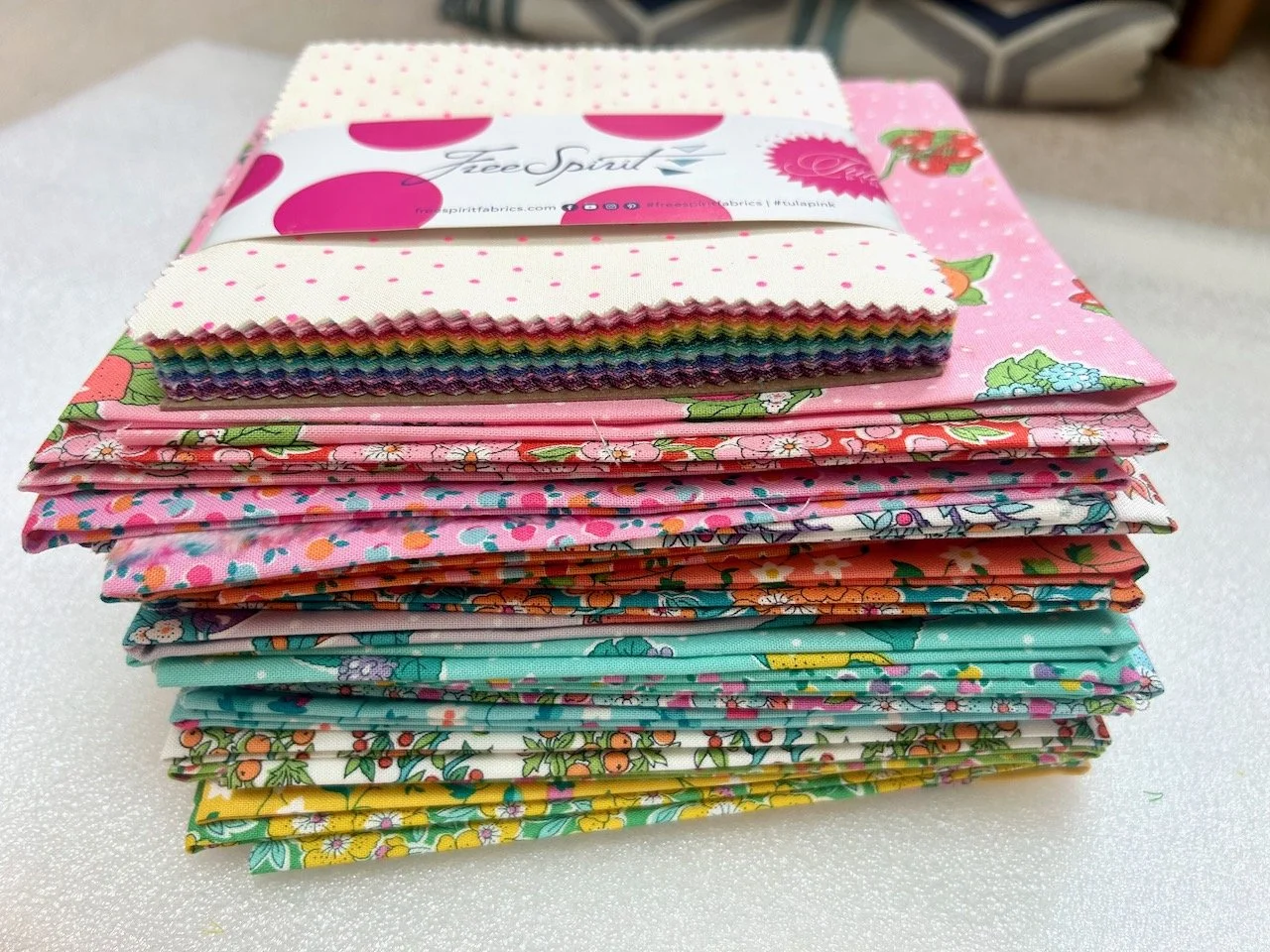
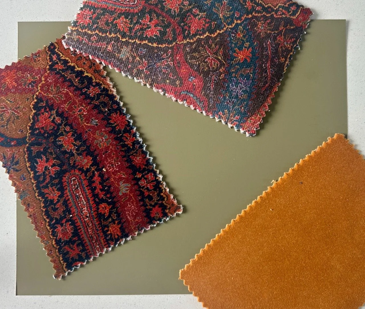
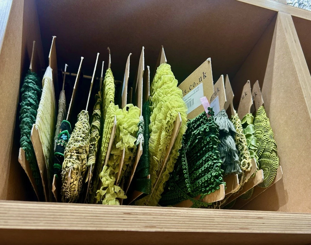
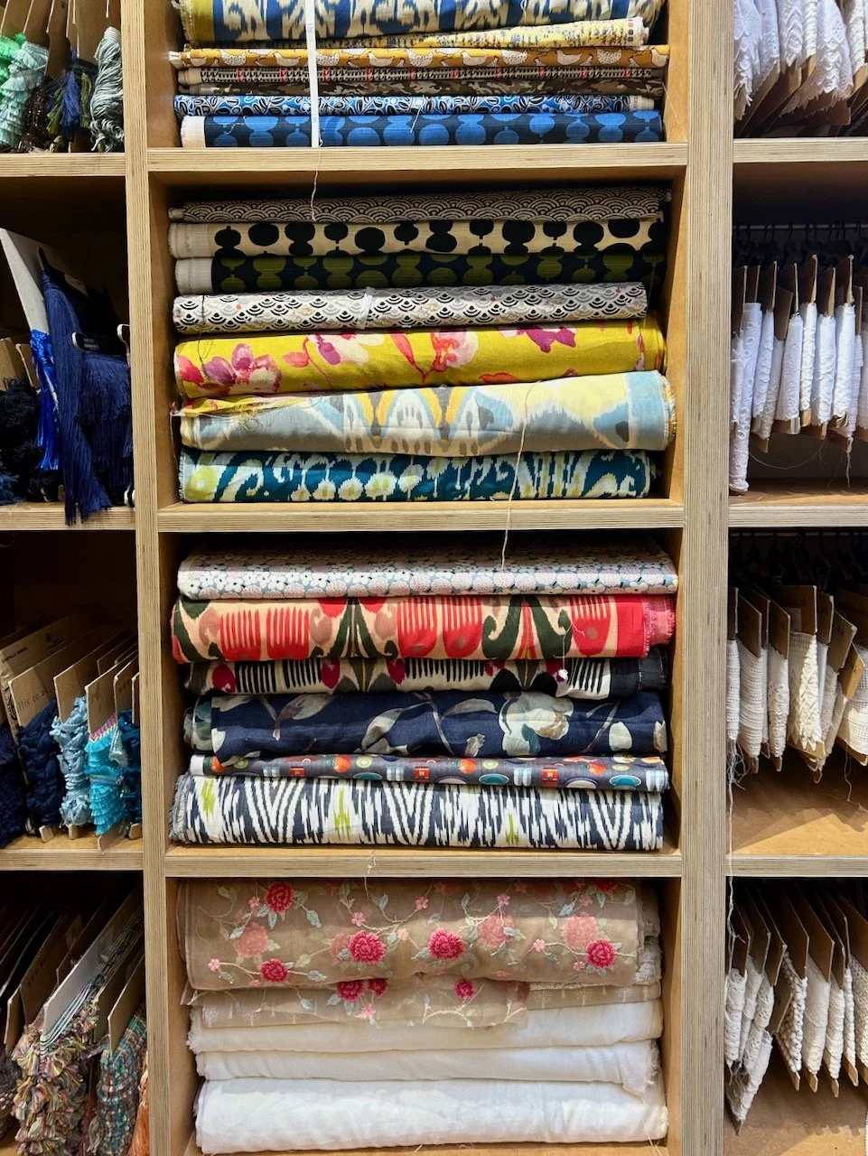
There was every kind of haberdashery item you could possibly wish for, plus wool, plus fabric and with a lot of vintage charm.
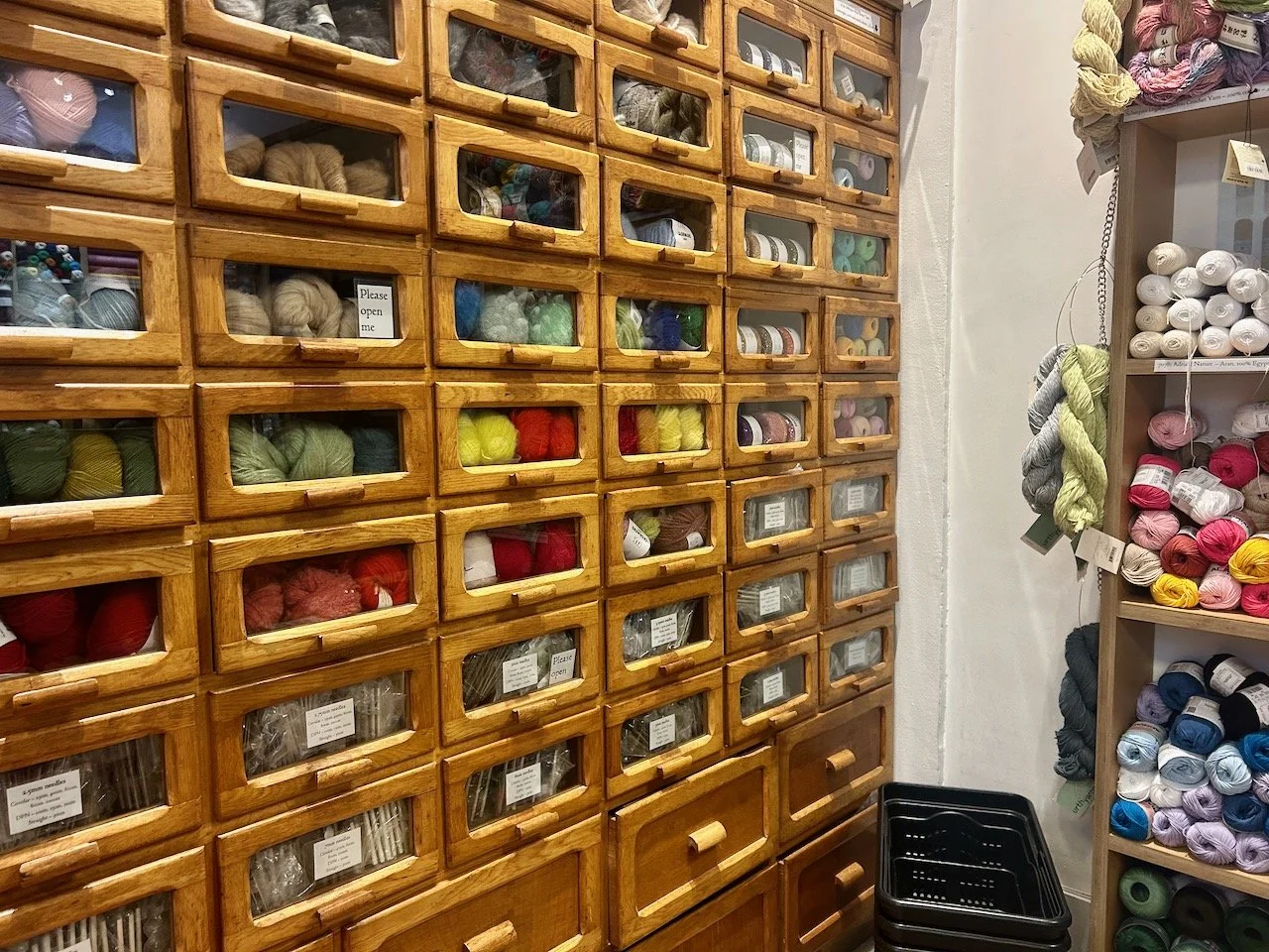
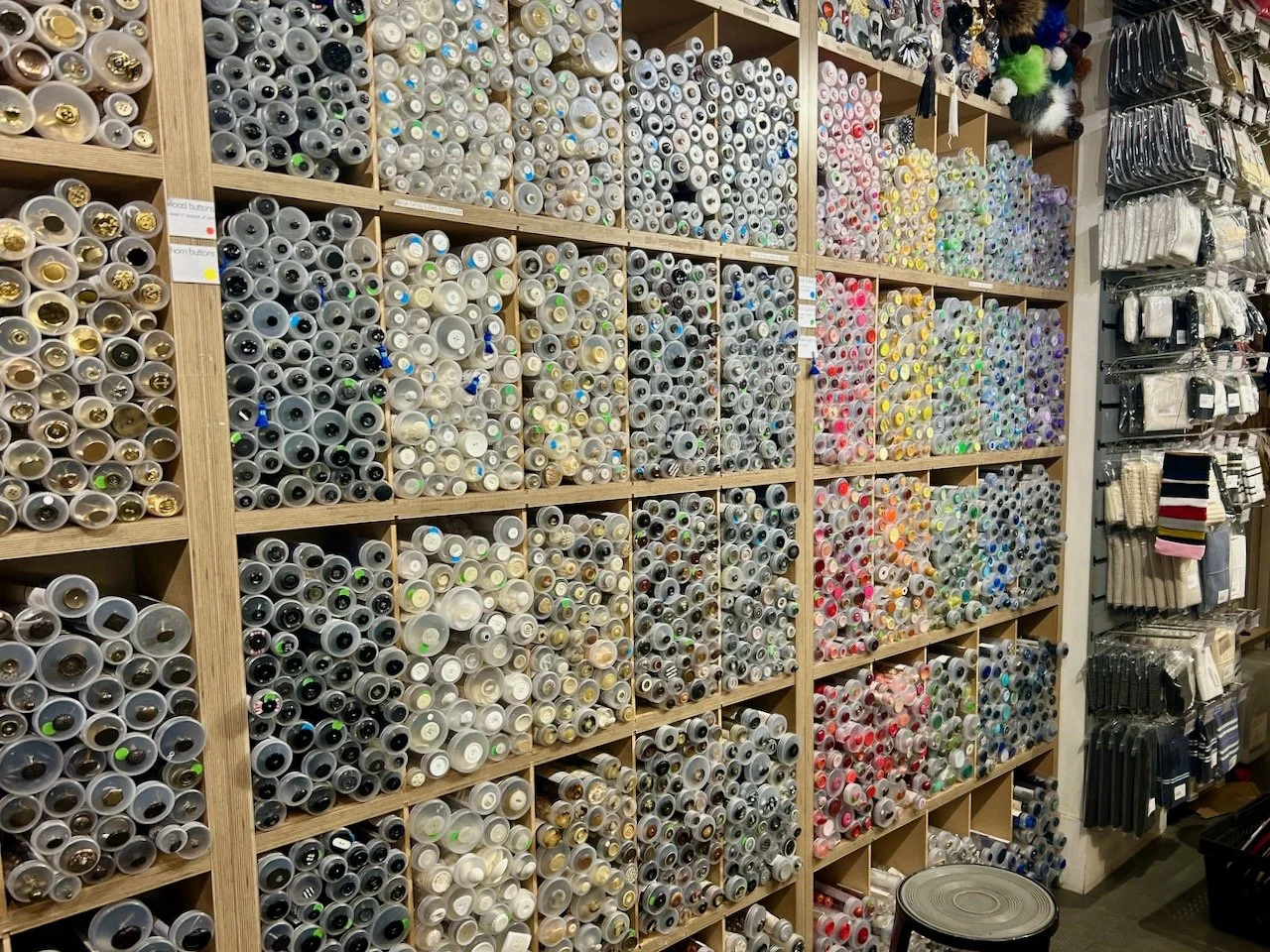
I couldn’t help but think wouldn’t it be lovely though to have a similar unit for my own craft supplies, though the wooden storage unit above also reminded me of a school uniform supply shop, just me?
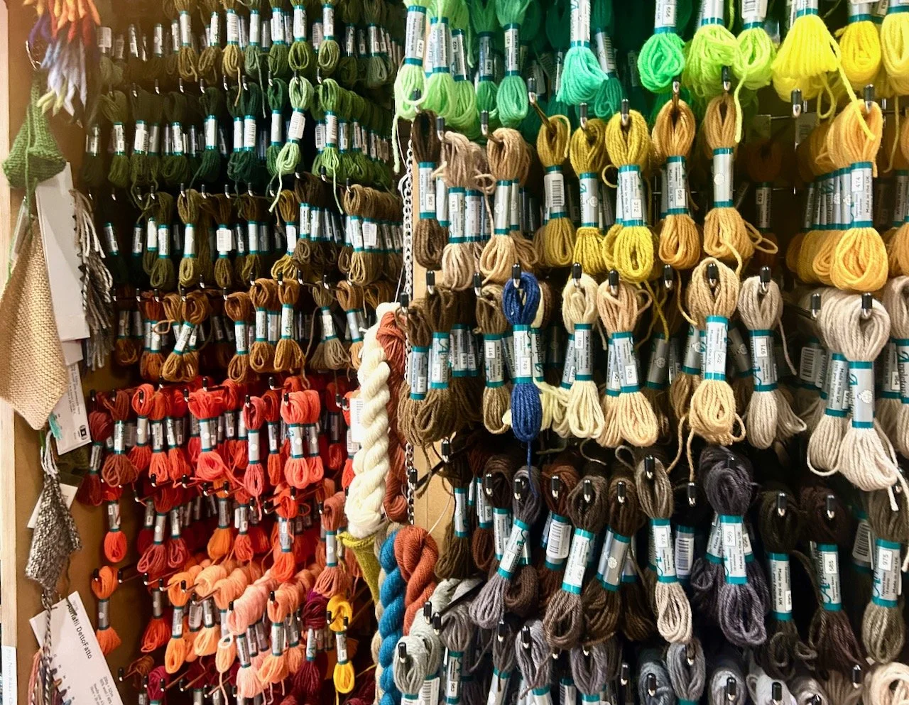
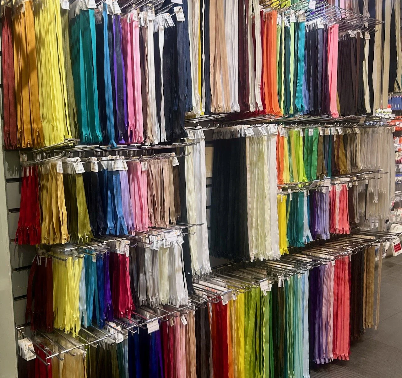
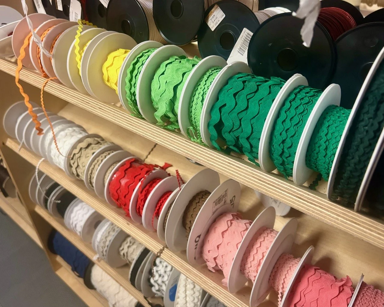
Throughout the two levels of the shop there was a rainbow of colour.
At the very back of the shop on the ground floor I found the cutting table, and even that was a cutting table with a difference as the centre was filled with buttons.
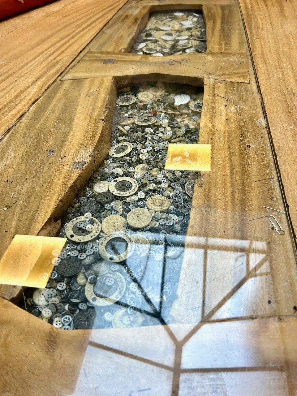
Thankfully though, buttons weren’t in short supply - just look at the range available. And to think I thought the selection in Liberty was extensive when I visited last year!
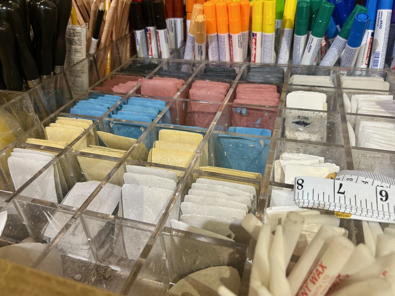
I was tempted by some of the Tailor’s Chalk, but I resisted - I have some, though not as beautiful as this, and well, there’s only so much of it you can use isn’t there?
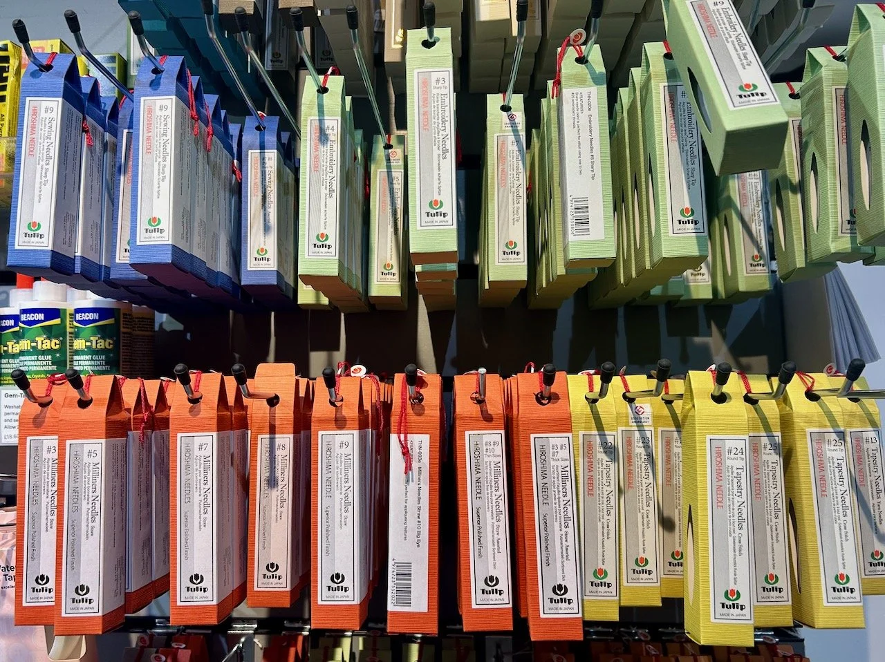
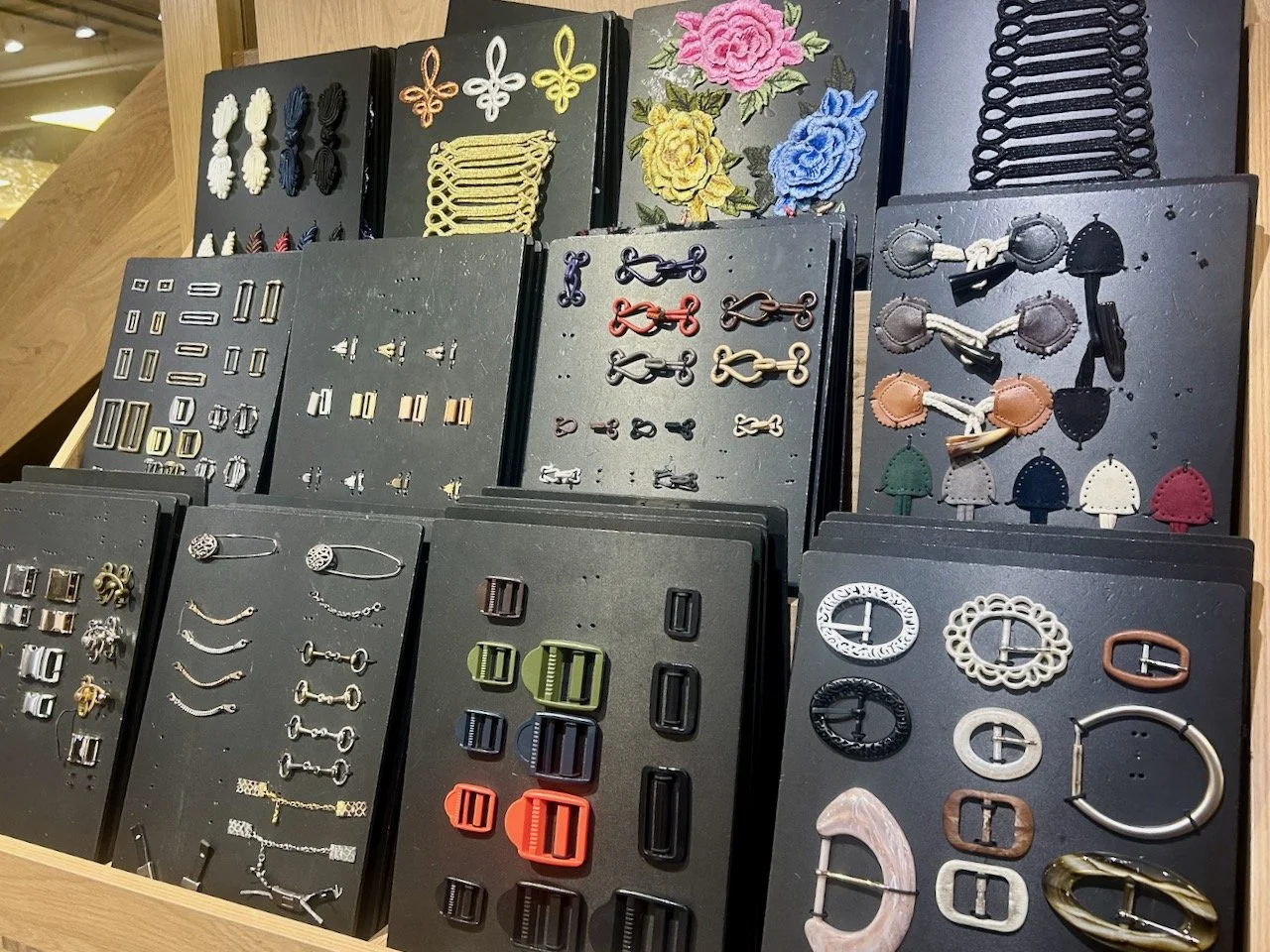
In the basement, alongside the tempting Tailor’s Chalk were rows and rows of needles, cards of every type of fastening you could ever want.
And miles of zips.
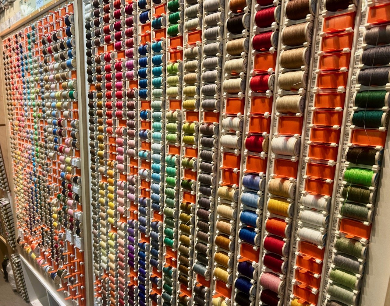
With cotton and ric rac in an array of colours.
In fact the choice was vast, almost overwhelming - this is definitely a shop you need to go to with a plan. A browse is good, but just wow - it’d be even better with a plan!