Transition and Decay, the rusty interpretation

While there may not be as many photos here as in my colourful interpretation post these rusty interpretations really did make me stop and think about the craft and work that has gone into both of these pieces.

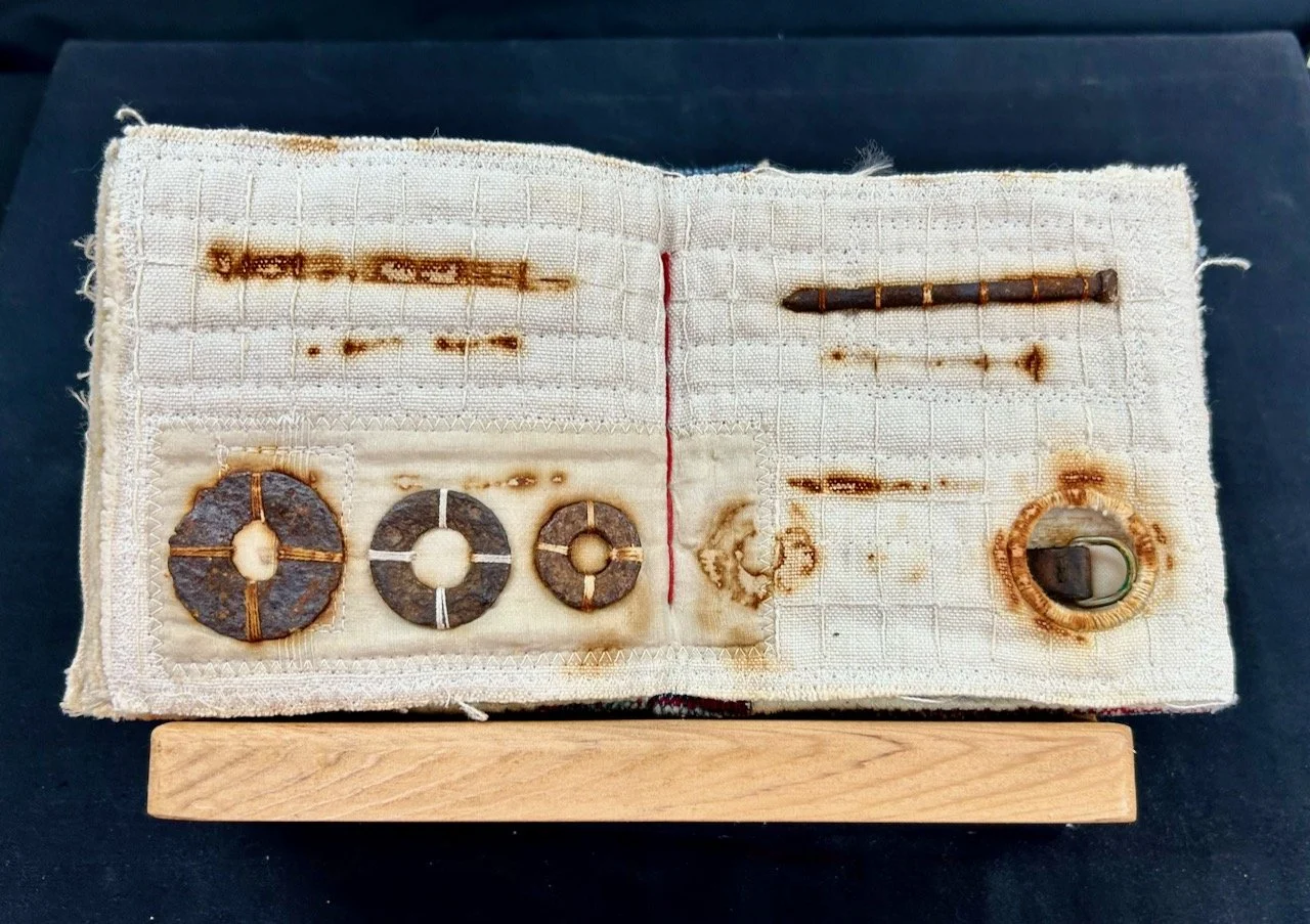
The book by Gilly Meeks held items in various stages of rusting along with stitching and shows the effect that has on the material

The little rusting book, Gilly Meeks

THE RUSTING BOOK, GILLY MEEKS

Gilly says it comines her love of the making process, stitch and found rusty objects. Recycled fabrics in the book include cotton, linen, silk and tea bag fabric and all rect in different ways to the rusting process. Gilly also says she’s very drawn to the ghostly marks which result from the process.

The larger Rust quilt by Fiona Burrows takes a different and larger approach - her piece shows the aesthetic and symbolic qualities of decay and decomposition in the style of Piet Mondrian.

RUST, FIONA BURROWS

RUST, FIONA BURROWS

And just look at the detailed quilting.

RUST, FIONA BURROWS

RUST, FIONA BURROWS

I love both of these pieces as much as I love the colourful interpretations, but to me these pieces really needed their own post to shine (or rust!).

Which of the interpretations I’ve shown is your favourite?

Transition and Decay, the colourful interpretation

Back in March in an unassuming building in Nottingham I went along to the East Midlands Contemporary Textiles exhibition titled Transition and Decay. I wasn’t quite sure what to expect, but the leaflet was handed out at the Newark Quilt Show back in January and as we planned to be in Nottingham that week, then there was no reason not for combining a visit to the exhibition with our errands, and lunch!

And we weren’t disappointed with any of those. We started out at another new-to-us venue, the Nottingham Society of Artists Gallery in a part of the town (city?) centre we’ve not visited much yet, and we were met with a riot of colour. Even MOH was impressed and took some photos.

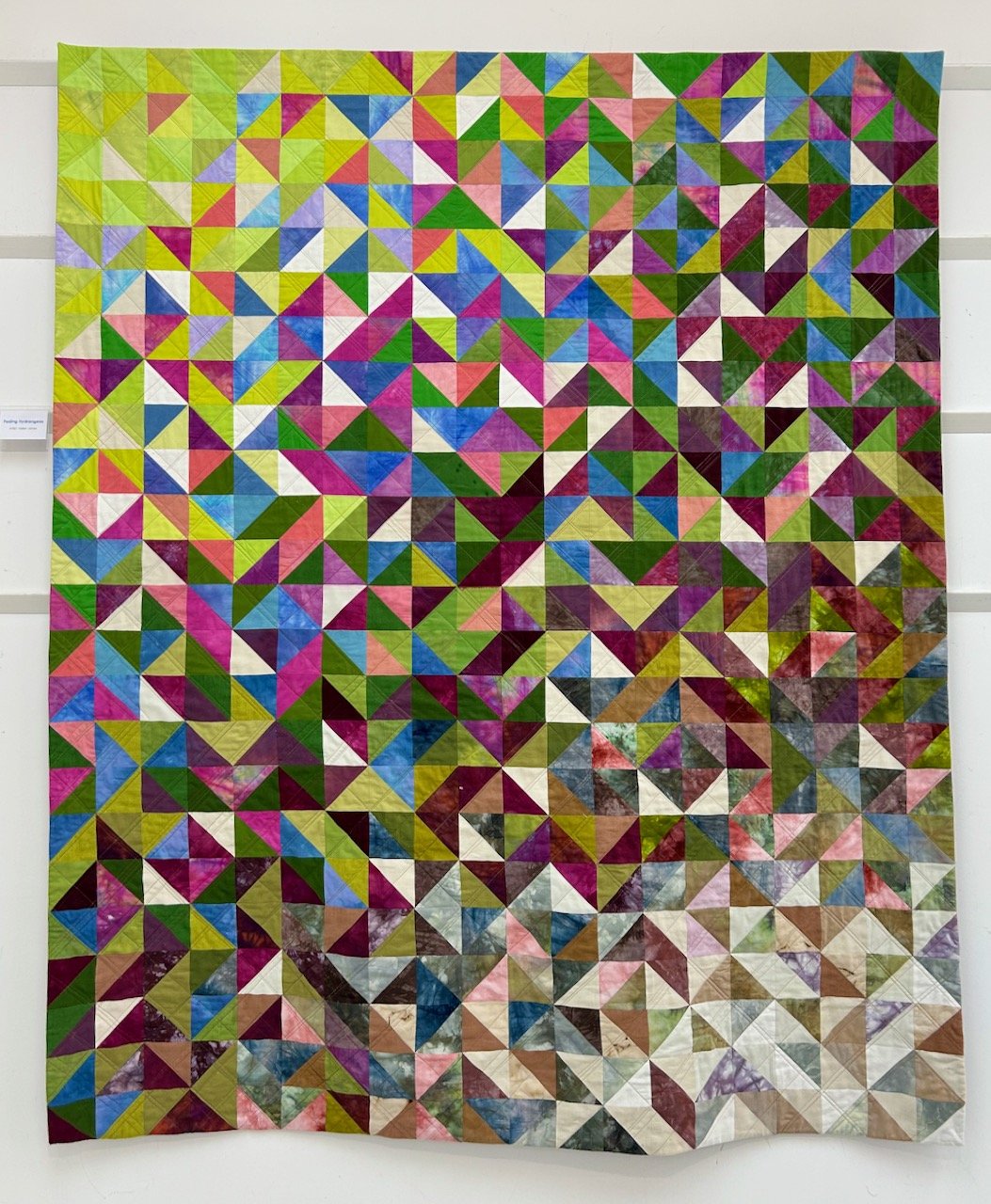
It’ll be no surprise to you, and it certainly wasn’t to me, that I was instantly attracted to the most colourful exhibits some of which I’m sharing in this post. My favourite item from the exhibition was this ‘Fading Hydrangeas’ as not only can you instantly see the decay, and all the colours of the hydrangeas throughout its lifecycle, but also because of the intricate work and the patience it must have required.

FADING HYDRANGEAS, HELEN JONES

FADING HYDRANGEAS, HELEN JONES

Helen said that she loves colour and has been inspired by the constantly changing hues of the hydrangeas in her garden; from the bright, pure colours right the way through to the delicate petals in winter. Isn’t it gorgeous?

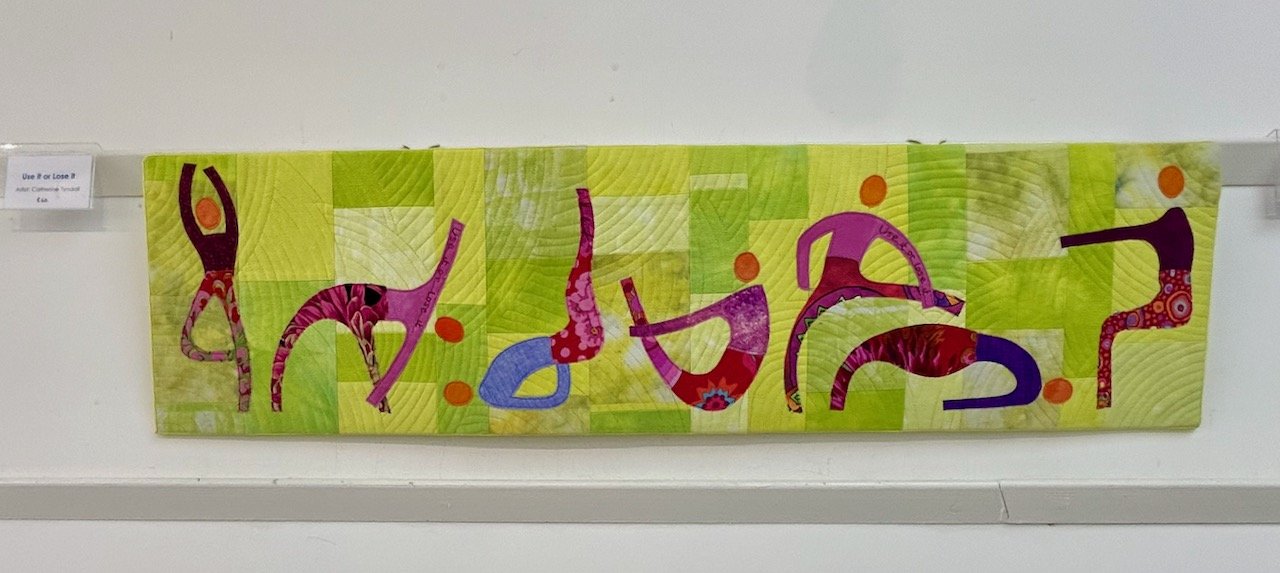
The next one I’m sharing is more literal - ‘Use it or lose it’ - and a type of decay that I’m sure all of us are keen to embrace, but it’s also a timey reminder to actually make that happen isn’t it?

USE IT OR LOSE IT, CATHERINE TYNDALL

USE IT OR LOSE IT, CATHERINE TYNDALL

VARIOUS SMALL QUILTED SQUARES BY THE EMCT GROUP

VARIOUS SMALL QUILTED SQUARES BY THE EMCT GROUP

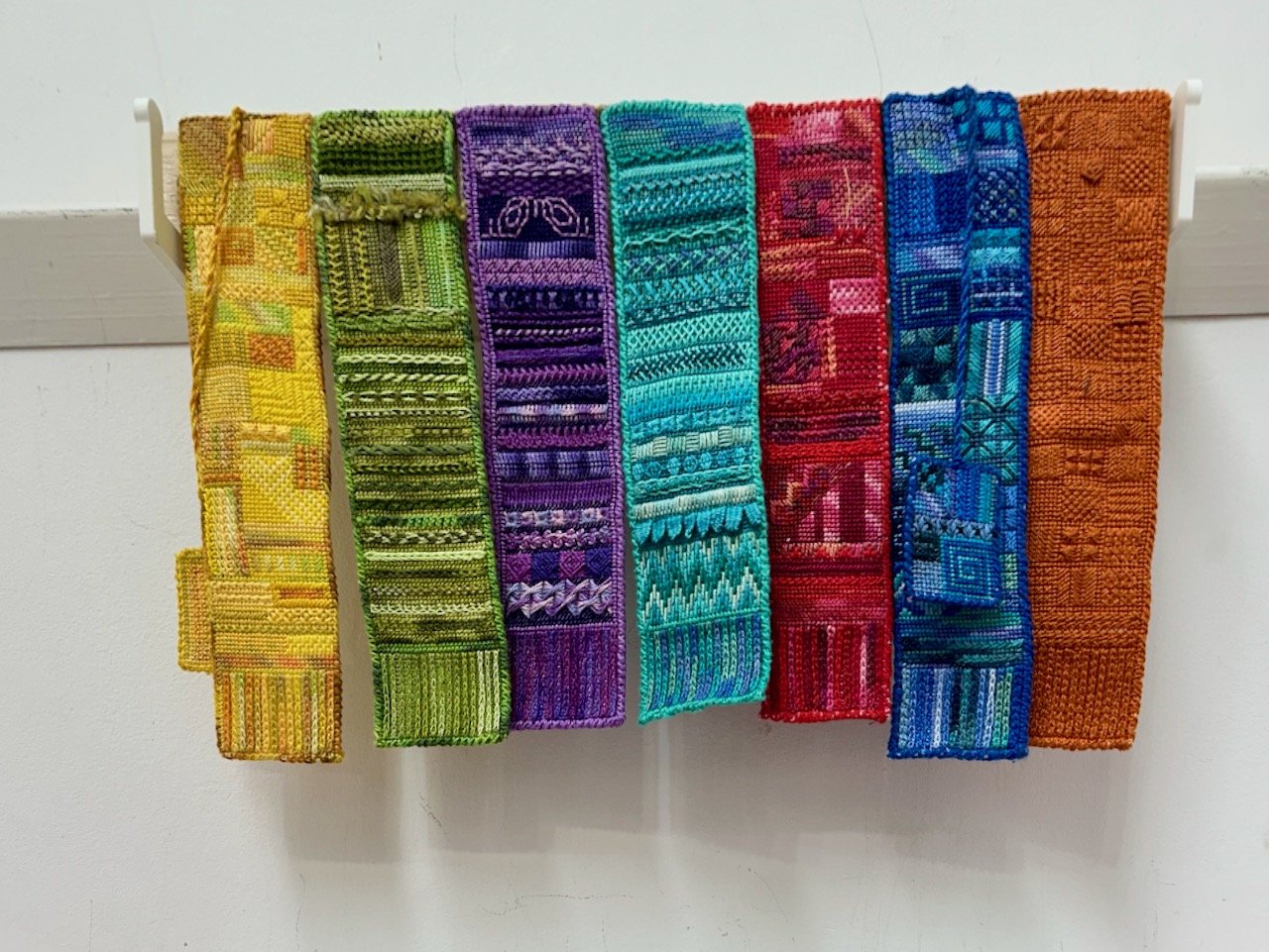
There was little information available in the show notes for the items above and below, but I understand they were completed by members of the East Midlands Contemporary Textiles group for their regular meetings, and they felt (and I agree) that they should also be displayed.

RAINBOW COLOURS AND EXQUISITE STITCHING, EMCT GROUP

RAINBOW COLOURS AND EXQUISITE STITCHING, EMCT GROUP

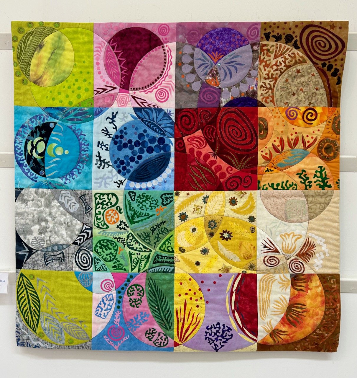
This piece by Linda Forey started as ‘a possible method of looking at transparency in colours, and became a fun game of adding applique shapes’ - either way the result is stunning and playful - and also a contender for my favourite piece in the exhibition.

PLAYING WITH COLOUR, LINDA FOREY

PLAYING WITH COLOUR, LINDA FOREY

LONG STRIPS OF INDIVIDUAL SQUARES, EMCT GROUP

I love the colourful strips of individual works pieced together, and wish I could share more about them. It was the fruit on the blue background (on the right above) that caught my eye, and the more I looked the more detail and amount of work I could see.

Truly amazing.

It was a great exhibition, which also had a ‘touching table’ where the artists had made available the pieces they’d created when starting out to create the pieces for the exhibition, that was really interesting but also highlighted that there’s always so much more that goes into creating anything quite this beautiful.

Look out for another post where I’ll share with more items from the exhibition, which look at transition and decay in a completely different way, that’s why I’m sharing it as a separate post - I didn’t want either of the approaches to get lost.

The fourth (and last) of our black and white pictures

Here’s the final post in this series, which follows more details on why we chose the first, second and third photos as part our series of four black and white pictures. As you know the first two images were of holiday memories, and the third was prompted by where we used to live, so it seems only right that the final image was of our new location. It’s also the only photo not taken by me in the series too.

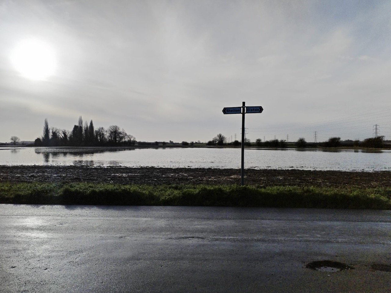
MOH took this photo of one of his regular bike rides, it’s a place we drive past often and so it was a bit of a shock to see the field full of water that first winter we were here. We were already a little bit more shocked than we thought we would be by the weather and its impact on the area around us, and I remember thinking how much hardier these country folk were, much more than us townies and questioning if we’d made the right decision to move.

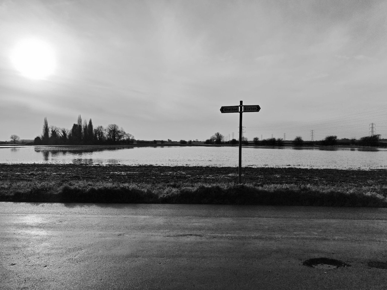
But to give you an indication of how grim it was, and how much of an eye opener it was, there’s very little difference colour wise between the colour and black and white photo. There’s definitely some mileage in the ‘it’s grim up north’ saying, but it’s also true we’re glad we moved here as there is so much more it offers us.

The black and white photo loses the place names on the sign, but I think accentuates the pot hole - which like many places is sadly a way of life right now. We’ve learnt that here though they draw a yellow circle around them, we’re not convinced this is to highlight where repairs are needed though as often the yellow circle wears off and needs replacing too! You’ve got to laugh though…

So the final image is a good reminder of our first winter in our new house, and I think complements the other images in our series of four black and white pictures, each of which includes an element of nature. Together they make a great and impactful display in our bedroom of our now not quite so new house!