
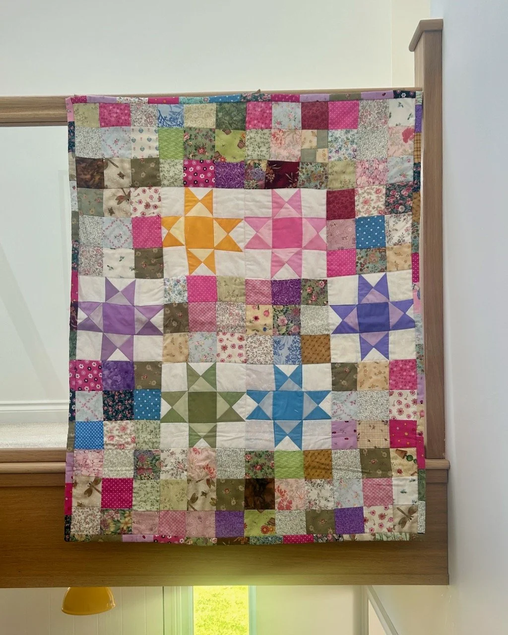
Today I’m sharing more from the Knit & Stitch Show from Harrogate last year, and now I’ve shared all of the graduate showcase exhibits I’m going to move on and share some of the equally exquisite work on display in the gallery sections, starting with Shelley Rhodes.
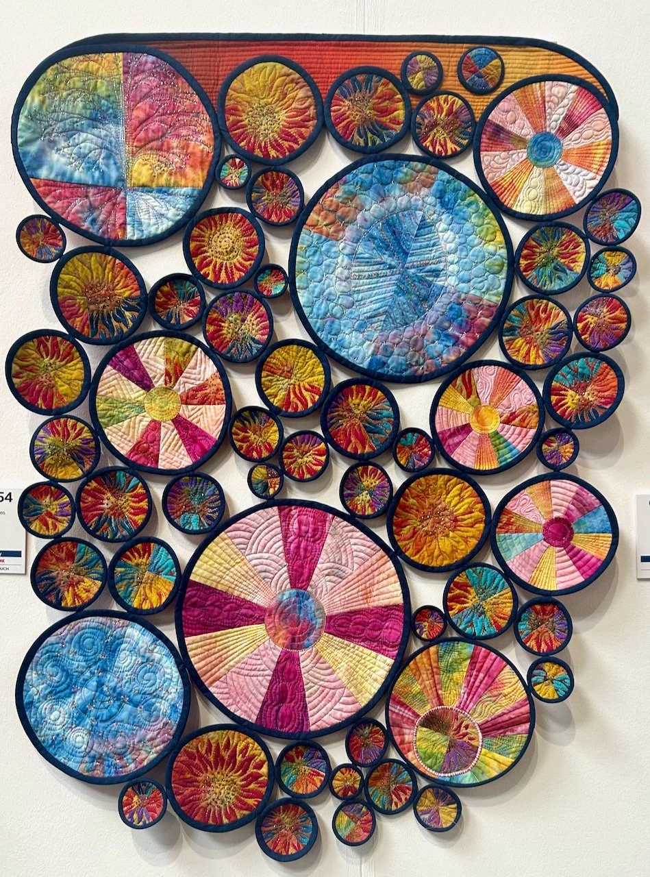
I’d not seen any of Shelley’s work before but I was completely mesmerised by it - both when they were hung together, and individually. Shelley’s a mixed media artist who is drawn to the concept of fragmentation on repair, each the elements for her pieces are either weathered, worn or broken.
Her website says she is ‘drawn to the effects of time, the transience of nature, the things that go un-noticed and the ever-changing fragility of things around her.’
And together her pieces are quite a statement.
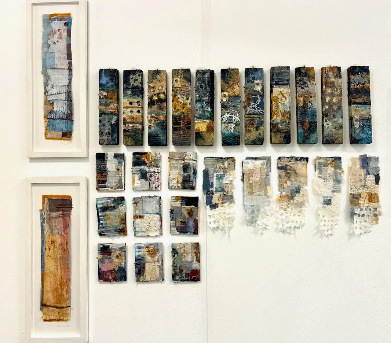
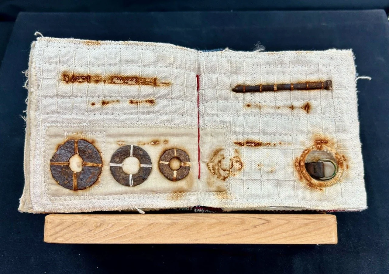
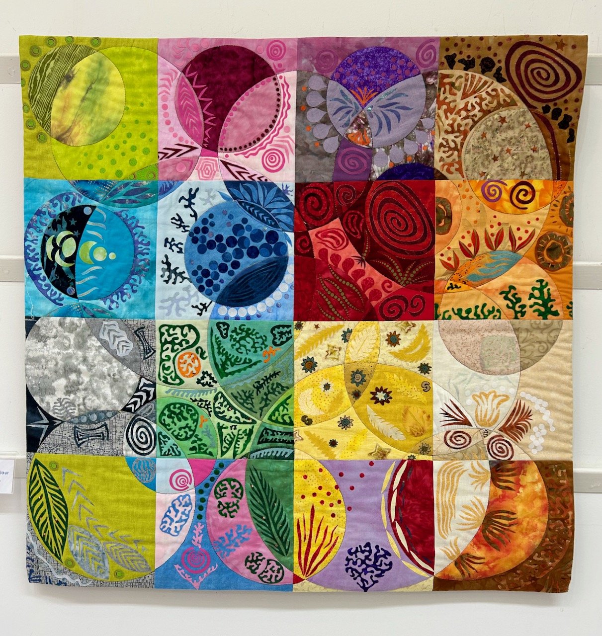
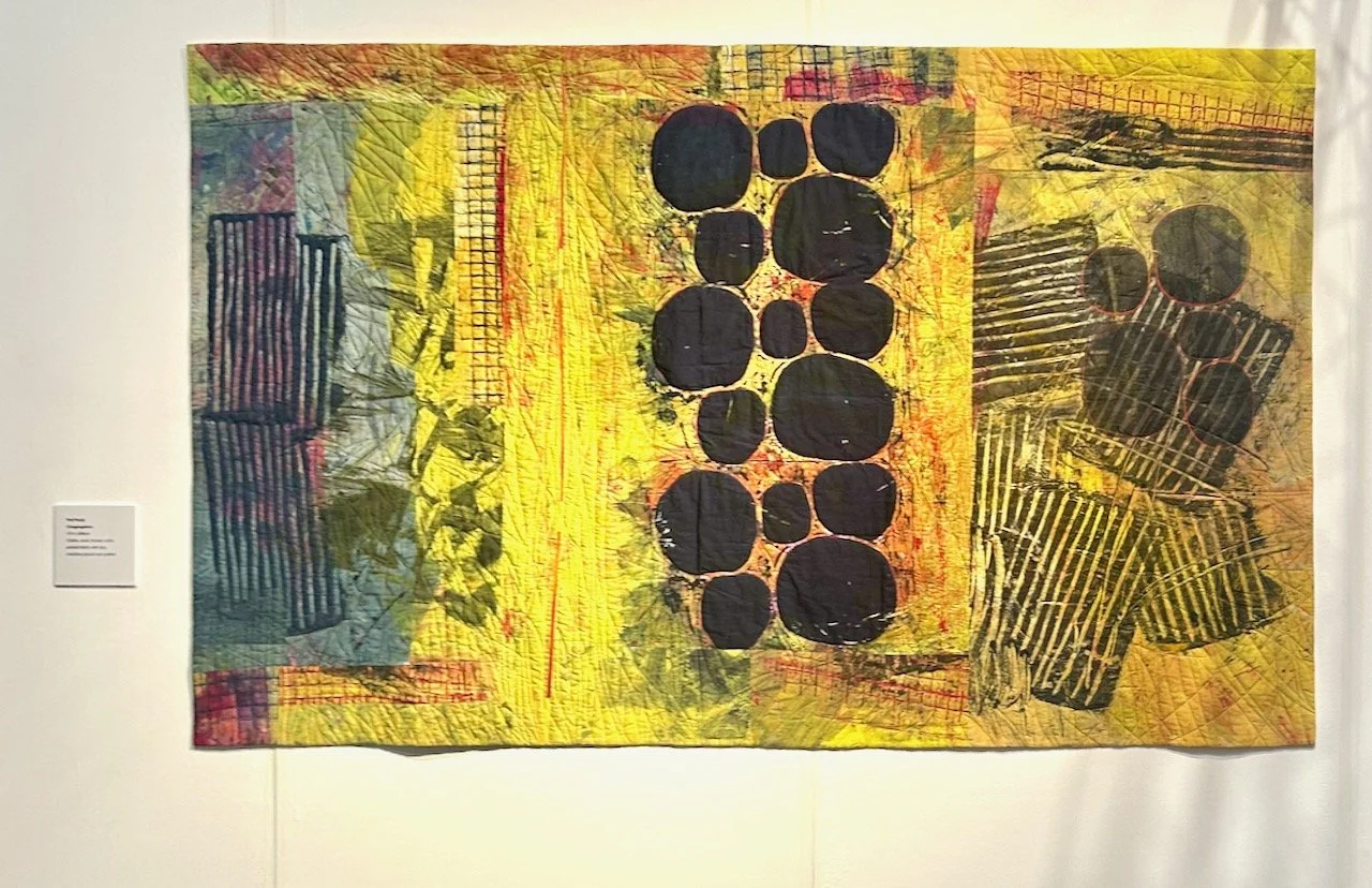
BEHIND THE STITCHES, SHELLEY RHODES
But I think are equally good alone.
She uses stitches to join pieces, and takes inspiration from Kantha making and combines layers of distressed, pre-used cloth piecing, matching and mending as she goes - and the results are stunning.
A SEGMENT OF BEHIND THE STITCHES, SHELLEY RHODES
I loved the detail on each of these elements, and it was great to be able to get so close to do that. I’m always amazed at how cohesive mixed media art is whilst using scraps - but then I guess if I were to colour code my scraps I’d be in with more of a chance of not creating a rainbow! Though obviously these are a level above anything I would create, but I’m sure there is still the satisfaction of putting something together well, whatever your skill level.
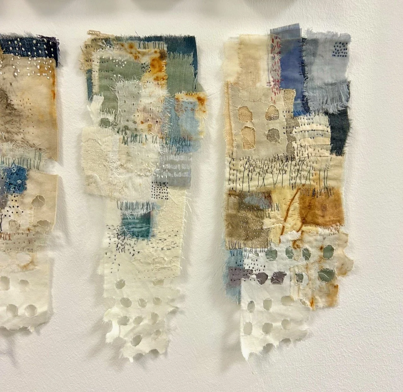
A SEGMENT OF BEHIND THE STITCHES, SHELLEY RHODES
I think though of all of the different type and shaped pieces, it is these oblongs that are my favourite, perhaps it’s the colours, perhaps the addition of nails/tacks - or maybe both.
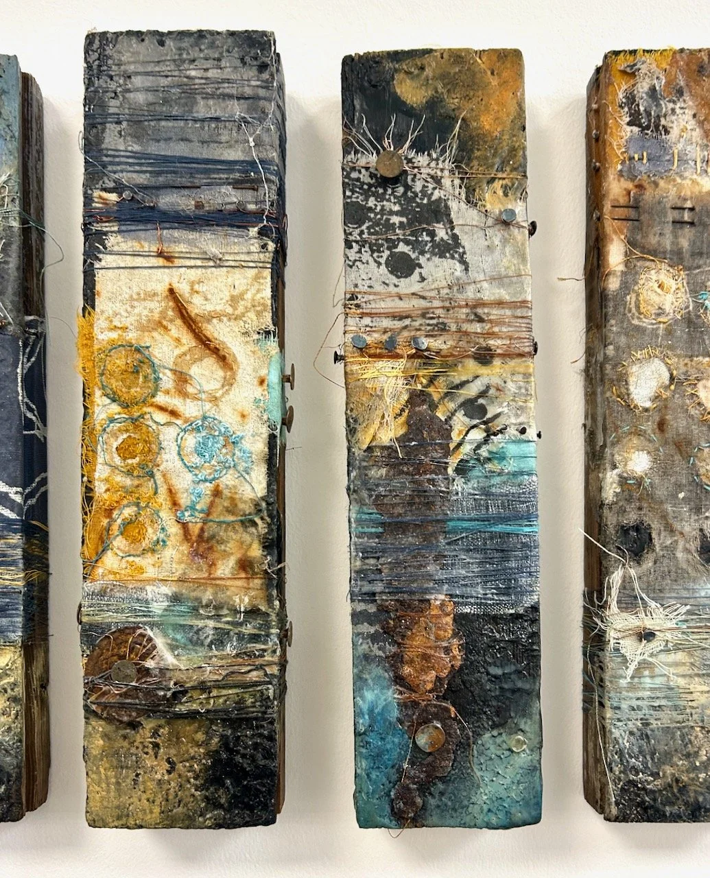
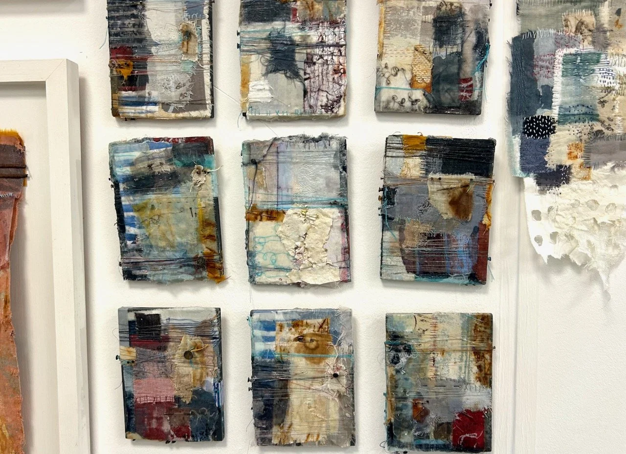
A SEGMENT OF BEHIND THE STITCHES, SHELLEY RHODES
I’m glad to have seen them, and to share them here - and to wonder at their inception and beauty, and now you can too.