Transition and Decay, the rusty interpretation

While there may not be as many photos here as in my colourful interpretation post these rusty interpretations really did make me stop and think about the craft and work that has gone into both of these pieces.

The book by Gilly Meeks held items in various stages of rusting along with stitching and shows the effect that has on the material

The little rusting book, Gilly Meeks

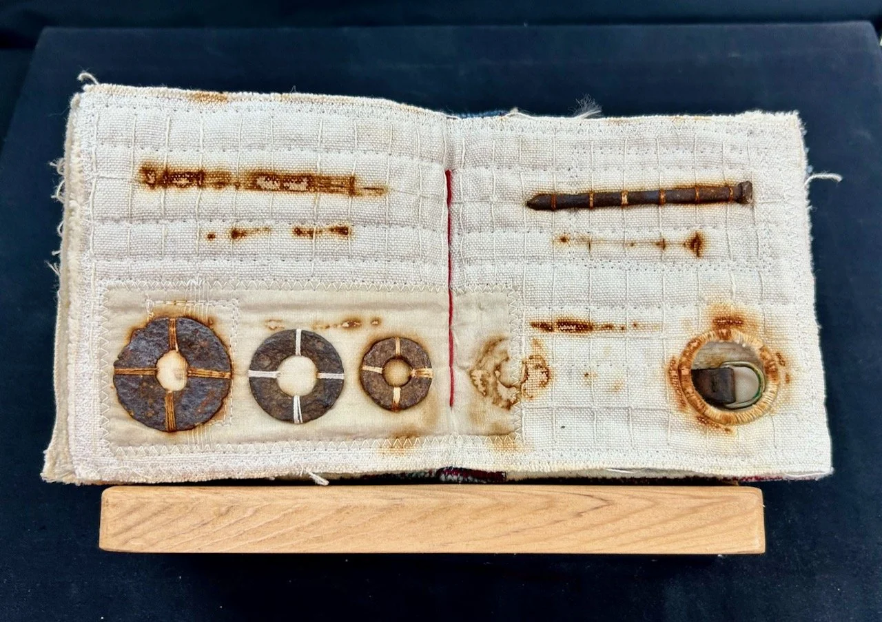
THE RUSTING BOOK, GILLY MEEKS

Gilly says it comines her love of the making process, stitch and found rusty objects. Recycled fabrics in the book include cotton, linen, silk and tea bag fabric and all rect in different ways to the rusting process. Gilly also says she’s very drawn to the ghostly marks which result from the process.

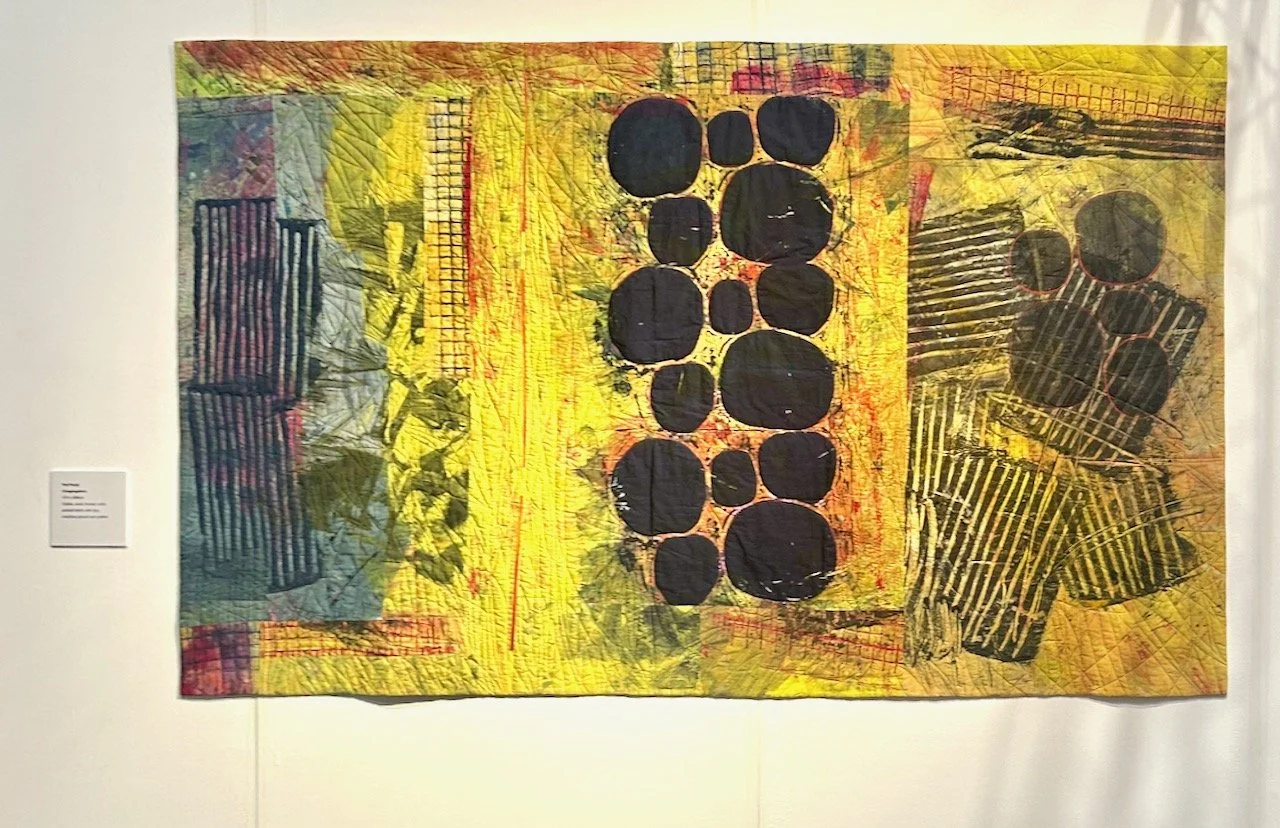
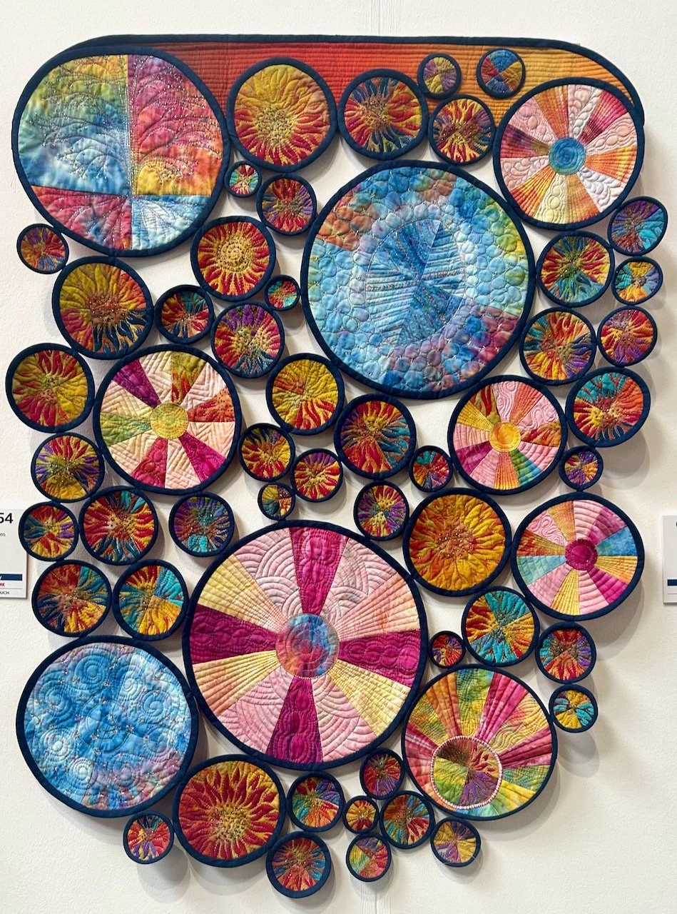
The larger Rust quilt by Fiona Burrows takes a different and larger approach - her piece shows the aesthetic and symbolic qualities of decay and decomposition in the style of Piet Mondrian.

RUST, FIONA BURROWS

RUST, FIONA BURROWS

And just look at the detailed quilting.

RUST, FIONA BURROWS

RUST, FIONA BURROWS

I love both of these pieces as much as I love the colourful interpretations, but to me these pieces really needed their own post to shine (or rust!).

Which of the interpretations I’ve shown is your favourite?

Transition and Decay, the colourful interpretation

Back in March in an unassuming building in Nottingham I went along to the East Midlands Contemporary Textiles exhibition titled Transition and Decay. I wasn’t quite sure what to expect, but the leaflet was handed out at the Newark Quilt Show back in January and as we planned to be in Nottingham that week, then there was no reason not for combining a visit to the exhibition with our errands, and lunch!

And we weren’t disappointed with any of those. We started out at another new-to-us venue, the Nottingham Society of Artists Gallery in a part of the town (city?) centre we’ve not visited much yet, and we were met with a riot of colour. Even MOH was impressed and took some photos.

It’ll be no surprise to you, and it certainly wasn’t to me, that I was instantly attracted to the most colourful exhibits some of which I’m sharing in this post. My favourite item from the exhibition was this ‘Fading Hydrangeas’ as not only can you instantly see the decay, and all the colours of the hydrangeas throughout its lifecycle, but also because of the intricate work and the patience it must have required.

FADING HYDRANGEAS, HELEN JONES

FADING HYDRANGEAS, HELEN JONES

Helen said that she loves colour and has been inspired by the constantly changing hues of the hydrangeas in her garden; from the bright, pure colours right the way through to the delicate petals in winter. Isn’t it gorgeous?

The next one I’m sharing is more literal - ‘Use it or lose it’ - and a type of decay that I’m sure all of us are keen to embrace, but it’s also a timey reminder to actually make that happen isn’t it?

USE IT OR LOSE IT, CATHERINE TYNDALL

USE IT OR LOSE IT, CATHERINE TYNDALL

VARIOUS SMALL QUILTED SQUARES BY THE EMCT GROUP

VARIOUS SMALL QUILTED SQUARES BY THE EMCT GROUP

There was little information available in the show notes for the items above and below, but I understand they were completed by members of the East Midlands Contemporary Textiles group for their regular meetings, and they felt (and I agree) that they should also be displayed.

RAINBOW COLOURS AND EXQUISITE STITCHING, EMCT GROUP

RAINBOW COLOURS AND EXQUISITE STITCHING, EMCT GROUP

This piece by Linda Forey started as ‘a possible method of looking at transparency in colours, and became a fun game of adding applique shapes’ - either way the result is stunning and playful - and also a contender for my favourite piece in the exhibition.

PLAYING WITH COLOUR, LINDA FOREY

PLAYING WITH COLOUR, LINDA FOREY

LONG STRIPS OF INDIVIDUAL SQUARES, EMCT GROUP

I love the colourful strips of individual works pieced together, and wish I could share more about them. It was the fruit on the blue background (on the right above) that caught my eye, and the more I looked the more detail and amount of work I could see.

Truly amazing.

It was a great exhibition, which also had a ‘touching table’ where the artists had made available the pieces they’d created when starting out to create the pieces for the exhibition, that was really interesting but also highlighted that there’s always so much more that goes into creating anything quite this beautiful.

Look out for another post where I’ll share with more items from the exhibition, which look at transition and decay in a completely different way, that’s why I’m sharing it as a separate post - I didn’t want either of the approaches to get lost.

Hamid Zenati at the Nottingham Contemporary

While there are plenty of exhibitions in London - one of which we’ve been to recently, there’s also plenty of exhibitions and ‘culture’ outside of the capital, and that’s something we’re still exploring. Since we’ve lived in Nottinghamshire though, I think we’ve been to more concerts and such, which given we practically lived on the O2’s doorstep in Greenwich is pretty odd! I think here we’re actively looking for things to explore as we build our new lives, but all of that is made so much easier by the institutions here putting on such great programmes.

Anyway, while my car was in for its service and MOT we decided to catch the bus into Nottingham and spend the day there. We weren’t sure which bus exactly, but the garage pointed us in the right direction and on both journeys we had to run for the bus, so that was a bonus too.

I’d spotted the Two Steps at a Time exhibition at the Nottingham Contemporary in a magazine and had added the exhibition dates to my calendar, so that was just the prompt I needed to sort out something a little different. I also signed us up to the ‘Wednesday Walkthrough’ session where we were led through more details about the artist by an art expert, at this session Sheyda Aisha Khaymaz an artist, curator and PhD Candidate in Art History at the University of Texas at Austin.

After completing the more usual tasks of shopping and checking out items for potential future online purchases, and then grabbing a coffee we set off to find the Nottingham Contemporary. It’s a fairly brutalist piece of architecture, and one we hadn’t seen before - however when we arrived we realised we’d probably been less than a few hundred feet away from it on most of our visits to the city. Even better was we’re getting our bearings and knew this just by looking at our surroundings - it’s great when that happens and you start to find your way around a new place naturally isn’t it?

The modern building of the Nottingham Contemporary space

NOTTINGHAM CONTEMPORARY

I knew nothing of the artist before we booked our spaces, but learnt from the website blurb that Hamid Zenati (b 1944 Algeria; d 2022 Germany) was a self-taught and prolific artist working across many surfaces including textiles, fashion and ceramics and more.

This exhibition is the second-ever showing of his nearly sixty year career and the first in the UK - and from the images on the website I knew we were in for a feast of colour.

It was great to hear more about the artist, and the talk was busy with up to thirty people also attending, which the organisers clearly welcomed. I’ll not share much more about the artist or the talk, but we enjoyed both - I’ve realised lately that I’m very much a visual person (it’s not really a surprise tbh), so I’ll leave you (mostly anyway) to enjoy my favourite pictures.

various textiles hung around the gallery space

The gallery with the textiles was my favourite of the two spaces. They were hung at varying levels from the super high space and that also provided movement, and being able to get up so close was unexpected, as was being able to walk through (literally) the pieces - though of course people were respecting them and ducking to avoid any contact.

Textiles hung in a gallery at varying heights on display

The piece at the centre top of the image above is I think my favourite piece of the exhibition. I’m not sure if that’s because it captured your attention as soon as you walked in through its height or its colours, but it’s the one I kept coming back to - and there were plenty in here that I liked.

repetitive lines and blobs on a green and black background - two individual pieces of work

The boldness of the pieces was amazing, and perhaps this is attributed to being self taught and not needing to follow the rules, or perhaps it’s just what it is and what needed to come out! He didn’t document much of his work at all, so there’s no sure way of knowing - which again means you can make up your own mind, as can I.

The one below was close to being my favourite, for the colours. I can imagine that making a lovely summer dress! Which isn’t as mad or sacrilegious as it sounds, as the gallery staff were wearing his designs. I’m not sure how they felt about it, but it was a fab touch to bring the art to life.

A textile with a circle and shapes emanating from it

I’ll share one final textile, this one had me captivated during the first part of the talk. It was in my direct eye line and I found myself wondering if they were whales or just fish. They could be either I guess.

colourful whales - or fishes - on a black background

This last picture is the one the MOH was most taken with. It’s in the second gallery where there’s more ceramics and even more textiles, though smaller ones which are laid out on plinths. It too follows the ‘fill the space’ approach which isn’t something I’m against. I too love the bold colours, and would happily have a pair of matching, or at least complementary, vases like this on our half-stair landing - though I’d be worried about them bouncing down the stairs unaided.

It’s great to find exhibitions such as this locally, I’m glad I spotted it and that we were able to go and enjoy it - I’m sure we’ll be back to the Nottingham Contemporary, and I’m pretty sure there’s much more in Nottingham and around for us to discover.

PostCommentLove