Eight autumnal cards

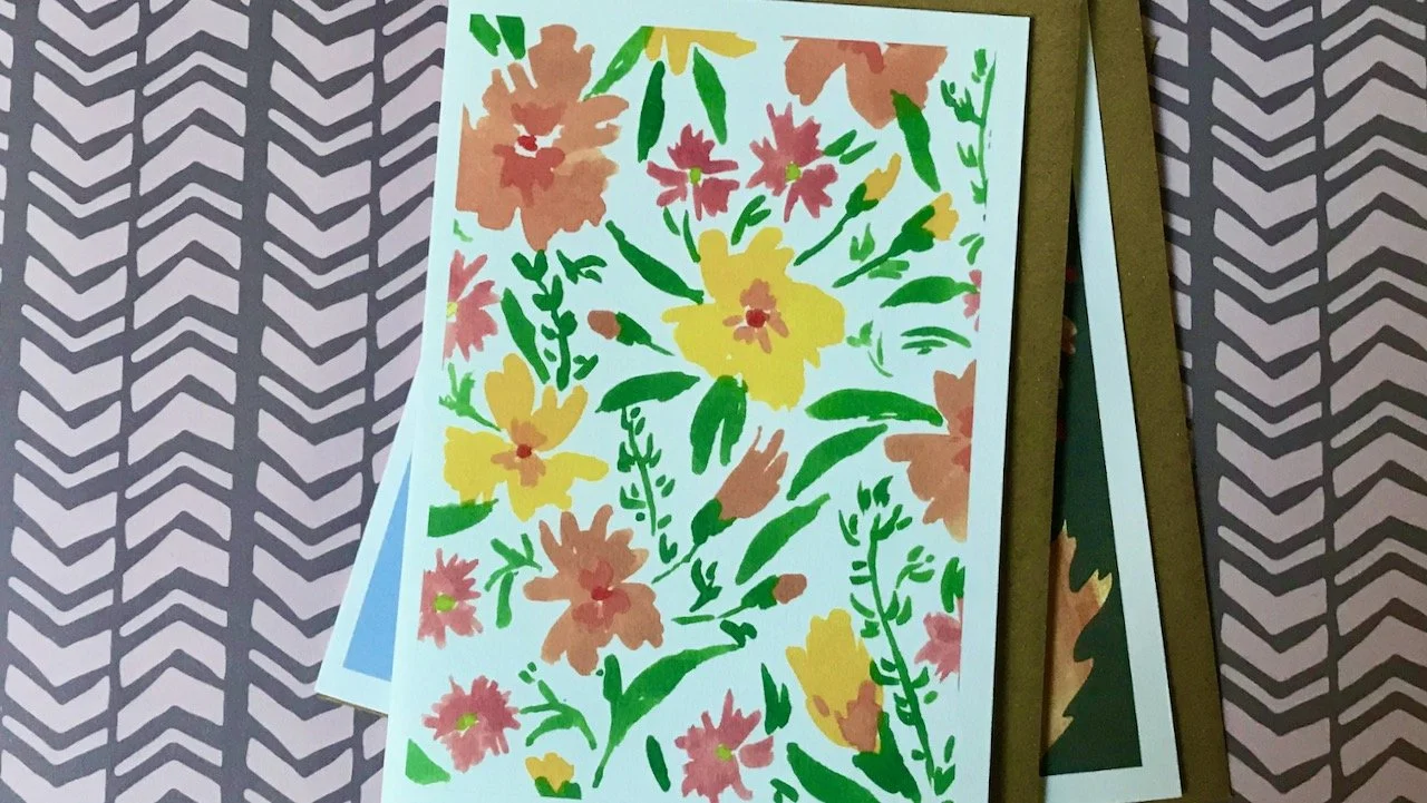
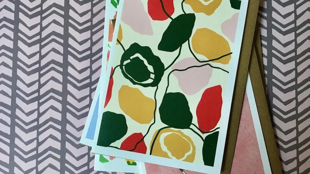
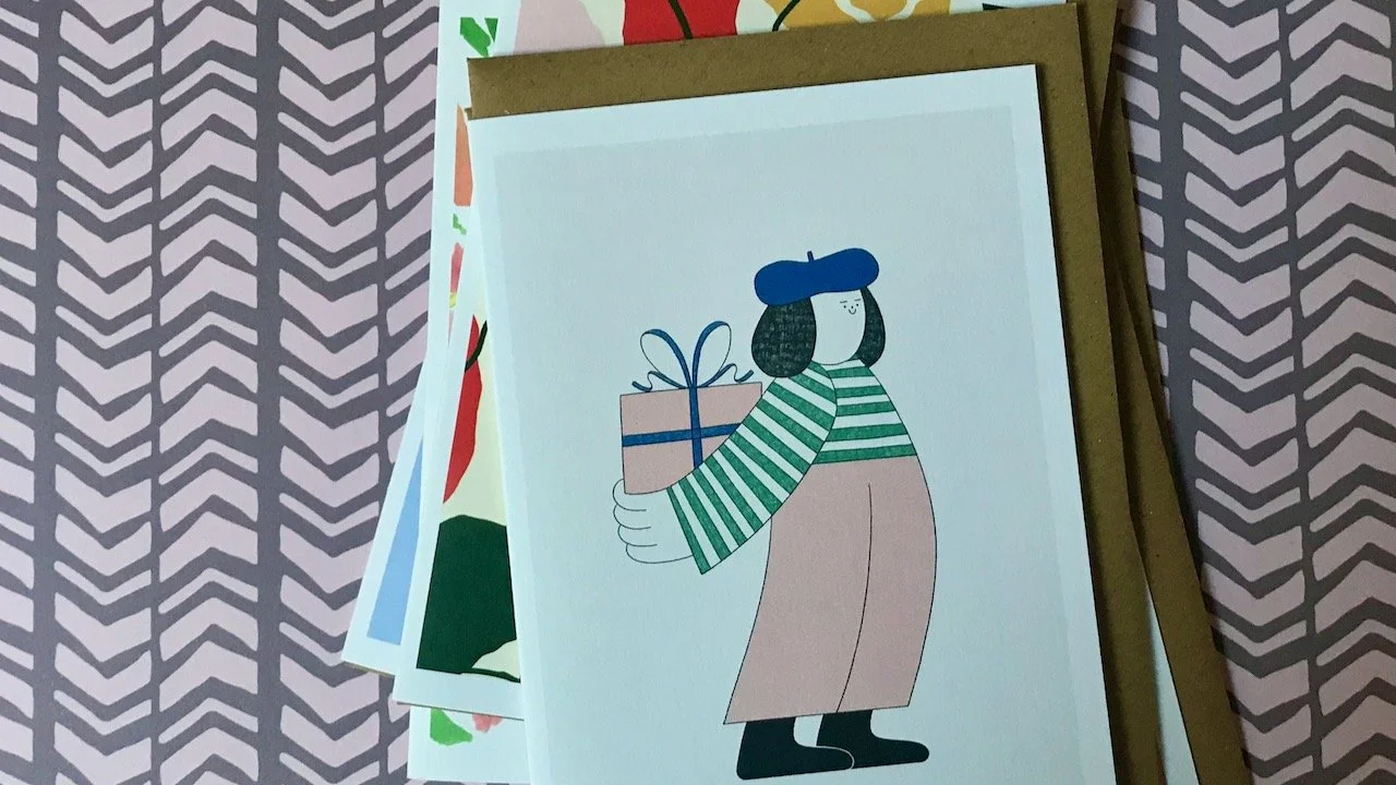
I’ve received my latest box from Cardboys, and again they’re mini pieces of art which will be popping through letter boxes of people I know celebrating over the next few months. As ever for £24 I received eight cards, once again with a thank you card, some specifically for birthdays and others which can be put to many uses.

Two green budgerigars sitting on branches against a light blue oval on a darker blue background

ARTIST: LAURA BARNES

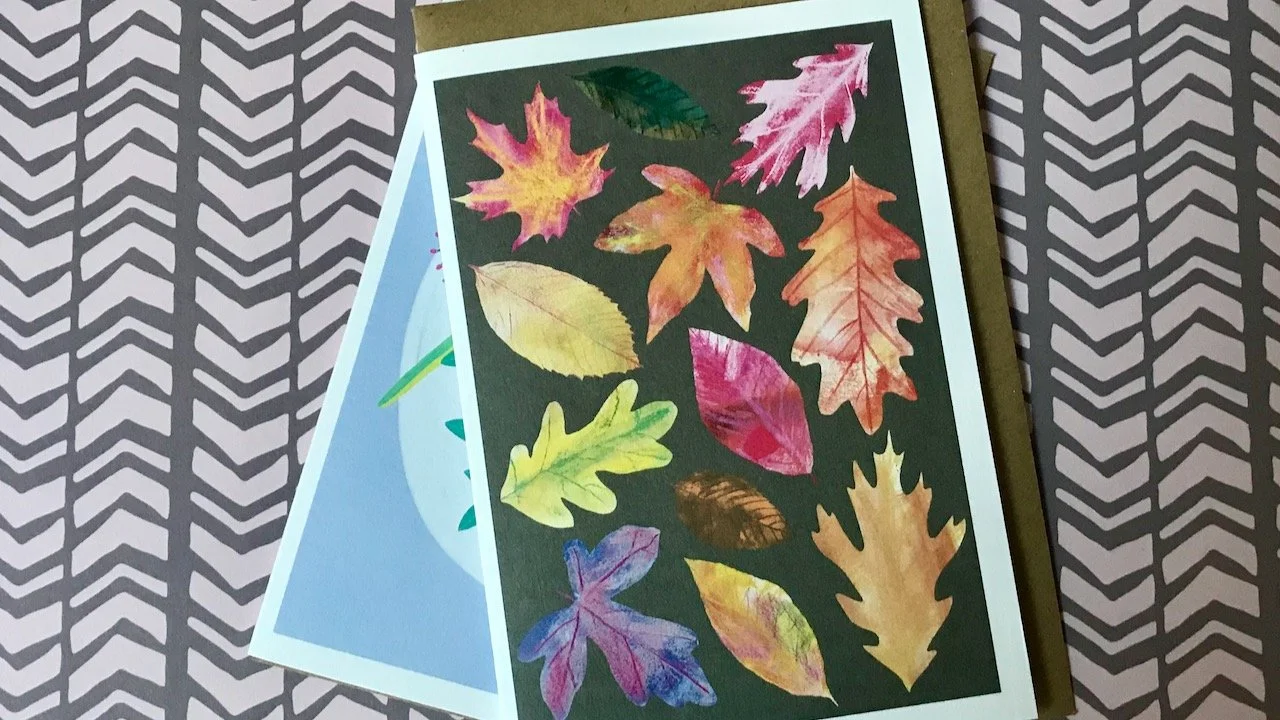
This box covers the three months September to November, so I wasn’t surprised for there to be an autumnal leaf design, which I think is one of my favourites this month.

Green, red, amber and purple autumn leaves on a brown background, with the previous card beneath

ARTIST: GRACIE GERSTMAN

yellow and peach flowers with green leaves on a white background, both previous cards are at the bottom of the pile

ARTIST: REBECCA DIGGLE

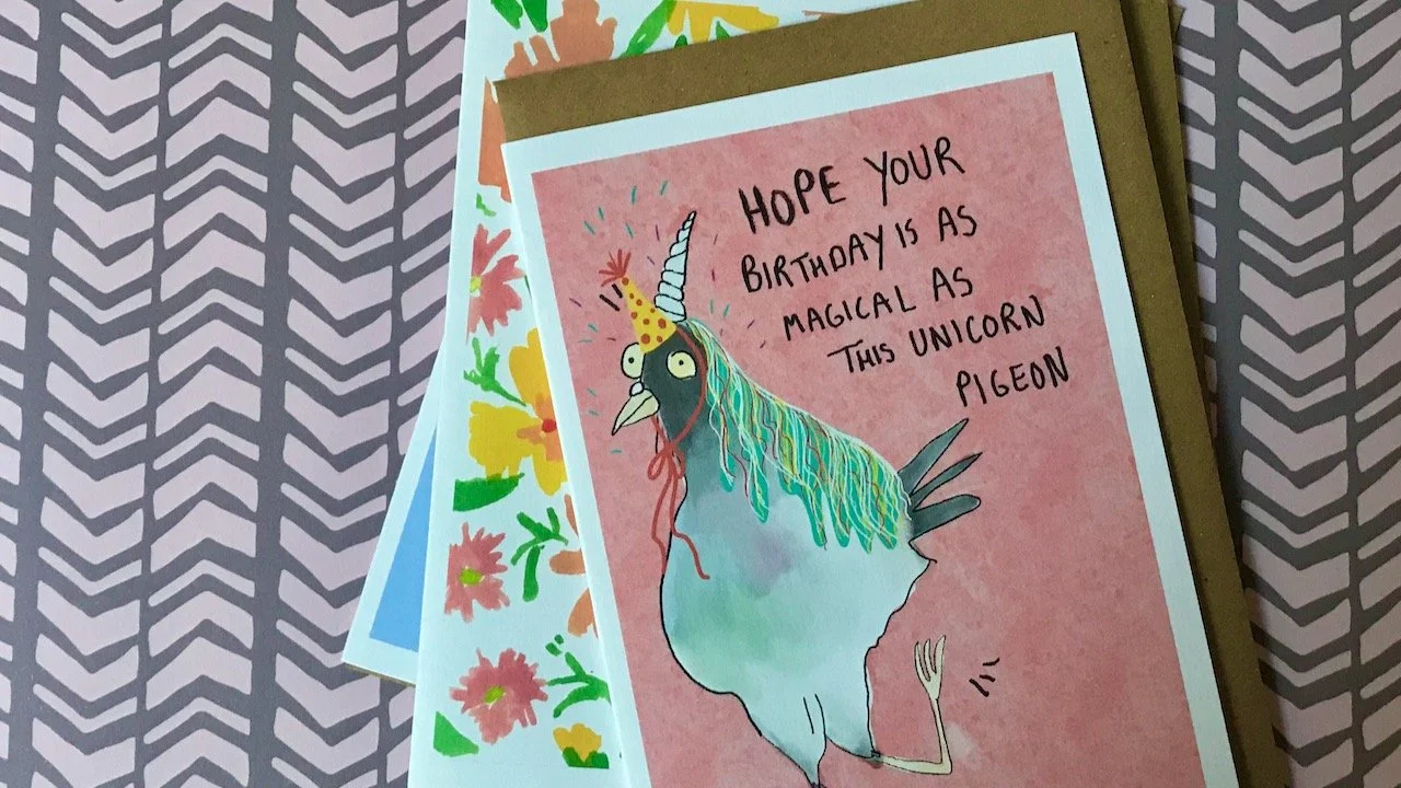
I’m not always a fan of more comical designs, but this unicorn pigeon made me smile. I think we all need some unicorn pigeons right now!

On top of the previous cards, a picture of a unicorn pigeon on a pink background with text "hope your birthday is as magical as this unicorn pigeon"

ARTIST: GRACE CHILTON

pastel pink, yellow, red and green splodges creating a flowerlike patter on a cream background

ARTIST: FLORA DUKE

What I like about these is that they encourage me to share them, not necessarily always by post. We don’t need to talk about the cost of postage, but isn’t it always nice to receive something nice in the post?

A hand drawn female wearing a beret, striped top and trousers holding a present behind her back

ARTIST: HOLLIE FULLER

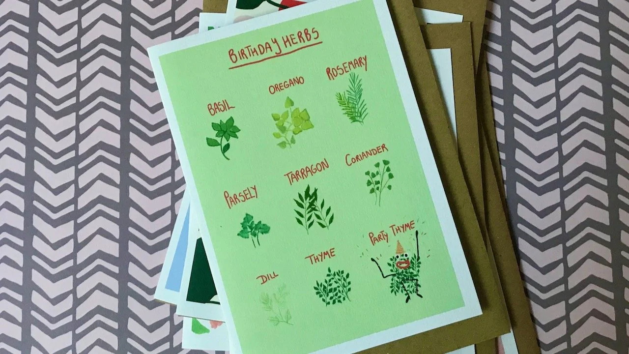
This month though, there was one card that had me considering if I wanted to continue with the subscription. And it was this one. I like the idea and depiction of Party Thyme, but I’m struggling with the typo. I’m not sure if I’ll be able to use this one without pointing out the misspelling, but then again that says to the person receiving it that I think they’re ok to be sent a typo - see, what a dilemma.

A green card of Birthday Herbs with 9 illustrations of herbs, including Party Thyme

ARTIST: GRACE CHILTON

A tiger lazing among golden flowers, and palm trees with a yellow sun on the horizon.  The words 'thank you' in orange at the top of the card.

ARTIST: HANNAH GRACE

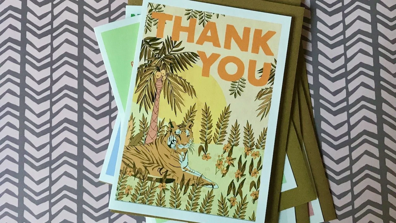
But then again, one card in what is now twenty four isn’t bad odds, but I know I wouldn’t have bought that card. Thankfully though the last card in this set is a zinger, and I’ll be sorry to part with this one. What would you do about the typo card, I’m interested to know your thoughts.

————

If you want to see previous boxes, read my post from August.

Post Comment Love 11-13 November

Welcome to this week’s #PoCoLo - a friendly linky which I co-host with Suzanne, where you can link any blog post published in the last week. We know you’ll find some great posts to read, and maybe some new-to-you blogs too, so do pop over and visit some of the posts linked and share some of that love. If you were here last week it was great to have you along, if you’re new here this week we’re pleased you’re here.

Despite it raining most of the week, once again I’ve spent very little time online and on my blog. And while that’s good in some ways, it does make me feel more behind with everything than I’d like to be. I am clearly still relishing the freedom of not being bound to my desk, but with that it seems comes the unruliness and lack of routine. Something to work on, I think.

There was a break in the rain though and I grabbed that, along with my waterproof and headed down into Greenwich. I found myself wandering around the National Maritime Museum and realised it’d been such a while since I last visited and enjoyed new and old exhibitions. I’d not seen the ship’s badges before, and they covered the walls in the Sea Things area, so for my photo this week I’m including my favourite, isn’t it great?

A ship's badge on the wall of the National Maritime Museum - diamond with a gold rope border, the background is yellow with a single pink flamingo in the centre, with the word flamingo above

You are invited to the Inlinkz link party!

Click here to enter

Digging out my watercolours

I’ve been experimenting. It’s been a long time since I used my watercolours, but I’ve been mesmerised by the many tutorials and reels on Instagram, as well as the fab artwork they seemingly easily produce. So rather than keep watching and wondering what if, I had a go.

I was quickly reminded that it’s been a long time since I used my watercolours, and as you can see they’ve probably had minimal use previously.

My watercolours - two rows - in a wooden box with a white mixing tray at the front end of the box

But I figured it couldn’t be hugely different to other crafts, even though a paintbrush is perhaps a less familiar tool. So I thought I’d start with something easy and explorative, as well as useful - what colours are what, and how they were different on wet and dry paper. It’s the wet paper approach that had really caught my eye, and it worked well in real life too.

Trying all of the colours on wet and dry applications.  In the central column of 'wet' colours I've doodled flowers in black pen.  The names of the colours are written alongside each.

Where I think it really works is with the doodled flowers, which are in pen rather than with a brush. Again they’re rough and unplanned but they also show that that’s ok, and I think this is something that I’ll be exploring further.

It was definitely worth watching some ‘how to’ videos before I started, both for inspiration and practical tips. The most practical tip was to have two water jars, one for cleaning brushes and allowed to get dirty, and the other for applying on the paper and paints. And it’s working. The other tip related to this which is probably even more important is to keep your mug of tea in a separate part of the desk so you don’t dip your brush in that by mistake!

Eminently sensible.

A dirty and clean lidded jar of water on an upturned lid on my desk

Not feeling quite brave enough yet to go freehand, but wanting to do more than squiggles. I decided my next step would be some ‘watercolour colouring in’ and so I found a design which could be printed. Of course this meant it was on usual printer paper, rather than the paper I’d used for the colour test in my sketchbook, and so it performed differently.

A first attempt at "colouring in" using watercolours and rough blending, with the colour palette sheet in the background

But it worked well enough for what I wanted. The blending is a bit rough, the colours are over the lines - but it was great fun, worthwhile and part of my learning journey. Now I just need to be braver and try something freehand - though I’ll be watching a few more of those tutorials before I start.

My finished colouring with watercolours - over the lines and all

I’ve a feeling I’ve a few more afternoons ahead of me experimenting and refining (or picking up) some technique!

I was featured on Blogger Showcase