A coat of paint and some new cushions

A while back I bought some wrought iron garden chairs on eBay and knew they needed a bit of TLC. I also knew that I didn't want to repaint them white either, but I wasn't sure which colour to choose.  We already had an old iron table in Antibes Green - another eBay purchase which needs some work - and I was keen to keep the table the same colour, but was struggling to find the colour I needed and I absolutely refused to go the Hammerite route. I mean there's nothing wrong with Hammerite but i) they didn't have the colour I wanted and ii) I still wanted the table to retain its character, and some of its rust much to MOH's dismay.  

Anyway I've discovered that Annie Sloan's chalk paint comes in exactly the colour I want and although I haven't bought it yet, or started to tackle the table I knew that whatever I did with the chairs, they had to match the table I was planning.  When I saw that Farrow & Ball had a new yellow colour in their range I went to investigate. It is a bright yellow and has the fab name: Yellowcake - so with a name that includes two of my favourite things I was sold!

THE EBAY PICTURE

THE EBAY PICTURE

GETTING READY TO PAINT

GETTING READY TO PAINT

STIRRING THE PAINT: YELLOWCAKE 

STIRRING THE PAINT: YELLOWCAKE 

YELLOW!

YELLOW!

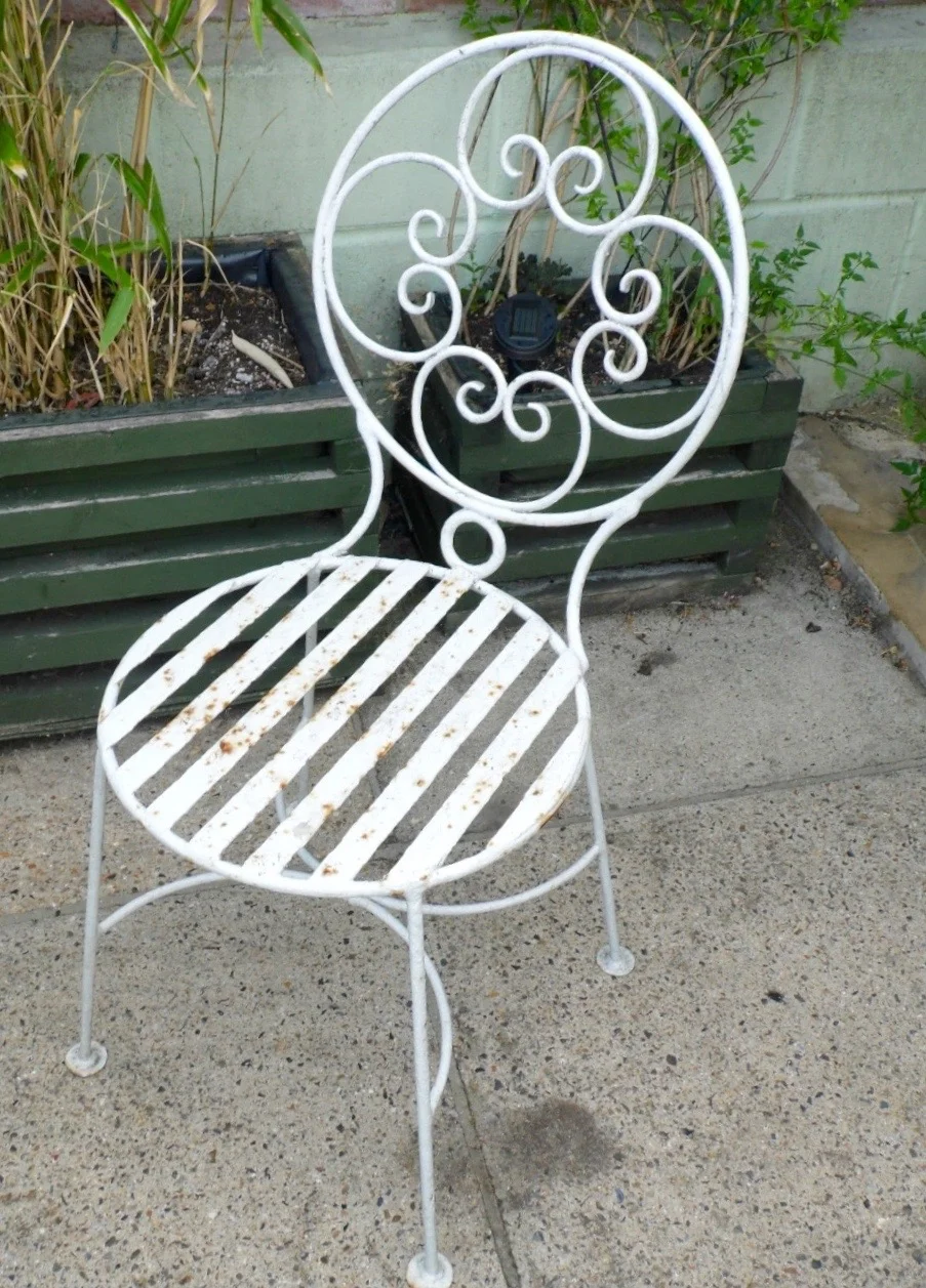
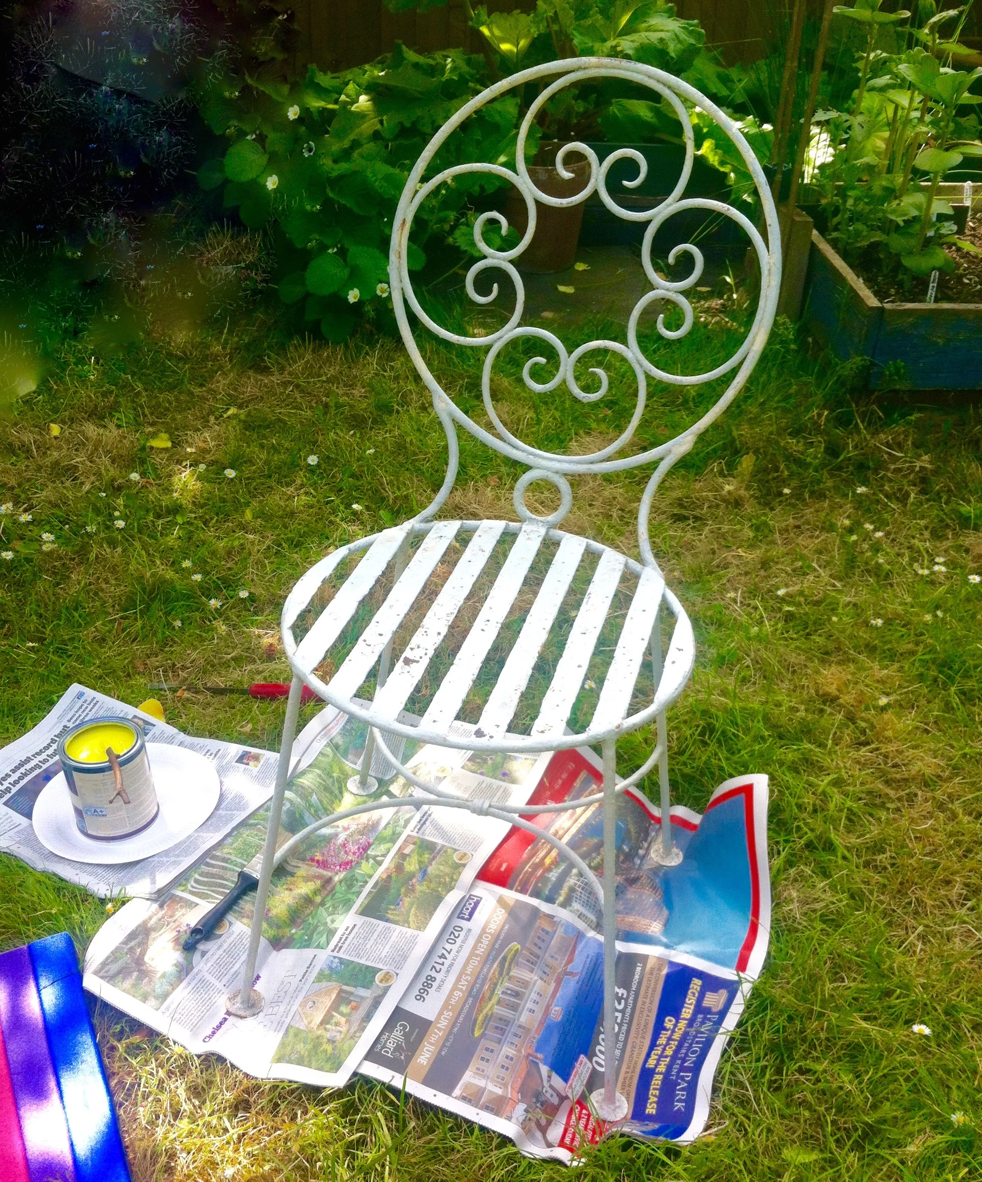
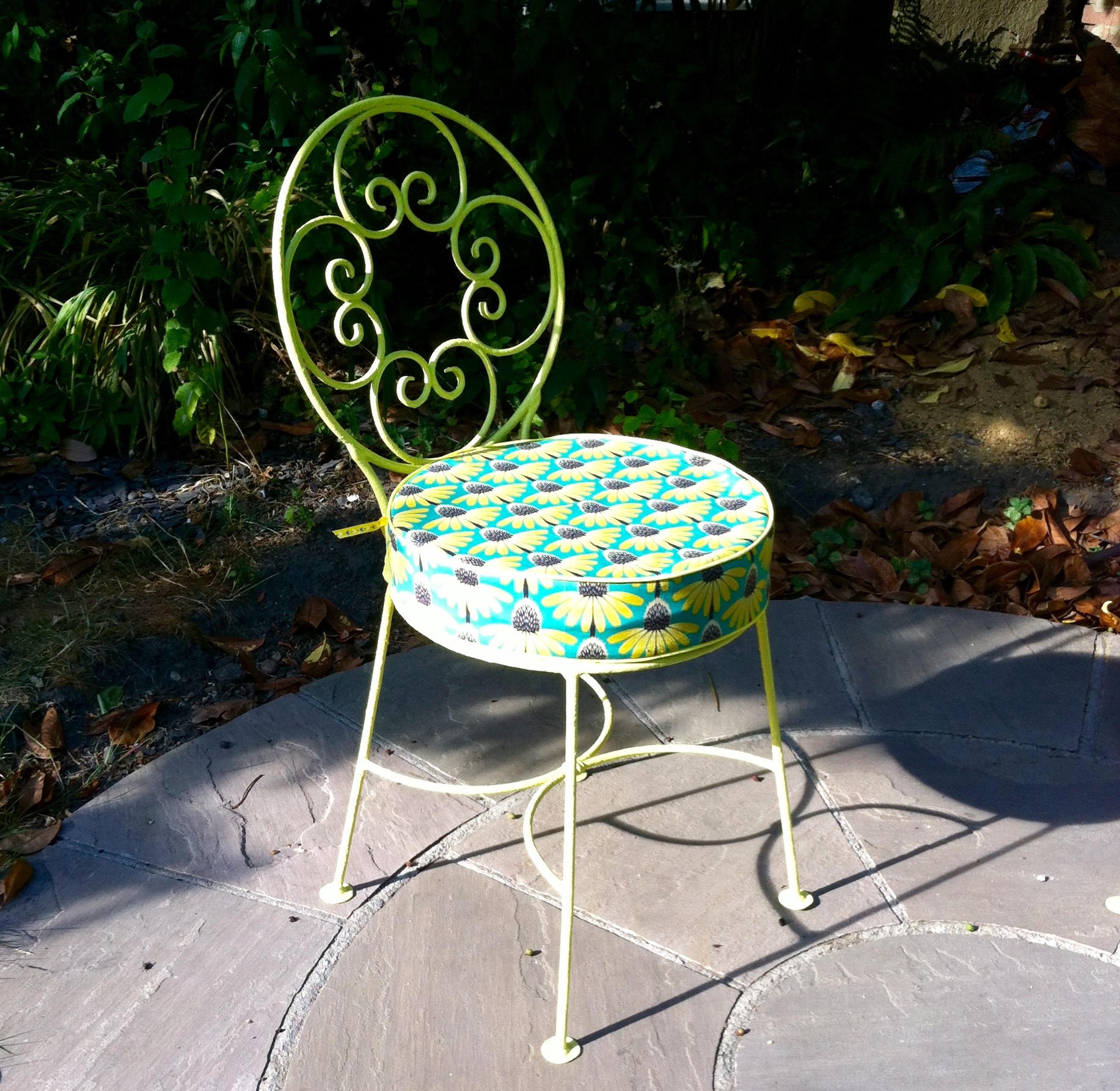
Before any painting could start the chairs needed to be rubbed down and a rust treatment applied and MOH set about this with gusto. I think he'd rather I'd bought new chairs as there was "years and years of paint on these" but I was less keen. So painting them became my job, so paint them I did.

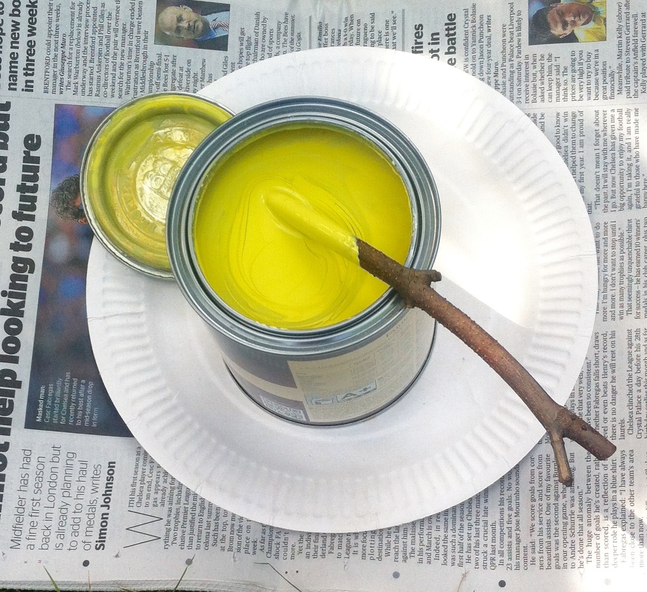
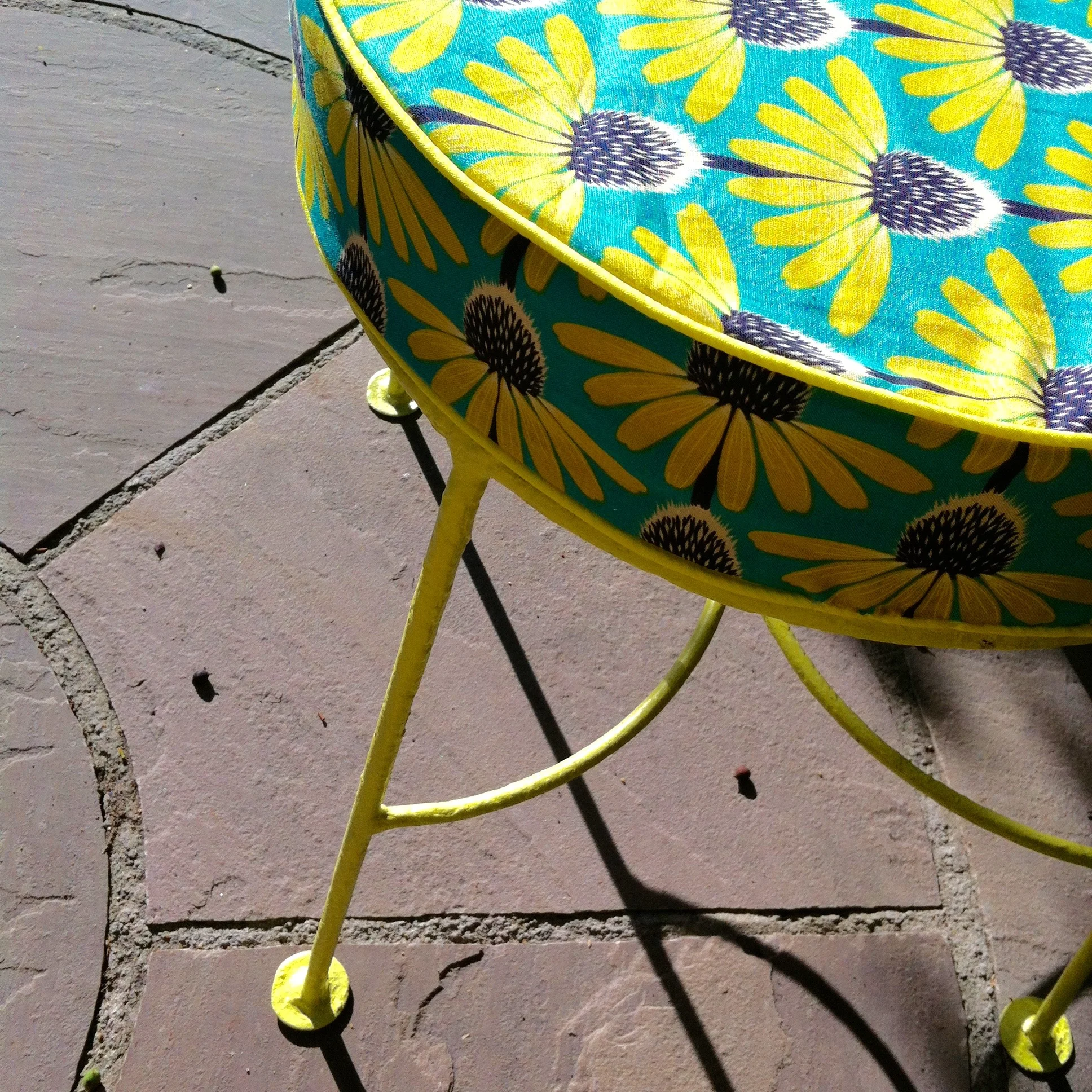
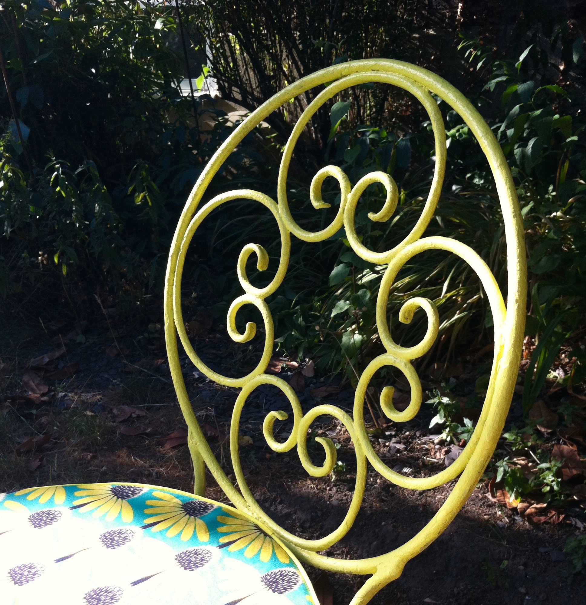
Bright yellow. Yellowcake yellow.

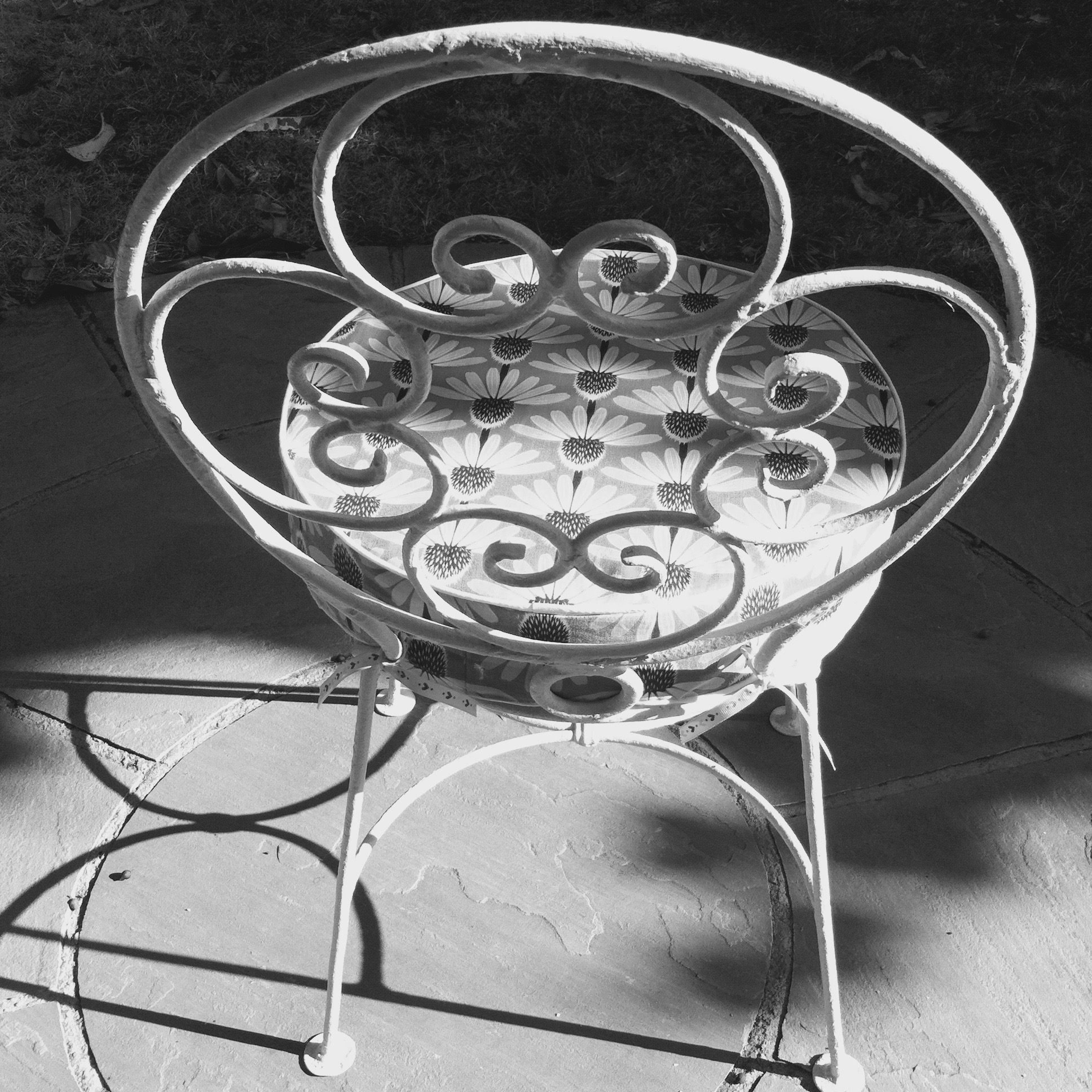
In fact they're not as yellow as I'd hoped!  But I am pleased with them. I like that they're bright and cheery and I don't mind that the paint finish isn't smooth as a new chair would be. And most of all I like them because they're yellow and quite unexpected!

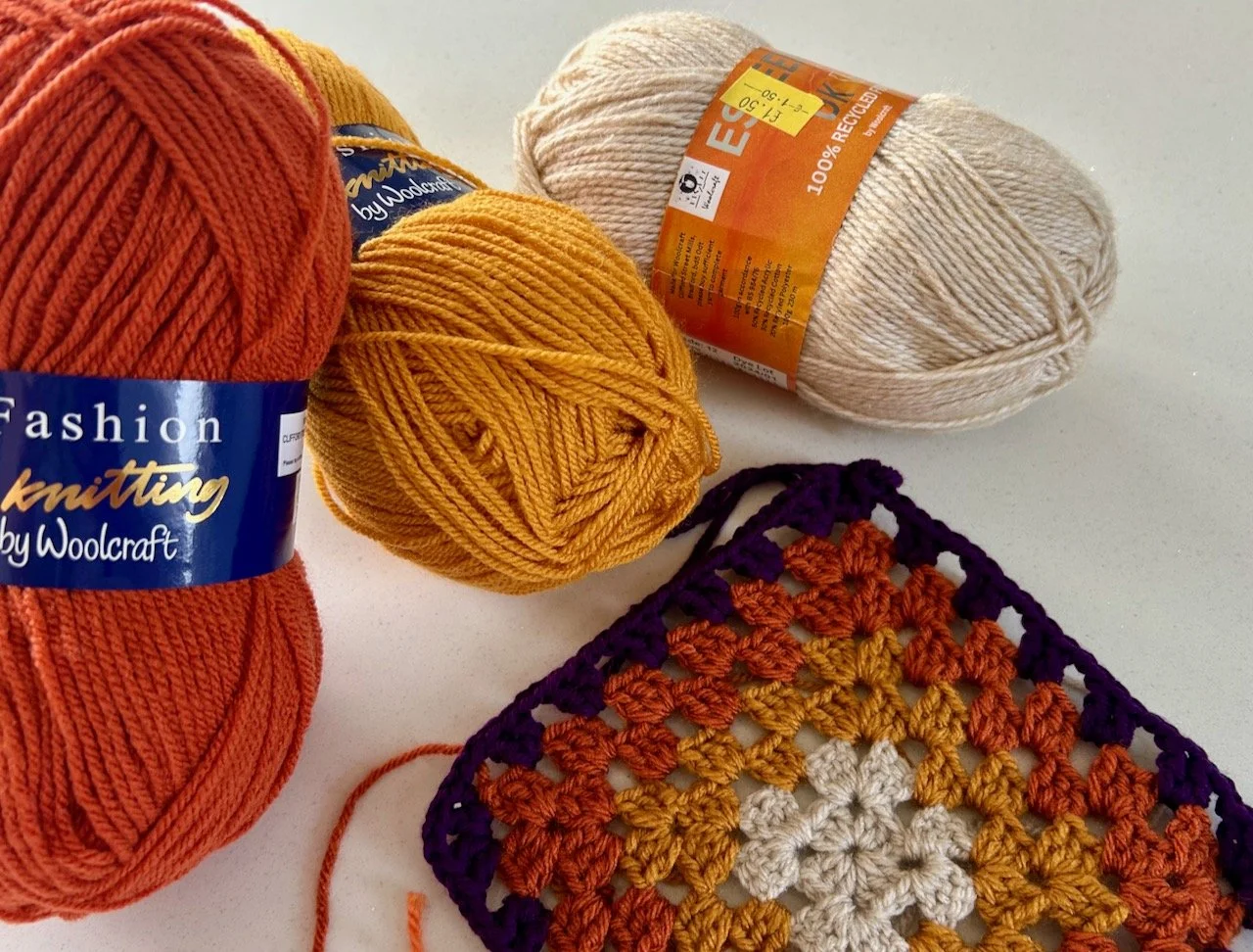
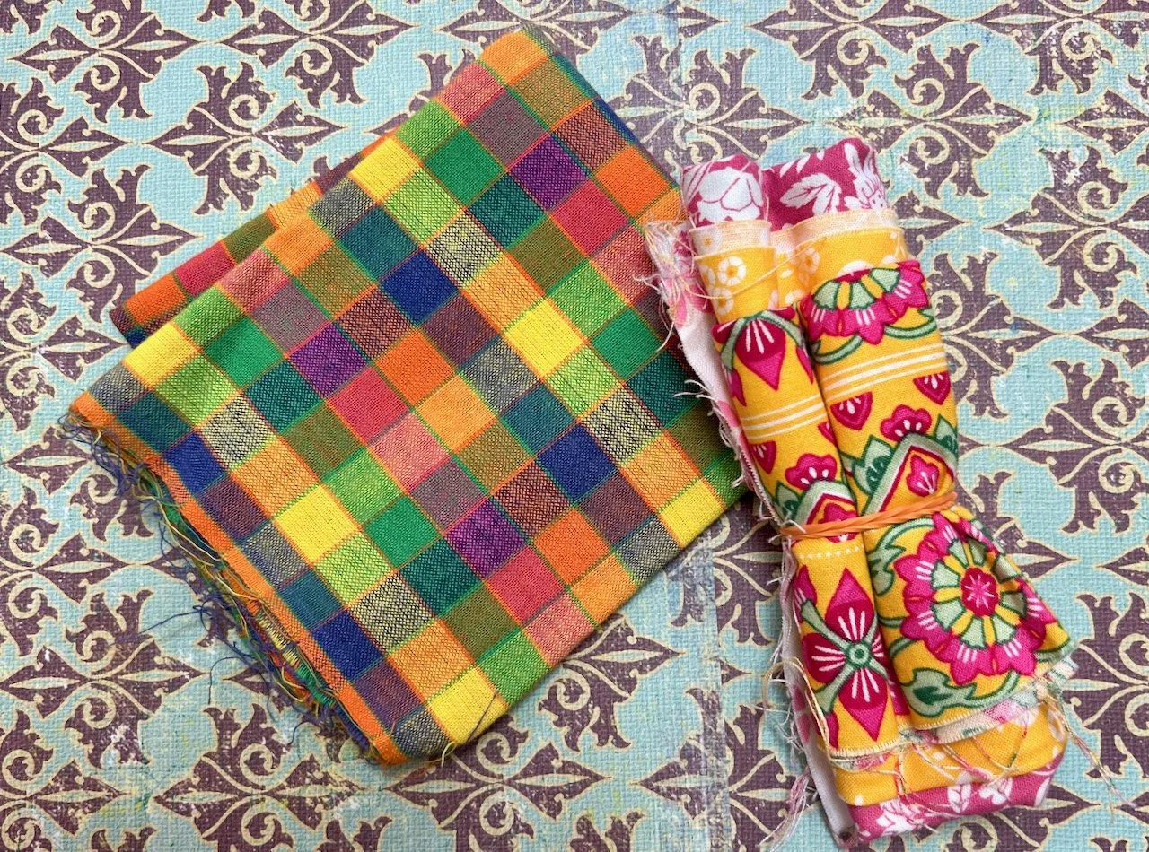
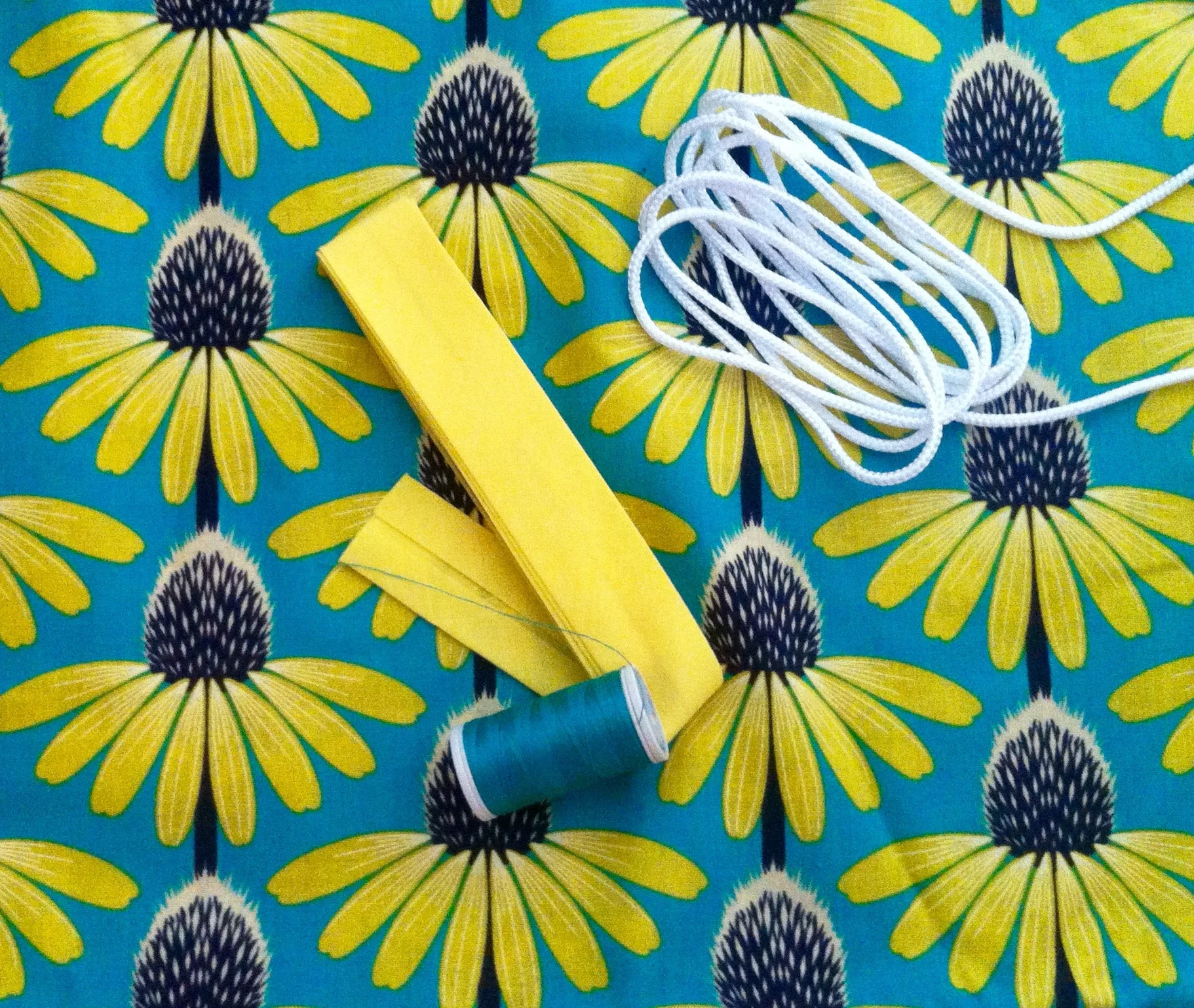
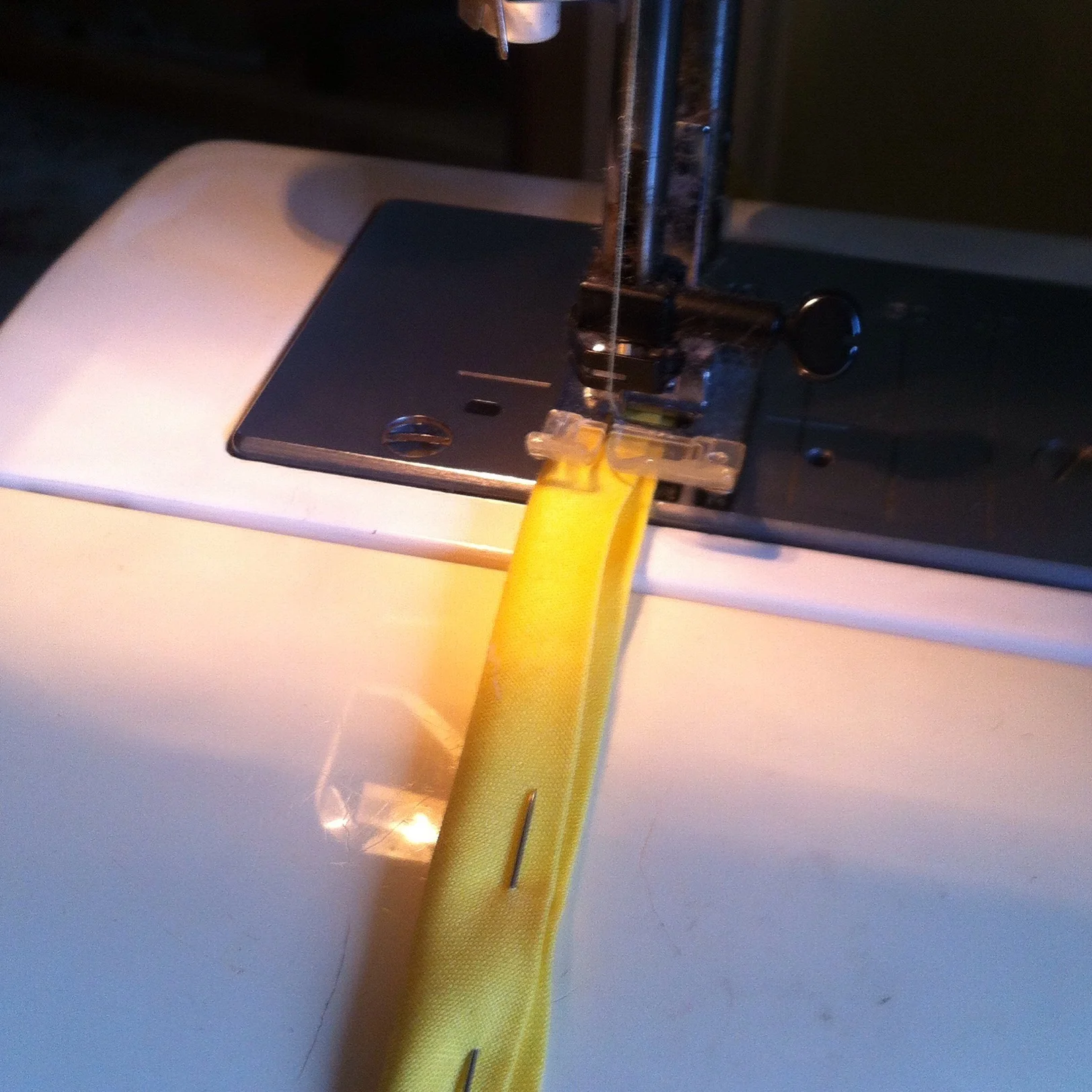
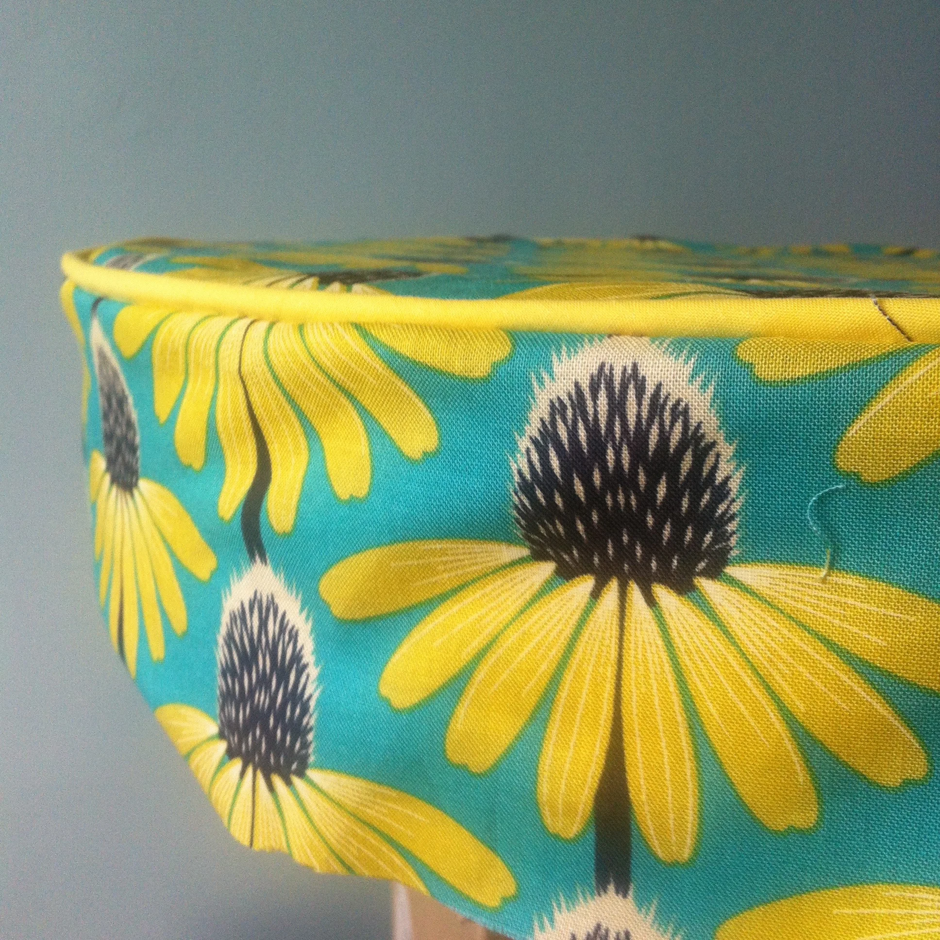
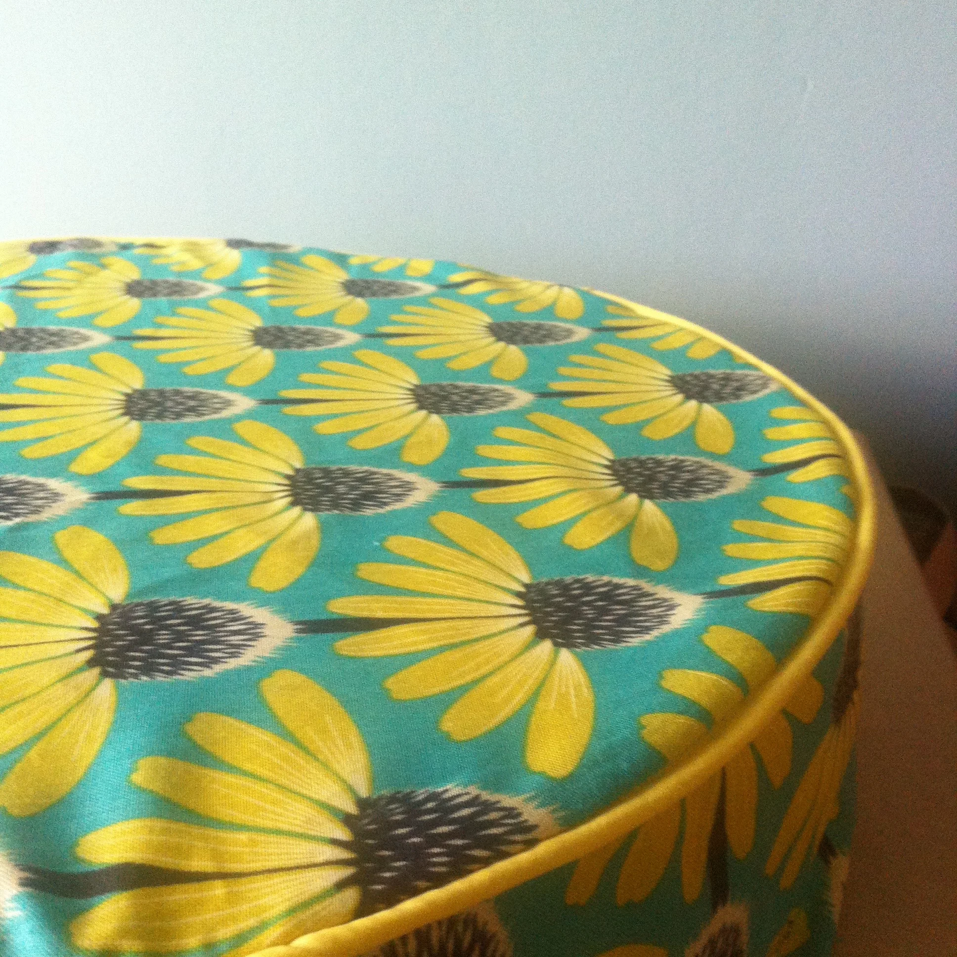
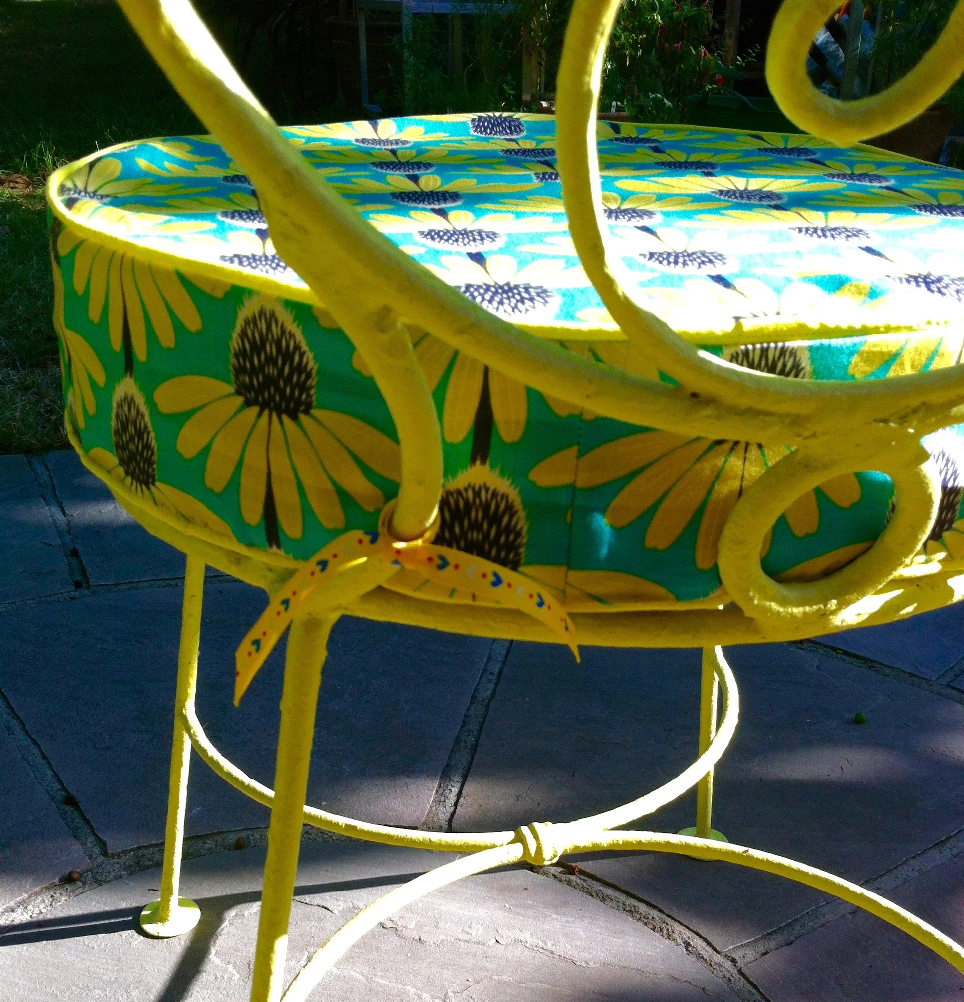
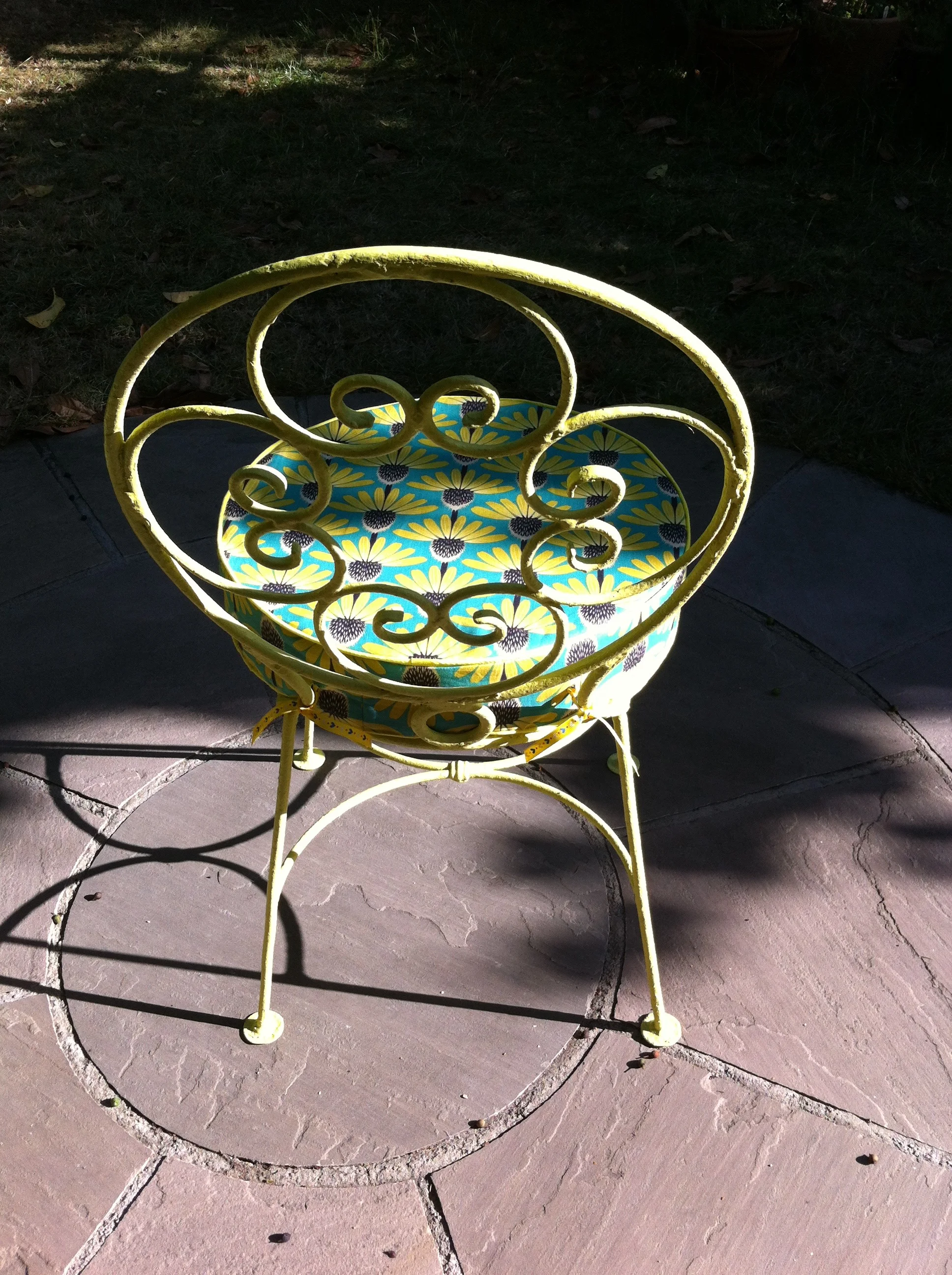
They're the sort of garden chairs that need a cushion and when I saw this material I knew it was perfect for my pre-loved chairs. So I bought some quizzing the lady in John Lewis about how much I'd need and checking my instinct on how to make the cushions I had in my mind - you know the sort, the sort with neat piped edges.  I had it in my mind that I'd make these cushions and overlooked the fact that I'd never done anything quite like this...

CUSHIONMATERIALS.JPG

So with foam inners that were cut to fit the seat of the chair I was running out of excuses so I set about finding a tutorial on how to sew the piping and get sewing.

FOAMCUSHIONINNERS.JPG
SEWINGPIPING.JPG

It turned out the lady in John Lewis was right when she said she wasn't much of a sewer as I've more material than I needed - which I don't mind as it's lovely - but quickly ran out of bias binding so came to a halt until more supplies arrived. It was quite a timely pause as it gave me time to work out how to do the next bit and to get some tips from my dressmaker mum.

CUSHIONSUNDERWAY.JPG
CUSHIONWITHPIPING.JPG

When the additional bias binding arrived I was flying and both cushions are now complete:

FINISHEDCUSHIONS.JPG

I added ribbon ties to the back of the cushions. I considered making ties from the bias binding but then remembered I had this grosgrain ribbon with the same yellow and liked the contrast it gives.

CUSHIONTIES.JPG

And here they both are together

FINISHEDCHAIR&CUSHION.JPG
REARVIEW.JPG
PAINTEDGARDENCHAIR.JPG
CUSHIONCLOSEUP.JPG
CHAIRBACKDETAIL.JPG

I'm really pleased with how both the chairs and the cushions turned out, and they look great at the end of our garden. They're comfy too - now I just need to get the French table sorted, and perhaps a smaller side table for everyday use, as it's always nice to have somewhere to my gin and tonic (or cup of tea!)

Six Grand Room Sets

I'm still working through and editing my photos from Grand Designs Live in London earlier this year, but I thought it was about time I shared more of the Grand Room Sets. There were six at the show and each of them different. As with every room set I think I've ever seen, there's things I like and things I don't but each time I'm amazed that a blank set can be relatively quickly be transformed into a normal looking and functional room!

1. Normal is boring

This theme for this room set by Owl Design was the colour black and they took their initial inspiration from a stormy summer sky over the sea. That gave them blues and greys mixed with yellow which you can see on the walls. 

greyyellowlivingroom.jpg

It's a fun and colourful look, but I wouldn't have known that the inspiration was the colour black - well until I read the board anyway. I'm not sure about the geometric patterned floor, although it's effective here I think I'd spend time with my eyes identifying the cubes and blocks and probably send myself into a tizz.

But I did like the artwork, and I tend to agree. Normal is boring. And those tiny terrarium - how cute and dainty are they?

Normalisboringsign.jpg

2. Marsala zone

This room by Charlotte Froud uses the Pantone colour of the year for 2015, Marsala. She's matched its earthy tones with cool blues, greys and black. The copper accessories and metal lighting and bold geometric prints which bring the look together and the result is a fun and modern room.

3. Dining in elegance

This room set by Fleur Ward she says started with the wallpaper and that inspired the other items. I've mixed feelings about the wallpaper; I like the colour, but I'm less keen on all that swirling. It brings back memories of painting techniques frequently used on Changing Rooms and in no doubt many houses around the country. I'll admit I had some too, but nothing quite like this.

I like the chairs in racing green leather, I'm not sure you can ever go wrong with these and they look comfy for a fabulous meal. You know the sort, the ones you wish would never end and the ones where you've eaten far too much! I think they need something contemporary with them though, just to bring them to life.

It was the lights in this room that I really liked; they have a feeling of time gone by but are new and made by a local craftsman. I like the informality of the group of lights in what is quite a formal and luxurious room. Oh and maybe the pink swung me a little too!

And just look at that rug. I bet you weren't expecting that. It's suede and I think if I were to have this I'd spend far too much time stroking it, which in itself is a good reason for me not to have it. But it is gorgeous!

4. Colour and fun in the kitchen 

This kitchen by Amanda Neilson has clearly taken its inspiration from Mondrian with those blocks of primary colour. The colour block theme continues with the furniture and that rather funky SMEG fridge. The information board at the show said it had been designed "as a multi-function room for eating, entertaining and even a bit of dancing, we included highlights of gold and special lighting features to bring the room to life."

The music streaming is bound to get the party started - and if you fancy a dance then there's this rather glitzy floor and of course a disco ball. Just what every kitchen needs, as I'm sure we've all been known to dance around our kitchens at some point!

5. Cool, soft and subtle "en plain air"

This room set by Mathilde Kubisiak embraces cool, soft colours mixed with subtle warm tones in a minimalistic setting. The room uses mobile furniture and innovative storage and makes use of recycled materials too and there's a definite relaxed feel about the room. It's a nice calming colour way and I'm particularly keen on the green used on the walls.

The blinds at the window are interesting. We rarely use blinds in our living rooms, and if we do they're usually uniform and functional. But by using three different designs the blinds become a feature in the room.  I must admit I'm less sure about the "trapeze" wall art above the sofa.

I do like the low level bench - it looks a great place for storage and to display items, for me though it's a little too cluttered, but I like the concept - and being low level, it isn't too intrusive into the room.

6.  Grand Exotica, colour blocking at its most daring

This design by Tracy Andrews is a media-related, library room which aims to "conjure the serenity of the colonial style and balmy rain forest." And it's certainly eye catching, but I like it.


The colours used - greens, white, yellow and blues - all work well in nature and make for a striking room set off by that vibrant, larger than life exotic wallpaper. What I particularly like about this room, apart from the yellow which I've always had a bit of a thing for is how the wallpaper has been hung almost as artwork. It set's the sofa off and almost becomes a piece of art itself.

It's the type of room that my dad would ask for sunglasses, and it would certainly cheer you up wouldn't it?

Each of these rooms stand out in their own way and while we may not have the time, inclination, money or bravery to replicate these rooms in our own homes, I think there's elements from each of them that can inspire our next project.  Are you inspired?

Home Etc