Getting started with Gelli Plate printing

If like me you’d not heard of this before, it’s a fun way of printing using a brayer roller and a flexible (gelli) plate to create prints with layers of colour and texture. You can buy gelli plates online, and while they’re not cheap (an A4 size plate is currently about £30) it should last many years. And if you’re wondering why gelli, then it refers to the gelatine used to create the printing plates.

I’ve only recently discovered this fun craft after being intrigued by a local Adult Learning class, which I’ve since signed up for. My course has four two hour sessions and cost me £18 - I wasn’t sure what to expect, but reasoned that I had nothing to lose. Attending one two hour session for that price is good value, four sessions is exceptional. As it turned out, it’s good fun and I’m definitely heading back next week to find out - and create - more.

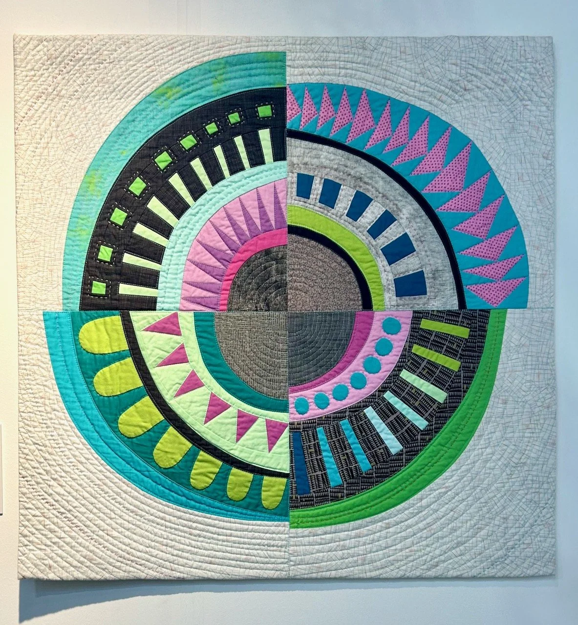
It’s been a while since I’ve taken a ‘printing’ workshop and this one looks to have more immediate results than lino printing, which I’ve tried before and have done a couple of times since learning.

Equipment for Gelli Printing

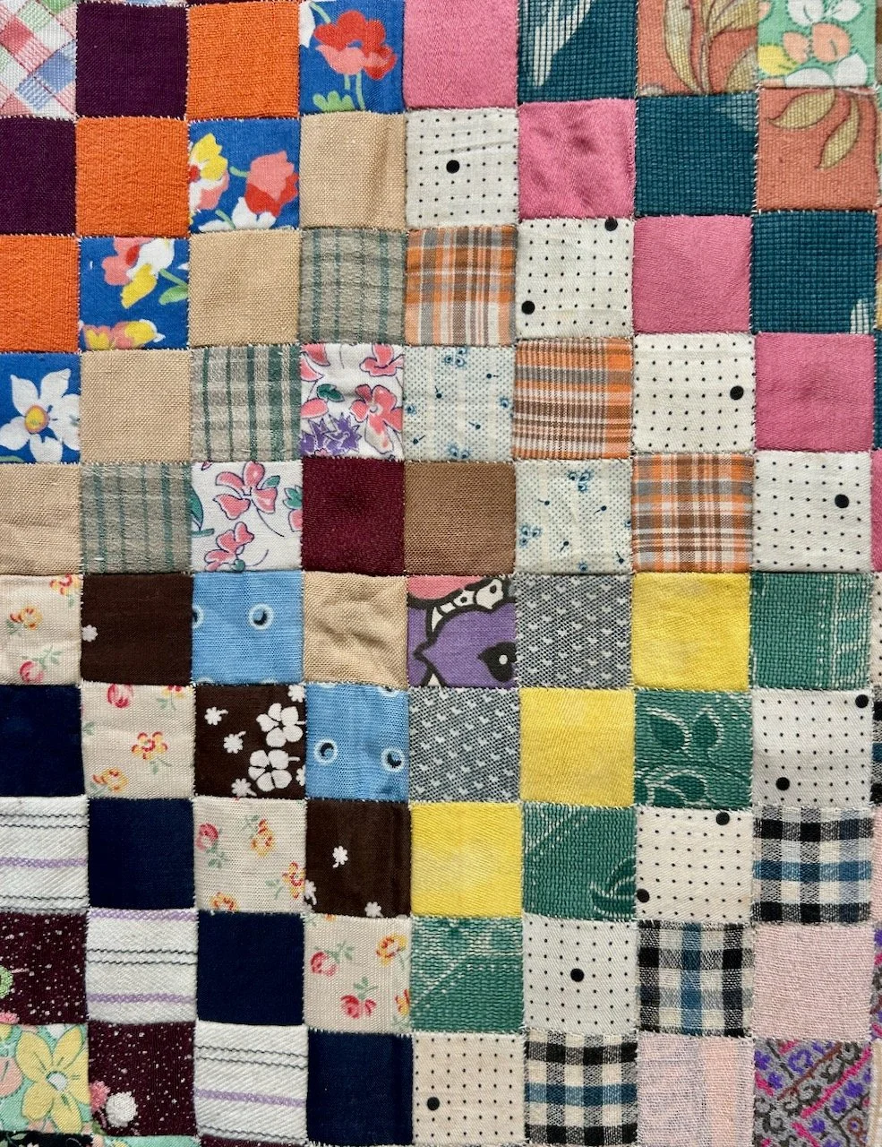
Apart from the gelli plate and brayer - I don’t have my own yet, and these are provided in the class I’m taking - the other things you’ll need to get started are paper (and lots of it), acrylic paints and some wet wipes. You might also want to wear an apron as removing acrylic paints from clothes can be tricky, not something I’ve tried yet, and hopefully I won’t need to either!

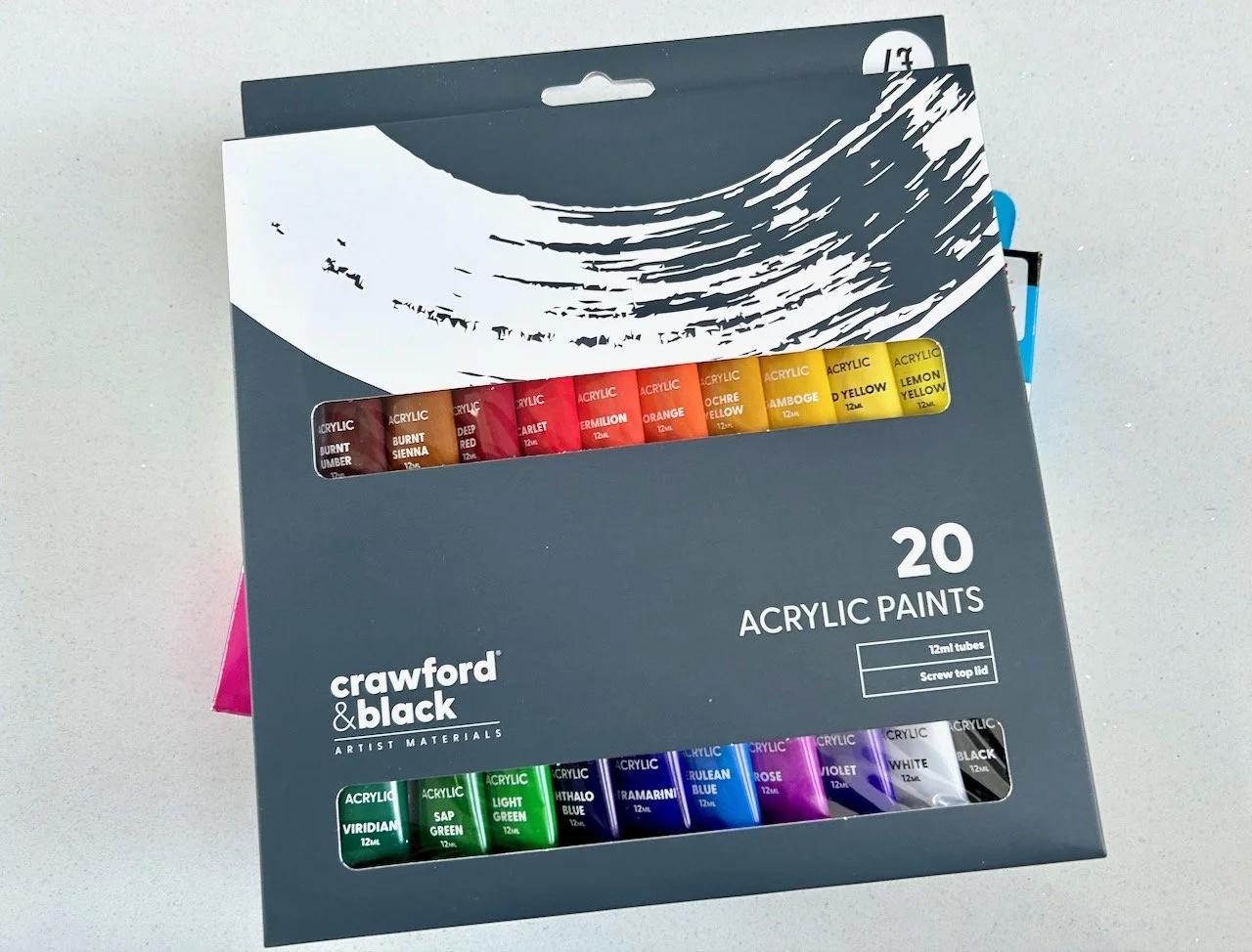
I had five basic colours - white, black, yellow, pink and blue - and this was enough to get started, though after a few prints I knew that I was keen to add more variety to my paint range. After the class I stopped off at The Works and picked up a set of 20 colourful paints to add to my newly growing paint stash. I’ll be looking out for the perfect tin to store them in soon too no doubt! I also picked up another pad of paper - the £2 bumper pad for kids’ drawing sort, as I think that will also be handy.

My first print

Like everyone else in the class I was keen to get on and do some printing. The advice was to start with our lightest colour, so for me that was yellow as white paint on white paper was unlikely to be that exciting! I wish I’d got a picture of the gelli plate, but it is weird - quite tactile, definitely flexible and well, squidgy in a solid sort of way.

After dabbing on a couple of pea sized blobs of paint it was time to use the brayer (or roller) to spread this across the surface. Here a light touch is everything, and you have to work quickly - especially in a warm room. Then your paper goes on top of the paint, and using your hands you smooth the paper over the gelli plate. This transfers the paint to the paper, and voila once the paper is lifted you have your print.
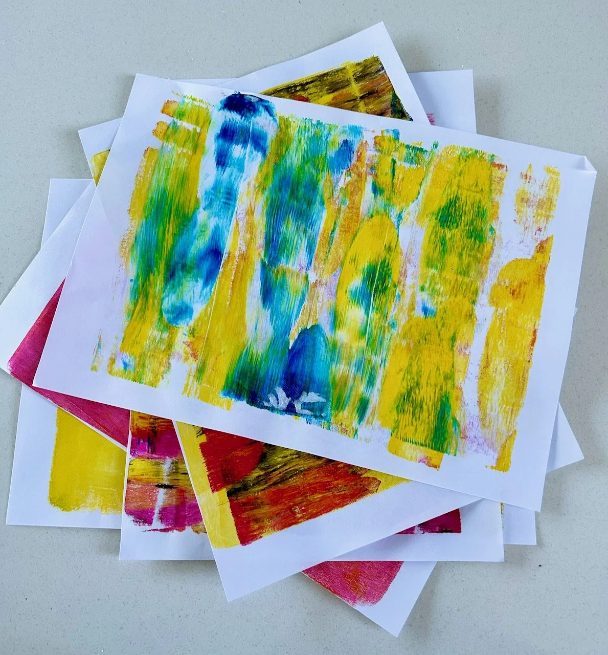
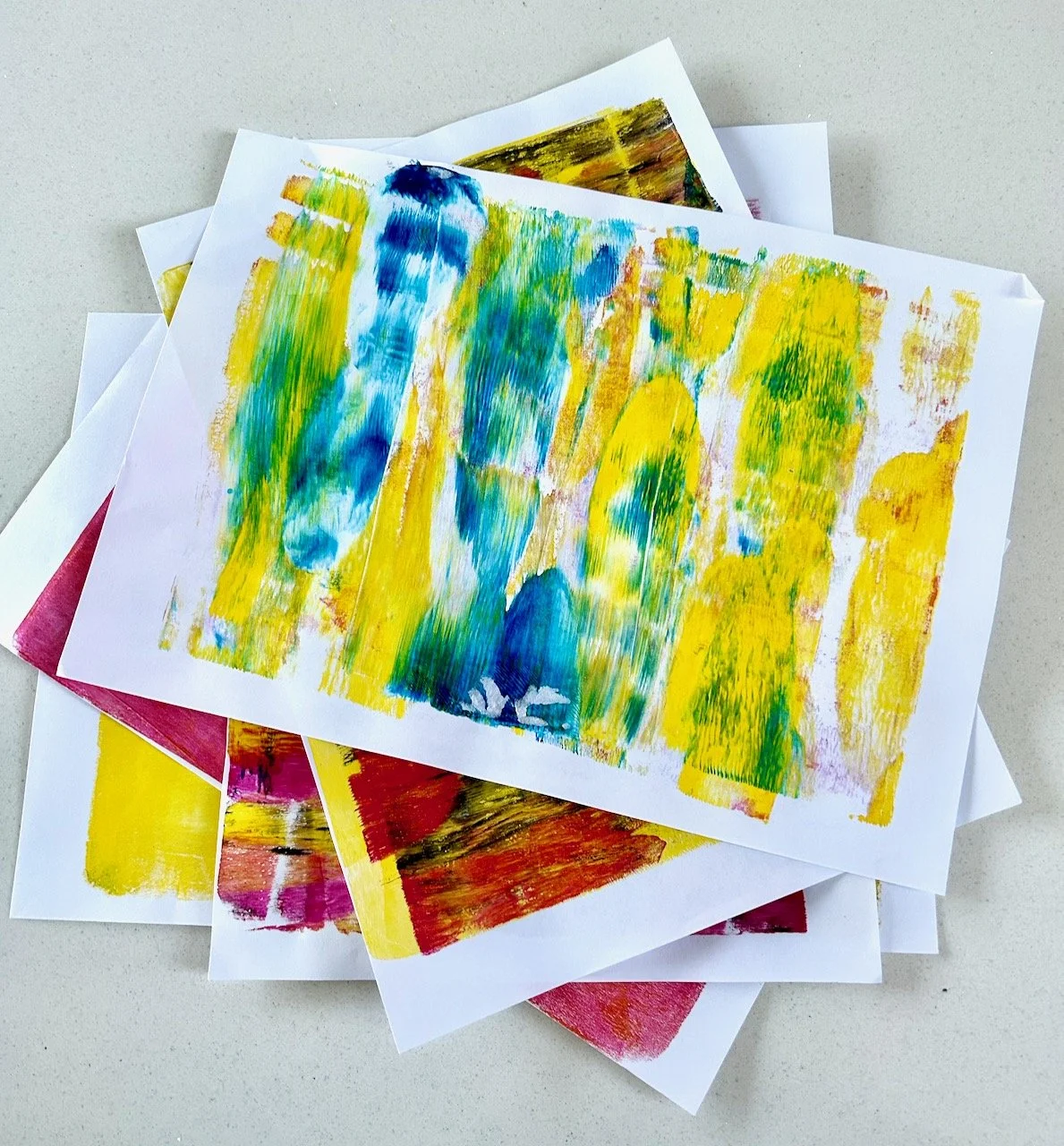
This is mine:

A yellow oblong of colour gelli printed on a white paper

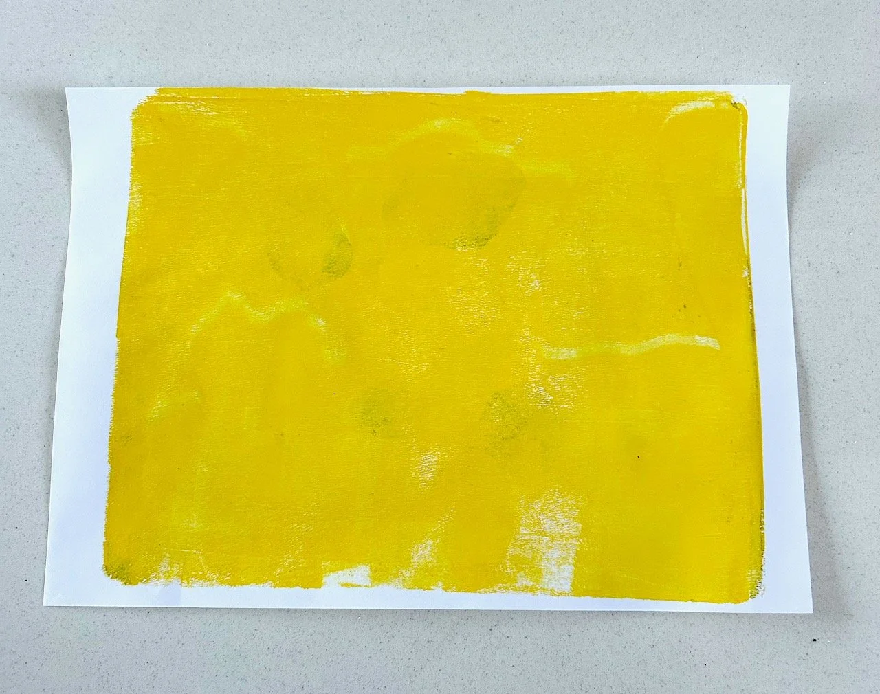
After an hour or so of chat, this was quite exciting - though I take your point, that it’s not really that exciting. But the point of this was to practice how much paint to use, and for that it was effective as my next print was barely there yellow, which I quickly printed over with pink.

Pink acrylic paint over barely there yellow gelli prints

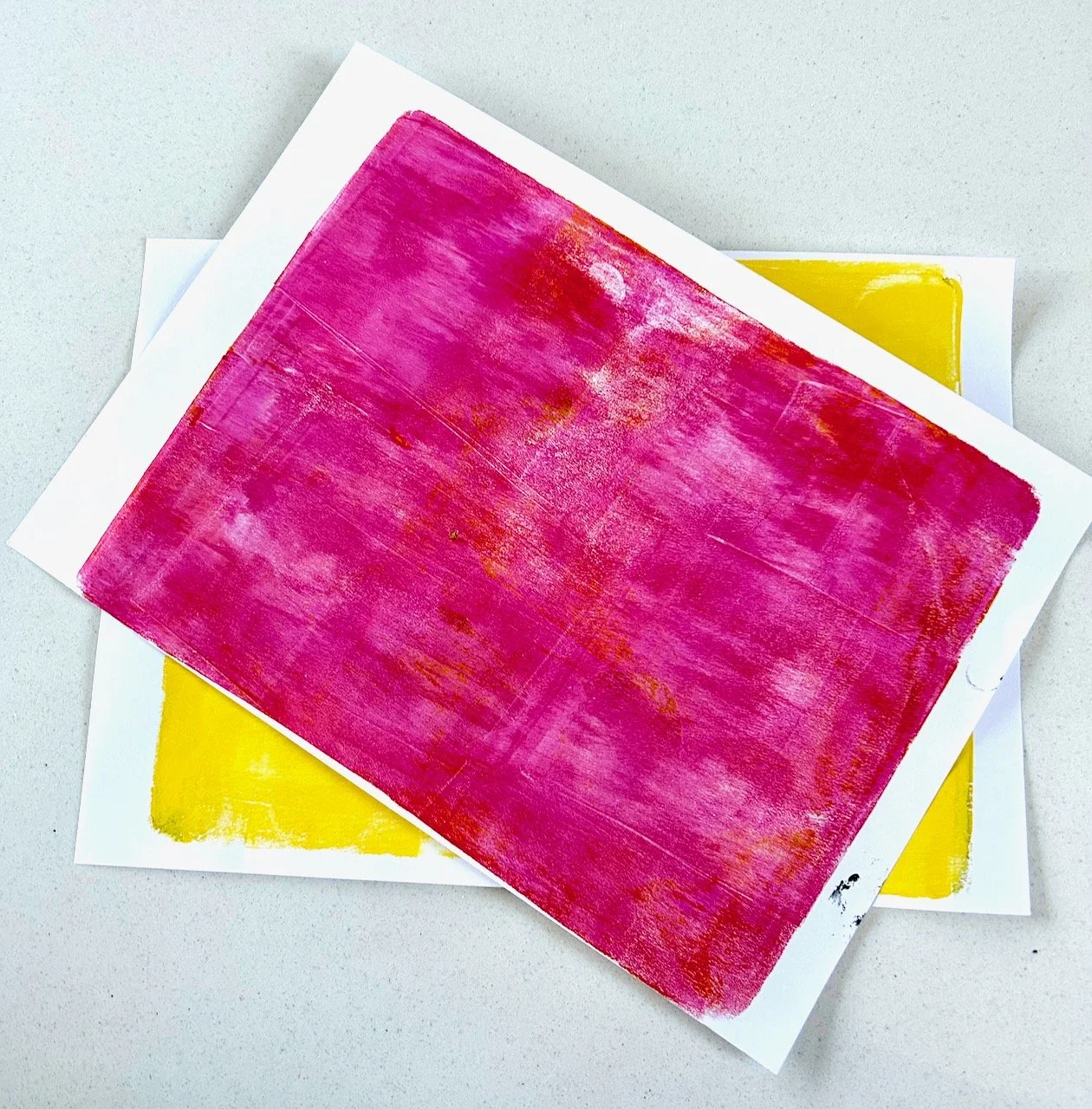
As you can see there’s some texture and some missing parts, but that’s ok and is part of the beauty of this kind of printing. It isn’t perfect, and you’re never really sure how it’ll turn out. If that’s an issue for you, then gelli plate printing might not be for you!

Using two colours

This is where I felt restricted by my paint colours, and why I added to my repertoire so quickly. There’s many combinations you can do with the basic colours, but with more colours the combinations is almost endless, though the challenge will be to work out the balance on what looks good, and what’s too much, and to avoid over rolling and ending up with ‘sludge’ no matter what colours you start with.

The gelli plate is still the same size, so with two (or more) colours you need to reduce the size of the paint blobs you add to the plate so it’s not awash with paint. I tried with yellow and pink, then some blue and finally some black - with mixed results.

Pink and yellow patterned gelli print
Pink and black paint gelli printed onto a yellow background
Blue and yellow - with some mixed green - gelli printing on a plain white background

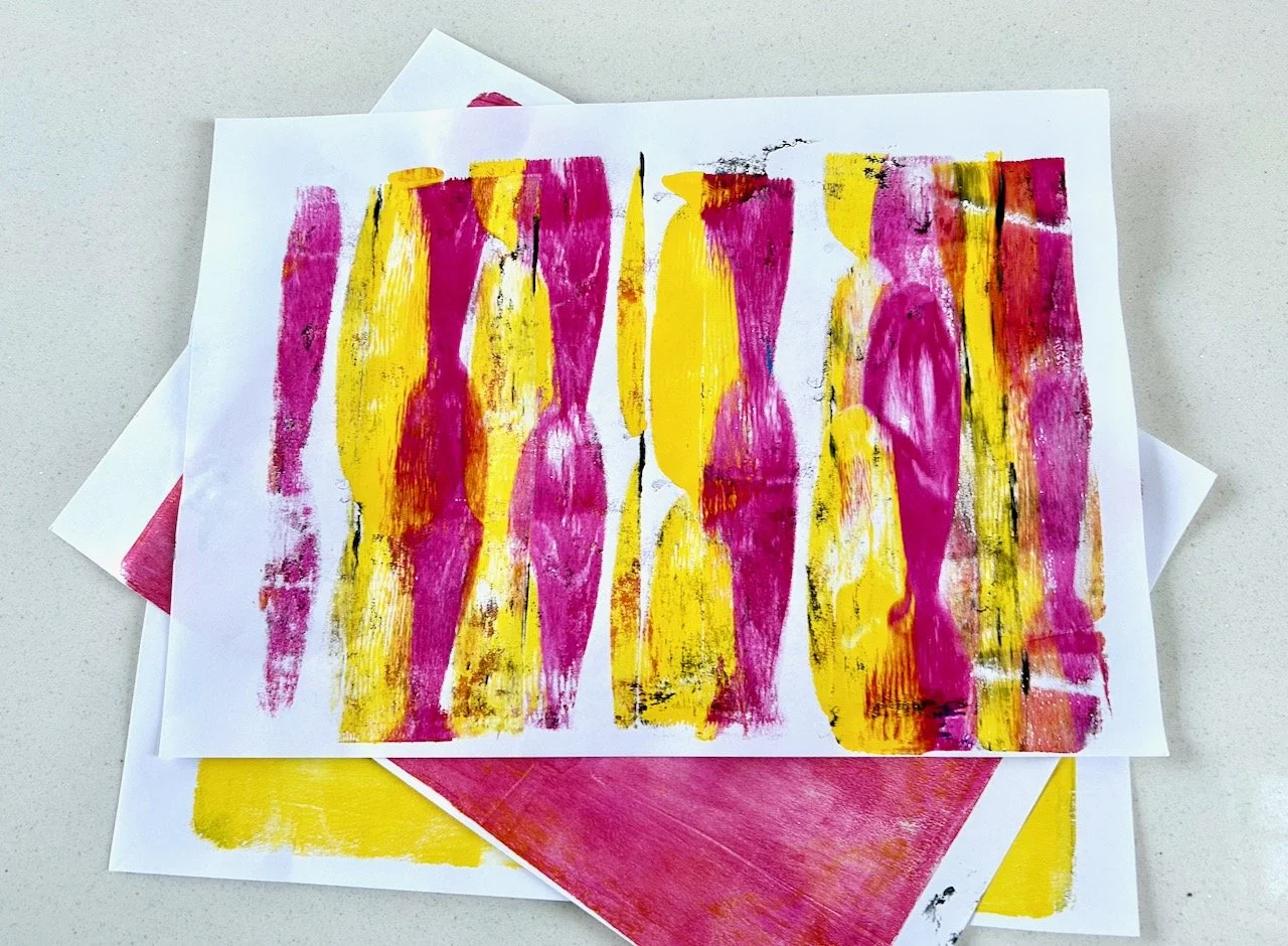
Because of how the gelli printing works you don’t need to clean your gelli plate in between prints, but it’s definitely worthwhile rollering off the excess paints in between applications. That’s not onerous at all as you can use a single sheet of paper for that, and it can result in some textured and very usable prints too.

The results of rollering off excess pink and yellow paint from the brayer

Cleaning up afterwards

No special equipment is needed for this either - soap and water to wash the brayer roller, and we used a wet wipe to remove any paint residue that remained on the gelli plate. That’s my sort of cleaning up!

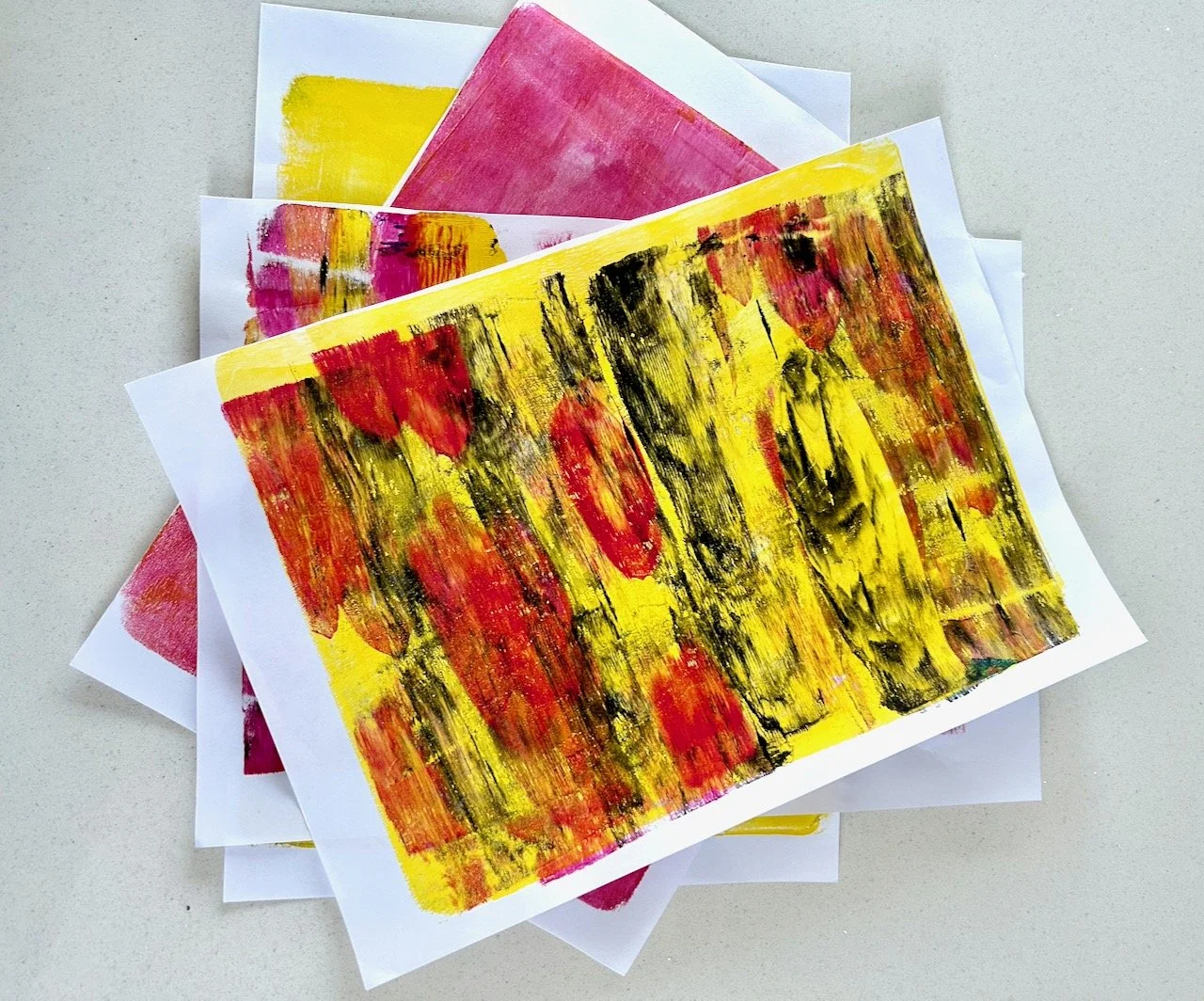
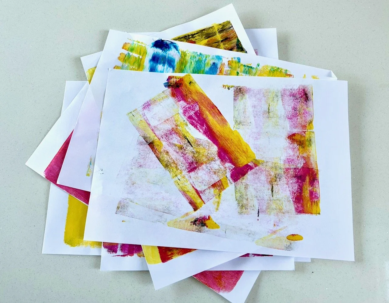
Using my gelli print artwork

Clearly these gelli prints aren’t masterpieces! But even these will have plenty of uses for my other crafts, the obvious ones are card making and collaging. I can see that once I’ve learnt more about adding texture these will be even more useful, and it’s likely that a single gelli printing session will generate prints for a good while, as well as providing the opportunity for a mindful afternoon.

I’m interested to learn more about this craft, and how texture can be added with items such as bubble wrap, packing tape (I have a fair bit of that leftover from our house move!) and especially leaves and more, I’m sure I’ll have one or two items in my craft room to try out too. I’ve another three weeks remaining in the class, so I’ll share more as I learn new skills.

But it’s definitely a promising start introducing me to a brand new craft, and I can’t wait to see where this takes me.

Post Comment Love 19-21 January

Hello there, and welcome back to this week’s #PoCoLo - a friendly linky which I co-host with Suzanne, where you can link any blog post published in the last week. We know you’ll find some great posts to read, and maybe some new-to-you blogs too, so do pop over and visit some of the posts linked, comment and share some of that love. Please don’t link up posts which are older as they will be removed from the linky, and if older posts are linked then please don’t feel that it’s necessary to comment on those. If you were here last week it was great to have you along, if you’re new here this week we’re pleased you’ve joined us.

I hope you’re managing to keep warm - it’s been pretty chilly here with the ‘feel like’ temperatures reaching -6 and much lower than I’d like. I’ve not been out much, but of course the day that I needed to go out was the day with a frost on the car, typical hey? It was so cold though that the frost scrapings hadn’t cleared from around the rear window by the time I was heading back again after midday - I don’t think I’m built for cold-weather living!

The reason I went out was for the first of a course of classes I’ve signed up for to learn how to make something respectable using Gelli Plate printing. It’s much easier than I thought, and a bit peculiar too and you can see just some of my first attempt creations in the pile of artwork below - they’re not bad, but some refinement will make them better! It was good fun though, and I’m heading back next week and will share more about the craft, and how I get on here soon.

You are invited to the Inlinkz link party!

Click here to enter

Admiring Carolyn Forster's quilts at the Newark Quilt Show

Last Friday I went along to the Newark Quilt Show held at the Newark Showground which is just a short drive away - I think it’s probably the closest-to-me quilt show I’ve ever been to, closer even to those at London’s Excel and that alone was a treat. I’d also not been in to the Newark Showground, though have driven past it several times - it’s on our list to go as they look to have some great shows on there, and the Newark Air Museum, which is also on our list, is also close by.

But they’re for another today, this visit was all about the quilts. I wasn’t quite sure what to expect size-wise, but I knew there’d be some quilts on display and some suppliers also present. Thankfully the show was clearly signposted and I followed a slow trickle of cars into the ground and to the parking area.

I was pleasantly surprised, while the hall wasn’t huge it was plenty big enough and the central section was dedicated to the quilts on display - and there were many. Suppliers, around 60 or so, were positioned around the edge of the quilts on display, and like every other show I’ve been to (and not just craft shows) the aisles were full of people making their way through the plentiful stalls.

You’ll know that I’m a long time admirer of scrappy quilts, and have many plans to make my own - even if many of those plans don’t quite come to fruition every time! And so I was keen to see the ‘Stash Busting Scrappy Quilts’ by Carolyn Forster that were on display.

I took many pictures because they were so lovely, and as future inspiration for myself and while I took pictures of the whole quilts, it’s the details that really appeal to me and so I’m only sharing partial shots of Carolyn’s quilts here.

CAROLYN FORSTER: VINTAGE LINEN QUILTS

The Vintage Linens Quilt is a great way to reuse embroidered linens, especially those with a stain or two - though it needs some bravery to cut those up. I’ve acquired a few old tablecloths myself and I can see this being a good way to get them out of the cupboard and in use. Carolyn has used fabrics that compliment the embroidery to form a repeating block which I think works really well.

The Triplet Block Quilt is one that really caught my eye, I’m not sure I’ve really seen this block much before but spotted it in a couple of Carolyn’s quilts and it’s one that looks really effective repeated over a whole quilt too. I agree with Carolyn that the fabrics here give the quilt a summery feel, but hadn’t spotted that the block is set in alternating directions, until I read the card pinned alongside.

CAROLYN FORSTER: TRIPLET BLOCK QUILT

After that I did spend perhaps more time than actually necessary looking at how the blocks I liked were constructed, and without being mean or taking anything away from Carolyn’s work, they often are what appear to be quite simple shapes. I say what appear to be quite simple shapes, as we know that not everything is always what it appears to be, and there is real skill in not only the sewing but the fabric choices and layout.

Carolyn acknowledges that in the Beach Houses Quilt saying that ‘the simple shape belies the fact that the sewing can be quite challenging. All the rows need to be set0in with the often-dreaded Y-seam!’

CAROLYN FORSTER: BEACH HOUSES QUILT

Beautiful though isn’t it?

The Scrappy Crosses Quilt was another favourite of mine, this was inspired by a vintage quilt. Carolyn says that in this quilt she ran out of the original fabric for some of the centres of each block, but the good thing about scrappy quilts is that most of the time no one notices the substitutions. That’s so true, and a good lesson as I think often we’re so focussed on getting it right, when really a small deviation doesn’t really matter at all.

PART OF THE SCRAPPY CROSSES QUILT USING MULTIPLE FLORAL FABRICS

CAROLYN FORSTER: SCRAPPY CROSSES QUILT

The Hexagon Lozenges Quilt using big hexagons, which is great for stash busting! The quilting design suggests smaller pieces have been used, but look again and it looks like this would be one that would grow quickly, and be relatively simple to do.

CAROLYN FORSTER: HEXAGON LOZENGES QUILT

In the Diamonds and Stars Quilt for me it’s the plain fabric that becomes the star (quite literally) with the patterned fabric playing a supporting role - though the yellow floral fabric in the centre of the picture below looks pretty special. This quilt is based on a 60 degree diamond and an old fashioned block which is simple and effective.

CAROLYN FORSTER: DIAMONDS AND STARS QUILT

There was a good reminder alongside the Curtains Quilt that anything goes, and quilts don’t have to use dress-weight cotton. This one uses old curtains and curtain fabric off-cuts and I’ve no doubt that it would keep you just as cosy as any other quilt.

CAROLYN FORSTER: CURTAINS QUILT

Carolyn started, and finished, the Maple Leaves Quilt during the first Covid lockdown and was inspired by one in the book ‘Unconventional and Unexpected’ by Roderick Kiracofe which gave licence for unusual choices. I love its boldness and larger prints, and I know I’ve plenty of larger prints stashed away which I could use in a similar way (one day!)

CAROLYN FORSTER: MAPLE LEAVES QUILT

So much inspiration here for me, and hopefully for you too - my planned project list is perpetually growing! But if I get close to anywhere near through that list I know I’ll have some beautiful quilts - both fabric and yarn-based - and will have plenty to choose from!

There were plenty more quilts on display at the show and I’ll share my favourites in a separate post soon.

PostCommentLove