



Making my own neon sign

Last Thursday after work I headed into Greenwich Market to the Makers & Friends pop up shop for a craft class, co-hosted with London Craft Club. And a craft class with a difference, as I was going to make my own neon-style sign. Yes, I know. How cool is that. I'll tell you, it's very cool and I really had no idea what to expect.

In front of me where the materials I'd need to start my sign. I'd already thought about potential designs and while I knew there'd be some templates available to choose from on the night, I hankered after some neon lettering. Ever since we started to think about redecorating, yes  all the way back to 2013, I'd wanted an "eat" sign next to the table.  I also wanted letters to spell "cook" in the kitchen and I decoupaged my own, but the eat was - or has been - sadly lacking.

materials for the make a neon sign workshop
And while Becci, the instructor and soon-to-be-kit-releaser from EllBie Co, said lettering was more complicated and unlikely to be completed in an evening, she did say it was entirely possible. I was umming and ahhing but decided nothing ventured nothing gained and decided to stick with my eat.

And while Becci, the instructor and soon-to-be-kit-releaser, said lettering was more complicated and unlikely to be completed in an evening, she did say it was entirely possible. I was umming and ahhing but decided nothing ventured nothing gained and decided to stick with my eat.

The workshop was hosted by makers and friends who support independent makers

Then came my first challenge. To draw my design. In front of me was an A3 piece of paper, and the heart on the back was for it I changed my mind and chickened out and decided to go for something simpler. It was hard to draw the lettering so large, and that's without tackling the trickiest part of the t. But with some perseverance it was starting to look how I'd hoped.
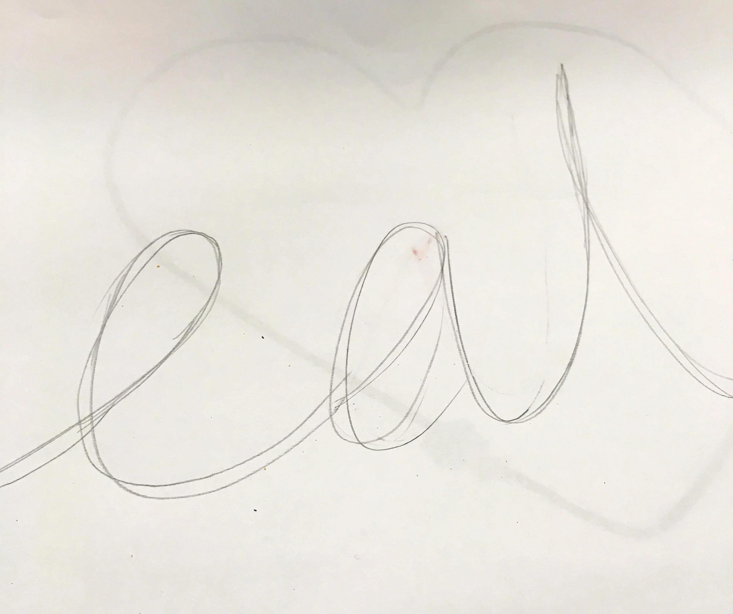
Drawing my design for my neon sign

For the cross of the t, I needed to do it in one fluid movement, hence the trickiness. I decided to approach it more in a flower shaped design and to squeeze it into shape as I went. With my design mostly there, I took the aluminum wire and bent that into shape, sticking it to the paper and mostly to the design using masking tape.

the first step to making my neon sign was to bend the aluminium wire into shape, the masking tape helped to keep it in place

As you can see the t was starting to look less petal shaped and more t-like, thanks to the pliers.  I was rather pleased with myself and ready to move to the next phase.

the aluminium wire for my neon sign was taped in place and it even looked like I hoped it would

And next was the neon bit. Well actually electroluminescent wire. As you've probably already worked out I chose blue, but there's also a pink version. And I know some of you will be shocked by that, but I think blue will go better with our decor, so it's a small sacrifice. I'd rather we used this, because I was already convinced this was going to be a fun addition to our decor. 

The magic in this step is invisible thread. I was pleased though that I had a navy skirt on is it meant that there was no hiding place for it on my lap. Well, once I round the end of the new reel anyway. That proved problematic for more than just me, so I didn't feel quite so bad. The electroluminescent wire is tied to the aluminium wire using the thread in a series of knots. And for mine, they're almost every two centimetres, so that's a lot of knotting, and that's why I didn't get to finish my design on the night.

the next step in making my neon sign was to attach the electroluminescent wire to my design

It was a lot of knotting and to start with I was all fingers and thumbs. But my fingers (and thumbs) soon got the hang of the movement and it wasn't long before it was almost second nature. And actually quite calming and therapeutic as often crafts can be, especially when they're going well. I could quite easily see how Becci says she manages to do this while sitting in front of the TV. I'm not quite at that level of comfortableness with it, but it's not unattainable.

While I didn't get the whole design knotted, I did get through my trickiest letter and skipped ahead to the next step, and that's securing the knots. And for that we used the craft staple of PVA glue. I was keen to secure my knots so all of my good work didn't, quite literally, come undone on the way home. 

The t on my neon was giving me some trouble but I'm sure it will work out ok

And for that it was covering the knots and both wires in glue. I think I might have been a little too liberal with mine, but as PVA glue dries clear once I'd smoothed it out a bit, it was going to be fine. The glue will also bind both wires together and give the form a little, well more rigidity. And while it looks messy in the photo above I've since trimmed the ends of my knots and it's hard to see where they are. 

But what I, and everyone else in the class, was keen to see was how our designs would look in the dark. So with the battery packs attached, out when the lights and on cue we turned on our neon artwork. 

turning out the lights and turning on my neon sign - impressive hey

Pretty impressive, huh?

A look down the table and you can see I wasn't the only one impressed with my evening's work. Next to me there was a sign of "joy" - wasn't it right that we were seated together? - and there were many more off-piste and off-template designs that evening.

And it wasn't just my neon sign that had success, just look around the room

So I left with my eat sign safely tucked away in a pizza box - I loved the idea of this - and clutching the instructions and invisible thread so I can make progress at home. Of course, I haven't yet, but I will. We're off to Norfolk in a week or two and I know that my eat is coming with me then.

And when it's done I'll work out the next bit, on how to get it where I want it to be. You can make your sign so it hangs on the wall or so it's part of a frame and neither really appeal to me as I'd much prefer to have it freestanding. I know that won't be possible because it is just the thickness of a wire, but I'm trying to invent some kind of stand in my head to make it work. I've a plan - and hopefully a cunning one - and if that works, I'll reveal all when I show you my completed sign.

But in the meantime I've got some knotting to do...


* Thanks to the London Craft Club and Makers and Friends for inviting me along to try my hand at a new craft, and to Becci from EllBie Co for being a patient instructor. I had a great evening and think you would love it too.
Love This #73: Sandberg's Swedish Wallpaper Art

It's been a while since the London Design Festival took place, and this year I headed over to the London Design Fair in creative heart of East London. The fair included what has previously been known as Tent London and Super Brands London and was held in the Old Truman Brewery. The building itself is fascinating and I'm sure you'll spot it in future posts, and it's likely it will have its own post too. 

But before we get to that I want to share more about this Swedish wallpaper company, who I saw quite early on. But I was so keen on one of their wallpapers that I carried a sample of it around for the rest of the day. MOH was worried I think because he could see how taken with it I was, and because he knew we had nowhere suitable for it. I knew that too, but I also knew I wasn't leaving without a sample, even if I'm banking the wallpaper for a future project and house.

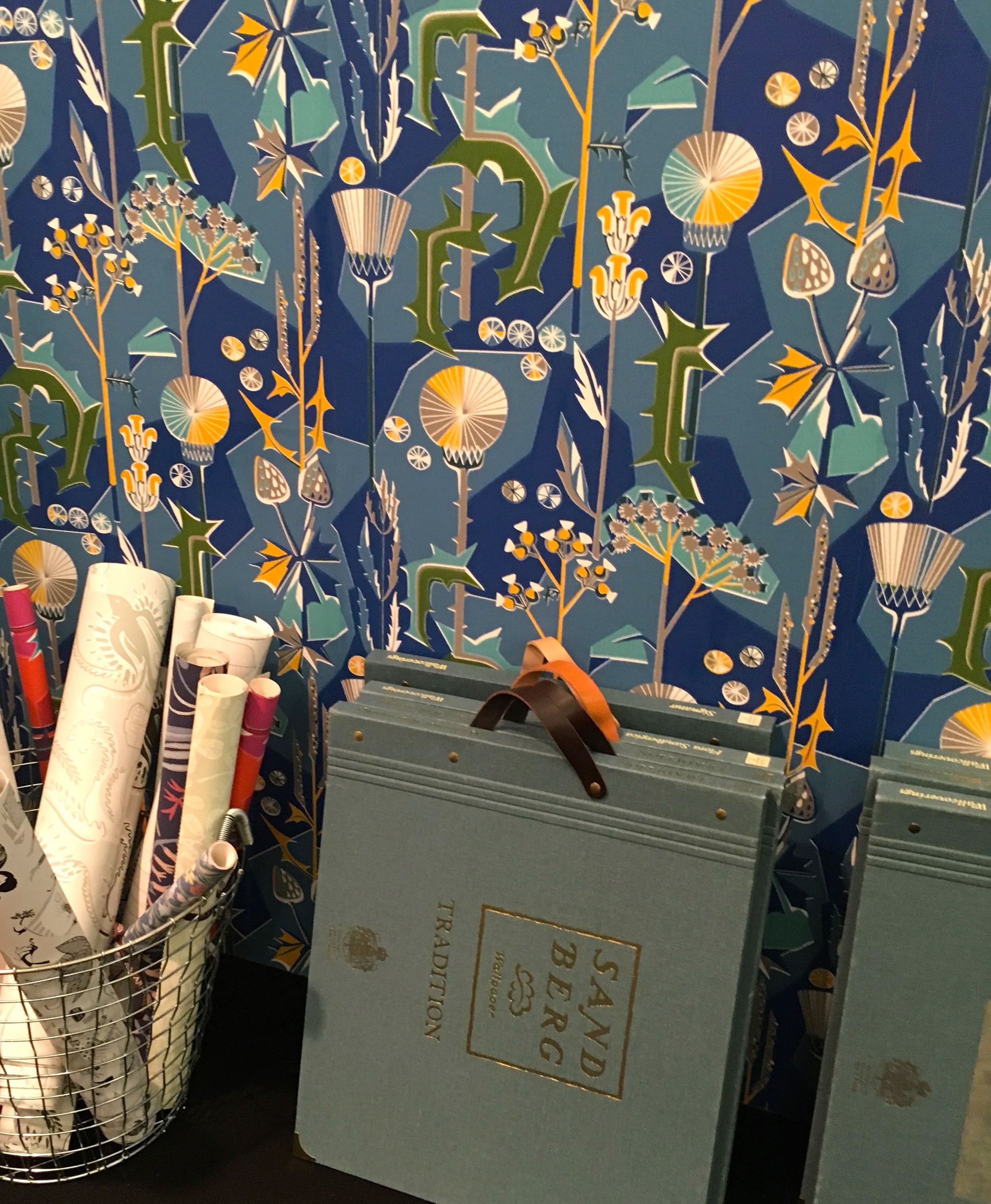
But it was this wallpaper that caught my eye and drew me over to the Sandberg stand.

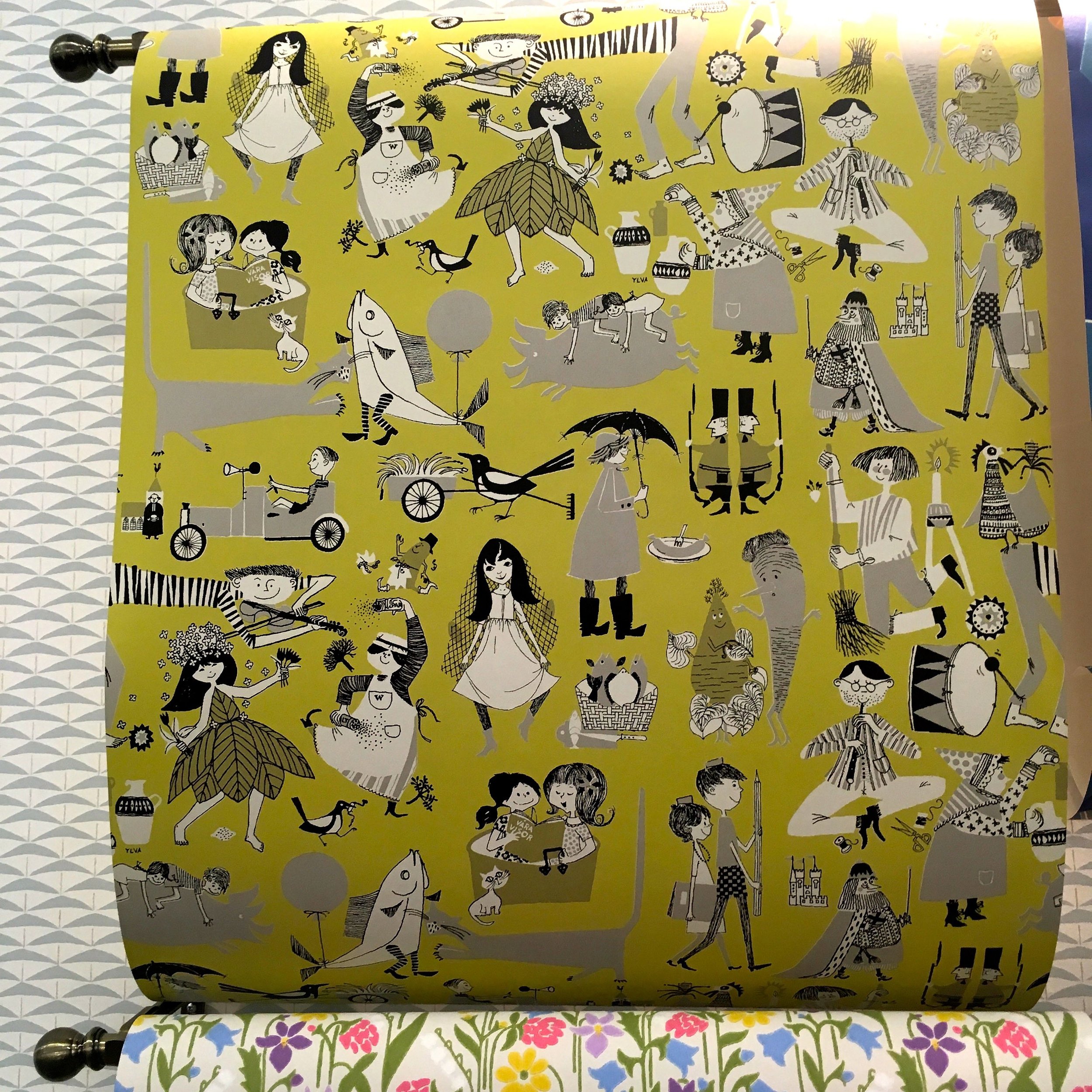
SANDBERG SIGNATUR WALLPAPER: VÅRA VISOR

SANDBERG SIGNATUR WALLPAPER: VÅRA VISOR

The yellow version of the wallpaper inspired by the songbook ”Våra visor” with the sort of pattern that the more you look at, the more you see. MOH wasn't keen on this one, but I could see this working in either a child's room or a playful part of the house. 

While looking at the yellow and grey Våra visor I couldn't help but notice the wallpaper that captured my heart, and that's this striking and boldly patterned wallpaper. While it has yellow in it, I wouldn't look at this and say it's yellow and that troubled me, as I rarely go for blue. The lady said it came in a yellow colourway and briefly wondered which room we'd redecorate to accommodate it. 

SANDBERG WALLPAPER: TISTLAR BLUE 

SANDBERG WALLPAPER: TISTLAR BLUE 

But when I found the yellow version I was disappointed, it was more lemon than bold yellow as I'd hoped and the plans to redecorate where immediately shelved. There's a red version which was back in the bold range, but not for me. Which left the blue which had caught my attention, and that I was unable to stop looking at.

SANDBERG WALLPAPER: TISTLAR YELLOW

SANDBERG WALLPAPER: TISTLAR YELLOW

SANDBERG WALLPAPER: TISTLAR RED

SANDBERG WALLPAPER: TISTLAR RED

SANDBERG WALLPAPER: TISTLAR BLUE

SANDBERG WALLPAPER: TISTLAR BLUE

I've decided that for me the pattern is thistles and that's some of the attraction, along with the bold lines and colours. I've since read that the lines have been softened, and more worryingly that the blue is also available in a fabric. At the moment, having this somewhere at some point is inevitable, but I just don't know when or where.

I'm hoping that the sample which I left clutching goes some way to fill the need for this pattern, that I didn't know existed. That's not going to wallpaper me anything, it might just about cover a book - remember those days when you used to cover your schoolbooks in wallpaper? - yes, me too.  I do have a plan for it and that's as part of a craft project that's underway at the moment. My challenge there is to use enough of the wallpaper to capture the elements I like, but to save enough so I'm not without it. 

Although I guess I could send for another sample if it comes to it. 

When I looked at the Sandberg site to check the names of the wallpapers I've shown here I found myself browsing the site and finding lots more boldly patterned wallpapers and some more subtle ones too. But the thing that I liked the most was the Sandberg wallpaper personality quiz.

I've taken it twice now, on different days, and both times it's made me a Nowstalgic, and both times the Tistlar wallpaper has been shown in the results (admittedly the red version) but that confirms my feeling of inevitability, doesn't it?

Apparently as a Nowstalgic I love "products and patterns that have stood the test of time" and enjoy exploring new techniques that fit in with "relaxed and aged style of the home." That feels right, it also says that auction sites and flea markets are a favourite, that's not so true. But it is true that items featuring favourite colours become must-haves, and the bit about mixing my finds with teak furniture is also partly true. Of course, it's quite general but at least some of it rang true.  

What's your wallpaper personality type?  Take the quiz and let me know in the comments.

Love This #72: Joyful Living, Norfolk

Sometimes when you walk into a shop you just know, don't you. You know it's a place where each time you visit you'd find more than one thing you could leave with. For me it was a case of ooh I like that, and that, and that too. So it was the kind of place that I could quite happily have left with lots of items, the trouble was that I didn't really have time to talk myself into (or out of) many of the items, so I did the next best thing and took some pictures so I can have a leisurely browse and so I can ponder some more.

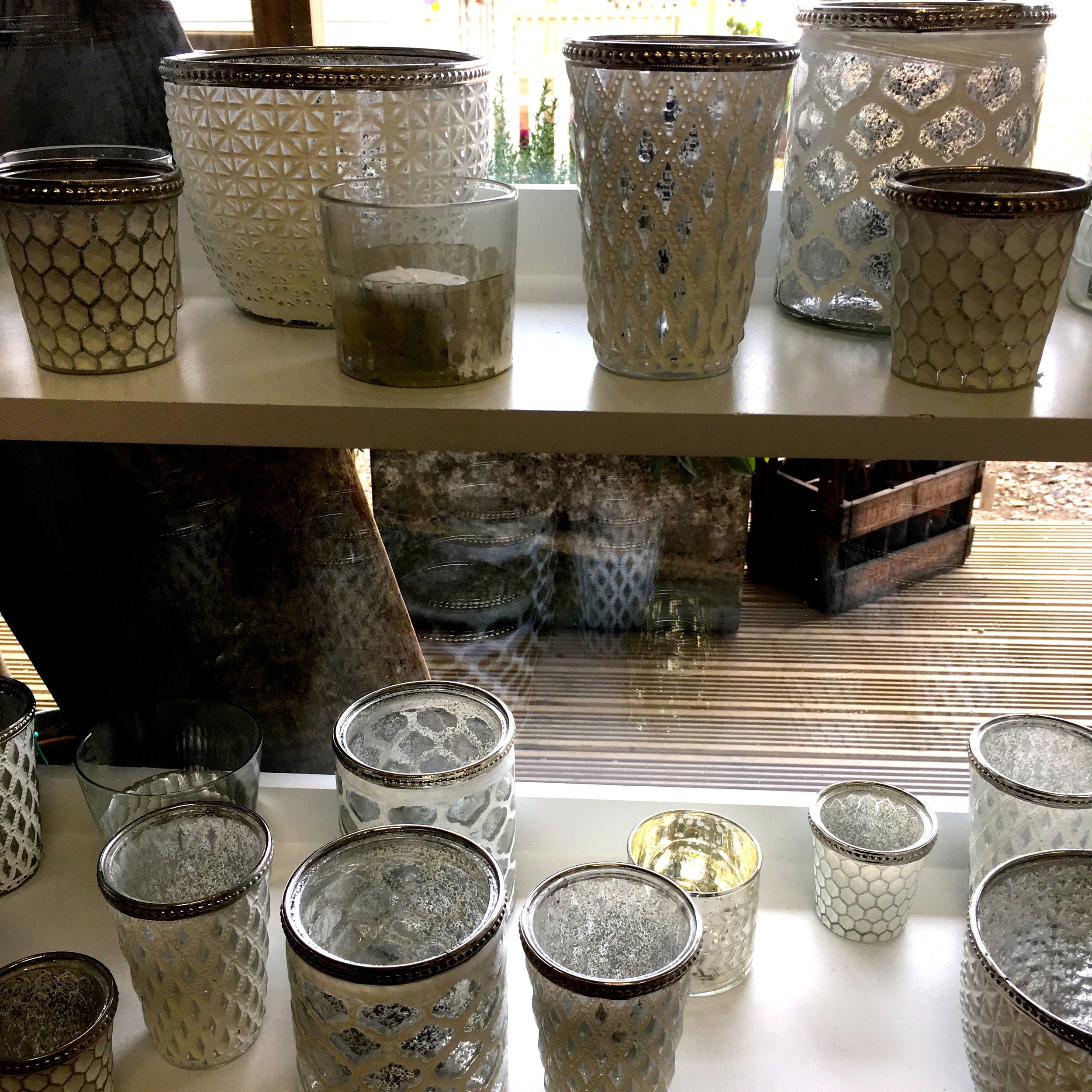
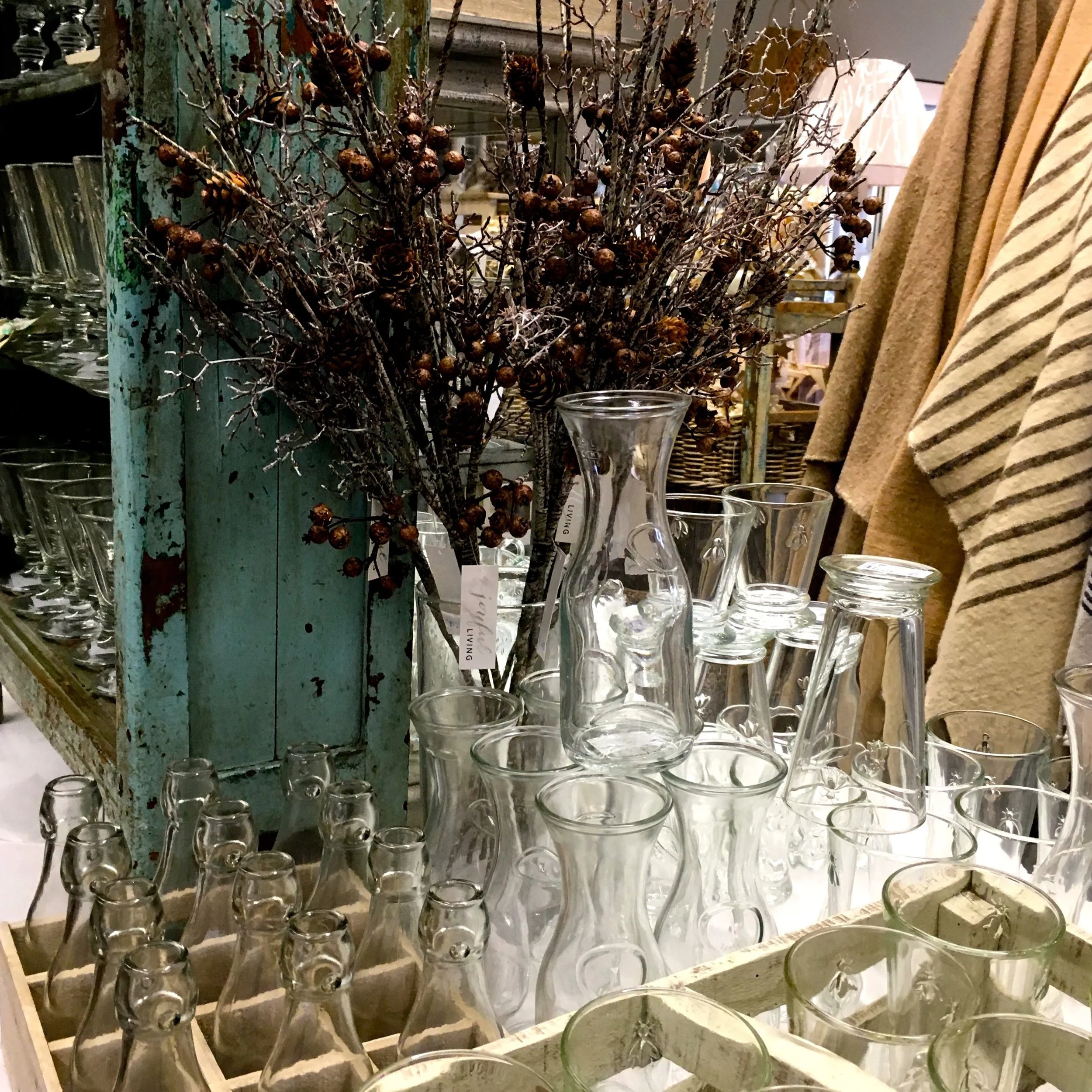
It was these vases, candle holders and generally shiny things that had me hooked. Not only their design, but the fact they go together without looking like you've tried too hard and that the same design is available in multiple sizes. I'm already in the TOTOATOT frame of mind - yes the This One, This One And That One Too - and it's hard not to be.

Shelves of glass vases

I've realised though that I haven't told you where I am. Well exactly where I am. I'm in Joyful Living in Norfolk. It's a shop by Jo Griffiths in the what seems to be ever-growing Drove Orchards in Thornham, just along from Hunstanton or Sunny Hunny as you'll often hear me call it.

On their website they say the items often "feature neutral textures, rather than bold patterns, for calm, easy-going living" and that it's a great "mix of old and new, more beautiful and functional than fashion-led" - I knew there was a reason it appealed to me.

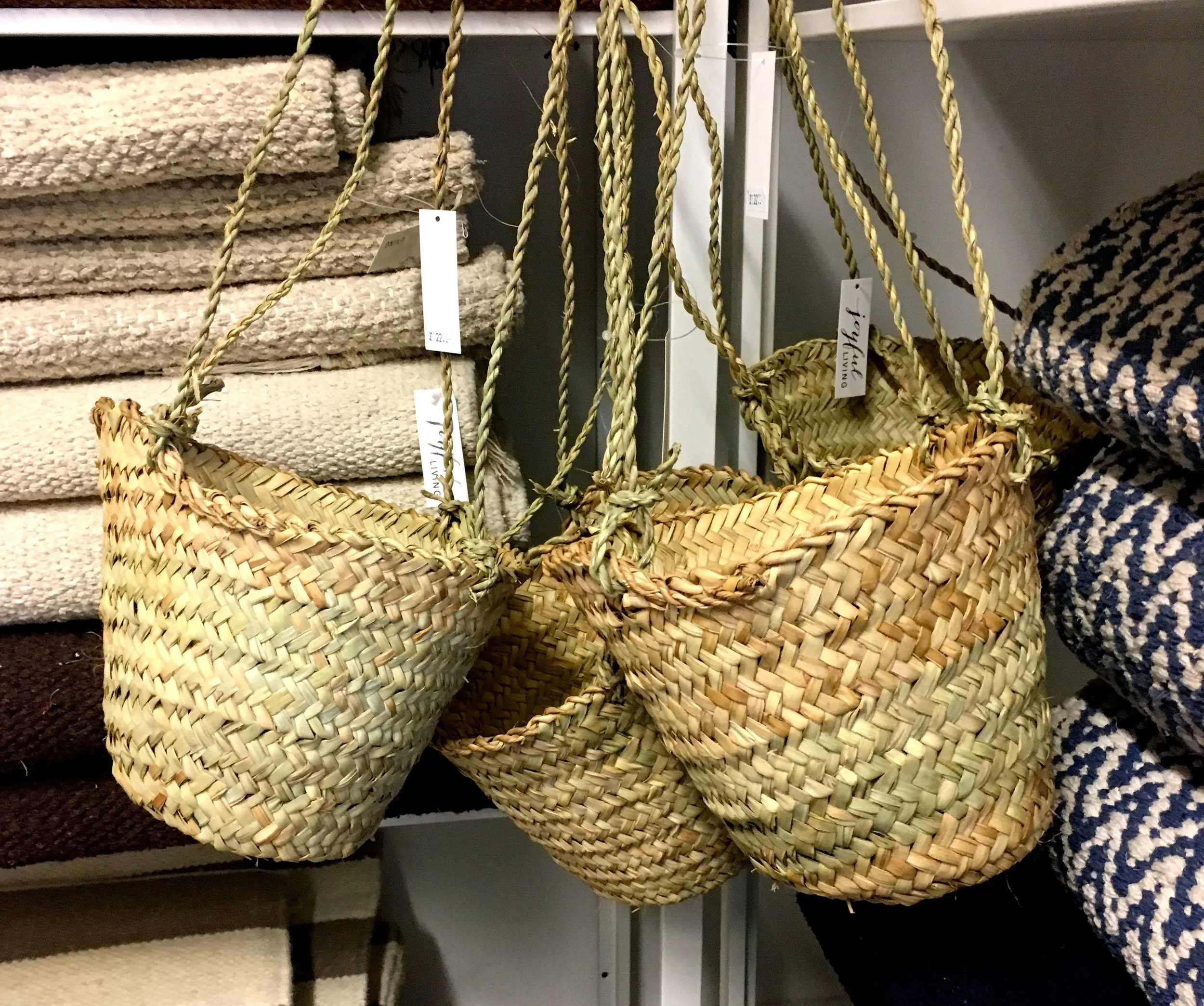
Natural materials hanging baskets and textural rugs

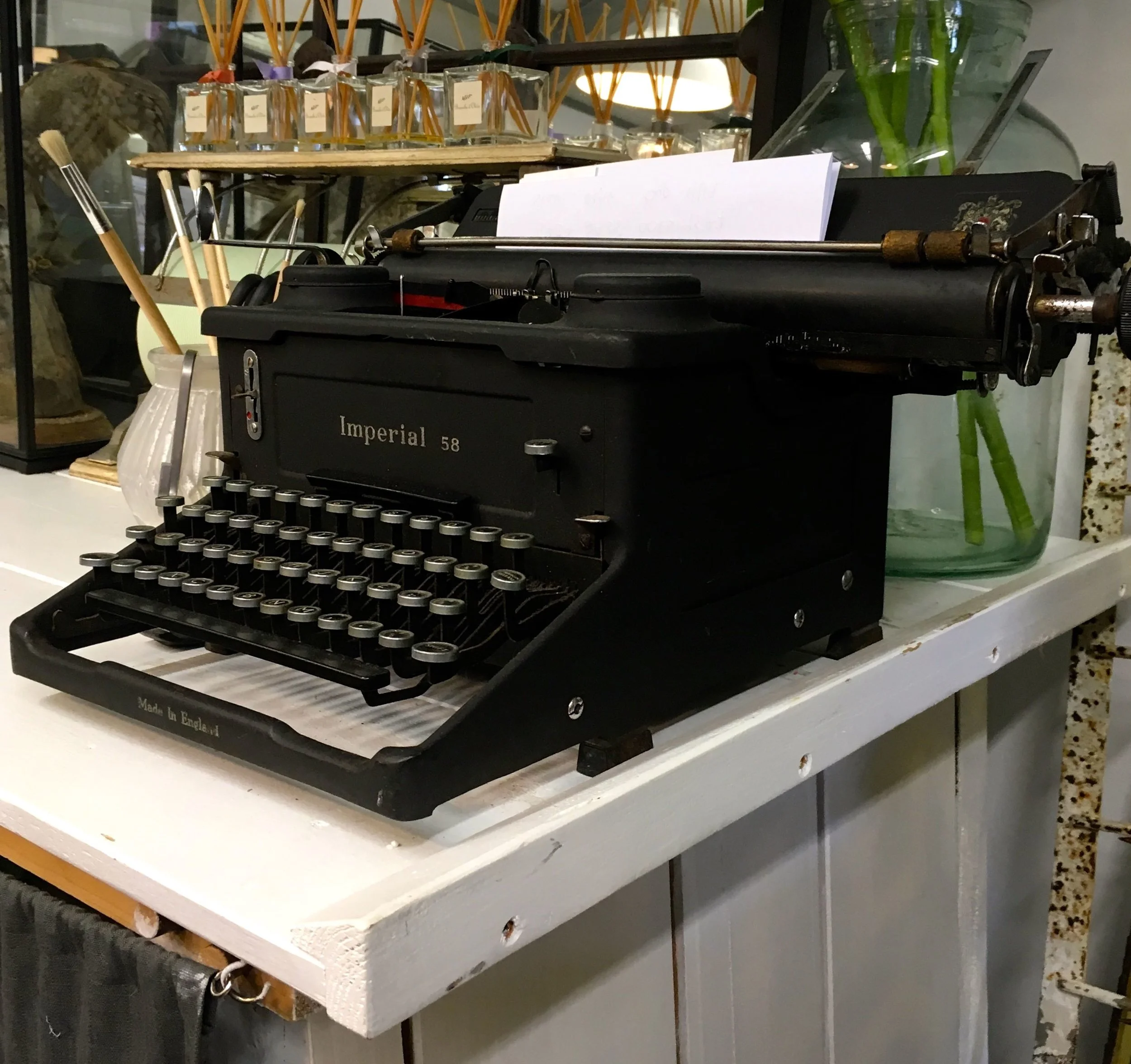
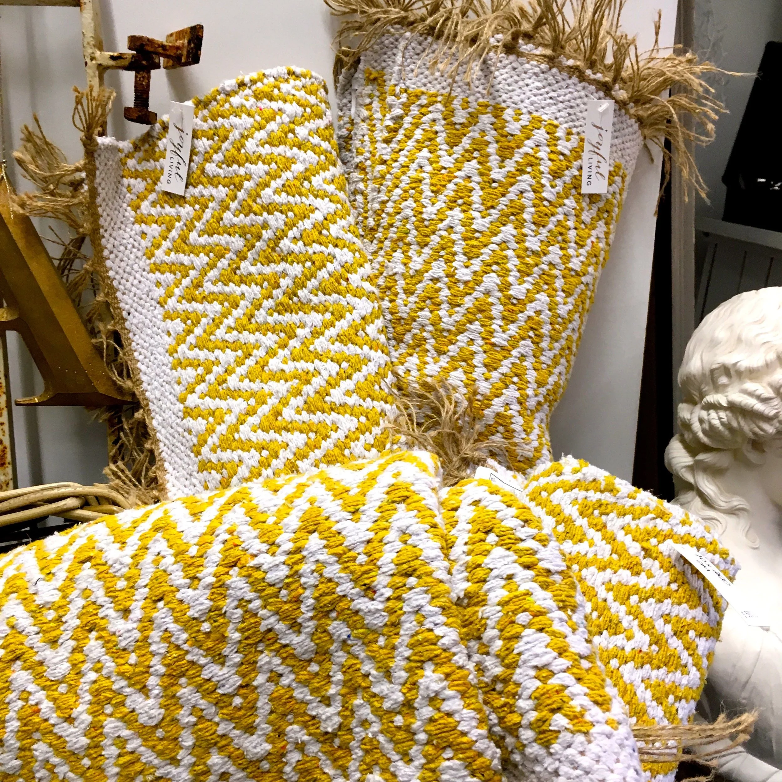
The natural textures, the old style typewriter and my new favourite of diffusers. Oh and some yellow chevroned rugs.

An old-fashioned typewriter
Yellow zig zag rugs
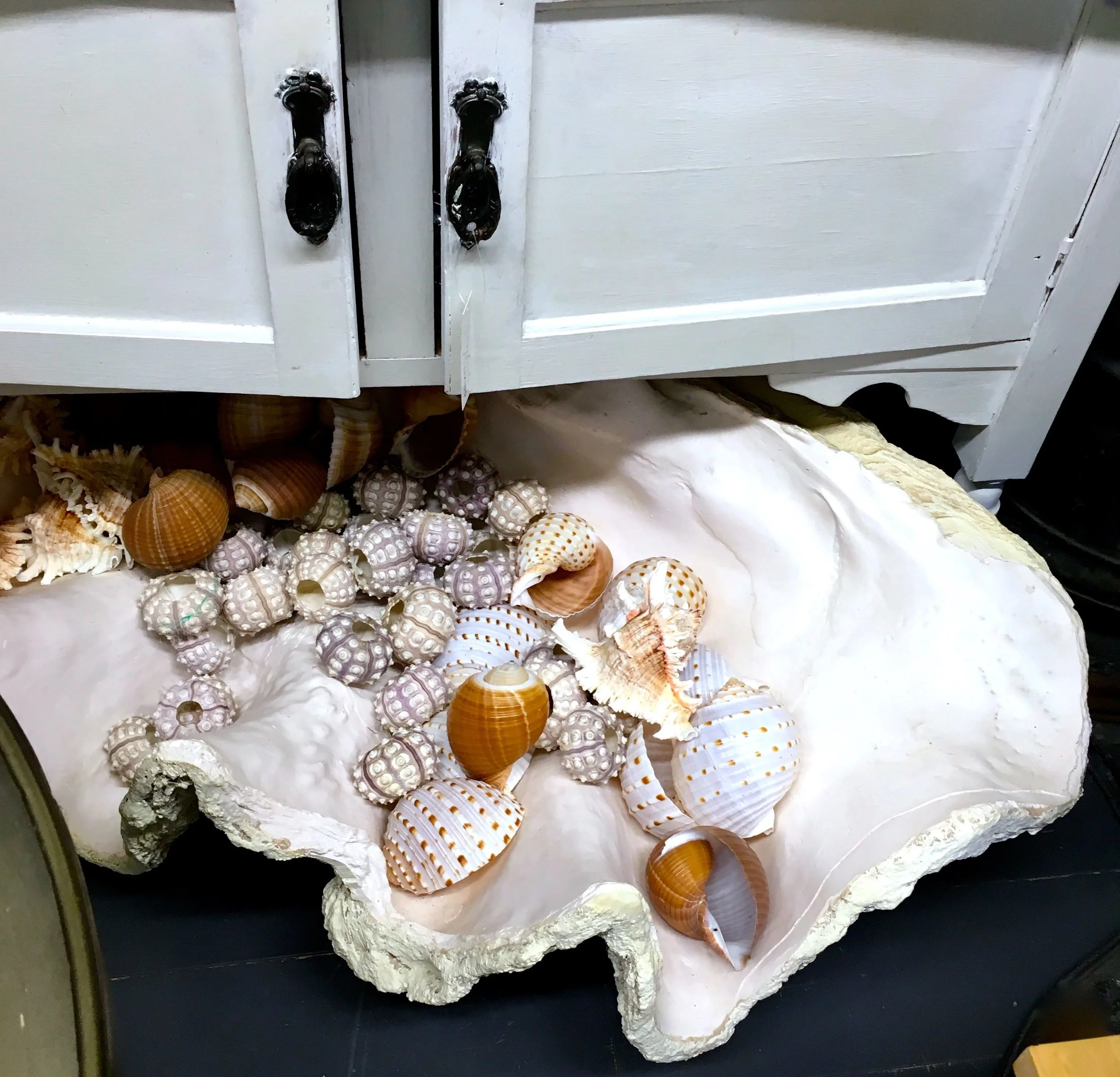
Pretty shells

It's the type of shop that I could look round endlessly, but the type of shop that MOH rolls his eyes at. Luckily for me though my dad was there and mum and I sent them off on a exploratory mission down towards the barn to read a sign. My mum's a clever woman, we had time to browse in peace, they were off doing something useful and you know what I don't think we ever did ask them what the sign said.

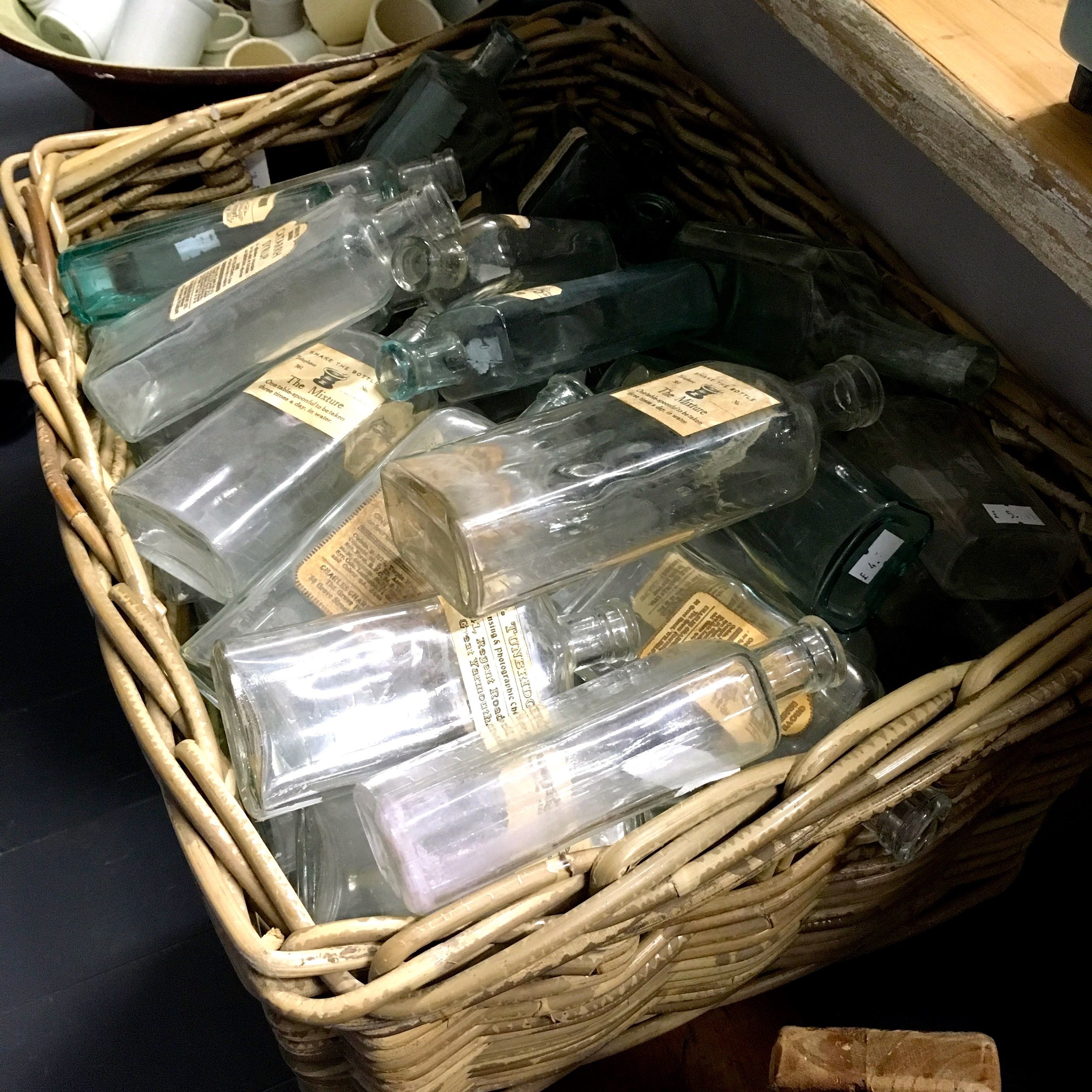
The shells and the glassware was much more important. As was the potted history of the old medicine bottles and our local chemist, Beales. I do remember having an old gunked up bottle of pink, chalky chamomile lotion in the bathroom cupboard in such a bottle, but that was it for me memory-wise. I'd happily have some of these though.

Glass bottles and jars and carafes
wicker baskets full of old medicine bottles
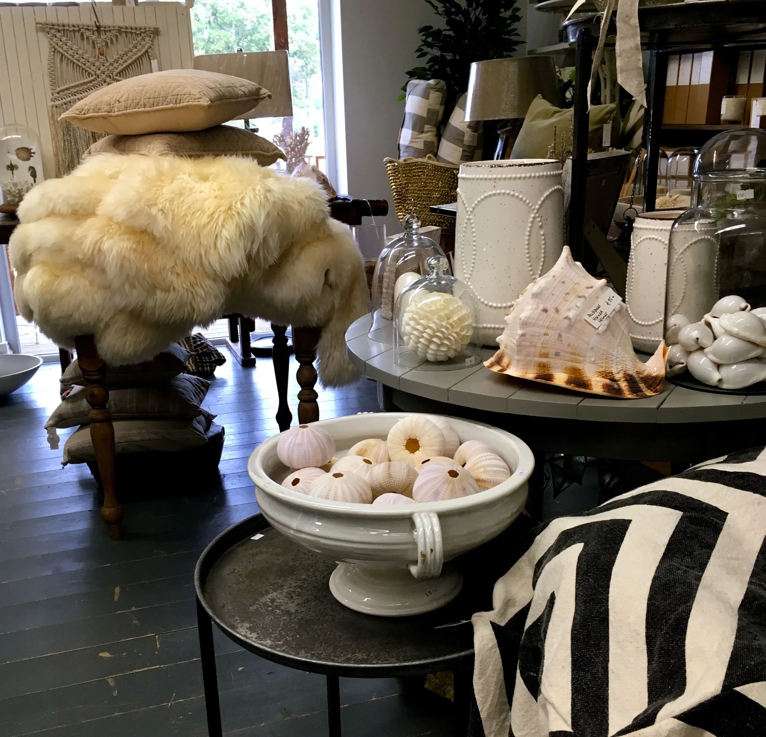
Cushions and fluffy throws, shells and chevrons

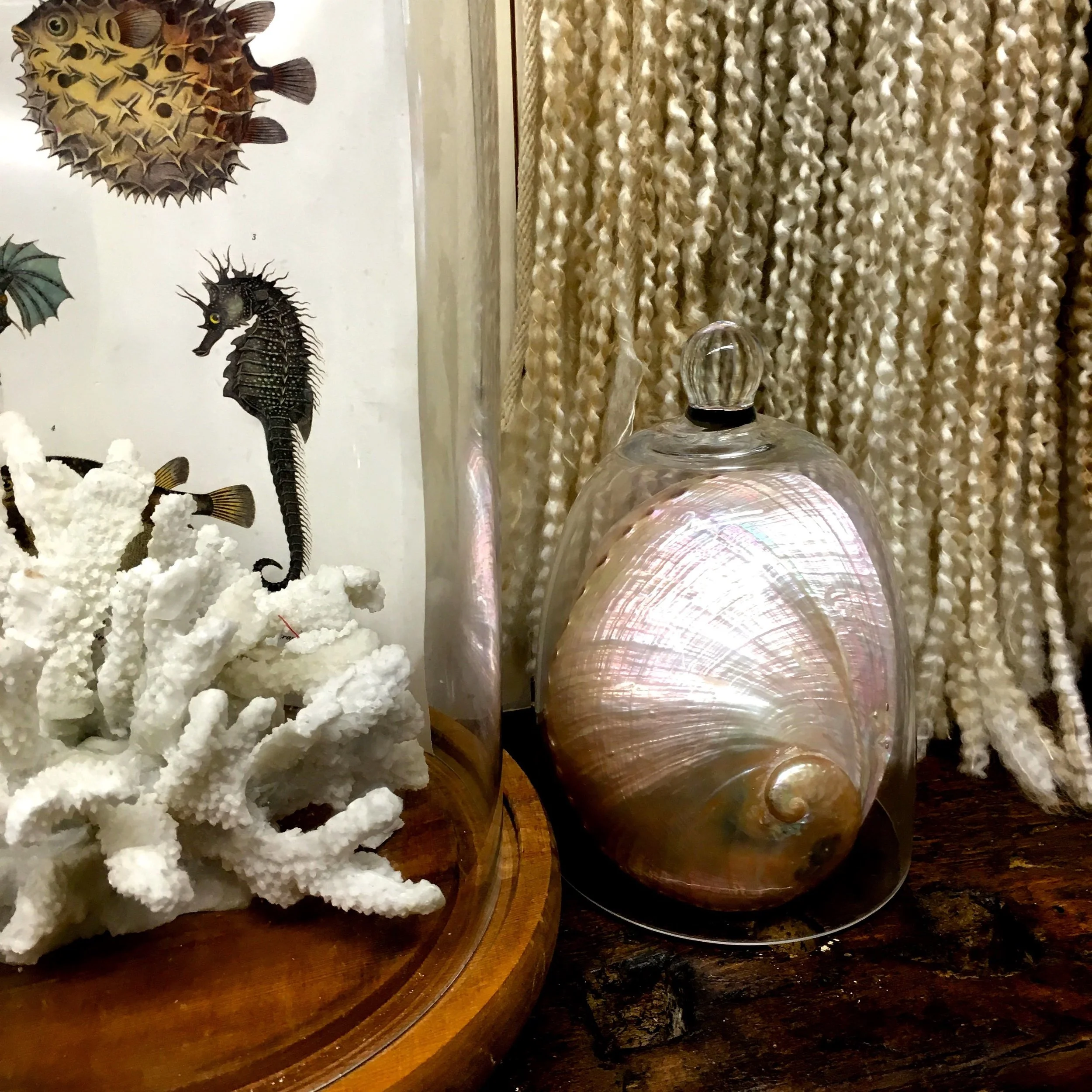
Usually I'm not drawn to shells. Well not shells I'd like to have in my house anyway. I find them fascinating, but usually I'm happy that they're in someone else's collection. Not these though, I think it's their whiteness and cleanness. And in the picture below the shininess. Or maybe it's because it's in its own dome. It's gorgeous either way.

Sea horses and pearlescent shells
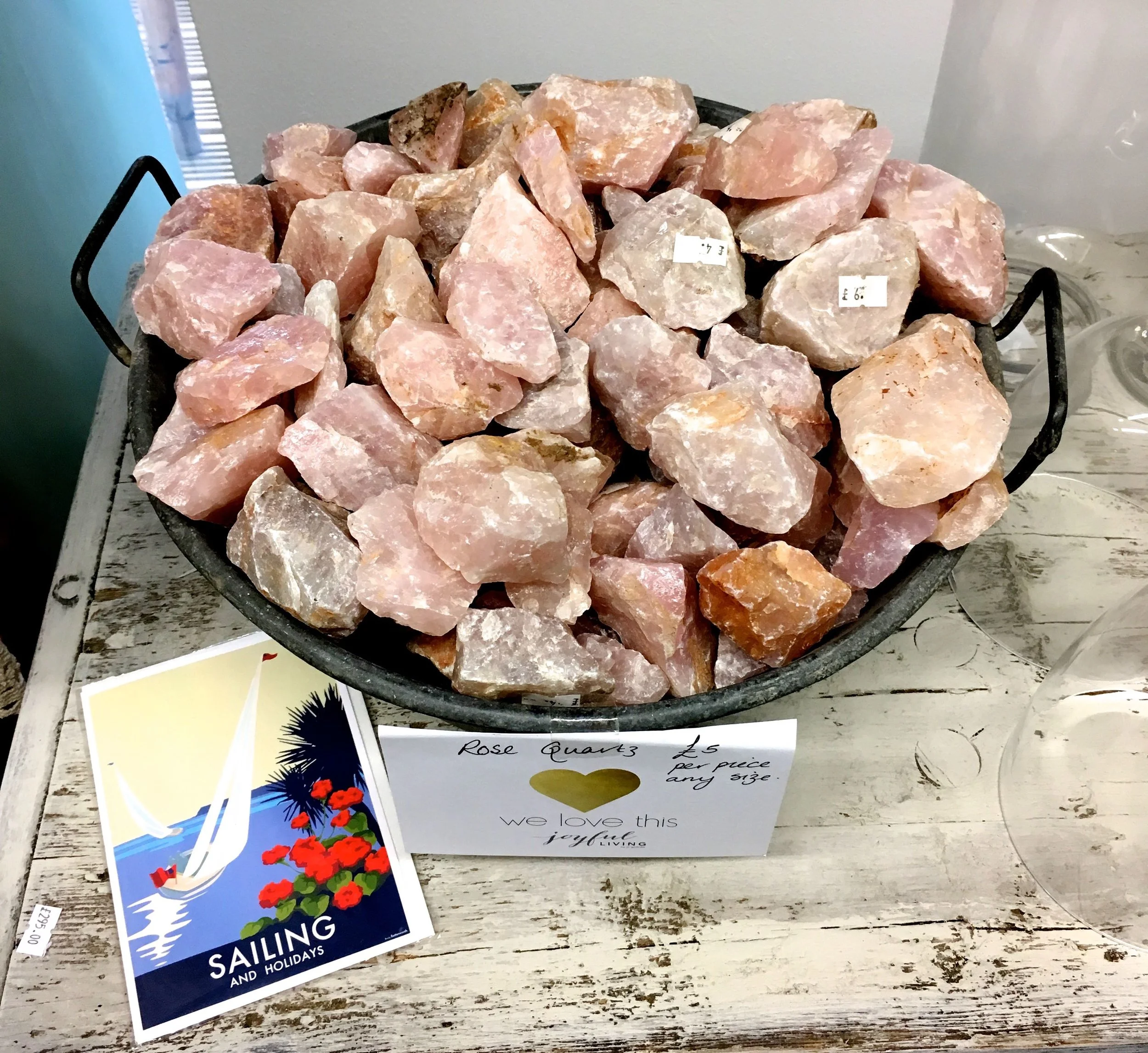
rose quartz norfolk style

When I saw this crocheted throw, I knew that was my cue to leave the shop. For the record I left without the throw, but I was sorely tempted to take the caressing of it a step further, to unfurl it from its rung, to ask the price and then to convince myself it's just what I've been looking for.

In fact it is what I've been looking for, it was that pearlised cotton that just feels nice to the touch. I've been meaning to teach myself to crochet and now I've seen this, it's what I had in mind. I just didn't know that until I saw it. But of course it's slightly ambitious for a first project, especially when I can't even crochet. Yet.

The most gorgeous crocheted throws, which is where I had to leave the shop as finding out more about this would have most likely been expensive!

So I left, almost with the blinkers on, but not quite. It was everything about this shop that I liked, even the storage. But I knew it was time to go as staying any longer would be dangerous. So if you're ever in the area, do go along to this shop. But don't leave with the crocheted throw or we might never speak again, that is, unless you leave with it wrapped and with my name on.

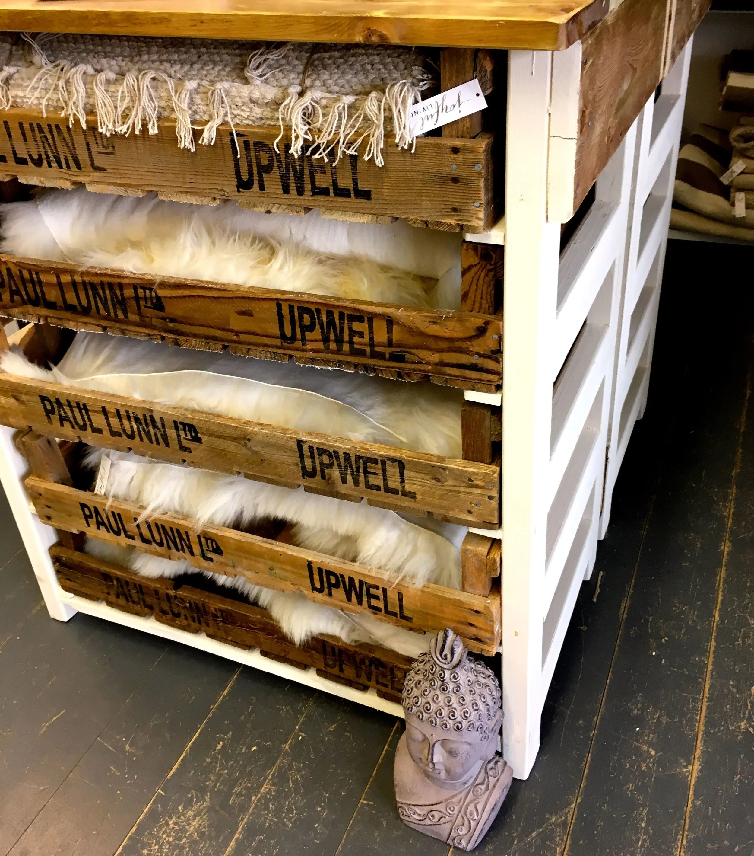
Even the storage worked for me

Do you know that a shop's just you, as soon as you walk in the door? Or is that just me?

PoCoLo