
Back in March in an unassuming building in Nottingham I went along to the East Midlands Contemporary Textiles exhibition titled Transition and Decay. I wasn’t quite sure what to expect, but the leaflet was handed out at the Newark Quilt Show back in January and as we planned to be in Nottingham that week, then there was no reason not for combining a visit to the exhibition with our errands, and lunch!
And we weren’t disappointed with any of those. We started out at another new-to-us venue, the Nottingham Society of Artists Gallery in a part of the town (city?) centre we’ve not visited much yet, and we were met with a riot of colour. Even MOH was impressed and took some photos.
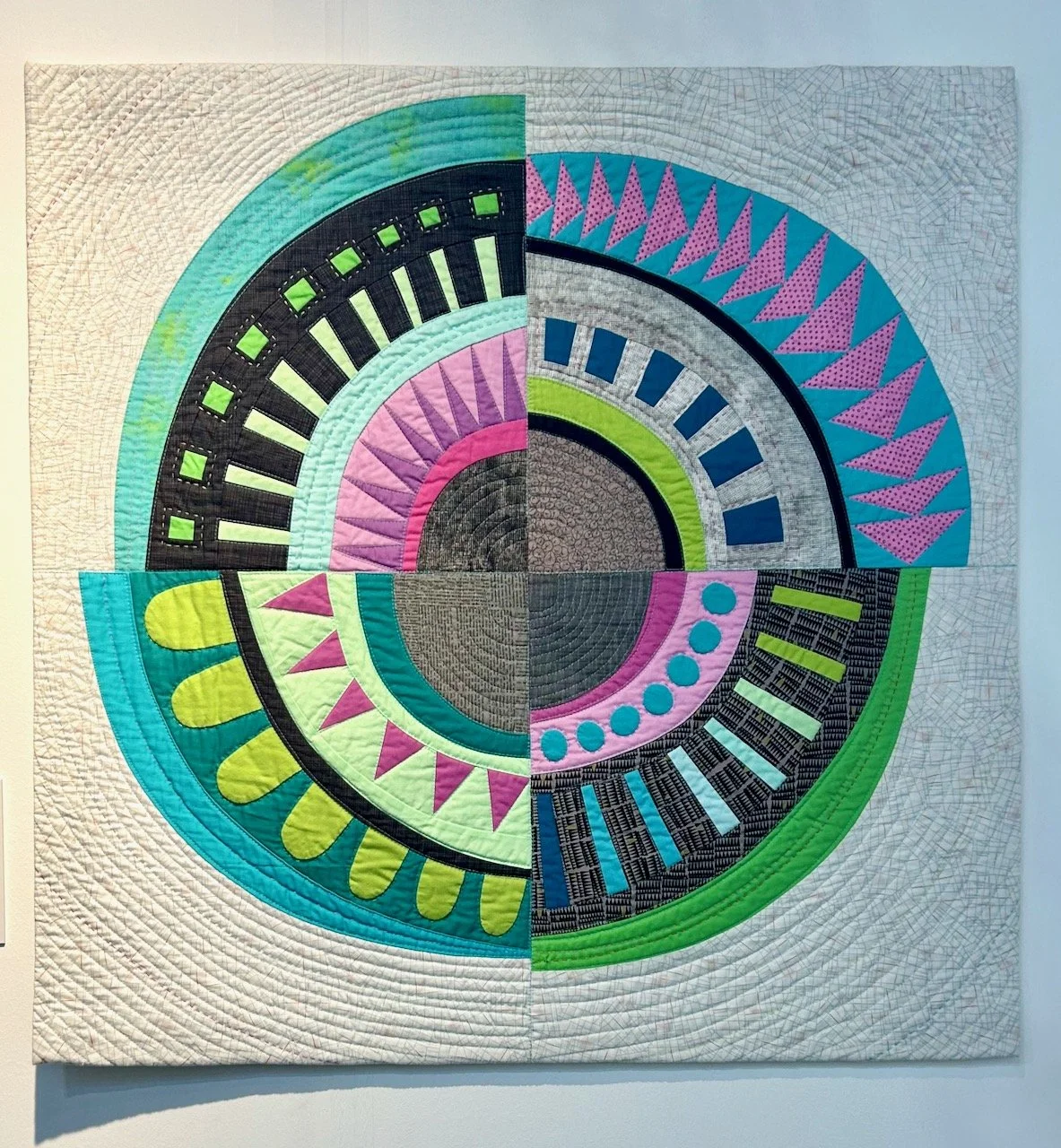
It’ll be no surprise to you, and it certainly wasn’t to me, that I was instantly attracted to the most colourful exhibits some of which I’m sharing in this post. My favourite item from the exhibition was this ‘Fading Hydrangeas’ as not only can you instantly see the decay, and all the colours of the hydrangeas throughout its lifecycle, but also because of the intricate work and the patience it must have required.
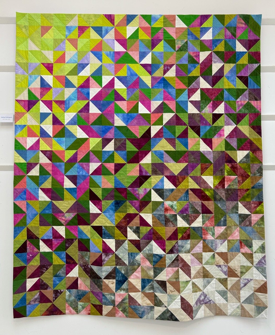
FADING HYDRANGEAS, HELEN JONES
Helen said that she loves colour and has been inspired by the constantly changing hues of the hydrangeas in her garden; from the bright, pure colours right the way through to the delicate petals in winter. Isn’t it gorgeous?
The next one I’m sharing is more literal - ‘Use it or lose it’ - and a type of decay that I’m sure all of us are keen to embrace, but it’s also a timey reminder to actually make that happen isn’t it?
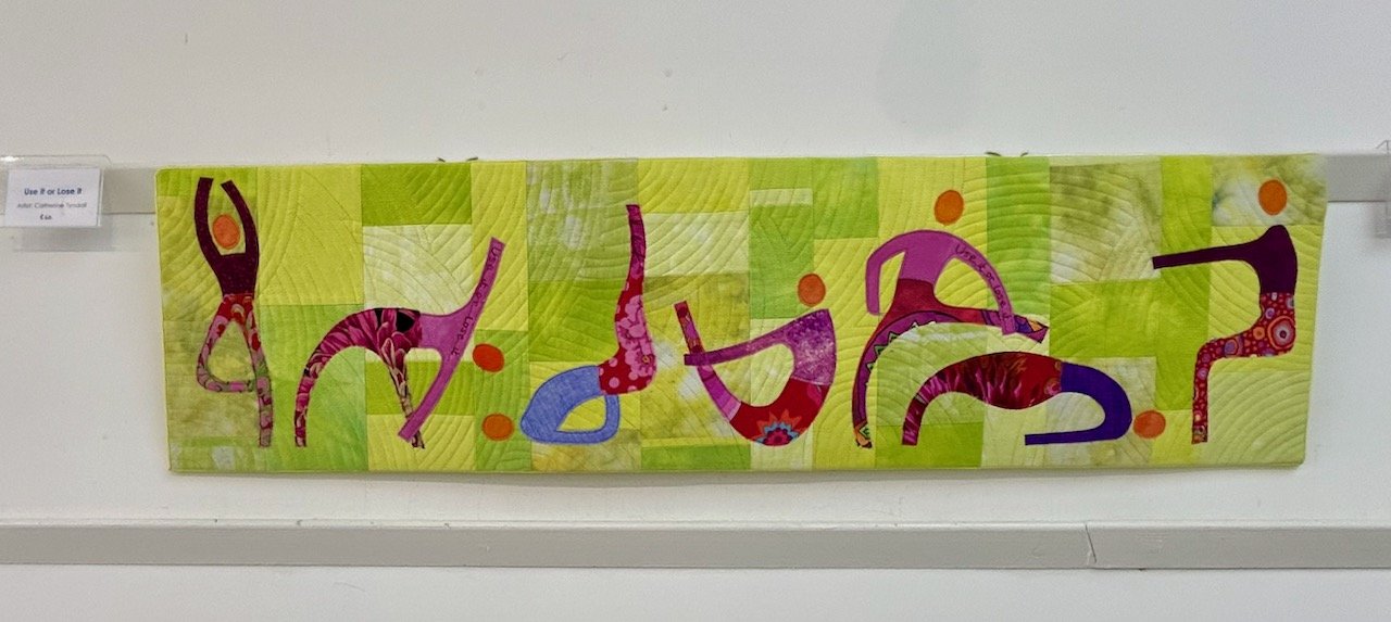
USE IT OR LOSE IT, CATHERINE TYNDALL

VARIOUS SMALL QUILTED SQUARES BY THE EMCT GROUP
There was little information available in the show notes for the items above and below, but I understand they were completed by members of the East Midlands Contemporary Textiles group for their regular meetings, and they felt (and I agree) that they should also be displayed.
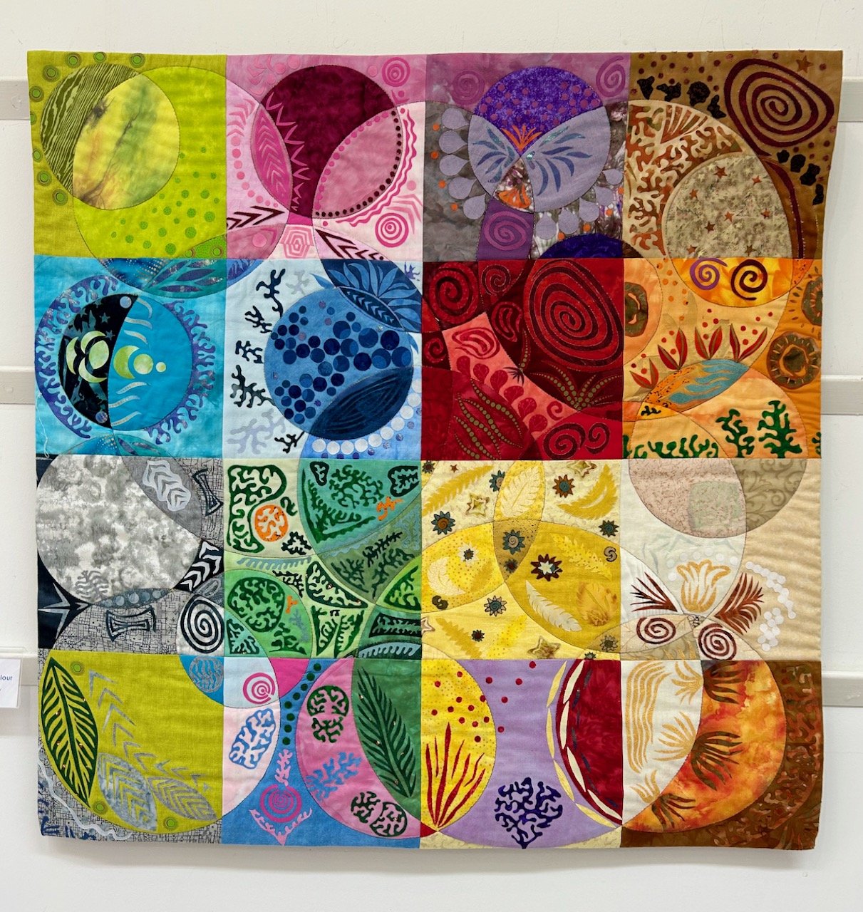
RAINBOW COLOURS AND EXQUISITE STITCHING, EMCT GROUP
This piece by Linda Forey started as ‘a possible method of looking at transparency in colours, and became a fun game of adding applique shapes’ - either way the result is stunning and playful - and also a contender for my favourite piece in the exhibition.
PLAYING WITH COLOUR, LINDA FOREY

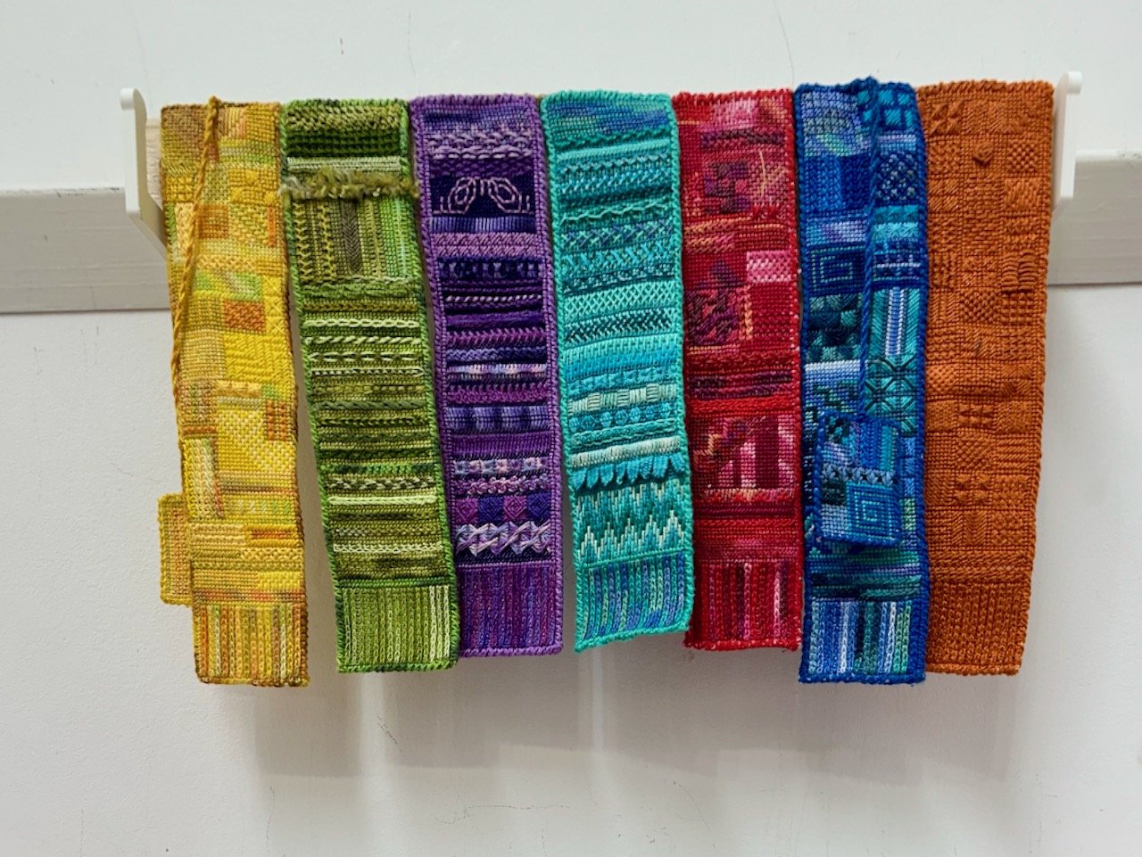
LONG STRIPS OF INDIVIDUAL SQUARES, EMCT GROUP
I love the colourful strips of individual works pieced together, and wish I could share more about them. It was the fruit on the blue background (on the right above) that caught my eye, and the more I looked the more detail and amount of work I could see.
Truly amazing.
It was a great exhibition, which also had a ‘touching table’ where the artists had made available the pieces they’d created when starting out to create the pieces for the exhibition, that was really interesting but also highlighted that there’s always so much more that goes into creating anything quite this beautiful.
Look out for another post where I’ll share with more items from the exhibition, which look at transition and decay in a completely different way, that’s why I’m sharing it as a separate post - I didn’t want either of the approaches to get lost.