Big Ideas: A spa-style bathroom

I’m sure we’ve all had days where we’ve wished we’ve had a spa to walk into as soon as we step through the front door, and while that may not always be possible, and we may have to plan our spa visits in advance, there are some style tips we can adopt to make the most of our own bathrooms to make them a haven of relaxation.

The Big Ideas for this bathroom are:

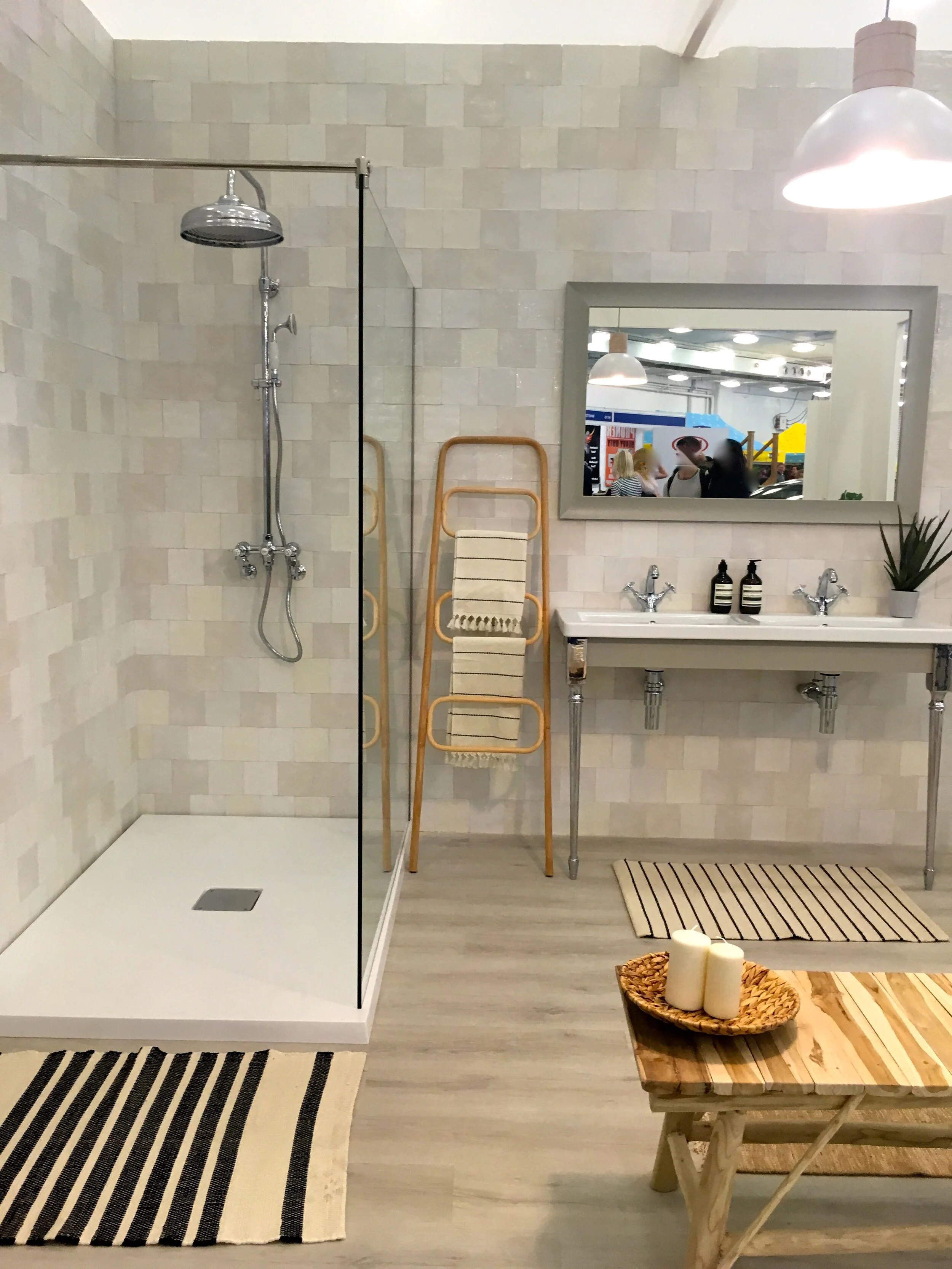
  1. Tactile finishes such as natural woods and limewash tiles

  2. A neutral palette which enhances the hygge design, but is also easy to update

  3. A relaxing vibe, as we all know a calming atmosphere promotes wellbeing.

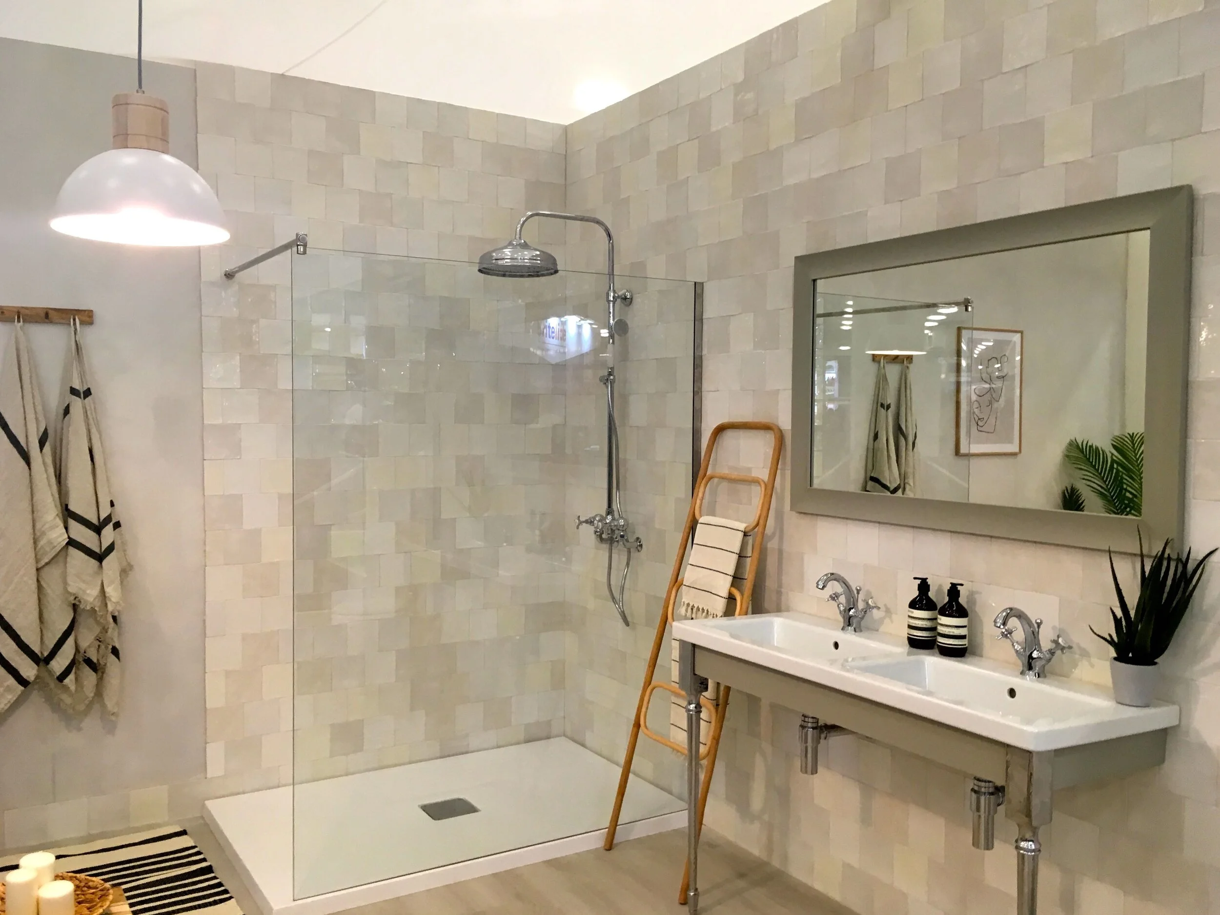
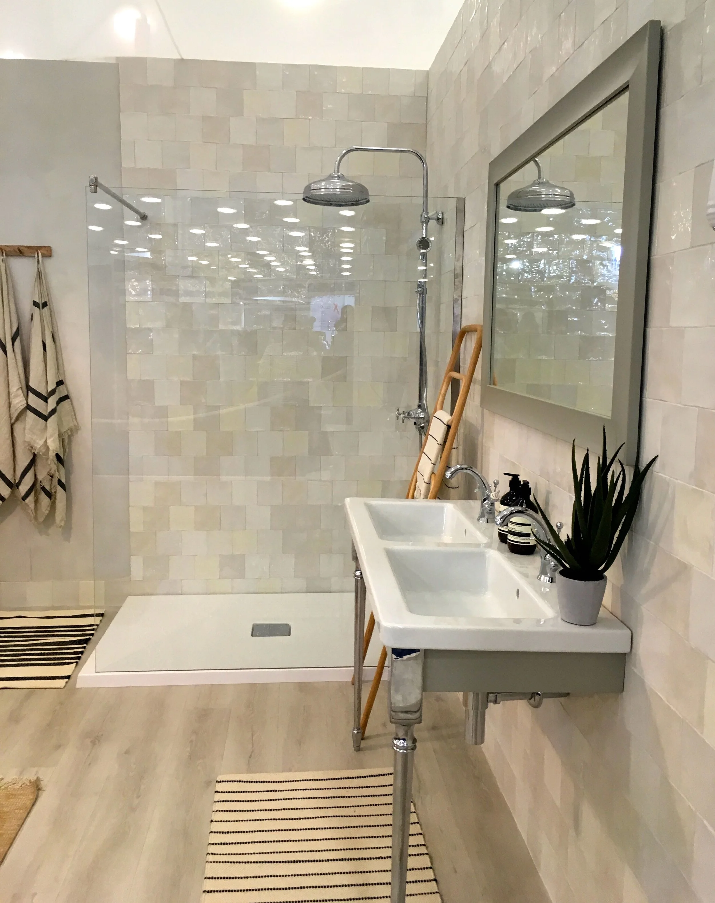
the spa-style bathroom at the Ideal Home show

For me in this bathroom, it’s the tiles that make it. I’m sure they’re the type of tiles that builders love to hate and will tell you how hard they are to put up, but if they can look this good, I think that’s worth it. And if they are hard to put up, then I think I’d recommend a builder than trying to do them yourselves. I’ve said before that MOH and I are DIY-incompatible, and these don’t look like materials that would help with that.

calming and tranquil spa-style relaxation

He’d be a big fan of the shower though, even if the tiles aren’t quite his thing.

natural textures and neutral colours

The other thing about this bathroom is that it’s full of texture. The wood, the tiles, the mats, even the basket with the candles in on the bench. Texture is satisfying for our eyes, and our soul I think.

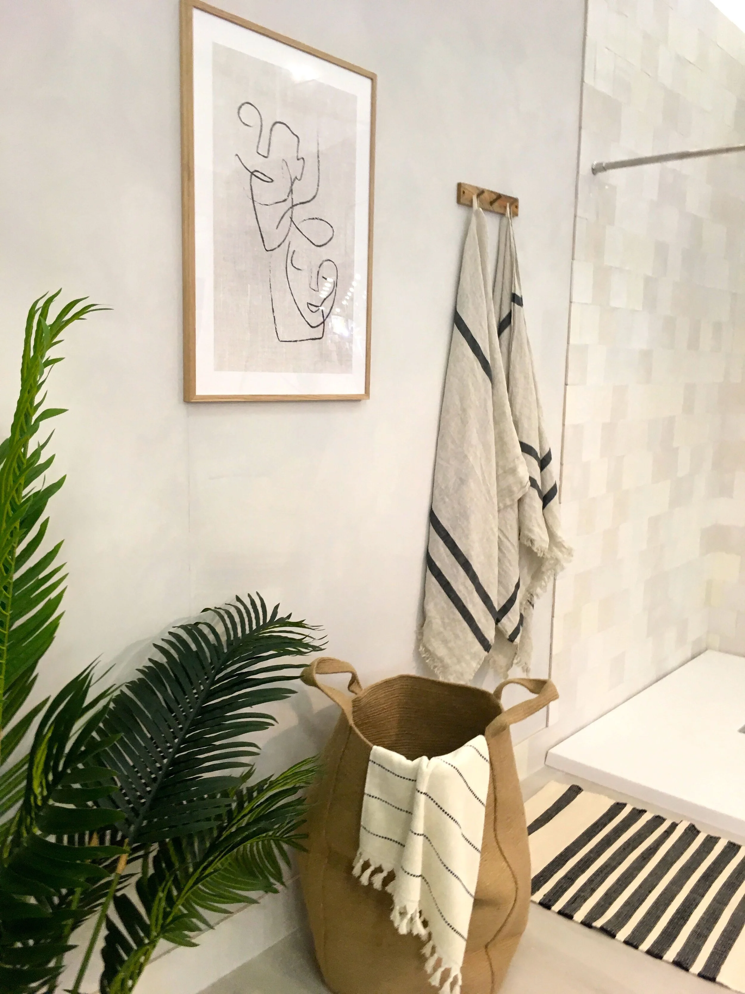
artwork and towel storage that's stylish too

It’s unusual to have artwork in a bathroom, often because they’re small and steamy places, and so it’s not practical. But if you have the space, then it’s worth considering. I like the picture above even for a non-bathroom space - it’s the type of image that challenges your eyes and brain, but also rewards them with a pleasing image once you’ve really seen it.

Even if we can’t fit all of this into our own more normal sized bathrooms, some of the Big Ideas would be relatively easy to incorporate, and I’m sure the benefit would be ten-fold.

Big Ideas: A cocooning kitchen

I can always tell how much I like a room set by the number of photos I take, and you can tell from this post I was rather keen on this one, and I haven’t included all the ones I have.

The Big Ideas for this cocooning kitchen are:

  1. Dark & Dreamy, with the refined textures and handcrafted feel

  2. Timeless flooring, decorative parquet always has the maximum impact

  3. Tropical elements, whether that’s focal point plants, or the wallpaper, but it’s a great way to personalise your space

  4. Gold accents add a luxurious touch and bring a boutique look

  5. Wine & Dine, the bench style seating is great for entertaining.

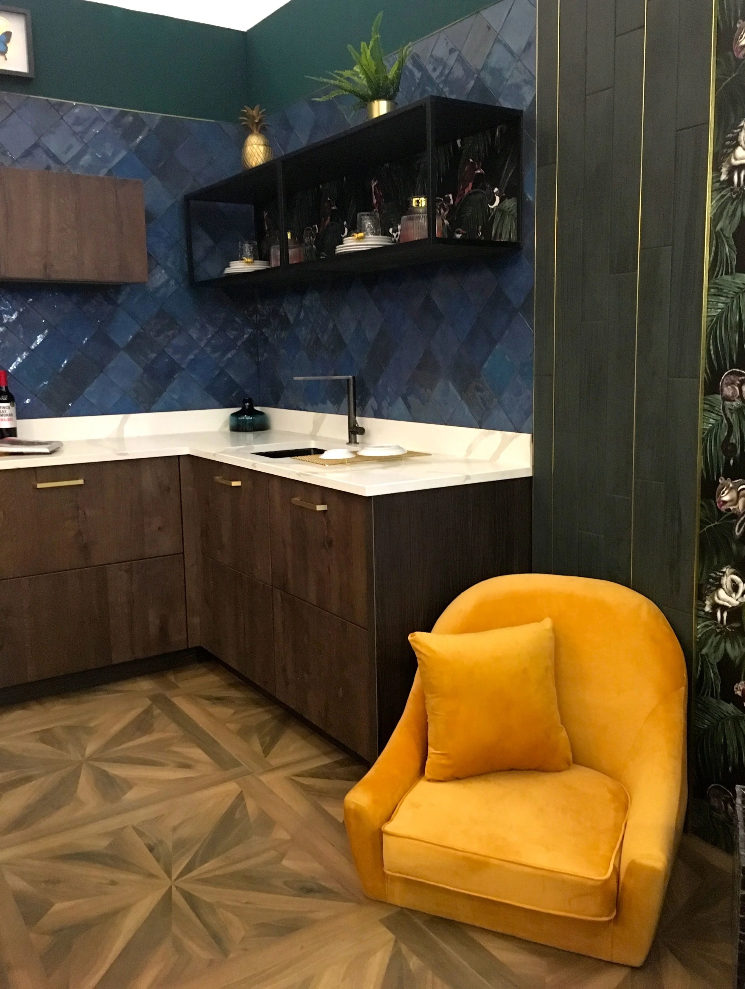
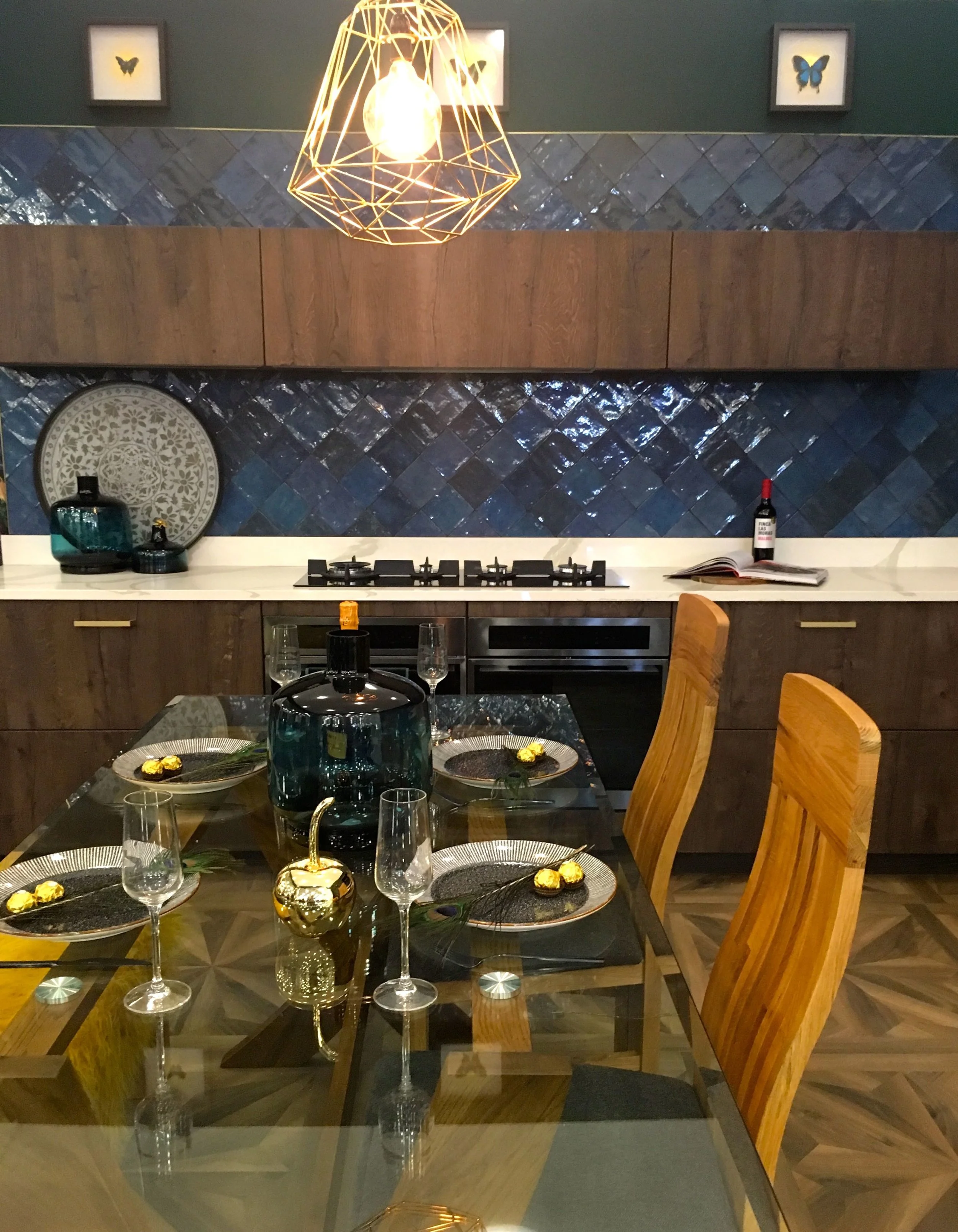
dark and moody and a pop of colour

Just look at the darkness of the colours, the texture of the tiles, the pattern on the floor and the pop of colour from the chair. Hang on, at first I didn’t notice anything wrong, but looking again the chair looked a little unusual. Stepping back, it was reassuring to know that even for room sets there are hiccups.

SOMETHING’S MISSING…

SOMETHING’S MISSING…

Although the legless chair does have a certain air of comfort about it!

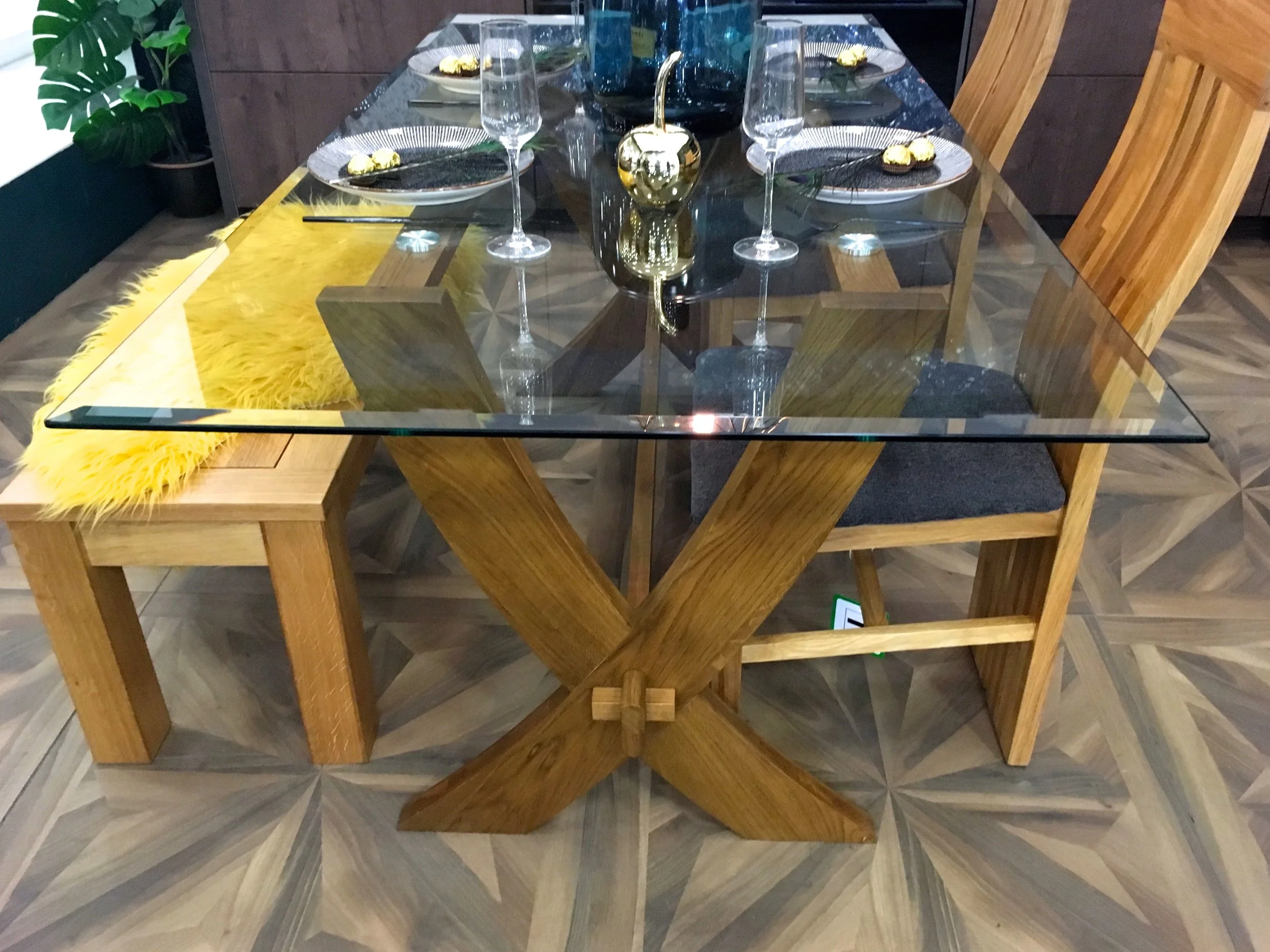
a dining space in the kitchen

There’s wood flooring, on the cupboards and in the dining space, along with the touches of gold, on the table and hanging above it.

stools, table legs and chairs

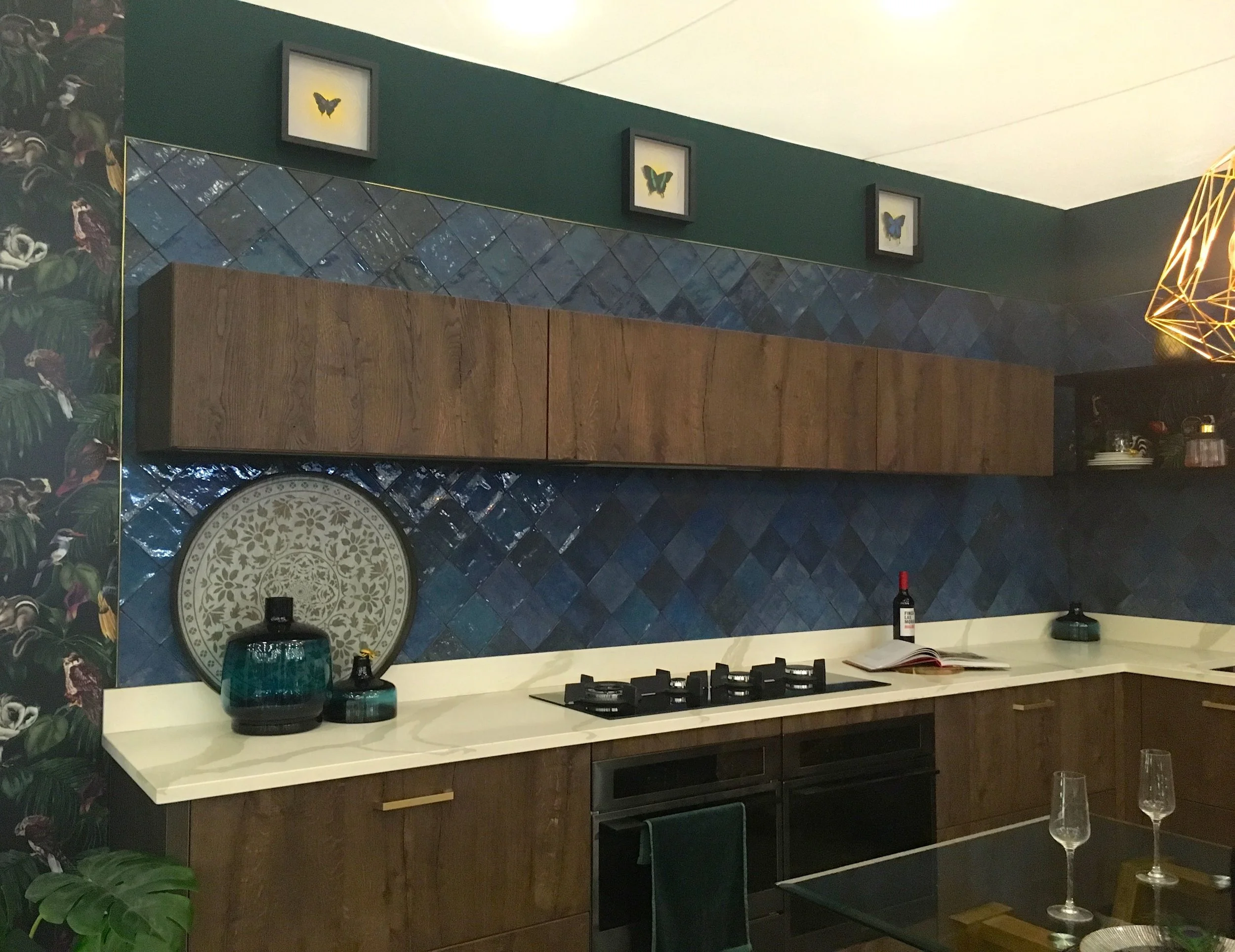
I think it’s the tiles that make this work, they reflect light, add texture and look simply gorgeous. Clearly it’s not a proper kitchen, I mean where’s the kettle?

the kitchen area

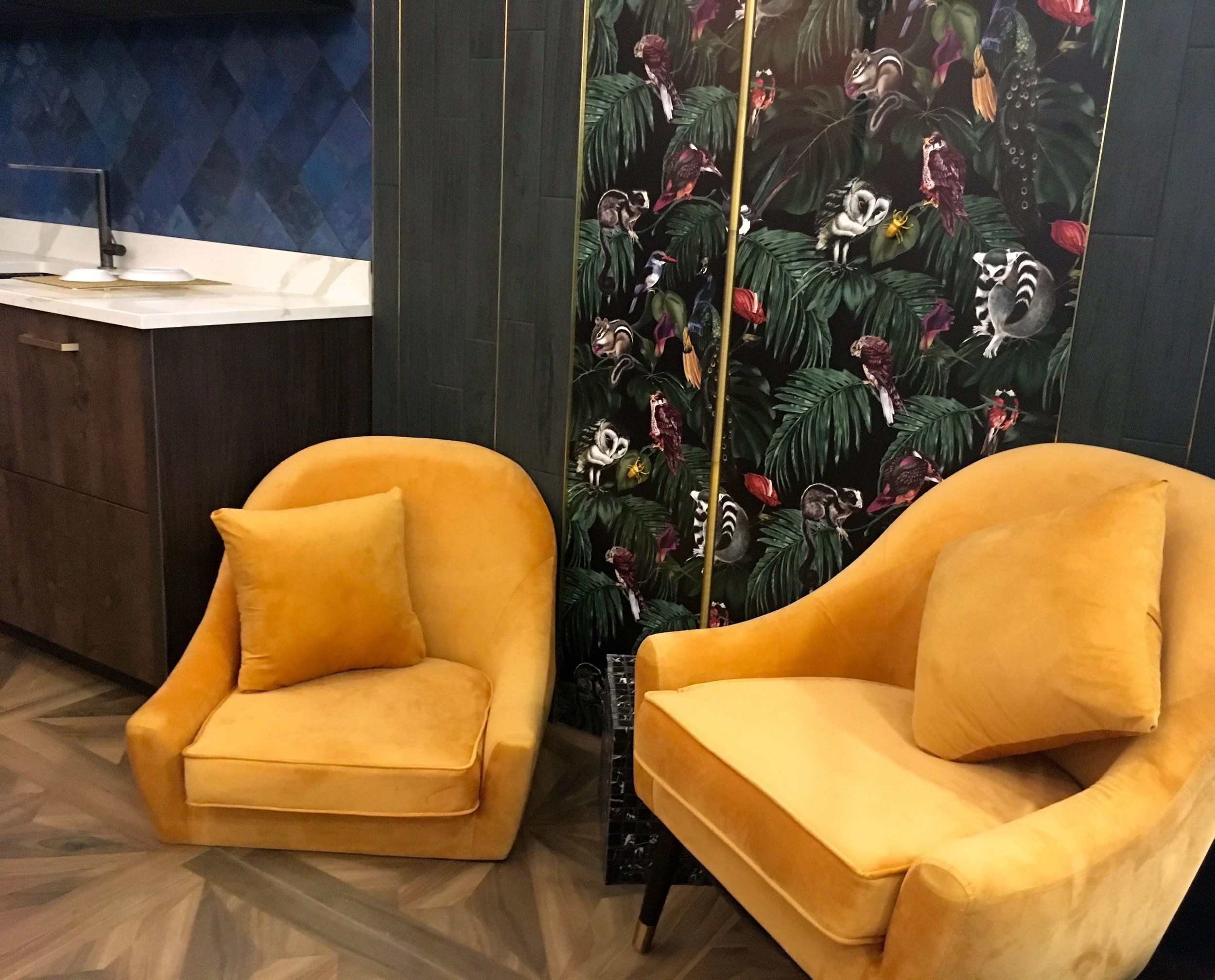
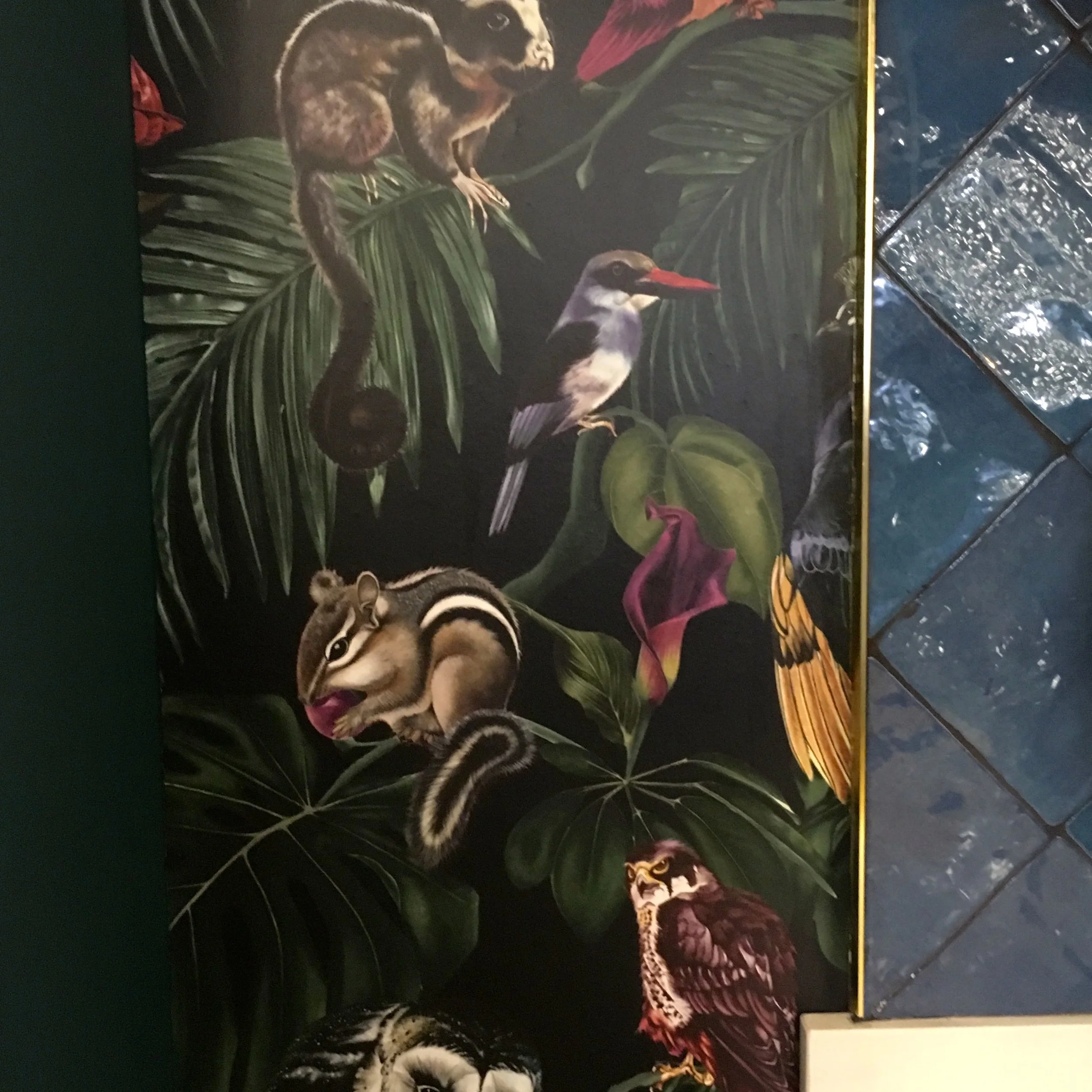
The wallpaper too adds some quirkiness and even though it matches the dark and dreamy brief, it’s also colourful and quirky.

a close up of the wallpaper

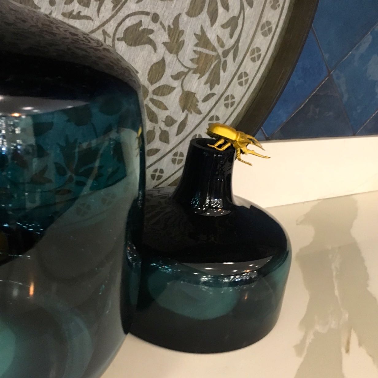
It might not be an obvious choice of wallpaper for a kitchen, but it works doesn’t it? Though you do have to be careful for the insects…

insects everywhere

What do you think?

PoCoLo

The Upcycled Garden

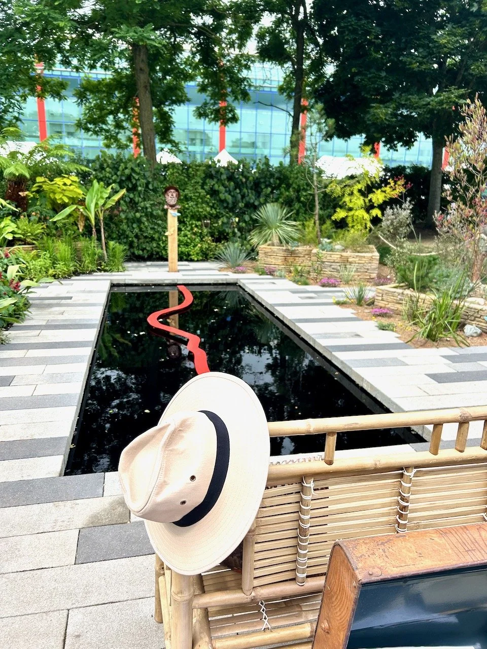
This is the last of the garden room sets from this year’s Ideal Home Show, and I’ve saved my favourite until last. And in true me-style, I had quite a good chat with Max McMurdo who was hanging around the garden he created trying to eat his lunch and have a conversation with someone who thought he looked familiar, but thought nothing more of it. Until I actually read the leaflet I picked up and realised who I’d been chatting to over the upcycled pallet.

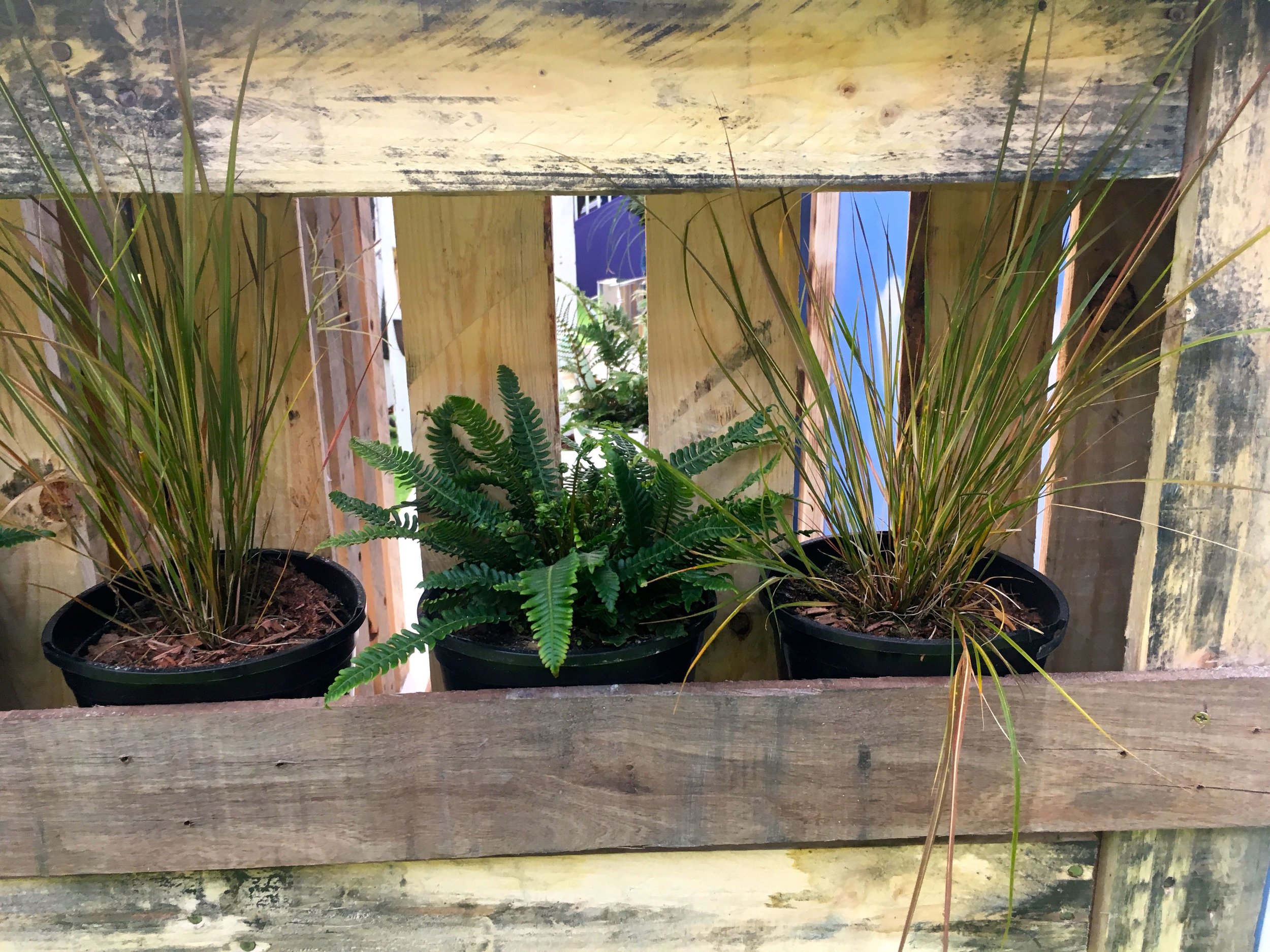
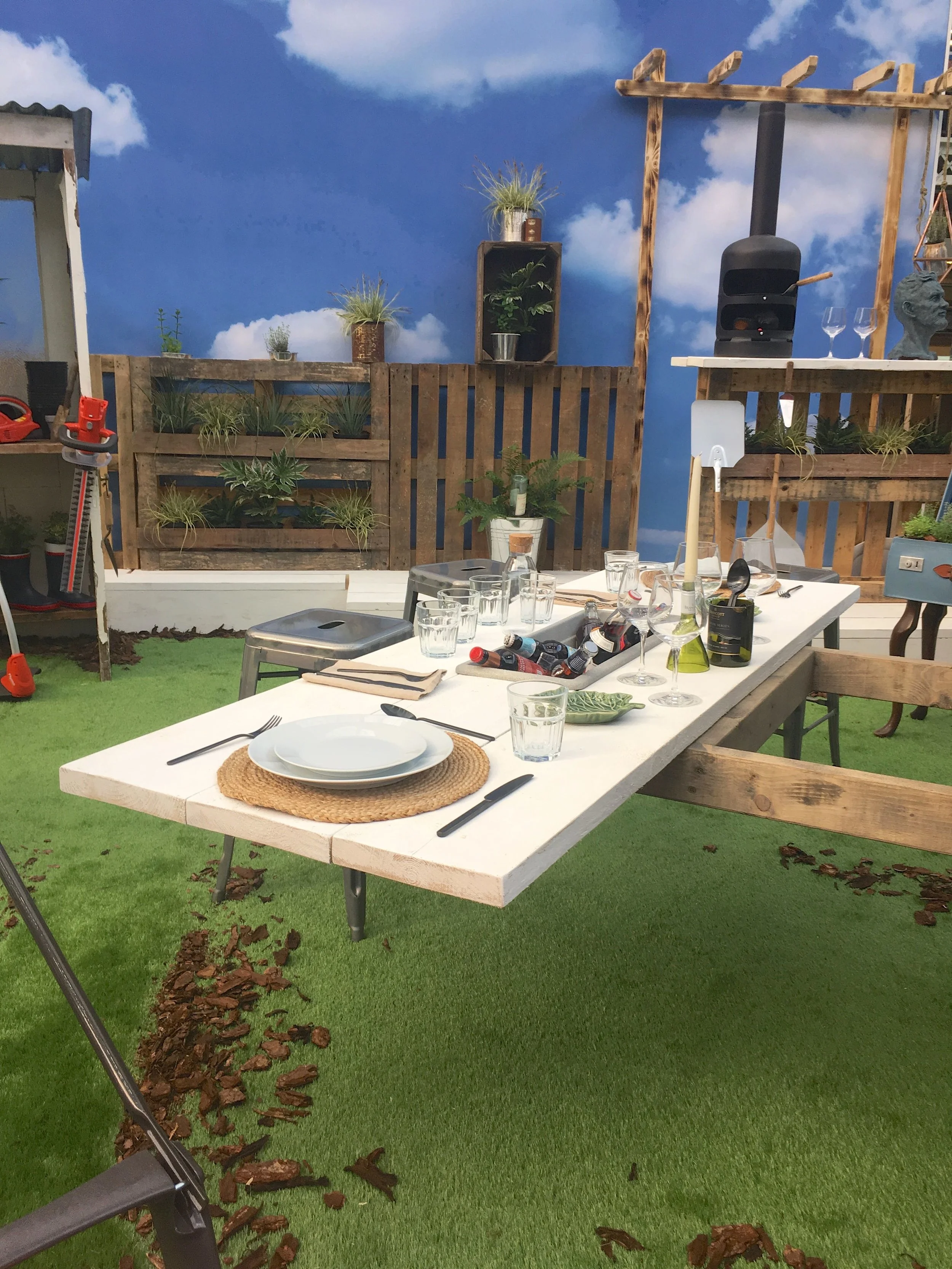
A pallet as a planter in the Ideal Home Show

It is a particularly good use of pallets, and one I wished I’d thought of when in my first house dad and I put up a front fence made of pallets. Just adding an extra plank to keep those pots in, would have added some interest. I was clearly way ahead of my time, although looking back I think I’d have had to nail the pots in as a plant that was on my open porch, which took two people to lift disappeared one day. It’s not actually the sort of thing you can phone the police for is it?

“Yes, hello Officer, yes my five foot money plant, that’s extremely heavy is missing.”

“Where did I leave it? Well on my doorstep, it’s too heavy to move you see.”

But anyway I digress, although that is how and when I got my yucca plant, which is still going strong despite a small accident with MOH falling onto it recently. These doors too reminded me of the “shed-that-dad-built” which I shared on here a couple of years ago. That post is worth a look for the old-fashioned photos alone.

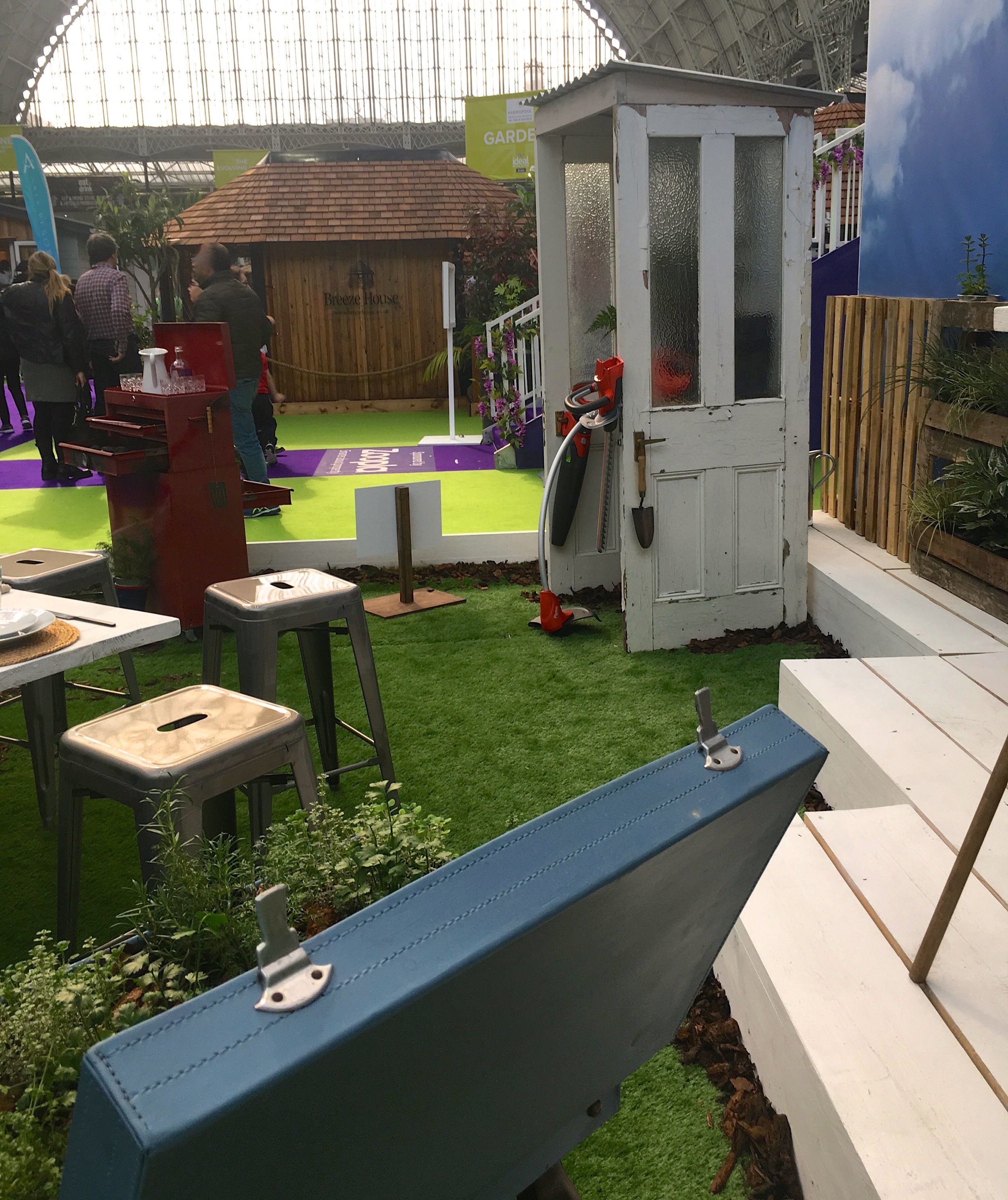
old doors and a suitcase put to good use in the Upcycled Garden at the Ideal Home Show

Back to my chat with Max. It was the real Max I got to speak to, not the statuesque one that perched on yet another pallet. Max is a designer and upcycler and has gone “back to his roots” according to the leaflet with this Land Rover inspired garden, reusing ideas from his book “Upcycling Outdoors”. The leaflet goes on to say that upcycling items has “previously been associated with items within the home” but that this garden shows what you can do with your outside space. I’d just like to say, pop back to the post with the “shed-that-dad-built” there was much upcycling going on there, mostly through quirkiness and need, rather than driven by a reuse mantra, but it was the early nineties…

More pallets, a pizza paddle and a self-portrait
A suitcase planter on legs at the Ideal Home Show

It’s true though that suitcase side tables are more often used indoors, but they do make a lovely planter too.

A landrover put to good use in the Upcycled Garden

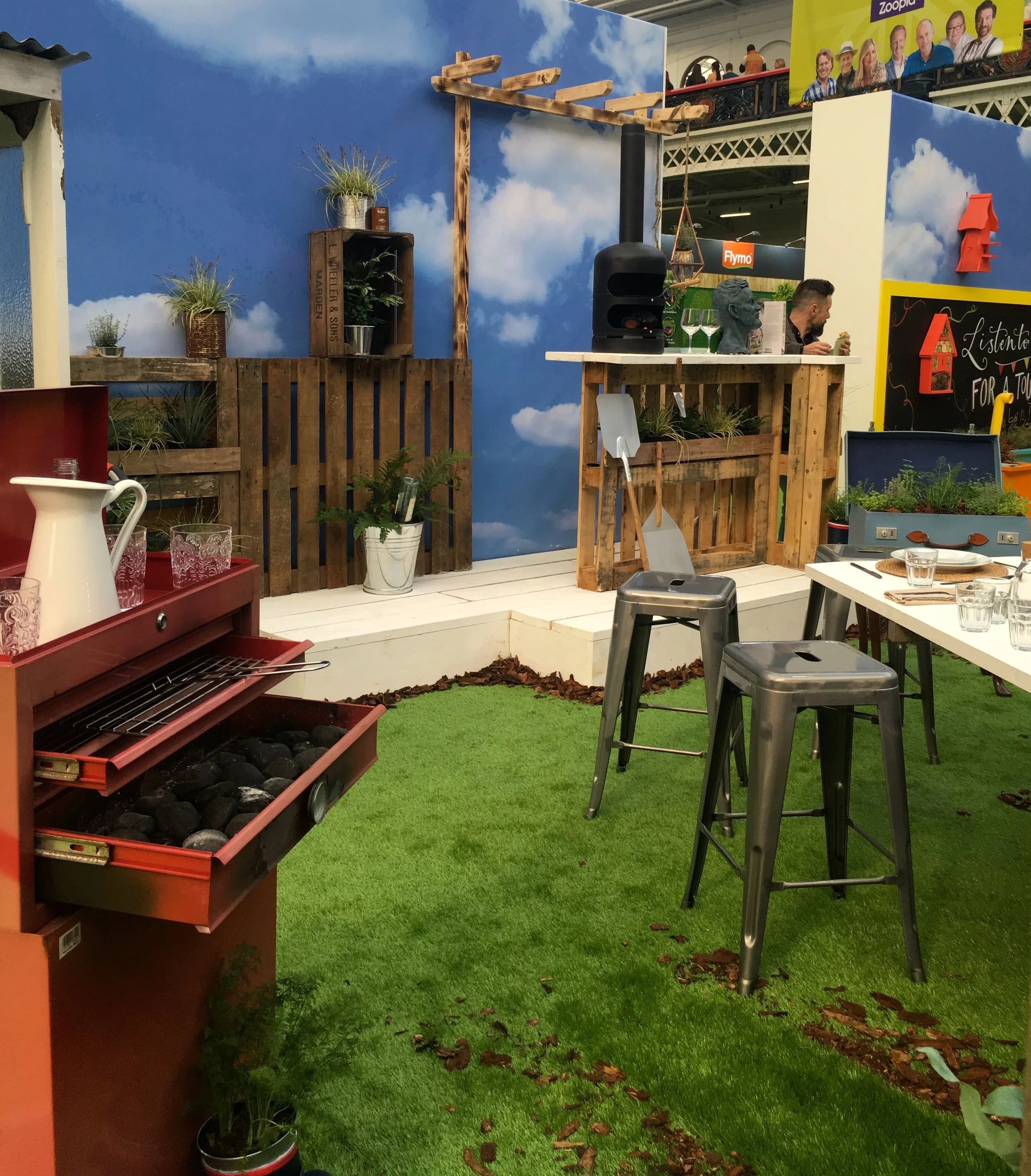
That old tool trolley isn’t what it seems either - it’s a barbeque of course. And while storage is always important everywhere, so is having a functional and attractive dining area. Some planks laid across a wooden frame have easily sorted that - that’s definitely something to remember and reuse at some point.

Storage in a garden is always important
Planks forming  a stylish dining space

You didn’t believe me when I said it was a barbeque did you? Here you go…

Can you spot the double Max McMurdo profile?

It was definitely my favourite garden, and while the planting is quite subtle, it’s there thought, and as we know all good gardens are based on a good structure.

What do you think? For me, there’s memories, inspiration and so many things to see in each and every one of these photos. I’m only sorry there wasn’t more time to enjoy the space and take full advantage of the hospitality laid on!

PoCoLo