The kitchens at Belvoir Castle

I don’t know about you, but I find kitchens in large stately homes fascinating, and those in castles even more so. Above stairs at Belvoir was fantastic, but below stairs even more so - maybe it’s because I know my place, or maybe its the industriousness of them, but I know they’re always worth a look. The old kitchen at Belvoir Castle was at the centre of a series of rooms which includes larders, stores and rooms for the senior kitchen staff.

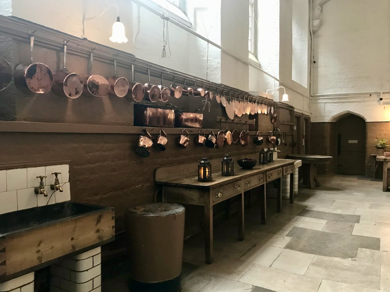
a look along the kitchen with a wooden sink, freestanding wooden table and copper saucepans hanging along the wall

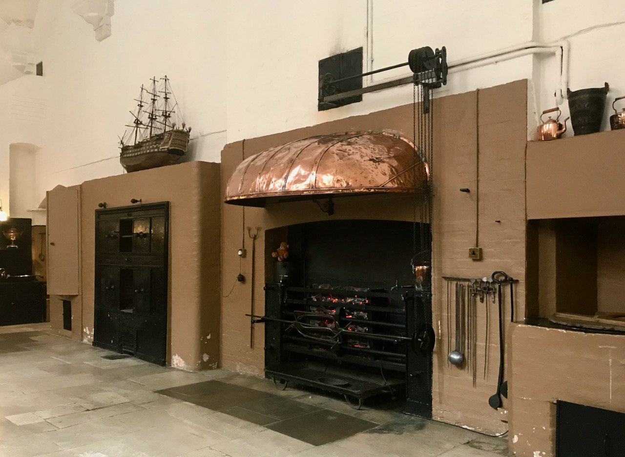
In this kitchen there were thirty plus staff preparing meals for the family, guests and the staff. It doesn’t bear to think how much food and drink was prepared in this space with its coal fired ranges and glorious copper pots and pans. And let’s not even think about keeping it or those pans absolutely gleaming.

the ovens along one side of the kitchen with an open fire with a large copper 'hood'

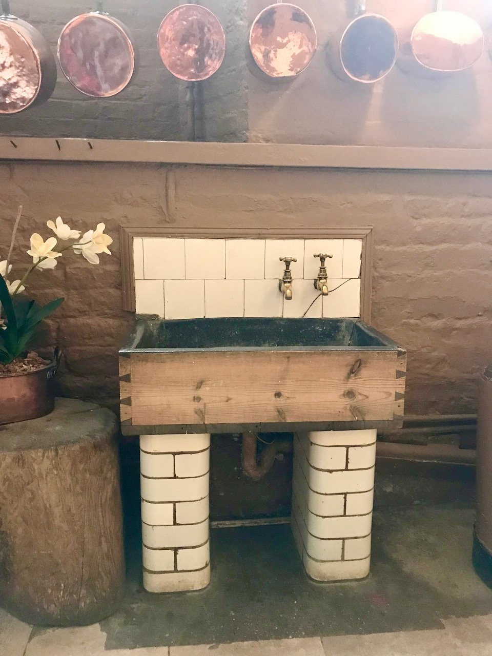
The simplicity of the wooden lead-lined sink on tiled pillars tell its own story - and can most probably tell us many, many stories of its own.

a wooden lead lined sink on tiled pillars with two taps out of the tiled splashback
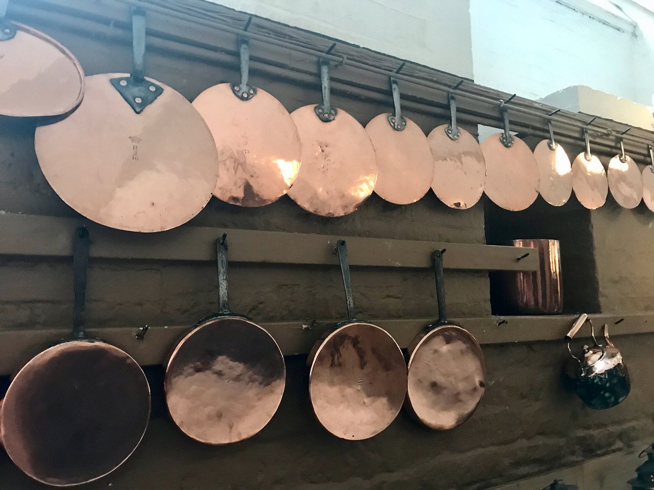
copper pans hanging on a brown wall
large copper urns in the background, in the foreground a large wooden kitchen table with 'fake' food - fruit, strawberry tarts

One of the other rooms that was open to visit was The Pastry, which had a dual purpose. For what it’s named after - there’s a marble slab set below the window, which I don’t seem to have captured, but that was designed to provide a cool, dry and calm area where the cook could prepare delicate pastries and more I’m sure.

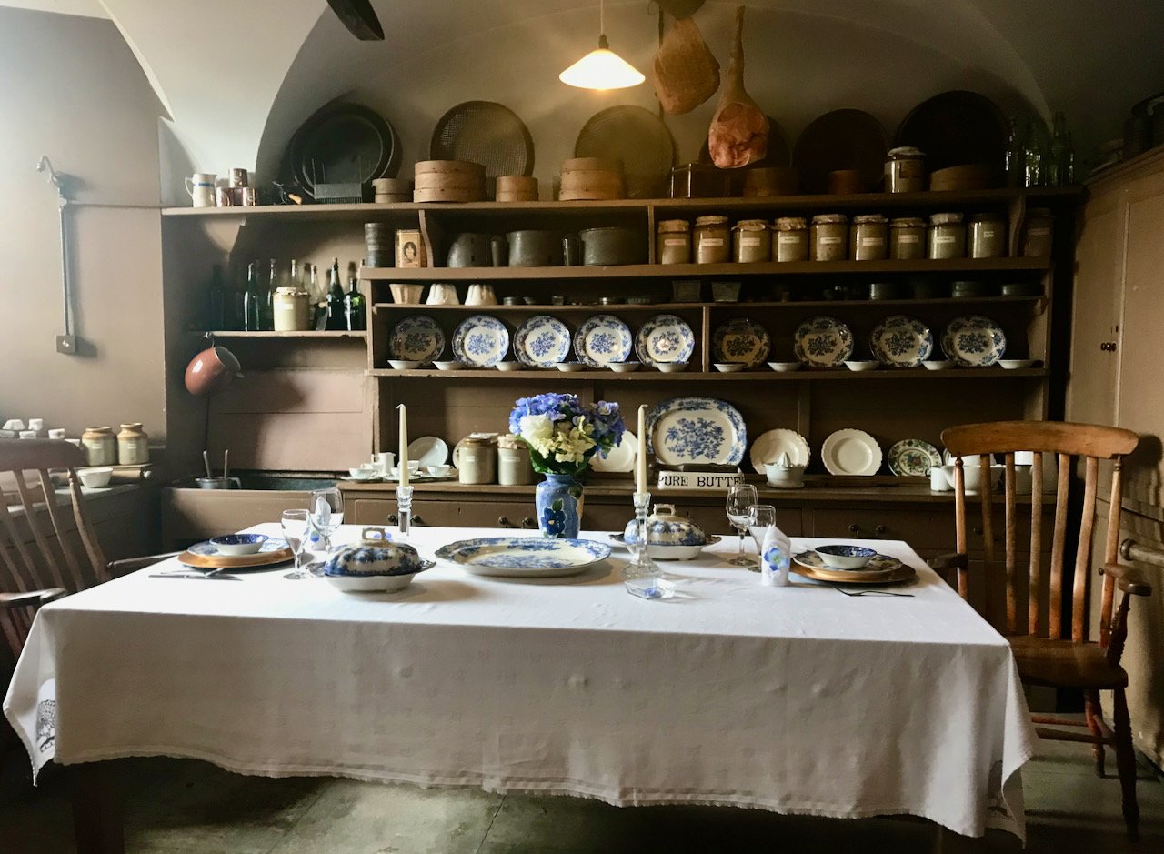
a separate side room with a table laid with blue/white crockery.  A dresser in the background with more crockery, storage jars and bottles

The room was also used as a space for the cook and kitchenmaids as a dining room and rest room, and it looks much more like the country kitchens we’re more familiar with - complete with some metal signs and tins that I’d be very happy to own myself.

a metal lyons tea sign and a breakfast biscuit tin on top of the cupboards
a close up of the end of the table laid with a place setting, and the wooden carver chair pulled out the dresser with blue/white crockery displayed in a symmetrical pattern in the background

Seeing these spaces empty is as I said before fascinating, and I bet even my most realistic visualisations are a patch on what life in kitchens like these were really like. I think I much prefer being able to imagine what it might be like, rather than experiencing them first hand - cooking meals for more than two people can be stressful enough, especially as there’s been really little opportunity to do that over the past few years.

I was featured on Blogger Showcase

An open-shelved delight

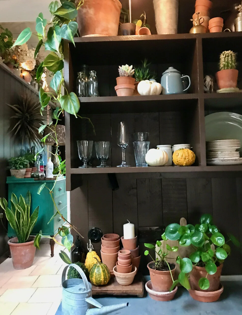
When we arrived at our holiday cottage in Norfolk last October this was the view that met us as we opened the door, quite breathtaking isn’t it?

open shelves galore

We knew the cottage would look great, but we perhaps weren’t expecting our breath to be taken quite so much away. I like the idea of open shelving in a kitchen, but I know that mine would rarely look as pretty as these! But I was hopeful that for a few days, and in someone else’s space, I wouldn’t mess it up too much.

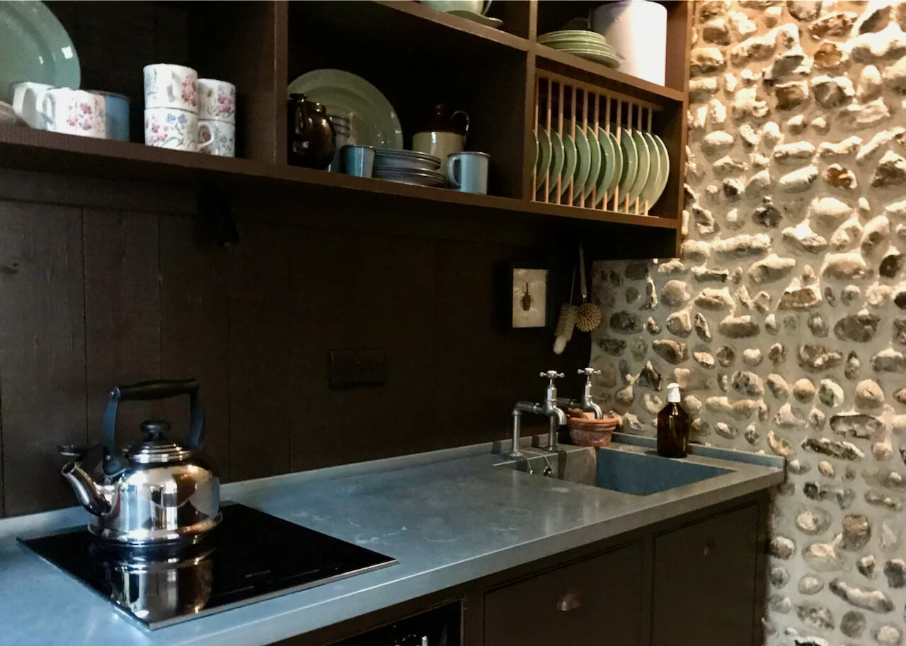
a sink in a zinc worktop

I was also quite taken with the zinc worktop, and it’s something I’d have in a future kitchen. Perhaps not on every worktop, but I can see the advantages of incorporating it somewhere. I could get MOH to make even more pastry - one of his specialities - if he had such a space couldn’t I? I’m less good at pastry, I think because my hands are too hot, but that works for bread making, which is very much more my thing.

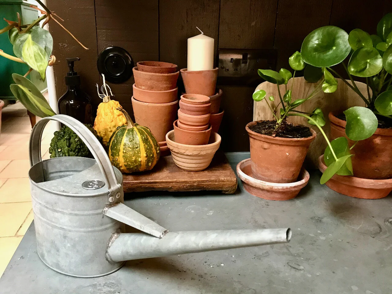
pots pumpkins and a watering can

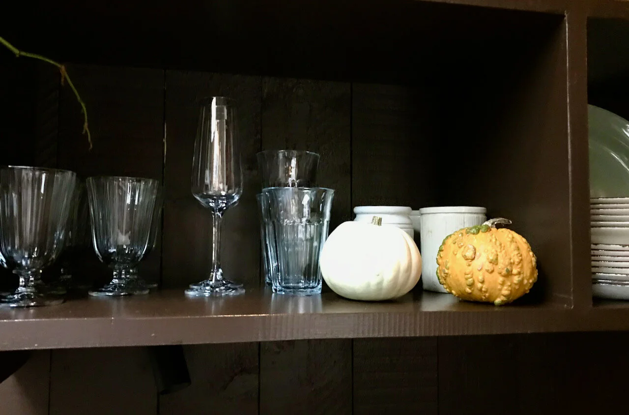
The worktops looked great, but in reality for longer term living all the ‘staging’ probably wasn’t that practical. Though adding the gourds and pumpkins was a really lovely touch and one that’s do-able and very repeatable in my own kitchen. I just need to remember - or find this post again - in the autumn.

glasses and baby pumpkins

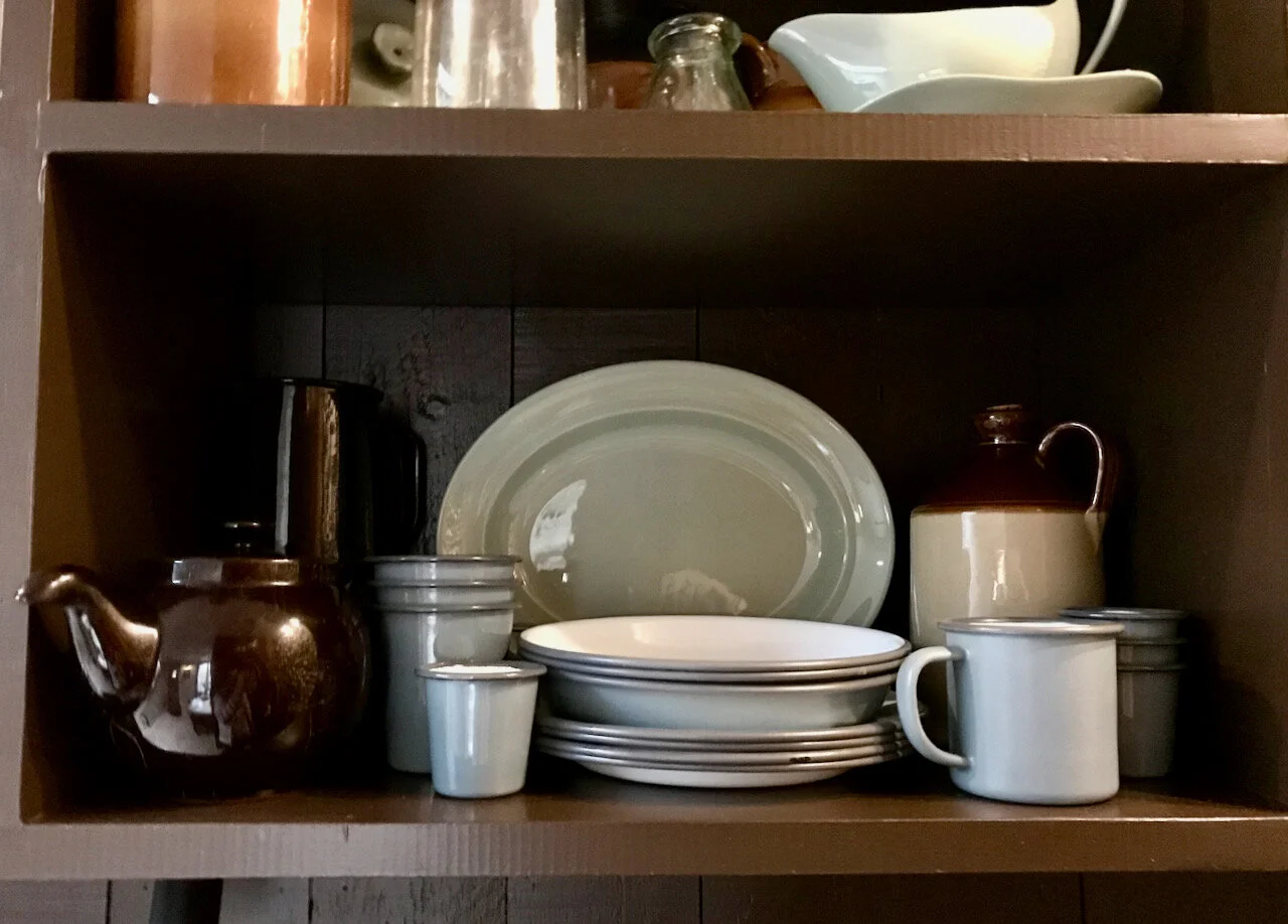
The stack of enamelware reminded me how much I like enamelware, and reminded me of what I have at home, and rarely use. This was a soft grey and white variety, whereas mine is white with the blue trim - quite the classic look. I do like a classic, as my Le Creuset is the traditional orange sort too. Having been reminded of the enamelware’s beauty I promised myself to make more use of my own, and I’ve added to it too. MOH now has some espresso cups, and I’ve my eye on a roasting set too, if it ever comes back in stock.

teapot, stack of plates and enamel mugs
pretty hand painted floral mugs

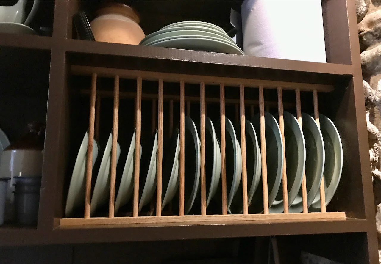
The mix of practical and pretty really appealed to me. I don’t think it’s much of a coincidence that I’ve also bought some pretty and hand painted coffee cups either. And even though the look is modern, there were many traditional elements, like this drying plate rack above the sink.

plates above the sink
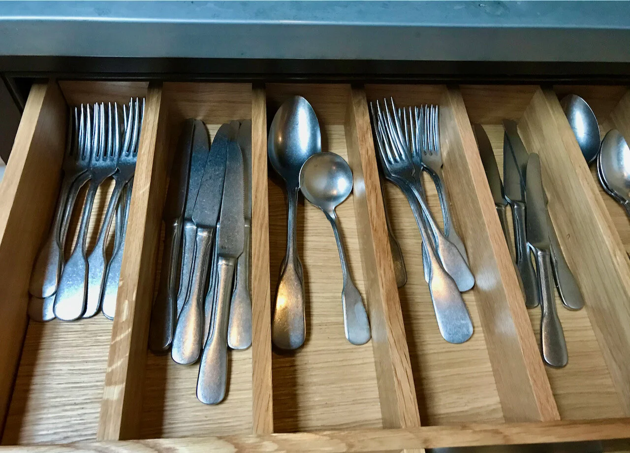
cutlery in a drawer

And I bet like me, you weren’t really surprised to discover the style of the cutlery in the cutlery drawer.

PoCoLo

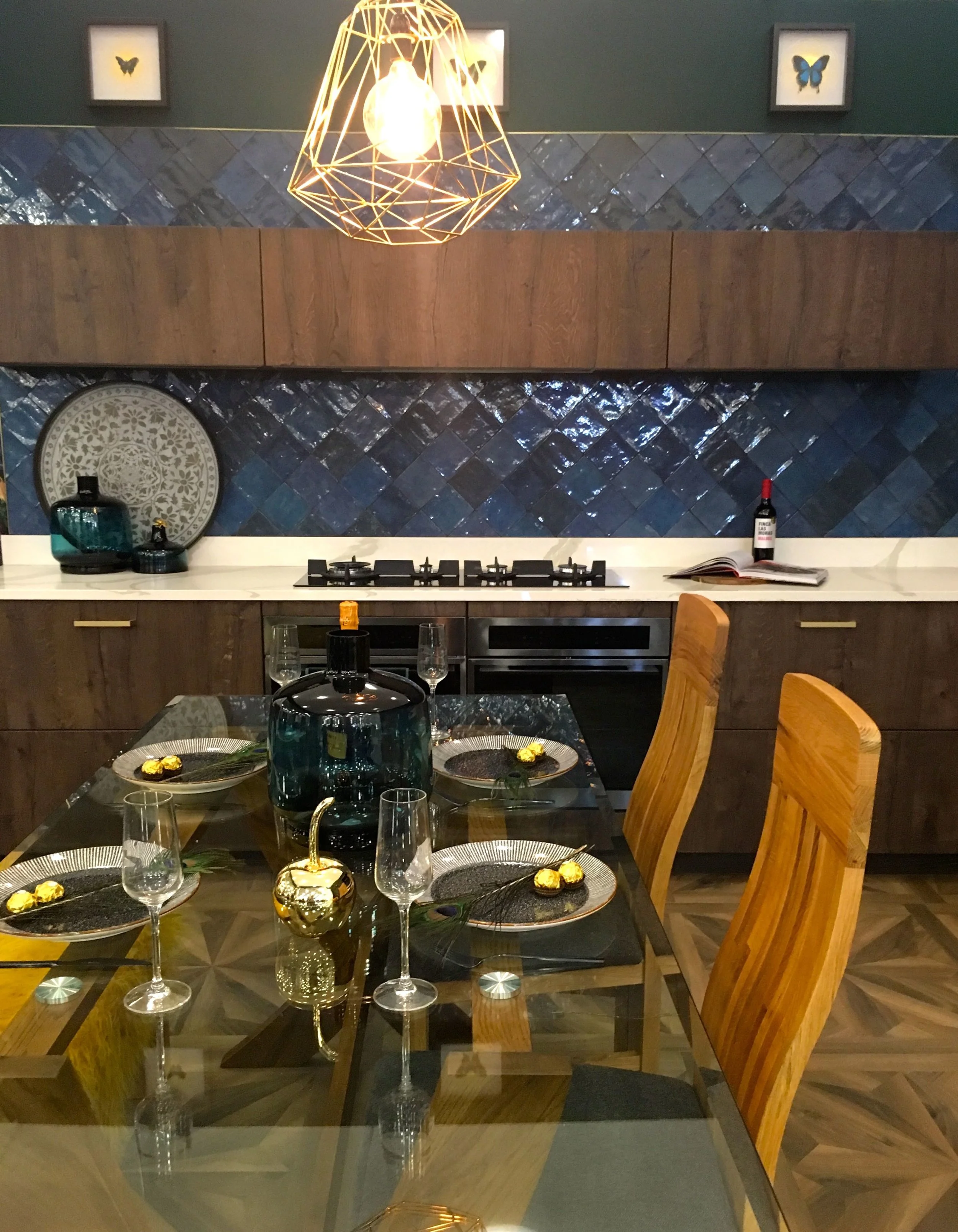
Big Ideas: A cocooning kitchen

I can always tell how much I like a room set by the number of photos I take, and you can tell from this post I was rather keen on this one, and I haven’t included all the ones I have.

The Big Ideas for this cocooning kitchen are:

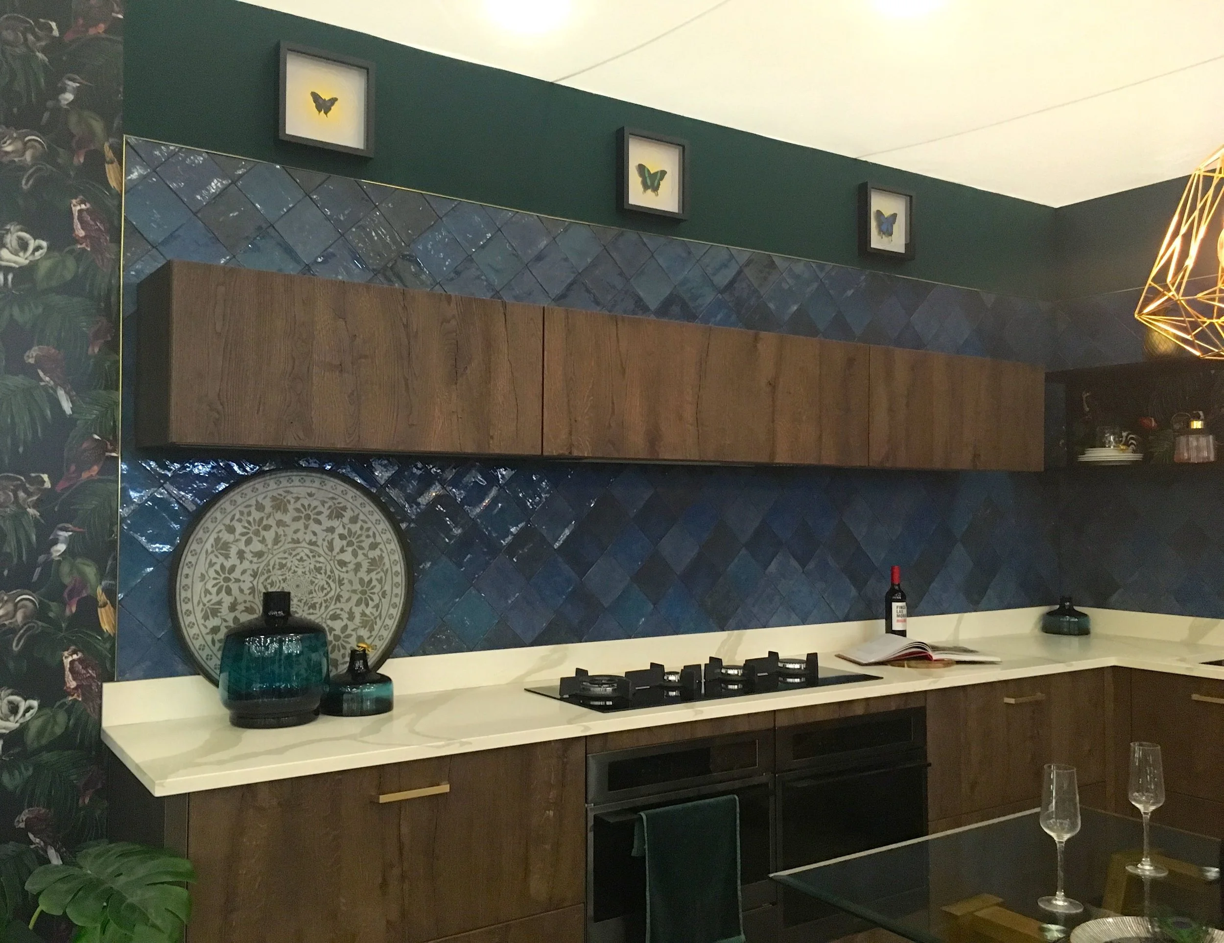
  1. Dark & Dreamy, with the refined textures and handcrafted feel

  2. Timeless flooring, decorative parquet always has the maximum impact

  3. Tropical elements, whether that’s focal point plants, or the wallpaper, but it’s a great way to personalise your space

  4. Gold accents add a luxurious touch and bring a boutique look

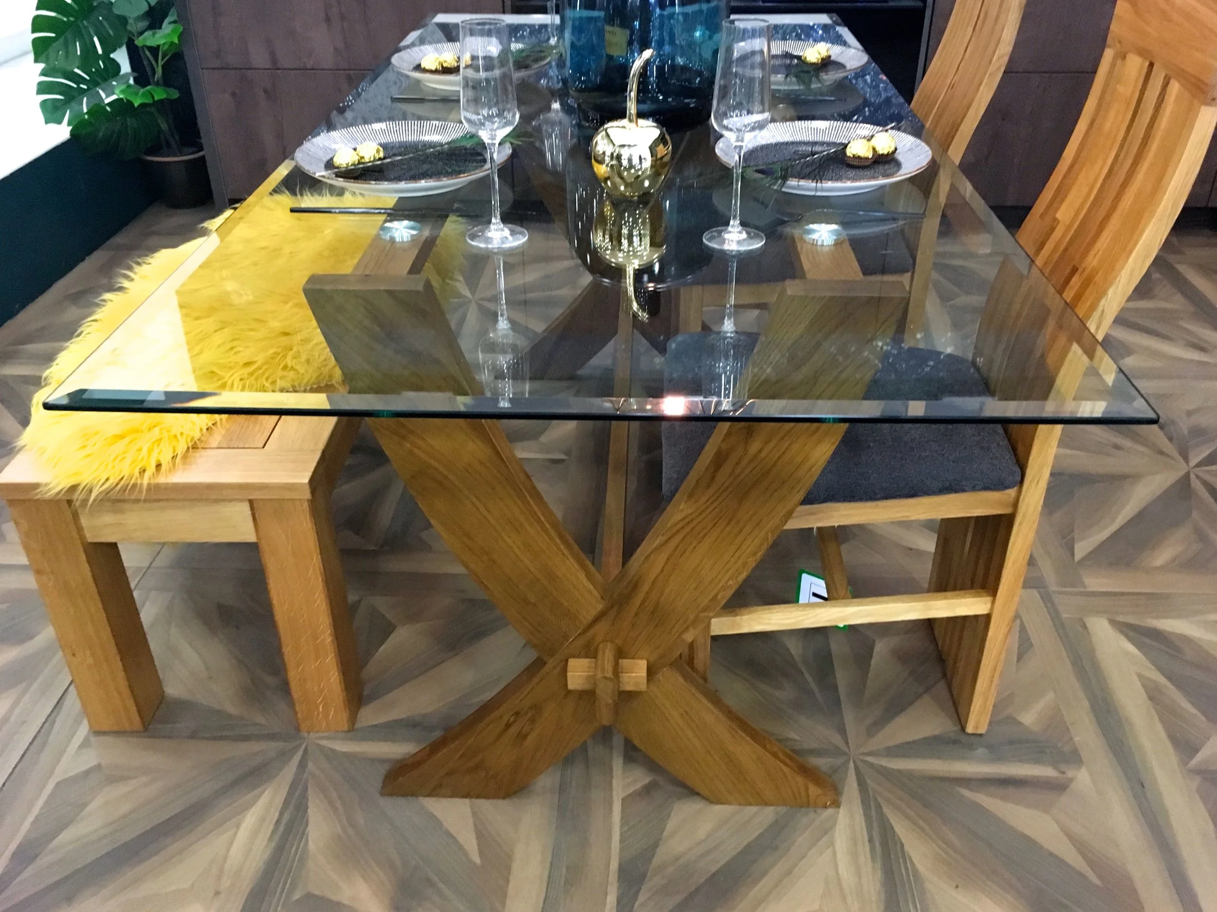
  5. Wine & Dine, the bench style seating is great for entertaining.

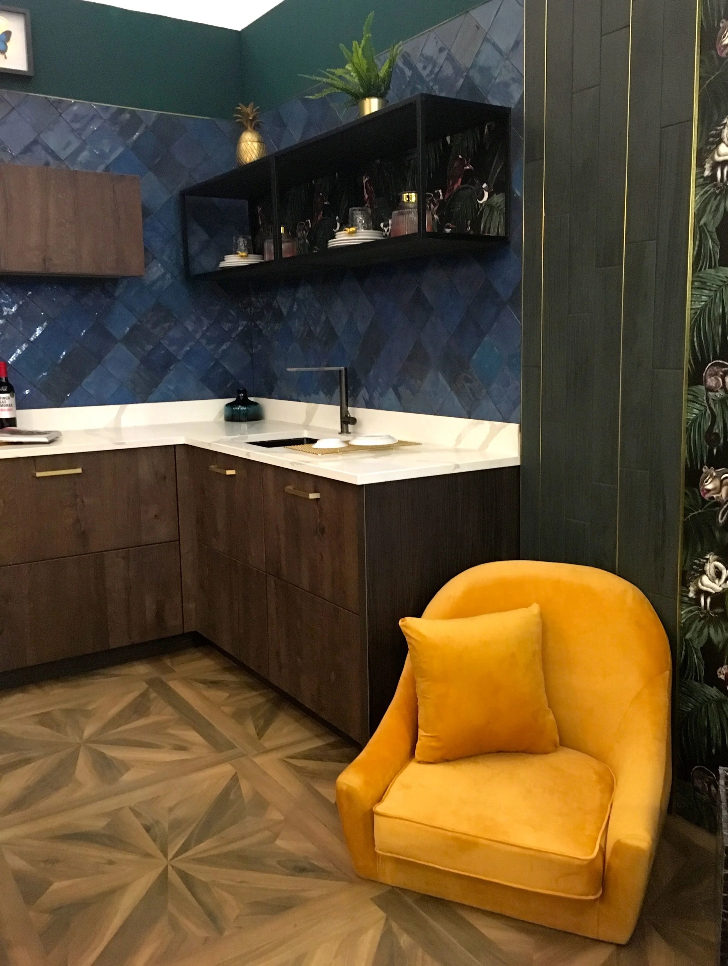
dark and moody and a pop of colour

Just look at the darkness of the colours, the texture of the tiles, the pattern on the floor and the pop of colour from the chair. Hang on, at first I didn’t notice anything wrong, but looking again the chair looked a little unusual. Stepping back, it was reassuring to know that even for room sets there are hiccups.
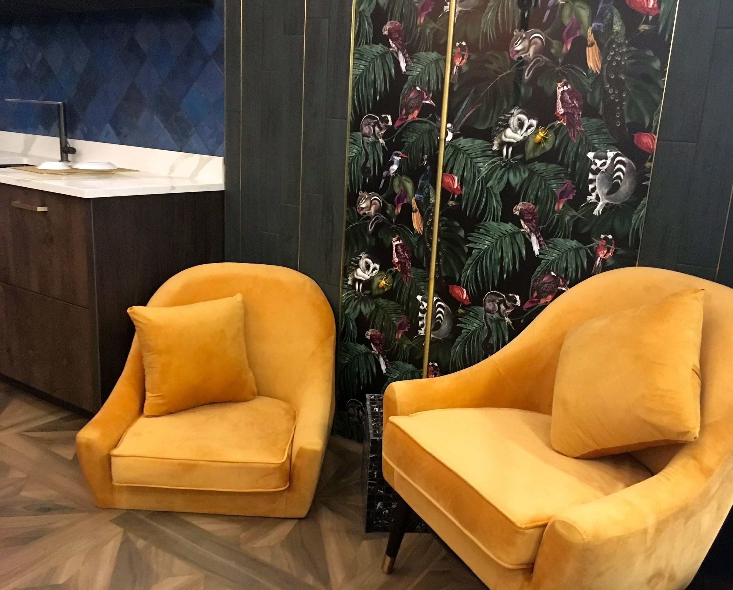
SOMETHING’S MISSING…

SOMETHING’S MISSING…

Although the legless chair does have a certain air of comfort about it!

a dining space in the kitchen

There’s wood flooring, on the cupboards and in the dining space, along with the touches of gold, on the table and hanging above it.
stools, table legs and chairs

I think it’s the tiles that make this work, they reflect light, add texture and look simply gorgeous. Clearly it’s not a proper kitchen, I mean where’s the kettle?

the kitchen area

The wallpaper too adds some quirkiness and even though it matches the dark and dreamy brief, it’s also colourful and quirky.

a close up of the wallpaper

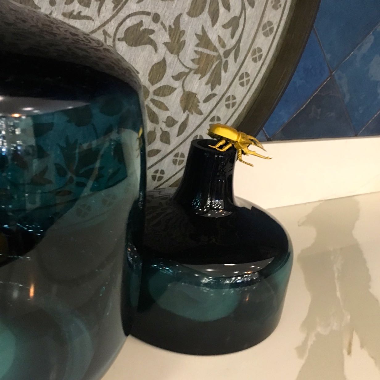
It might not be an obvious choice of wallpaper for a kitchen, but it works doesn’t it? Though you do have to be careful for the insects…

insects everywhere

What do you think?

PoCoLo