It's been a little while since my post on loving maps, and the fear of wallpaper but the good news is the map is on the wall, and I love it. Things didn't turn out quite as I planned for the actual putting it on the wall part, and so I didn't have to face my fear of wallpapering after all.
I was pleasantly surprised at how quickly my Wallsauce mural arrived, in fact I couldn't believe it was here just a few days after I'd made my choice, they most certainly don't hang about. It arrived well packaged too, in a sturdy cardboard tube within a wallpaper sized cardboard box. There was wallpaper paste too, and as I discovered a visual plan as well as some written instructions, which are also available online.
THE MASTERPLAN
But because life happens we needed to change our plans of tackling this ourselves. I'm certain we made the right decision as not only were we nervous wallpaperers but our attention, and time, has been taken up by those life events I mentioned on Monday, and neither of us wanted to ruin, or even slightly mess up, what is quite honestly, beautiful wallpaper.
And so we asked our conservatory builders to do the job for us, or the decorator anyway - I use builders as a generic term, and were confident they were up to the job, I wouldn't have asked otherwise. They were just as keen as us to see what was inside the package that arrived, and so we peeked. My first view was of Alaska (from Panel 1 of the plan above), and I was smitten, although in truth I think it could have been anywhere and I'd have had the same reaction, because as I said in my first post, because, well maps.
Now the builders had seen the wallpaper, they were keen to see the wall it was going on, which was the tricky bit, as we'd yet to tell them it was the curved wall around our spiral staircase. Their faces were a picture, and while they might have been a little incredulous they were soon checking the wall for what prep needed to be done.
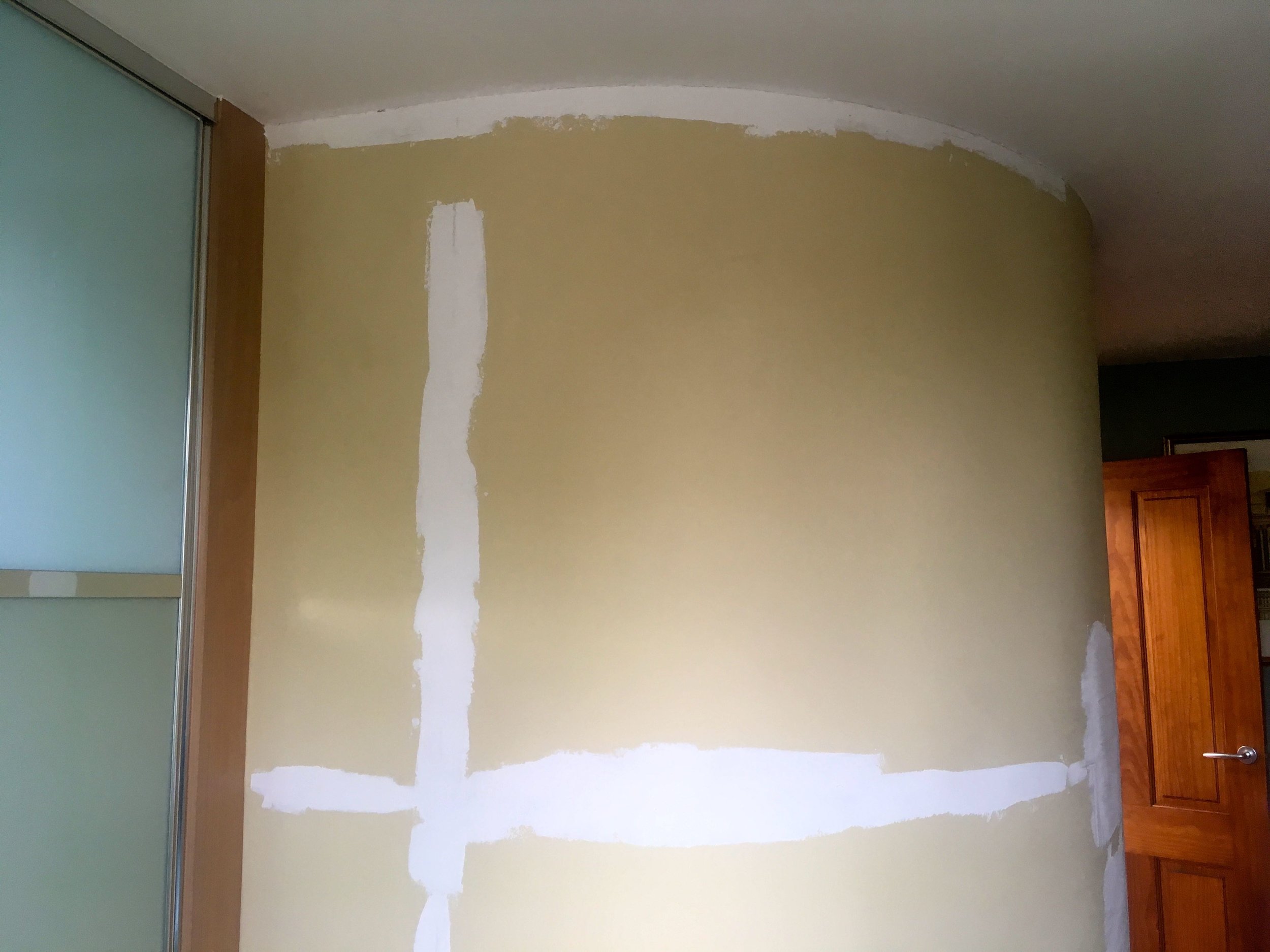
I know from dad that it's all in the preparation, so I wasn't surprised to come home to a wall with some extra filler. Actually it was great to see tradesmen taking pride in their work, reading the instructions that came with the wallpaper, consulting with us and confident in their skills to do a job well, that we'd all be happy with.
FIRST THE FILLER, THEN THE DUST
But of course where filler goes, dust follows. Luckily I'd thought this through and moved the duvet and as much as I could out of the room. The room was covered with plastic sheets and dust sheets, but my reasoning was if it's not there in the first place it's not going to get dusty, is it? And that's something I'd recommend, even if a builder says there'll be no dust. As it's likely your definition of no dust will be different to theirs!
The result which wowed
I'd been keen to follow progress as the paper went up, and cups of tea were made, proffered and gratefully received so I could keep a bit of an eye on proceedings. And progress was quick, relatively speaking (and definitely much quicker than I would have done) and the paper, and the design got the thumbs up from the builder too.
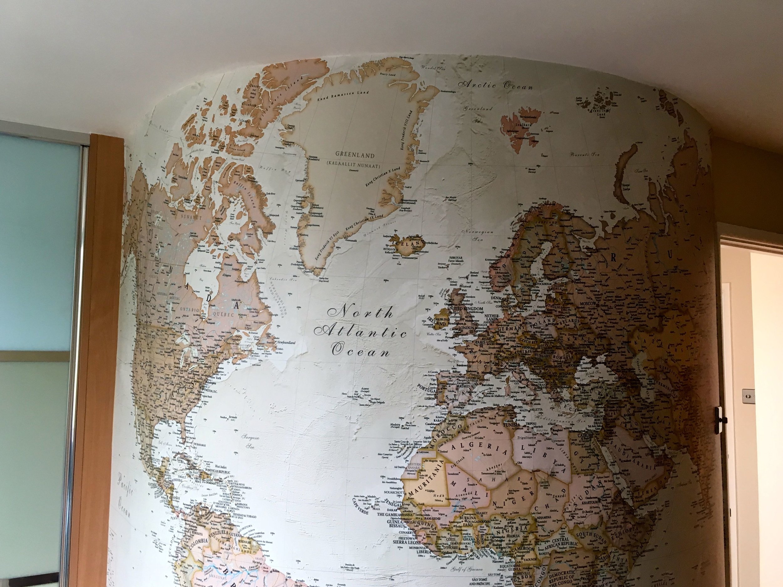
Even among the dust and detritus it was clear this was something spectacular. I hadn't thought how having a map on a curved wall would give it a "globe" effect, but of course now it's been pointed out I'm going to claim that as the idea all along, what do you think?
In my first post I shared my potential choices from the world map wallpaper section on the Wallsauce site, but didn't share which one I'd chosen. This is the Antique world map and is the perfect choice for our room as it tones well with the wardrobe, and as both are things that I expect to be around for some time, that's a good thing.
The more eagle-eyed among you will have already spotted that Australia and New Zealand are missing (sorry guys!) - my wall just wasn't big enough to get you in and I chose to include all of the Americas, rather than cutting that off of the final design. It's nothing personal, but as we're more likely to travel to the States it made sense to have that on our wall, as I'm pretty sure this wall is now going to become a key tool in our travel planning,
I wasn't expecting to be able to choose where to make the cut on the design, but thinking about it logically it makes sense as not all walls will be the same size, and not all images work if stretched to peculiar dimensions. In fact the customisable-ness of the image size and position is one of the pluses, and imagine how this could work if you chose your own image. It was also easy to do on the site and to check your design.
You'll see that our map has a textured effect (look to the right of the text South Atlantic Ocean in the photo below) and that's in the wallpaper design rather than actually being raised, and it's very effective and I think adds to the overall result.
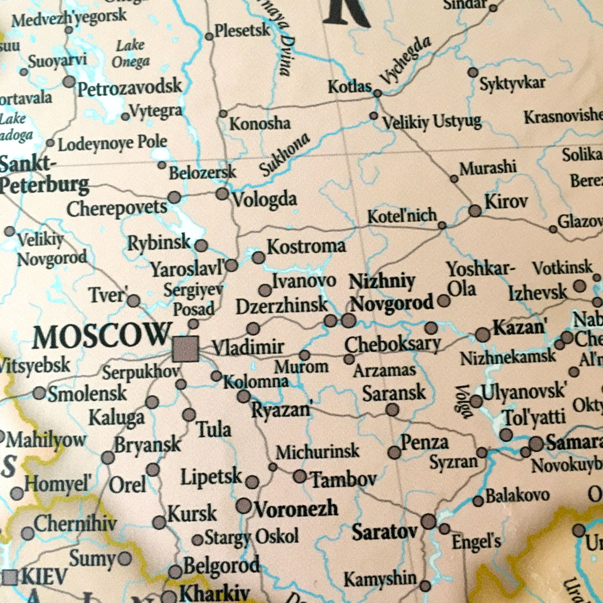
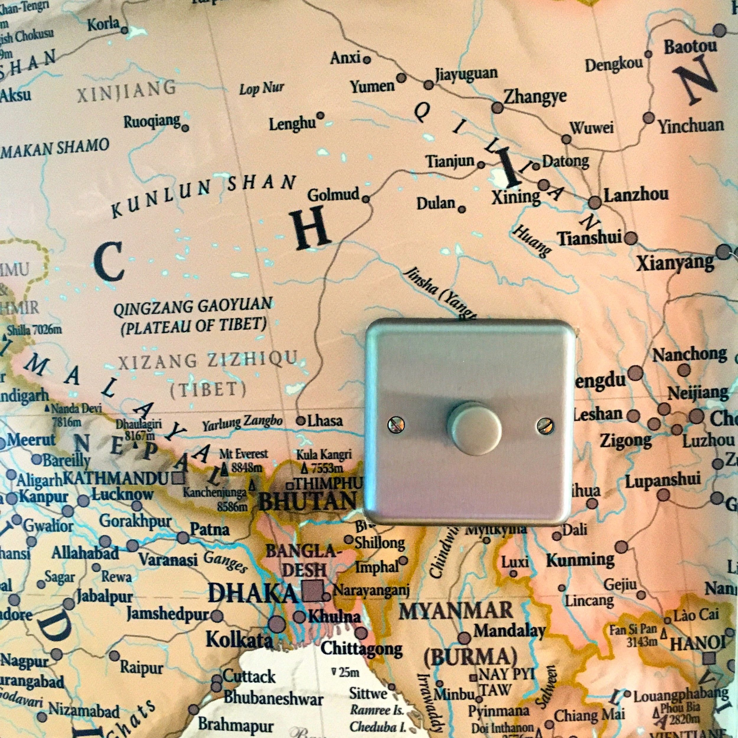
I mentioned that we would most likely use this while planning our trips, but it's already had its first use when at the weekend I looked to see where England's game against Panama was taking place in the World Cup. You can clearly see Nizhniy Novgorod to the right of Moscow in the photo on the left below, and my light switch in China in the photo on the right.
There's going to be many happy hours poring over this map, which has entirely transformed the room. You've probably worked out I'm completely thrilled with it already and impressed with the quality and service I received - and I am - but I'm keen to know if you have, or would consider mural wallpaper in your house, and of course what do you think of my wall.
* This is a collaborative post but all views and opinions are my own.
