Today I’m taking a quick look at the top posts from this year, and in a slight change from last year there’s two lists. The main part of the post focuses on the popular posts which were created this year, then finish with a list of the top posts created anytime, pleasingly some of my 2018 posts are on that list too.
And yes, the IKEA hack post features again - but despite my reminder to myself in last year’s post I didn’t manage any more this year. So, let’s start with this year’s posts.
1 A map on my wall
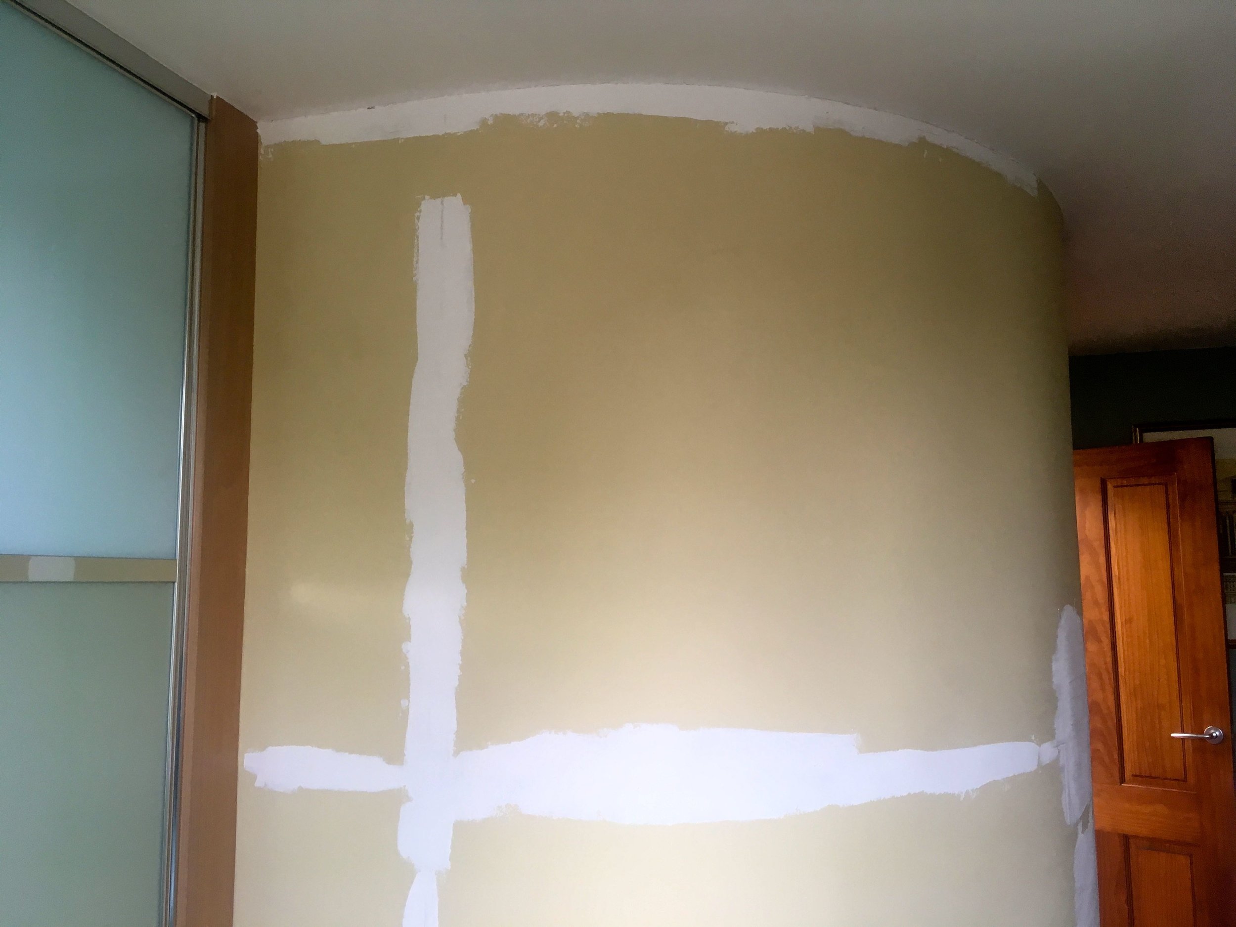
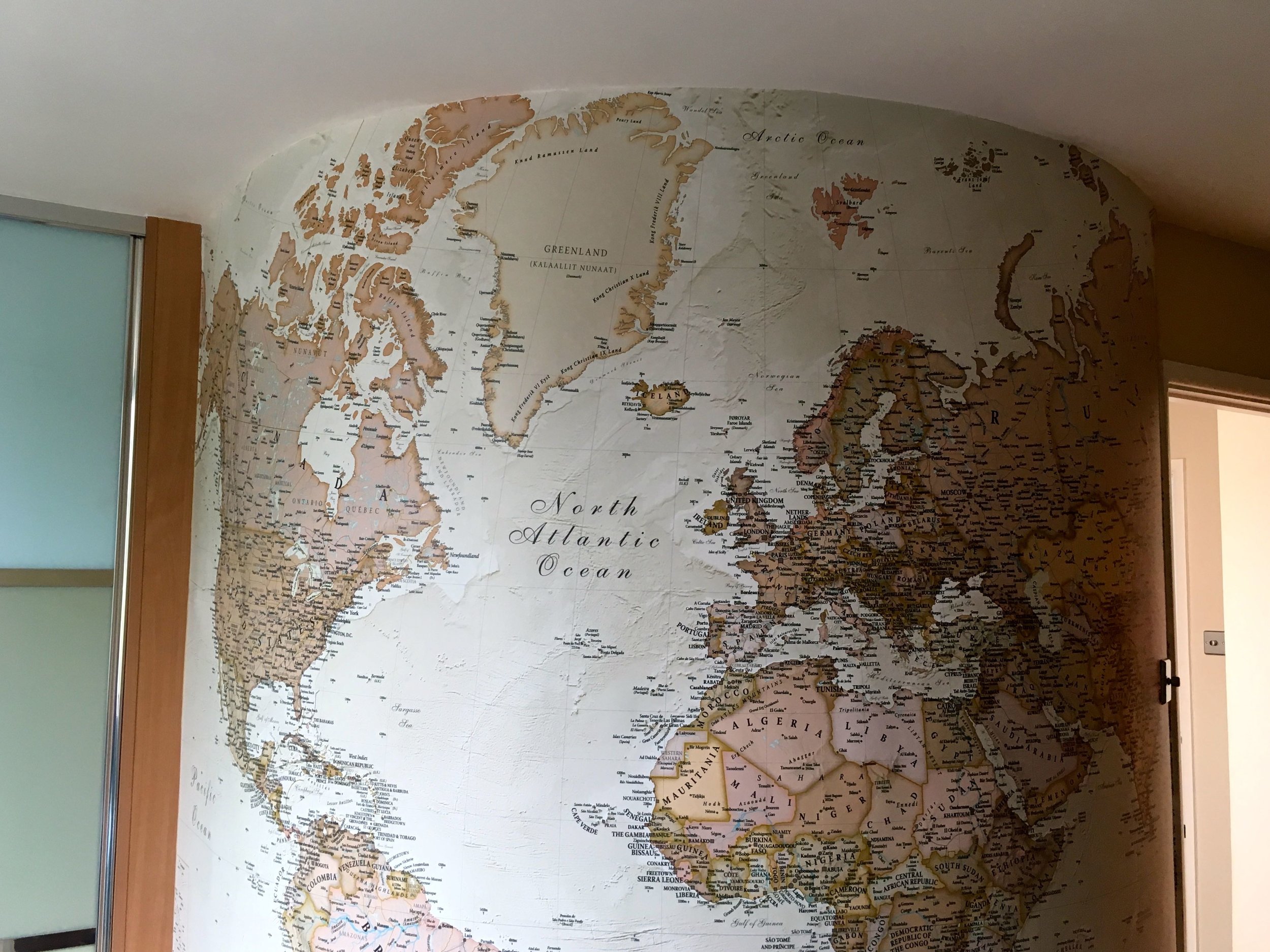
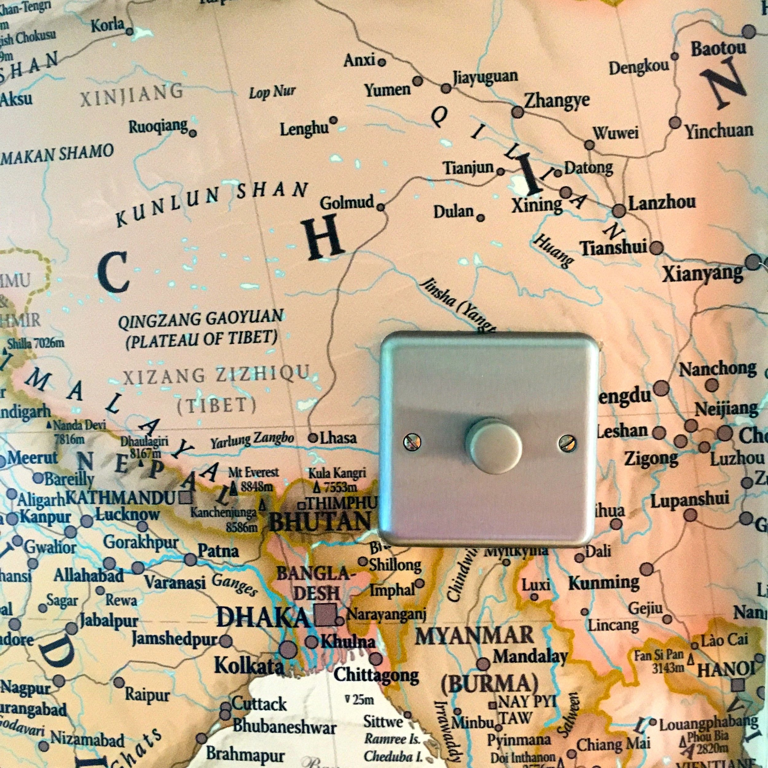
I’m pleased this post tops the list because it’s high on my list of favourites too, so you’re likely to see it on that post too. I’m not apologising for that though as the mural wallpaper has transformed the room and I still catch myself heading up there for a peek, and perhaps a virtual stroke. It’s also been quite a hit with our visitors too, even if the decorators were slightly less than pleased when they learnt it was destined for our curved wall.
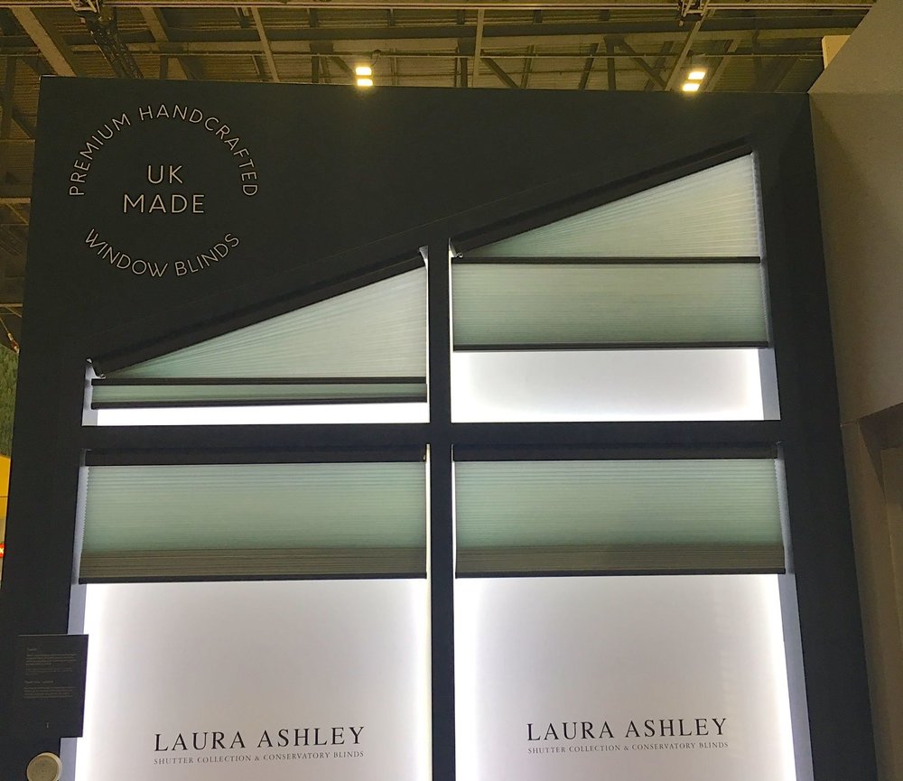
2 Blinds and shutters with Thomas Sanderson
I’m surprised this post is so high up the list on views, but then again Thomas Sanderson is a well established and well respected company. From talking to their people on the stand at Grand Designs it was clear they have a passion, and plenty of knowledge, for window coverings and they’re worth a look if you’re after blinds for your conservatory, they have more than you’d think and the technological advances are amazing.
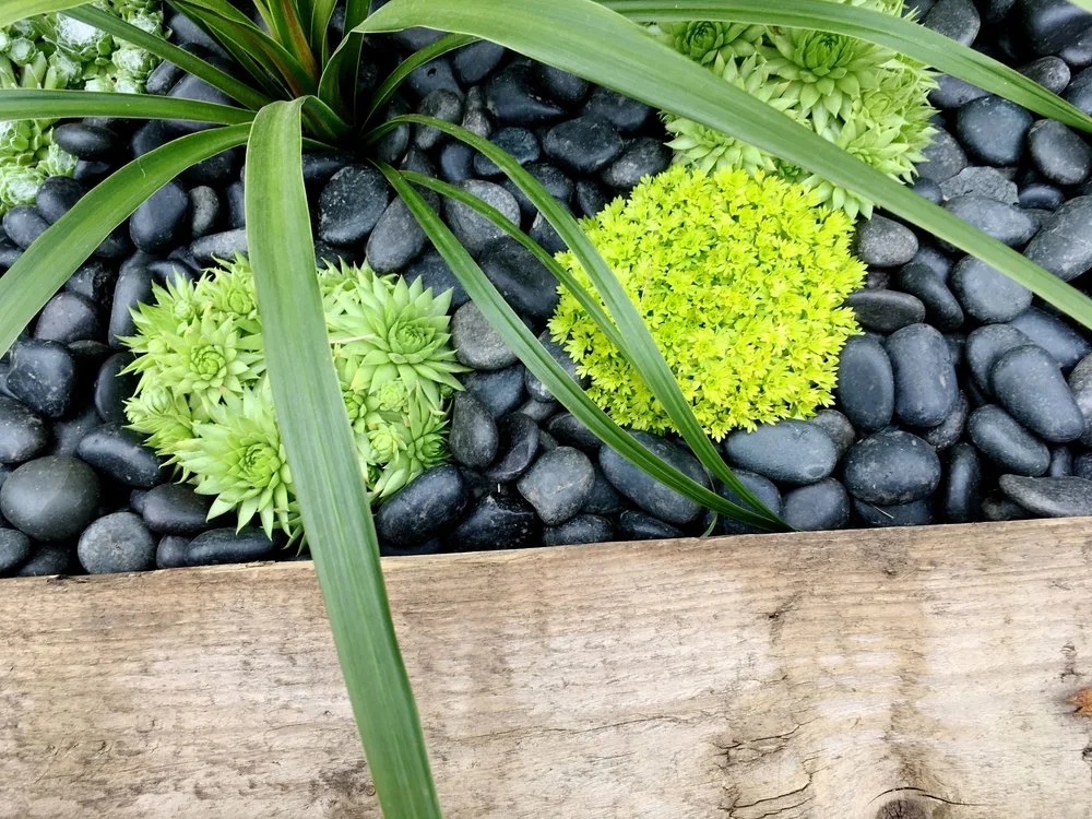
3 Our space in space
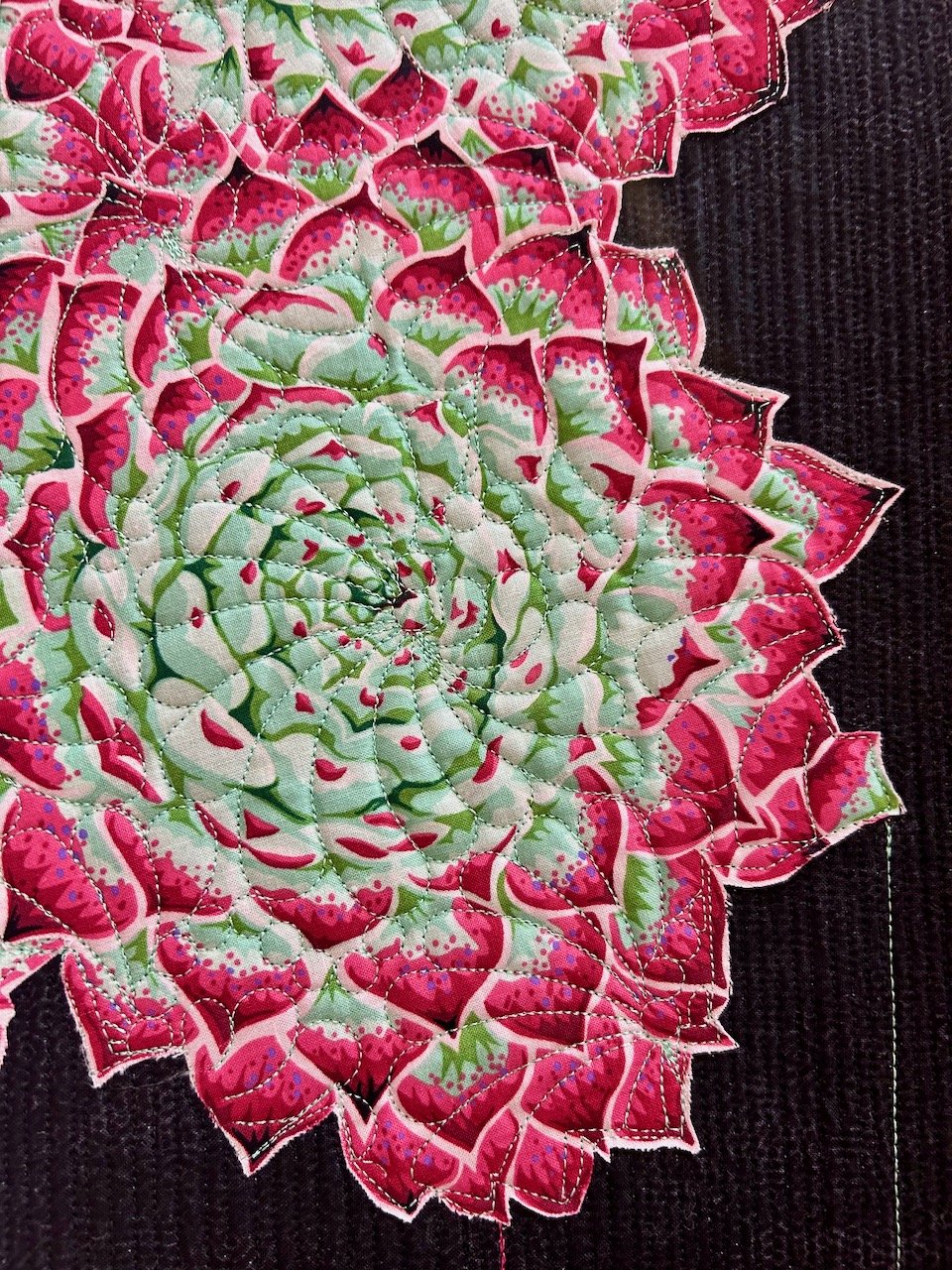
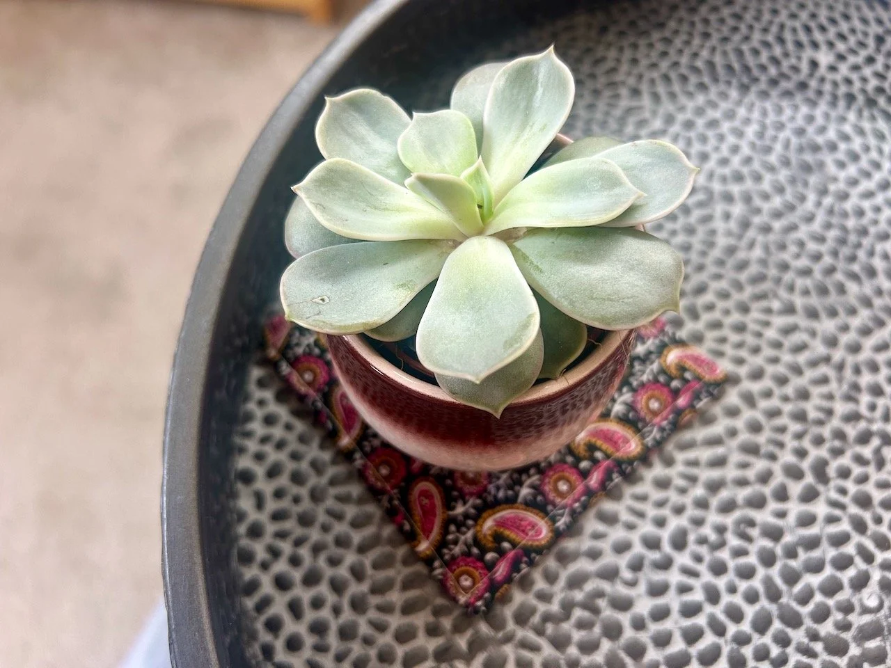
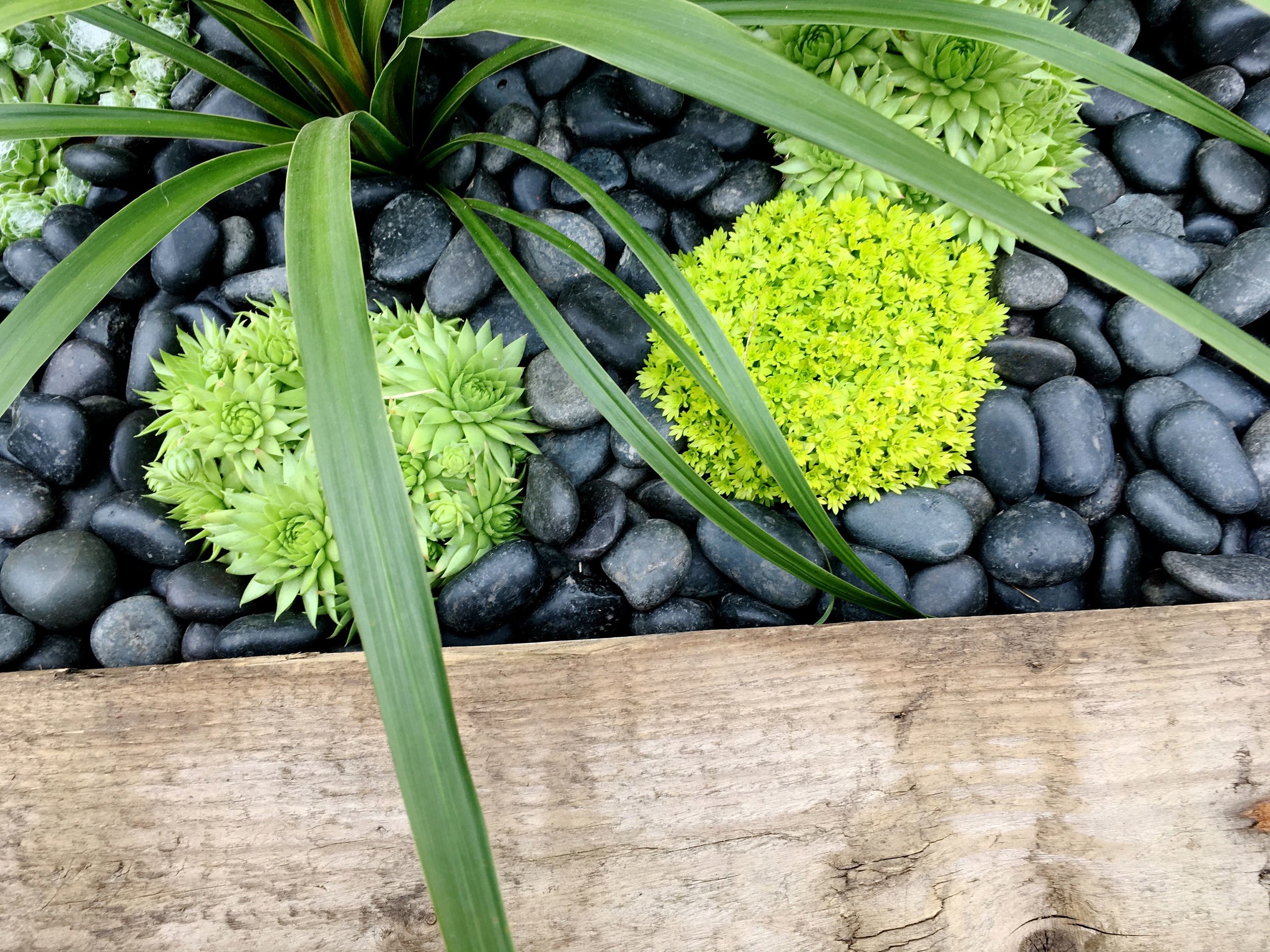
This Beautiful Border at Gardeners’ World Live in Birmingham had more to it than first met the eye with its connection to the Voyager mission in 1990. And the Dr Who tardis, is the blue dot that’s home, that’s us - you’ll have to check out the post for that photo, because I couldn’t resist sharing some bright green succulents against the grey of the slate.
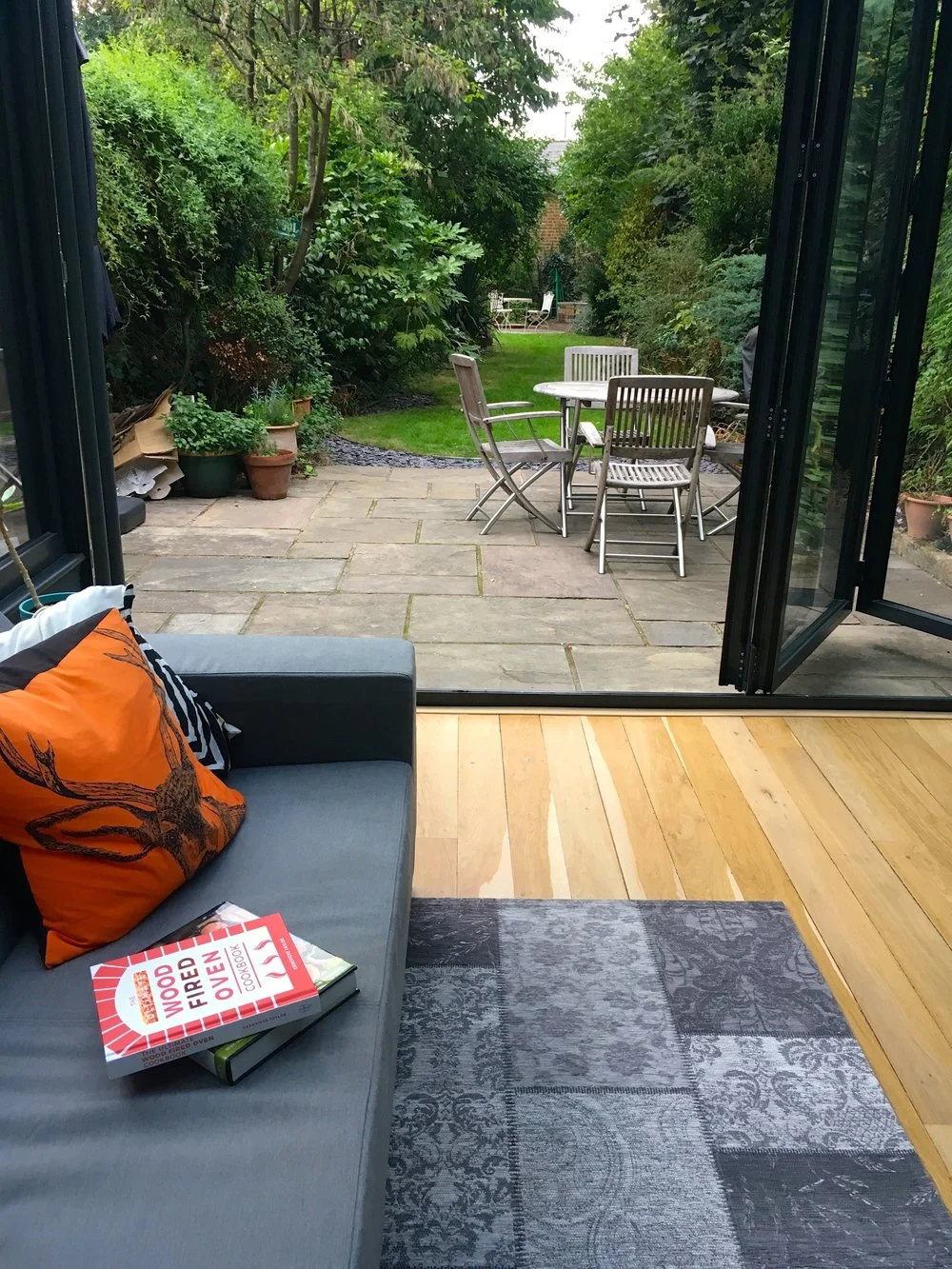
4 A great summer to enjoy our redecorated conservatory
We’ve only managed two house projects this year, the wallpaper which is at the top of this list, and the larger conservatory revamp. 2018 has been a tricky year, but having this work done has made such a difference to how we use this space - and it looks great too! It’s no surprise then that this project features more than once on this list, but reassuring that the “after” is the most viewed.
5 Adding flexibility - and stools - to our dining table
What’s more is that now our revamped conservatory now matches the style of the rest of our downstairs, which while we’ve a house that was built in 1890, is much more modern. I’m keen that our furniture complements our style and each other, but doesn’t have to match exactly. That’s what I liked about these stools, they work at the dining table, but they also work in other rooms including the study, which is where they’re more usually found and brought out when we need that extra seating.
6 Hello February!
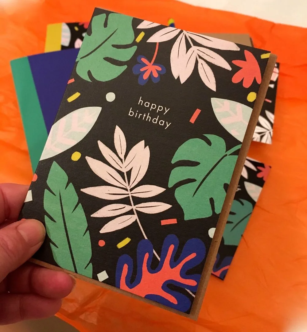
Perhaps another surprise to the top viewed list, but then again this pop of colour in February could be just what everyone needed. This post showed the contents of my February stationery subscription box, which was a gift that I very much enjoyed and I’m still making use of.
7 Our conservatory plans
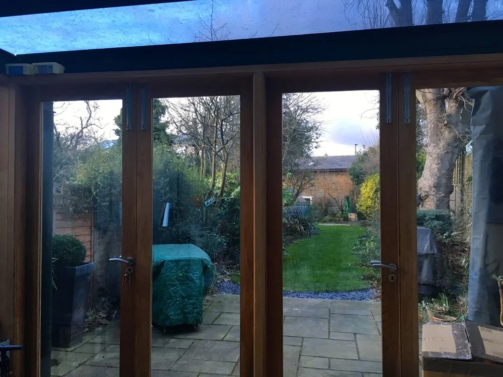
This post captures some of the before shots - note the ice cream tubs above the doors top left in the photo below, catching water from an ever increasing leak, and while it’s not the prettiest of posts, I’m glad I captured it. As well as setting out our plans, it also shows what it looked like before the work started, so it’s easy for you to see how much of a difference the bi-fold doors made, especially if they’re something you’re considering yourself. We’d come to love this conservatory, and making the change was a big one for us, but we’re so glad we did as we love it even more now, and it’s a much more usable space.
8 Those pom poms in the Botanical Bedroom
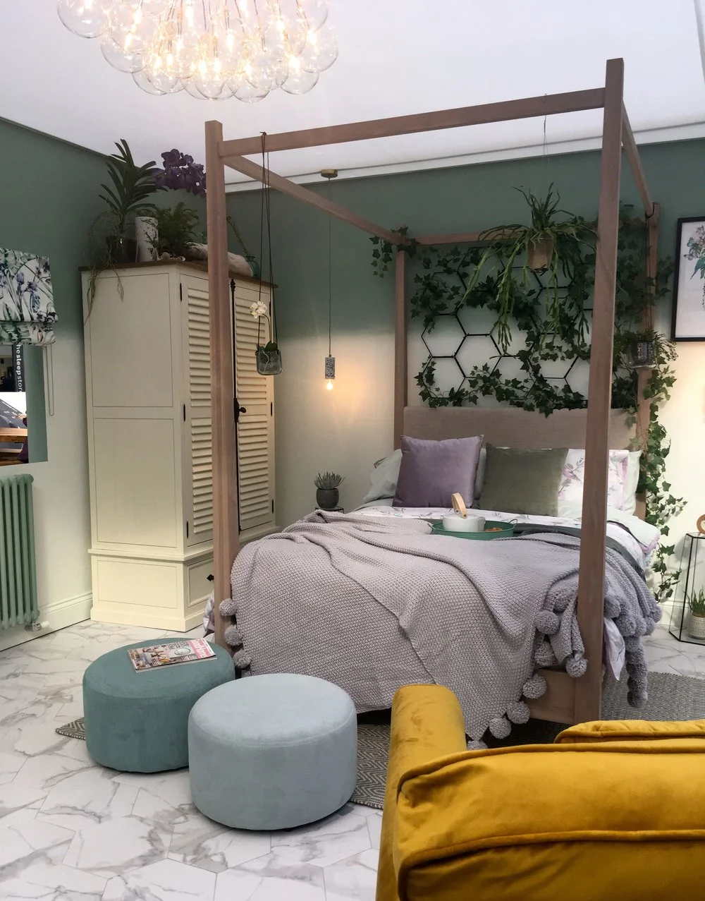
You know how much I like a show, so it’s good to see one of the room sets from this year’s Ideal Home Show in this list. The other big shows I visited this year - Grand Designs and Gardeners’ World Live - also appear on this list, so it seems you like a show as much as I do. The big thing in this bedroom was the pom pom edged throw, and I noted that they were one of the things that I saw everywhere at the show. I’m a confirmed pom pom lover, so that was good news for me and some pom pom edged cushions have snuck into a couple of rooms at home too - I’ll share more of those shortly.
9 Conservatory news - and progress!
Yes, another from the conservatory revamp - this one and in progress post, and where we had quite an open feel to the back of our house, once the oak doors had been removed. It was like this for longer than I liked as there was a mix up with the door and window delivery, which meant that I delayed posting real time updates, because, well we didn’t have a back to our house. And while it was perfectly secure, or so the builders and MOH told me, I felt much better when the doors were on. Although we did get quite used to just wandering out into the garden!
10 The final push
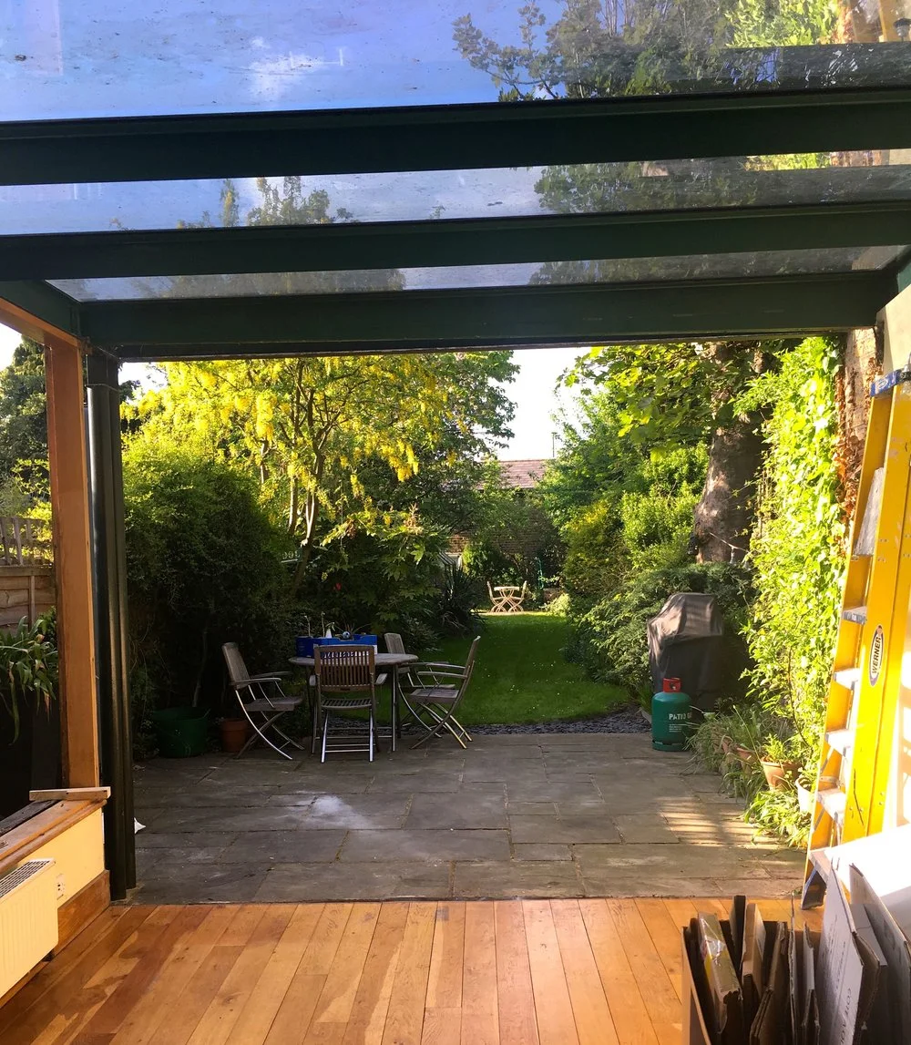
Despite what it looks like in the shot below, it was almost there, there was just the tape to come off the doors and skirting and the floor to be sanded. Like all projects though - including a good sort out - it got worse before it got better, but it was so much better (see above!)
So looking back it’s a good reflection on our year, the new additions and building work featuring heavily along with a post from each of the big shows. No posts from our garden though, but then again, we’ve hardly found time to do much there this year either, which wasn’t quite our plan but other things needed to take priority. But I’ll share more from our garden, and the gardens we visited, in my gardening year round-up post next week.
And the second list
This list is posts created at any time but viewed in 2018, the year in brackets is the year the post was originally posted, as I do like a bit of detail
Filling our gabion baskets (2017)
A map on my wall (2018)
Exploring the RAF Oulton Museum at the Blickling Estate (2017)
Our space in space (2018)
And looking at the stats, it’s going to have to be a pretty special post to knock the Ikea hack off top spot, but who knows maybe my wallpaper will do it, or maybe there’ll be something else. We’ll just have to wait and see - but in the meantime I’ll be sharing some of my favourite posts of the year split into two parts again, as you know I have terrible trouble choosing just a few!

