Tulip fever

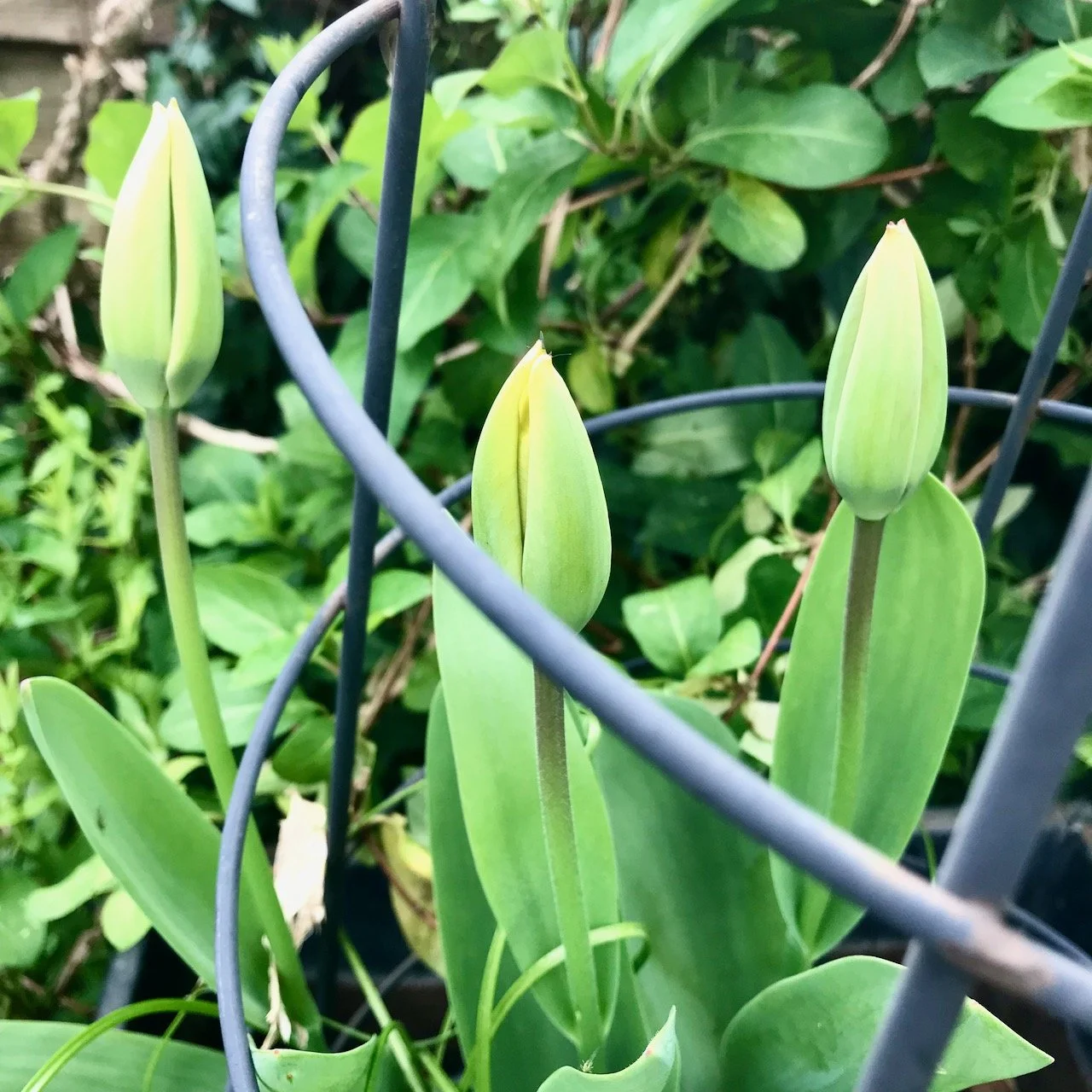
This spring no doubt you’ll have seen me share pictures of one or two tulips here and on my social channels, and I’m very grateful to organised me who last autumn, not only bought bulbs but also planted them. Or most of them anyway. I found another packet in the greenhouse last week which didn’t quite make it into a pot - well there’s always this year for those…

But the ones that did make it into pots, bloomed and bloomed and brought a very welcome pop of colour to our garden, so this post is sharing those, and celebrating them. I planted them in large plastic flowerpots, so that the plastic pots could be easily lifted out of the terracotta pots once they’d finished flowering - this worked out well and is something I’d do again and recommend.

Tulip bulbs starting to flower inside and outside the circular frame
The buds starting to show their yellow colour, with the lime green euphorbia and black metal pot behind
A single yellowy-peachy flower just starting to open
4 fully open fiery orange and yellow tulips with black stamen on display

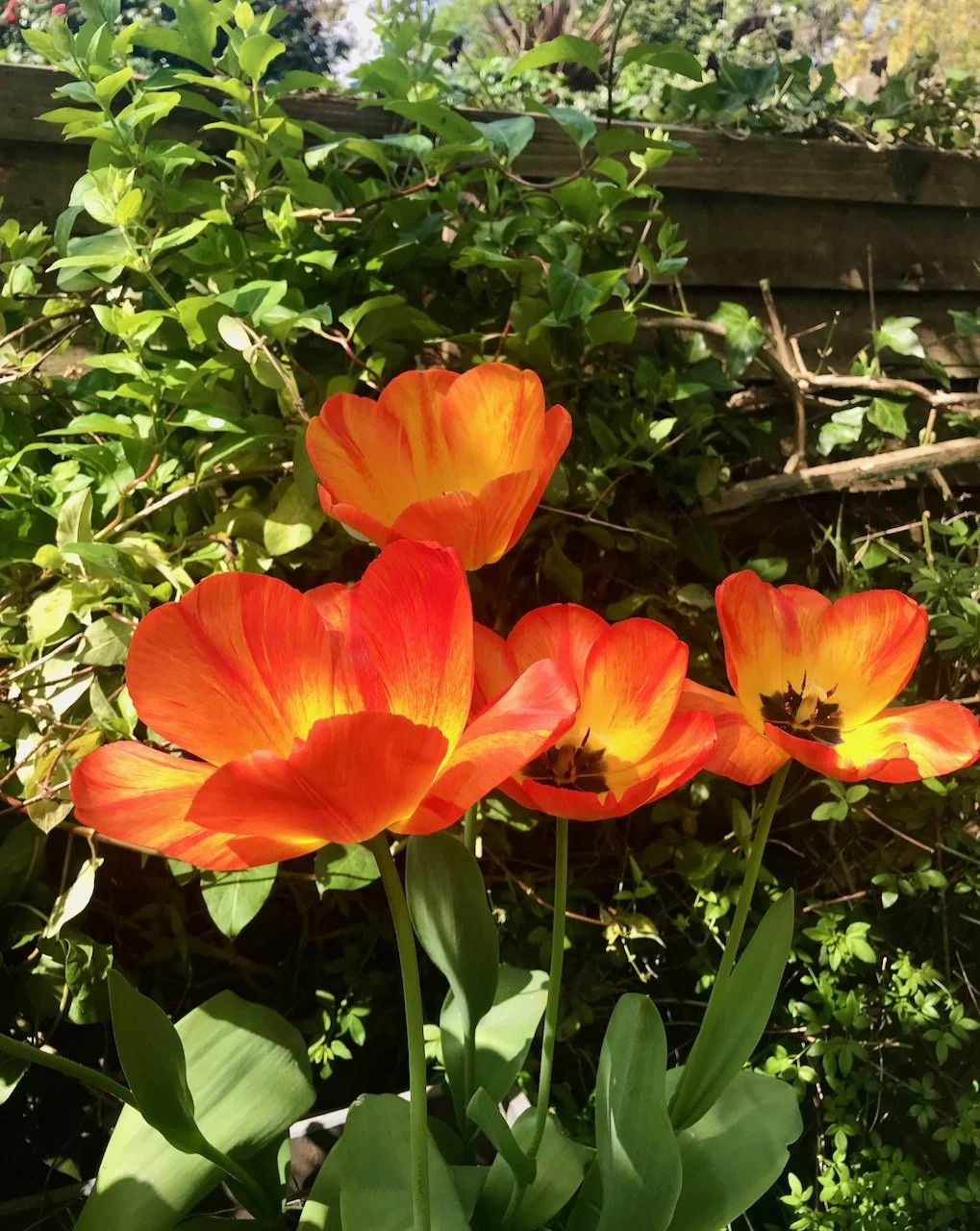
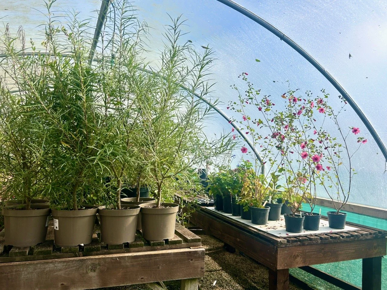
From inside the house it was great to get the pops of colour and to watch them change colours, and then one day they were gone. Their petals dropped completely, but soon to be replaced by the alliums. Given my success with the tulips I had high hopes for the alliums, but it was not to be. My ‘old faithfuls’ - the alliums that flower on the patio flowered as they usually do, but the ones in pots were sadly disappointing. They flowered but were floppy small heads, rather than the brilliantly bold spheres I’d been hoping for - next year maybe!

A single yellow tulip tinged with orange, among vivid orange tulips

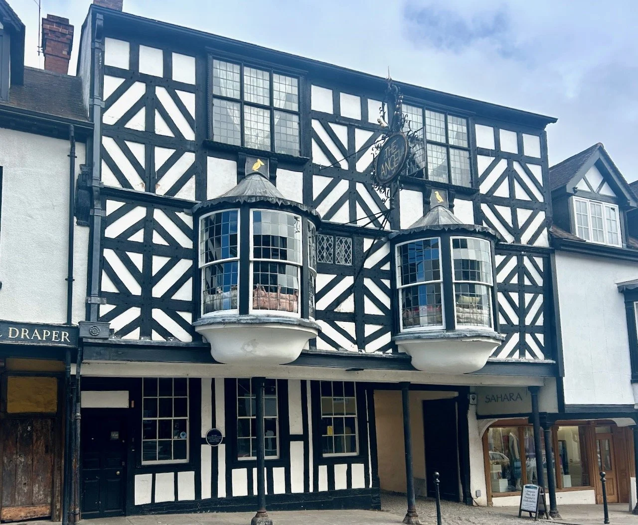
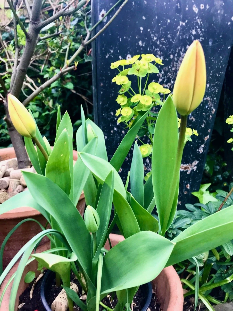
The tulips also worked out well as we put our house on the market at the end of March and so it was good to have some colour in the garden, and for it not to be “just green” which has been MOH’s observation in years gone by.

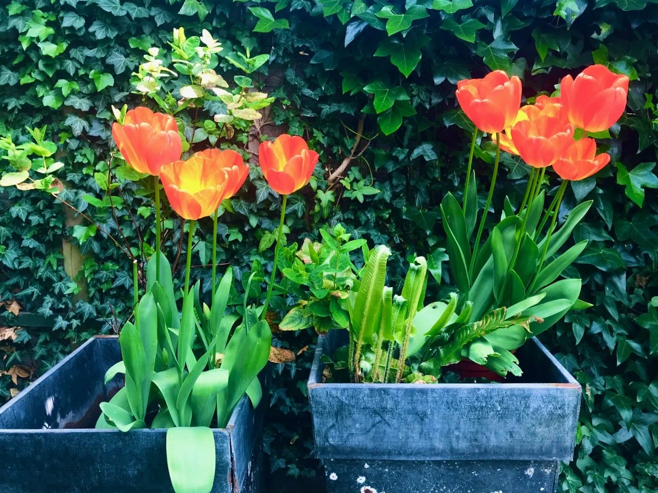
These pots were further up the garden, so not visible from the house, and every time without fail I walked past these the colour gave me a surprise - it shouldn’t have, but it did. So there really is something in that saying about not being able to see your whole garden from a single vantage point.

A single open tulip flower edited to show the detail on the petals, hence the blue tinged background

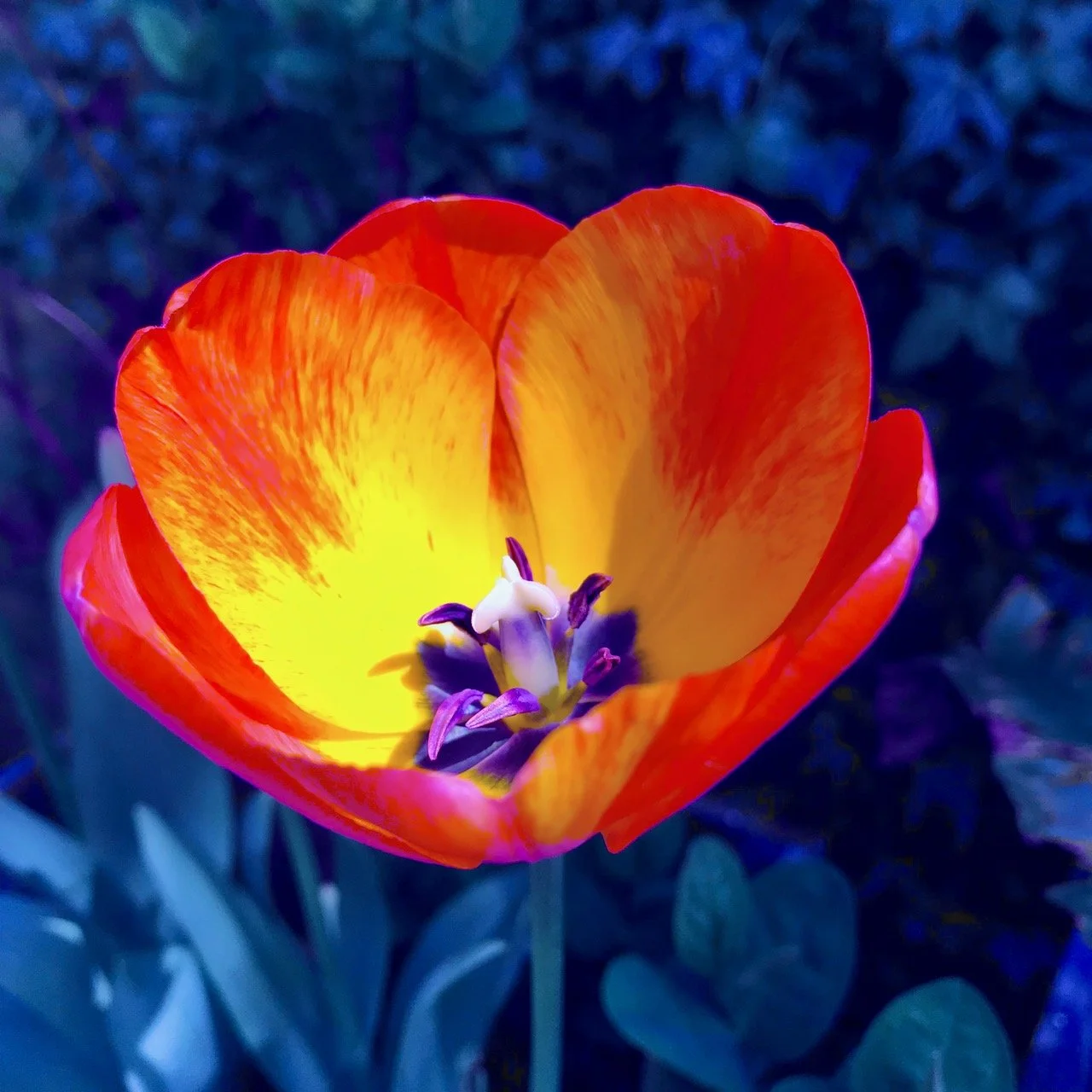
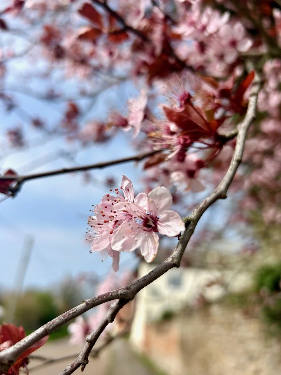
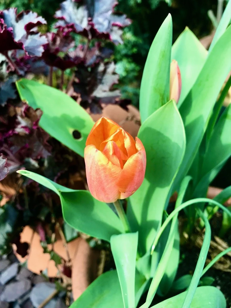
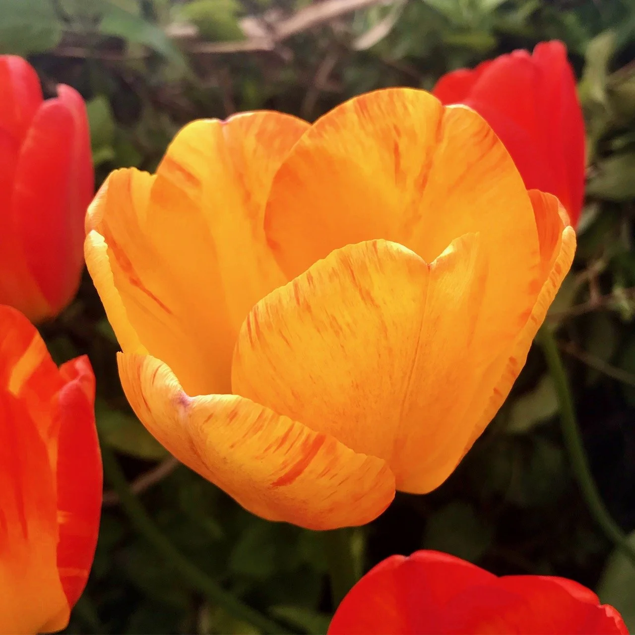
The detail on the petals was fantastic and I couldn’t resist playing with the contrast and colour editing tools a little, well quite a lot - the background foliage is a little on the purple side!

Hopefully I’ll remember to be just as organised this autumn!

A new light

Last month at Grand Designs Live we found another light to admire and lust after. And this wasn’t any old light, though it probably is a pretty old one. It’s a style of light that we’ve looked at for a long time, and always put on the ‘one day’ list. Turns out the one day turned out to be last month, and I couldn’t be happier.

I’ve said before, and I stand by it - the Design Arcade is one of my favourite areas of the show. It’s a single walkway, a corridor through the show which is jam-packed of great stuff. There’s inspiration each side of you, and we often walk up and down here at least a couple of times, each time seeing something new.

Therefore at the show in May, it wasn’t unexpected for us to stop and admire the lights on the Albert & Edward stand, in fact I’d have been more surprised if we didn’t stop and linger for a while. Many of the customised lights caught our eye, and I’ve a feeling at some point we’ll be looking to buy a memory wall light, and actually it was that which got us talking to Duncan.

One of the memory wall lights included an old metal boxed puncture repair kit, similar to one that we’d come across whilst sorting through my FILs garage recently. I’ve a bit of a thing about tins, and knowing that MOH doesn’t share this, I’d slipped the old-fashioned tin into one of the boxes we brought home. He remembered the tin from his childhood and wished he’d kept it - ta dah - good news, I had. These memory boards won’t be for everyone, but when they can include your own memories, then that would make them even better.

Lights on the Albert & Edward stand at Grand Designs Live

But anyway, our new light. It’s the one on the right above. We admired it and carried on wandering around the show, but this time knowing that if we get the place we’re after it will fit perfectly. It’s dangerous to make purchases for properties you don’t yet own, so we needed a plan b - and with viewings on our own home continuing we needed somewhere for it to go that made sense.

We pondered it some more and realised with a bit of light rearrangement we could make this work, so headed back to the stand again and made the purchase. Duncan kindly agreed to drop the light off either on his way back or soon after, which MOH was very happy with as carrying it back on the Jubilee line didn’t really appeal.

It’s been in place in our conservatory for a few weeks now, and it looks great.

GEC industrial style light on a tripod stand in our conservatory
A view of the top part of the light standing from behind
Looking down at the chain and the central ring of the tripod legs
A close up of the detail where the 'strap' of the light meets the triangular top of the stand
The yellow lit filament of the bulb

Thanks Duncan, it was great to meet and chat with you. I’m pretty sure we’ll be down to the shop at Whitstable at some point, especially now we have a potential customised memory wall light vacancy on our ‘one day’ list!

I was featured on Blogger Showcase

Love this #97: The Card Boys

One of my highlights from this year’s Grand Designs Live show was The Card Boys who were in one of my favourite areas of the show - the Design Arcade. For a small space it’s crammed full of really interesting stuff, the stand we bought our new light from was also based here, but more of that another day - we expecting to take delivery of the light later on today.

But back to The Card Boys

It’s essentially a card subscription box - so depending on your views on boxes in general, it may or may not be for you. The longer version of what it is, is a small piece of art on every card which supports independent artists and illustrators, and provides something more unique than cards from most high street stores. On the back of each card there’s the artist’s biography with their web and instagram links - so it’s a great way to discover artists, and great for artists to get their work more visible.

Each box is seasonal and contains eight cards for £24 - so £3 a card, which is really good value, though that clearly depends on if you like the designs, and how many cards you use/send. You can skip a box, so as long as you make the arrangements in time you won’t be charged, and you can cancel at any time. It’s a new venture set up by Callum and Adam - the Card Boys - who are creatives who met at school in Brighton.

I’ll concede that I do have a bit of a thing for cards, and often buy cards in advance when I see a card that will work for someone, or even buy multiples just to have a supply ready to use when I need them. MOH knows me well and wasn’t surprised when I stopped to find out more, and even less surprised when I signed myself up.

Step into springtime

The spring box was on offer at the show - so it was even more attractive to me. I’ve shared each of the cards and artist’s images below. My absolute favourite card in this set is my final picture - the Thank You card by Hannah Grace, it’s even more stunning in person. I think that will be the card that I’ll struggle to part with, and if I do, the recipient should feel especially worthy!

I should say I like all of the designs, there’s only one, maybe two that I most likely wouldn’t have chosen but I’m not sharing which. I can recognise the work that’s gone into each design, and I am sure the appropriate occasion will present itself, I just don’t know what that is yet.

A landscape of mountains, blue sky beneath the clouds and grasslands at the foot of the mountains

ARTIST: MICHAEL BARTLETT

A fox standing upright dressed in pink trousers a blue jacket and a green top.  Wearing shoes (obviously) with the word Foxy above - image on a yellow background

ARTIST: GRACE CHILTON

A female on a salmon background wearing coat and trousers and  a scarf, carrying packages a bunch of flowers and a tote bag with a loaf of bread

ARTIST: EMMA TOBEY

A blue waterwash background showing 8 synchronised swimmers in red bikinis and swimming caps forming a pattern by holding each other's left hand

ARTIST: EMILY LUSCOMBE-WATTS

A pink flowering plant with tall green leaves in a blue and white pot on a purpley/blue background

ARTIST: REBECCA DIGGLE

A pale blue background, below the words Dive in! is a female naked body diving into the water, the splashes are small blue fish

ARTIST: EMILY LUSCOMBE-WATTS

Four lettuces with arms and legs (obviously) dancing with the words Lettuce Party above on a pale pink background

ARTIST: GRACE CHILTON

A navy blue background with capital letters in pink green purple and yellow spelling THANK YOU.  in the lower part of the card is a pink/purple lupin plant with green leaves

ARTIST: HANNAH GRACE

I’ve already used one, and am looking forward to using some more - but probably not my favourite design! And, like any subscription box, the anticipation of what’s in the next box is high…

I was featured on Blogger Showcase