
So fast forward a couple of weeks and the post-holiday haze of tasks is lifting, I went back to my original idea to show off these samples. Before we get to the samples, let me tell you a little about Art of the Loom.
They're a family business, now in its seventh generation, which started when Benjamin Thornber moved his family from the farm to Burnley and became an "out and out textile man." The company has since been reborn and now focuses on pure, natural fibre fabrics.
They're proud of their heritage and hope that by only using wool, linen, cotton and viscose in their ranges "you too can appreciate the luxurious feel and genuine textures" woven into traditional and contemporary materials.
As well as having some great products on their website they also seem to have some fun looking at some of their job titles on their team page. There's a Chief Eccentric and Grandad as well as a Daydreamer and Apprentice Eccentric and a Voice of Reason and Anchor-man and the Super Elves in the Warehouse.
It made me smile and encouraged me to explore their site further. It's great to see such personality, and it's even better when the products are good too!
So let's see some of those products.
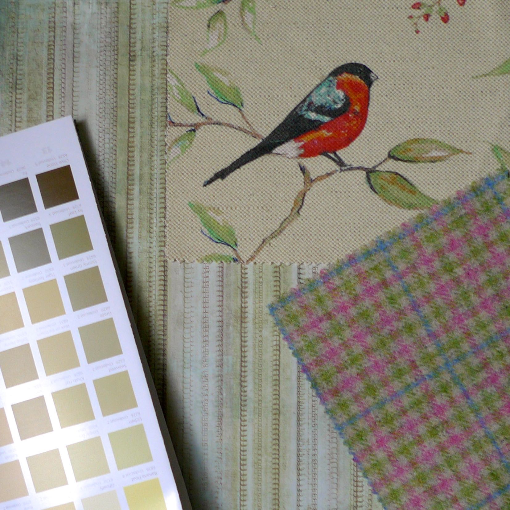
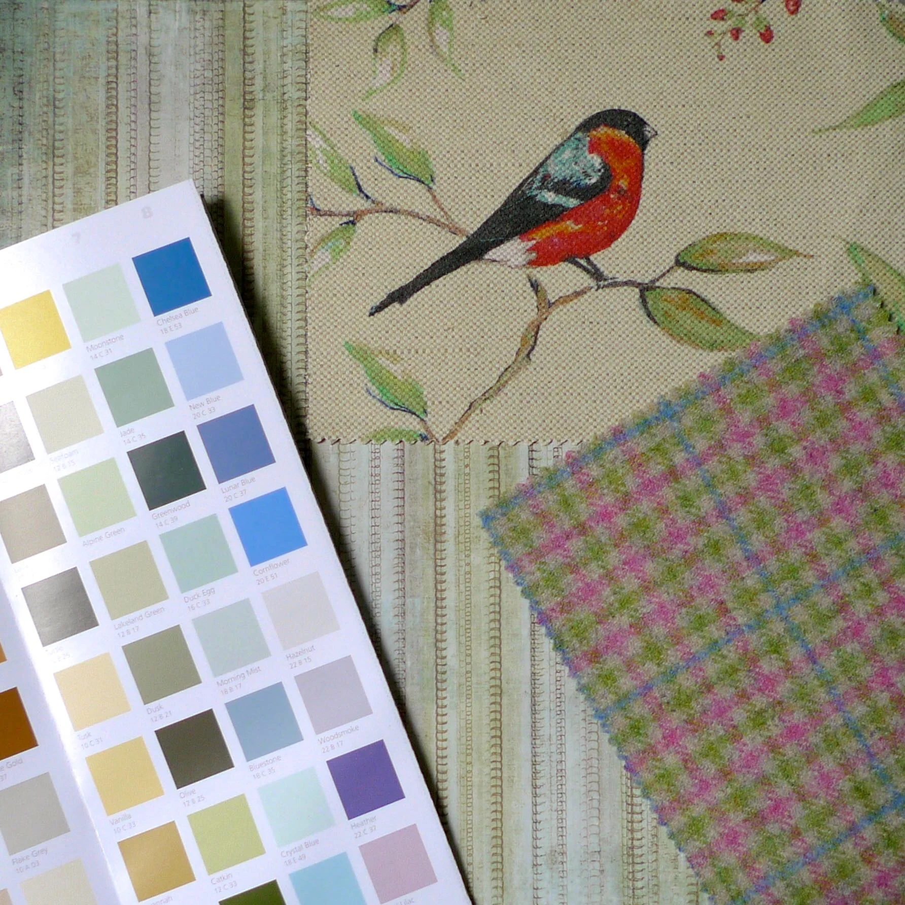
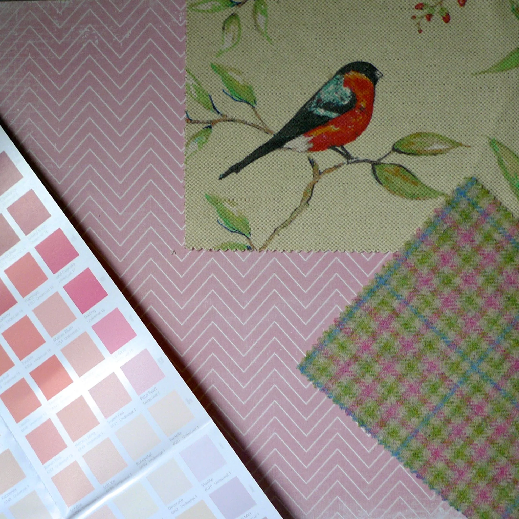
In the Summertime
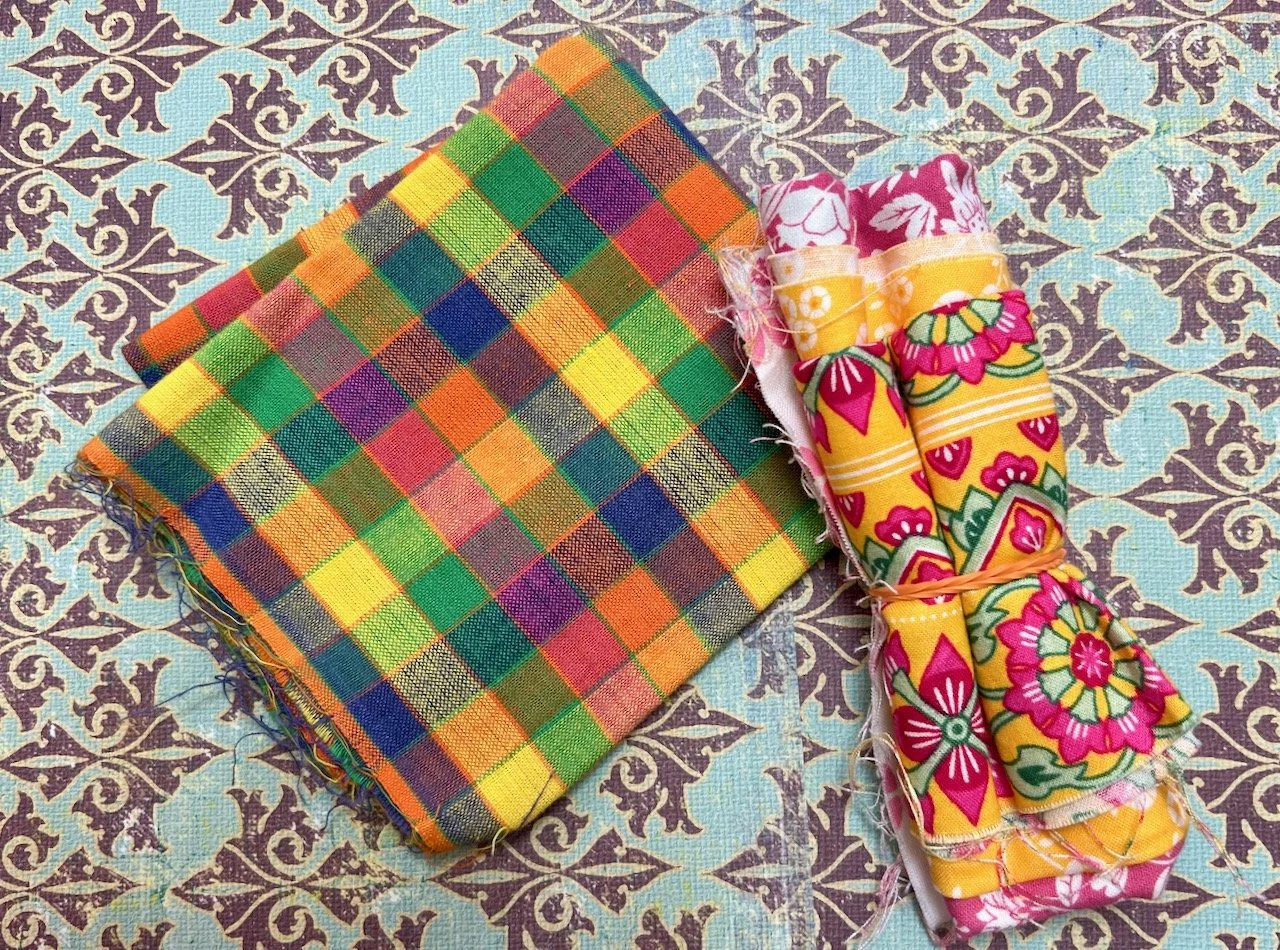
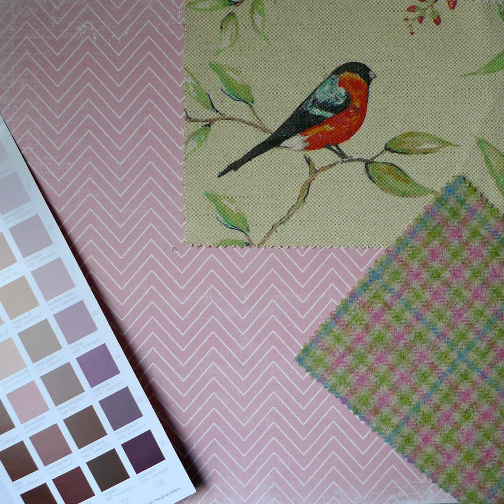
This is a fun collection - I mean a cheery, red breasted bird partnered with colourful checks, what's not to like. The material with the bird is well named as Dawn Chorus and the colour here is Apple - it's 67% cotton and 33% linen. The Ilkley Pastels check is 100% wool and both have a lovely soft feel to them.
In the first two photos below I've teamed these with a complementary striped background with browns and caramel paint colours and then a mixture of colours from the paint charts. I think both work equally well and it really goes to show that it's what you put alongside your soft furnishings that makes your scheme sing (or perhaps tweet tweet tweet in this case!)
Adding a bolder background which picks up on the pink in the Ilkley sample changes the feel once again. Here I've matched it with pastel pinks in the first picture and then purples and browns in the second shot. I think the pastel pinks are something I'd more naturally match with this scheme, but by pushing the pinks towards purple and brown, I think I've found a better and more adult match. Isn't it fascinating how this works out?
Serengeti and Knightsbridge
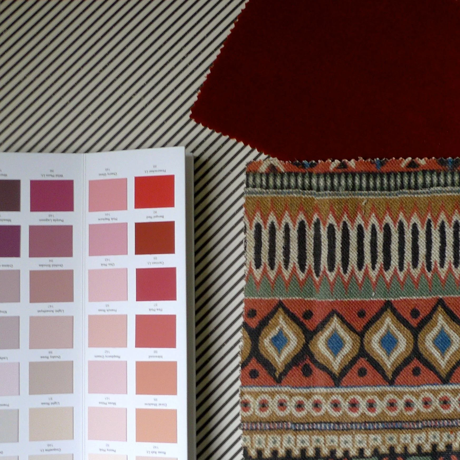
These were my least favourite samples in the pack I received. The Serengeti Maasai design is just a little too aztec for me. It's a 60% cotton, 40% linen mix and for me the colours are a little too dull and not vibrant enough. It may be just your thing though, I like the use of traditional patterns and I think it matches well with the Pumpkin Knightsbridge velvet. The colour of this 100% cotton sample is deep and I like it more than I expected to.
I've mentioned before here that I'm a child of the 70s and velvet featured heavily in my childhood. Whether that was a smart velvet jacket - navy blue I think, or a red velvet pinafore bridesmaid dress, it's a material I shy away from now. I just can't help myself - and while I don't think I've anything against the velvet clothing I wore growing up, for me it's a very 1970s feel.

My first instinct was to match these samples with a neutral background and to use bold colours to introduce more colour. I was interested to see what type of patterned background would work with this pattern and eventually I settled on a black and white diagonal stripe. I think the orangey-reds would work well in this scheme or perhaps picking out the blue would also work.
Brunel and New England
The samples I received from these ranges are my favourite. The Floral design in Plum from the New England collection is gorgeous. I'm not sure what the flower is but it could be a rose, which is a flower I'm finding myself drawn to more and more. Before I'd have said I wasn't a rose fan, but recently I'm not so sure. The fabric is 60% cotton and 40% linen and is quite a heavy fabric, more suited for a blind than curtains if you were thinking about your windows.
The check design, called Brunel Check, also in Plum is I think one of those modern classics. Incredibly versatile, it's 100% linen but has some weight to it and plenty of texture. Below I've teamed the materials with a small dotted bold background and picked out the plum colours in the paint chart. And I think they do work, but you wouldn't want much of those dots, perhaps a feature wall.
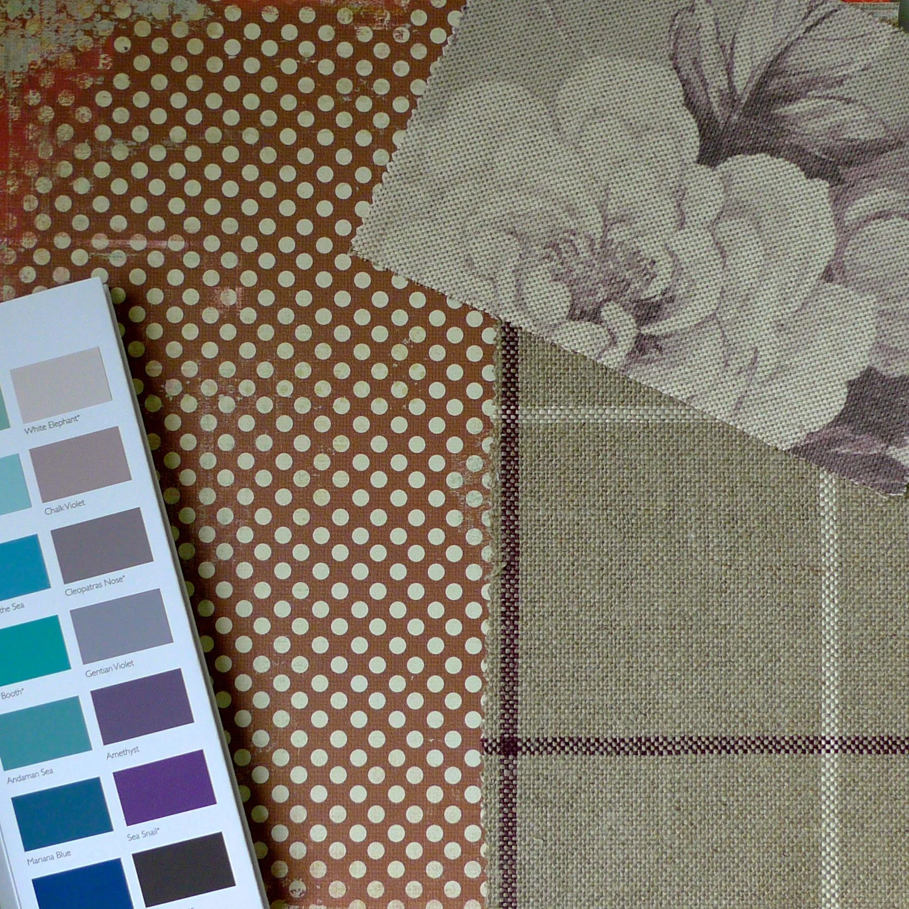
A PATTERNED BACKGROUND WITH PURPLE AND BLUE PAINT CHART AND BRUNEL AND NEW ENGLAND
For a different look I've chosen a nature themed background with the same paint samples as before and then again with a zing of green. The latter is my favourite colour combination, but then again I do like green so that might be swaying me towards that.
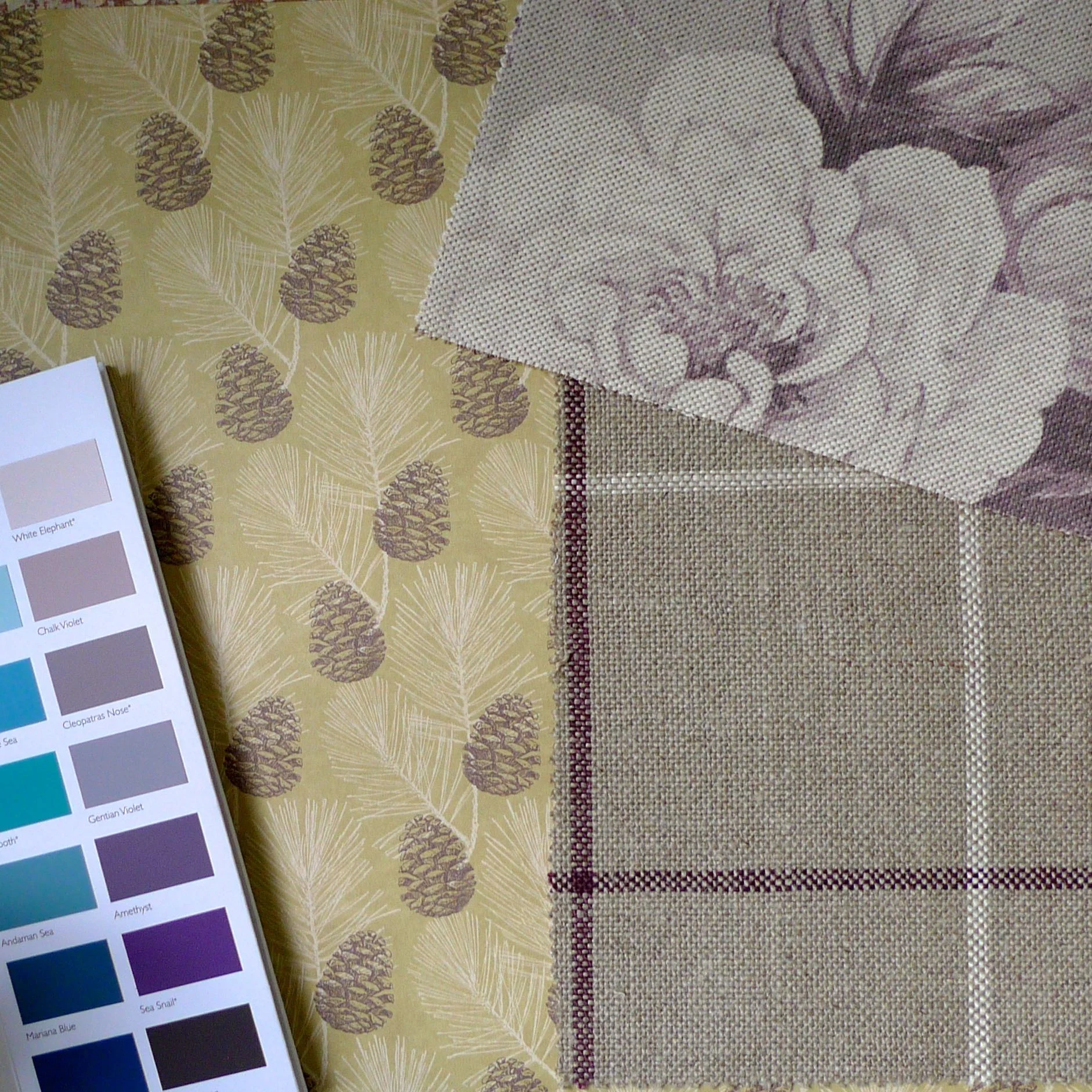
A NATURE INSPIRED BACKGROUND WITH PURPLE AND BLUE PAINT CHART AND BRUNEL AND NEW ENGLAND
A NATURE INSPIRED BACKGROUND WITH A ZINGY PAINT CHART AND BRUNEL AND NEW ENGLAND
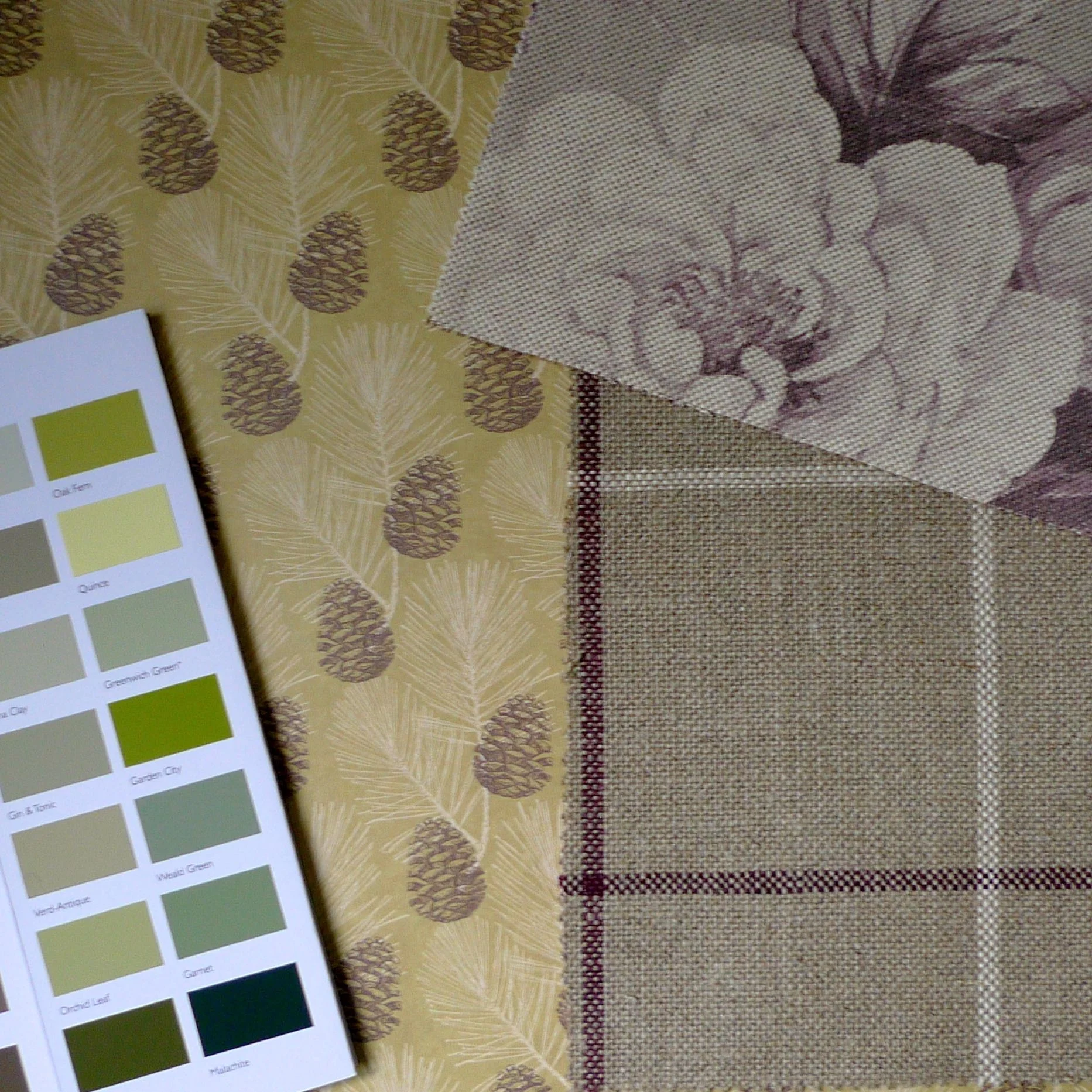
Whitewell and Holyrood
The grey material below is from the Whitewell collection and the colour is pigeon. It's 65% cotton and 35% linen and the result is a relatively soft, but what looks to be a hard wearing fabric which is no doubt very versatile. Below it's paired with the Oban Plain design in Purple Dawn from the Holyrood collection, and isn't it great? It's 100% wool and lighter than I expected it to be, but everything I expected from a tartan. And it's just what I'd want covering an armchair in front of the fireplace.
These fabrics work with both a cool colour palette of blues and purples as well as with a warmer colour palette of pinks and cerises.
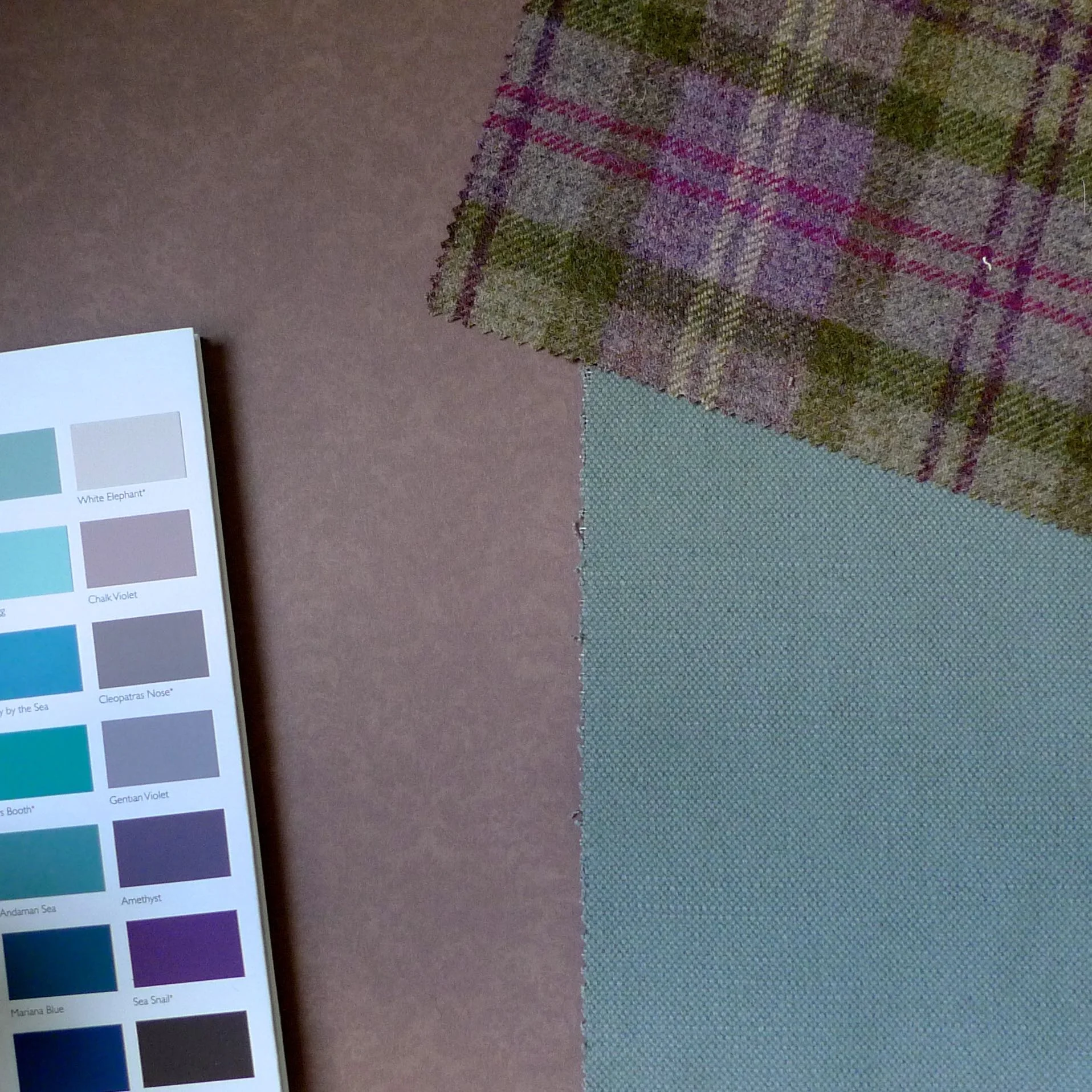
A HEATHER BACKGROUND WITH PURPLE AND BLUE PAINT CHARTS AND WHITEWELL AND HOLYROOD
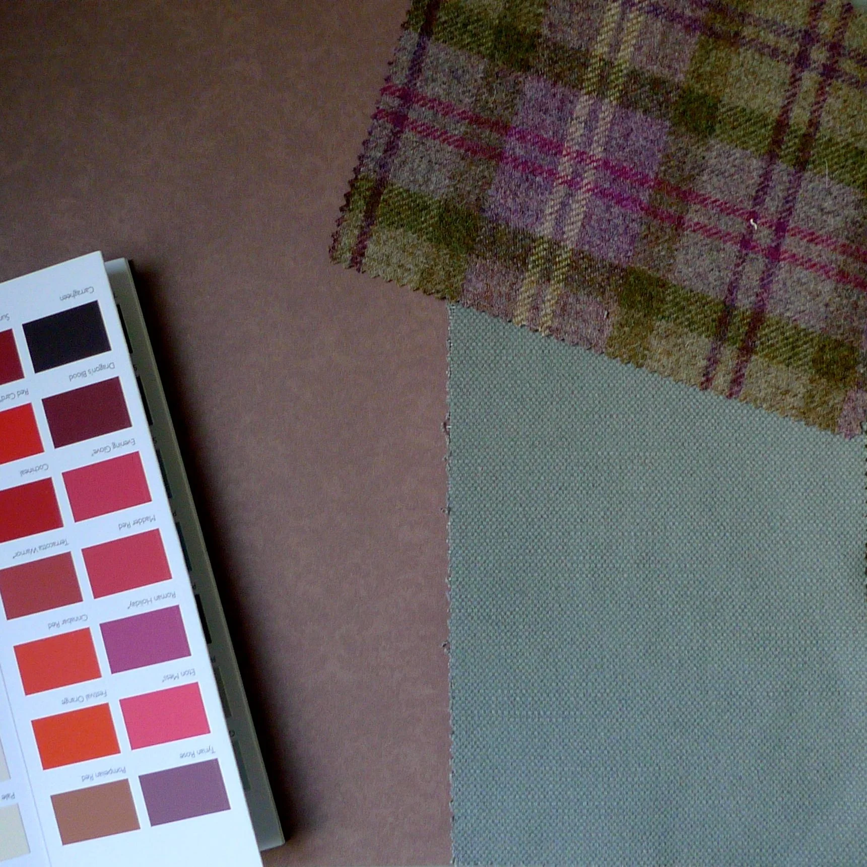
A HEATHER BACKGROUND WITH A PINK PAINT CHART AND WHITEWELL AND HOLYROOD
I thought I'd try a bolder scheme I've opted for a green and white spotted background and greens from the colour chart. I think this also works, but is clearly much bolder and the pigeon grey looks slightly greener.
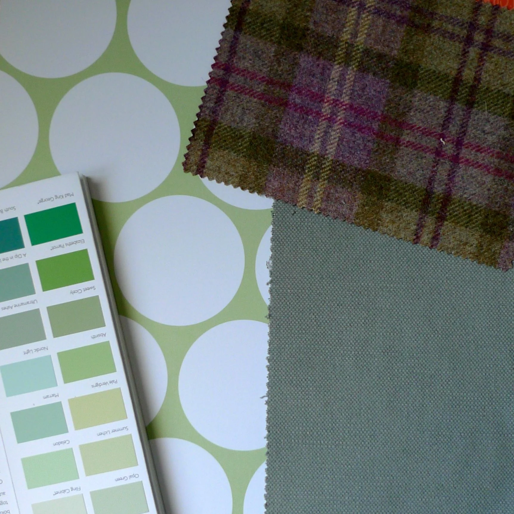
A PATTERNED BACKGROUND WITH A GREEN PAINT CHART AND WHITEWELL AND HOLYROOD
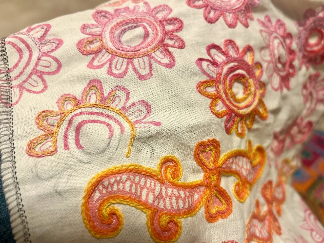
Rio
I loved this embroidered sample of Rio from the Carnival Collection and it really is as bright and cheery as it looks. It's 100% cotton and while it matches well with bright primary colours it would also inject a blast of colour into a more neutral background. I also think it'd make a stunning sundress, it'd definitely make a statement on a hot, sunny day - now wouldn't a few of those be welcome!
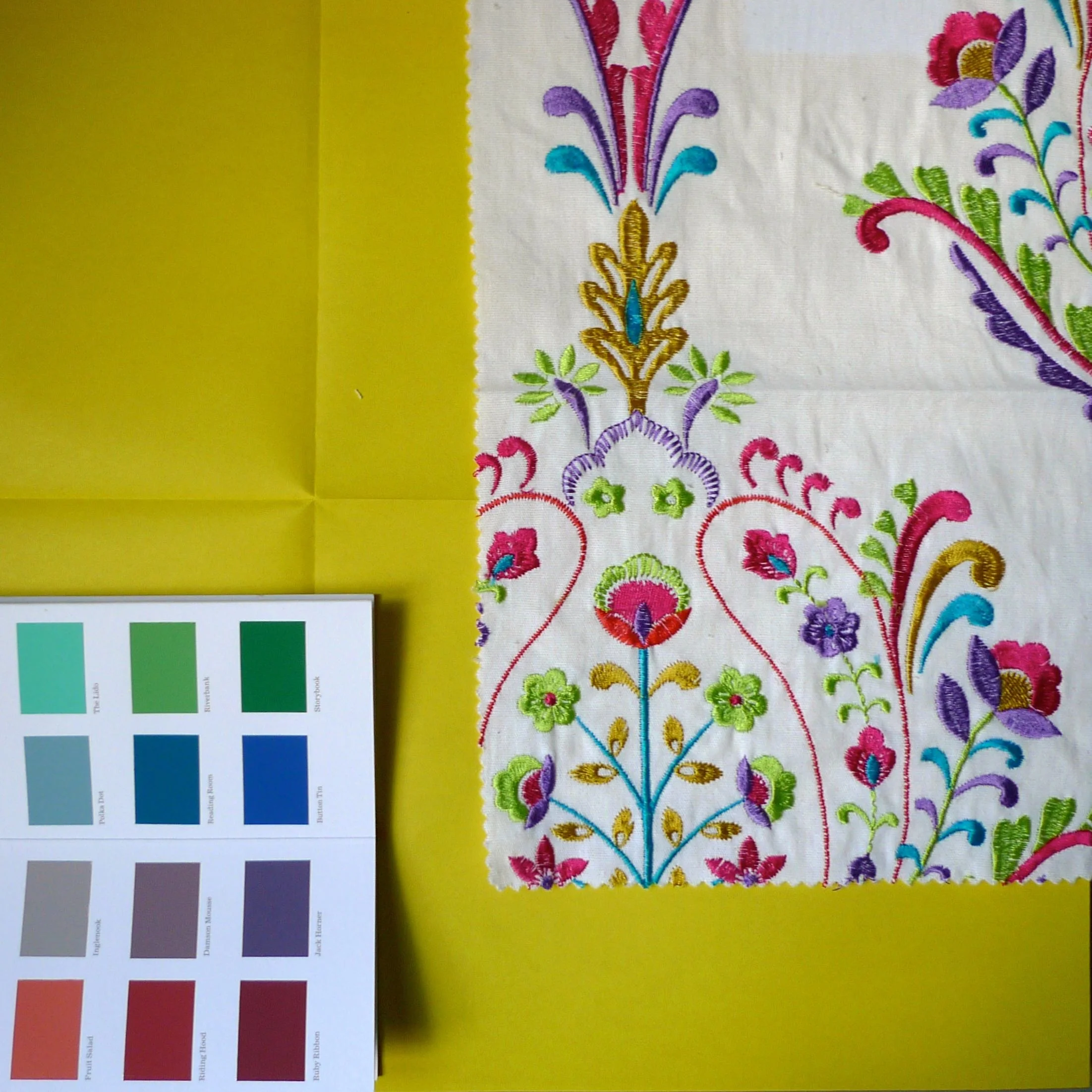
A BRIGHT BACKGROUND WITH A BOLD PAINT CHART AND RIO
So overall Art of the Loom sent me some great samples which were a good introduction to their products. The samples - similar to A5 size - were larger than samples I'd received in the post before, which meant you really could see what the pattern looked like, something that isn't often possible on a two inch square.
What do you think of the fabrics? Which is your favourite and would you match them with the colours I have? Leave a comment and let me know, or let me know what your alternative job title would be!
This is a collaborative post with Art of the Loom, who provided the fabric samples shown in this post, but all opinions are my own.