Celebrating milestones

Birthdays. Something we all have every year. I'm definitely in the celebrate your birthday camp and usually for my birthday in May there's a meal out, presents if I'm very lucky and generally lots of birthday love. And for me that's what birthdays are about. Yes there's the whole year older thing, but heck who's counting?

But while I'm a big advocate of celebrating my own birthday, celebrating my blog birthday or my blog-aversary isn't something I've been so good at. Don't worry you can hold fire on the congratulations - it's not just yet, but in February. Maybe that's a contributing factor, although looking positively February is better than January which I find the bleakest month of the year, and the month that I'm most likely to hibernate both metaphorically and physically.

So when Nuffnang invited me into town for drinks to celebrate their second birthday, I started to wonder why I hadn't celebrated my blog birthday yet, and how very remiss of me that was - but back to the party.  The celebrations were at Devonshire Terrace close to Liverpool Street station in The City. And despite working relatively close by for almost thirty years it was somewhere I'd not been to or heard of before.

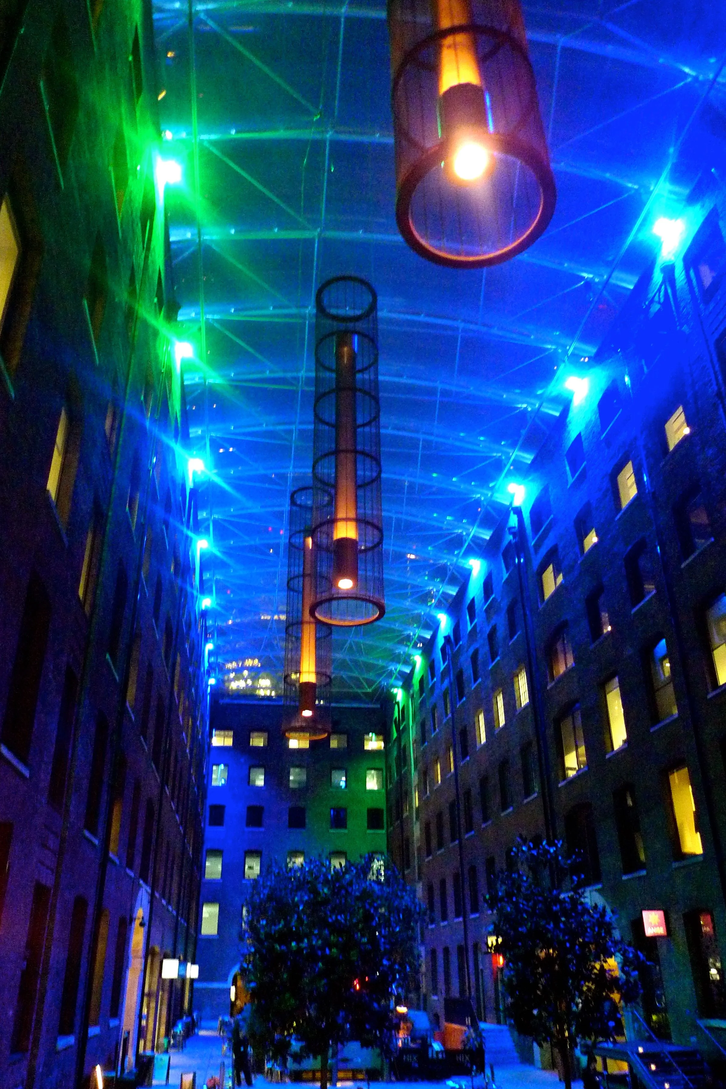
And it was a bit of a gem really, just look at the surroundings.

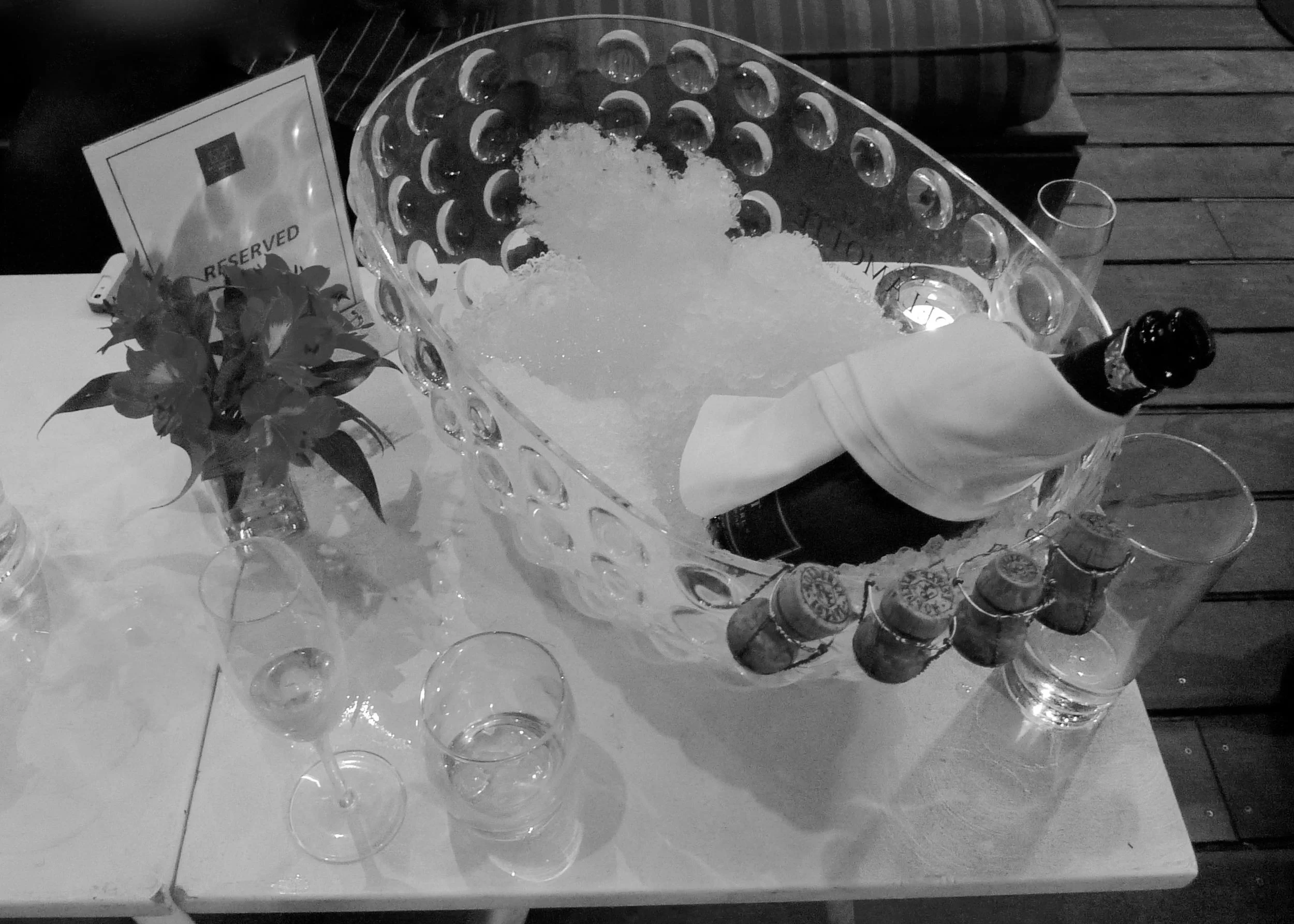
BIRTHDAYS NEED BUBBLES...

BIRTHDAYS NEED BUBBLES...

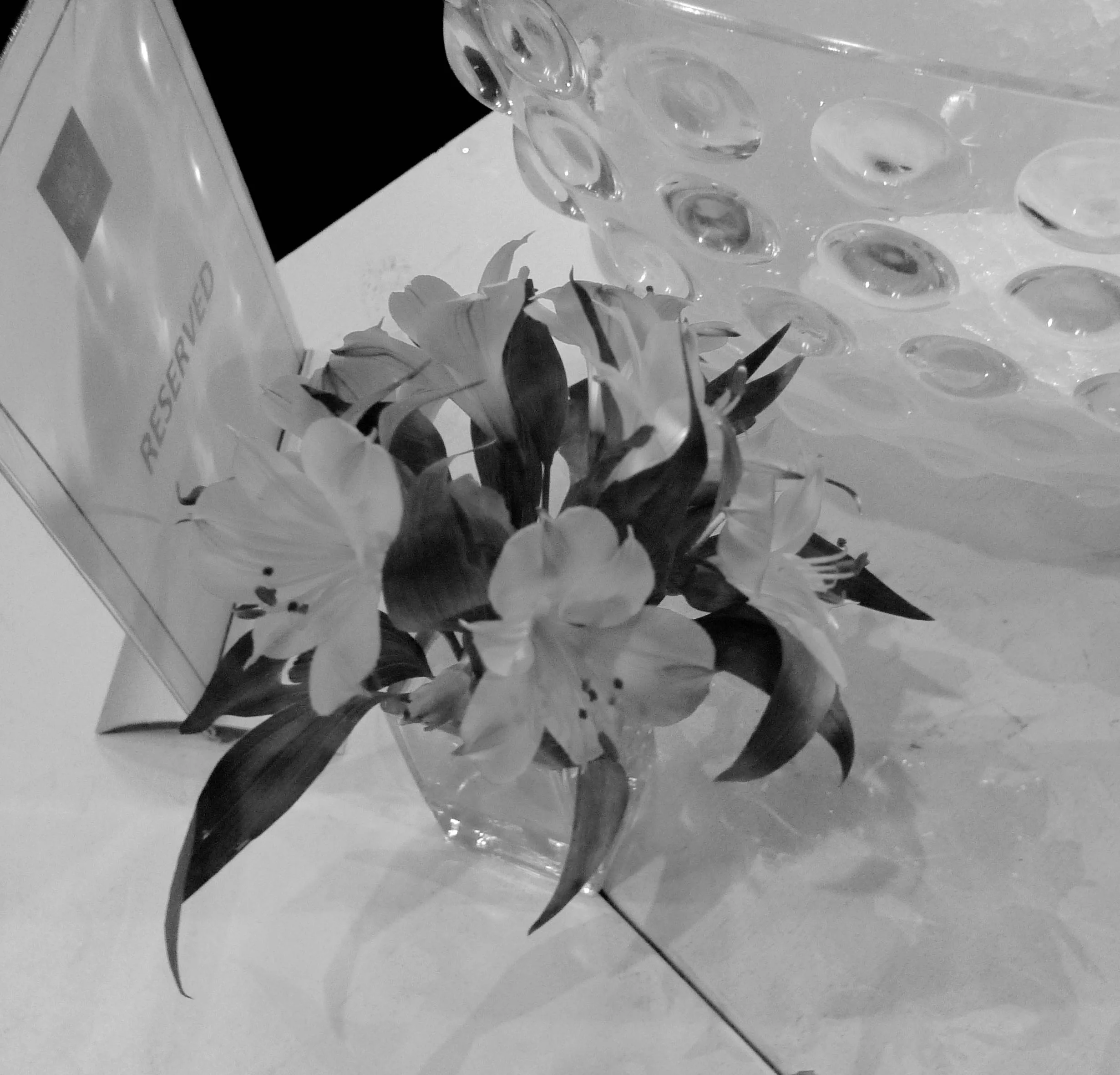
...AND FLOWERS...

...AND FLOWERS...

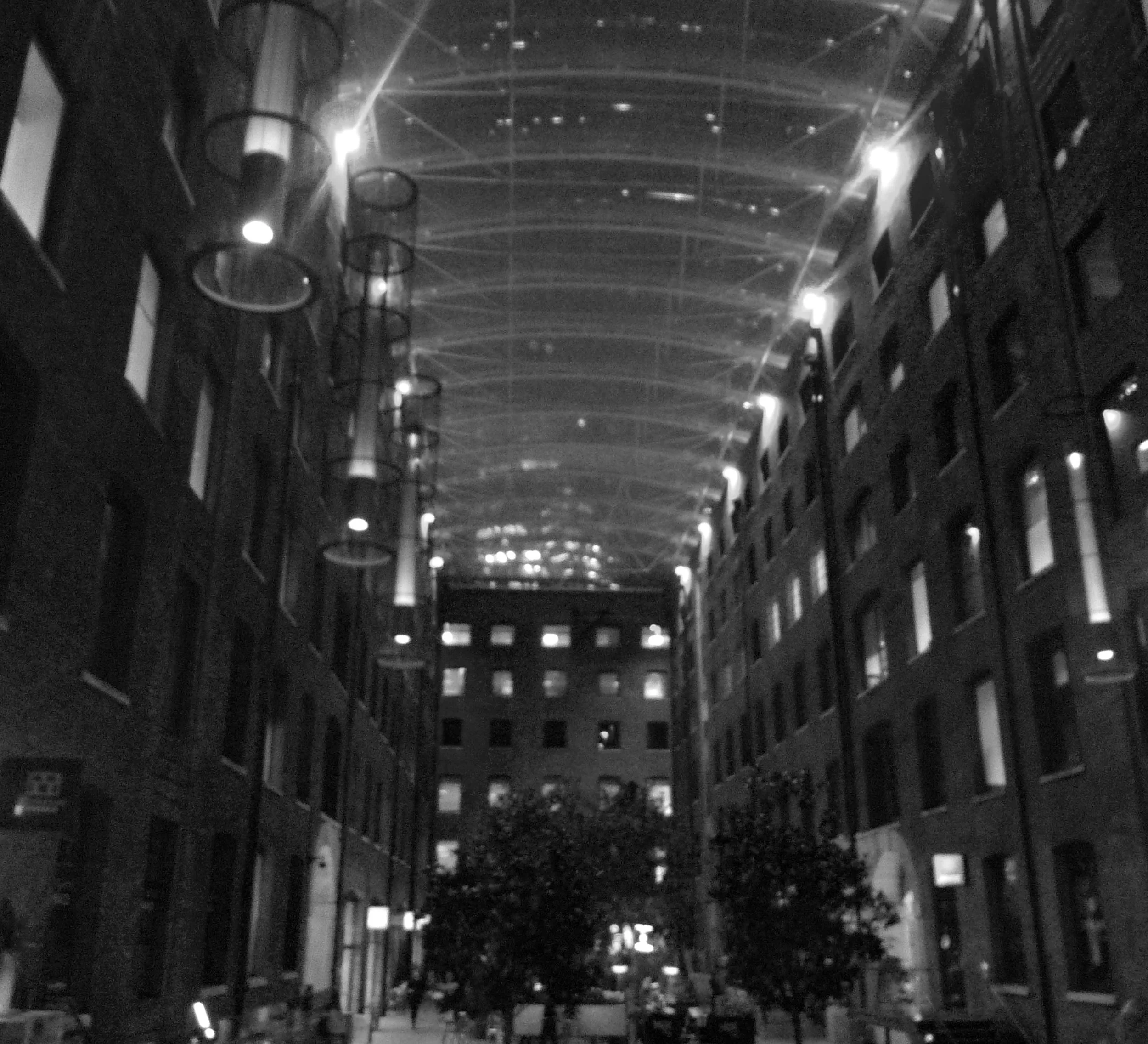
...AND A GREAT VENUE IS ALWAYS A BONUS!

...AND A GREAT VENUE IS ALWAYS A BONUS!

Devonshire Terrace is inside Devonshire Square which has a fabulous glass roof over the courtyard allowing views of The Gherkin (you can just about make it out in the photo above)  It's a fab space with many bars and restaurants, the landscaping makes you feel like you're outside, but with the roof and the patio heaters you definitely know you're not.

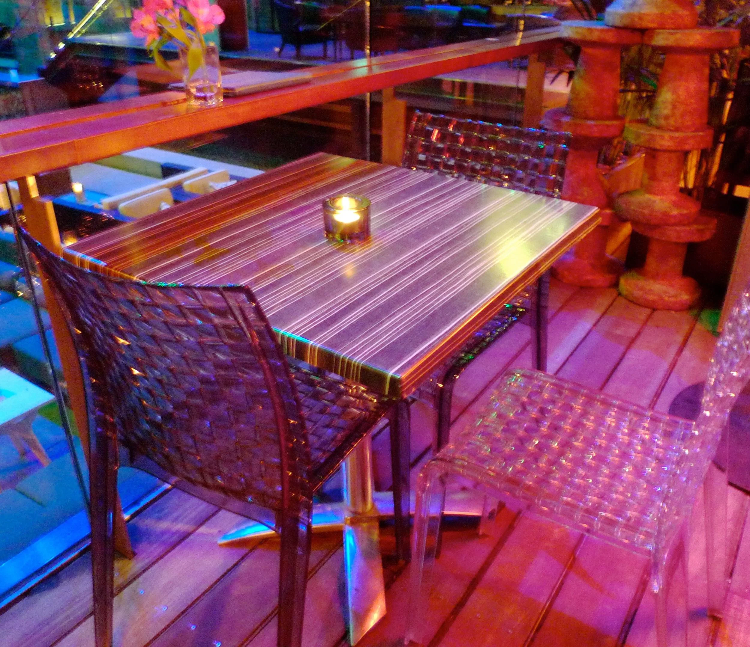
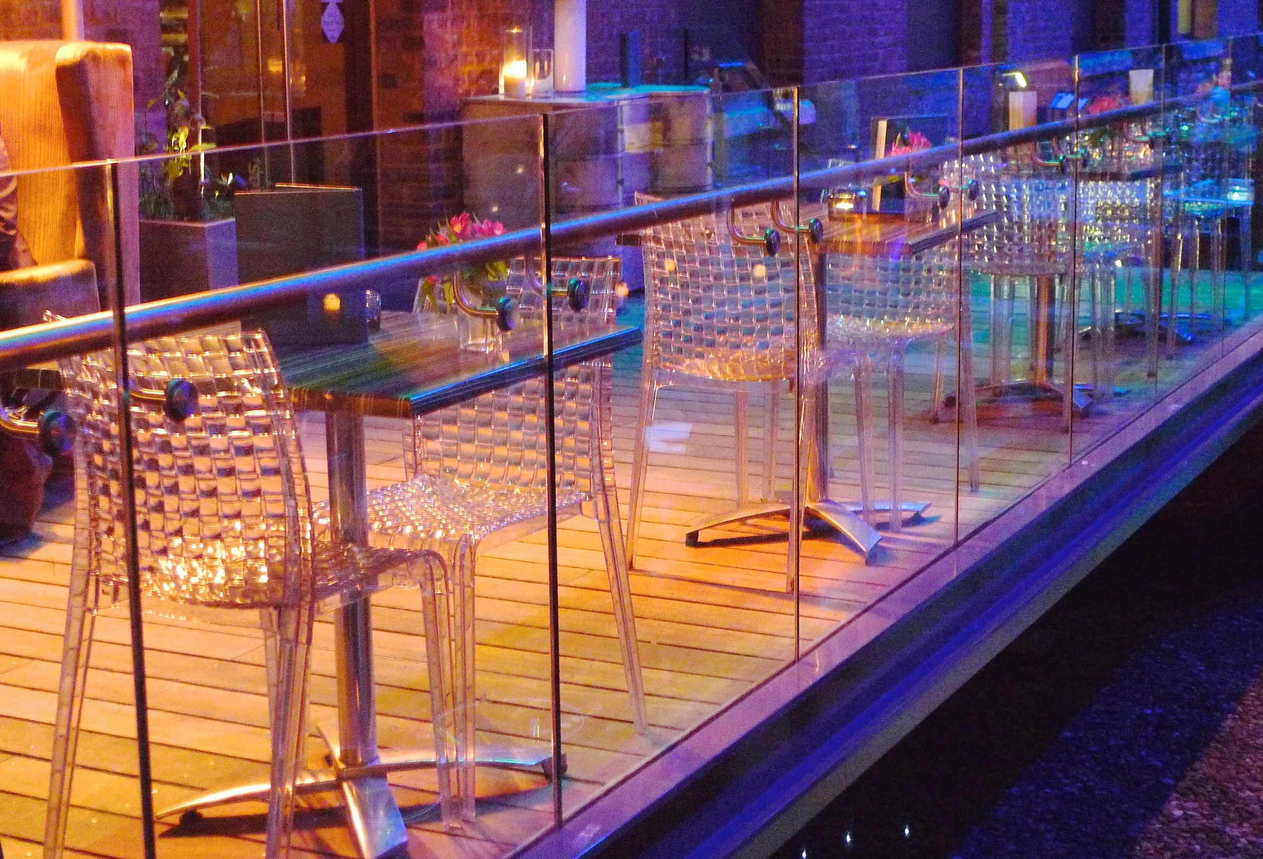
I was quite taken with the furniture there too, as well as a sunken area with comfortable seating for a more relaxed after work drink there were these fab tables and chairs. So much detail and interest and super chic at the same time, they really dazzled under the colourful lights.

A great venue for celebrating and one I can see myself heading back to on future trips to The City. Happy birthday Nuffnang and thanks for inviting me to help you celebrate.  Thanks also for prompting me to check when my blog birthday is, it's 17 February - and next year, I'll be celebrating three years of blogging.  Looking back to my first few posts, we've come a long way!

Share the Joy linky at TheJoyChaser.com

A wander through the Victoria Embankment Gardens

Arriving at Charing Cross shortly before ten in the morning - yes early for me - it was busier than I've got used to. I didn't fancy the jostling walk along The Strand to Somerset House where I planned to see the Ten Designers in the West Wing as part of the London Design Festival, more on that another day though.  So instead I headed towards Embankment and ducked into the Victoria Embankment Gardens which are between The Strand and the Thames.

And it's a much prettier walk. 

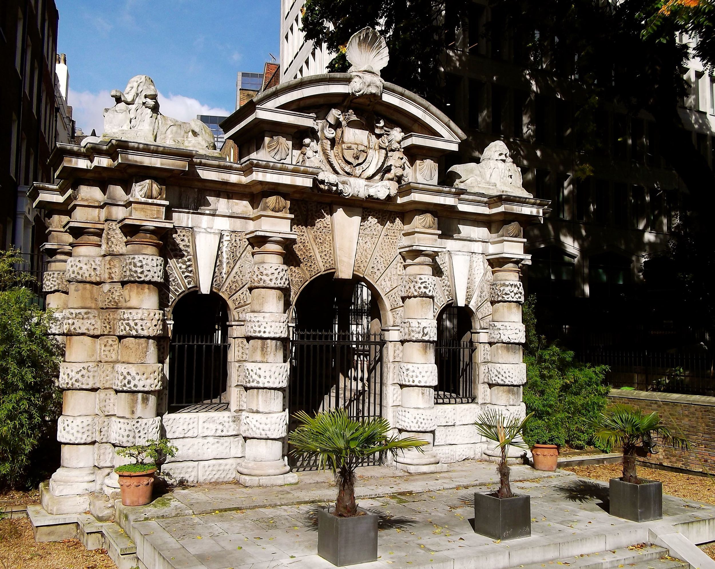
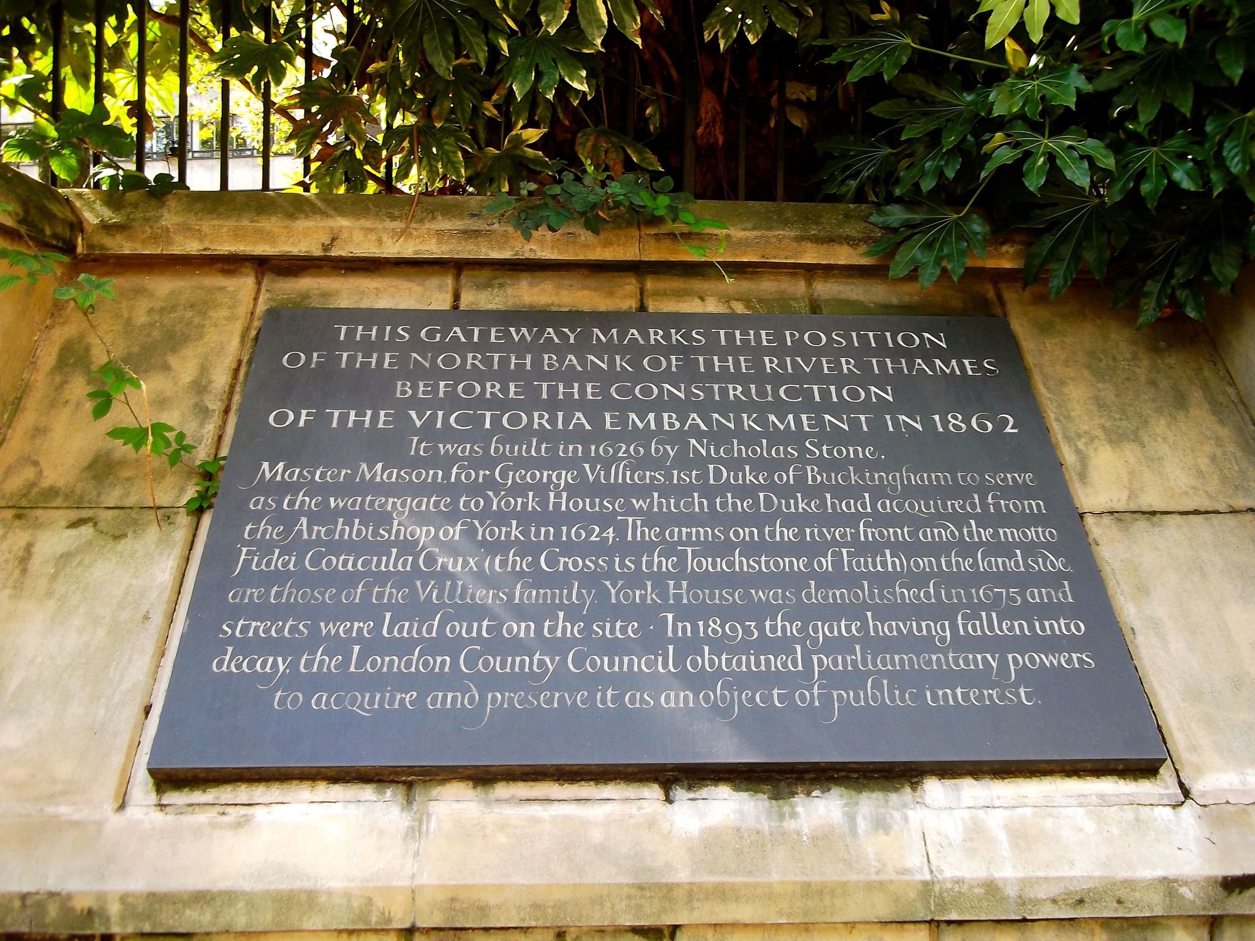
I've seen this gate many times before but never stopped to see what it was before. The gateway marks where the North Bank of the Thames was before the construction of the Victoria Embankment in 1862. That's quite a way from where it is now as there's the gardens and the road before you get to the river. I'm always amazed by such engineering feats...

Looking towards the river you can easily see one of London's iconic landmarks.

Aviewofthelondoneye.jpg

Back to the gardens, just look at the sun shining through these leaves.

And is that a little monkey tree in a pot? A fairly large pot though.

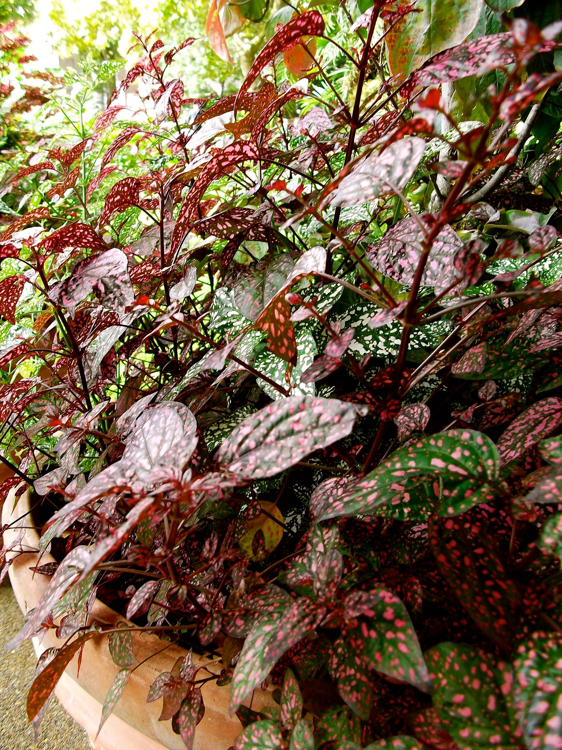
But just look at those leaves. The colour and the pattern. Wow.

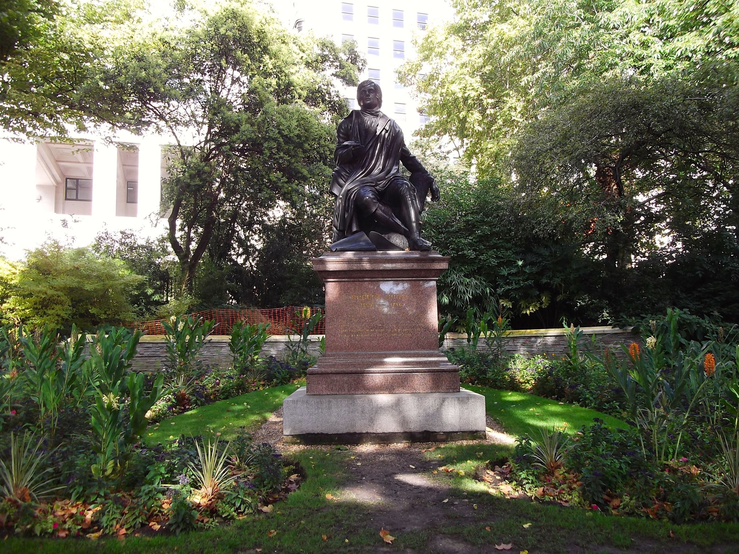
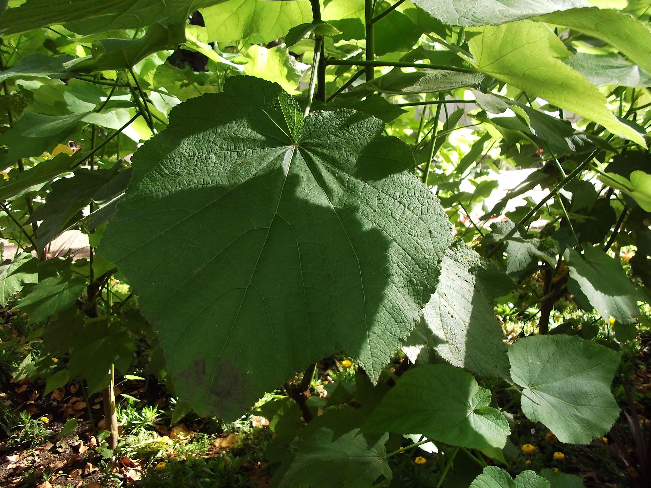
It is quite a formal garden and there's plenty of statues throughout - like the one to Robert Burns above. As I was admiring the brightness of the orange flower and thinking how like sweetcorn the leaves were, I turned and saw this huge leaf. Remind you of anything?

Maybe my tree?  Hmmmn...

It was mid-September and the flowers were still bright and colourful. I liked the planting in this part of the park - very bold and spiky.

As I reached the end of the path there was a small pond with water lilies and a small tree fern. It looked quite out of place so close to the road, but calming nonetheless.

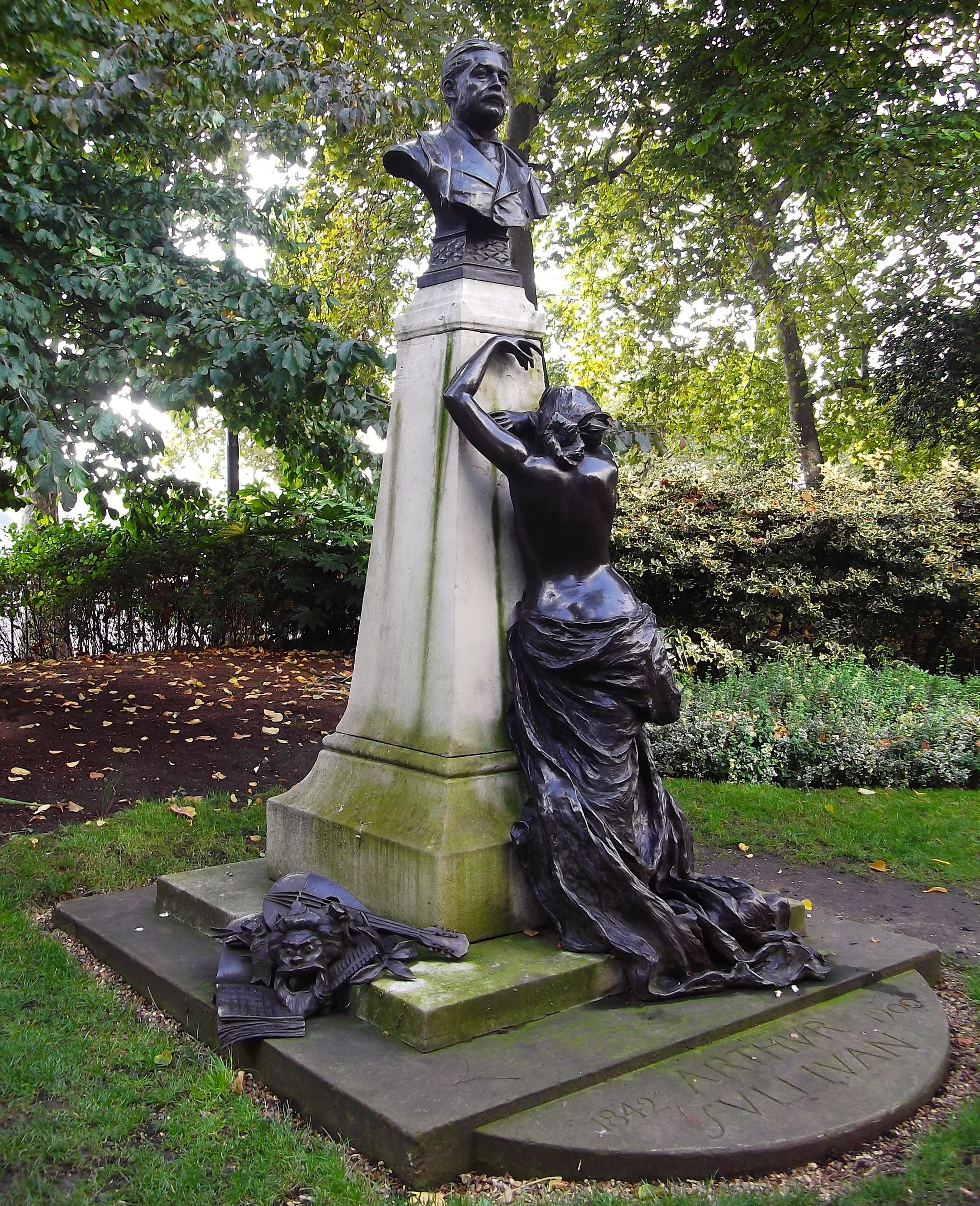
This statue is quite dramatic and I was interested to know more about Arthur Sullivan. I then realised he was the Sullivan from Gilbert and Sullivan of Mikado and the Pirates of Penzance fame. It's quite a statue isn't it?

And with that I was back in the hubbub of London life and the never ending roadworks. And that was quite a change to the stillness of the Embankment Gardens - look:

My Travel Monkey

The Creative Spaces at John Lewis, Oxford Street

On my recent trip to John Lewis in Oxford Street where I had a long wander around their revamped Homewares department I stumbled upon something completely unexpected.

The introduction on the wall summed it up perfectly, and here it is:

A celebration of design and imagination, our Creative Spaces are designed to inspire. John Lewis offered space to four of the UK's most innovative interior creatives and gave them free rein to sign their perfect home environment. A relation of individual style, personality and taste, the Creative Spaces bring contemporary home design to life in an exciting and immersive way.

There were four spaces, so let's take each one in turn.

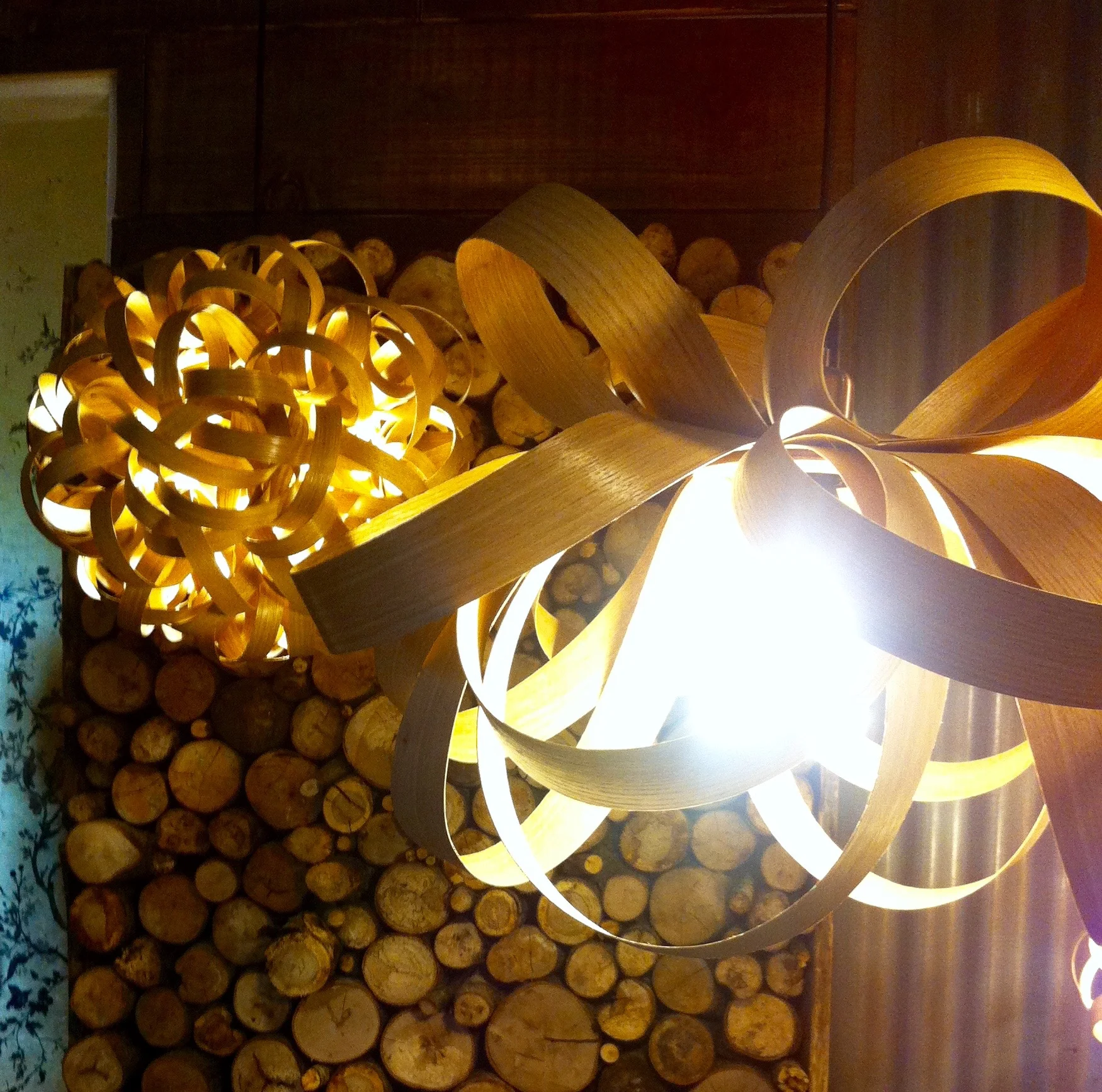
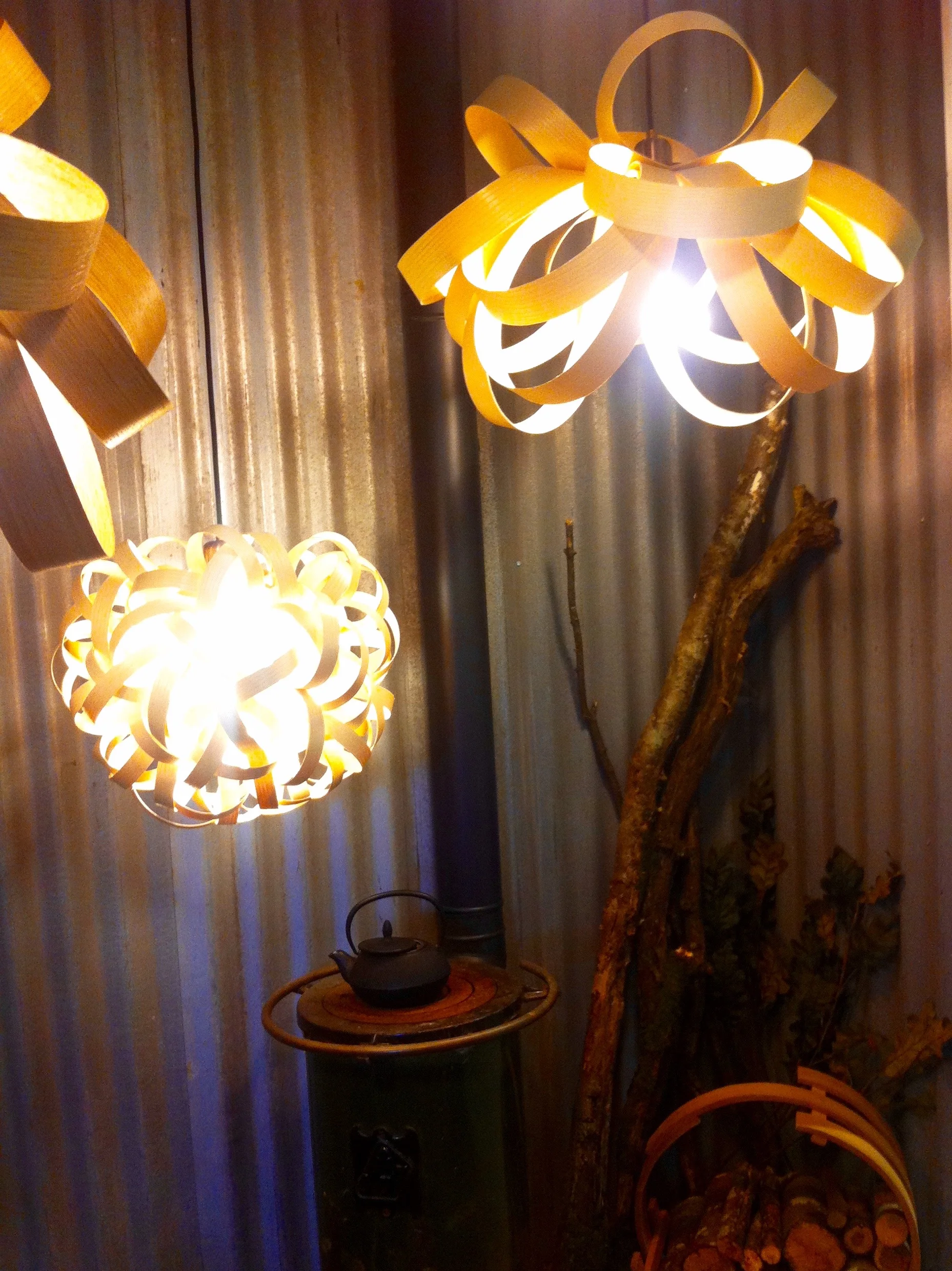
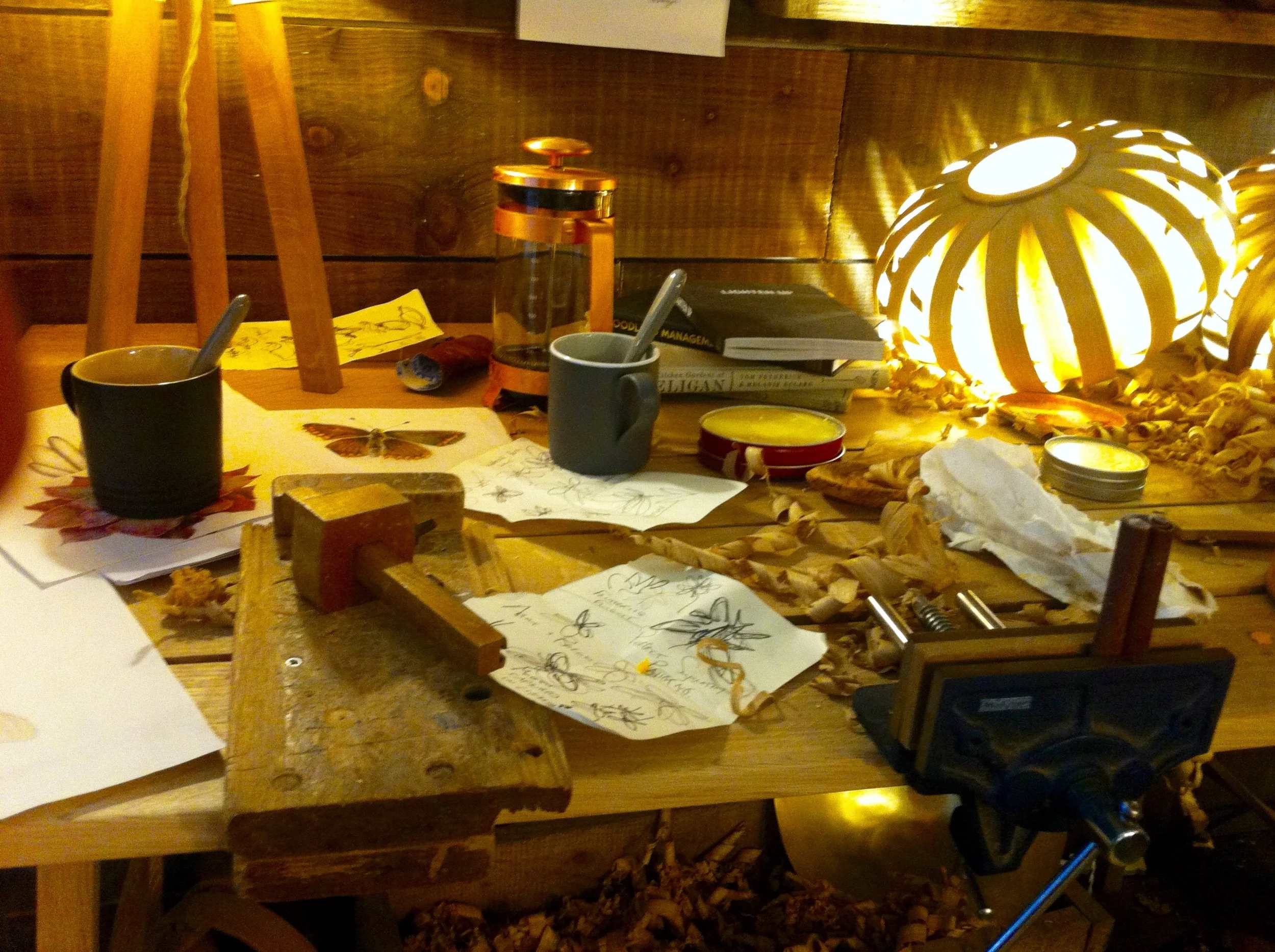
1. Tom Raffield

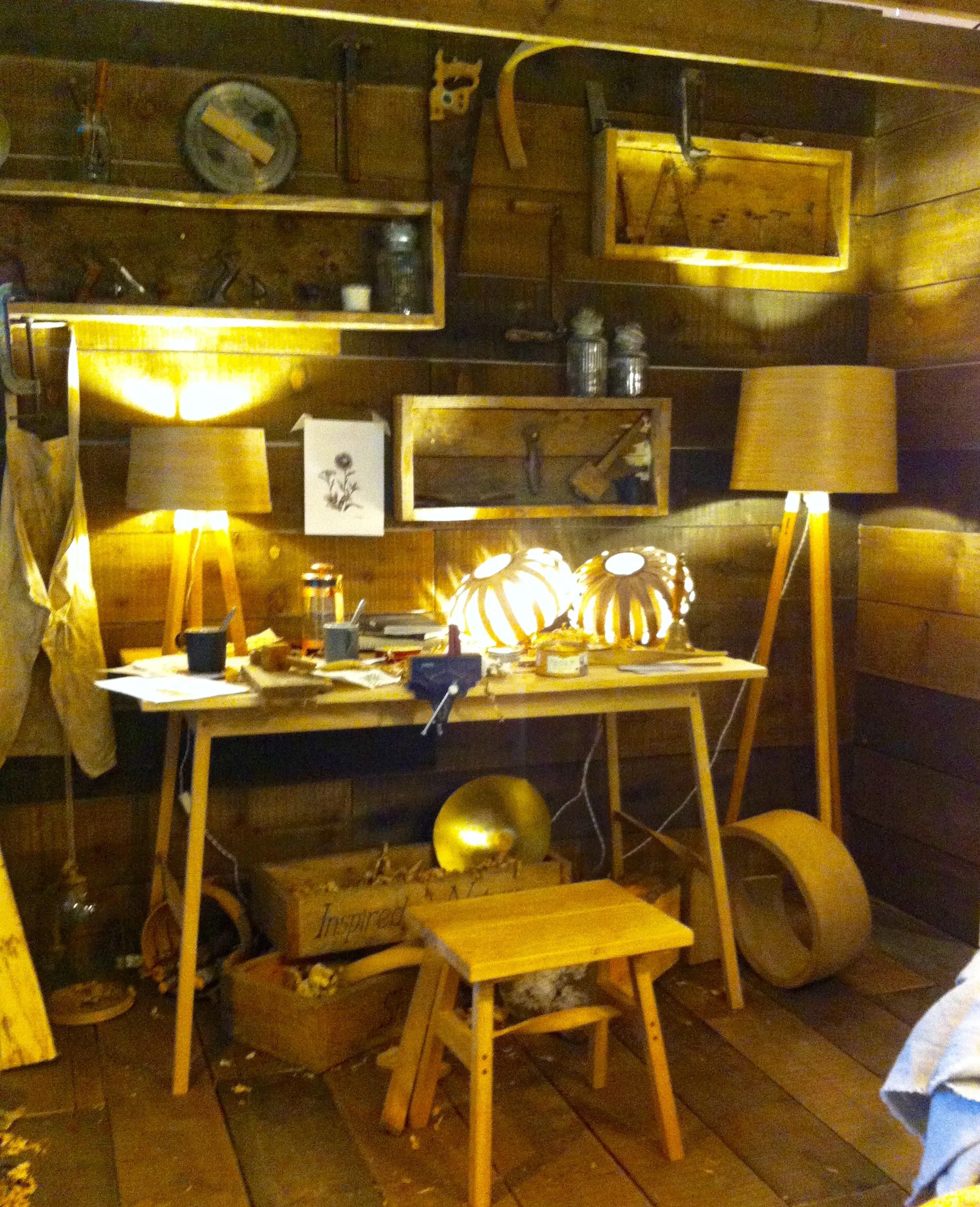
With his imagination stimulated by the beauty and wilderness of Exmoor where he grew up, Tom's designs are spectacular, ecologically sound and beautiful. He's a former winner of the Lighting Design Association's Lighting Design Award and it's easy to see why. 

His space is themed on a woodland cabin of someone who creates beautiful products using traditional methods. It's inspired by his home, a gamekeeper's cottage set in 30 acres of woodland in rural West Cornwall. Which if I'm honest sounds idyllic.

TomRadffieldJohnLewisCreativeSpaces.jpg

2. Buckinghamshire New University

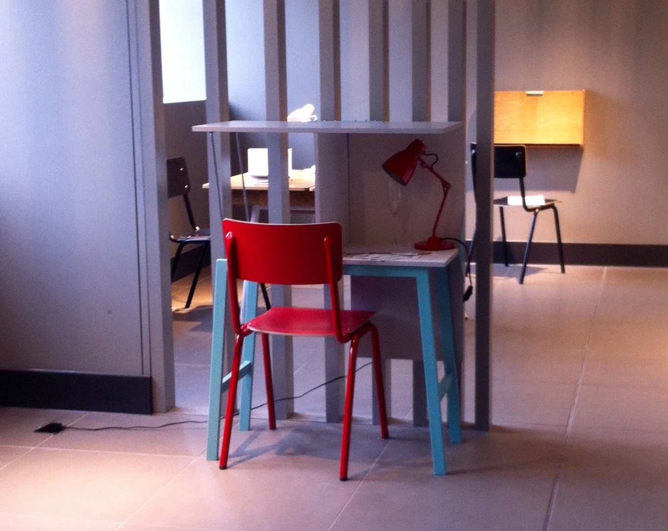
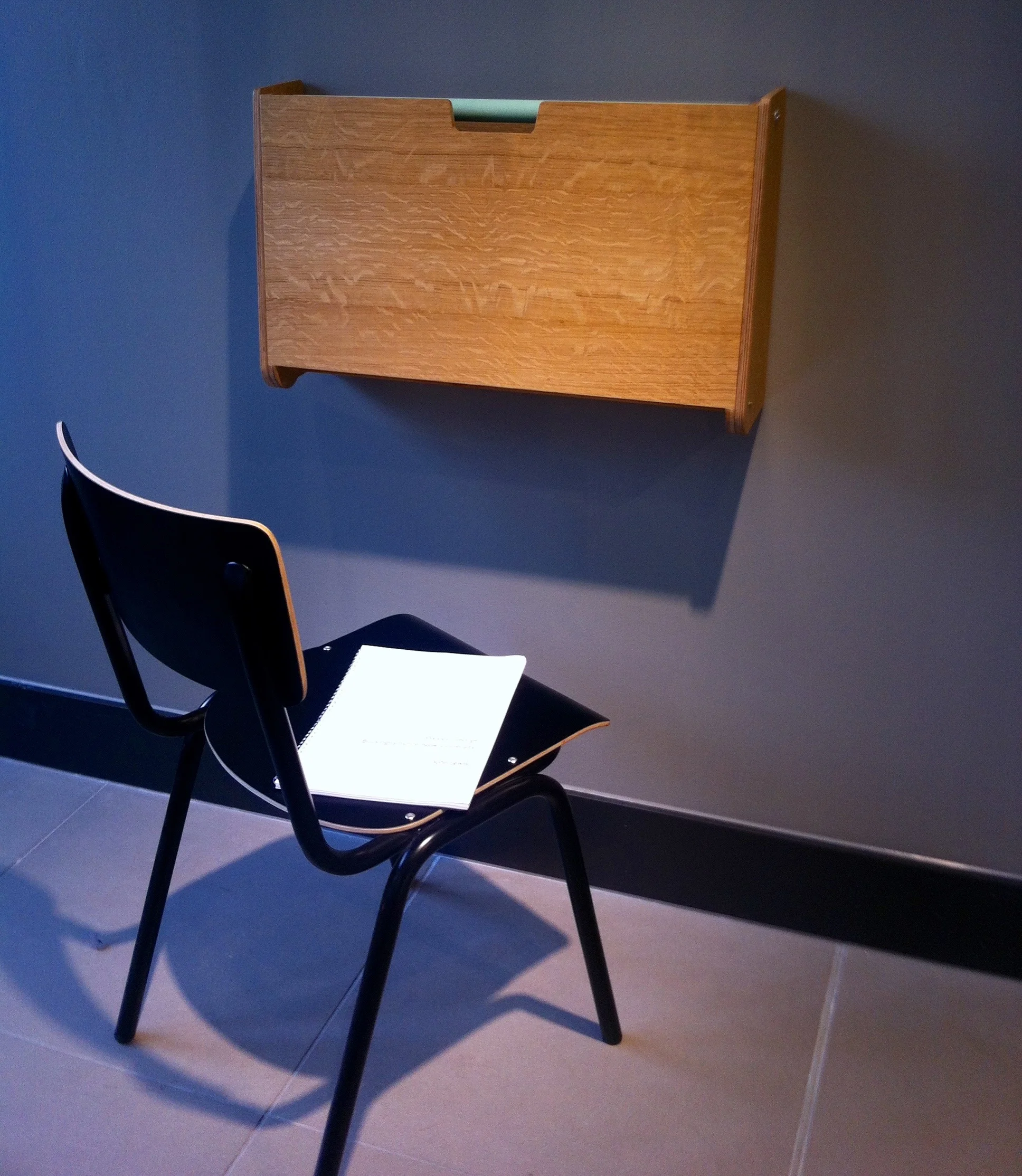
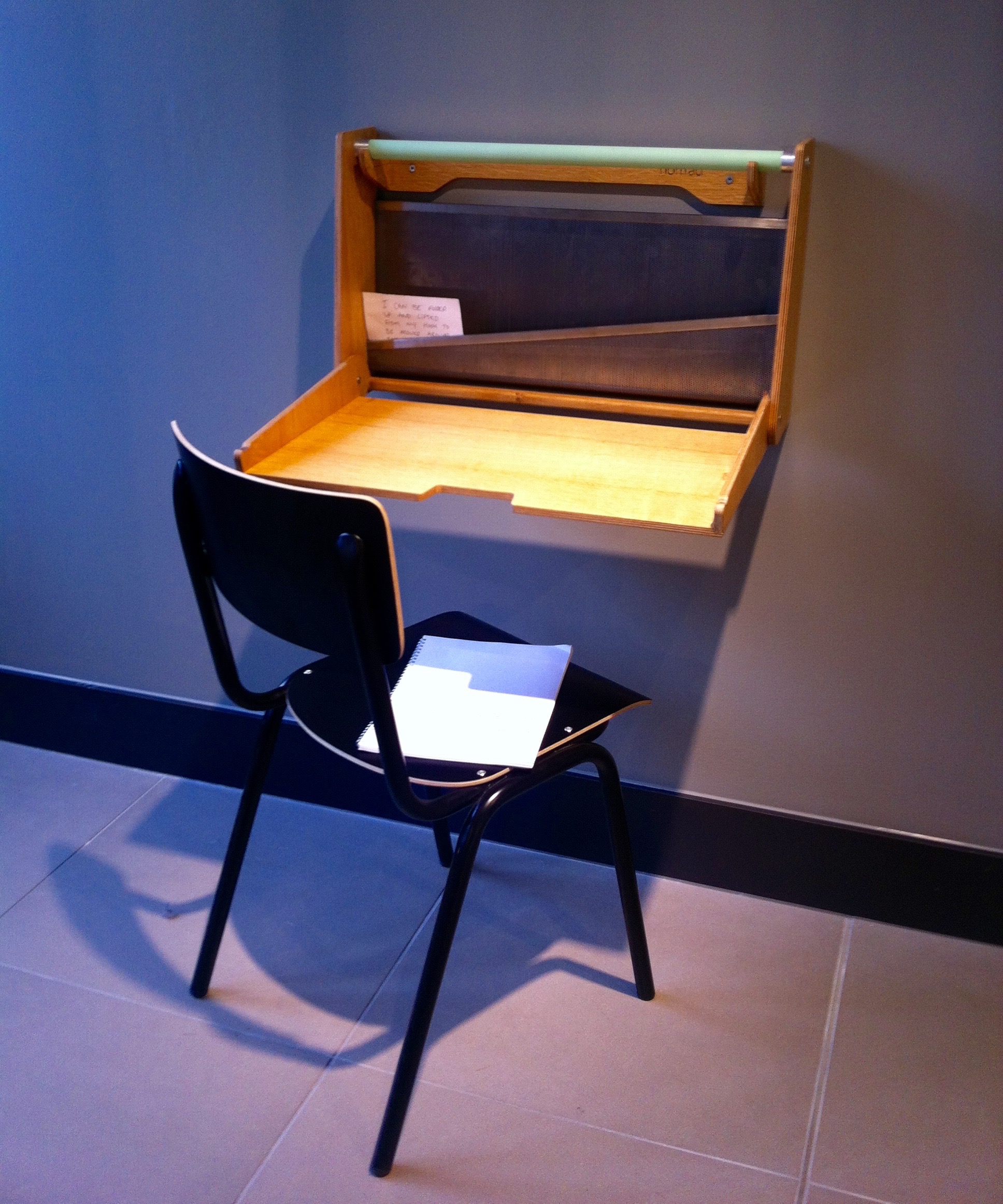
Charlie Fowler, a member of John Lewis' Design Studio has worked as a furniture designer for ten years. His most recent outreach project involved third year students from the BA Furniture course at this university. The students designed furniture aimed at solving the problems associated with working from home.

The design brief reflects the increasing number of people who work from home and the blurring of boundaries, particularly in urban areas where pressure on space means that very few people have a dedicated room to use an a home office. These pieces have been designed to make the maximum use of space and to be multi-purpose and adaptable.

I've mixed feelings about these, I can see why they could be very popular and there was one piece that I really liked. But apart from that one piece - and I'm pretty sure you'll work out which one without me telling you - I couldn't ever see me buying these. 

BuckinghamshireNewUniversity.jpg

And yes, it was the fold-up desk on the wall that I was taken with. I think it's a clever way of incorporating a desk into almost any space. If I wasn't already running out of walls, or didn't have sloping walls upstairs I'd be looking into this further.

3. Timorous Beasties

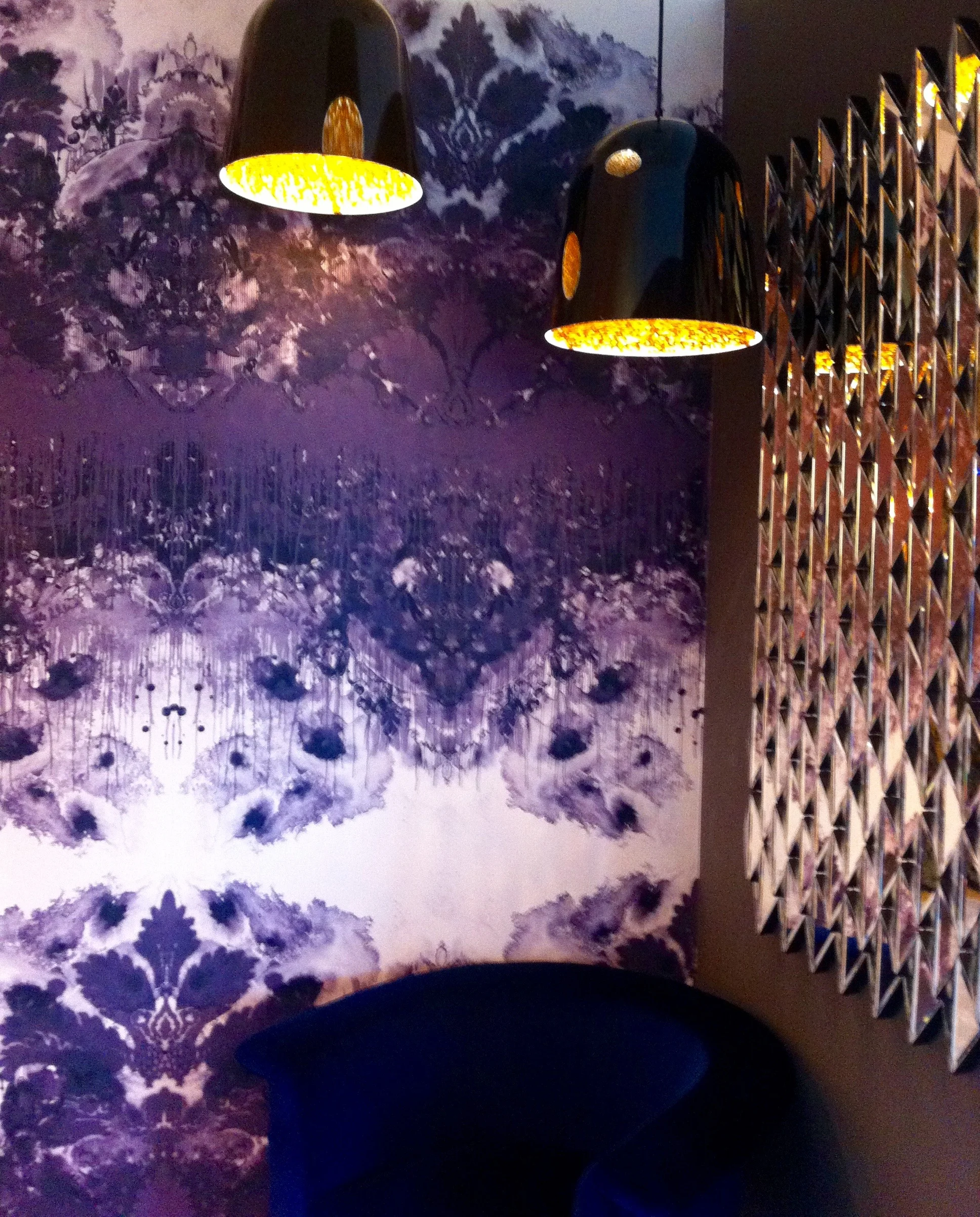
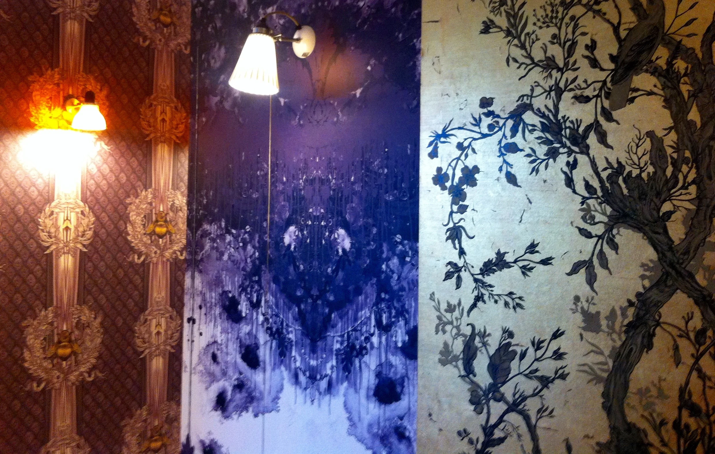
Founded by Alistair McAuley and Paul Simmons in 1990, Timorous Beasties are noted for their surreal and provocative textiles and wallpaper. The studio is a diverse operation considered iconic by those in the know and has won many awards.

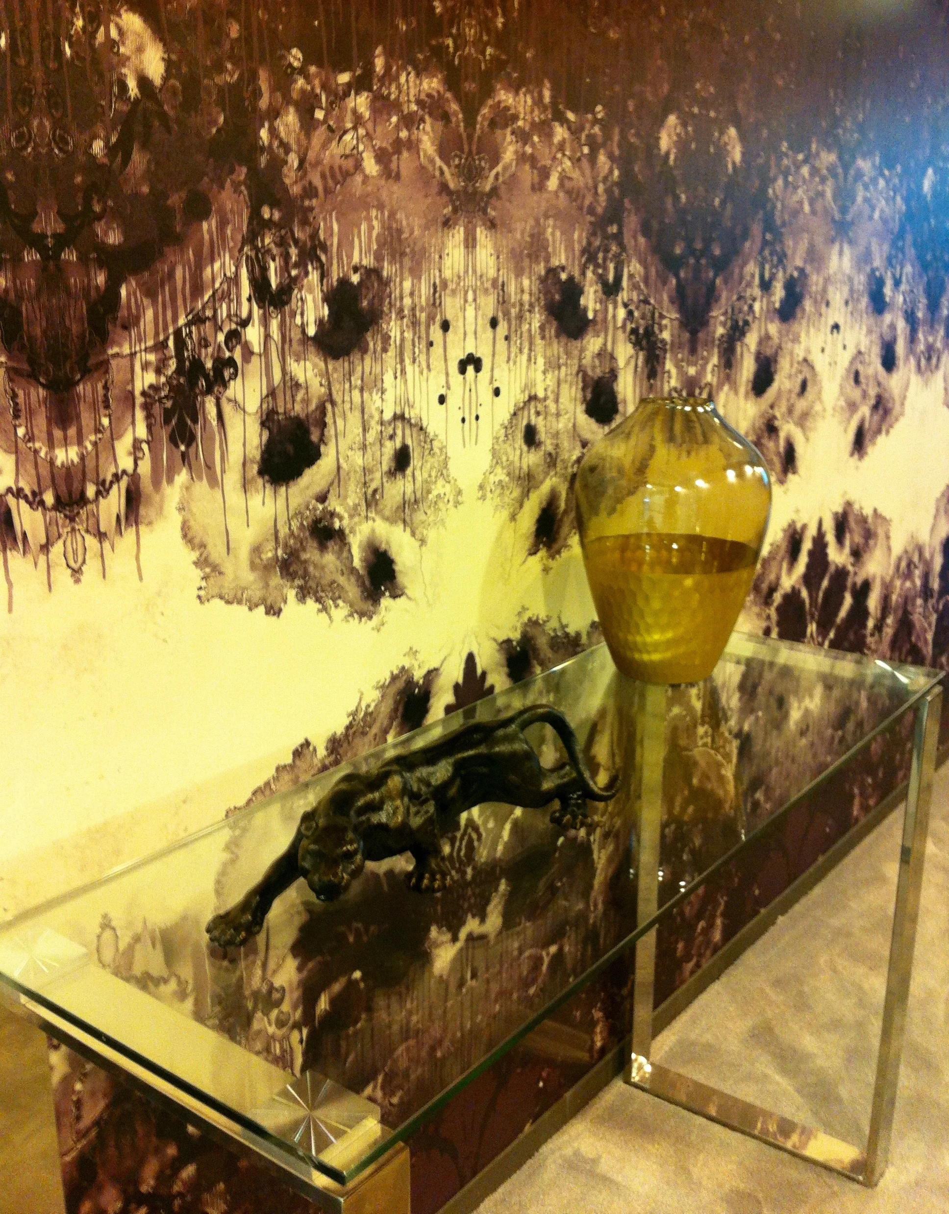
This space explores the great opportunities that hallways have. They're often the first space that greets you into your home or one that enables you to move from room to room, and they believe this means we can be more daring and provocative than in a conventional room. Here they have kept everything relatively dark to illuminate the rooms leading off the space, and this is a very deliberate attempt at reassessing an often neglected space.

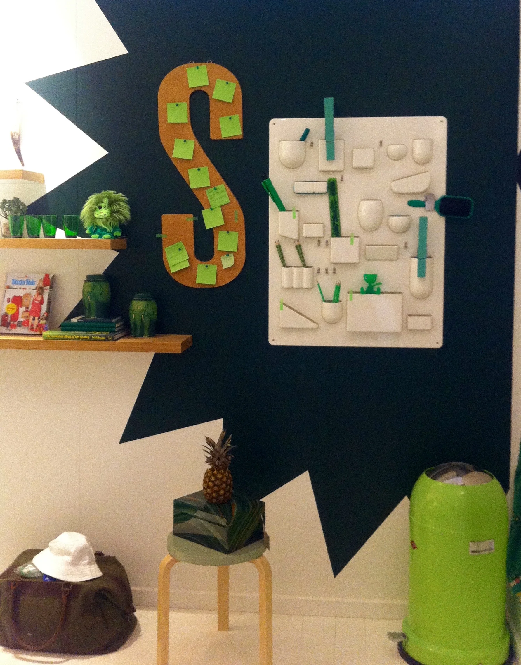
4. Supermarket Sarah

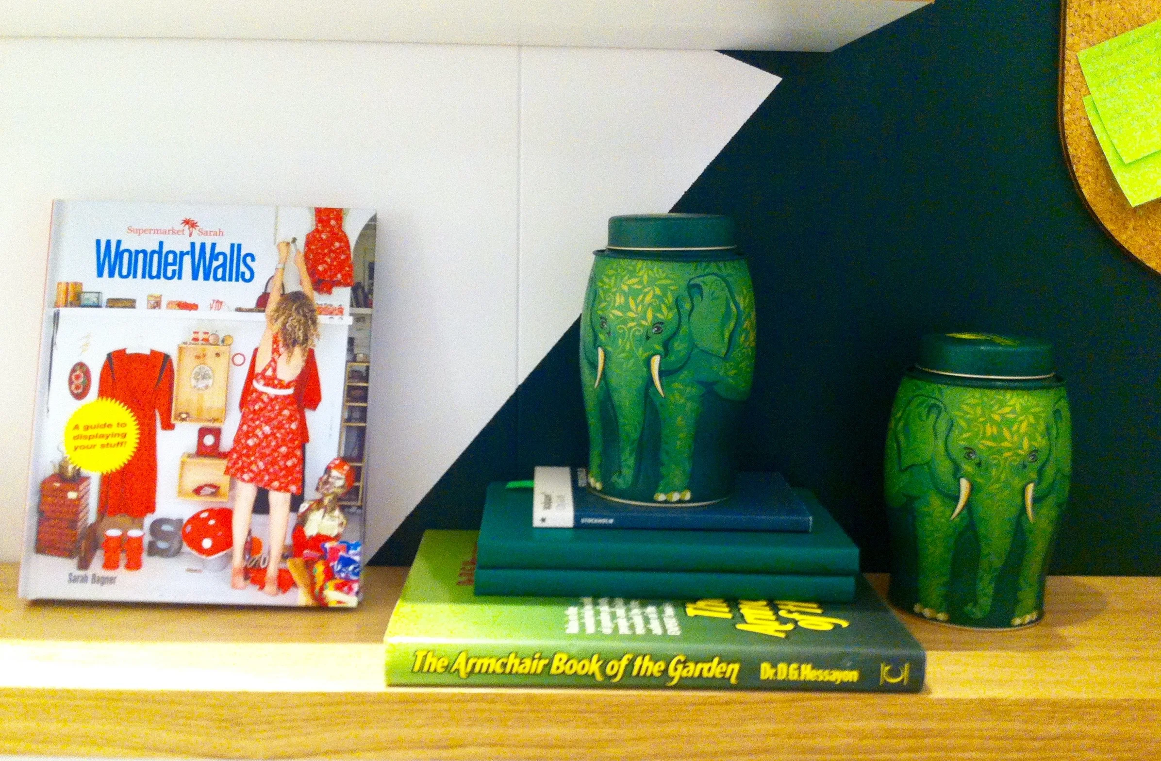
Sarah is a stylist and she wanted to mix her passion for fashion and interiors with a fun new way of shopping online. It's a simple idea and is a wall of "clickable" items. Sarah sells items on uniquely curated walls, the first of these went live from her living room. They soon spread to bars, galleries and major department stores. The site is now an open platform for creatives to sell their wares and Sarah works with major brands to create unique retail spaces and branded content.

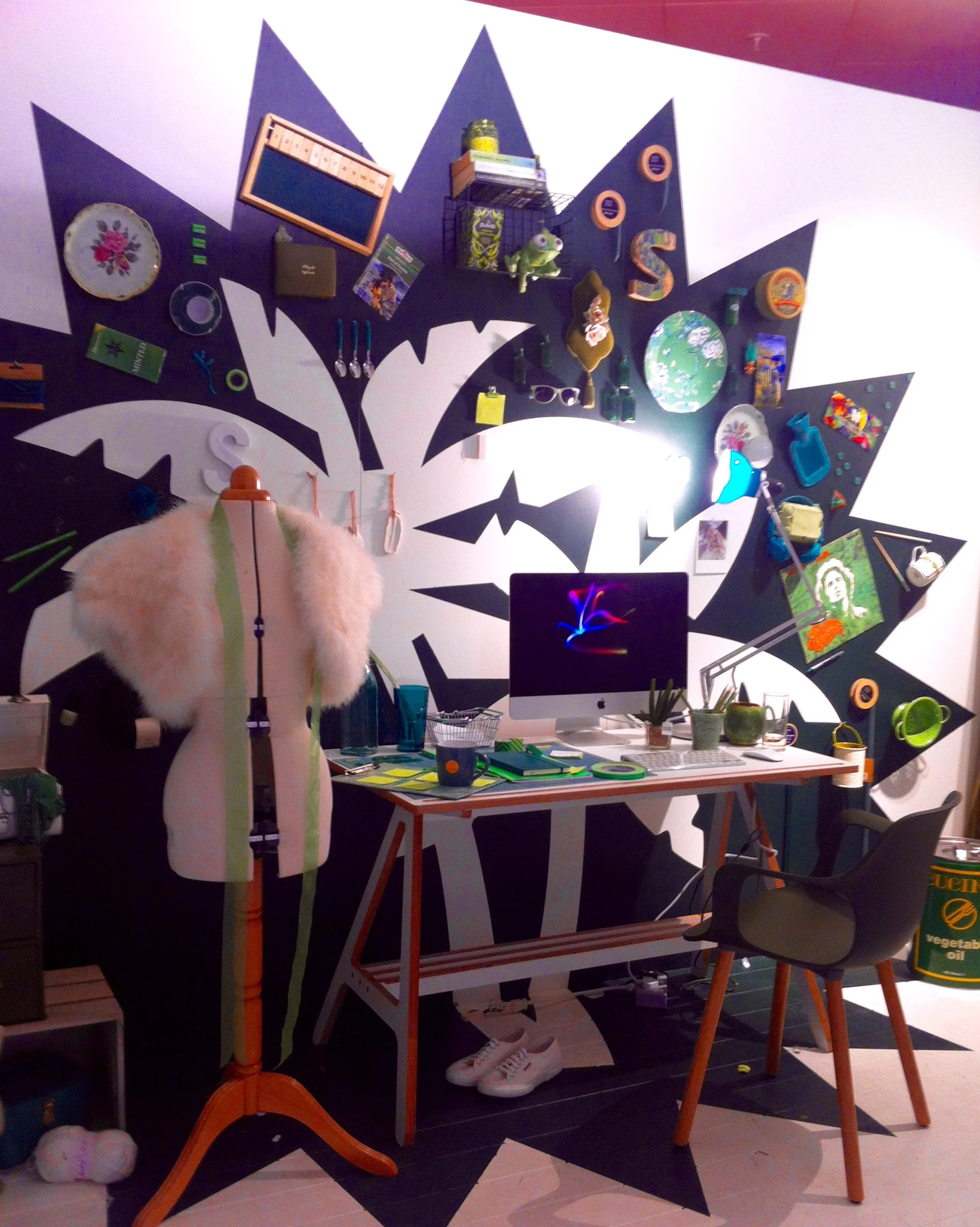
Sarah's Supermarket room forms her signature splash which is normally in CMYK colours but is now in the John Lewis green, and she's picked her favourites for her ideal studio which embodies the feeling of studio play.

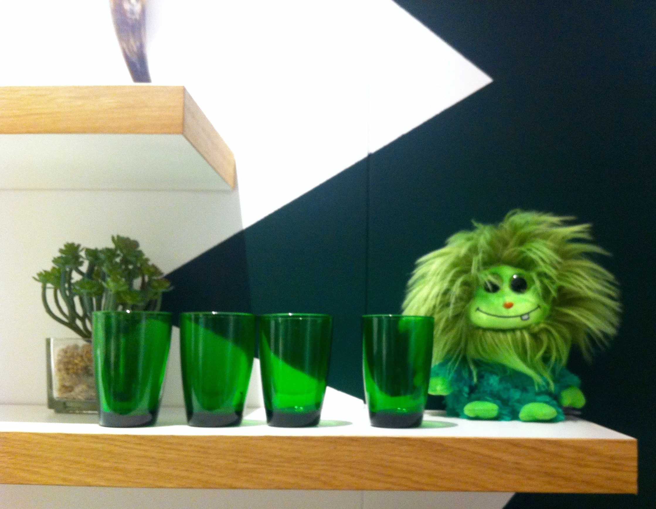
I found this to be a fun set and I as I'm rather partial to green, I found lots of things to like - especially the large S!

So there was quite a lot to take in in this relatively small space. And without knowing it was there either. I'm not sure how long it's there for, but I'm glad to have seen it. What do you think?

Home Etc