I couldn’t quite believe my eyes when I stumbled across this exhibit of smallest room room sets at Grand Designs Live at the Excel last May. I mean it was made for me to share with you but somehow I didn’t get around to editing the photos, until now, and I’m excited about them all over again.
There was a whole block of individual room sets, each different and each put together by different designers. I have a varying number of photos for each design, which all this time later gives more of an insight into my favourites, but you’ll discover that as I share the posts.
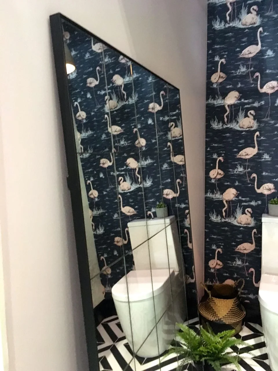
This first one is all about the glamour and it’s by Grace and Grey, who have plenty of quirky home accessories and furniture on their site, which is well worth a look. And who can resist a flamingo wallpaper?
The thing that struck me most about this room set was the large free standing-looking mirror - if you look carefully it’s secured, but designed to be at this angle - but it’s quite something isn’t? Despite the theme of glamour, it has a bold design that mixes pastels and geometrics, and does it well.
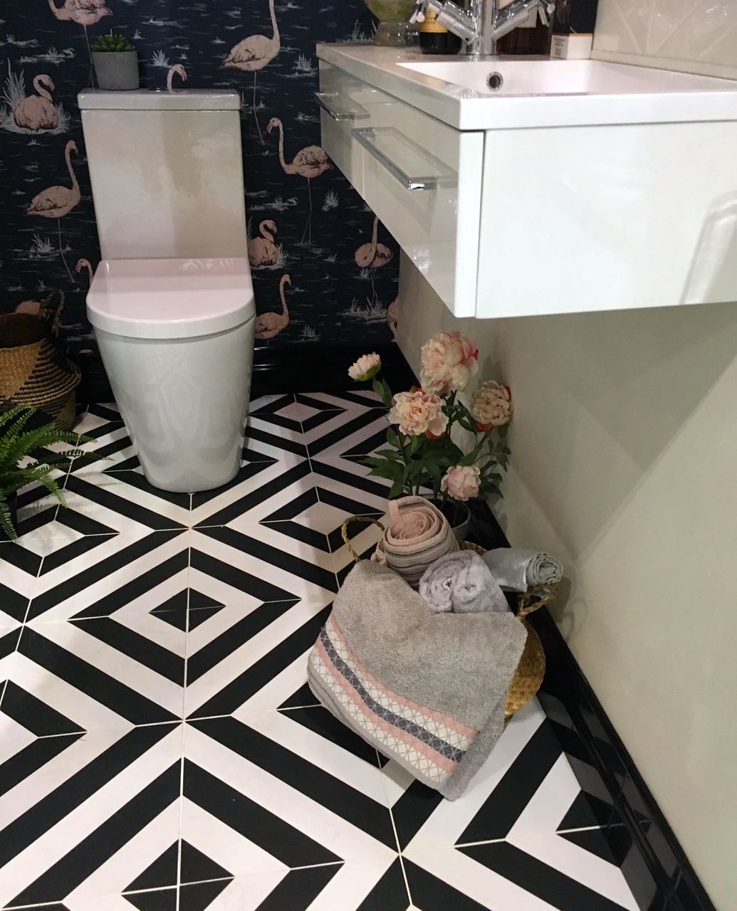
But there was one final surprise, and that was on the wall opposite the mirror. This beautiful oversized chevron tiled splashback, whose colours complement the pinks of the wallpaper. Splashback is probably doing it a complete injustice, tiled wall art is probably more accurate.
Isn’t it unusual, but effective?
I’m also a fan of the simple clean lines of the sink unit, and I’m a firm believer of having somewhere to put essential junk in a bathroom so I’m hoping that the left-hand side provides that. Overall this lavatory works for me, and demonstrates how chevrons and patterns, darks and pastels can work together well. I think often in our own homes we err on the side of caution in our decor, and need these reminders that it’s ok to be a bit braver.
What do you think?

