
Love this #97: The Card Boys

One of my highlights from this year’s Grand Designs Live show was The Card Boys who were in one of my favourite areas of the show - the Design Arcade. For a small space it’s crammed full of really interesting stuff, the stand we bought our new light from was also based here, but more of that another day - we expecting to take delivery of the light later on today.

But back to The Card Boys

It’s essentially a card subscription box - so depending on your views on boxes in general, it may or may not be for you. The longer version of what it is, is a small piece of art on every card which supports independent artists and illustrators, and provides something more unique than cards from most high street stores. On the back of each card there’s the artist’s biography with their web and instagram links - so it’s a great way to discover artists, and great for artists to get their work more visible.

Each box is seasonal and contains eight cards for £24 - so £3 a card, which is really good value, though that clearly depends on if you like the designs, and how many cards you use/send. You can skip a box, so as long as you make the arrangements in time you won’t be charged, and you can cancel at any time. It’s a new venture set up by Callum and Adam - the Card Boys - who are creatives who met at school in Brighton.

I’ll concede that I do have a bit of a thing for cards, and often buy cards in advance when I see a card that will work for someone, or even buy multiples just to have a supply ready to use when I need them. MOH knows me well and wasn’t surprised when I stopped to find out more, and even less surprised when I signed myself up.

Step into springtime

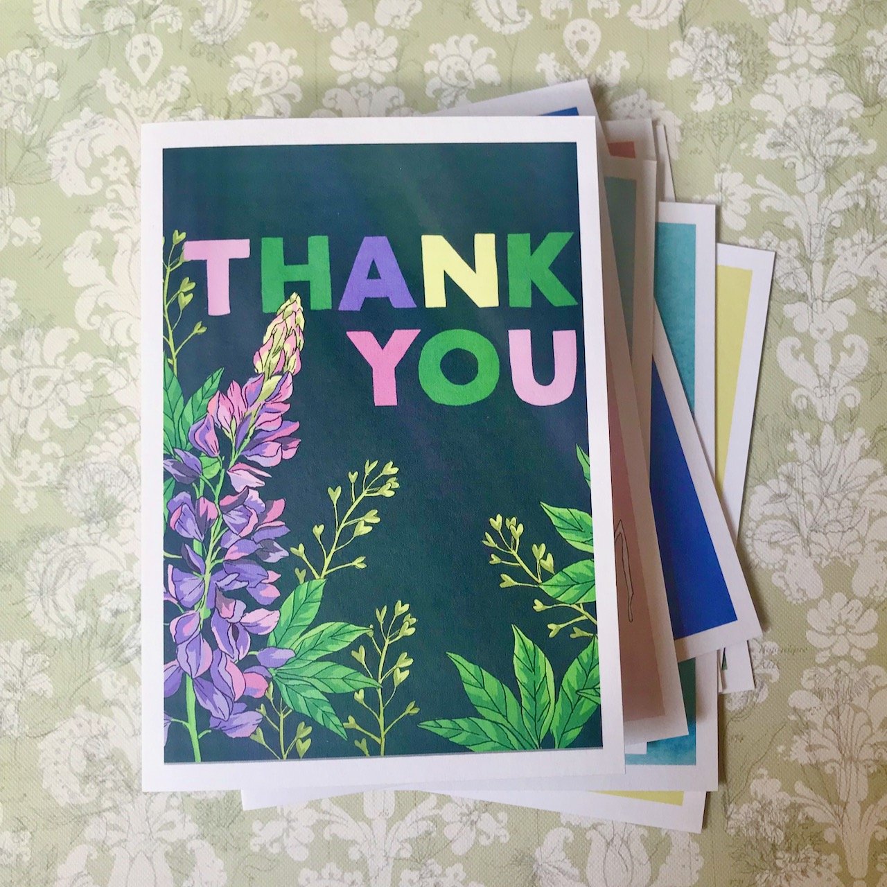
The spring box was on offer at the show - so it was even more attractive to me. I’ve shared each of the cards and artist’s images below. My absolute favourite card in this set is my final picture - the Thank You card by Hannah Grace, it’s even more stunning in person. I think that will be the card that I’ll struggle to part with, and if I do, the recipient should feel especially worthy!

I should say I like all of the designs, there’s only one, maybe two that I most likely wouldn’t have chosen but I’m not sharing which. I can recognise the work that’s gone into each design, and I am sure the appropriate occasion will present itself, I just don’t know what that is yet.
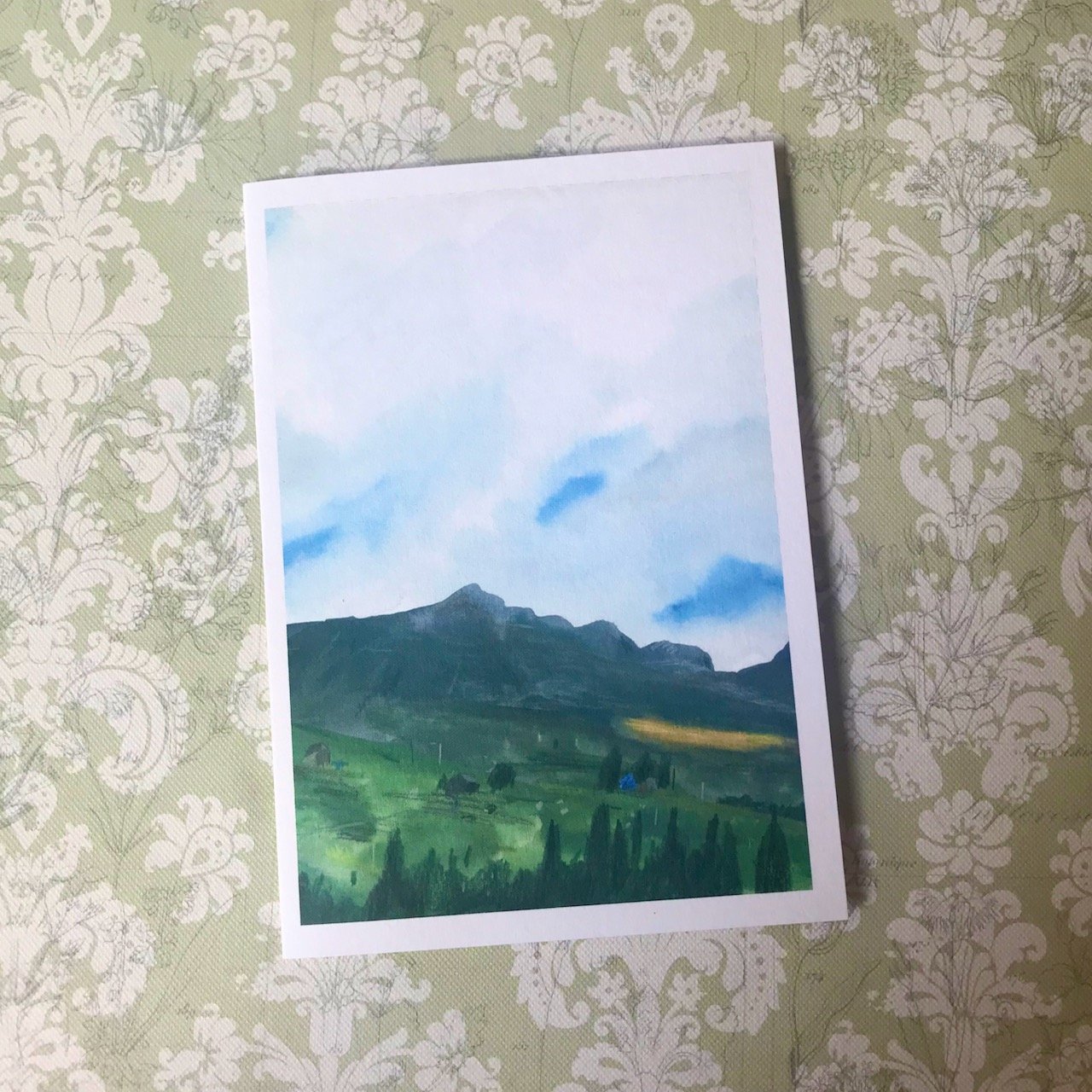
A landscape of mountains, blue sky beneath the clouds and grasslands at the foot of the mountains

ARTIST: MICHAEL BARTLETT

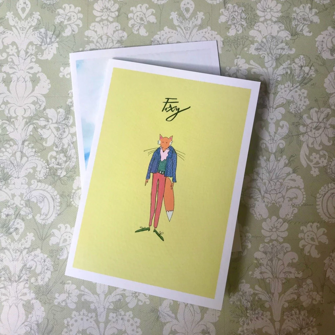
A fox standing upright dressed in pink trousers a blue jacket and a green top.  Wearing shoes (obviously) with the word Foxy above - image on a yellow background

ARTIST: GRACE CHILTON

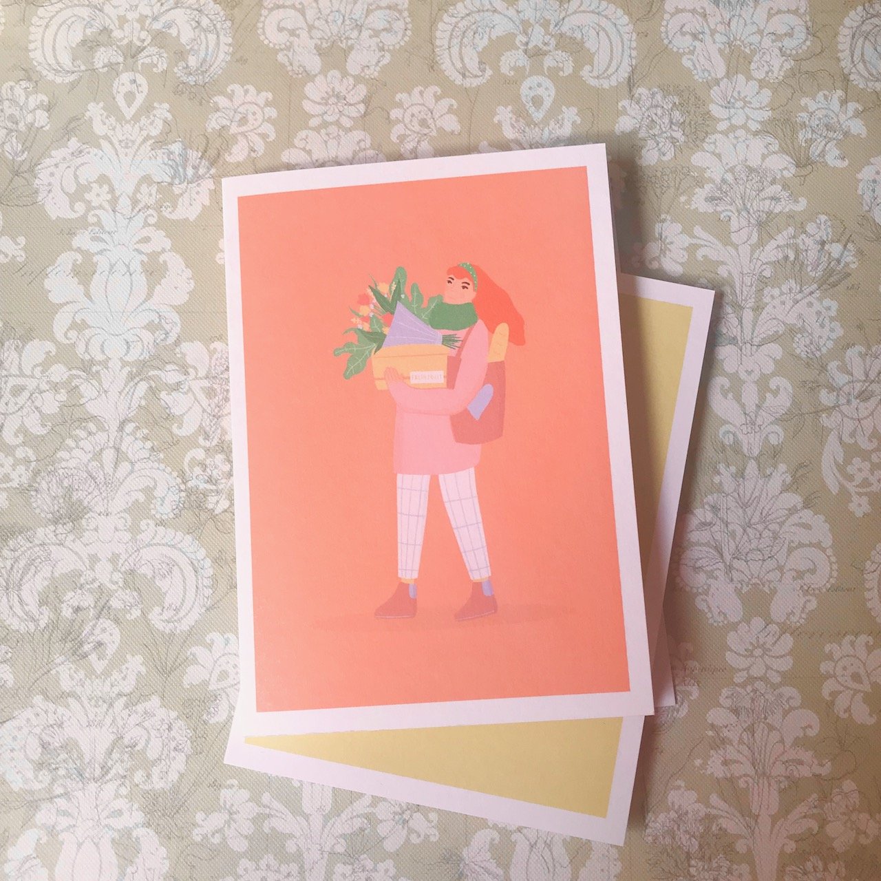
A female on a salmon background wearing coat and trousers and  a scarf, carrying packages a bunch of flowers and a tote bag with a loaf of bread

ARTIST: EMMA TOBEY

A blue waterwash background showing 8 synchronised swimmers in red bikinis and swimming caps forming a pattern by holding each other's left hand

ARTIST: EMILY LUSCOMBE-WATTS

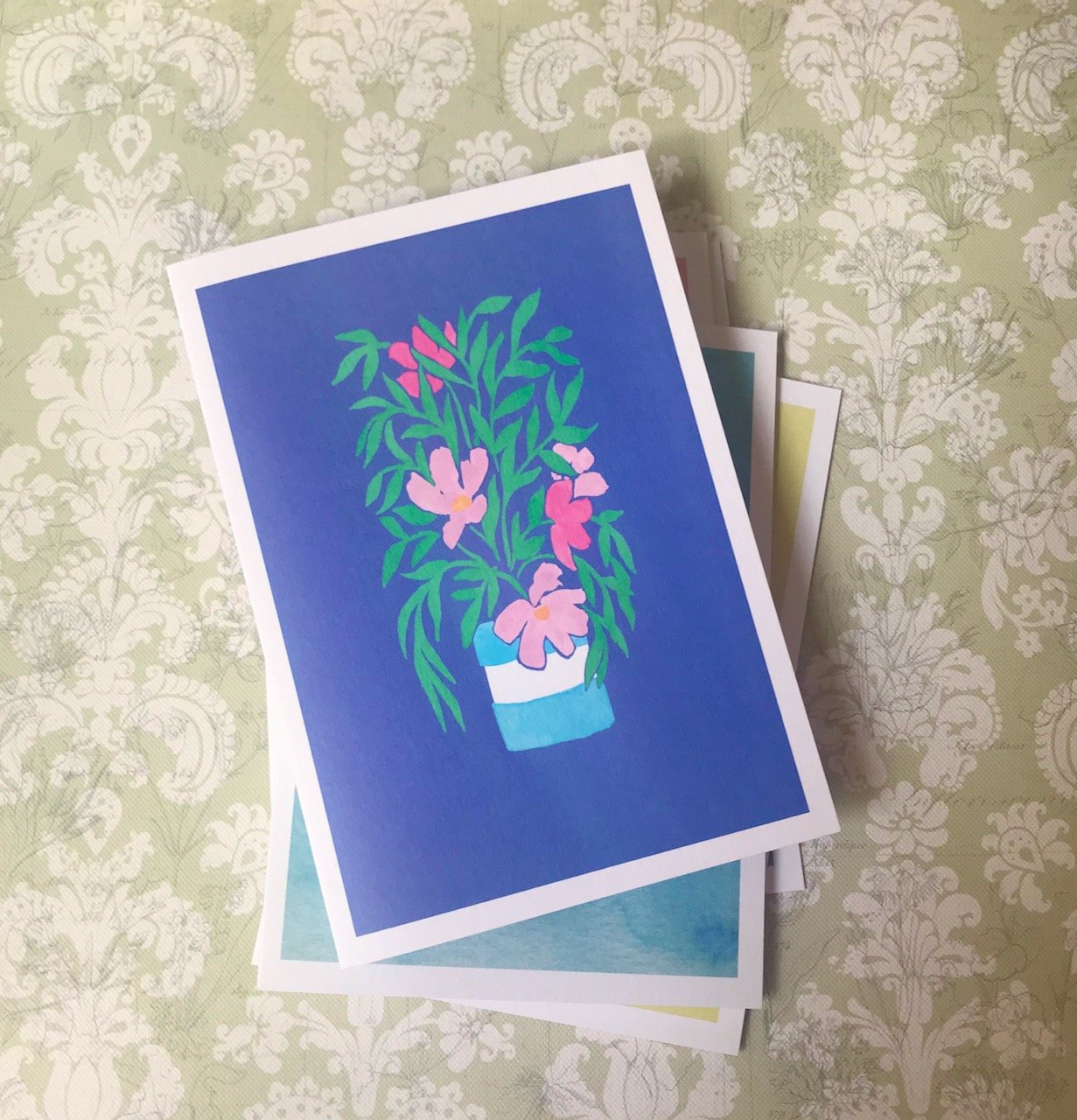
A pink flowering plant with tall green leaves in a blue and white pot on a purpley/blue background

ARTIST: REBECCA DIGGLE

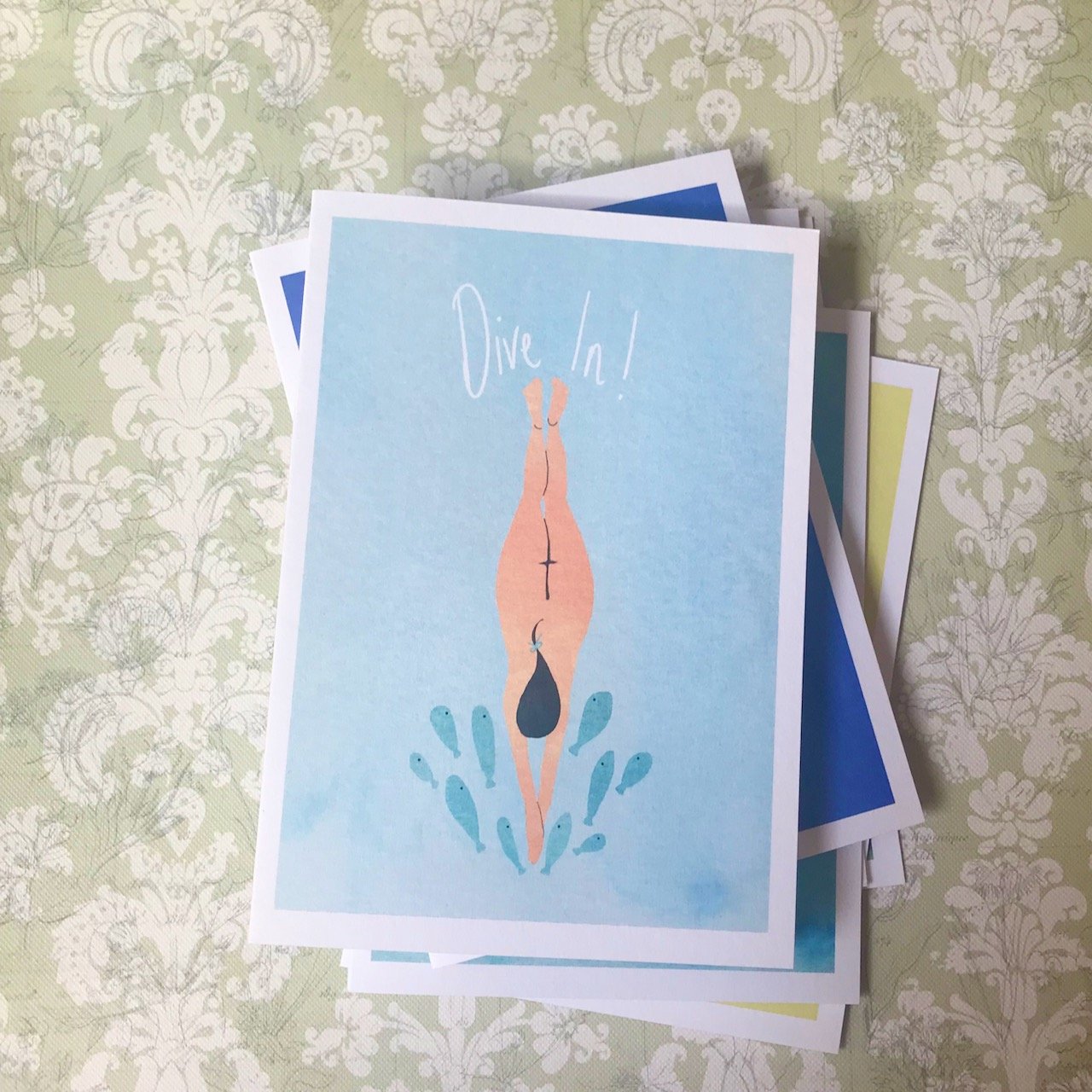
A pale blue background, below the words Dive in! is a female naked body diving into the water, the splashes are small blue fish

ARTIST: EMILY LUSCOMBE-WATTS

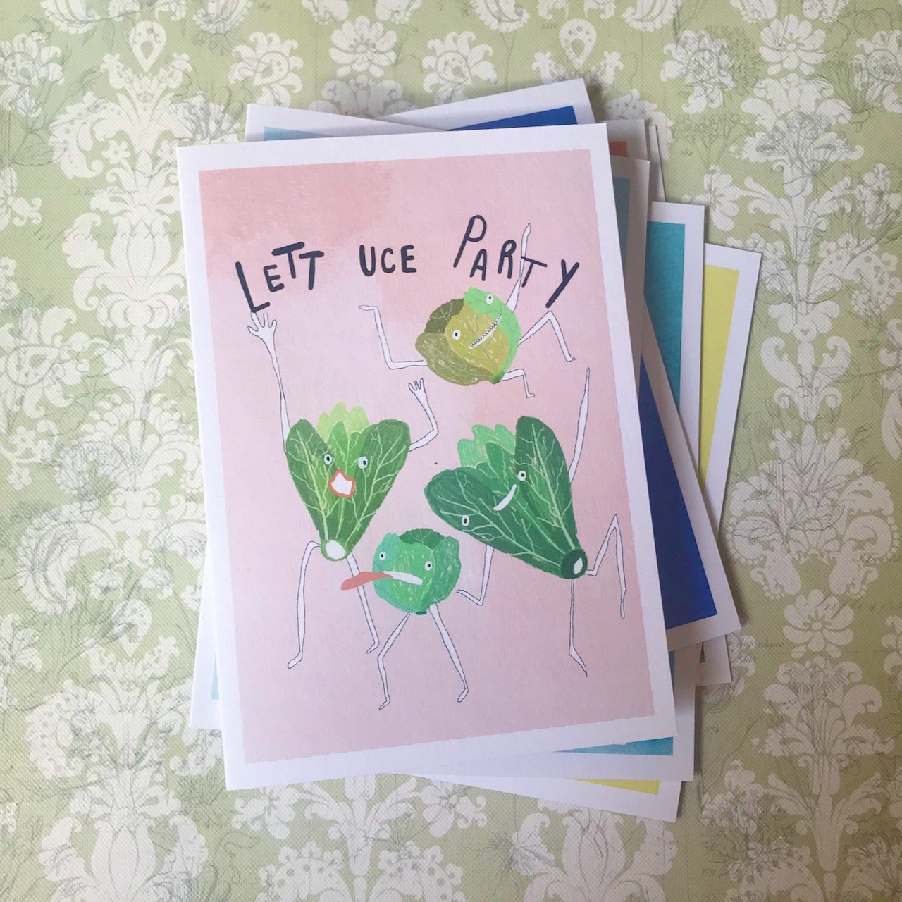
Four lettuces with arms and legs (obviously) dancing with the words Lettuce Party above on a pale pink background

ARTIST: GRACE CHILTON

A navy blue background with capital letters in pink green purple and yellow spelling THANK YOU.  in the lower part of the card is a pink/purple lupin plant with green leaves

ARTIST: HANNAH GRACE

I’ve already used one, and am looking forward to using some more - but probably not my favourite design! And, like any subscription box, the anticipation of what’s in the next box is high…
I was featured on Blogger Showcase

The working from home project: discrete and beautiful

Last weekend we headed over to Grand Designs Live, which was the first time it had taken place since before the pandemic. I’ll share more about the show another time as there was lots to see, but I was pleased to see that the room sets were back - and with a theme that many of us I’m sure have grappled with these past few years. If you’re anything like us, back at the start of the pandemic the working from home thing felt a temporary thing, but yet here we are a couple of years on and it’s still very much part of working life for many.

This design by Monica Gounaropoulos from Spiti and Soul Interior Design sets out to create a multifunctional home office within an existing room. Monica says that she ‘wanted a usable space which can also be enjoyed to the max once work has finished’ - and there are many people that have needed just that. Not everyone has an additional space to use, and so the challenge has been keeping that balance.

Monica’s design incorporates discrete solutions concealing work items and leaving a beautiful focal point for the room, which helps separate work from home life. She uses a colour palette of blue for productivity and orange as a mood lifter.

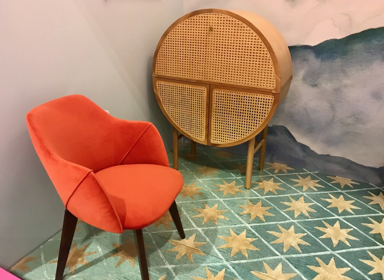
A round cabinet (desk) against the wall with an orange chair in front
A wooden open shelving unit and alongside a wall painted with a 'mountain range' design
The round wicker 'desk' cabinet, orange chair on a rug which is a green/blue with gold stars
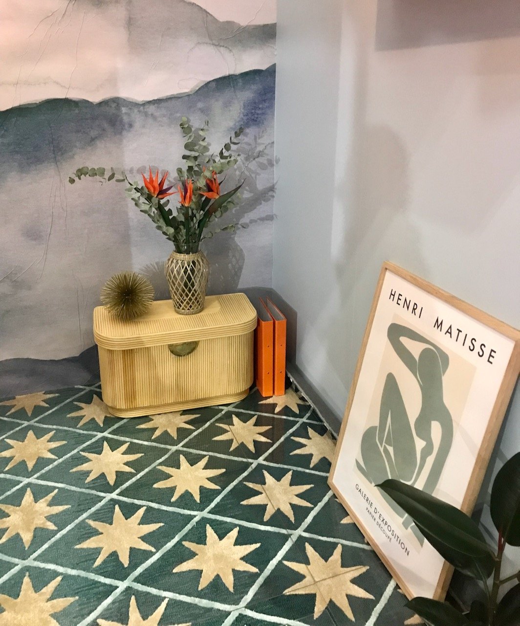
Below the open shelving unit showing the floor with a blue/green rug with stars on there is a small wicker-like storage unit and a framed matisse print leaning against the wall

Now I liked this room set, the rug, the feature wall and the pop of orange - but it’s only when writing this post that I’ve realised that it’s showing the ‘at home’ set-up rather than the ‘working’ element, and that feels like a miss. There’s no doubt it’s been put together well, and the rug and backdrop wall are stunning, but it doesn’t scream working at home to me, or maybe that’s the point?

I was featured on Blogger Showcase

Tropical loos in the City

I’ve realised that the past couple of posts have a bit of a tropical feel to them, and yes, here’s another. I’m not sure what this means - is it that tropical things are having a moment, or am I just being drawn to them? Does that mean I need to head to a jungle, or decorate in the same style? I’m not sure, but I know that the lushness of each of the posts is definitely appealing - and if you scroll back, you’ll see that while there’s the tropical theme, each of the posts are pretty different.

And this one’s different too, after a fair break thanks to the pandemic, I’m back visiting loos. Or rather I’m sharing the well decorated loos with you - these tropical loos were in Browns in Old Jewry, right in the City of London. I was there meeting friends, one of whom I was due to meet a week or so after lockdown and we’ve only just managed it.

As everyone is discovering for themselves, it’s great to start catching up with each other again even though everyone appears more cautious and perhaps a little out of practice.

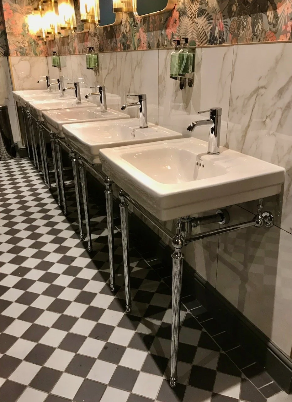
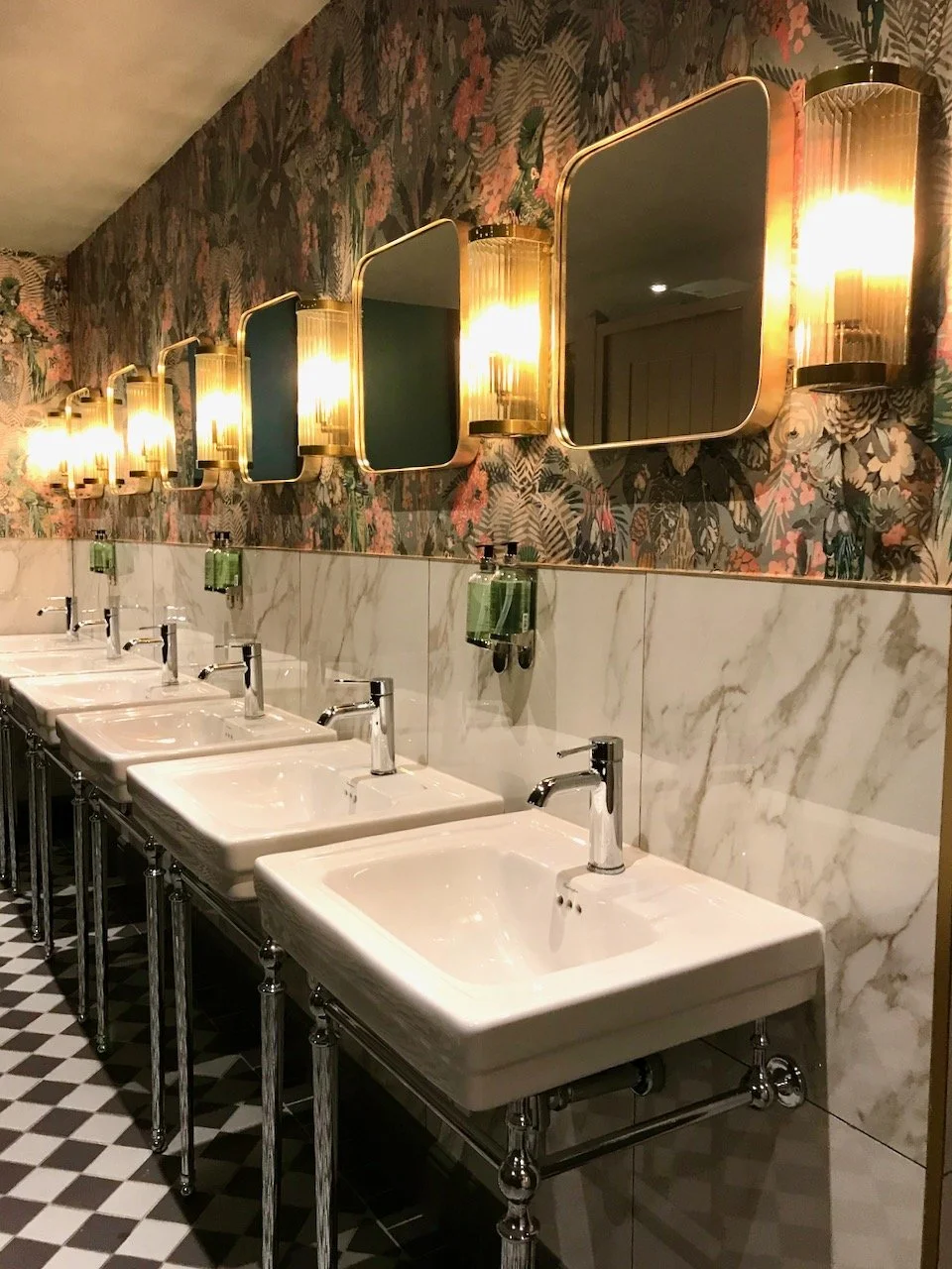
A row of six white sinks on chrome legs, a black and white geometric floor

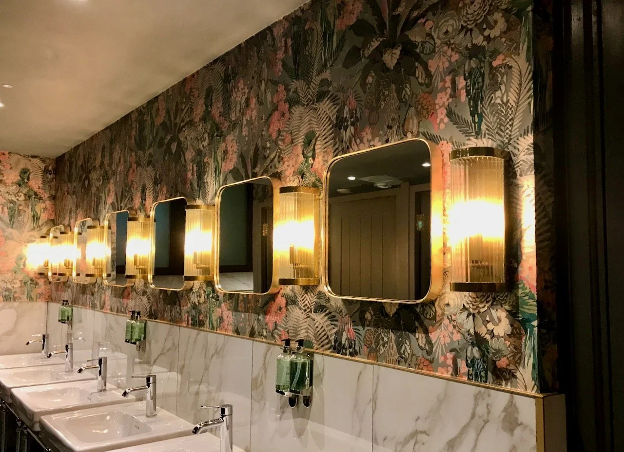
These loos are a little unexpected, but were a very pleasant surprise. You’ll know a standard loo won’t feature here, and this is far from a standard loo. It’s a great mix of styles - classic and more modern, geometric and tropical, brass and chrome - and yet it just works.

Above the sinks are rounded square mirrors with glass tube wall lights in between, set on a tropical lush wallpaer

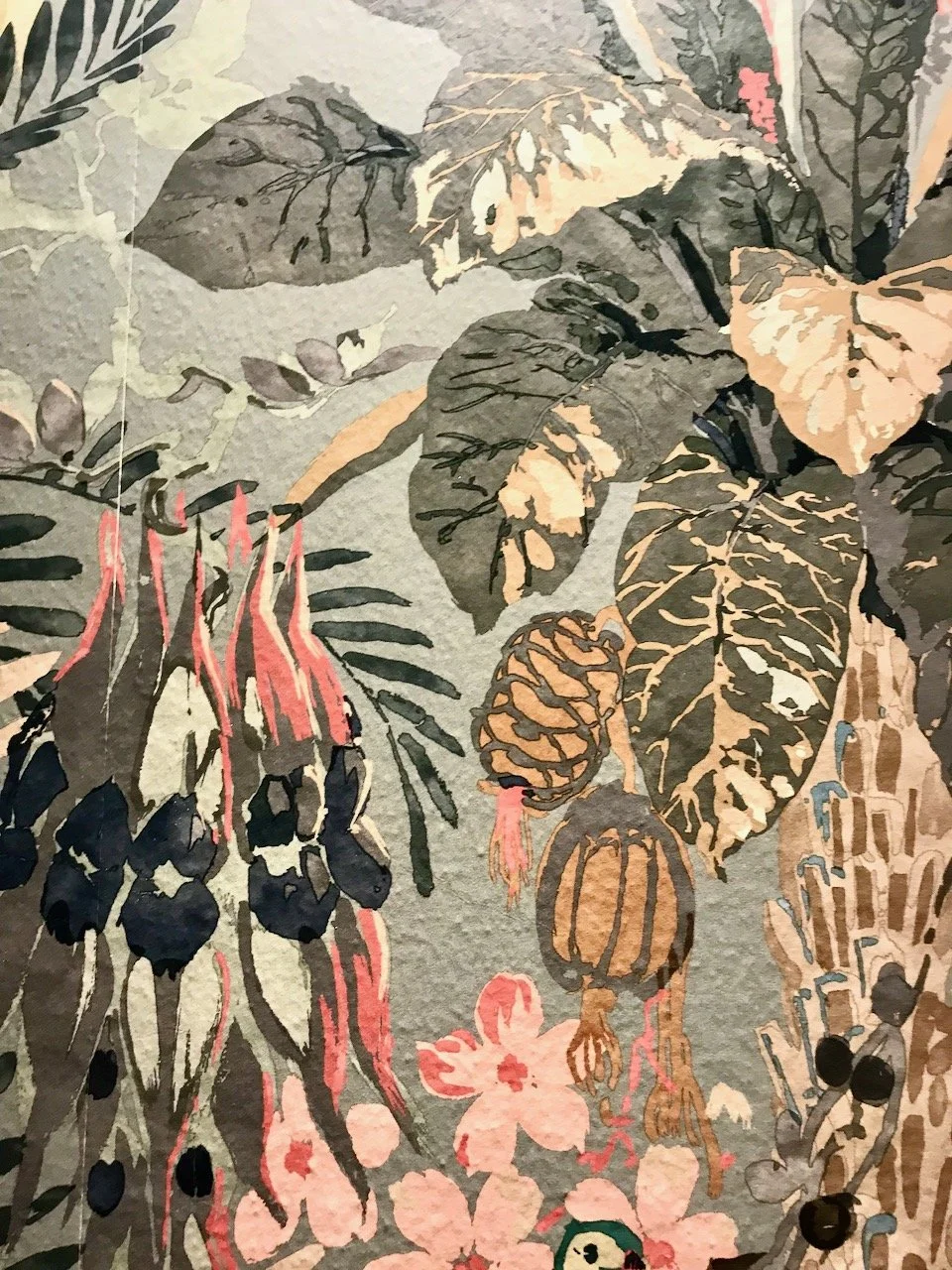
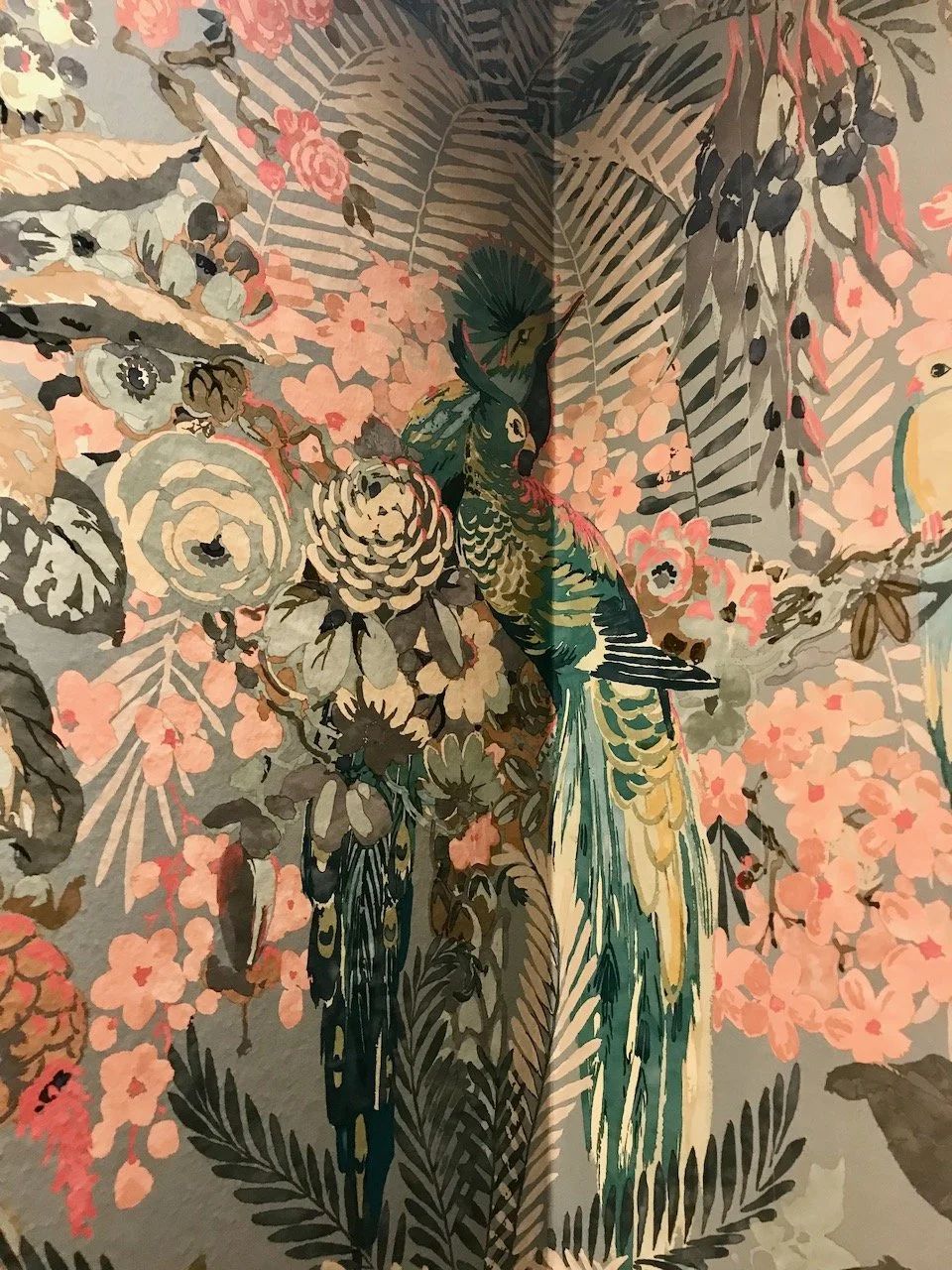
I loved the wallpaper so a close up was in order - though arguably it’s less effective close up, but the birds nestling in the corner worked!

a close up of the plants on the tropical paper
in the corner of the tropical wallpaper, birds nestle

Not convinced it works?

the wallpaper, mirrors, lights, tiles, sinks on legs and flooring

Step back and take the whole view in, I love it - but clearly none of us need that many sinks in our smallest rooms!

I was featured on Blogger Showcase