
My current obsession: Scrappy quilts

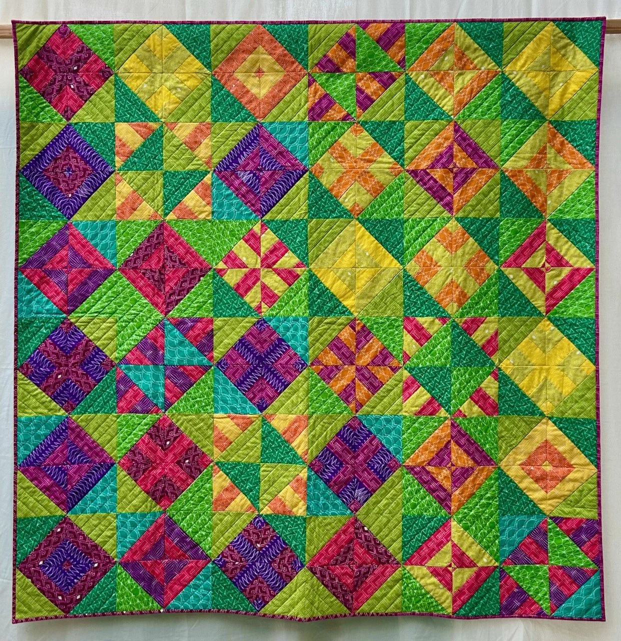
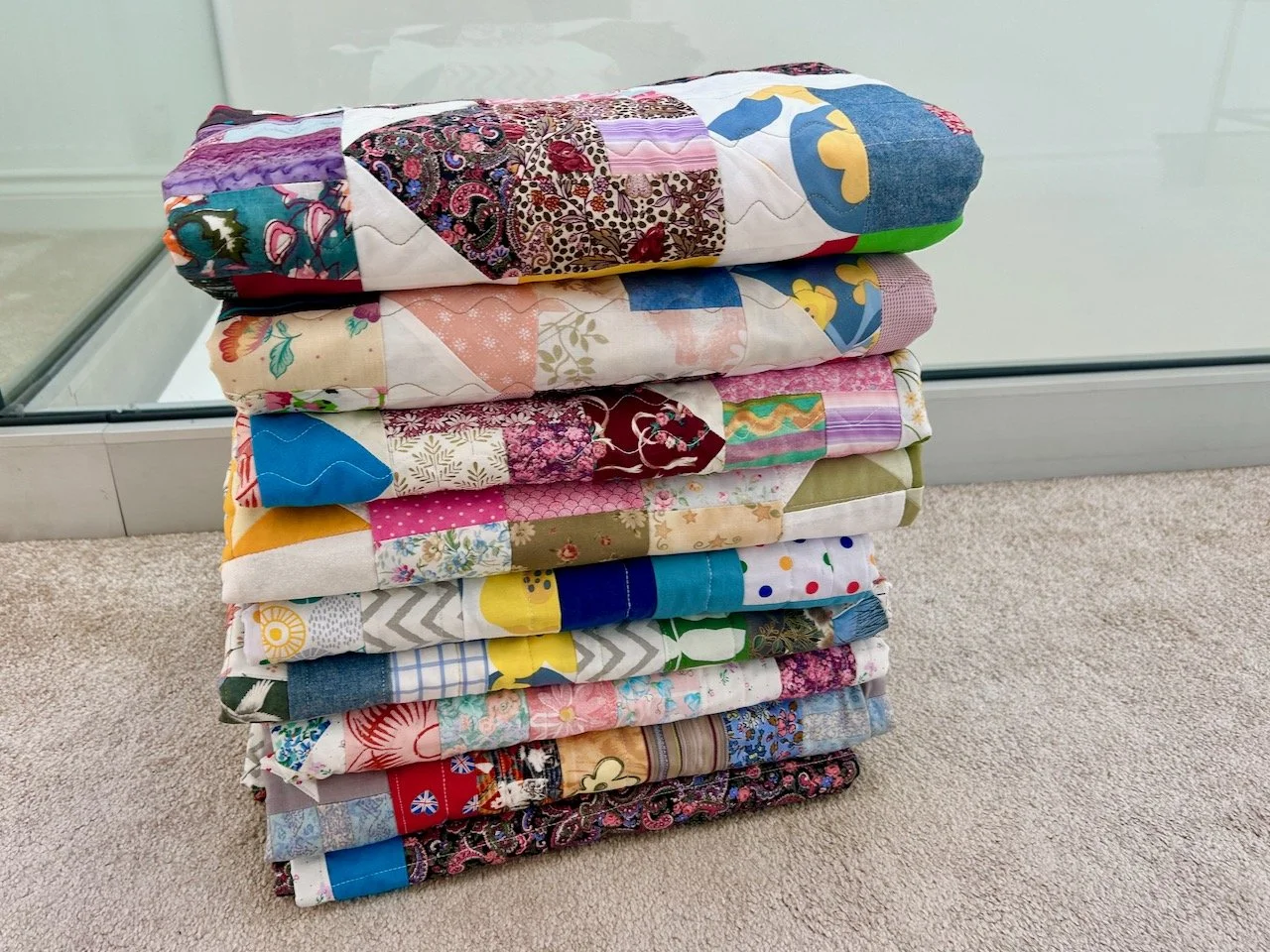
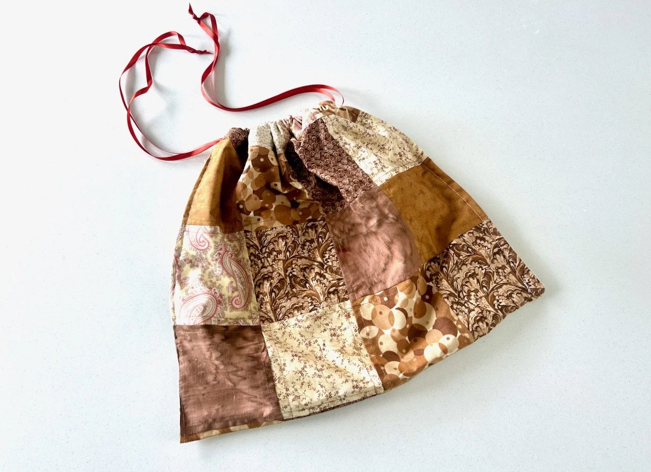
I've always had a thing for patchwork quilts. I've even made a few in the past; more recently that fondness has manifested itself in the patchwork bread bag I made.  You'll know I planned to make another one, but somehow I haven't yet, and that's because something else has been gnawing at me. And that something is bigger than a bread bag.

It's a full blown quilt.  Well, actually it's more than one.

I know, crazy huh? 

It's not like I have plenty of spare time, is it? But I can't shift the desire to make a quilt, or two. So I've been looking around for what type of quilt, and what pattern I want to make. I know I'll need something relatively simple, and something that grows quickly too. As I've a feeling that if the first one is too hard, or something I perceive to be too hard, then it'll likely get stuck.

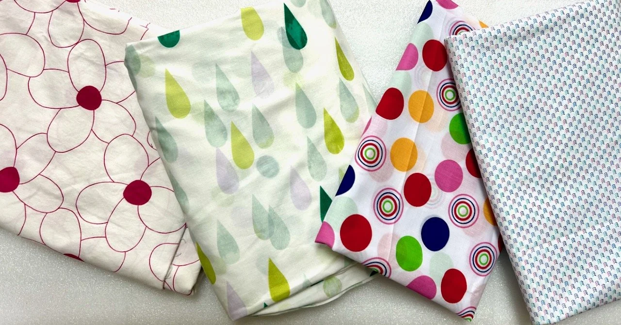
I already have some material, well quite a lot in fact. I have a bundle from Prestigious Textiles of yellows, greys and white geometric prints that I always planned to make into a quilt at some point. And I still will but I've realised these will be my second quilt. As while the material is gorgeous, and will be perfect in our bedroom, it suits a more complex design, and isn't for my relatively simple and quick growing quilt.

cube fabric from prestigious textiles

The design I've chosen for this material is Lori Holt's picnic star quilt, which you can see on her website - scroll down on that link until you find the red, white and blue quilt, and you'll know why it's on my list, and why it's not in top spot, yet.

A stack of yellow white and grey geometric designed fabric

So what kind of quilt will I make?

The other reason for rejecting the yellow and grey star quilt as my first quilt, is that to me it won't be truly scrappy. I think scrappy quilts should be more, well scrappy. But coordinated scrappy, if I can. When I saw Lori Holt's Great Granny Squared book I knew this was the kind of thing I had in mind. There's enough of a design, enough fabrics repeated, but still scrappy enough to qualify as a scrappy quilt to me.
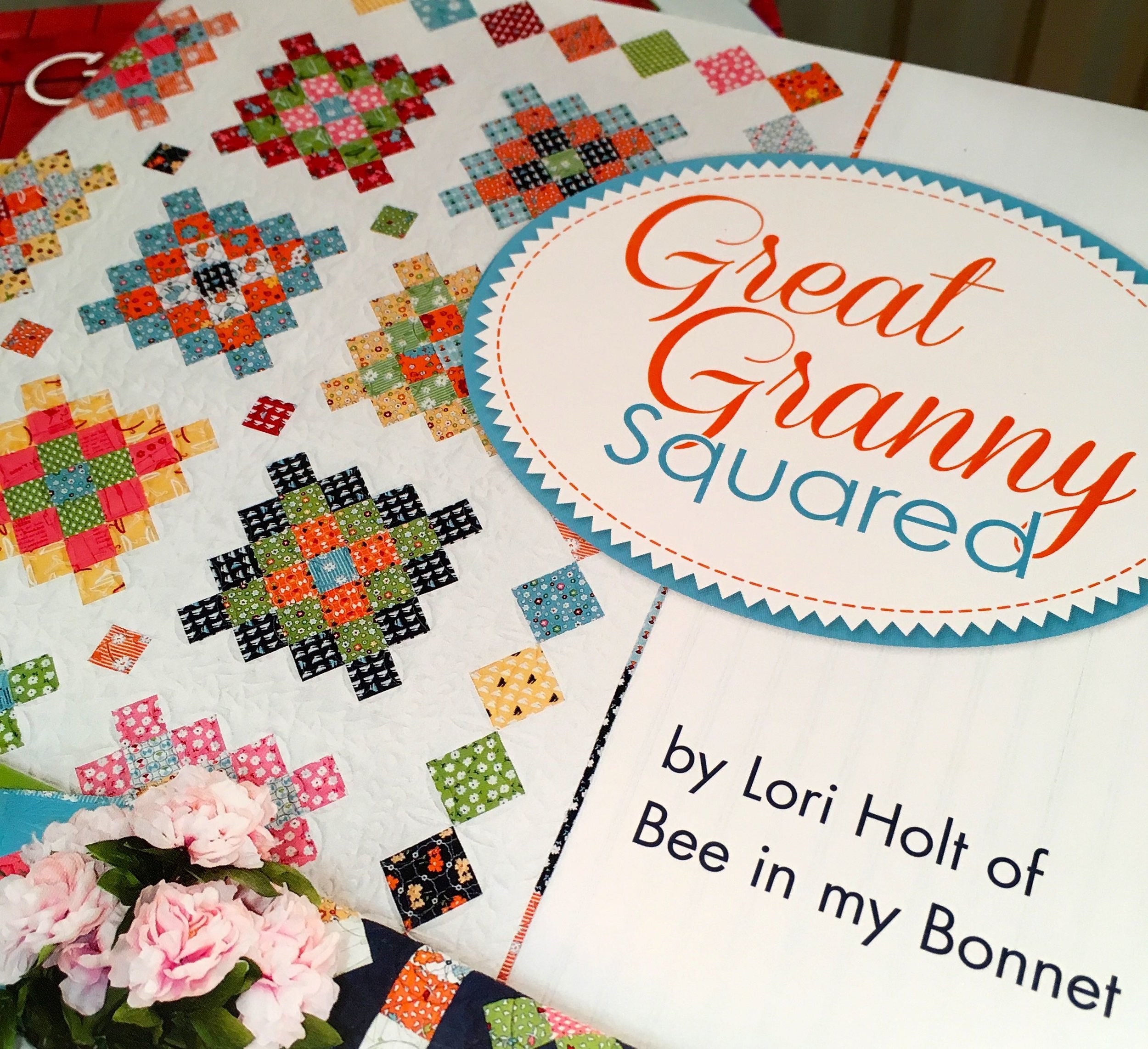
patchwork quilt patterns books and research

But how to make it happen?

I could buy the material to make this quilt, but again that defeats the point of the scrappy quilt.

I've material that has been amassing for some time now. Some I've bought, some left over from my earlier quilt making days, which is quite a feat as it's survived several clear outs and has hardly been touched since we moved here some fourteen years ago!  Some more material I'm sure has come from my mum, who is a big sewer. And more still has come from clothes I've cut up instead of throwing out. 

And so, the thing I'm wrestling with, is do I have enough material to do the scrappy approach justice. I'm hoping that by mixing in materials that hold memories the quilt will have that extra-specialness I'm after. MOH's initial reaction was that I couldn't use old clothes for this, but soon backed down when I asked what he thought the origins of patchwork quilts were. It was the easiest win I've ever had, I can tell you. He doesn't know yet, that the space freed up using material is only making space for future treasures, but then again perhaps he does.

I *think* I have enough scrappy material, but I need to work that out for sure before I start. I'm telling myself that "I only need 33 two and a half inch squares" as a minimum to make it work. I mean just thirty three squares, that's not so many is it. In fact I need quite a few sets of thirty three squares, which is where the doubt and uncertainty creeps in. So I think next weekend you'll find me looking for enough similar and contrasting materials for the main part of the quilt. And hoping I have enough. And if I'm lucky, actually cutting some of those squares, but we'll see.

I'm less worried about the background as I have that sorted. I have a king-sized duvet that we no longer use, that should be plenty big enough to at least provide the background for the top of the quilt. While it's cream (which I like), it's design is a bit too fancy and it doesn't look so good un-ironed (I'm less keen on those) and so it too has been relegated for another use. If it doesn't to the back, I've plenty of time to come up with a plan for that.

So wish me luck, acknowledge my craziness and definitely look out for some updates along the way!  

PoCoLo

On my noticeboard: December

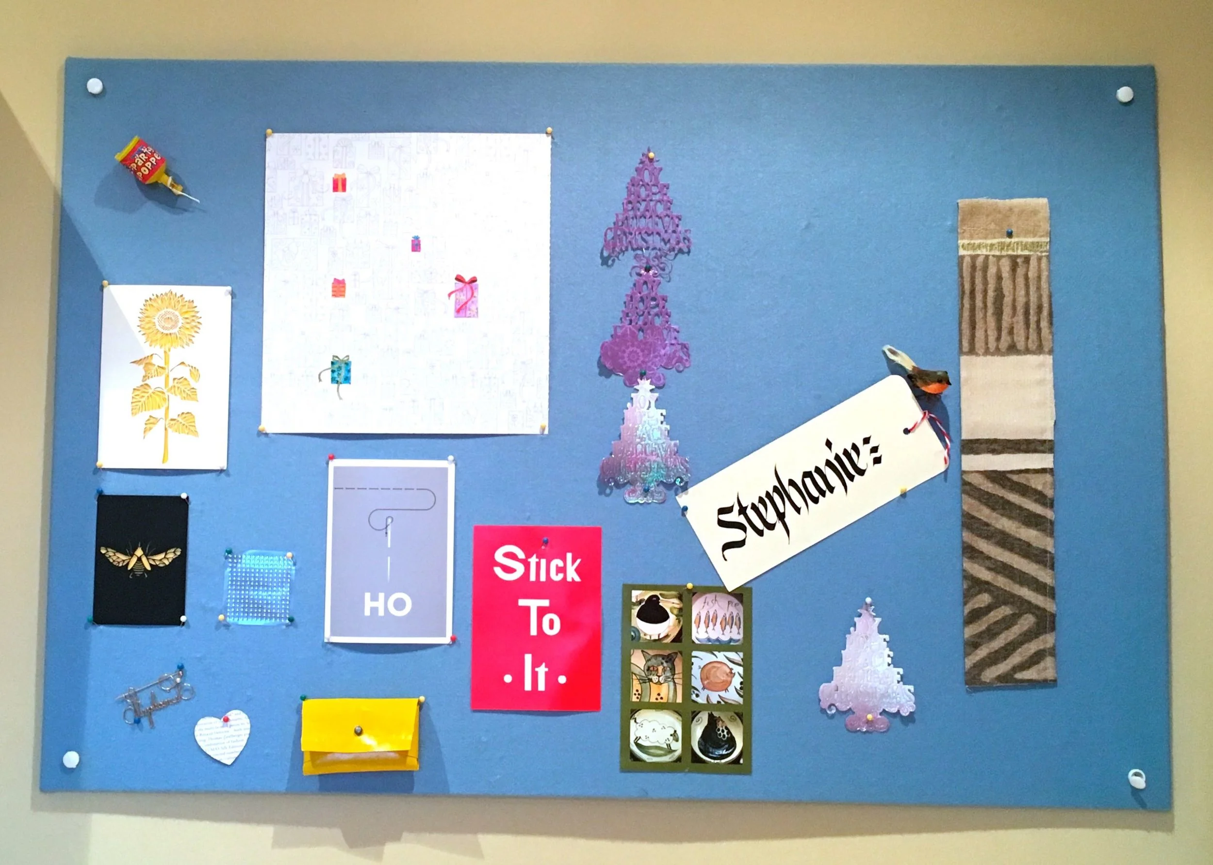
I realised last month that my noticeboard often reflects my thoughts as well as my projects for the current month, and none more so than last month. There's often things I've picked up along the way and am unsure of what to do with, but things I know that I don't want to lose sight of just yet, so I thought I'd take this post to walk you through it.

On my noticeboard - December - in my craft room

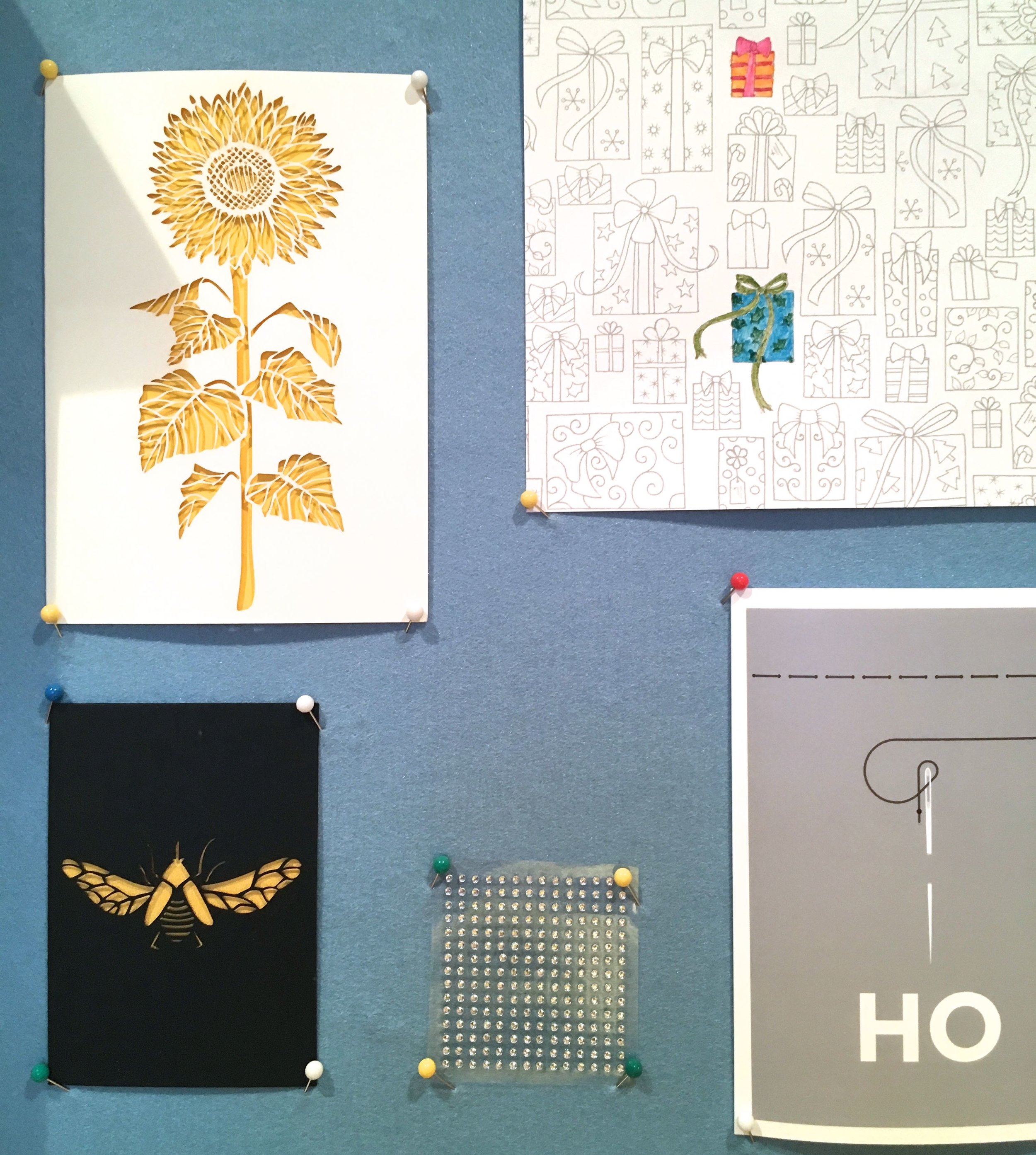
There's been some more colouring from Johanna Basford's Christmas book. I decided to try water with some of the Staedtler pencils and was rather pleased with how it's turning out so far. I particularly like the parcel with the red bow.  There's still quite a way to go to complete this one, and maybe it'll be finished by Christmas this year!

Christmas colouring, a design by Johanna Basford, on my noticeboard

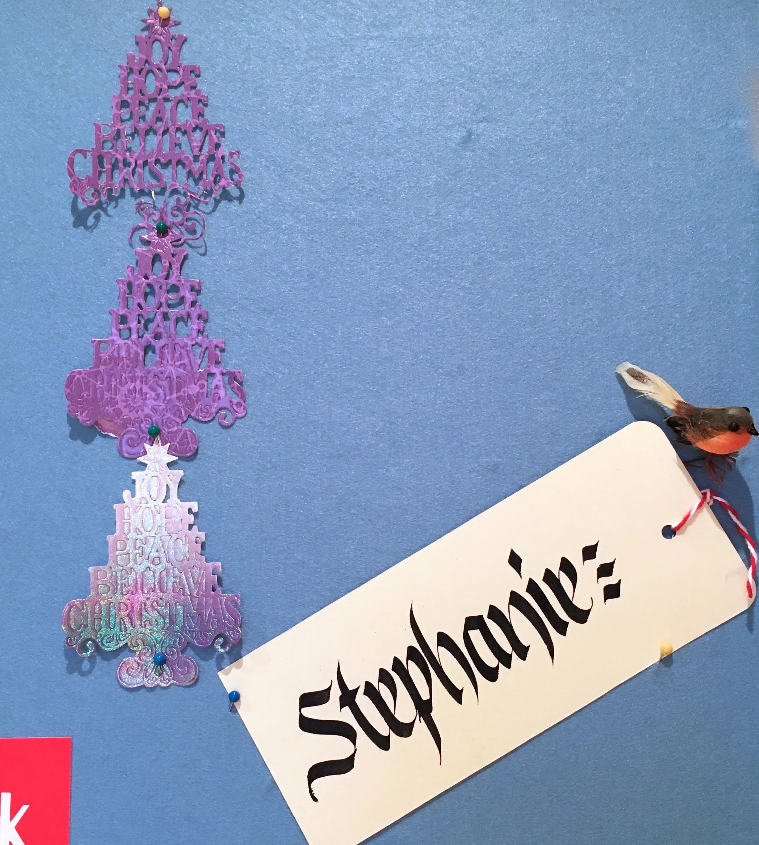
There's more hints of Christmas too.  The three die cut trees didn't make it onto my Christmas cards - I didn't get around to sharing a post on my cards this year, but these were some pretty test cuts that I either tore or need some extra cuts to complete. So instead of doing that I pinned them onto my board.

Calligraphy and christmas card cut outs - on my noticeboard

The name tag was was from my evening at the London Graphic Centre and reminded me of a calligraphy poster I did for a flower festival many years ago. I expect I've got that somewhere, so I'll try to remember to dig that out.  The robin to the right of the tag was another from the craft supplies provided for the Christmas stocking I made last month.

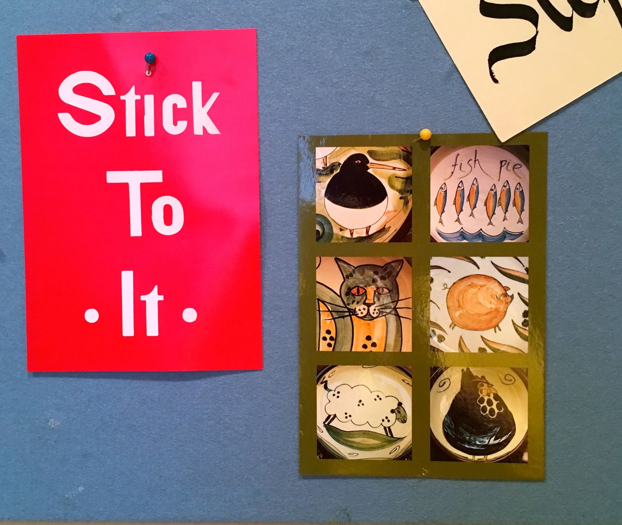
I've a couple of postcards too. I'm not sure where the Stick To It one came from but it seemed quite appropriate for me. The other one is one I'd found during a clear out. It's from my favourite Norfolk potter - Phillippa Lee Pottery - I'm amassing quite a collection of pie dishes, flan dishes and noodle bowls from there. And every time we go to Burnham Deepdale I have a look to see what's new. Most of the time though MOH is with me and so spending is slightly restricted, but one day... 

A couple of post cards - on my noticeboard

The papercut cards I bought at Makers & Friends, the night I started to make my own neon sign, which I still have some knotting to do on.  In fact more than before as the invisible thread has got itself knotted in the box too, hmmmn..

cards - on my noticeboard

The grey card - Sew Ho - or Soho is one of the Place in Print cards which again is apt for my craft room.  All of the cards are on the noticeboard because they're in the "pretty and not for sharing" category in my head. The diamante dots are a new purchase, in case I needed them for my Christmas cards. I didn't, and I didn't want to lose them, so they went onto the noticeboard too.

frietag pouch and a heart - on my noticeboard in December

The yellow pouch is a Freitag pouch and is made from recycled tarpaulin. This is on my board because it's bright and cheery and because I haven't worked out what to do with it yet. There will be a use for it I'm sure, I just don't know it yet. I've more to share with you soon about Freitag as on the basis of this little pouch I convinced MOH to buy me a larger bag, which I plan to use as an overnight and short trips bag, for Christmas.  More on that soon.

And finally in the top photo you might have noticed a longish strip of brown and cream striped and zig-zagged material. That's my current sewing project, and one I'm stuck on. I'm making a seat cushion for a garden bench, I think that's part of the problem, I know it won't be used anytime soon so I can't quite find the motivation. But I need to, as I want to get started with other projects and I know that if I move on without completing this the project is doomed. 

The feel good factor for this project though is that I'm recycling some of the material from our old bedroom curtains to make this seat cushion cover. I'm taking the same approach - yes freestyling - that I did for my gorgeous yellow chairsbut it feels so much slower for this larger oblong version. 

Both of those feel good, but I really wish it were done.  If you have any tips on how to get going again on a craft project, please let me know!

The adult colouring trend to reduce stress: Does it work?

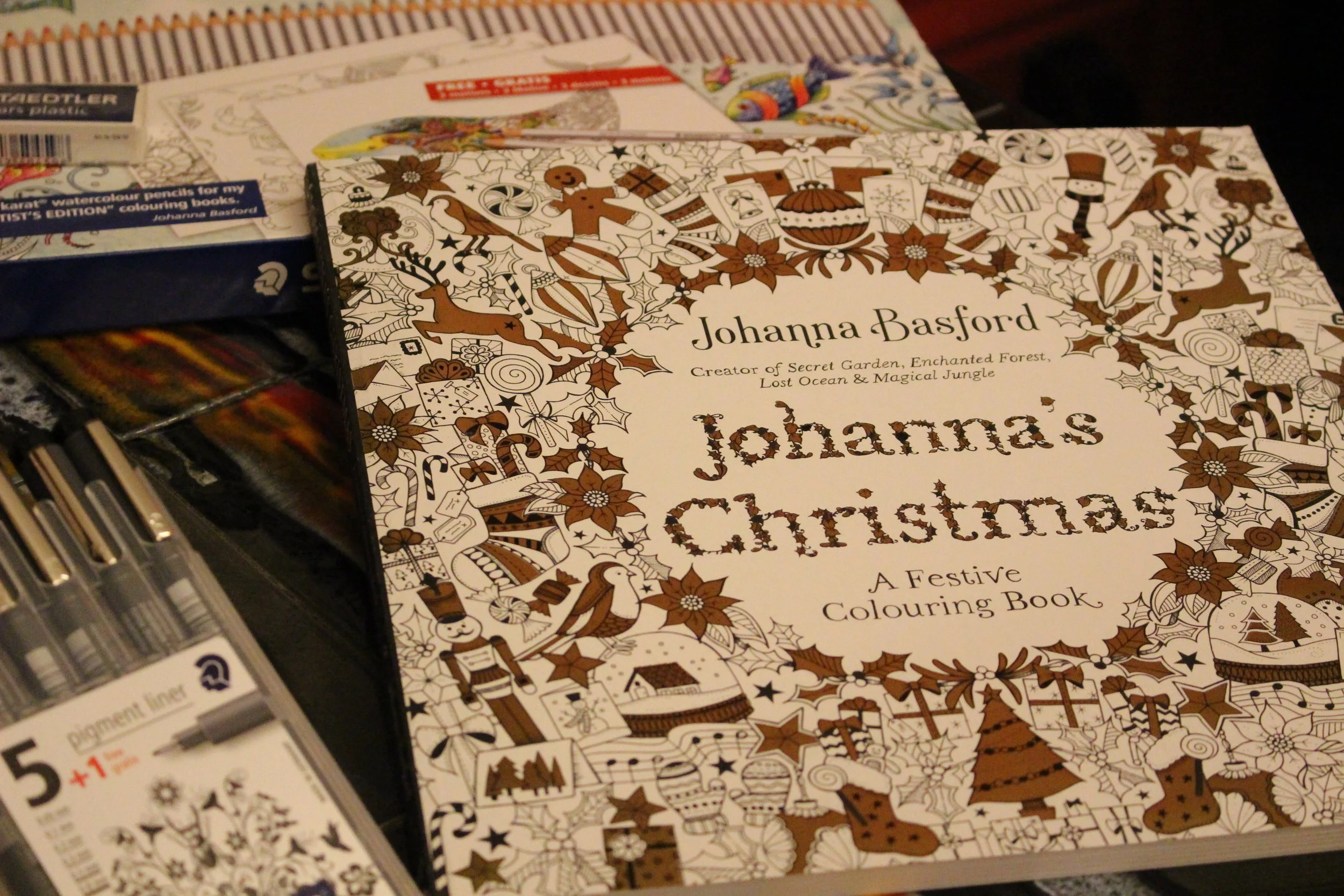
Recently Staedtler, who incidentally are celebraring 50 years in the UK, invited me to a Creative Christmas Colouring evening with Johanna Basford OBE to celebrate the launch of her new book, Johanna's Christmas. It was also the perfect opportunity to find out for real, if colouring really can help reduce stress.
Image credit: Staedtler

Image credit: Staedtler

And typically, but completely unplanned, I really did put that to the test. The event was at the Hospital Club in Covent Garden, a really cool venue I'd been to before, so after work I jumped on the DLR and headed towards Bank. Where we sat for longer than I'd have liked. Then as usual, there were the queues to leave the platforms and move around the station. Eventually I made it onto a Central Line train and as time was getting on decided to change at Holborn and take the Piccadilly line straight to Covent Garden for a shorter walk.

Sensible plan on paper. But when I got to the Piccadilly line platform, I heard the announcement of doom "severe delays are operating on the Piccadilly line" - whoop! But I was there and hoped I'd be able to squeeze on the next train.

And luckily I could, but even so I arrived at the venue later than I'd wanted to be and more stressed than I needed to be too. This was going to be a good test for the colouring.  I soon found a place, was given a copy of Johanna's new book and decided which design I was going to colour - you'll not be surprised to see it was a tree.

A glass of red wine also found its way to me and as I started to colour, and talk to my fellow colour-ers either side of me, I started to relax. And enjoy myself.  But just look at the concentration on my face, and you'll see the focus isn't the wine...

Image credit: Staedtler

Image credit: Staedtler

And despite it being an industrious evening, with each of us intent on our creations, it was a friendly and fun evening. There was plenty of chat, and I think the ladies either side of me had had a much more relaxing journey, as their colouring was much more refined than mine. I'd opted for pens with a fibre tip to flood colour into my design, and my colours were bold and somehow, without too much planning, I ended up with a rainbow effect.

Image credit: Staedtler

Image credit: Staedtler

The swirls and curls and flowing design made this the perfect design for me, and following the curves completely distracted me from the journey there. I think I needed to see results quickly, and the pens and this design helped with that. And yes, you may have spotted that my wine glass is empty, but I was so into what I was doing that I didn't get up to fill it up, nor did I check out the food. I did manage to tear myself away though to try the gorgeous canapes that the waiting staff brought round.

Johanna shared a couple of tips, which were helpful, they were:

  • To remove the design from the book when you start to colour, that way you can easily move the paper around so that it's comfortable to colour, and you'll be confident that your pens or watercolours won't affect the rest of the book.
  • It doesn't matter if you go over the lines - yay! I think staying in the lines is completely overrated, so I was pleased to hear this. And it's true, only you know if you've gone over the lines, so who's to know? And if anyone notices, just call it artistic flair!

It was lovely to meet Johanna, who has sold a staggering twenty million plus colouring books worldwide, in over forty countries, and discover that she's still as passionate about creating new designs. In fact she said she had so many ideas for her books, that the problem is always which ones should be left out rather than which should go in. 

JOHANNA BASFORD DEMONSTRATING HER FRONT COVER LETTERING

JOHANNA BASFORD DEMONSTRATING HER FRONT COVER LETTERING

Johanna talked us through how she creates the detailed lettering on the front of her books, and I tried a Christmas card using the same approach. That's to draw your design - in my case Joy - lightly in pencil, and then to add Christmassy motifs and designs, such as holly, Christmas trees, presents, candy canes and so over following the pencil line. Then when you're happy with that to go over the pencil shapes with a fine line pen. 

It was fascinating to watch her in action, and fun to try out, but I had a tree to finish colouring in and I was determined to complete as much as I could that evening. So in answer to my question at the top of this post - can colouring reduce stress, well it's a resounding yes from me.

It's something I'll be remembering to do more often too, so if you see me and I'm stressed, remind me. If you're still not convinced that it's a stress-buster, why not give it a go yourself? Staedtler have some tips for getting started with adult colouring with tips for the basic and advanced techniques, as well as a colouring sheet to download. And there's still time to add a colouring book and some pens or pencils to your Christmas list, trust me you won't regret it!

Thanks Staedtler and Johanna for a lovely and inspiring evening. Thanks too to my colouring companions for the conversation throughout the evening and their kind words about my less than delicate colour combinations!

PoCoLo

* This is a collaborative post with Staedtler, but all views and opinions - and colour combinations in my design - are my own.