A folklore living room at the Ideal Home Show at Christmas

This room set is inspired by storytelling from days gone by and for me, that's easy to see. It's a room that draws on the traditional reds and greens of Christmas but with a modern slant. It combines rustic with style and screams Christmas doesn't it?  I think there's also a touch of Scandi-style for good measure too.

A coffee table and a christmas tree in the corner  in this room set at the Ideal Home Show at Christmas

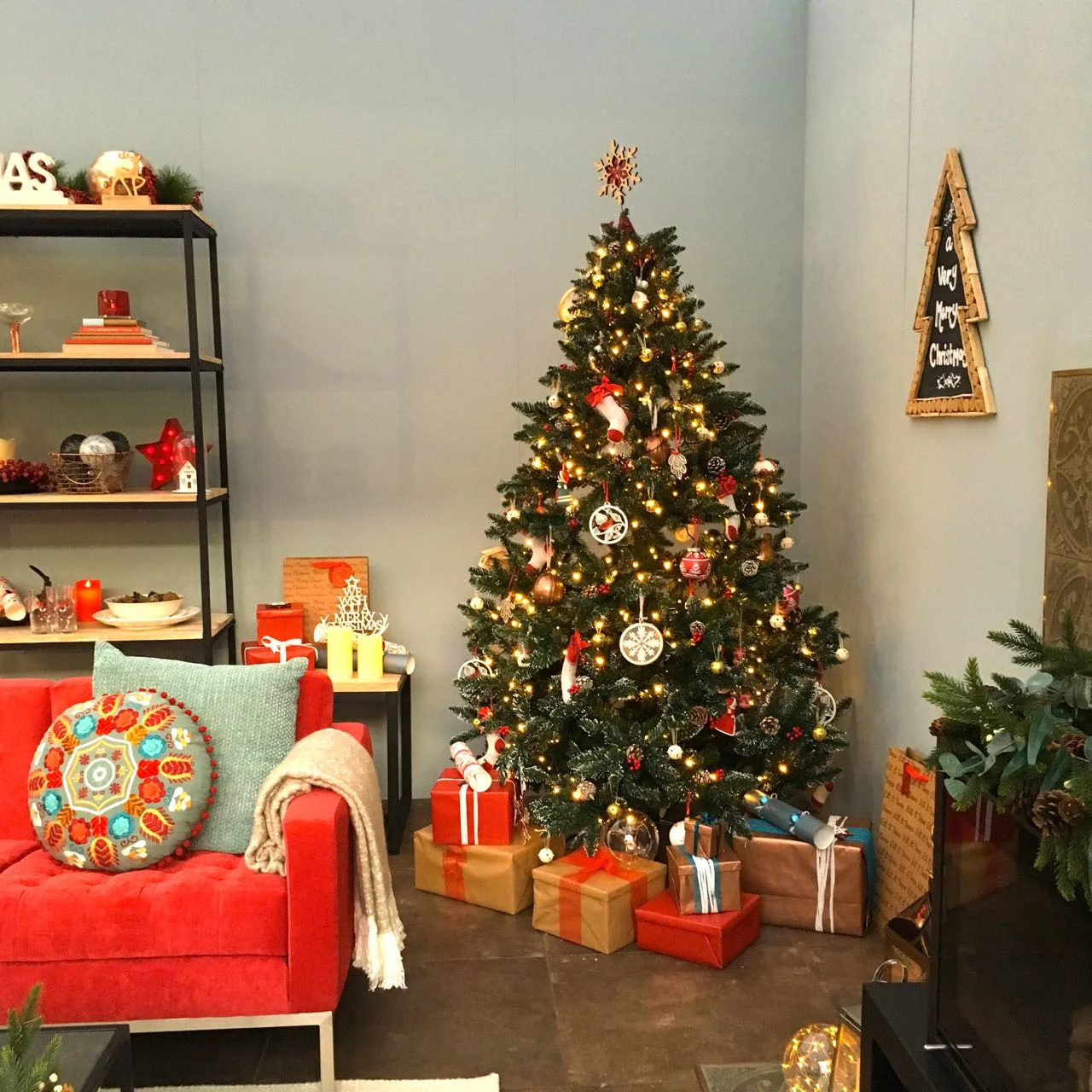
There are elements of this room I love, the neutral background which looks grey in my pictures is a paint colour called Celestial Blue and provides the perfect backdrop for the bright berry red sofa.

The black framed coffee table and open shelf unit were also favourites, which will no doubt shock MOH as I won't let him have a coffee table in our current living room. I don't dispute how useful the right coffee table would be, but I'm not budging on the fact that it will turn our space into an obstacle course. 

The frame of the table is simple isn't it, and it reminded me that I still need to buy some square metal tubing to repair our gazebo which suffered from pooling rain damage in the summer.  Another one for the to do list. 

The wood burner and black metal coffee table  in this room set at the Ideal Home Show at Christmas

I also like how the simple framed table is decorated with eucalyptus and pine.  Pine I've used to decorate our house before, but not eucalyptus and it's something that's on my list for this year.  It also reminded me I still need to buy some square metal tubing to repair our gazebo which suffered from pooling rain damage in the summer.  Another one for the to do list - and funny how you get those reminders when you least expect them isn't it?

A matching open shelf unit and standard lamp  in this room set at the Ideal Home Show at Christmas

We have a teak open shelf unit - well less open than this one - and if I'm honest when I looked at this one I was full of admiration and envy all at the same time.  The plan was for ours to look equally as stylish, but in reality it rarely is and often becomes a home for bills, important stuff and all manner of things.  Luckily we have some doors on ours so a quick tidy (aka shoving things behind the doors) can make it feel super stylish pretty quickly again. Unless you really are a no clutter kind of person I'd always recommend getting some closed space on an open unit, if you can!

A tree and a berry red sofa in this folklore themed room set at the Ideal Home Show at Christmas

No living room room set for Christmas would be complete without a tree would it? Infact I suspect many of us feel the same about our own living rooms. This year I'm contemplating having the tree in our conservatory as with six adults in our house I think the large tree may just prove one thing too many. The challenge will be of course to make our living space equally as festive without the tree, I have a plan starting to form and we'll see if I can pull it off.

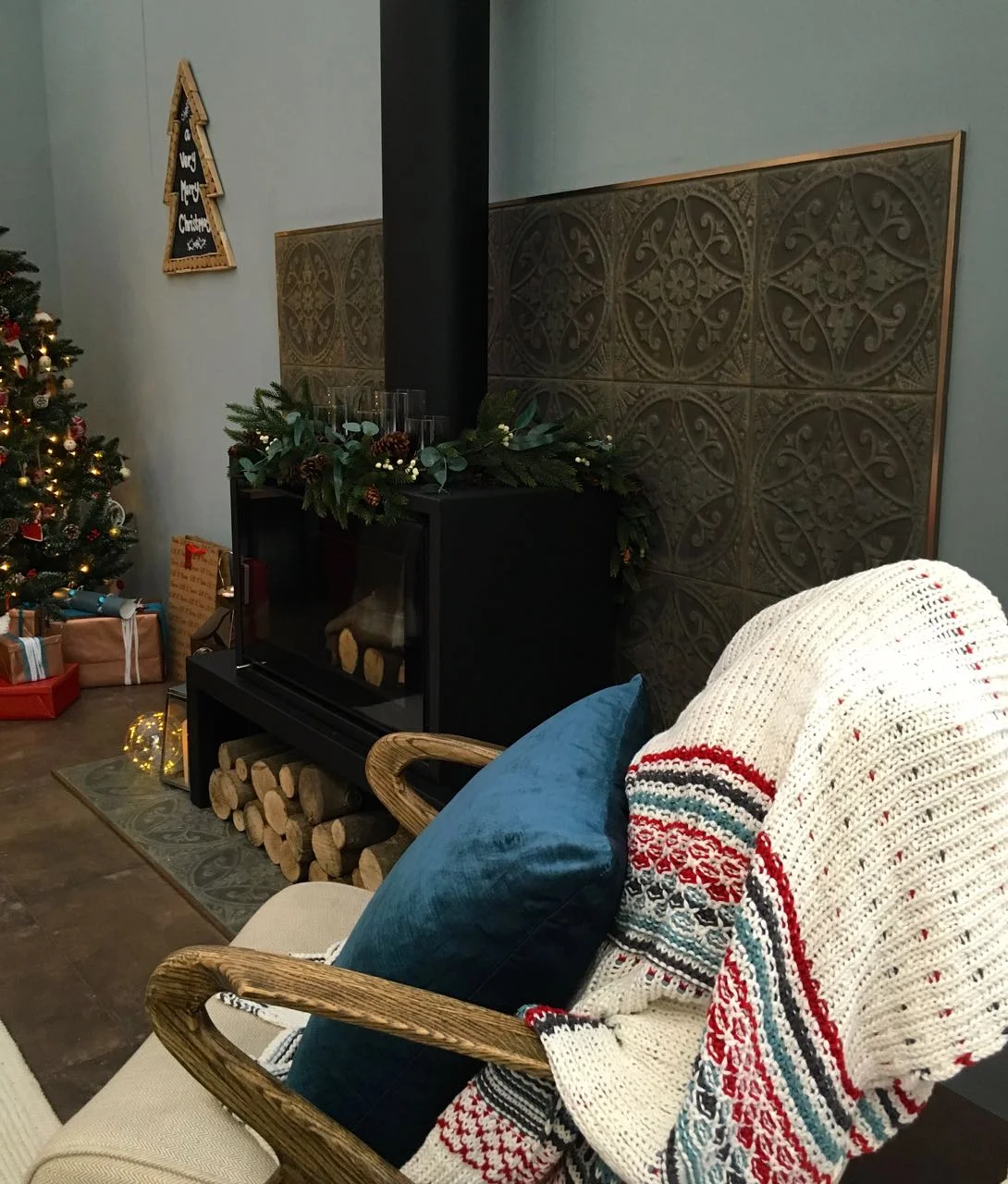
The final element of this room I loved was these tiles. The pattern, their texture and how they're used on the floor and the wall to create a practical zone around the log burner.  They're ceramic but are called pressed pantina steel tiles and have that aged look that works so well here, the copper edging really does add the finishing touch.

A cosy armchair in front of the wood burner  in this room set at the Ideal Home Show at Christmas
Stepping back to get the whole view of this room set at the Ideal Home Show at Christmas

So what do you think? Is the festive folklore style room for you?

A Ski Lodge bedroom at the Ideal Home Show at Christmas

Now doesn't this look a calming bedroom?  It's inspired by boutique-style wood cabins and while there's plenty of wood it's not overdone and has avoided that sauna look!  It looks the perfect place to snuggle and hibernate in. 

I'd never considered rustic wood, dusky pink and silver together, but I think it looks great. I'm also a fan of that headboard shelf as you've probably already noticed I am keen on having stuff around me. While I admire the minimalist approach, it's not really for me. 

A comfy looking haven in this room set at the Ideal Home Show at Christmas

It definitely has a feeling of luxury - I can't decide if that's the tea tray on the bed, the many luxurious throws or just the fact that it looks like a place I'd want to spend some time in.  Of course, like even the best hotel bedrooms, once we've arrived it never quite looks as pretty...

It also feels a bit decadent to have a Christmas tree in a bedroom. I know it was the Ideal Home Show at Christmas, and it is a pretty tree, but is that really a thing?

A tallboy and a Christmas tree too  in this room set at the Ideal Home Show at Christmas

I am a fan of the stars, and of that drawer unit though - it's the simple, clean and unfussy lines that appeal. And stars? Well stars are just good aren't they?  I need some more in my life, or more accurately in my decor...

throws and wraps make for a comfy look  in this room set at the Ideal Home Show at Christmas
 
a look at the bedside tables  in this room set at the Ideal Home Show at Christmas

I'm wondering when I can move in?  Who's joining me?!

Home Etc

A precious metals Dining Room at the Ideal Home Show at Christmas

Wow. Just wow. 

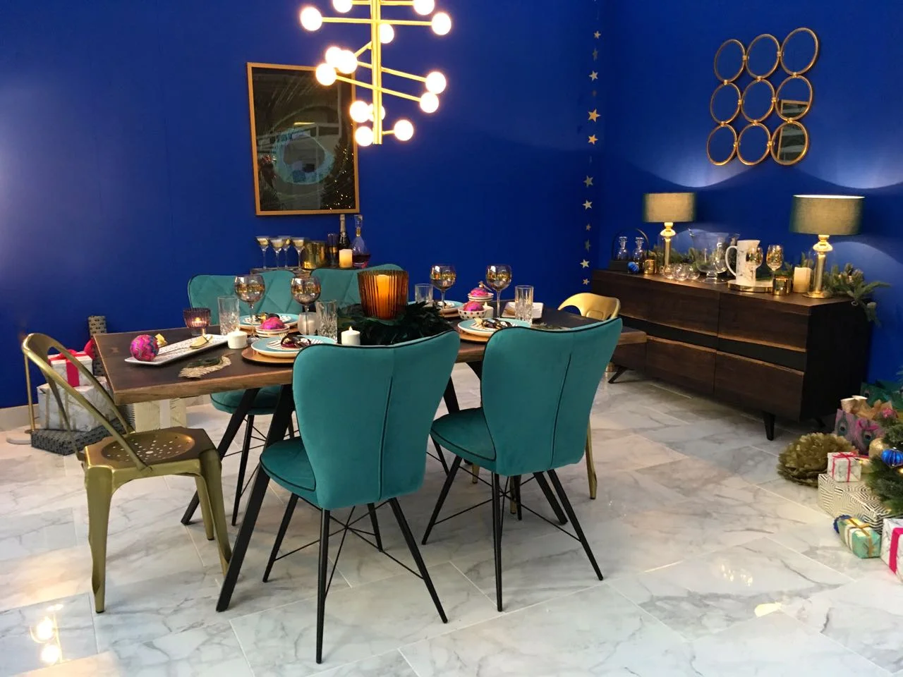
This room certainly looks sophisticated and glam doesn't it?  And usually I'd say that blue isn't my colour, but it's the dark cobalt blue that really gives this room its impact, and I love it - it was the first room set that I looked at at the Ideal Home Show at Christmas, and I think it's the one with the most impact.  I'll share my photos from the other two room sets in the run up to Christmas. 

Cobalt blue and precious metals in this room set at the Ideal Home Show at Christmas

Usually there's more room sets at each show but as I said in my previous post about the show, it wasn't as large overall so I guess it made sense to have fewer rooms.  Plus also I expect there aren't many people that decorate their bathrooms for Christmas, our outside rooms are most likely to be a chill-to-frozen zone and no one needs to see a kitchen that's preparing Christmas lunch looking pristine, do they?

But back to the dining room - it does look like a very grown up room doesn't it?

Baubles and feather decorations in this room set at the Ideal Home Show at Christmas

And the jewel like colours are really set off against that blue.  I wonder now though if the colour is best described as sapphire, as that would fit alongside the precious metals theme nicely.

A jewelled christmas tree in this room set at the Ideal Home Show at Christmas

The other thing I noticed about this room is how well it mixes copper and brass - and how well they go together.  It's the simple things in this room that really brings it together - one of my favourite elements is the string of stars hung vertically in the corner of the room.

Simple and easy to replicate in a corner that could do with some extra sparkle.

A line of stars and bold colours in this room set at the Ideal Home Show at Christmas

And a drinks trolley, my first thought was no, never, but I'm starting to see the attraction. I also remember my parents setting out a drinks trolley at Christmas, out came the embroidered linen and the bottles and glasses were displayed, all ready for a good old snowball or a babycham!   And there's nothing wrong with either of those I can tell you.

stepping back and taking in the view of this room set at the Ideal Home Show at Christmas

So what do you think?  Would you like this for your home, or just somewhere to visit?


Home Etc