I’ve finally made a start at editing my photos from our trip to Portugal at the start of June. I know, it’s taken me a while, but with so many photos I haven’t really known where to start. Eventually I worked out that the best thing to do was actually start, and so I have. And I’ve been quite traditional about it and I’m sharing some shots of the first place we stayed in Lisbon. Actually we only stayed in one place in Lisbon, but it was the first place on our trip.
I’m much more partial to an apartment than to a hotel. It gives us the flexibility to eat what and when we want, and even if we want - sometimes our days feel like they’re punctuated by food, and quite often it’s hard work fitting in three meals. Then on other days, it’s no problem at all! Anyway, once again i’d found a great looking apartment in Portugal, and I was later to recall the great lights in our Porto apartment - hold onto that thought, we’ll come onto the lights.
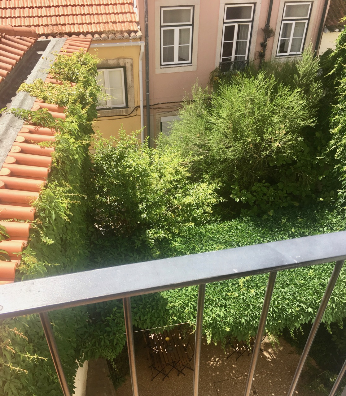
But first the view. I’d specifically chosen this apartment over another for its garden. As it turned out, while it was nice to look down on we never actually stepped inside it, despite its inviting shade in the mid-thirties heat.
The pastel buildings in the street behind us proved to be a good foil for the garden’s lushness, the blue of the sky and the terracotta tiles. And it was a view I was quite enthralled by, so seeing it from ground level and without air conditioning didn’t seem quite so important.
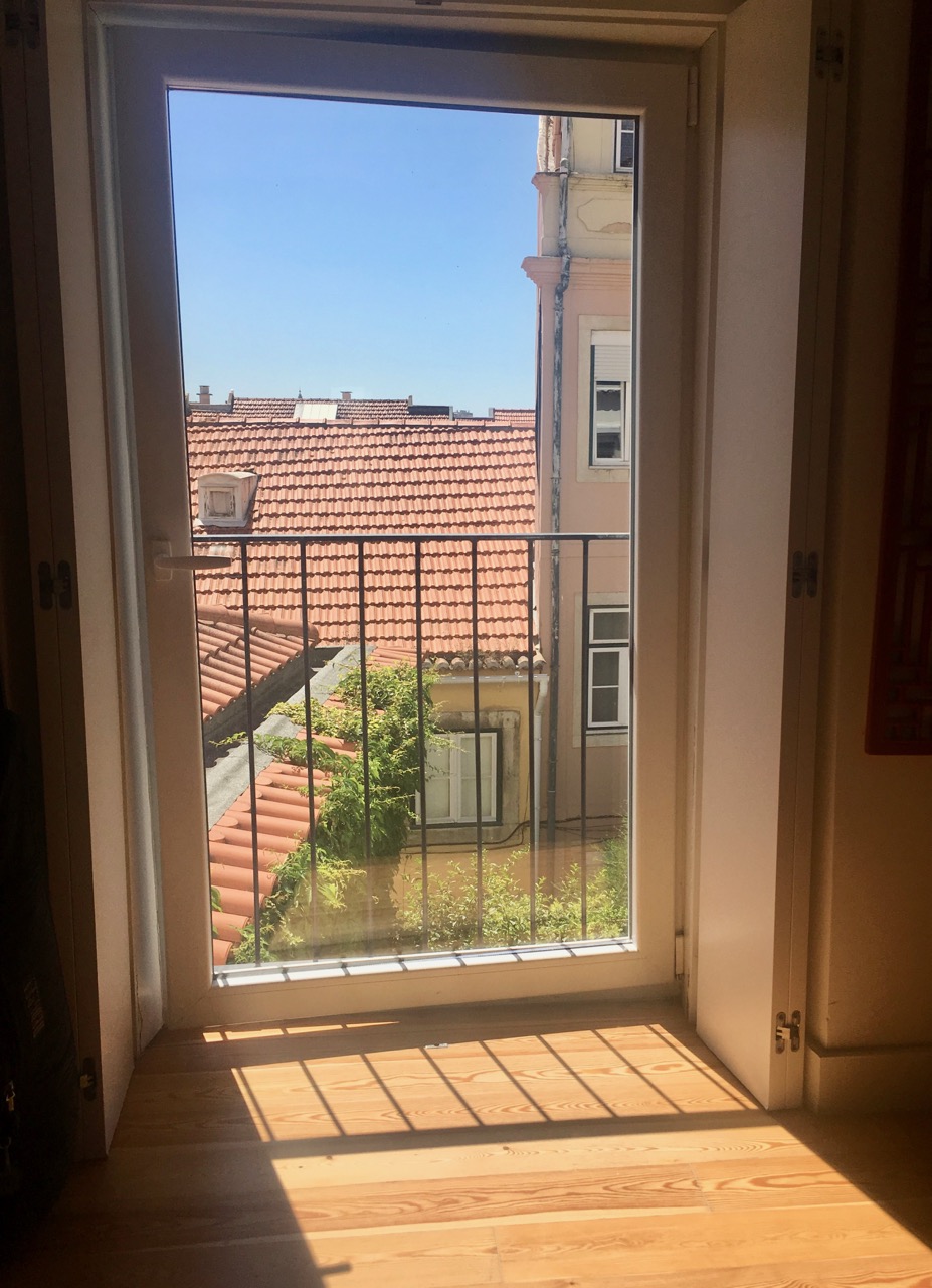
The bedroom had a juliet balcony, and if we didn’t have the air conditioning on (it’s nice, but it gets on your nerves doesn’t it?) the door was often ajar, but even so it framed the view nicely.
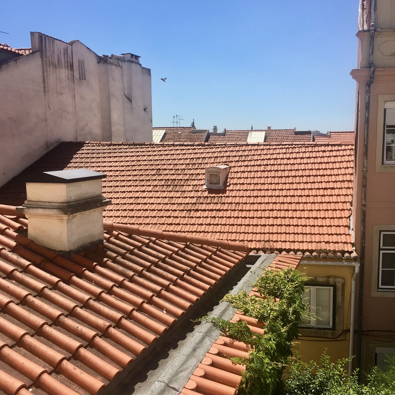
I could take many pictures of roof tops and their tiles, and I probably have taken countless similar shots over the years, but I’ll never tire of them. But I wanted to share more than the view outside, as the furnishings inside are also worth seeing. In the small dining area, the copper light and tubular chairs added a certain panache to our first impressions of the space.
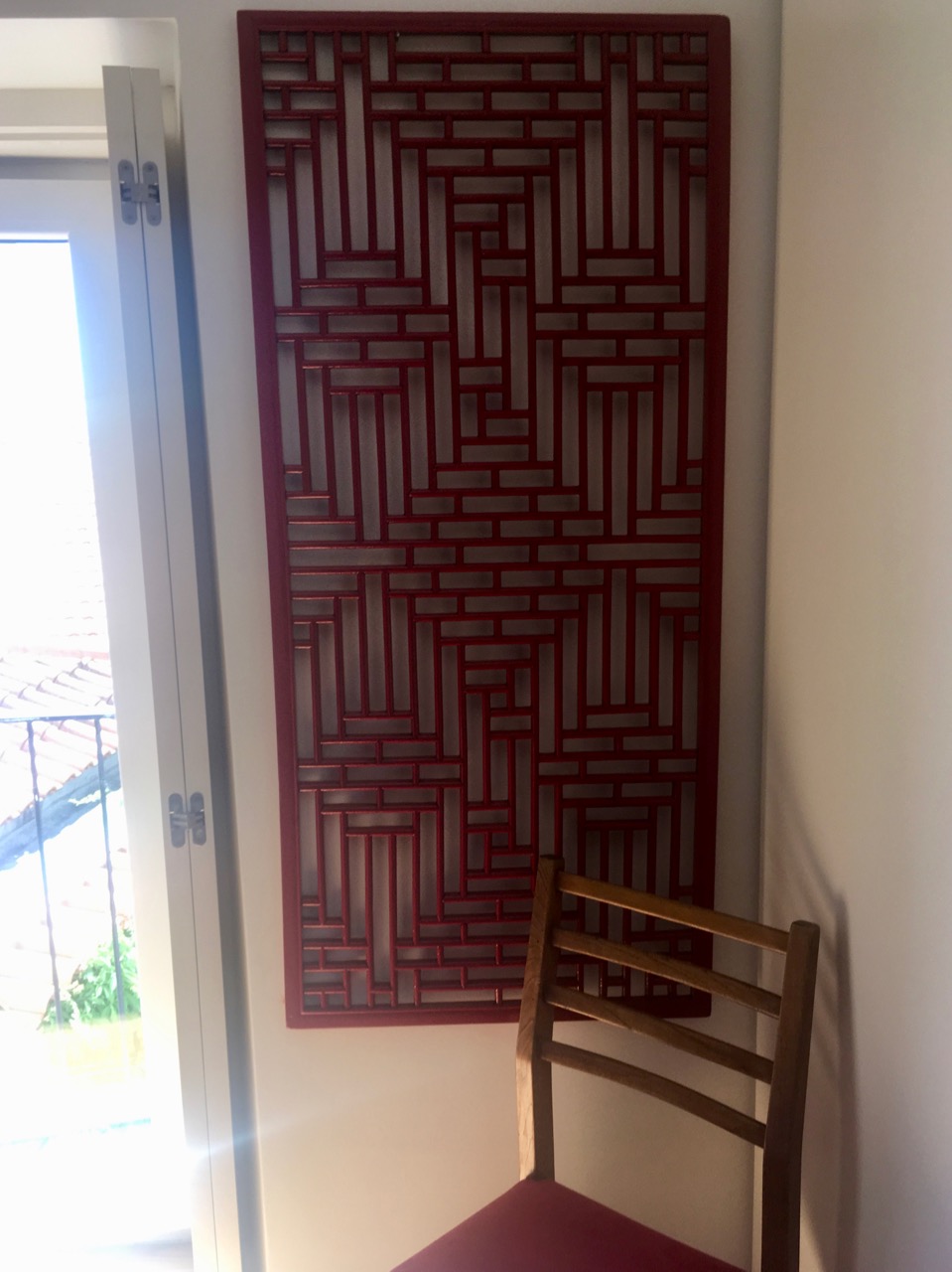
The red lacquered wall hanging in the bedroom was a great way to add some interest, colour and design to a quite plain space (excluding the view, obviously!) It was the sort of piece that your eye could just wander over and explore, without ever finding the reason why, or losing interest.
Throughout the apartment red was used to add colour, and it’s here that we start to get onto the lights. Clearly the Portuguese have a thing for great lights, or I just have a knack of choosing apartments with great lights. I’ve a feeling it’s probably the former, I mean, just look at these bedside lamps.
Simple, modern and effective. And easy to replicate.
In the living space we were spoilt with a couple of free-standing lamps. This silver coloured ‘branch’ light and the giant anglepoise lamp, which I totally fell in love with. I’d seen them before in magazines and online, but didn’t really get them, or the need for the size. Now though, I’m sold.
It’s a design classic - whichever size you go for - and it’s an easy and effective way of adding light, and style, to the right space. Overall, as I said before, the Portuguese have great lights…

