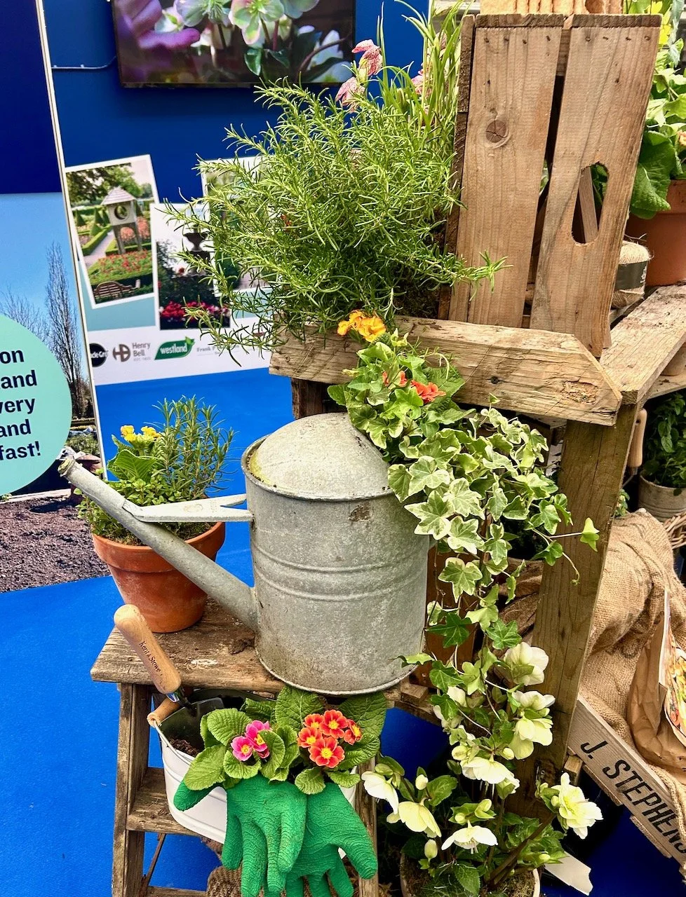
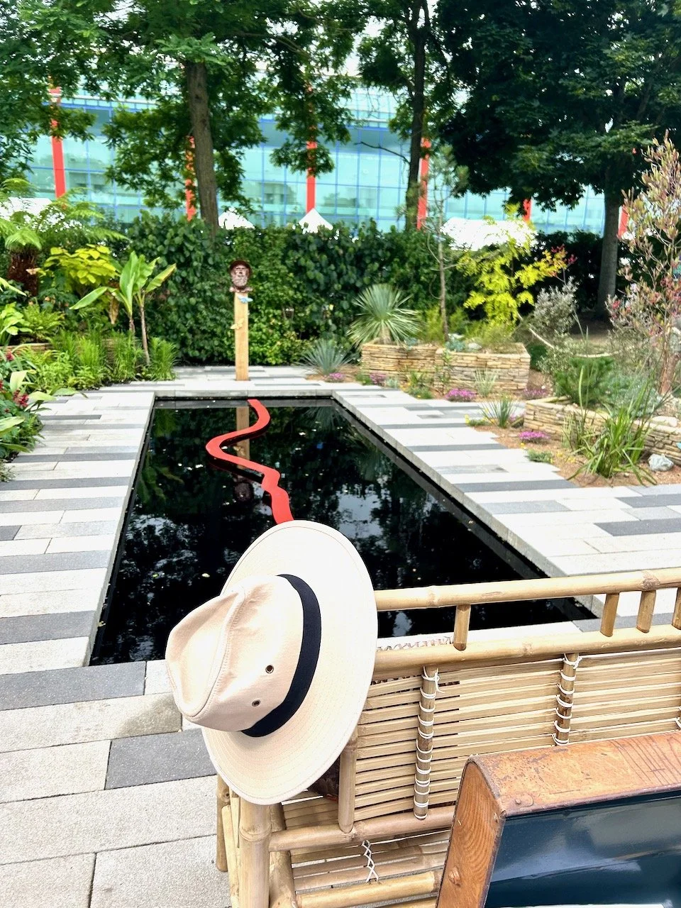
Gardening is good for you, that’s the message from the Horticultural Trades Association (HTA) who have a year long campaign to persuade more of us to get out into our gardens, to enjoy our spaces and perhaps perk them up a bit too.
I can’t quite believe it’s April already, the year seems to be running away with us. In my own garden I’ve hardly made it out there much yet and I’m not quite sure why. I suspect partly it’s due to the weather - it has been lovely the last couple of weekends, but we’ve been out and about so it’s also partly down to weekend plans. Unusually I don’t have any seeds sown yet either, but I also know with my north-facing garden, which takes a little longer to warm up, that I should be ok as long as I get started soon.
And because I also believe that gardening is good for us I’m planning to share more of the #GIGFY campaign for the rest of the year. So, on the first of every month, pop back and see the theme for the month and how they promote gardening, health and wellbeing activities. Every month I’ll also host a linkup where you can share your gardens and/or gardening posts (old or new) that complement the month’s theme. For April, that’s Get Creative with Colour.
APRIL: GET CREATIVE WITH COLOUR
Using colour in your garden
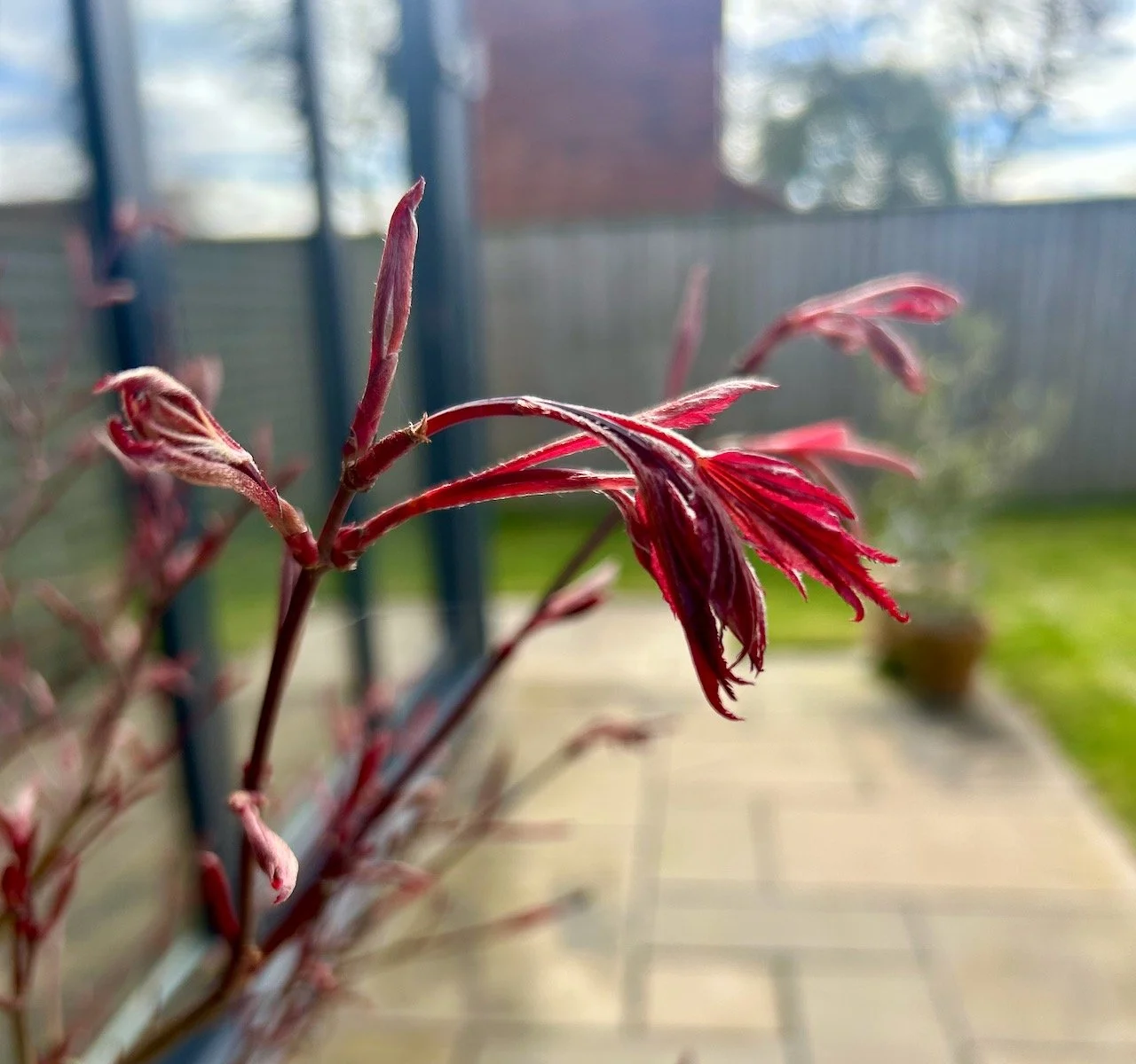
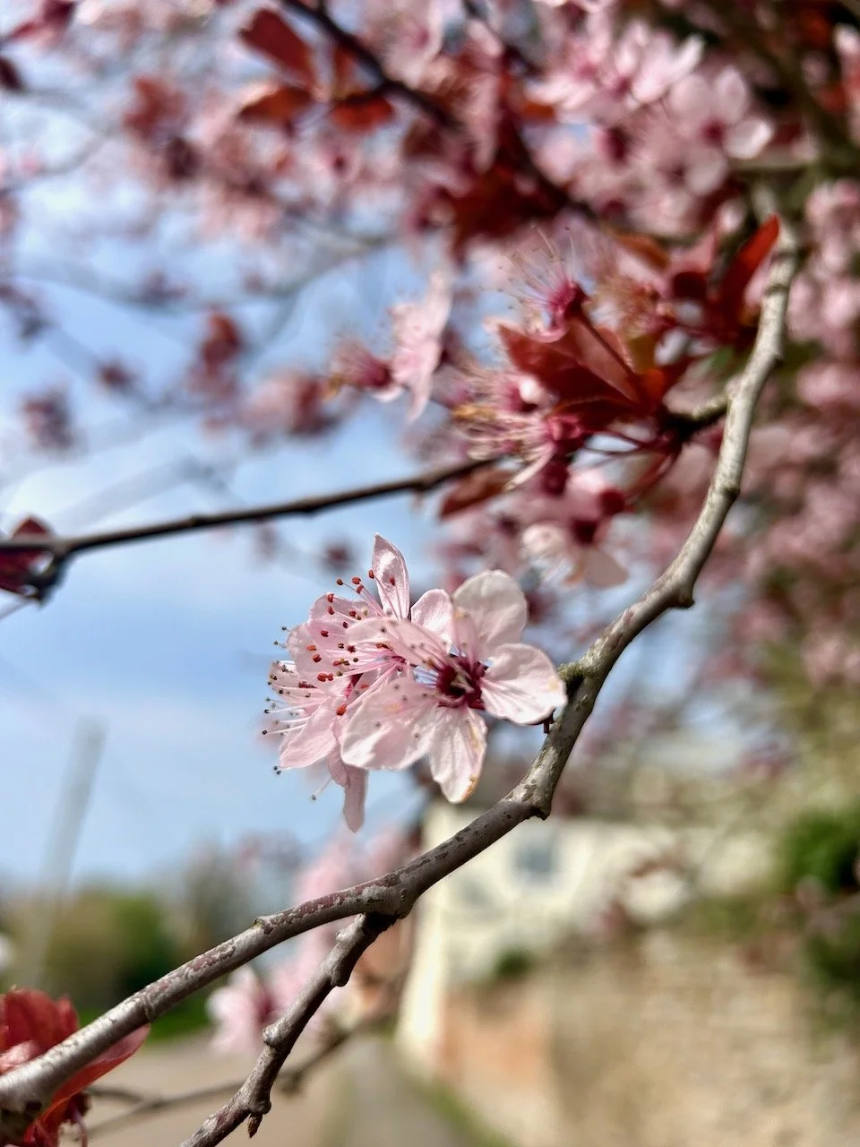
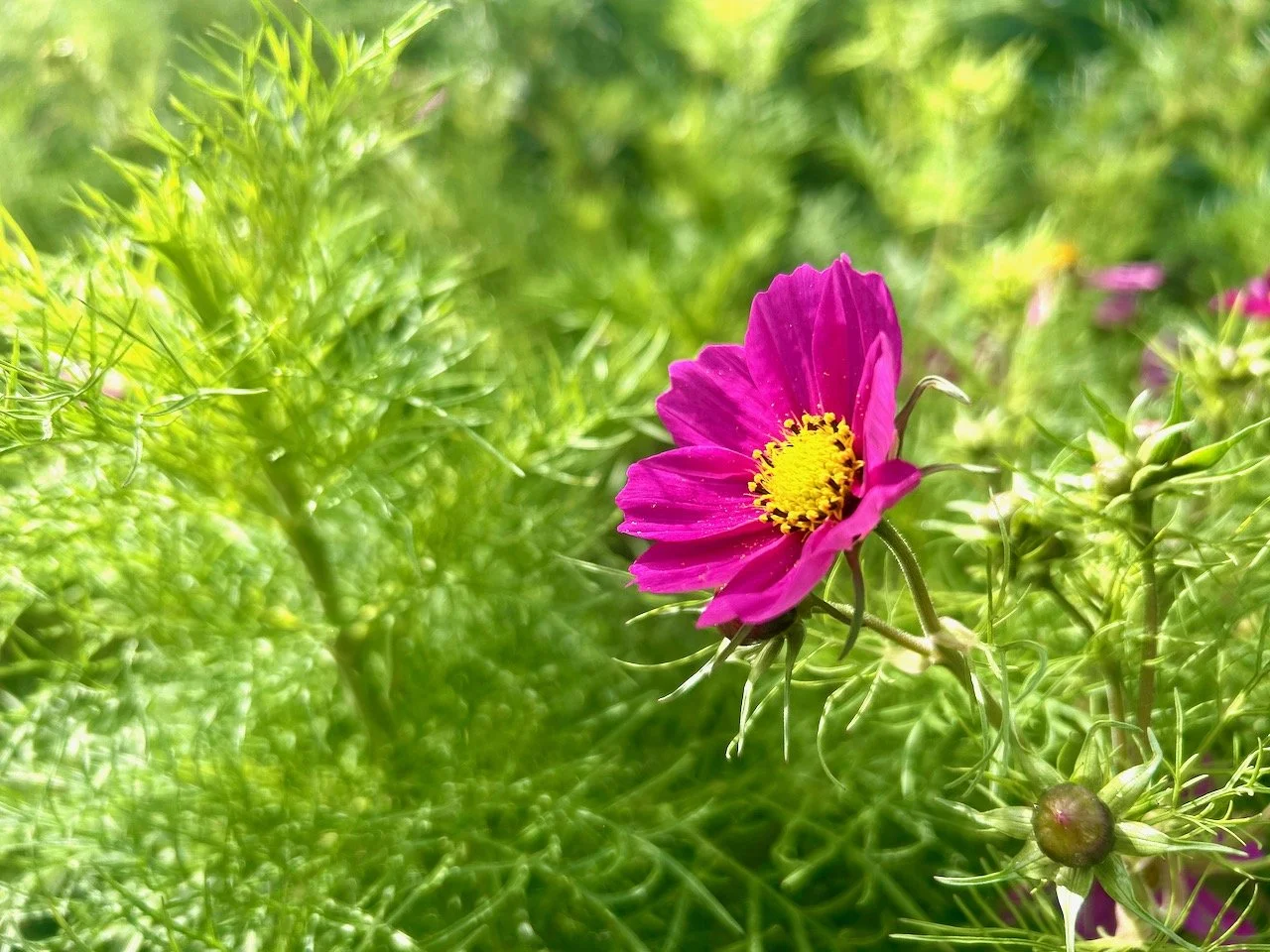
You’ll know I’m an advocate of colour, and so this is the perfect month for me to start sharing the ‘gardening is good for you’ with its colourful theme. I’d like to say I planned it like this, but I didn’t - I only learnt about this at the Garden Media event I went to at the end of February...
Using colour in your garden is as easy as using colour in your house. It’s that simple, although you’ll also know I think we can play it too safe with our interiors choices. So if that’s you, then going a bit wild with colour in your garden is the perfect way to rebel. I mean, have you seen some of the colour clashes that nature puts together, and which just work?
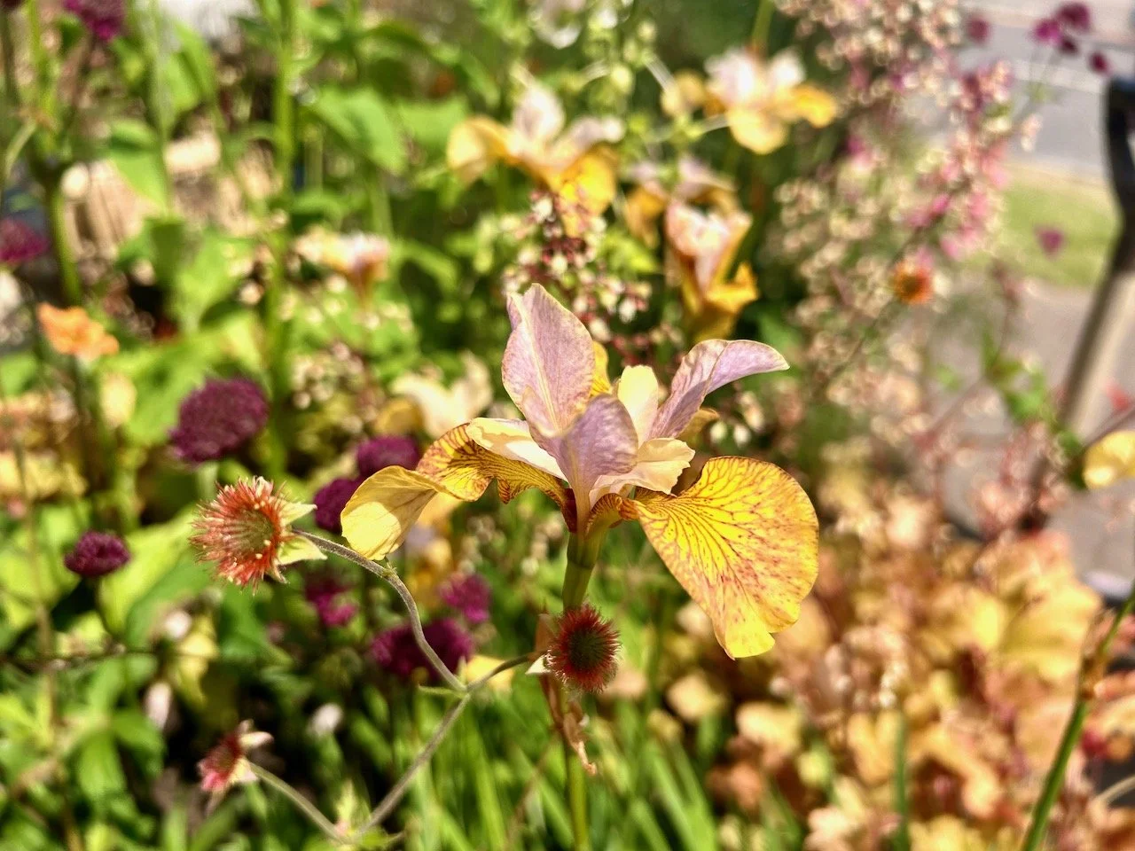
For somewhere bright and uplifting choose a colour palette with red, gold, yellow and orange – all colours with energy and warmth. Planted in bold bocks around a patio, and matched with furniture in equally uplifting colours, they’ll produce a joyful place socialise outside.
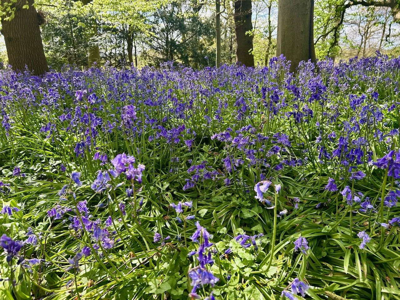
In contrast, create somewhere calm and relaxing using cool colours like blue, mauve and violet, set against a backdrop of green, and perhaps adding pure white and silver for a clean, tranquil effect. With soft chairs to sink down into you’ll create a peaceful and restorative space to sit out and meditate.
Different colours can influence on your emotions in different ways:
Red: bold, bright and stimulating, exciting and eye-catching
Orange: warm and vibrant, happy and fun
Yellow: cheerful and welcoming, positive and stimulating
Green: fresh, natural and calming, peaceful and relaxing
Blue: simple, cool, calming and relaxing
Purple: striking, powerful and energetic
White, grey & silver: pure and simple, clean and classic.
Colour can influence your visual perception of space
By growing bright red plants at the end of a long, narrow garden you can make it appear closer than it actually is, while cool, blue flowers will look further away, giving the impression that the space is larger. Vibrant colours like red and yellow grab your attention, drawing the eye away from eyesores or views you’d prefer to ignore, while pure white and gold shine out on dull days and brighten a shaded spot.
Choosing colour themed displays
You can have fun with colourful groupings or partners, and good planting companions include:
Purple and yellow or gold, such as Geranium, Achillea, Rudbeckia.
Red, yellow and blue, such as Solidago, Scabious, Camassia, Scilla peruviana.
Purple, green and orange, such as Geum, Alchemilla, Campanula, Erysimum, Salvia, Verbascum, Hosta, Euphorbia, Bergenia.
Dont worry about the ‘proper’ names of the plants, a quick look around your garden centre or on the internet will quickly determine what they look like and if you like them. Like other parts of your home, if you don’t truly love it then you shouldn’t include it.
You can find our more about colour therapy in garden design and learn the basics of colour theory to know what looks good using the appropriate link.
Gardens to visit for: colour-themed inspiration
Coton Manor, Northampton for their Blue & Yellow Border.
East Ruston Old Vicarage, Norfolk for their Red & Purple Border.
Hidcote Manor Garden, Gloucestershire (National Trust) for their Red Borders.
Sissinghurst Castle Garden, Kent (National Trust) for their White Border.
Despite two of these gardens being relatively close and/or close to family, I’ve not visited any of these, so it seems This month would be a good time to put right! If you’ve visited any of these gardens I’d be keen to see your posts linked below, alongside any that complement the theme.
