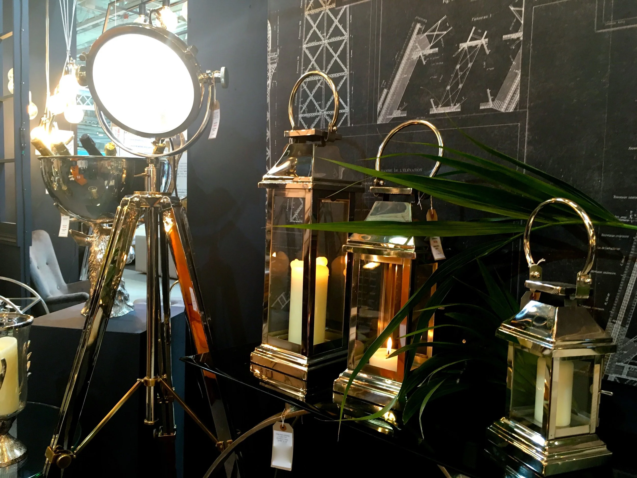
Today's post comes from the Ideal Home Show and as you can see from a quick look at the photos, there's a lot of lights, and mostly set against dark backgrounds - hence the title "light and dark" - and that got me thinking about how exhibitors show off their items on their stands. And of course, there's a chance to admire the lights, the setting and the pure extravagance that seeps from the photos. Or I think it does anyway.
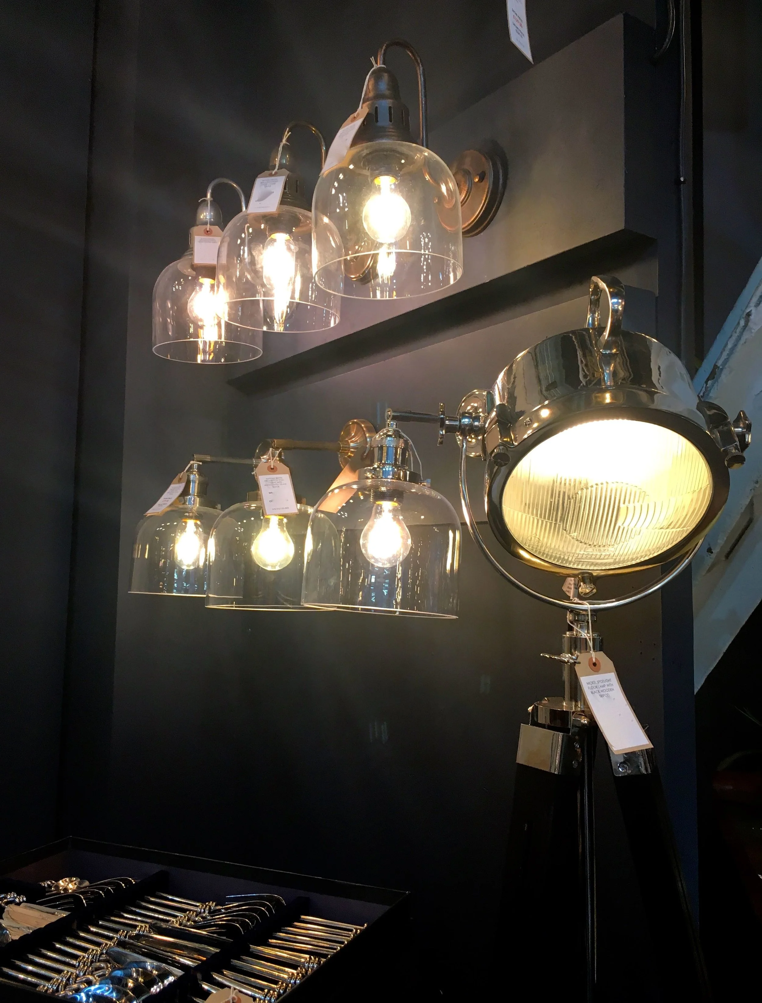
I think the lanterns above are super stylish and a classic whatever their finish. I've a wooden lantern of the same shape, and while that's good and equally timeless, these are more lust-worthy. I know though that it'd be the more industrial looking light that MOH would be swooning over, and if I'm honest that's ok as I'd happily find space for something like this.
The setting has a hint of sitting room, or house about it doesn't it? But one that's decorated in most likely a more modern style that many of us no doubt have. And they do look good, but how do you choose just one?
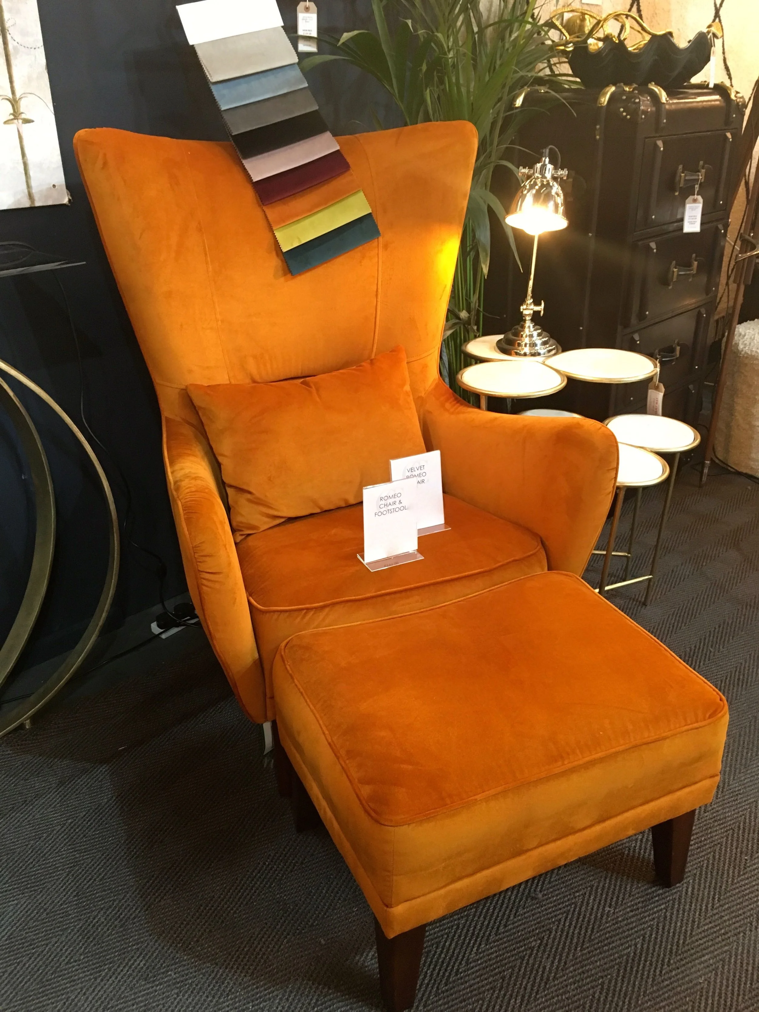
The one thing that wasn't dark on this stand was another of those statement armchairs, this one a gorgeous orange velvet. And it really was, and I'm not sure I ever thought I'd be admiring an orange velvet chair, but I am and I was.
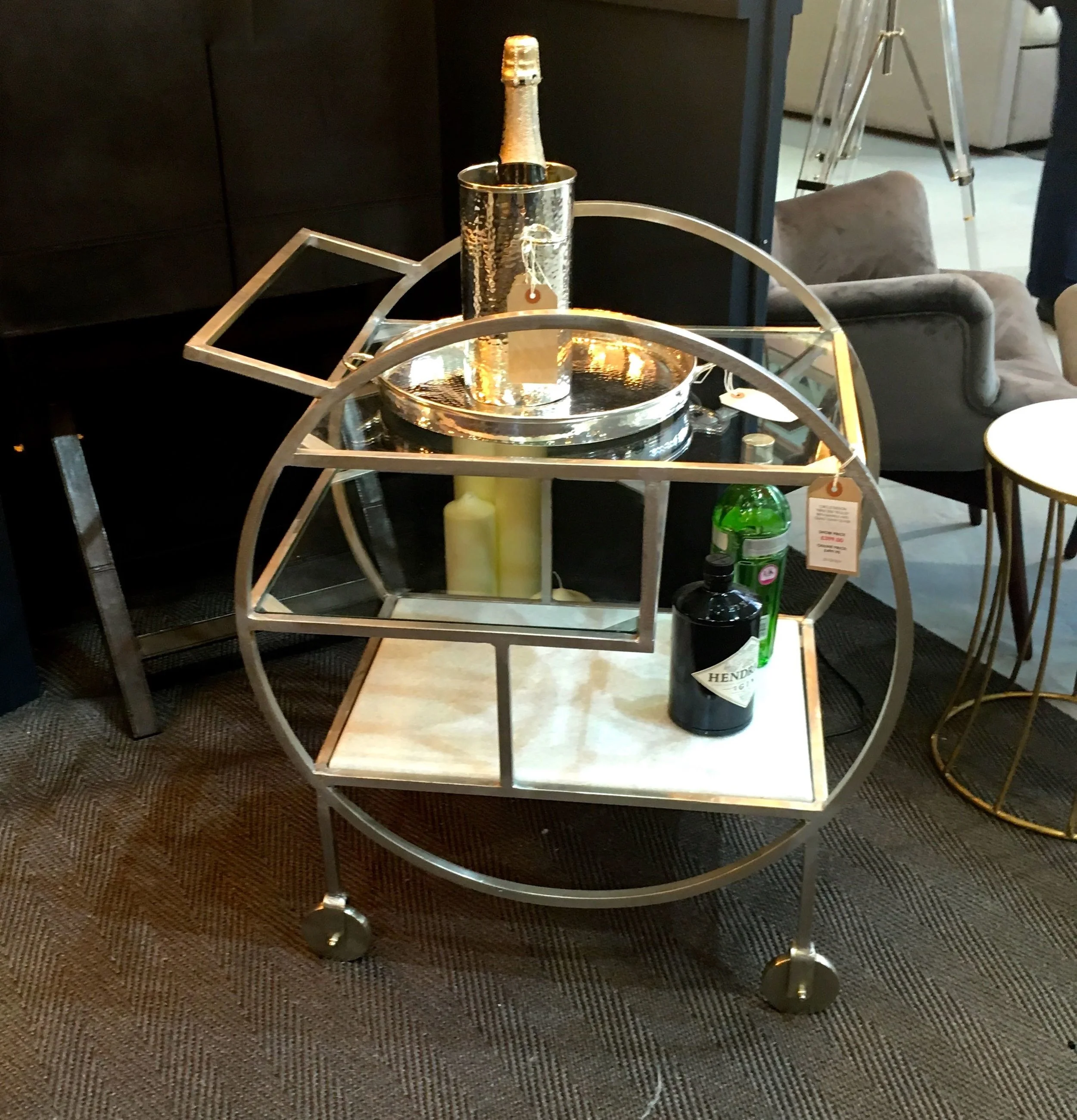
Even the drinks trolley fits in with the decadence, and it could be on this stand that my "need" or perhaps acceptance might be a better word, for this opinion-dividing piece of furniture started. I do quite like the one below, and think if you're going for a drinks trolley then you might as well go bold.
Initial research also shows that you also need some kind of retaining guard to stop your bottles whizzing off the end when you stop suddenly, which at some point I'm sure you're going to need to do. Many trolleys also have built in bottle holders - it remains to be seen if the one I will opt for has what I've already determined to be necessary features, or if I'll see one I love so much that they will just go out the window!
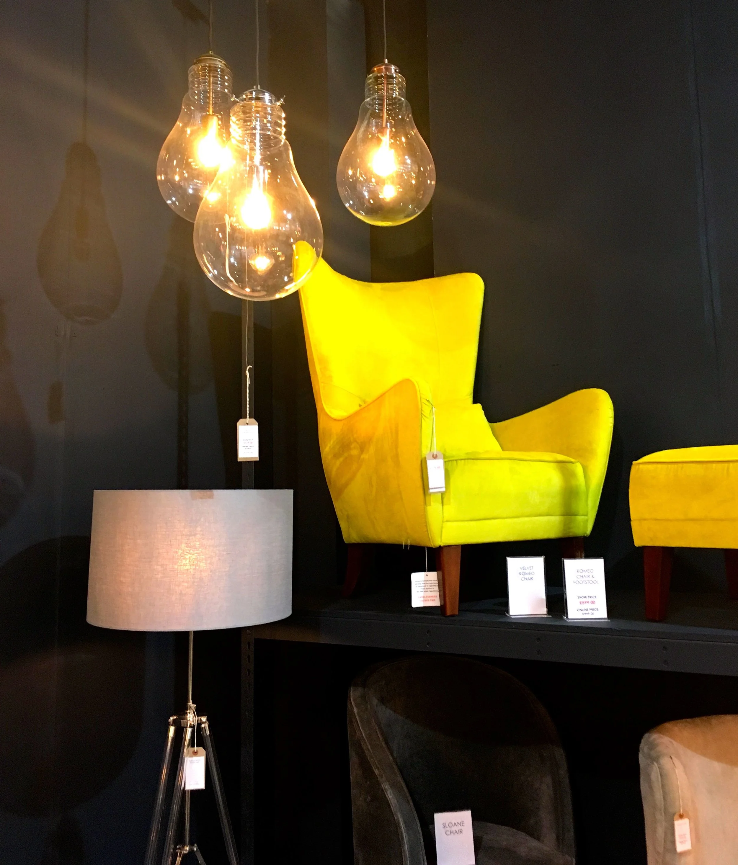
What I learnt about the stands, apart from the black background, is that repetition often works well. For me it's best demonstrated with the photo above, and with the photo below. Although I've included that, not only for the yellow chair, but also for the lightbulb shadows on the wall, they're just as good as the oversized bulbs I think.
I've no idea though whose idea it was to put that yellow chair out of my "stroking" reach!

