At the Assembly House in Norwich

It’s almost two months since our short-stay in Norwich, and I’m not sure where the time in between has gone. I shared a few pictures of The Assembly House, where we stayed while we were there, but nothing since. Our room was pretty special, in fact all the rooms are - and what’s even better is you can see each of the rooms on their website, before you book. Each has a different vibe and colour theme, and ours was blue and yellow.

A four poster bed and homely decor
cushions on the bed at the Assembly House

The colour scheme may have influenced my choice. And maybe the four poster bed did too. Truth is it was one of the available rooms in our price range, so that helped quite a bit too. What’s strange though is even though we knew what the room would look like before we stepped in, when we did, it still took our breath away. MOH was suitably impressed saying something like “it’s like someone’s house.” And what a complement to any hotel, and it really did.

cushions on the bed

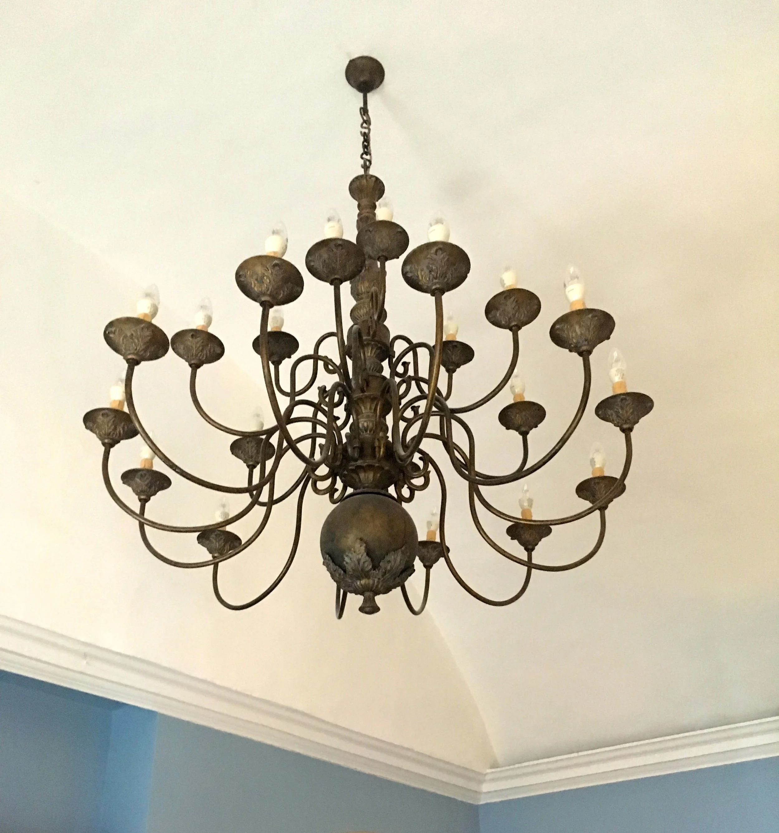
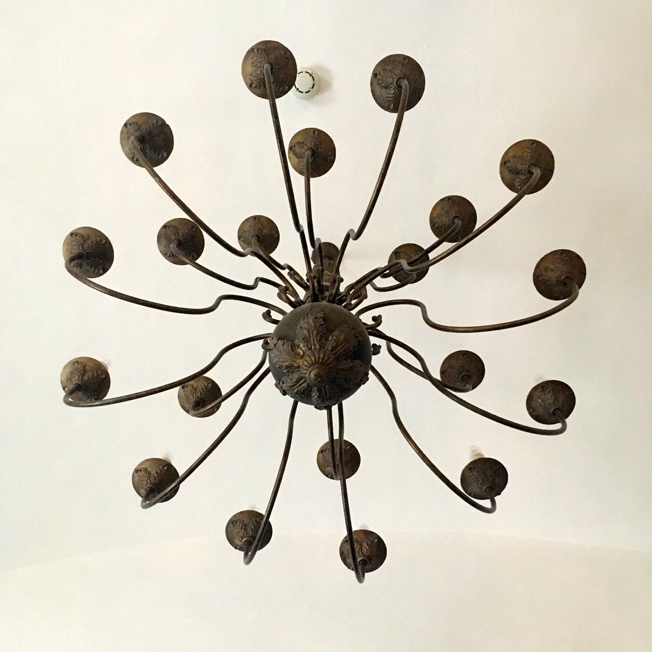
Although not many homes we know of have grandiose lights like this, let alone in the bedroom.

quite a chandelier in our room at the assembly house
the same light a different view

And I couldn’t help have an arty shot or two.

it was great to have a room that was big enough to have space for some decent sized armchairs, winged at that. And we made good use of them, much better than having to camp out on the bed, which isn’t ideal and is often why we choose apartments when we go away over hotels. Not this time though.

a winged arm chair
A free standing wardrobe

The old fashioned armoire was authentic as it was stylish. It needed some persuasion to open and shut, but that’s all part of the charm n’est pas?

A fireplace with a mirror above

While MOH made good use of the Nespresso machine, I admired the pom poms on the curtains. I know, a new and stylish way for those pom poms. MOH is already braced for the onslaught of pom poms in our house, they’ve made it as far as the cushions, but will they make it onto the curtains?

pom poms on the curtains

The artwork was pretty eclectic too, and I admired the mix of modern and traditional. I’m a gallery wall fan, but always struggle to line pictures up just as I want them. I resisted the strong urge to check the back of the pictures, as I’m pretty sure that if these are anything like mine, there’s often some blu tak, and sheer goodwill keeping them where they should be, and that’s not something you need to put right in a very well put together hotel room is it?

a very well thought out and comfortable room

And there was plenty of wall art - even between the curtains; this yellow butterfly arrangement may not be everyone’s cup of tea, but I loved it.

butterflies on the wall
oh the pom poms on the curtains

The breakfasts at The Assembly House were pretty special too, and it’s fair to say it was probably just as well we were only there two nights, or otherwise I’m sure we wouldn’t have been able to move.

PoCoLo

Floral thrones, of course

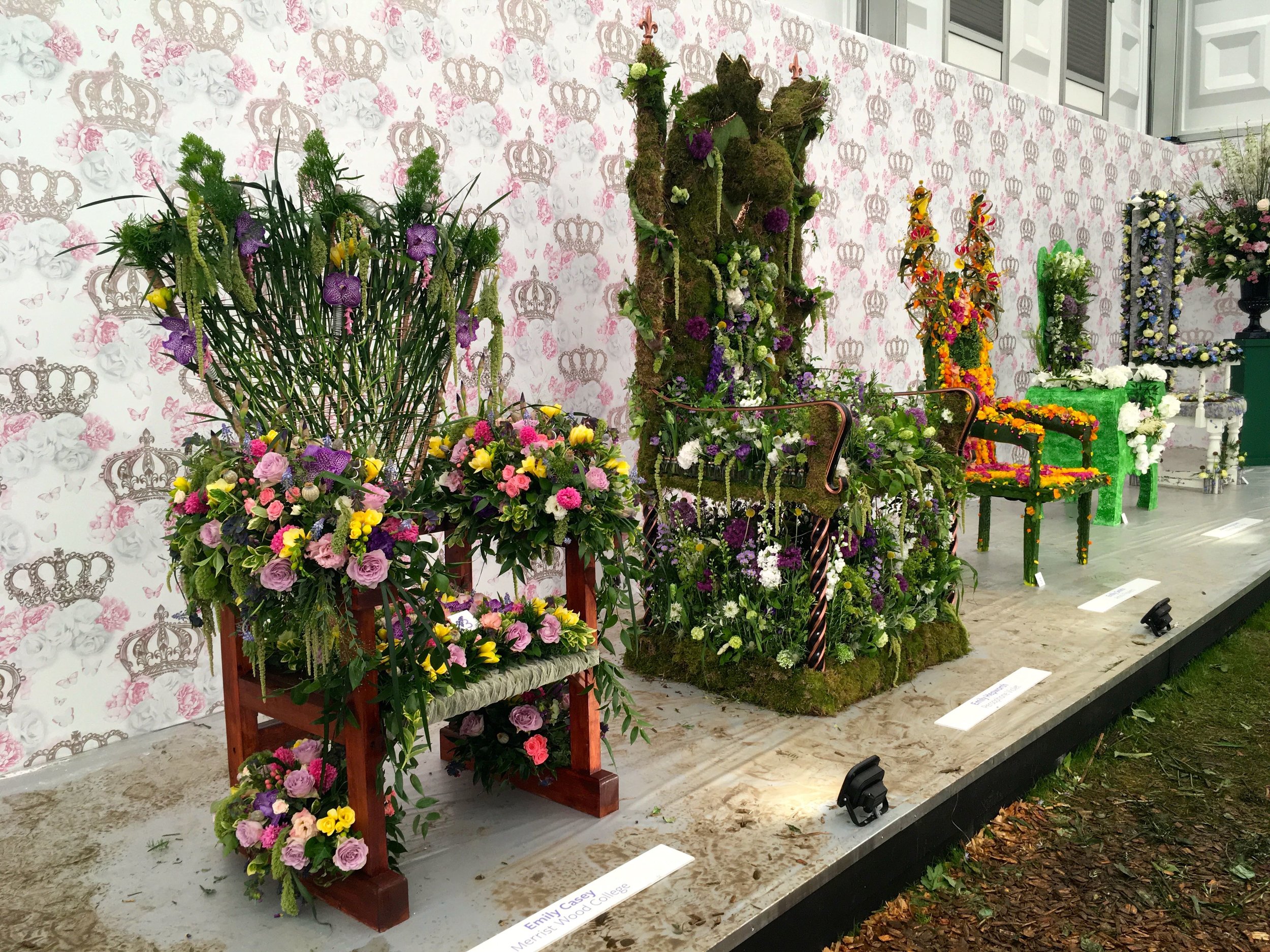
Prepare to be amazed. And potentially a little bit bemused. This post will show you flower arranging at its greatest, quite where the inspiration comes for these fabulous creations I’m not sure, but it was great to wander amongst them and admire them in the Pavilion at last year’s Chelsea Flower Show.

A row of floral thrones at the 2018 chelsea flower show
hearts and crowns on this floral throne from RHS Chelsea 2018

I like the yellows and purples of the one above, as well as its heart-shaped addition at the top of the back. Imagine if you were to sit on this (and I’m not sure I’d advise that) the heart would be just above your crown, because of course you’d have to be wearing a crown, wouldn’t you? In fact the one below, has an evergreen crown woven into its bold design.

bright yellows, oranges and pinks on this floral throne at rhs chelsea

What is amazing is the variations among them. The flamboyance and the variety of colours and approaches used. The one below has a more practical solution for its occupant to avoid a flower squishing situation, although I’m not convinced it would be any more comfortable.

pink flowers of almost every type in this floral throne

I remember being amazed at the number of entries, and while the theme was floral thrones, the armchair version was a favourite.

More of an armchair covered in flowers than a throne
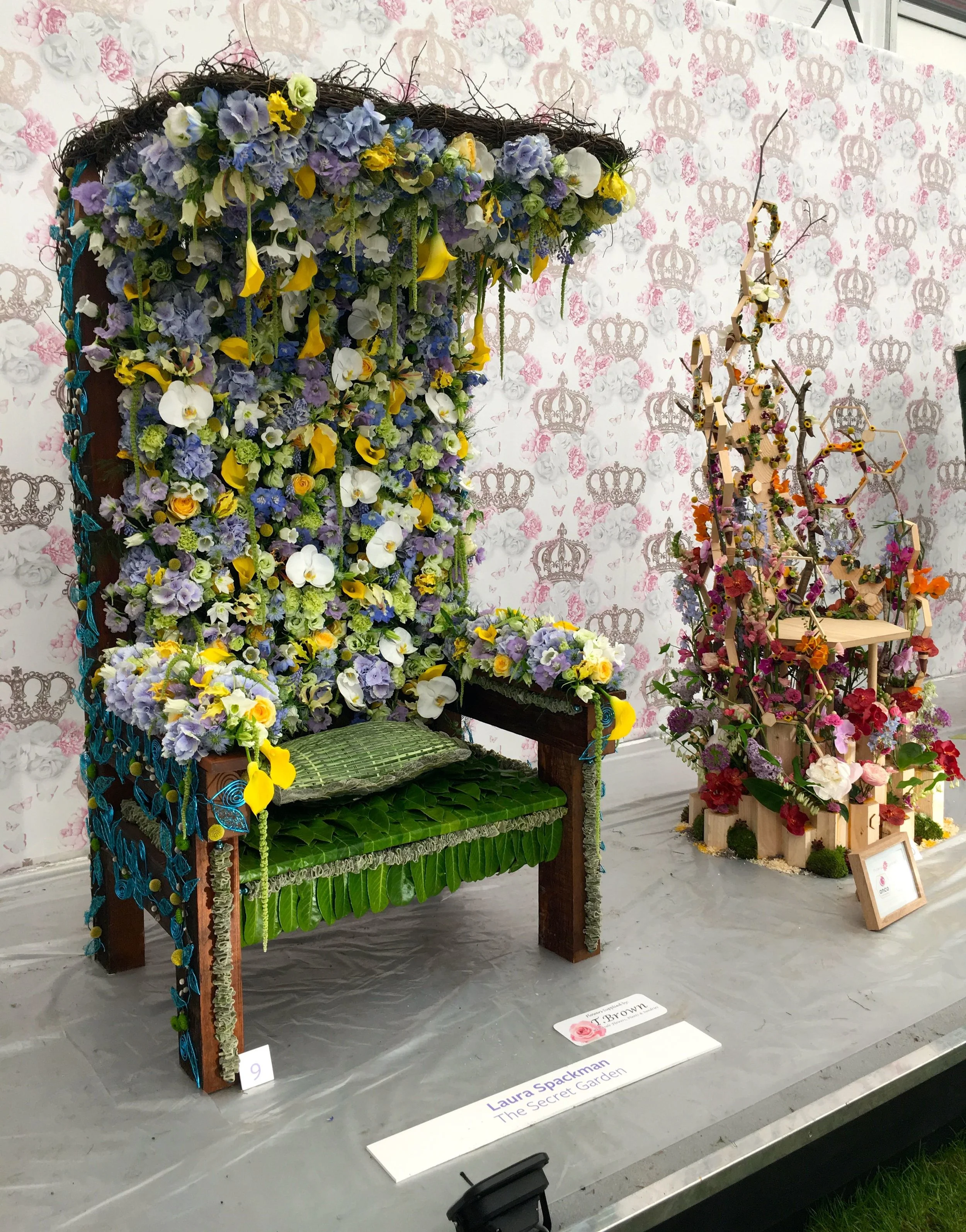
A canopied throne at the Chelsea Flower Show

The canopied version was much more regal, and I loved the colours of its flowers.

Pastel blooms for the final floral throne from last year's chelsea flower show

And it just goes to show that with a few logs from the garden and plenty of imagination, we all could have something just as spectacular, although in my case I think I’d settle for colourful as I’m not sure I could match any of this magnificence.

Hands up, whose garden will be supporting a floral throne this summer?

'Get creative with colour' this April

Gardening is good for you, that’s the message from the Horticultural Trades Association (HTA) who have a year long campaign to persuade more of us to get out into our gardens, to enjoy our spaces and perhaps perk them up a bit too. 

I can’t quite believe it’s April already, the year seems to be running away with us.  In my own garden I’ve hardly made it out there much yet and I’m not quite sure why.  I suspect partly it’s due to the weather - it has been lovely the last couple of weekends, but we’ve been out and about so it’s also partly down to weekend plans.  Unusually I don’t have any seeds sown yet either, but I also know with my north-facing garden, which takes a little longer to warm up, that I should be ok as long as I get started soon.

And because I also believe that gardening is good for us I’m planning to share more of the #GIGFY campaign for the rest of the year.  So, on the first of every month, pop back and see the theme for the month and how they promote gardening, health and wellbeing activities.  Every month I’ll also host a linkup where you can share your gardens and/or gardening posts (old or new) that complement the month’s theme.  For April, that’s Get Creative with Colour.

APRIL: GET CREATIVE WITH COLOUR

APRIL: GET CREATIVE WITH COLOUR

Using colour in your garden

You’ll know I’m an advocate of colour, and so this is the perfect month for me to start sharing the ‘gardening is good for you’ with its colourful theme.  I’d like to say I planned it like this, but I didn’t - I only learnt about this at the Garden Media event I went to at the end of February...

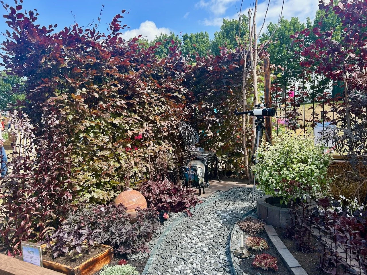
Using colour in your garden is as easy as using colour in your house. It’s that simple, although you’ll also know I think we can play it too safe with our interiors choices. So if that’s you, then going a bit wild with colour in your garden is the perfect way to rebel. I mean, have you seen some of the colour clashes that nature puts together, and which just work?

For somewhere bright and uplifting choose a colour palette with red, gold, yellow and orange – all colours with energy and warmth. Planted in bold bocks around a patio, and matched with furniture in equally uplifting colours, they’ll produce a joyful place socialise outside.

In contrast, create somewhere calm and relaxing using cool colours like blue, mauve and violet, set against a backdrop of green, and perhaps adding pure white and silver for a clean, tranquil effect. With soft chairs to sink down into you’ll create a peaceful and restorative space to sit out and meditate.

Different colours can influence on your emotions in different ways:

  • Red: bold, bright and stimulating, exciting and eye-catching

  • Orange: warm and vibrant, happy and fun

  • Yellow: cheerful and welcoming, positive and stimulating

  • Green: fresh, natural and calming, peaceful and relaxing

  • Blue: simple, cool, calming and relaxing

  • Purple: striking, powerful and energetic

  • White, grey & silver: pure and simple, clean and classic.

Colour can influence your visual perception of space

By growing bright red plants at the end of a long, narrow garden you can make it appear closer than it actually is, while cool, blue flowers will look further away, giving the impression that the space is larger. Vibrant colours like red and yellow grab your attention, drawing the eye away from eyesores or views you’d prefer to ignore, while pure white and gold shine out on dull days and brighten a shaded spot.

Choosing colour themed displays

You can have fun with colourful groupings or partners, and good planting companions include:

  • Purple and yellow or gold, such as Geranium, Achillea, Rudbeckia.

  • Red, yellow and blue, such as Solidago, Scabious, Camassia, Scilla peruviana.

  • Purple, green and orange, such as Geum, Alchemilla, Campanula, Erysimum, Salvia, Verbascum, Hosta, Euphorbia, Bergenia.

Dont worry about the ‘proper’ names of the plants, a quick look around your garden centre or on the internet will quickly determine what they look like and if you like them. Like other parts of your home, if you don’t truly love it then you shouldn’t include it.

You can find our more about colour therapy in garden design and learn the basics of colour theory to know what looks good using the appropriate link.

Gardens to visit for: colour-themed inspiration

Despite two of these gardens being relatively close and/or close to family, I’ve not visited any of these, so it seems This month would be a good time to put right!  If you’ve visited any of these gardens I’d be keen to see your posts linked below, alongside any that complement the theme.

“TheGardenYear