Black & White photo: A corner of Tintagel Castle

Yesterday I shared the first part of our visit to Tintagel Castle where we explored the remains of the castle on the headland. I left it as we headed off to find a spot to eat our lunch and promised to share the second half of our trip next Saturday, but I couldn't resist sharing a black and white shot of the castle ruins on the mainland before then.

For me this photo is all about the texture and the light and I think that makes it a great shot for the black and white treatment, what do you think?

Tintagel Castle.jpg
 photo 4d06e438-4e6a-4f3b-88b2-0c1093350397_zps361ad0e9.jpg

Our World Tuesday


Dad's Norfolk garden in Spring

It's been a while since I shared pictures from my Dad's garden - September last year in fact: A hard-working and productful garden - so as we're spending a few days in Sunny Hunny I thought I'd take you on a tour to see what's going on. Sunny Hunny (aka Hunstanton) lived up to its nickname yesterday and I have the rather attractive T-Shirt tan lines from our cycle around the back lanes to Burnham Overy Staithe and the pub to prove it!  It's not a great look...

These oxalis and mind your own business (I love its name!) peering out from underneath the greenhouse staging is a much more welcome sight.

oxalis.jpg
heuchera.jpg

As is the burgundy of heuchera above and the green lush aquilegia leaves, which those white star-shaped flowers are using for support.

Flowers.jpg
flowerbeds.jpg

There's a fair amount of pink in Dad's garden throughout the year, and that's by design as Mum is partial to a bit of pink. Right now there's this brightly coloured bush, which looks a touch azalea-ish to me and some pink bluebells, or should that be pinkbells?

pink.jpg
pinkbells.jpg

There's also some bluebells and some muscari or grape hyacinths, and I think Spring is probably the one season where there'll be blue flowers in this garden...

bluebells.jpg
muscari.jpg

There have been a few discoveries too, the most notable are these abandoned eggs under the sweet pea trellis. A duck had been spotted in the garden and not too long after the eggs were found, but who knows - let's not hope they turn into a brood of ducklings, it's unlikely as nothing is taking care of the eggs - but that is also a shame. They're well hidden which is why I suspect they've been unharmed so far.

abandonedeggs.jpg

Around the garden plants are fit to burst into flower, just look at this poppy:

poppy.jpg

And the peonies and lupins aren't far behind either:

peony.jpg
lupin.jpg
daisylike.jpg
yellowrose.jpg

In the front garden there's also colour, this beautiful rose is already flowering and the pale pink clematis is clambering over wherever it can! But it's a beautiful one...

clematis.jpg
pinkclematis.jpg

And I haven't even got to the veg patch yet, where there's potatoes, onions and broad beans on the go along with some tomato and beetroot seedlings, and I'm sure there'll be runner beans at some point.  As it just wouldn't be my Dad's garden without runner beans!

“TheGardenYear

The interiors of the three Show Houses

My recent visit to Grand Designs Live reminded me that I haven't yet shared the pictures from the inside of the three show homes at the Ideal Home Show. So today I'm doing just that and clearing the decks for a series of posts from my visit to the other home show at Excel in London's Docklands.

1. The Home for Life

This house was styled by House Beautiful and the exterior is a modern pre-fabricated design with lots of windows providing in real life better views than the exhibitors at the Ideal Home Show! It had a couple of roof garden areas too, and that would be useful where space was more limited. So onto the photos:

Kitchen.jpg
kitchentable.jpg
snug.jpg
snugsofa.jpg

We entered through the kitchen/dining room, which like the room sets was grey and pink, although this had wood units and instead the splashback was grey. I was surprised to see the same colourway, but as the rooms were designed by different people maybe pale pink is becoming the hot choice for colour in kitchens.  What do you think?

The pink and grey was continued in the snug with the pink armchair and cushions on the sofa - I like the idea of having somewhere informal to sit, and one day my plan is to get our conservatory back to being that space. Currently the furniture for that - two green easy chairs - are distributed through our top bedroom and the study, just waiting to be reunited!

After the snug our route took us into a Granny room (or a downstairs bedroom) with it's own wetroom and then past the cloakroom and into the living room. I think the man in my photo was also thinking, there was copper in the bedroom room set or maybe he was pointing out the funky mint coloured 1970s phone, which I remember my aunt and uncle had in purple. And I thought they were very trendy, and looking back they probably were - they both worked, they didn't have kids and probably had more to spend on creature comforts like funky phones. And food from Marks and Spencer. Happy days.

livingroom.jpg

The last rooms on the ground floor were labelled as a "young adult's room" and ensuite, then we were outside and using the outside staircase to reach the family terrace. In the child's bedroom I liked this pencil art, although I imagine most children would be frustrated to have their pencils behind perspex!  

pencilart.jpg

The master bedroom with its walk-in wardrobe and ensuite takes the space over the snug and granny room on the ground floor. I liked the bird wallpaper although I think I'd prefer less of it. The mustard cushions on the bed, confirmed my suspicions of yellow and gold turning up in all sorts of accessories.

masterbedroom.jpg

Out of the master bedroom there was a fabulous roof space, grandly named the Sensory Garden. And I immediately liked the feel of it, it was definitely an away from it all sanctuary. I've since learn that the furniture is by Raft, and you may remember that I'm a fan of their furniture.

roofspacebench.jpg
woodstore.jpg
roofspace.jpg

It was a good ending to our first show home and we were lucky with the queues too, so although there were people around (yes some of them pointing!) there wasn't too much shuffling along, which I think is the worst way to see these kind of show homes.

My verdict:

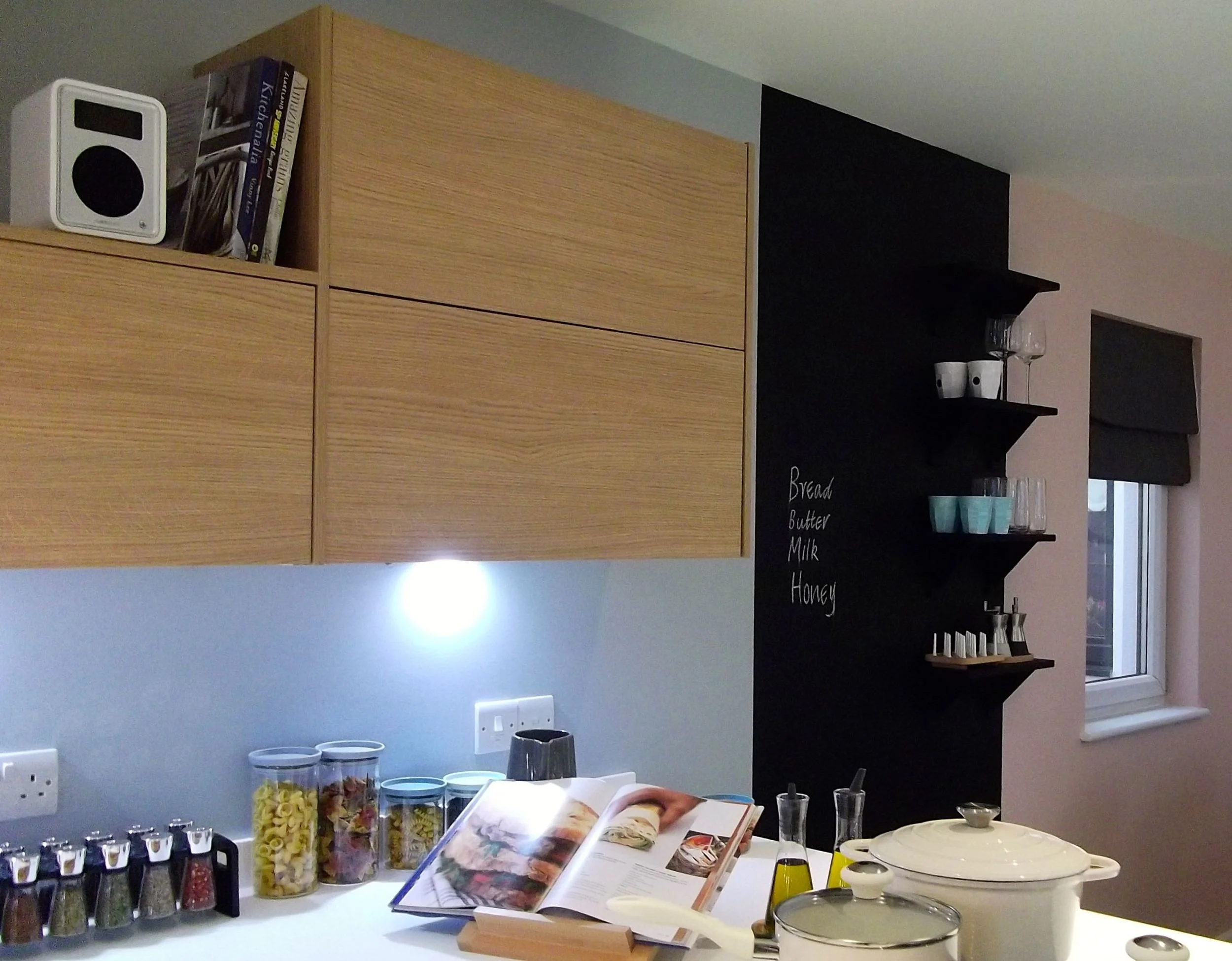
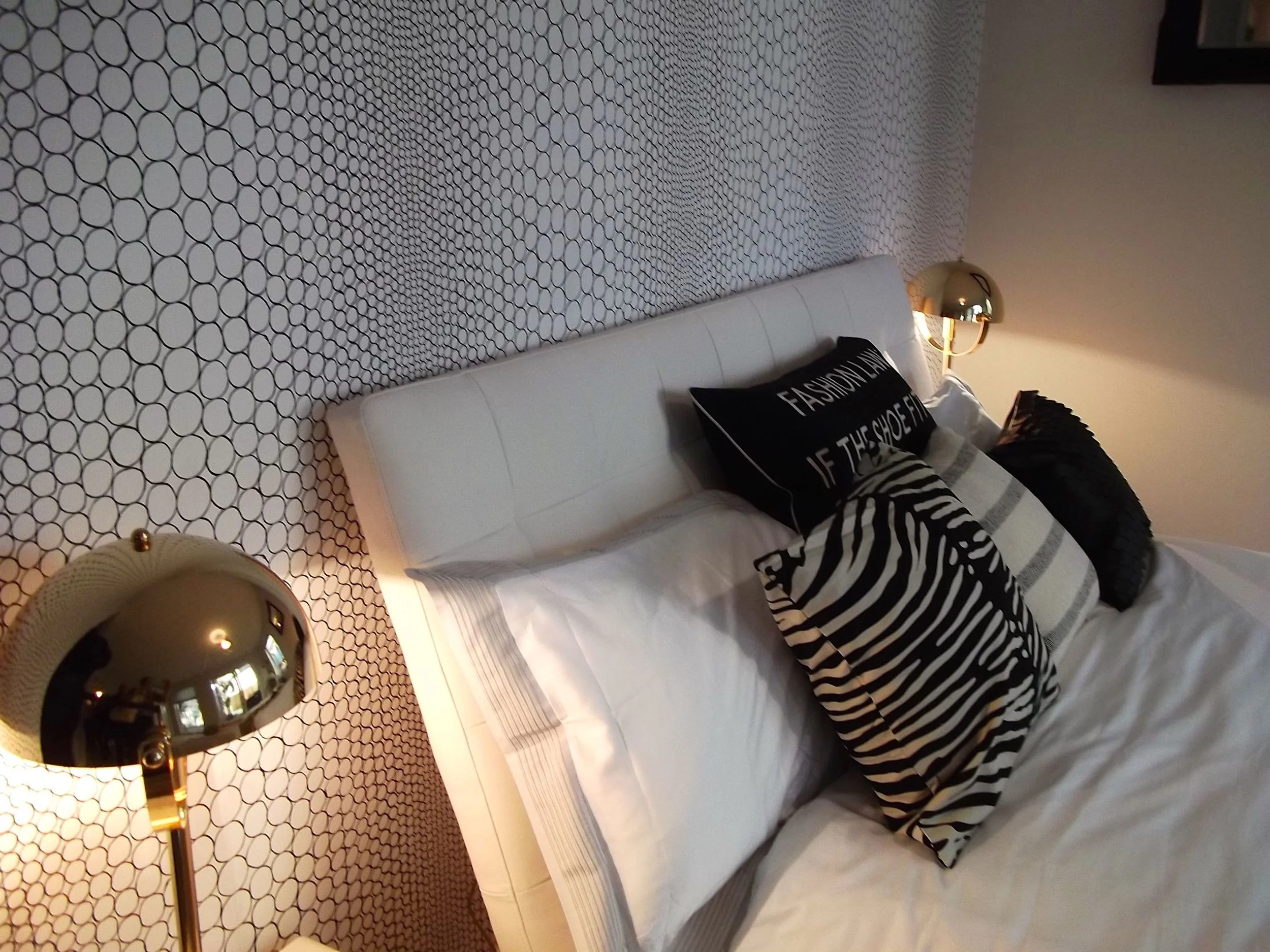
I like this house but I'm not sure about pink and grey for the kitchen, but I might just be being anti-pink! I did like the roof spaces and wish more houses (especially mine) had one.

2. The Gap House

And no it wasn't styled by the shop, it had been designed to show that we can use smaller urban spaces and create unique, innovative and exciting places to live. This whole house is just over three metres wide, which is a similar size to a garage or allotment, and it's intended to fit into a gap between two buildings. 

Again we entered through the kitchen, passing a cloakroom just by the front door. The kitchen was open plan and included a table and the stairs were at the back of the house and led to the lounge on the first floor. Up again and surprisingly there was space for two bedrooms, one with a drop down bed and therefore doubling as a study and the other with an ensuite. First the study:

patchworkchair.jpg
penguinbookshelf.jpg

And then the main bedroom, again with dark walls but I think with the recycled magazine accessories bringing colour, I think it worked. And I loved the lights and their shadows on this level.

recyledmagazinemirror.jpg
recycledmagazinebin.jpg
DSCF5473.jpg

My verdict:

It was an interesting house and clearly showed that it is possible to live and create spaces like these, and to stay stylish. I found a lot of the house too dark, but it was certainly dramatic and I loved the upstairs lighting.

3. The Future Proof Home

This house draws its inspiration from Scandinavian style and uses a palette that is natural and monochromatic with pops of colour and texture. Again there were spaces throughout to sit, you know just the sort of space to read your book away from most of the hubbub of daily life.

lounge.jpg
loungechair.jpg
bedroomcorner.jpg
headboard.jpg

The first floor and its bedrooms and bathrooms were more monochrome than the living spaces below, but the teepee in one of the bedrooms brought a fun touch. It's the sort of bedroom you'd want for a really cool kid, but you know that it'd soon have an influx of multicoloured plastic...

childsteepee.jpg

I liked the bathroom though, and the mix of textures and patterns in there worked, and the overall effect was that of a stylish hotel. And one you'd definitely want to keep minimalist, or as minimalist as you could anyway.

bathroom.jpg

My verdict:

I like the monochrome colours in some rooms, but personally I'd need more colour in my house. I agree though with keeping a set of colours and using that throughout your house to bring a unified look and feel. We do that here but alongside the neutrals we have red and duck egg blue (although they're not next to each other!)


So which of these show houses do you like the best?