One of the challenges about writing a single post about my visit to the Ideal Home Show has been exactly what to put in it. I mean, there was so much to see, and I tried my best to see most of it, which meant so many photos. But I think I'm there with a highlights post, though there will be many more posts to come in the coming weeks, because you know how much I like a room set.
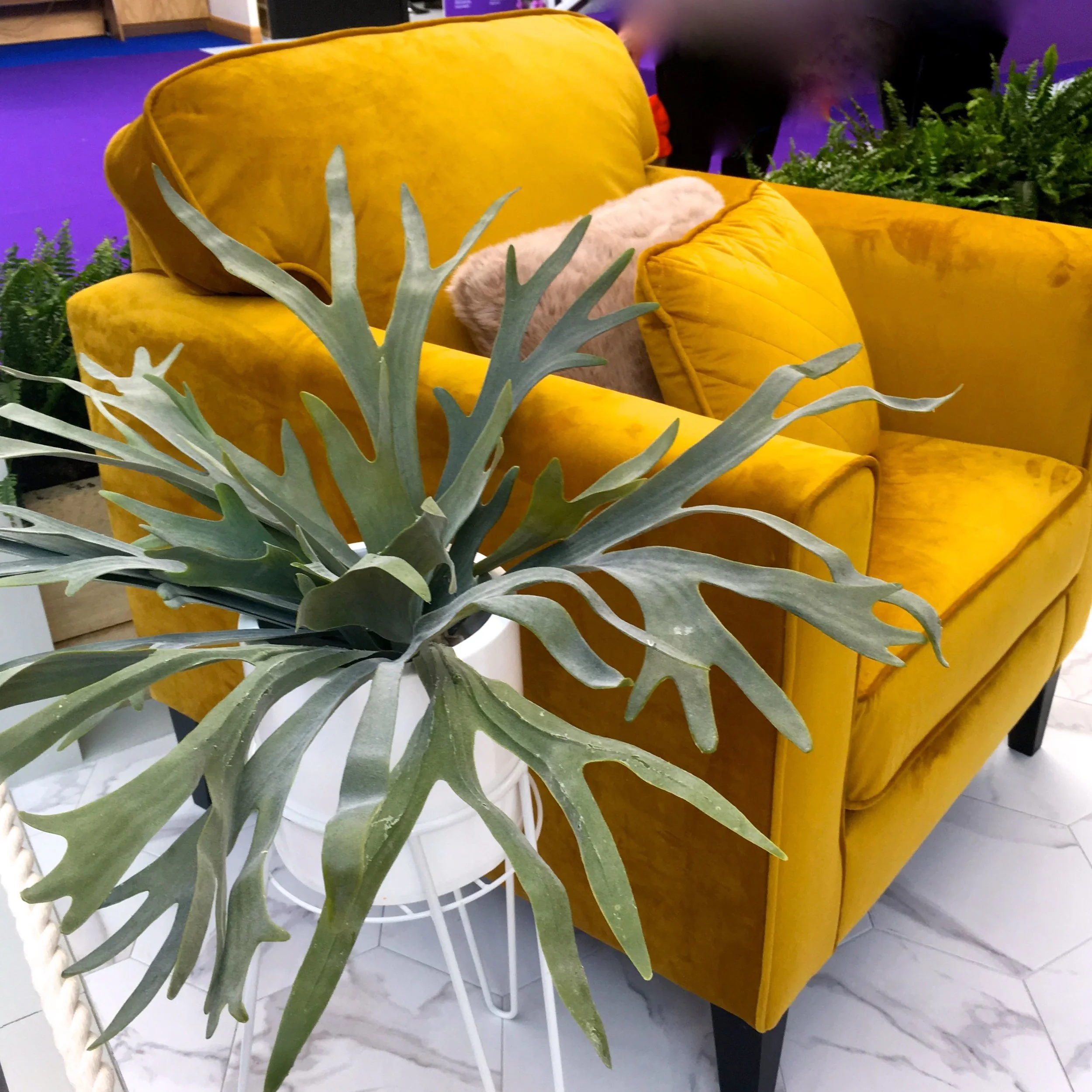
In fact I like them so much that the first set of photos were from the Good Homes Magazine room sets. I might very well have been swayed by this yellowy-goldy-mustard chair in the bedroom room set, but that was my room set of choice. Throughout the show though there were brightly coloured armchairs, so watch out for those becoming a thing (if they're not already).
The picture below is also from the bedroom room set and as well as the pom poms - I've already said here that I expect these to be big this year, and my visit to the Ideal Home Show only confirmed that - there's the mix of textures that just make a room work. The suede footstools, the wooly blanket and the textured rug. All of these calming colours might not be what you'd pair the yellow chair with, but it really did work.
I'm also partial to some clever storage and the kitchen room set had this built in on one of the ends of the kitchen cabinets. When storage is functional and stylish then that's a winner in my book. I'll share more soon, but the kitchen was dark and moody so the copper and metallic accessories really did shine.
The room sets were just inside the main entrance so really were one of the first things you saw as you got into the show, and it was quite a welcome. The bathrooms are often my least favourite spaces as because they're often the most unrealistic space wise - there's a reason that bathrooms are often referred to as the smallest room, isn't there?
This year though I was blown away by the bathroom and it's feature wall - I later discovered there were extra kitchen and bathroom room sets as a bonus, and I may be changing my mind about them being my least favourite room set. The patterned feature wall was stunning and would work equally well in a less generous and more usual sized domestic space too, and really give some character to what can often be a functional and formulaic space.
A SHOWER WALL WITH A DIFFERENCE
Before heading over to the houses to check out the length of the queues there, I found myself at the Furnish Your Home stand, which was full of ideas and items to live up to its name. I thought I'd choose an item or two from their stand to share with you too, but as ever that was easier said than done. There were items like these geometric lights which would make a great statement either in a hallway or over a dining area and bring a modern touch to any space.
Or maybe this sleek and stylish desk which would easily fit into and enhance a corner of most rooms, and double up as a console table when the laptop was put away. I think it's the type of piece that I'll be trying to accommodate at a future date, as having somewhere so stylish to work could only improve my outputs, right?
I mentioned earlier that feature armchairs were very much a thing, and this bold patterned brass chair, brass unit and wallpaper really made a statement. It really does show that if you go bold, you should go really bold and reap the benefits. This evokes a vision of a warm, snug and cosy room for me, perhaps a masculine room, but definitely one that would be great for cocktails - make mine a Manhattan!
The other thing I noticed at this year's show was mixed metallics. There was the copper jars and gold patterned mugs in the kitchen photo above, but also on the Furnish Your Home stand there was a silver mirrored chair adorned with a gold fabric cushion right alongside a rose gold console table. If you'd described that to me I might have scrunched my nose up, but it looks a whole lot better than I could have imagined.
Leaving the Furnish Your Home stand behind me I finally made it to the houses. The queues were short - phew - and I couldn't help but be reminded of the bubble hedge at Houghton Hall with this one outside the Innovation House with its interior designed by Sophie Robinson. While it looks real, it's actually faux box and I think is a great way to add interest and kerb-appeal.
Inside there was a riot of colour, and I'm saving that for another day. My favourite shot though was this one from the nursery, not quite what you'd call traditional either is it?
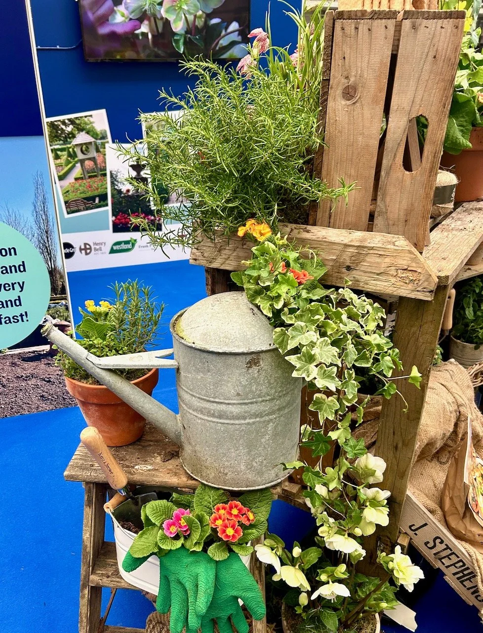
Elsewhere around the show there were many things that caught my eye, I've narrowed those down to just four:
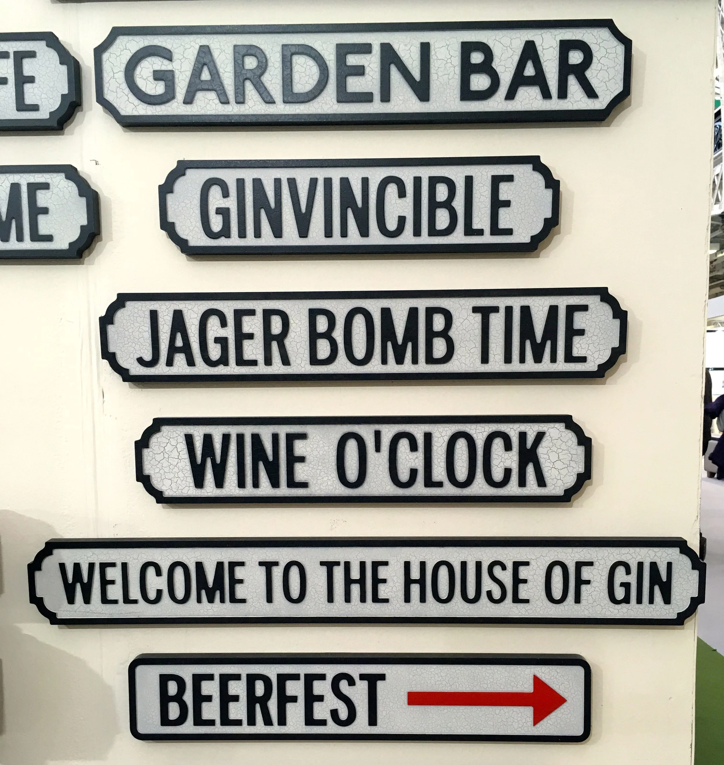
1. Fun garden signs, but which would would you choose?
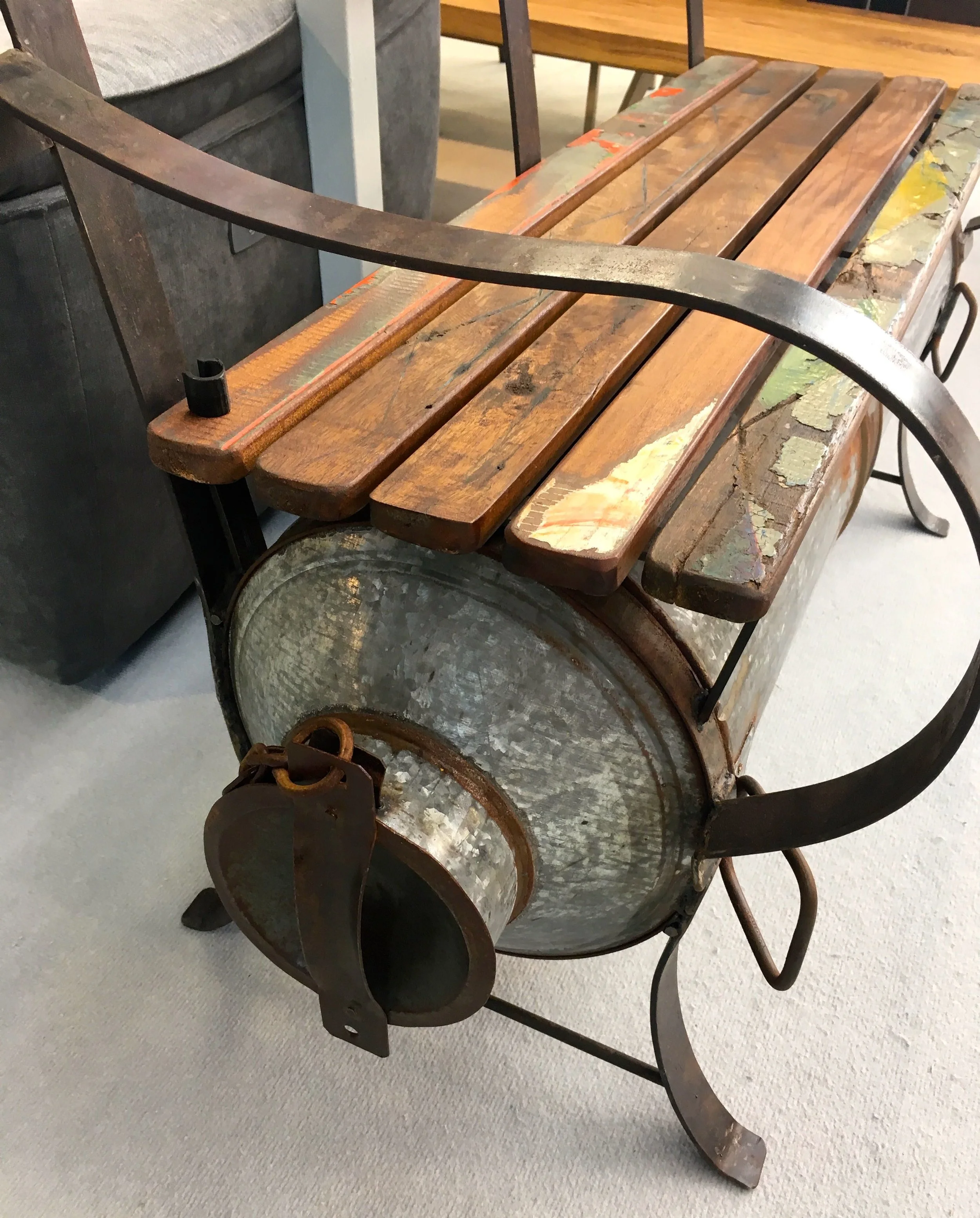
2. An upcycled bench incorporating a milk churn and recycled wood
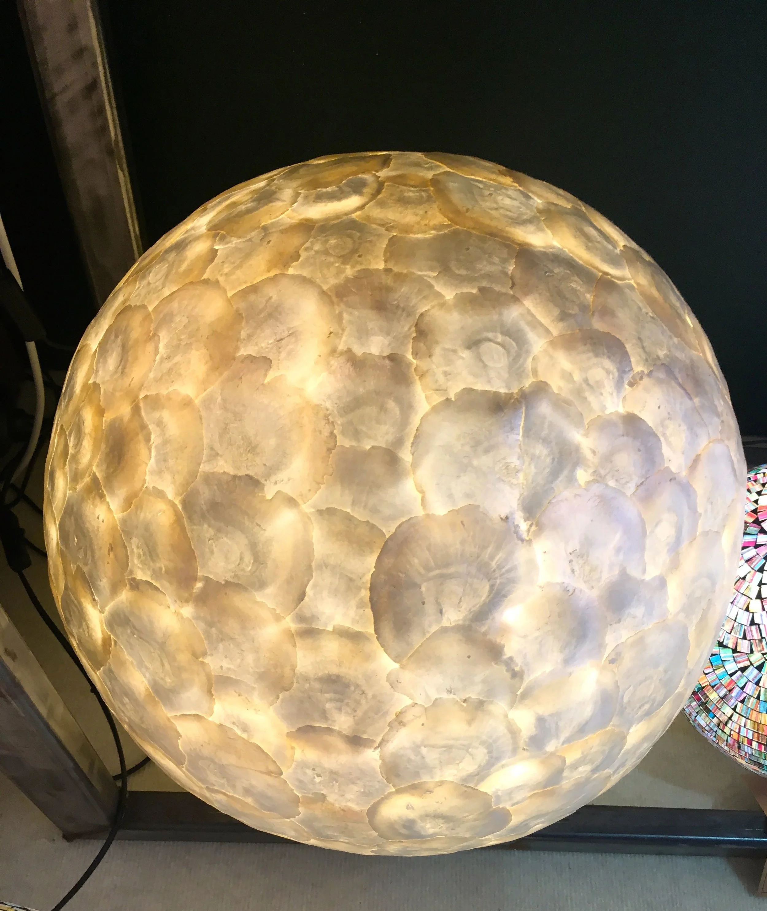
3. Handcrafted and responsibly sourced Oyster shell lights
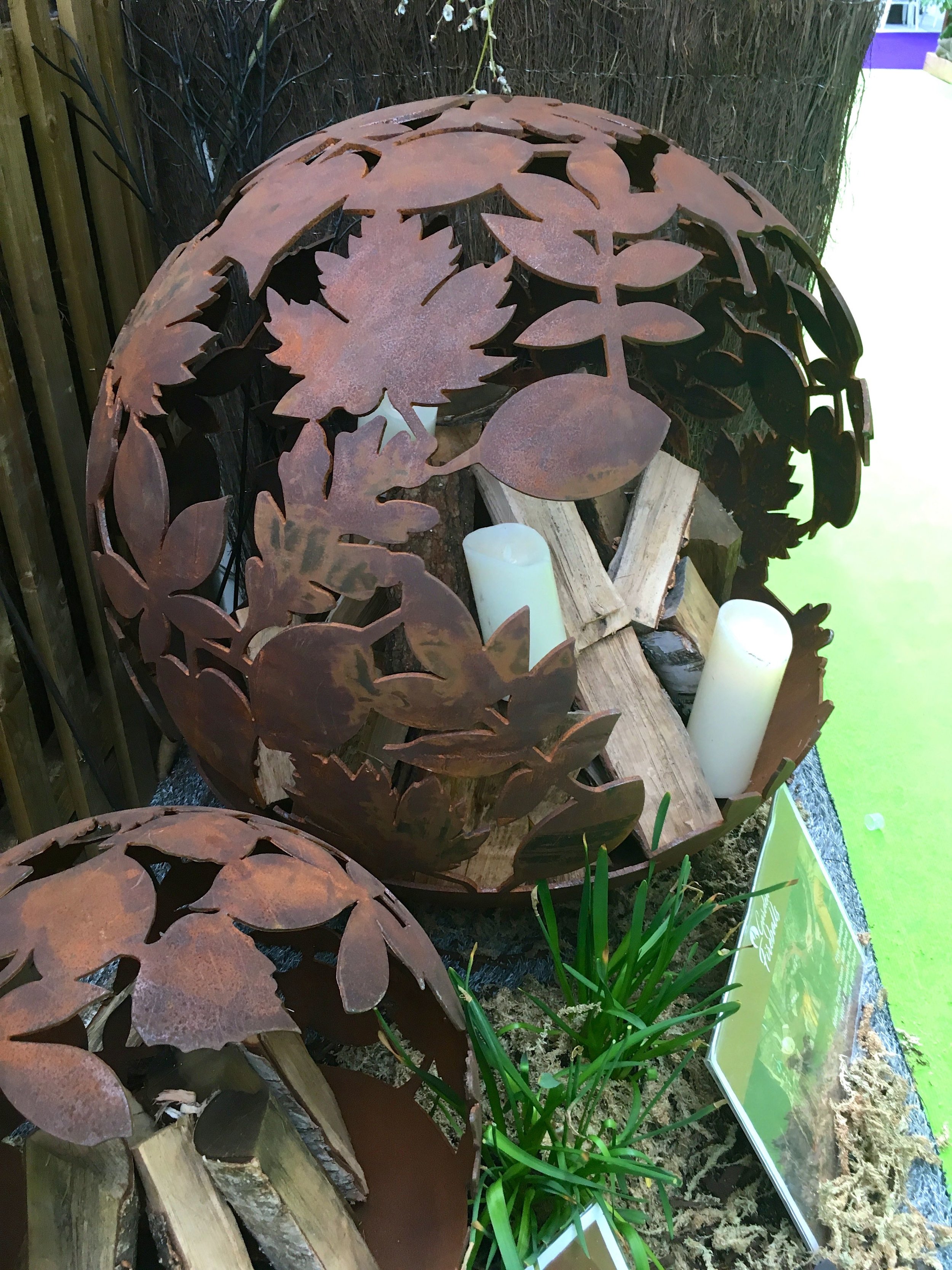
4. The stunning designs of the Garden Fireballs
So quite a visit, and that's only part of it - there's much more to come!
This is a collaborative post, but all views and opinions are my own.

