As well as The Houses at the Ideal Home Show there's also a series of Roomsets, which I think are one of my favourite parts of the show. This year was no different and today instead of showing you the next House, I'm skipping to the Beautility Kitchen - it's fab.
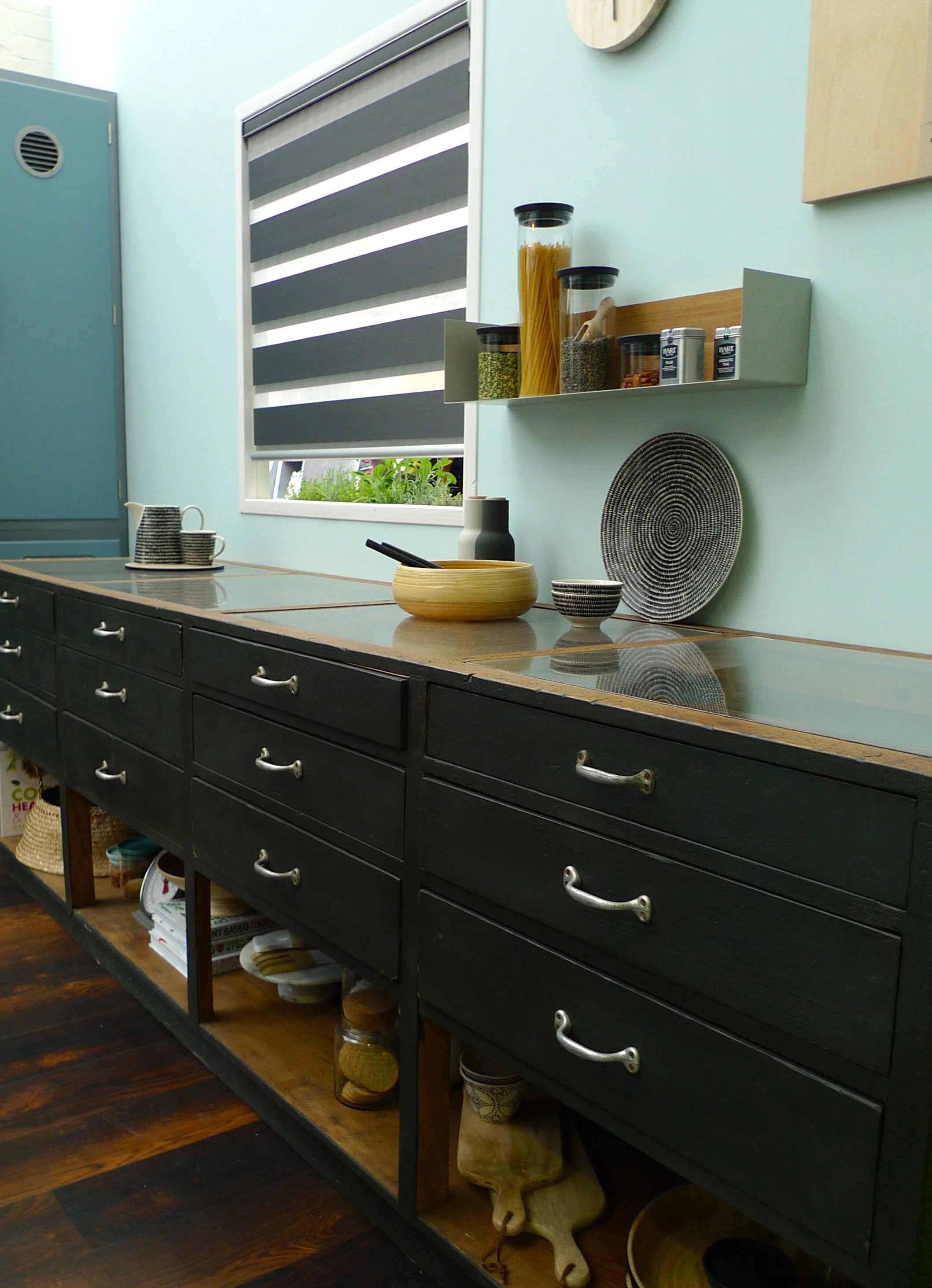
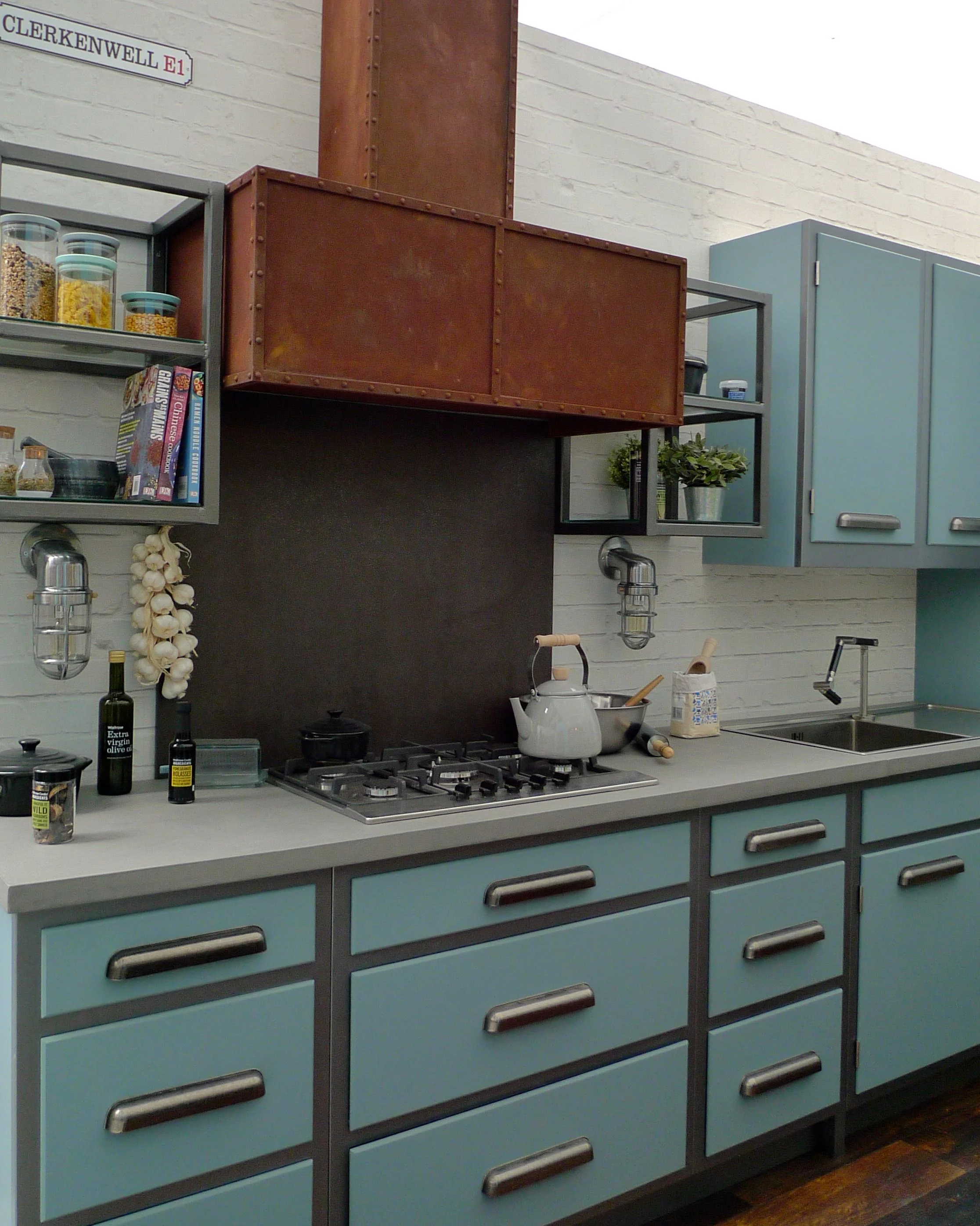
The Roomsets were created by Good Homes Magazine and there's some lovely things in each of the rooms. The kitchen - or Beautility Kitchen as they named it - has an industrial-chic look which is this season's trend. The blurb alongside the room said you could "create this chic look with a grown-up industrial edgy by mixing matt and metallic finishes with black details."
This is what they mean.
It's an unusual looking kitchen, but one I'm mostly a fan of - and I don't normally go for too much blue. I like the dark sideboard above, but I'm not sure how practical it'd be. There are a lot of drawers if you ask me - in my kitchen I have two drawers, and both of those are hidden drawers inside units. So it's safe to say I'm not a fan of drawers in kitchens. Our previous kitchen had several, one of which had unknown junk in, which we never knew what to do with. (Well in the end we just threw it all out!)
I'm also not sure how practical the open shelf would be at the bottom of the units. I think they look great, but agreed with MOH when he said they'd be a dust magnet - he's the master of dust in this house (yay!)
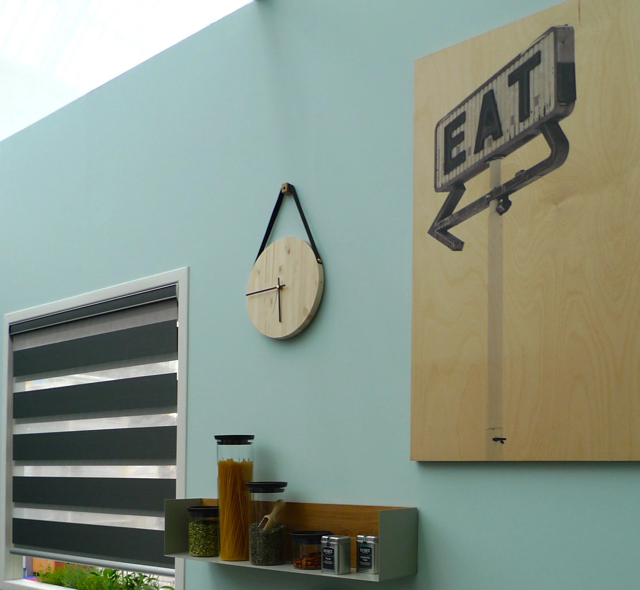
The wooden clock and picture, I think add texture and warmth, especially against the light turquoise walls. And they're a nice quirky touch too, aren't they?
A darker turquoise is used for a wall of units, and I think the handles on these emphasise the industrial look. The wood flooring is darker than I'd have thought it would be too, but I think it needs something strong to complement the rest of the room.
But that's not all that's industrial. Just look at that extractor fan - isn't it fab. Obviously it won't go in my high-gloss kitchen but it looks so right here. In fact we were drawn to lots of rusty metal at the show, so perhaps our subconscious is telling us something.
The worktop above looks like concrete - and it's absolutely right for this look. We considered a concrete topped table, and they're definitely worth a look and are much smoother than you'd expect.
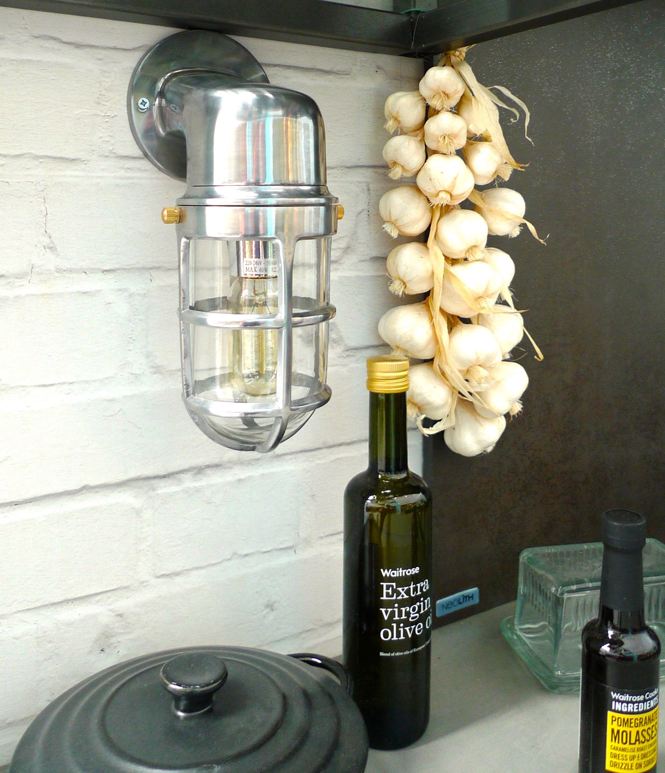
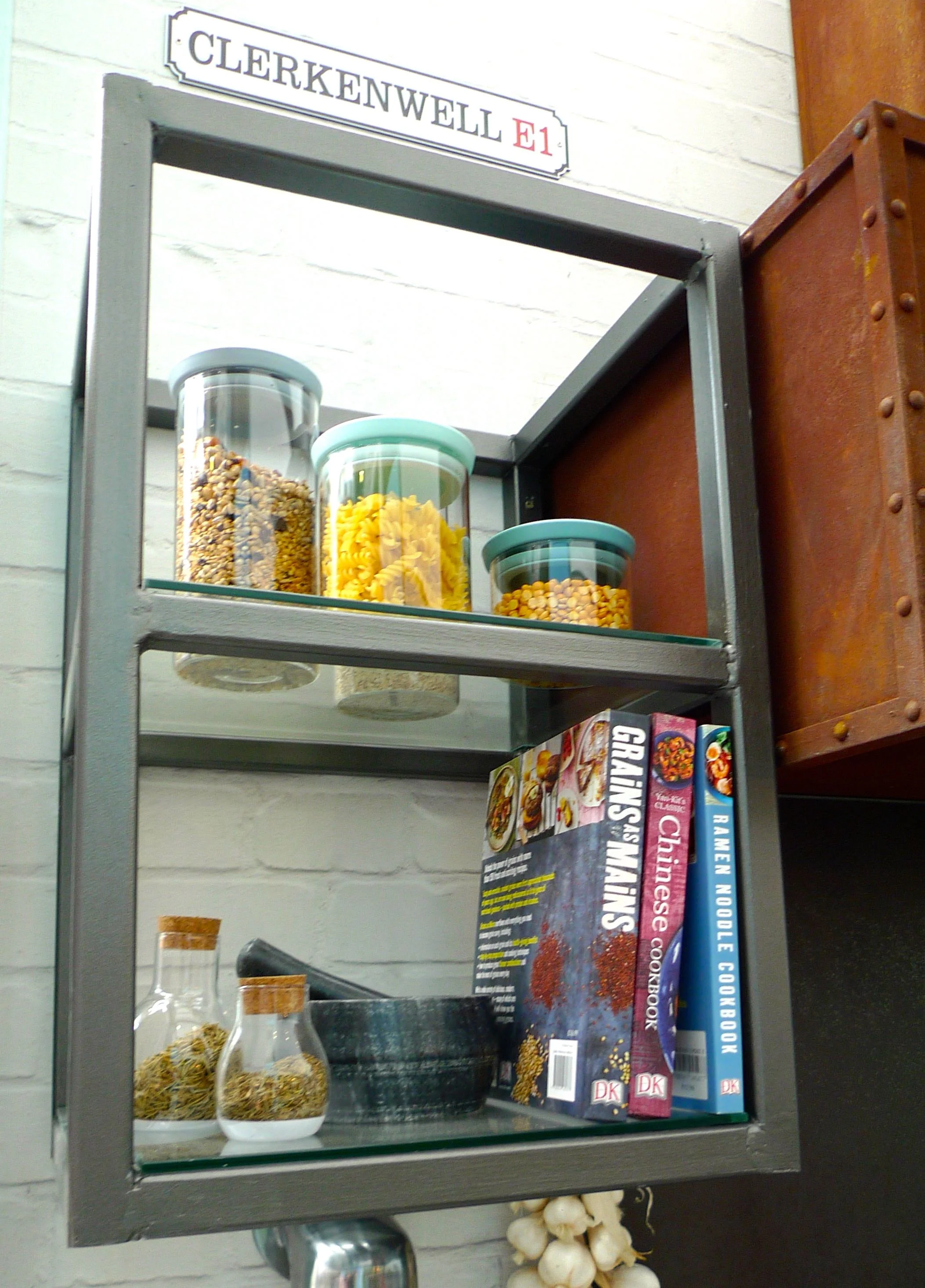
I also liked the unusual choice of under unit lights and the open shelf unit above it, for me they completed the look - and that Grains as Mains is a cookbook that appeals too.
What do you think of the kitchen? Is it a look you'd go for in your kitchen?
