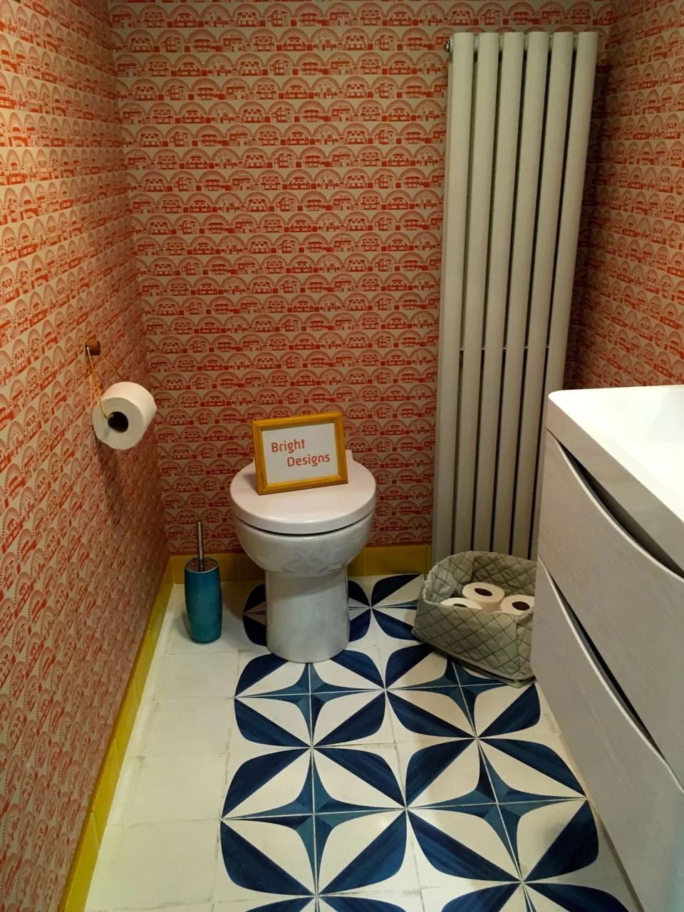
Today I’m sharing the second of my The Loo Series meets the Lavatory Project at Grand Designs Live, and you’ll not be surprised to learn this one that is full of colour is one of my favourites. Is it something I’d have in my own house, well sadly that’s a moot point as we don’t have a downstairs loo, I know (we don’t have an en-suite either, sorry perhaps I should have warned you about both of those revelations). A downstairs loo is definitely on our wish list for a future house, but again that’s a moot point right now.
But if I did, then yes, I think I would. I’d definitely go for a full on pattern in a small room, even the smallest room, as despite what you’d expect to think, it really does work.
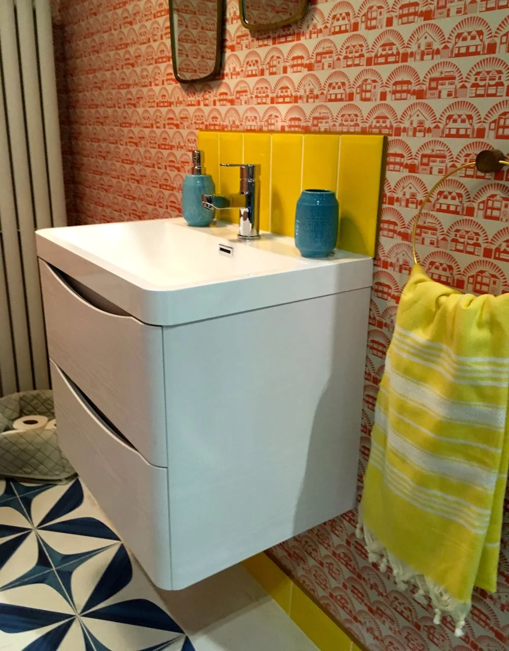
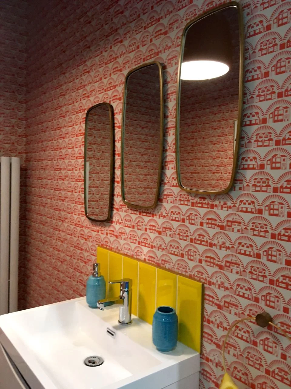
This room set has relatively few accessories, but what’s there works hard. The floor, with its central pattern defines the area and its larger pattern offsets the repetitive smaller pattern on the wallpaper, which has one of those patterns that draws your eyes along, looking for the pattern and imagining patterns and shapes that probably aren’t even there.
Not many of us would have put yellow touches - the skirting, the splashback and the towel, with a reddy-orange wallpaper and petrol blue and white floor, but again why not? Seeing it together shows it works. We know it’s often the small touches that make rooms work, and for me that’s true here.
The mirrors at differing heights appeal too, and not only because I’m just five foot and a bit, but also because of the visual interest it brings to the space.
And finally, artwork on a patterned wall? It’s magic when it works, like it does here - sorry I couldn’t resist, but I’m sure you know what I mean.
What do you think, is this a style that you’d have in your home?

