Care and hope in the Myeloma UK Garden

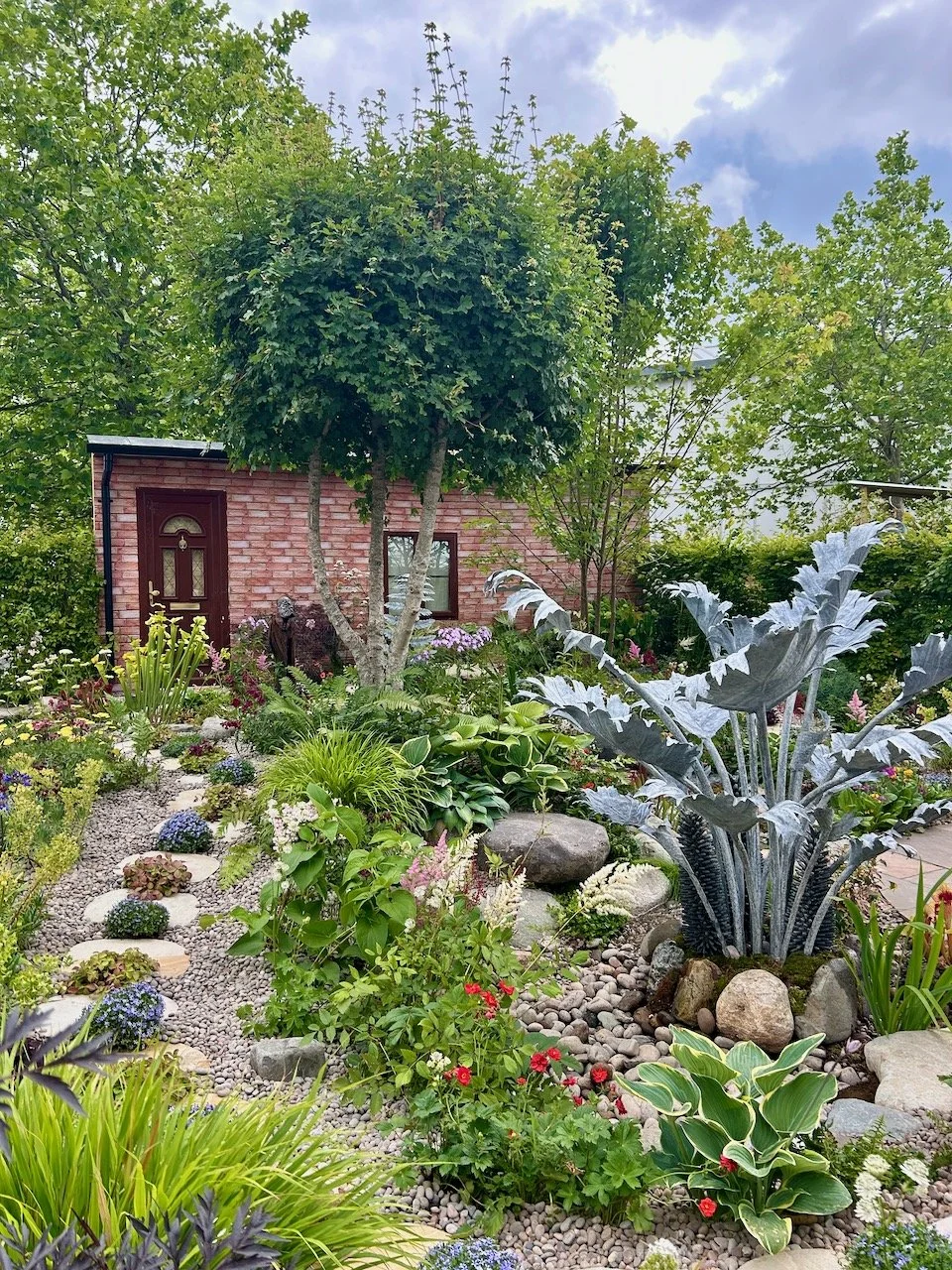
For today’s post we’re popping back to last year’s sunny Chelsea Flower Show and into one of the Space to Grow gardens. This one is sponsored by Myeloma UK and designed to raise awareness of the incurable form of blood cancer which is the second most common form of blood cancer.

The Myeloma UK Garden at the 2018 Chelsea Flower Show

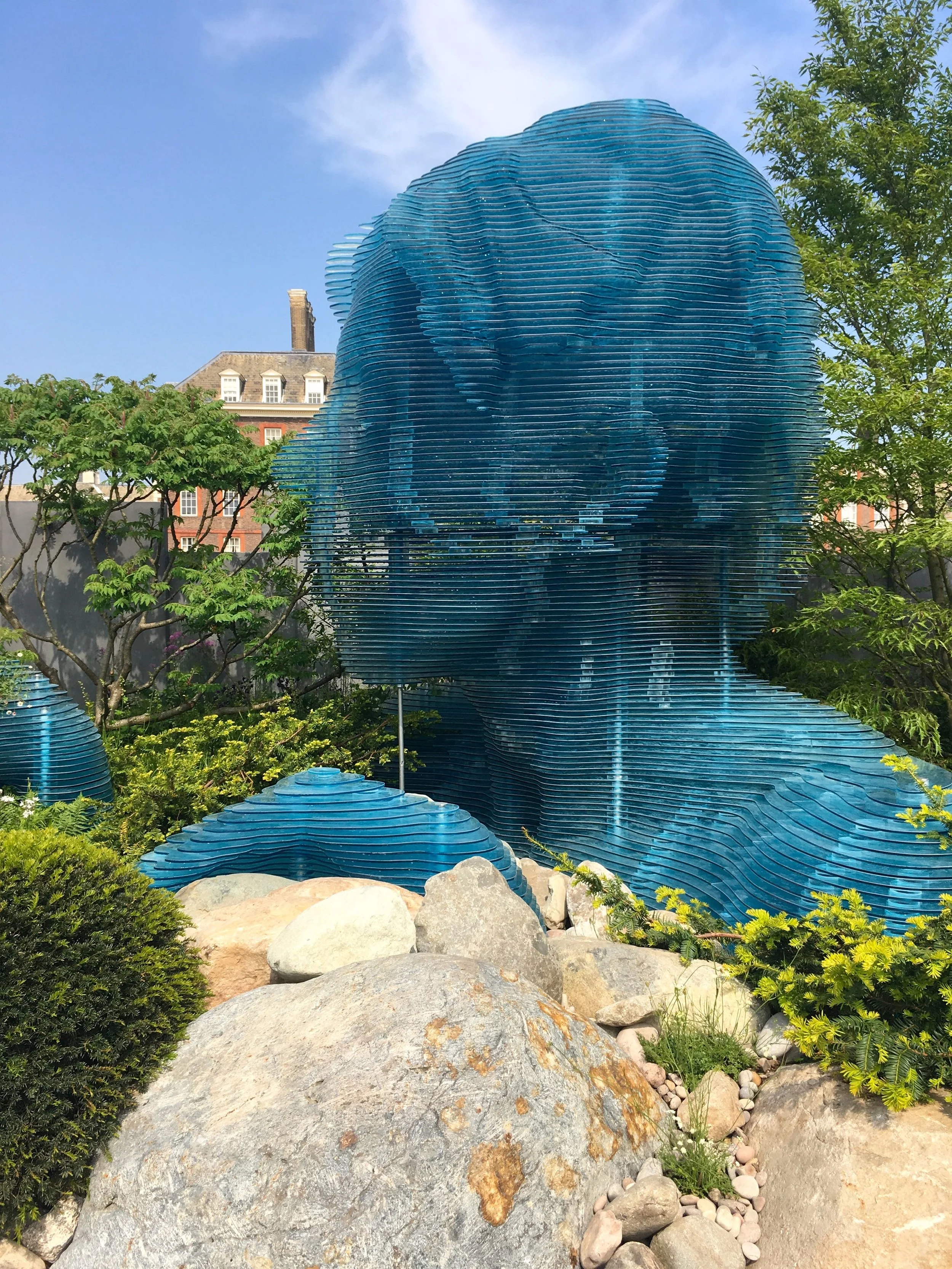
The blue acrylic structure represents the role of the carer and is certainly one of the most eye catching elements of the garden - it was large, and hard not to notice. It weighed 7.5 tonnes, so now you see what I mean when I said large, and made of layers it was built by the same team as those of the 2012 Olympic cauldron.

The other thing that you’ll notice as you look more closely at the garden is that there’s no path, and this symbolises and mirrors the situations that many patients face. The boulders represent the cancerous cells and have a combined weight of 18 tonnes, so that’s a lot to fight against for this treatable, but not yet curable disease - the planting most definitely softens the space.

The Myeloma UK garden of care and hope

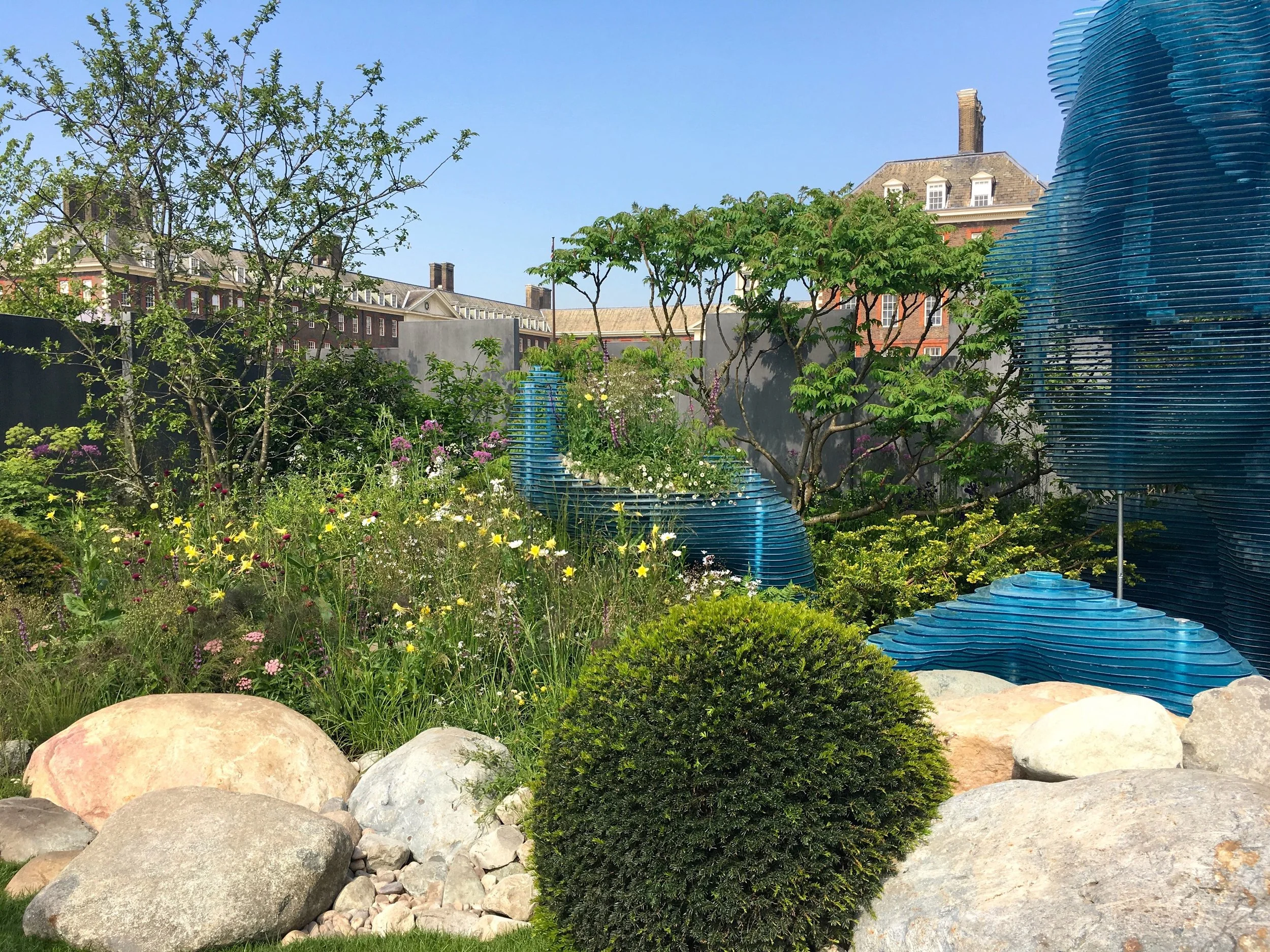
But there’s more to the garden than the landscaping, although that is a major element of the garden and which gives it its impact. The yew balls mirror the boulders, but provide a softer and more hopeful outlook, as does the delicate cow parsley. I think the background provides a different perspective of the outside world which I’m sure during many illnesses feels a different world away.

No path through the garden which mirrors the situation many patients face

I’m a fan of these show gardens which do much to raise awareness for their charities, because like the garden raising awareness of epilepsy, through a simple flower show (although in reality Chelsea is far from simple!) I’ve learnt - and I’m sure others have too - more, as well as enjoying the space on a more superficial level, as I think you’ll agree the acrylic structure really is the head turner.

Post Comment Love 11 - 13 January

Hello there - Happy New Year - and welcome to this week’s #PoCoLo a friendly linky where you can link any post published this year! Well, it is our first link-up of the year and it’s great to be back, and good to see you back too. Both Morgan and I know you’ll find some great posts to read, and encourage you to pop over to some of the posts linked and take the time to leave a comment or two so that everyone benefits from some extra love.

I do like the start of new years, it’s the best time for reflecting and planning, and you know I do like a plan. Sadly mine are never as pretty or as organised as the picture below. I start off with good intentions but then somewhere something goes awry, or plans change. One of my strengths is flexibility and it’s also my strength in overdrive, and too much of a good thing is not always good.

Blogger Showcase: Gabrielle from The Opinionated One

Gabrielle is a health, beauty, religion and lifestyle blogger from North Carolina, whose job calls for writing but is nothing compared to writing her blog. She’s a cat named Rum Tum (from Cats the Musical) and her best quality according to her husband is her rationality. You can read Gabrielle’s full answers on Morgan’s blog this week, but before you go pop over to her social channels and say hello: Twitter - Instagram - Facebook

A few new crochet projects

Somehow I seem to be accumulating crochet projects - there’s just so much I want to get on and crochet. Well, not just crochet, but let’s stick with that for this post. I have at least a couple on the go - the main one is the Vintage Hearts colourful throw and the latest additions are these Granny Flora squares. Strangely they’re much easier than they look. They’re the last design I have to complete from the first section, and I’d left them until the end as they looked tricky. So discovering they weren’t has been a bonus.

GRANNY FLORA FROM THE VINTAGE HEARTS THROW

GRANNY FLORA FROM THE VINTAGE HEARTS THROW

The colours are great aren’t they? The completed throw is destined for our conservatory, and with the bold and colourful cushions I think it’ll fit right in. As well as this I’ve got the square a week green, natural and pink throw almost there. At one point I thought it might be ready in time for Christmas, but soon I realised that was just pure folly. The plan for that when it’s completed is to complement the material throw over the arm of our new sofas, in an attempt to prevent wear and tear.

But you already knew about both of those, so they’re hardly new are they?

This little box of colourful loveliness was one of my Christmas presents. It’s full of small stone or river washed scheepjes wool, with just about every shade imaginable. I spent a few days over the break just admiring them and pondering how I could use them and show them off at their best. I’ve decided on something a little different to my usual squares, and that’s hexagons. I’m thinking something with a flower centre with a couple of colours against a darker background.

colour everywhere in this scheepjes pack means I'm happy
SCHEEPJES STONE WASHED DESTINED FOR A HEXI “FLOWER” THROW WITH A DARK BACKGROUND

SCHEEPJES STONE WASHED DESTINED FOR A HEXI “FLOWER” THROW WITH A DARK BACKGROUND

I spotted a pattern online, with a pattern for sale but on further investigation only a hardcopy if you lived in South Africa, so that didn’t work. But of course I can’t get that pattern out of my mind so I’ve been trying to work it out from the picture. Strangely the centre of Granny Flora has helped a bit, although I’ve managed to draw a chart that looks as if it might work, I’ve still some testing to do before committing these little balls of wool to it.

My next project is already started, and it’s a lot less colourful than anything else I’ve even got planned. In fact every time I look at the photo below I’m convinced it’s black and white, then realise the bookcase isn’t.

MONO - NOT BLACK AND WHITE - QUITE THE CHANGE FOR ME

MONO - NOT BLACK AND WHITE - QUITE THE CHANGE FOR ME

I saw a beautiful Portuguese tile inspired throw in a magazine, full of yellows and blues and whites, just like my post of Portuguese tiles and patterns and in a complete shock to the system, I chose the monotone wool to complete this in. Clearly it will have a completely different look, but it fulfils my need for variegated wool and crochet, and I don’t think it will suffer for that. And, let’s face it, if I enjoy it and want a colourful version then I can add it to the list.

The tweedy wool below is for another project, this one without a pattern as such. I rarely wear a coat - I find the sleeves oppressive - and the fleecy type wrap I have is getting a bit bobbly. So in a spate of positivity I decided I could create my own. A colleague at work had made a scarf in a stitch I liked and the idea was sown. I’m intrigued to find out how this will work up, and also now wary about if it will work at all.

FOR A WEARABLE WRAP PONCHO TYPE THING

As I’ve no pattern, I haven’t really got much of a clue as to how much wool it’ll take - and so I’ve probably got too much, so I could be branching out into everything tweed - or having a very short wrap, who knows. Not me, that’s for sure - but even though I’d be happy to have this completed by the end of the winter, I suspect it may take a little longer to complete - because there’s one or two other projects to make progress with too, along with everything else!

But it’s good to have a plan!