Looking up in Porto at facades and roofs

Ah, just look at those blue skies - I was editing my photos and could almost feel the heat from our trip in October, either that or I had the central heating up a notch or two higher than normal. We've had blue skies here, but they've been distinctly lacking in heat haven't they?

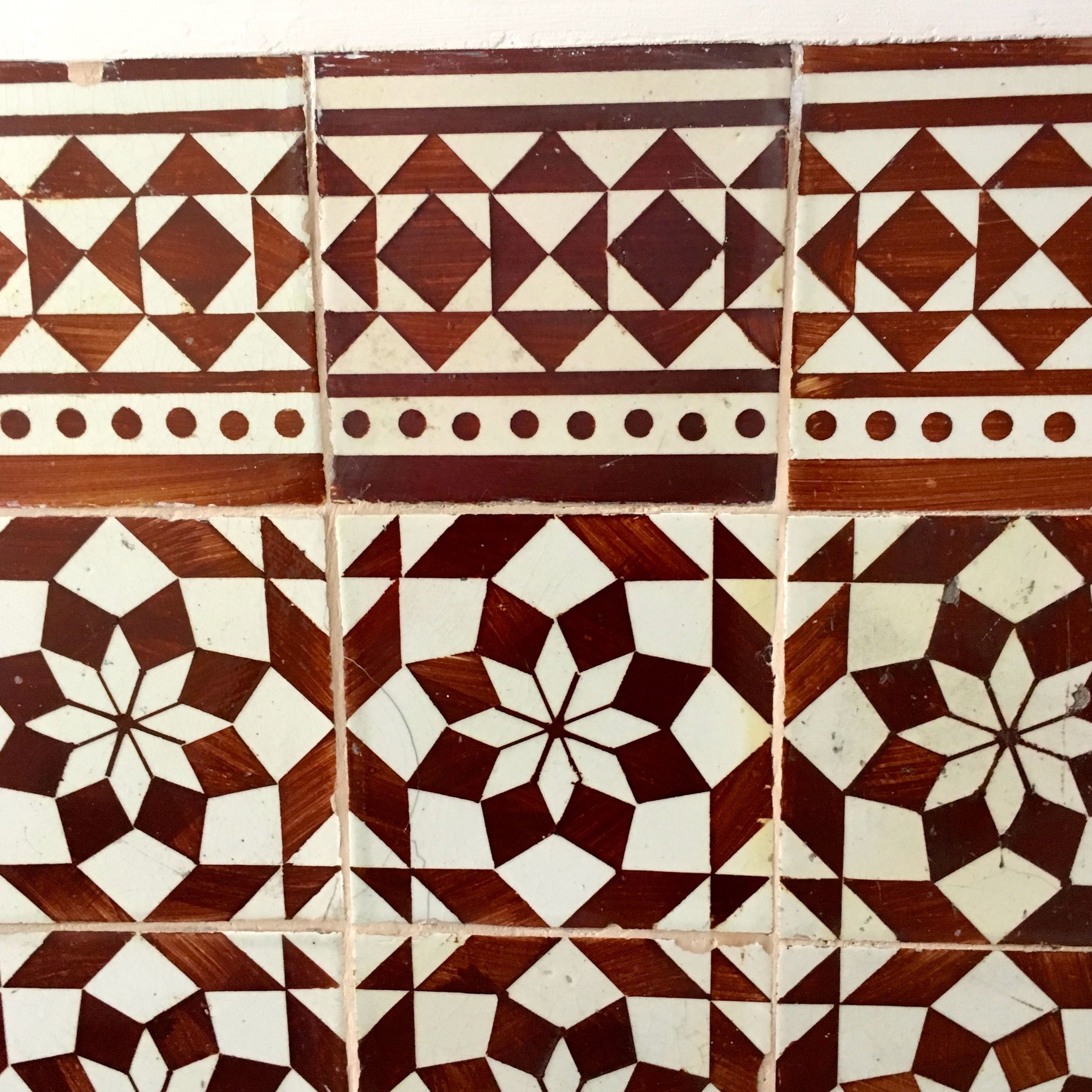
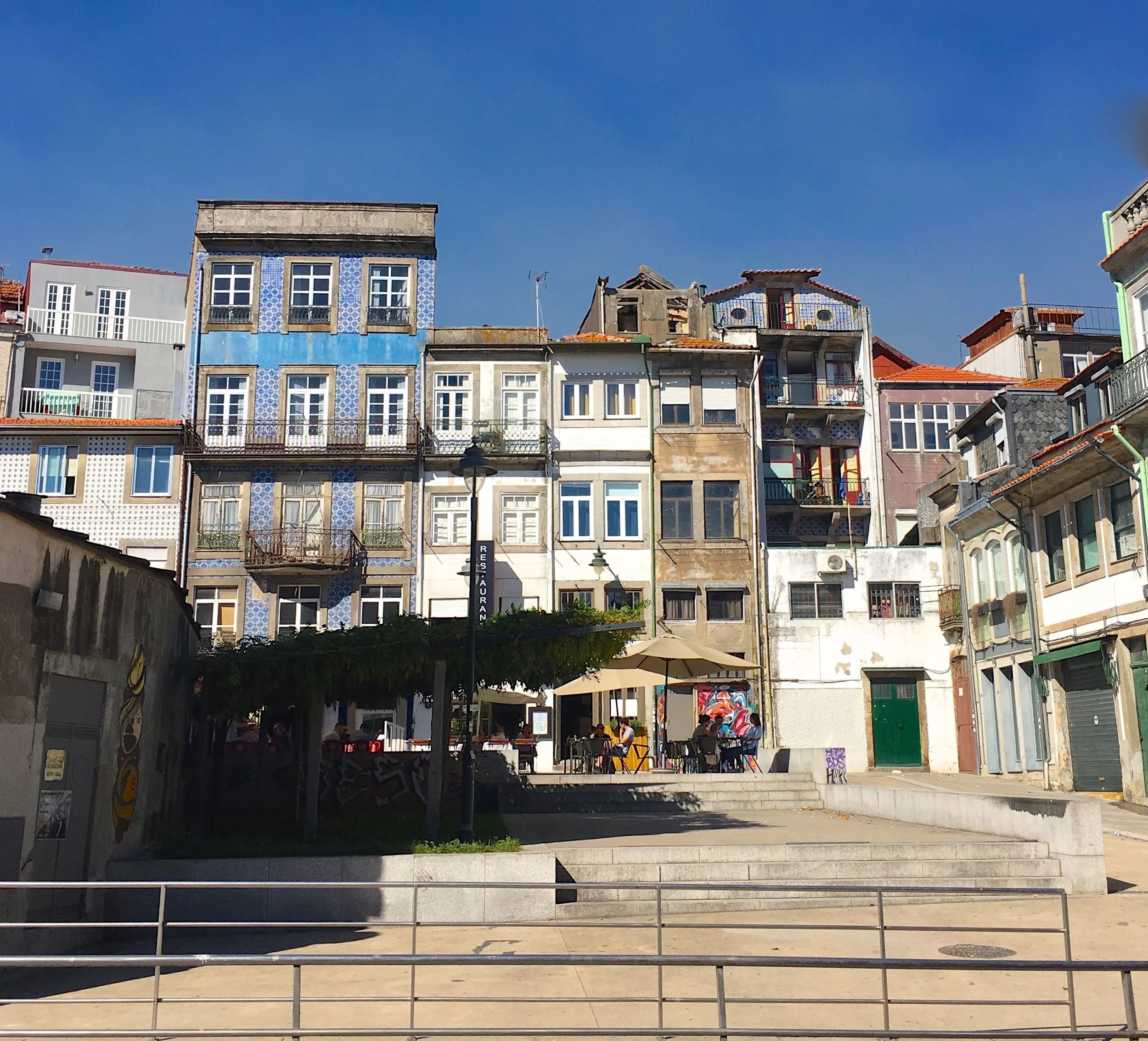
I've already shared some of my tile pictures from Porto, and they are the most obvious part of its charm but as we wandered I was looking up and started to notice some strange going ons on the roofs of Porto. Like many cities many properties are unable to expand outwards, in London there's a trend to dig down, but it seems in Porto for many years the attraction has been to extend up. 

But not just extending, we also spotted plenty of roof lanterns, there's three in the photo below - and yes, you can only just see the top of the third, it was on a relatively busy junction and I didn't get too many chances to get the best shot and live to tell the tale.

Spotting glass roof domes as we wandered around Porto

I couldn't help but wonder what they were like on the inside. It wasn't long before we walked past our first facade, and in our short time there it turned out we would walk past many.  I had to do a double take to see where the rest of the building was, but the giveaway was the very top floor and being able to see the sky through the openings. 

building facades In Porto

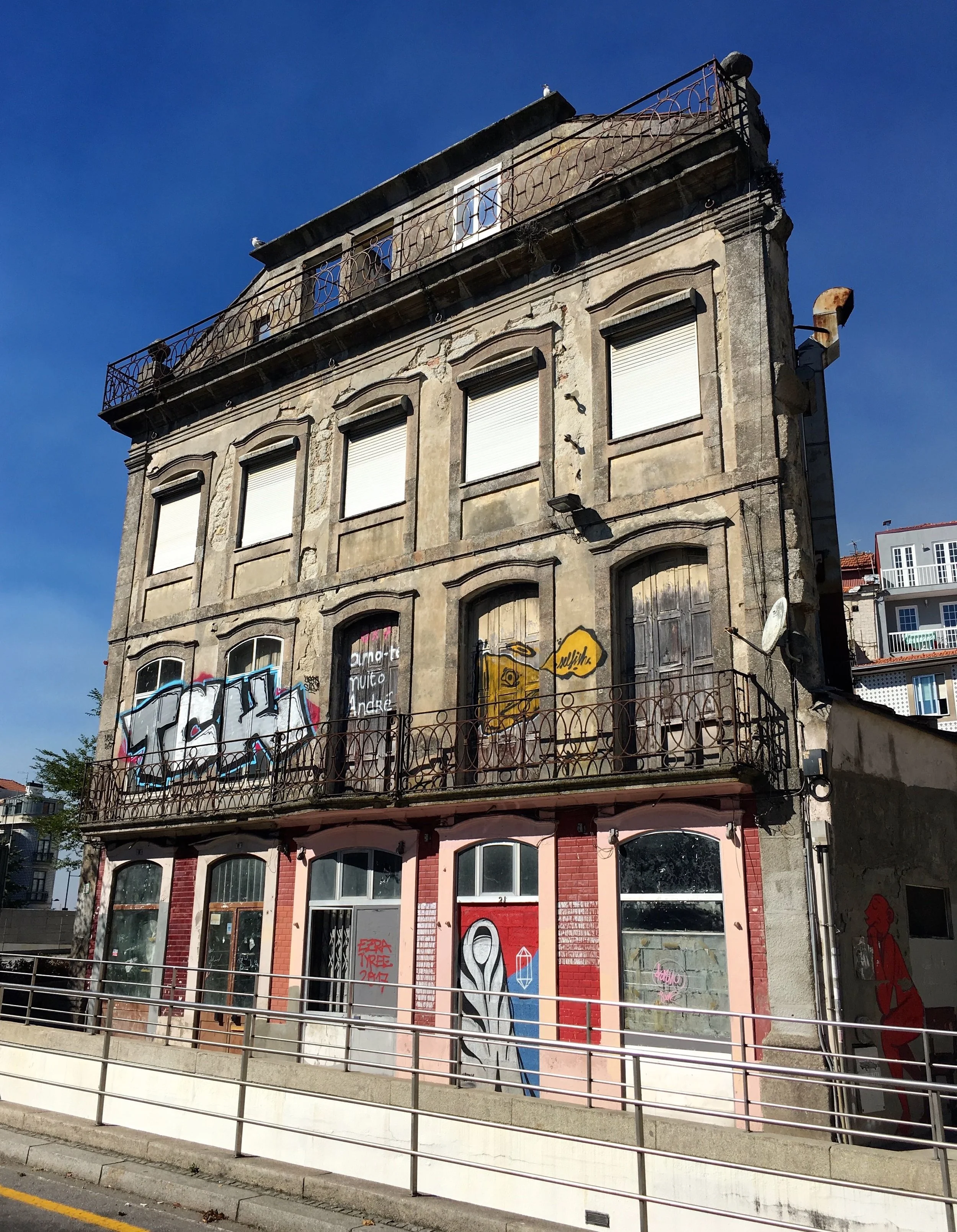
Even with the graffiti many of the facades are still beautiful, and by retaining the frontage it's most likely what's led to the higgledy-piggledy-ness nature, which is spectacularly charming. I'm sure the recent years and hardship haven't helped many in Porto and of course for some the buildings will also fall into disrepair. 

There was evidence though of building projects which is always a good sign, we know that from redevelopment in London too. The hardship isn't restricted to any one area, although clearly some have been more affected and less affected than others. 

multi-storied buildings in porto with some interesting roof additions

There's a mix of materials used too, just look at the yellow, red and black building below. I think its unusual to have the darker colour at the top, but - and I know it's a smaller footprint - but it doesn't dominate does it? 

narrow streets and extending upwards

Even on the more touristy waterfront there's also upward extensions - my favourite part of the photo below is the pink drainpipe on the black roof extension - quirky isn't it?

Pastel building facades on the river douro front

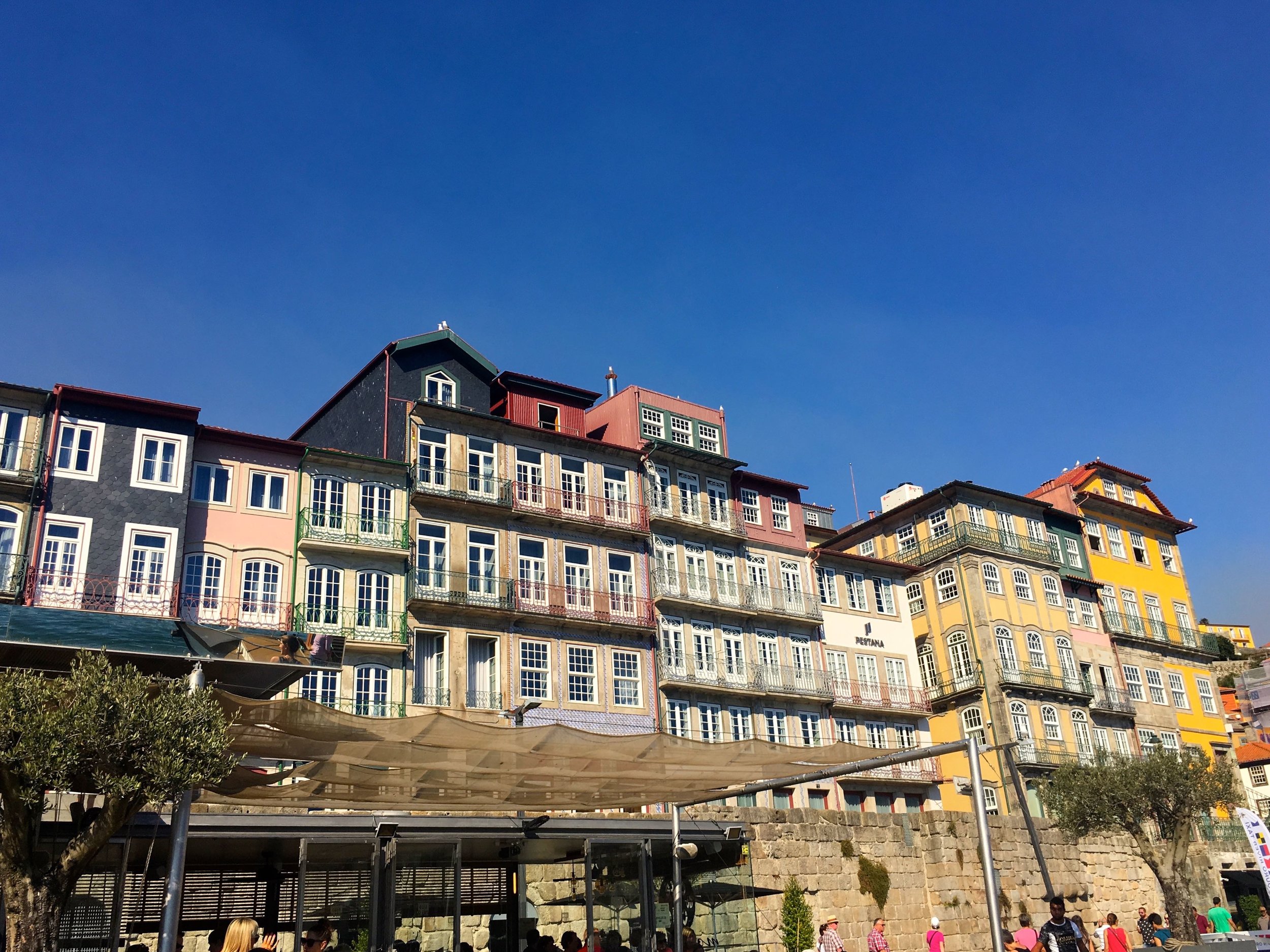
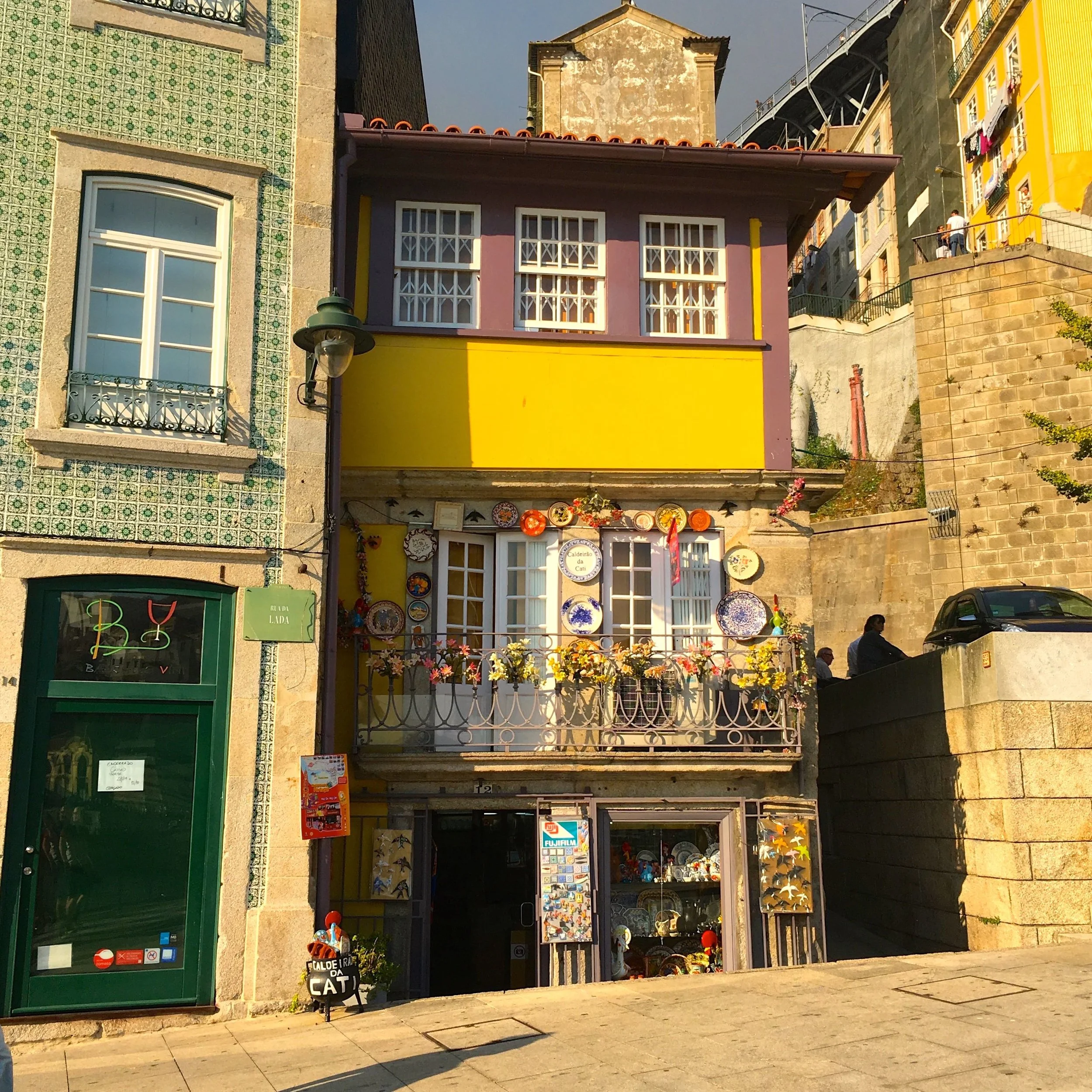
Also on the waterfront, snuggled alongside the bridge over to Gaia was this small three storey property - obviously the colour caught my eye, but look at the tiles on the property next door.  In Porto, any colour, any tile pattern really does go!

A small and pretty yellow house on the waterfront

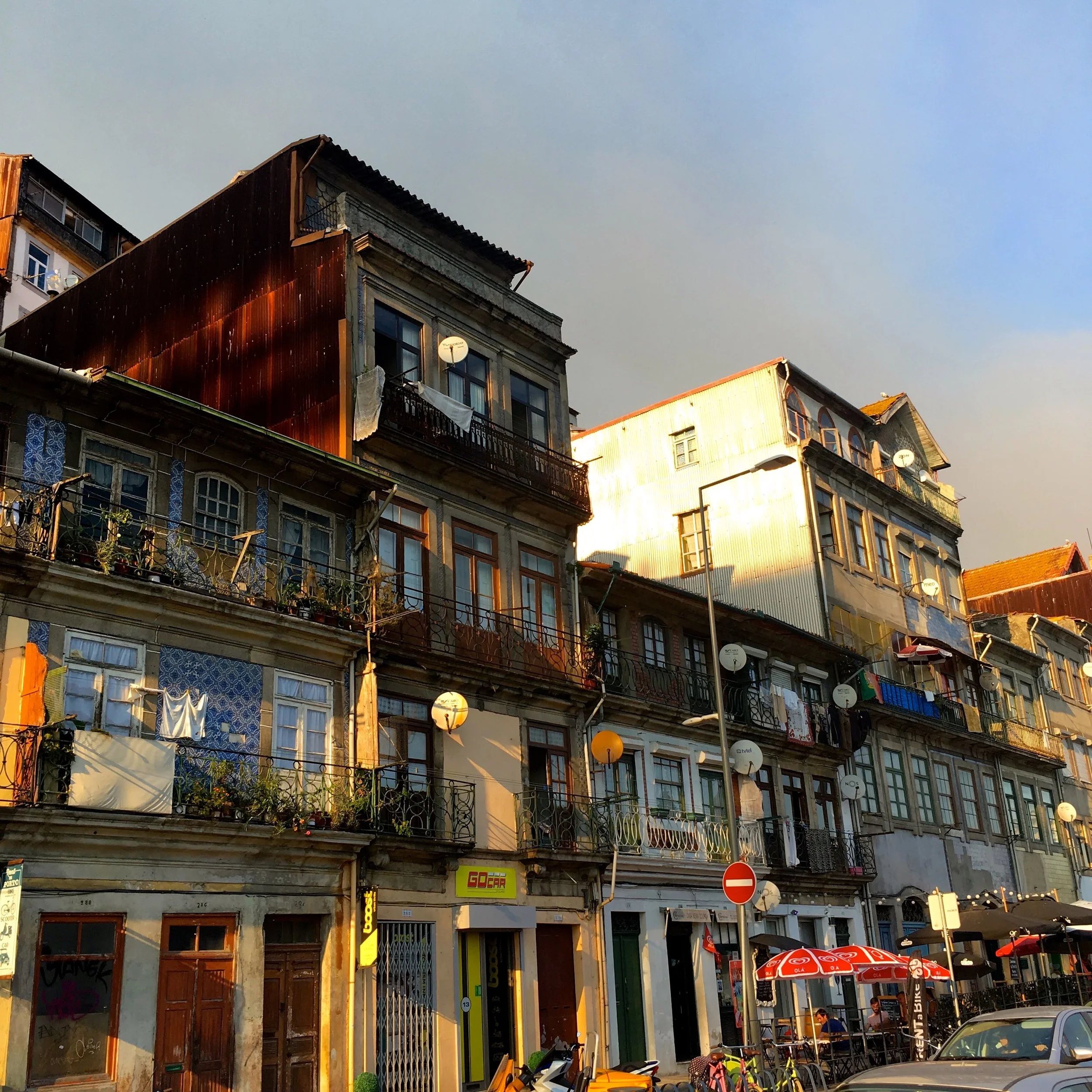
I lost count of the number of these shed-like extensions, many clad with corrugated steel, some weathering beautifully.

Extending upwards in Porto

I'm a big fan of looking up - and in Porto it really did pay it was much more rewarding than I ever expected it would, and we noticed parts of the city that I suspect passes many people by.  

Choosing a quirky apartment, instead of a hotel in Porto

Usually our holidays tend to be cottage-based rather than in a hotel, and that's how we like them. And so when we were in Portugal I was keen for part of our trip to follow our preferred approach. I struck lucky in Porto finding the Apartment Bomfim 234, and as you can see from the photos it positively shines.

Unbelievably I booked it on Expedia.  I know, that surprised me too.  From the outside though you'd never have known what was inside. This was the view that met us as we opened the door.

mid century modern furniture in our porto apartment

I wouldn't call myself a natural fan of mid-century modern furniture, it's a style of furniture that while I admire, I skip over when choosing items for our home. I'm not sure if that is due to growing up in a sea of teak and G-plan furniture in the seventies or because I'm pre-disposed to other styles, but in this apartment I started to see what I was missing out on.

A classic and stylish lamp in the quirky Porto apartment

This cabinet was the winner for me, not that we had the TV on (that's a rarity on our holidays too), and I think it's the added colour that won me over. For me, that takes this style of furniture to another level and I've found myself admiring similar projects since I've been home. It moves it away from those seventies memories, and into something more up to date, don't you think?

mid century modern furniture - I'm not usually a fan - but it really worked here


But there was more to the apartment than the furniture. There was the layout. On the mezzanine level there was the bedroom, on the ground floor the sitting area and a half floor below housed the kitchen and bathroom.  

Upstairs to the bedroom and downstairs to the kitchen

All were accessed by open staircases, which were the feature. These above, which lead to the bedroom do have a look of "shelves" about them, and were much easier to navigate than perhaps you'd expect.  

Upstairs the bedroom area, although snug, was just as stylish.  

Just enough space for a bed in the quirky Porto apartment
Stacks of cushions on a comfy bed in the quirky Porto apartment

When I say snug, there was just room for a bed, and just about enough room to get in it. Just, it was a bit of a squeeze, but I forgave it; its stylishness one me over. 

And, oh... the bedside lights.  A feature we both liked and a design element we're storing for the future.

bedside lights with a design touch

Heading downstairs to the kitchen area felt in some ways more precarious, but no less stylish. MOH kept marvelling at the building regs and such like that made this possible, ever the practical one...

heading downstairs to the kitchen area

Standing at the kitchen table gave a great view up to the living area and full length windows, complete with shutters.

More great lights in the kitchen in the quirky apartment in Porto's Bomfim

Now you might be thinking Porto, fabulous tiles and wondering where they are in this apartment. Well it didn't disappoint there either. They were saved for a full wall of pattern in the bathroom. 

patterned tiles in the bathroom, what else would you expect in Porto?

My first thought was wow, they're busy, but that quickly turned to wow, they're beautiful. Beautiful close up and from more of a distance, and they certainly made an impact. With another idea for the future banked, and another style feature I'd usually shy away from I was having quite an epiphany, and we'd only just arrived in Porto!

As we headed out of the apartment to explore Porto some more I noticed the first of many more walls of tiles. These were in the hallway, which somehow I'd completely overlooked as we arrived. 

Tiles in the lobby area outside were a little more traditional

Geometrics are big in the shops here at the moment aren't they, but it seems in some places they've never gone away.

New Prints and Jacquards from Prestigious Textiles for Autumn/Winter

It's been a couple of weeks now since I visited Prestigious Textiles at their stand in the Hilton at Syon Park as part of the London Design Festival to see their Autumn/Winter ranges. I liked the ranges I saw then and I still do. I took pictures of my own on the day but they don't compare to the official images for each range, so I'm using those instead in this post - and I'm sure you'll agree they are just gorgeous!

There's florals, bold patterns, silks, velours, rich palettes, some with a scandi-type feel as well as pastels and brights - so there really is something for everyone. I saw the first six ranges I'm showing below, and the seventh is one that I've a feeling will do well and has brought a furnishing favourite bang up to date, so let's get going...

1. Eclipse

This range is full of sumptuous deep pinks which are set off by just a little bit of shimmer. But it's not all pinks as the browns and earthy green and blue ensure it's not too girly. My favourite fabric in this range is shown best in the third photograph, the shimmering brown with the textured stripes looked great, and it was the one fabric I found myself holding onto as we talked about the range.

Photo credit: Prestigious Textiles

2. Mardi Gras

This whole range is fresh and colourful and it's quite fun too. I loved the paisley design shown on the chairs below - and just had to include this photo as isn't the room gorgeous? There's definitely a hint of tropical rainforest in this range and with its butterfly fabric - there's also a macaw fabric - it's fun too, and while this would look good in a breakfast room I don't think it needs to be restricted to there, as the photos show.

Photo credit: Prestigious Textiles

3. Grand Palais

This range is full of rich and detailed patterns that somehow are moody (in a good way) too! There's embroidered linens - just look at the cushion in the second photo, large checks, embellished bands and digitally-printed velvets all in jewel like colours.

Photo credit: Prestigious Textiles

And well I just had to share the pretty bike photo, didn't I?

4. Cube

This range has strong geometric and modern designs which I think work well on the printed cotton. Spots, zigzags, hexagons and 3D cubes used alone or together mean this is a range that I think will make a big impact wherever it's used. My favourite in this range is the hexagon pattern shown in the second photo - such a simple pattern, but so effective - and for me one that could be used in almost any home alongside  existing furnishings.

Photo credit: Prestigious Textiles

5. Safari

 I liked this range too, for me it's the luxurious look and that shimmer. There's contrasts too with crisp embroidered satins alongside foil-printed velvets. I am rather partial to the greens in this range, I find them calming and elegant and for me the range brings a contemporary touch to traditional.

Photo credit: Prestigious Textiles

6. Java

 I love this range, I think it's very liveable - the brochure says exuberant and I think that's right. It's fun and there's Scandi-like hints here too for me and I think this has the potential to be a very versatile range. And I love the idea of a tablecloth and coordinating napkins. I think the patterns bring an informality and funky vibe and this is a fabric I can see myself using. In fact, I've got a couple of things in mind already.

Photo credit: Prestigious Textiles

7. Velour

This is the range that I think brings an old furnishing favourite up to date. I mean there's 35 colours in this range - yes 35! And it seems a far cry from the drab velour I have memories of. I remember mum recovering our sofa a very long time ago with a mink brown velour, just imagine what she could have done with these instead!

And yes, why stop at one colour with so many to choose from - and you know what, those clever people at Prestigious Textiles have ensured they match the other ranges, so there really is no limit to what you can do.

Photo credit: Prestigious Textiles

Spending a rainy afternoon looking at fabrics was great fun and left feeling totally inspired. Thank you to everyone I met at Prestigious Textiles for showing me the ranges and explaining how the ranges come together. And watch this space for some of the craft projects I have in mind, I told you I left feeling inspired...

Of the ones I've featured here, I think the Java range is the most useable here, but you may have already picked up on that. It's hard though to choose a favourite overall as each could be used in so many ways, but I'm interested to know which range appeals to you - let me know in the comments.

This is a collaborative post with Prestigious Textiles, however all words and opinions are my own.

Home Etc

www.mrscraftyb.co.uk