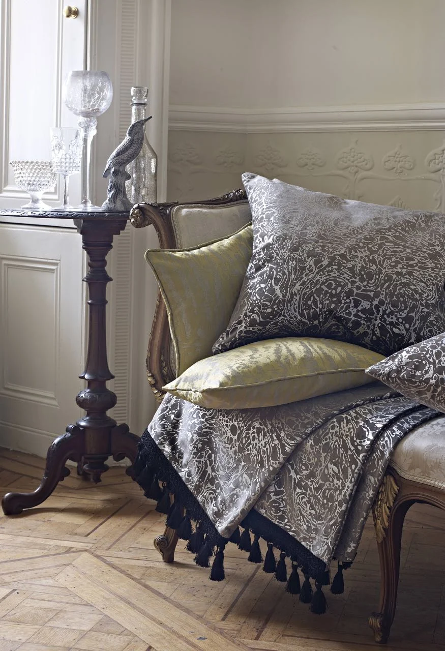
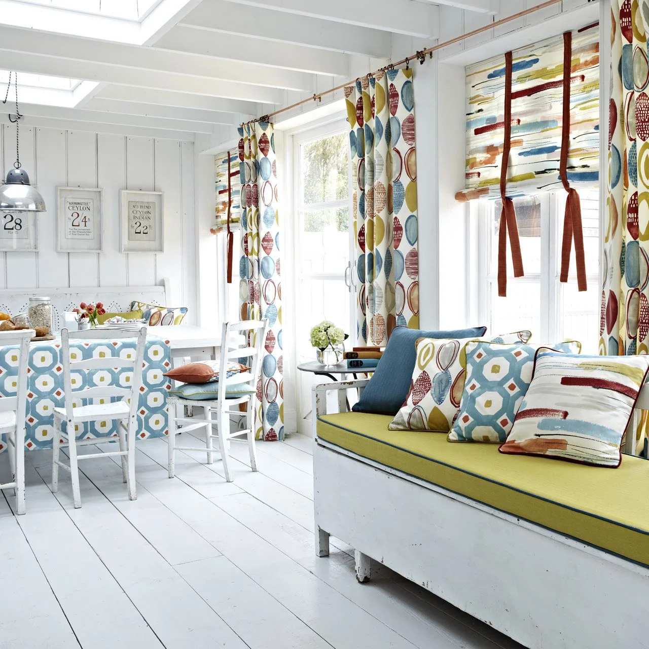
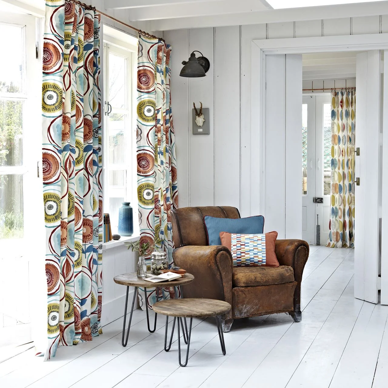
There's florals, bold patterns, silks, velours, rich palettes, some with a scandi-type feel as well as pastels and brights - so there really is something for everyone. I saw the first six ranges I'm showing below, and the seventh is one that I've a feeling will do well and has brought a furnishing favourite bang up to date, so let's get going...
1. Eclipse
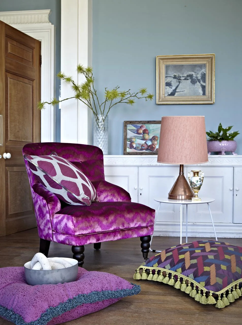
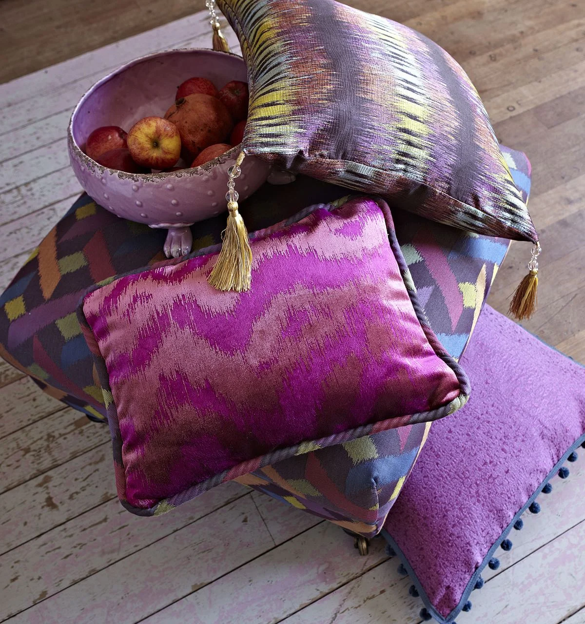
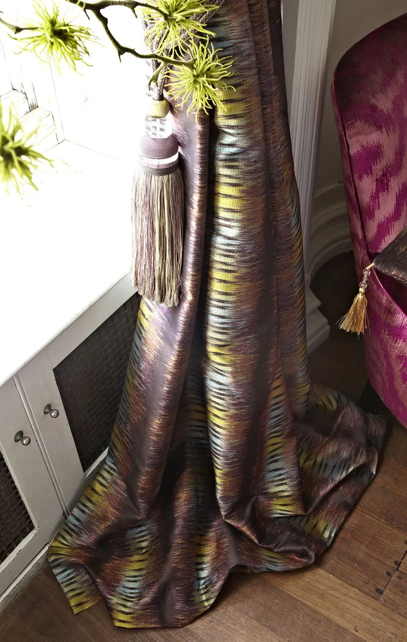
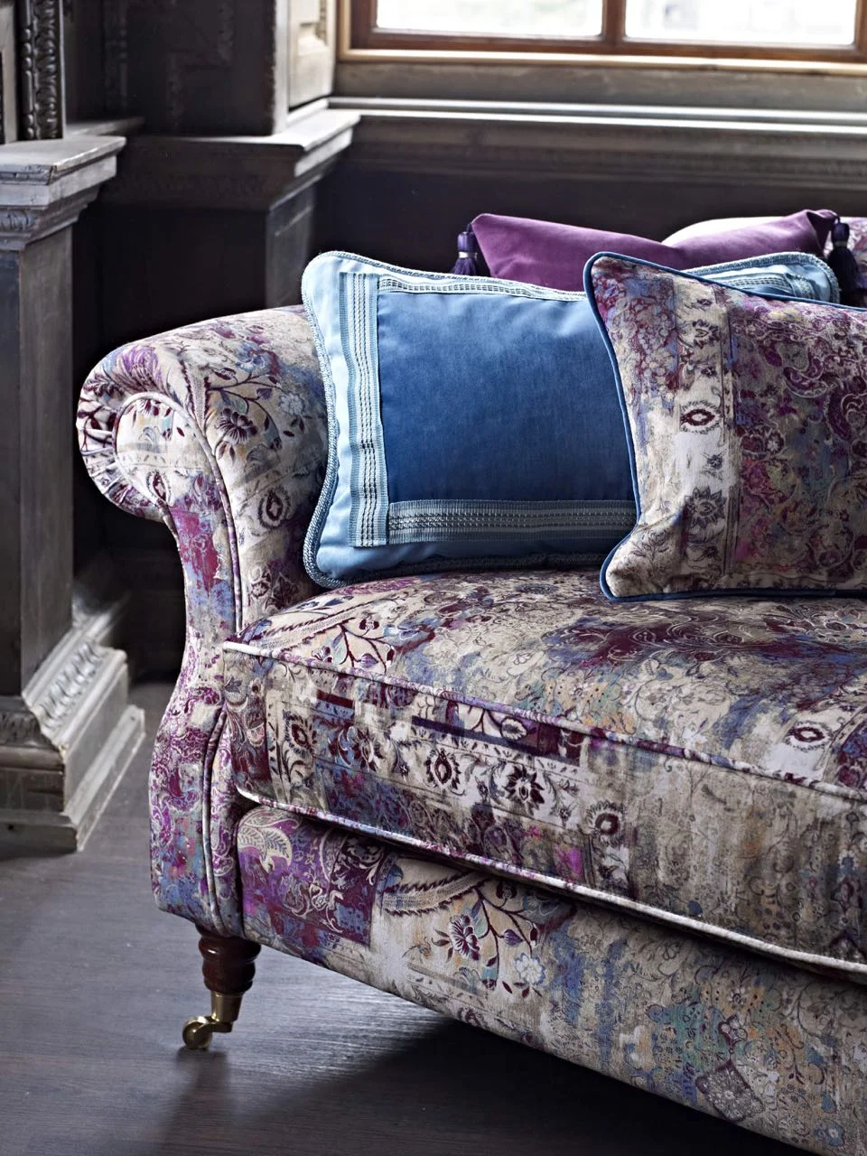
This range is full of sumptuous deep pinks which are set off by just a little bit of shimmer. But it's not all pinks as the browns and earthy green and blue ensure it's not too girly. My favourite fabric in this range is shown best in the third photograph, the shimmering brown with the textured stripes looked great, and it was the one fabric I found myself holding onto as we talked about the range.
2. Mardi Gras
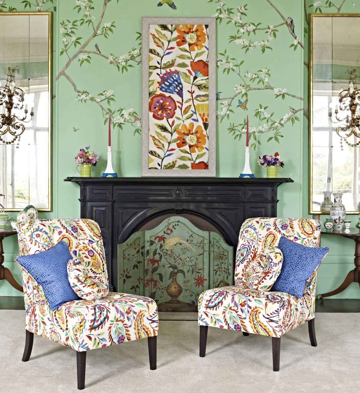
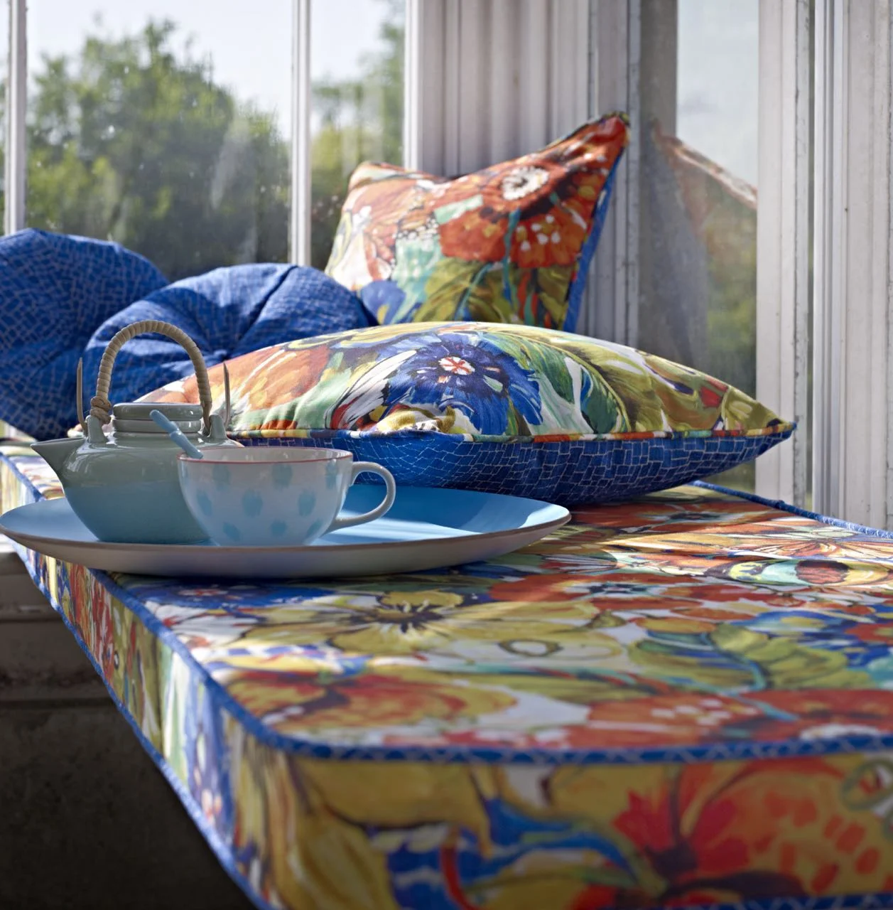
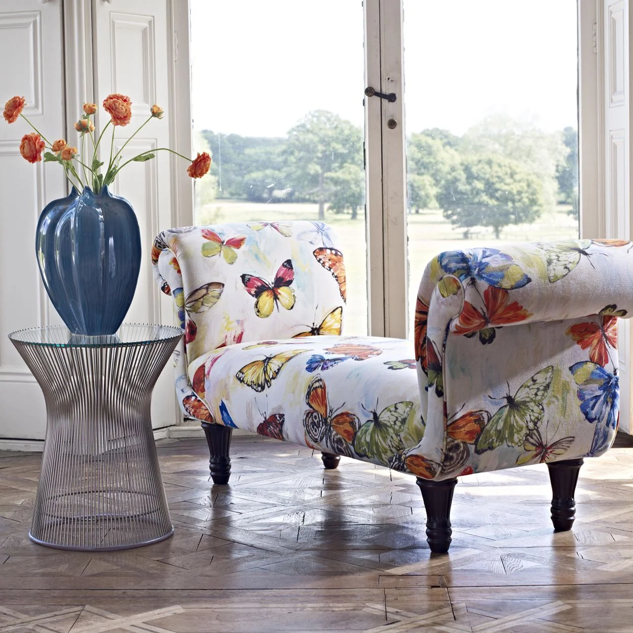
This whole range is fresh and colourful and it's quite fun too. I loved the paisley design shown on the chairs below - and just had to include this photo as isn't the room gorgeous? There's definitely a hint of tropical rainforest in this range and with its butterfly fabric - there's also a macaw fabric - it's fun too, and while this would look good in a breakfast room I don't think it needs to be restricted to there, as the photos show.
3. Grand Palais
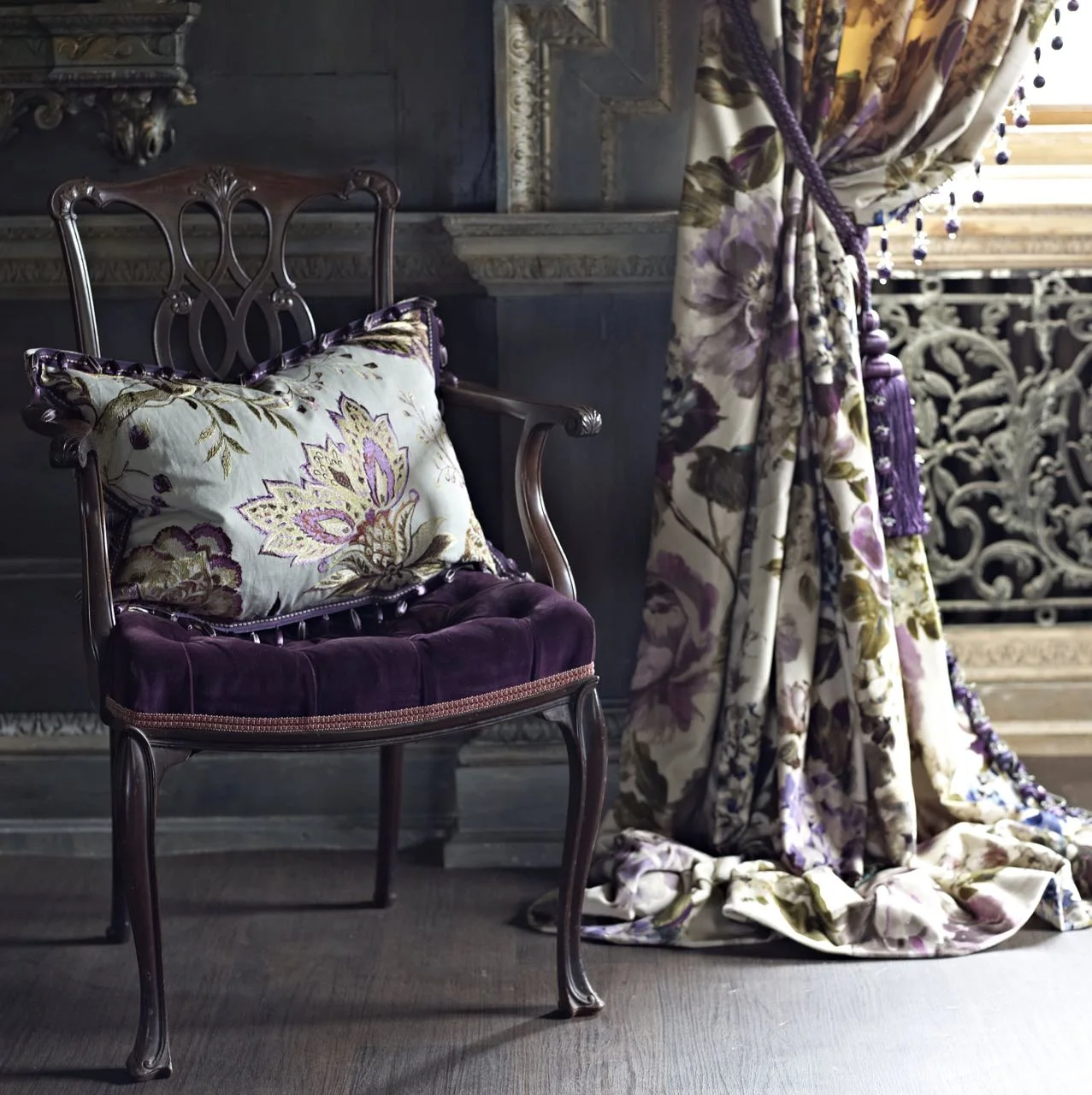
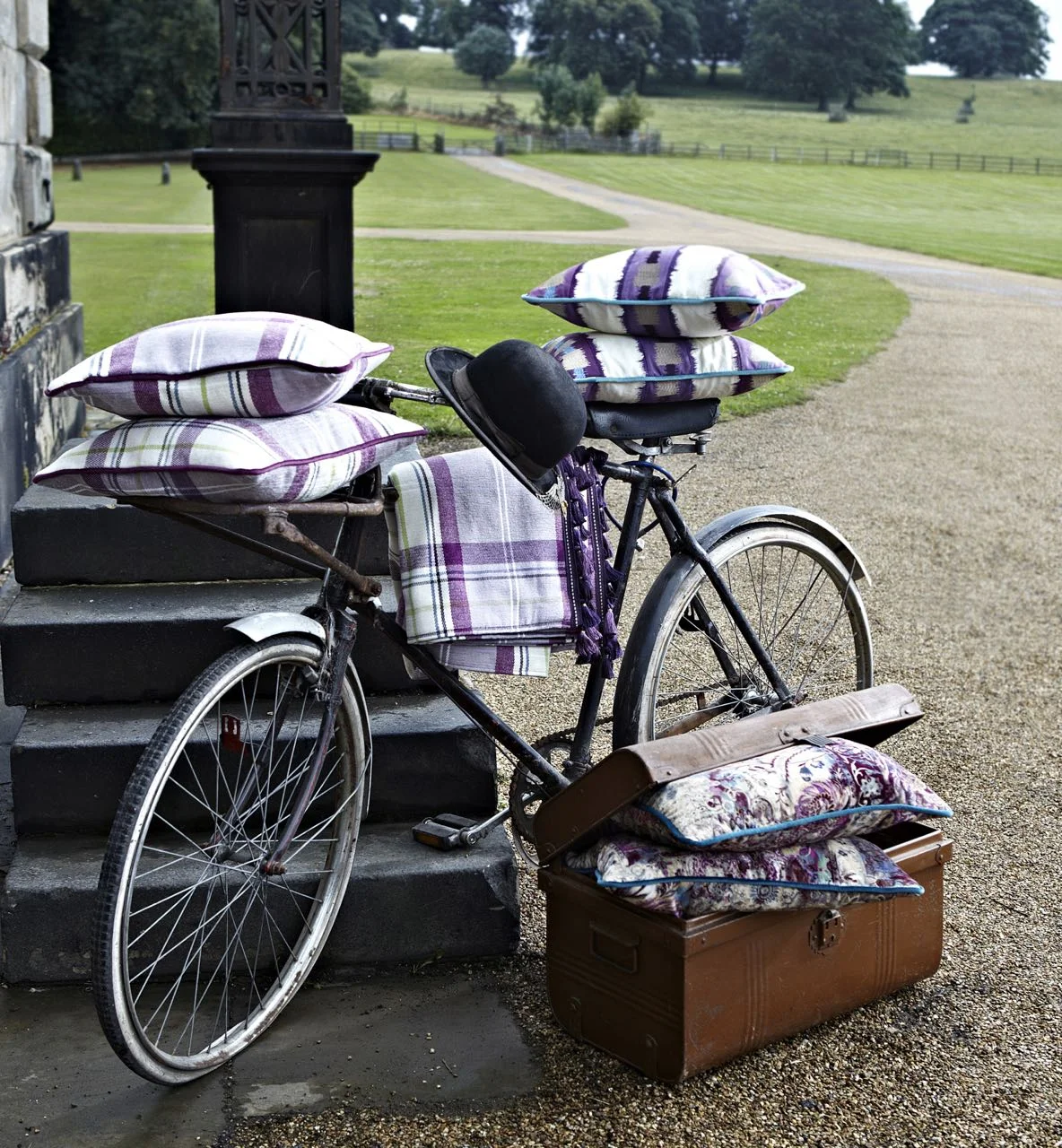
This range is full of rich and detailed patterns that somehow are moody (in a good way) too! There's embroidered linens - just look at the cushion in the second photo, large checks, embellished bands and digitally-printed velvets all in jewel like colours.
And well I just had to share the pretty bike photo, didn't I?
4. Cube
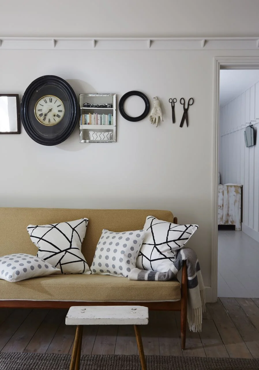
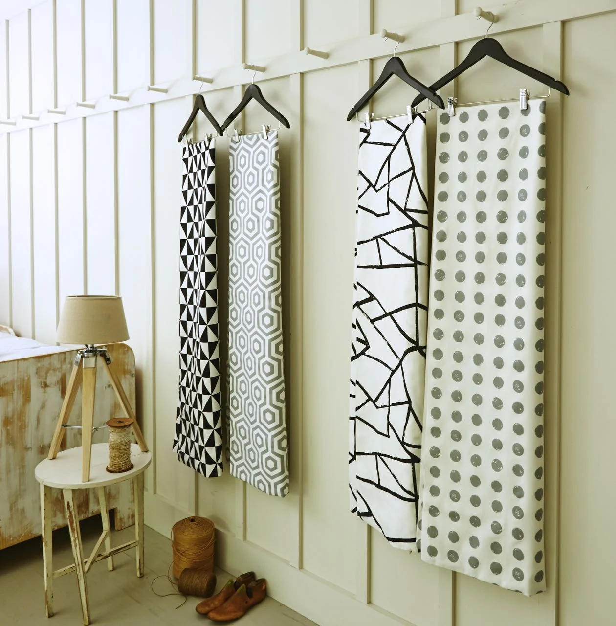
This range has strong geometric and modern designs which I think work well on the printed cotton. Spots, zigzags, hexagons and 3D cubes used alone or together mean this is a range that I think will make a big impact wherever it's used. My favourite in this range is the hexagon pattern shown in the second photo - such a simple pattern, but so effective - and for me one that could be used in almost any home alongside existing furnishings.
5. Safari
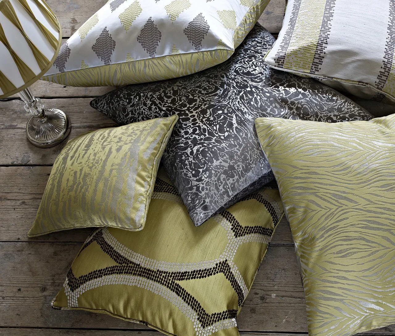
I liked this range too, for me it's the luxurious look and that shimmer. There's contrasts too with crisp embroidered satins alongside foil-printed velvets. I am rather partial to the greens in this range, I find them calming and elegant and for me the range brings a contemporary touch to traditional.
6. Java
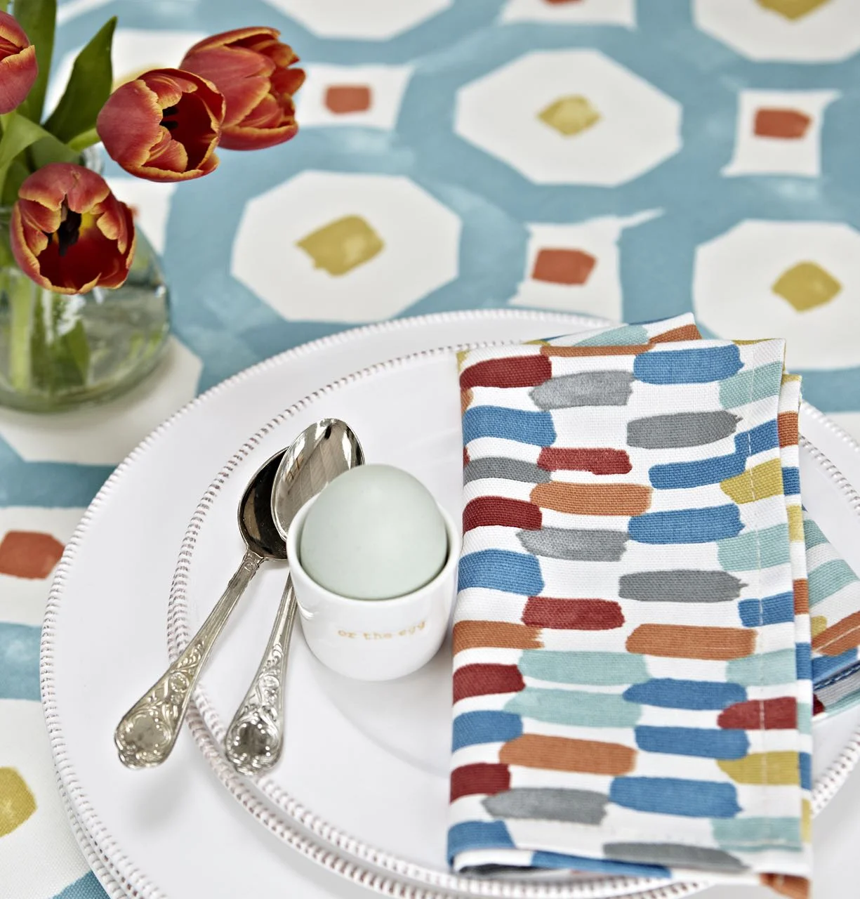
I love this range, I think it's very liveable - the brochure says exuberant and I think that's right. It's fun and there's Scandi-like hints here too for me and I think this has the potential to be a very versatile range. And I love the idea of a tablecloth and coordinating napkins. I think the patterns bring an informality and funky vibe and this is a fabric I can see myself using. In fact, I've got a couple of things in mind already.
7. Velour
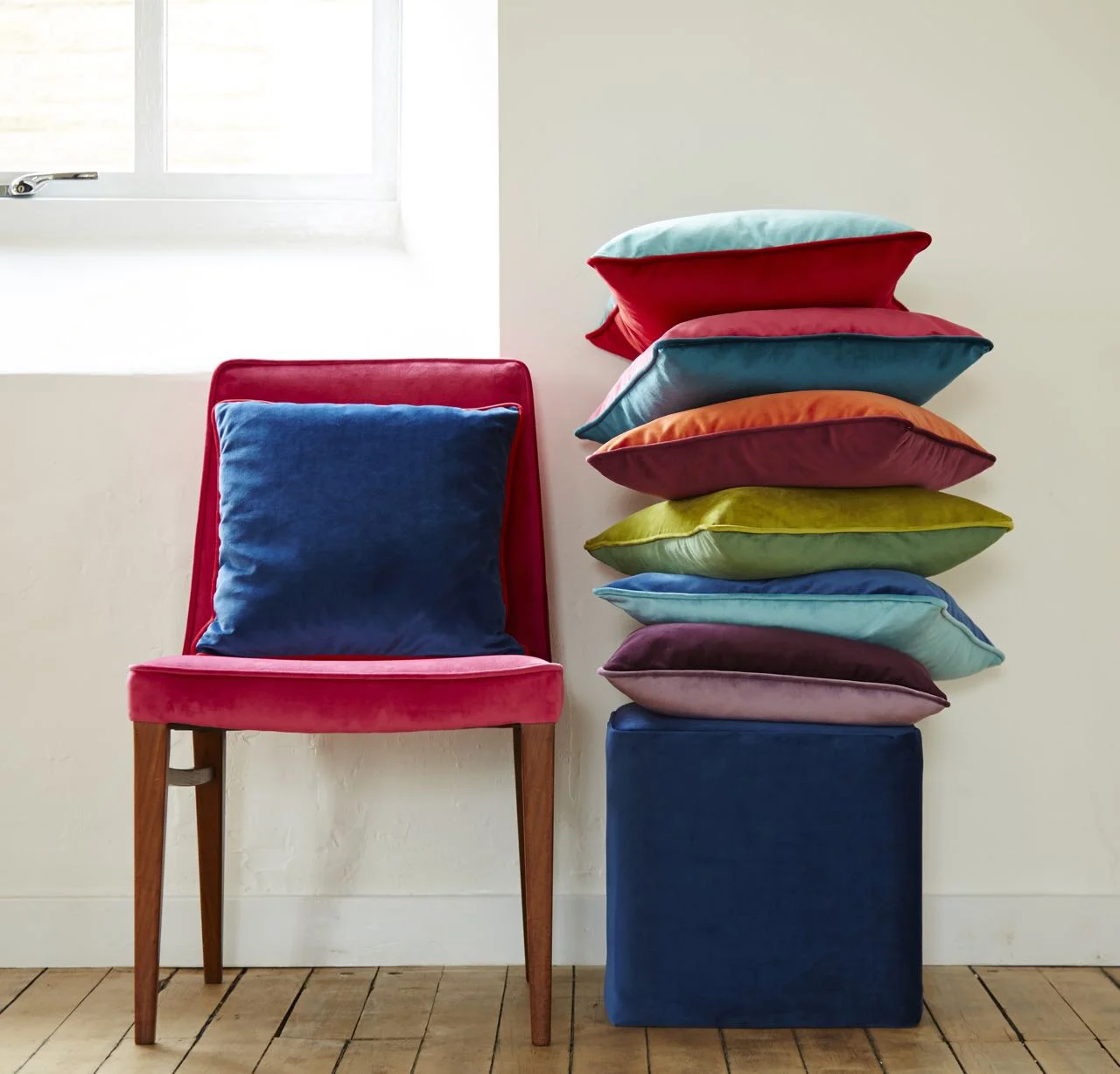
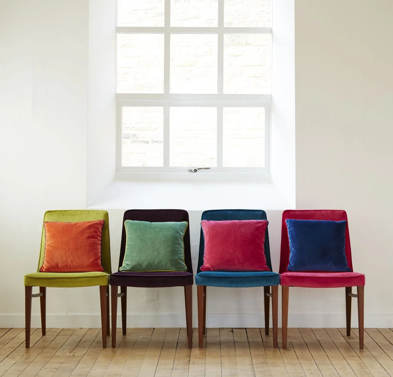
This is the range that I think brings an old furnishing favourite up to date. I mean there's 35 colours in this range - yes 35! And it seems a far cry from the drab velour I have memories of. I remember mum recovering our sofa a very long time ago with a mink brown velour, just imagine what she could have done with these instead!
And yes, why stop at one colour with so many to choose from - and you know what, those clever people at Prestigious Textiles have ensured they match the other ranges, so there really is no limit to what you can do.
Spending a rainy afternoon looking at fabrics was great fun and left feeling totally inspired. Thank you to everyone I met at Prestigious Textiles for showing me the ranges and explaining how the ranges come together. And watch this space for some of the craft projects I have in mind, I told you I left feeling inspired...
Of the ones I've featured here, I think the Java range is the most useable here, but you may have already picked up on that. It's hard though to choose a favourite overall as each could be used in so many ways, but I'm interested to know which range appeals to you - let me know in the comments.
This is a collaborative post with Prestigious Textiles, however all words and opinions are my own.
