Usually our holidays tend to be cottage-based rather than in a hotel, and that's how we like them. And so when we were in Portugal I was keen for part of our trip to follow our preferred approach. I struck lucky in Porto finding the Apartment Bomfim 234, and as you can see from the photos it positively shines.
Unbelievably I booked it on Expedia. I know, that surprised me too. From the outside though you'd never have known what was inside. This was the view that met us as we opened the door.
I wouldn't call myself a natural fan of mid-century modern furniture, it's a style of furniture that while I admire, I skip over when choosing items for our home. I'm not sure if that is due to growing up in a sea of teak and G-plan furniture in the seventies or because I'm pre-disposed to other styles, but in this apartment I started to see what I was missing out on.
This cabinet was the winner for me, not that we had the TV on (that's a rarity on our holidays too), and I think it's the added colour that won me over. For me, that takes this style of furniture to another level and I've found myself admiring similar projects since I've been home. It moves it away from those seventies memories, and into something more up to date, don't you think?
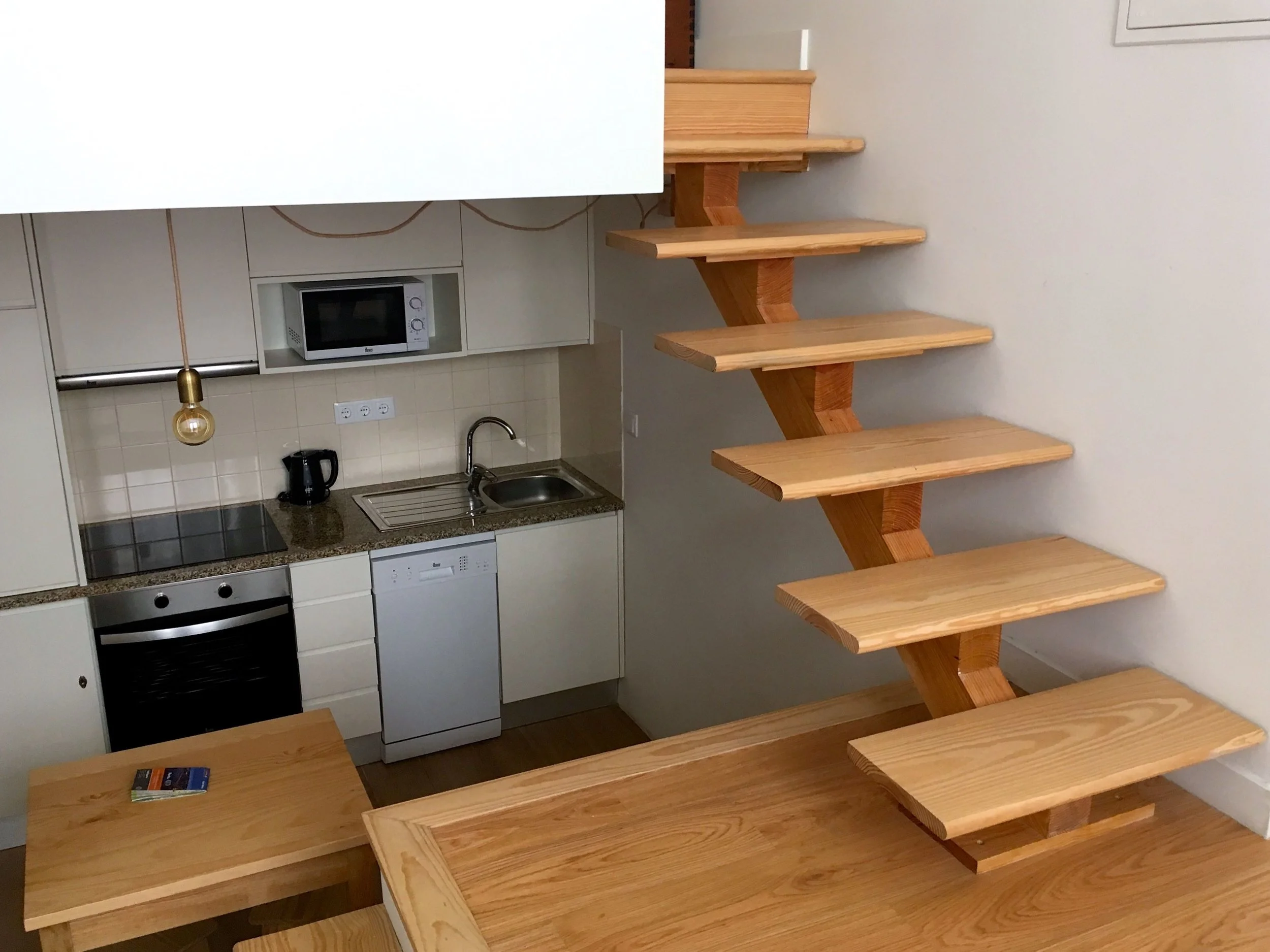
But there was more to the apartment than the furniture. There was the layout. On the mezzanine level there was the bedroom, on the ground floor the sitting area and a half floor below housed the kitchen and bathroom.
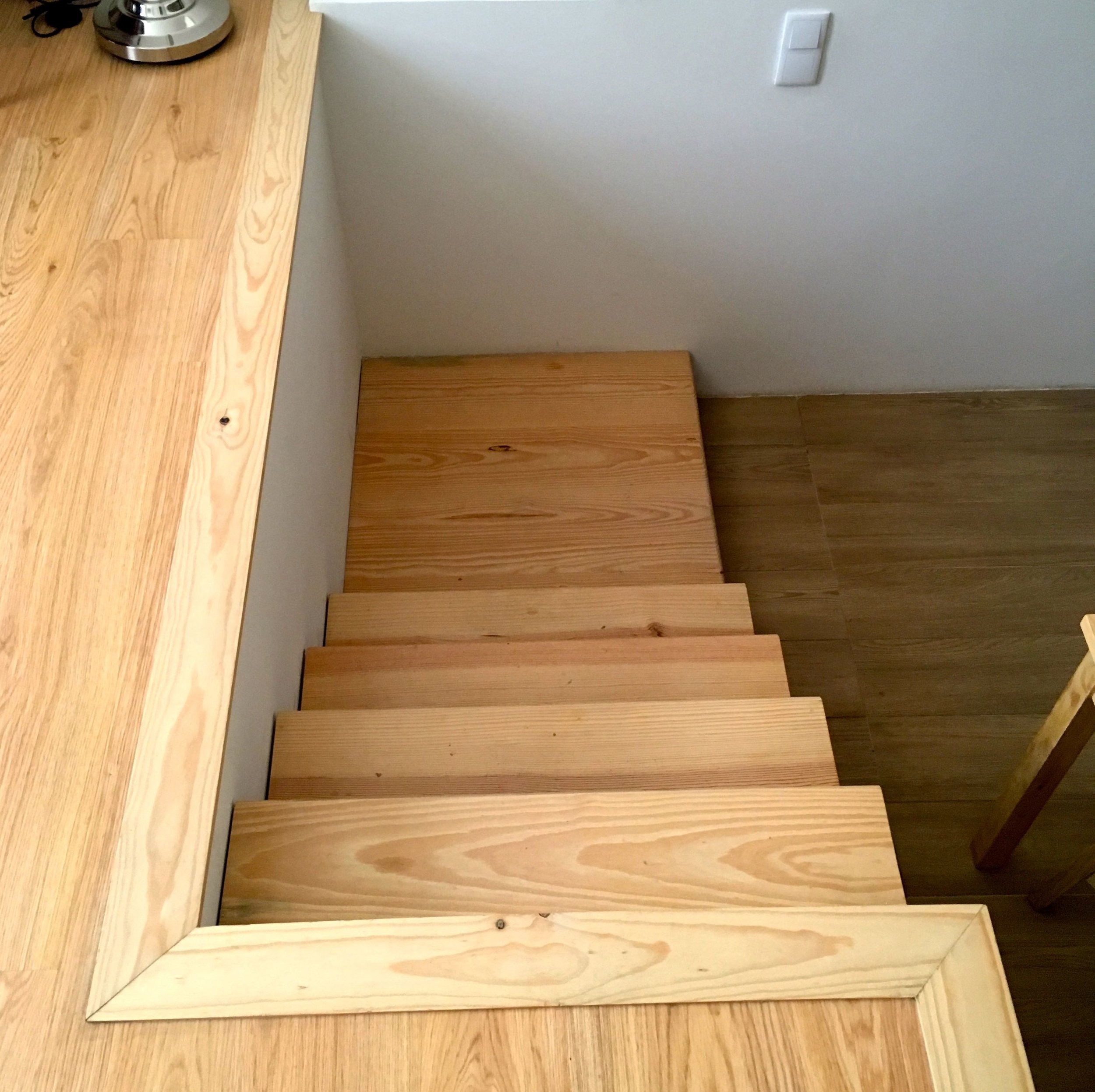
All were accessed by open staircases, which were the feature. These above, which lead to the bedroom do have a look of "shelves" about them, and were much easier to navigate than perhaps you'd expect.
Upstairs the bedroom area, although snug, was just as stylish.
When I say snug, there was just room for a bed, and just about enough room to get in it. Just, it was a bit of a squeeze, but I forgave it; its stylishness one me over.
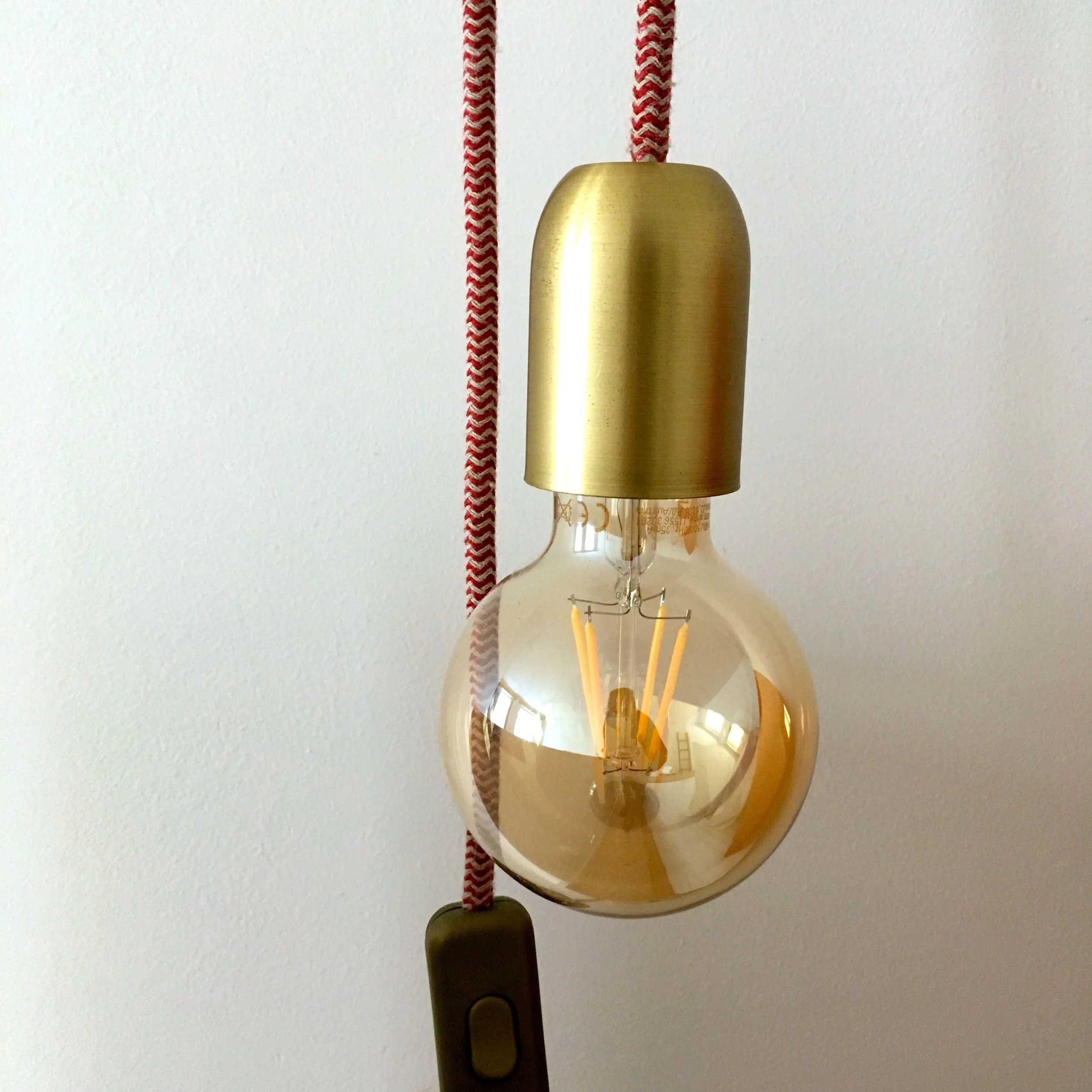
And, oh... the bedside lights. A feature we both liked and a design element we're storing for the future.
Heading downstairs to the kitchen area felt in some ways more precarious, but no less stylish. MOH kept marvelling at the building regs and such like that made this possible, ever the practical one...
Standing at the kitchen table gave a great view up to the living area and full length windows, complete with shutters.
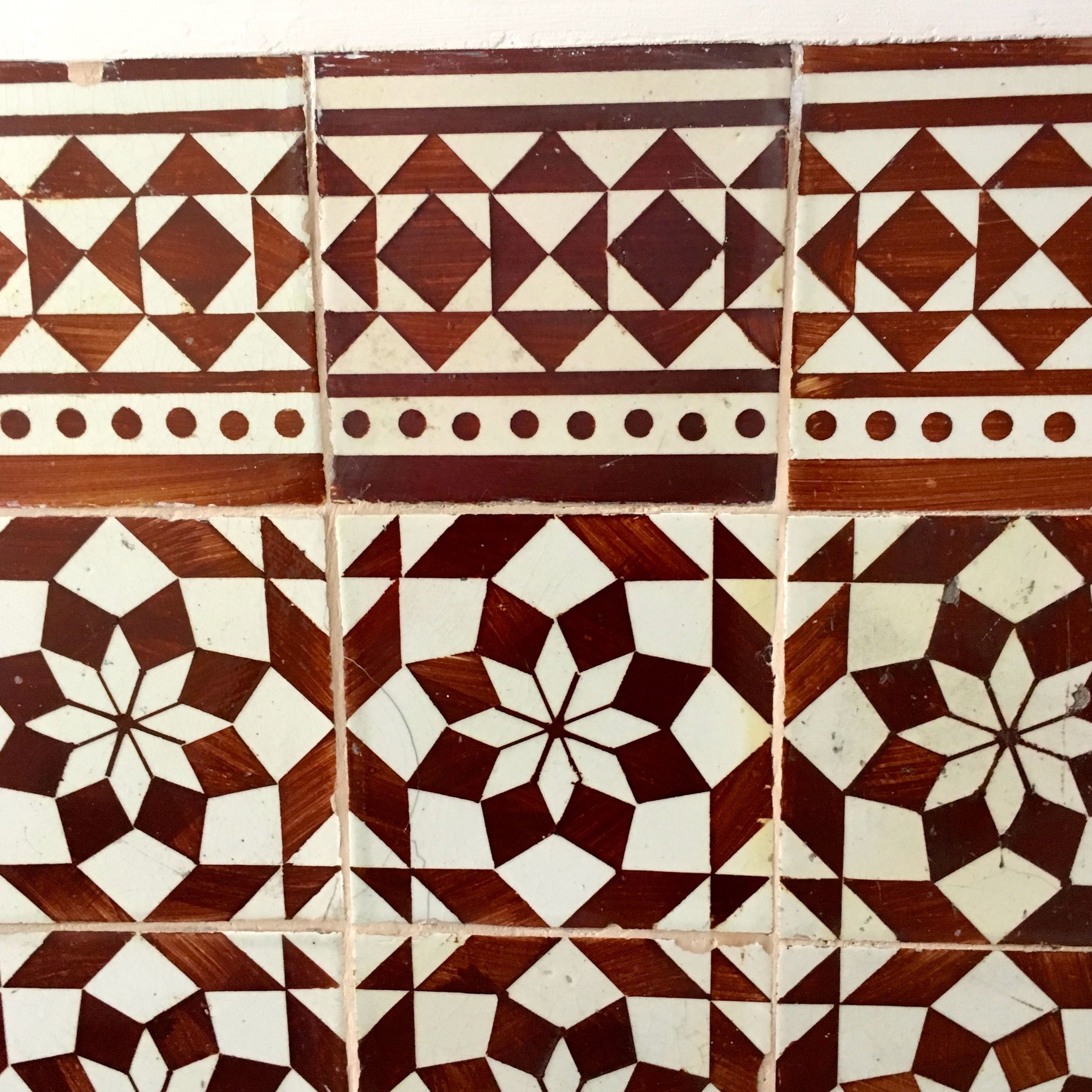
Now you might be thinking Porto, fabulous tiles and wondering where they are in this apartment. Well it didn't disappoint there either. They were saved for a full wall of pattern in the bathroom.
My first thought was wow, they're busy, but that quickly turned to wow, they're beautiful. Beautiful close up and from more of a distance, and they certainly made an impact. With another idea for the future banked, and another style feature I'd usually shy away from I was having quite an epiphany, and we'd only just arrived in Porto!
As we headed out of the apartment to explore Porto some more I noticed the first of many more walls of tiles. These were in the hallway, which somehow I'd completely overlooked as we arrived.
Geometrics are big in the shops here at the moment aren't they, but it seems in some places they've never gone away.

