Adding functionality with an Urbansize floating dressing table

One of the spaces that we needed to make work for us is in our dressing area, which is a rather grand name for the space between our bedroom and en-suite which also contains a built in wardrobe. The wardrobe is big, though the dressing area is small but with potential.

So I started to scour the internet for a small piece of functional furniture. I wanted something with a drawer, so that our clutter could be out of sight, and after much internet searching I found a unit that worked with the dimensions I had. It arrived in the summer, flat packed, and the afternoon we had the Red Arrows fly over MOH spent some time putting it together, with just a few swears here and there. We had doubts about it then, and well let’s just say it was in the ‘too good to be true’ category and while it technically should have worked, functionally it didn’t.

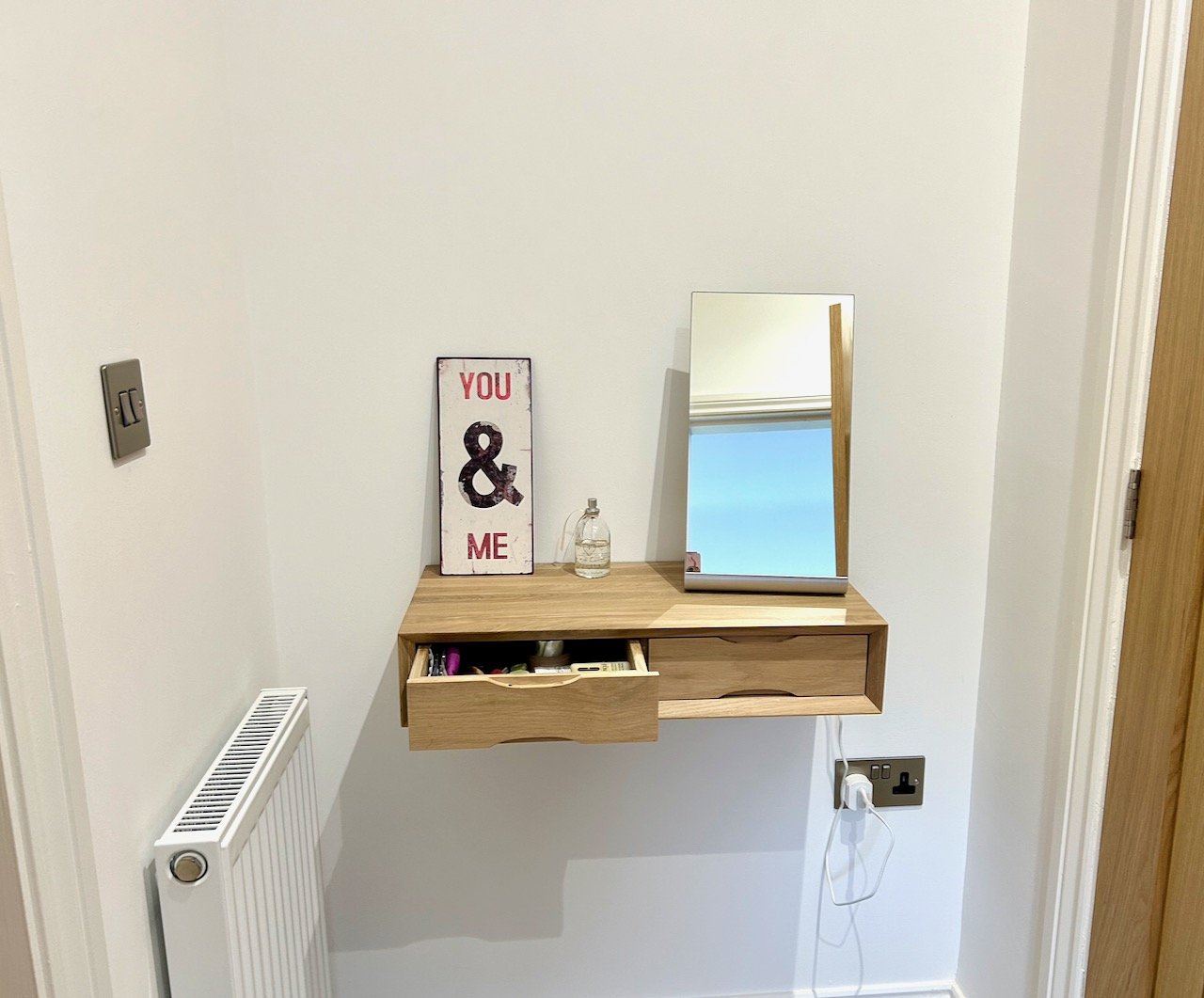
Just for clarity the Urbansize floating oak dressing table pictured is our replacement option, and one I wish we’d gone for in the first place. Sigh.

Anyway, after a month or two of not actually using the original piece of furniture for anything like we planned, we agreed enough was enough and we should try again. I’m not naming the company we bought the original piece from here and they have since closed their order book, which speaks volumes.

I remembered that I’d pinned the Urbansize floating oak dressing table when our new house was just a possibility - I’ve no idea why I hadn’t remembered before, and it would have been a lot easier, and less expensive, if I had. What’s more the dimensions worked too. Even better MOH was on board with the replacement.

The two drawer oak floating dressing table on the wall with a metal 'you & me' sign

Urbansize aren’t a company I was familiar with and so after my previous experience I thought I’d do some research and digging. The company was formed in Greenwich, just down the road from our previous house - who would have thought, and their registered office was just off our local parade of shops when we lived in London. The founder Sallie King designed her first piece, the floating bedside table frustrated at not being able to find furniture to fit her urban sized flat.

I’m very glad she did.

We ordered our floating dressing table, and it was despatched quickly and with us within a week - and in fact, much quicker than we expected. It looks great too. It comes with instructions on how to fit, which in fairness could have been more detailed, and optional brackets. We have plasterboard walls, and as I’m keen it stays on the wall, we opted to use these.

The urbansize floating dressing table with optional brackets shown in place
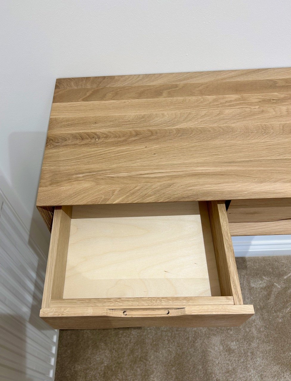
Showing the left hand drawer of the dressing table open

The drawers are small, but that’s kind of the point of it. It’s furniture for a smaller space so the drawers were never going to be huge. They’re big enough to hold some toiletries, and deep enough to have a mirror on the top. The mirror is from Ikea and a steal at £19 - it’s one that I saw and liked when we visited the Cotswolds in September.

Before we started using the drawers though I added some paper as a liner to help protect it - my thinking is that it will be much easier to replace the paper, than to try and clean the base of the drawer!

Showing the paper liner in the left hand drawer - the pattern on the pale paper is circles with a pink, blue, green and yellow two tone design

It’s a small addition to a small space that has really added value and made the space functional, rather than just a walkway to the bathroom - and I’m really pleased with how our version 2 worked out. So much so, that I’ve been back on their site to see what else they have. I’ve not made another purchase yet, but I’d definitely use them again.

I’m sure over time we’ll add more to this space, and we definitely need to revamp the inside of our wardrobe so it works makes full use of what is a relatively large space. It currently has a single shelf above the hanging space which is across the full width, which doesn’t work for us, so if you’ve used a company to fit out the interior of your wardrobe that you’ve been impressed by, I’m all ears.

For the love of wood

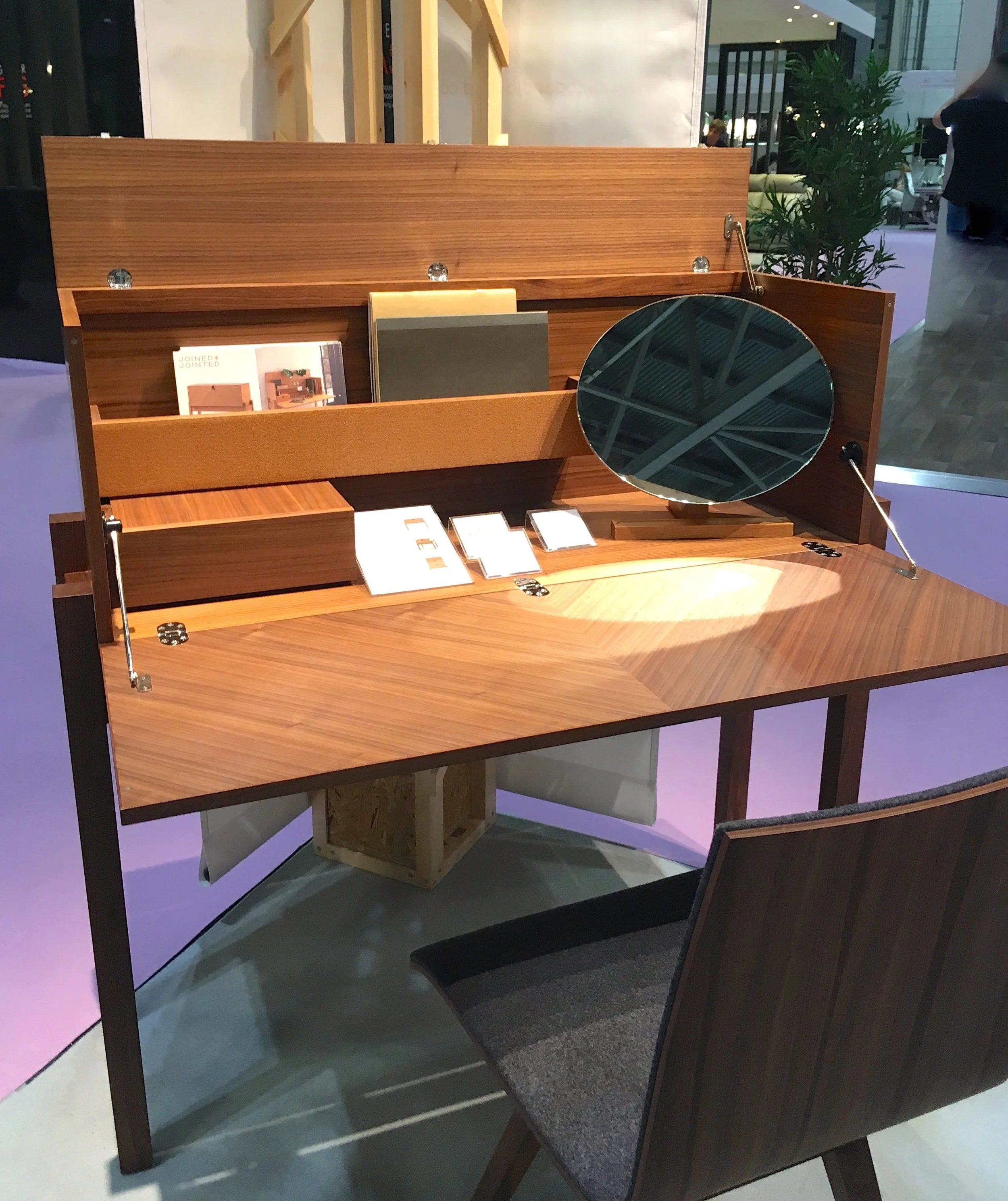
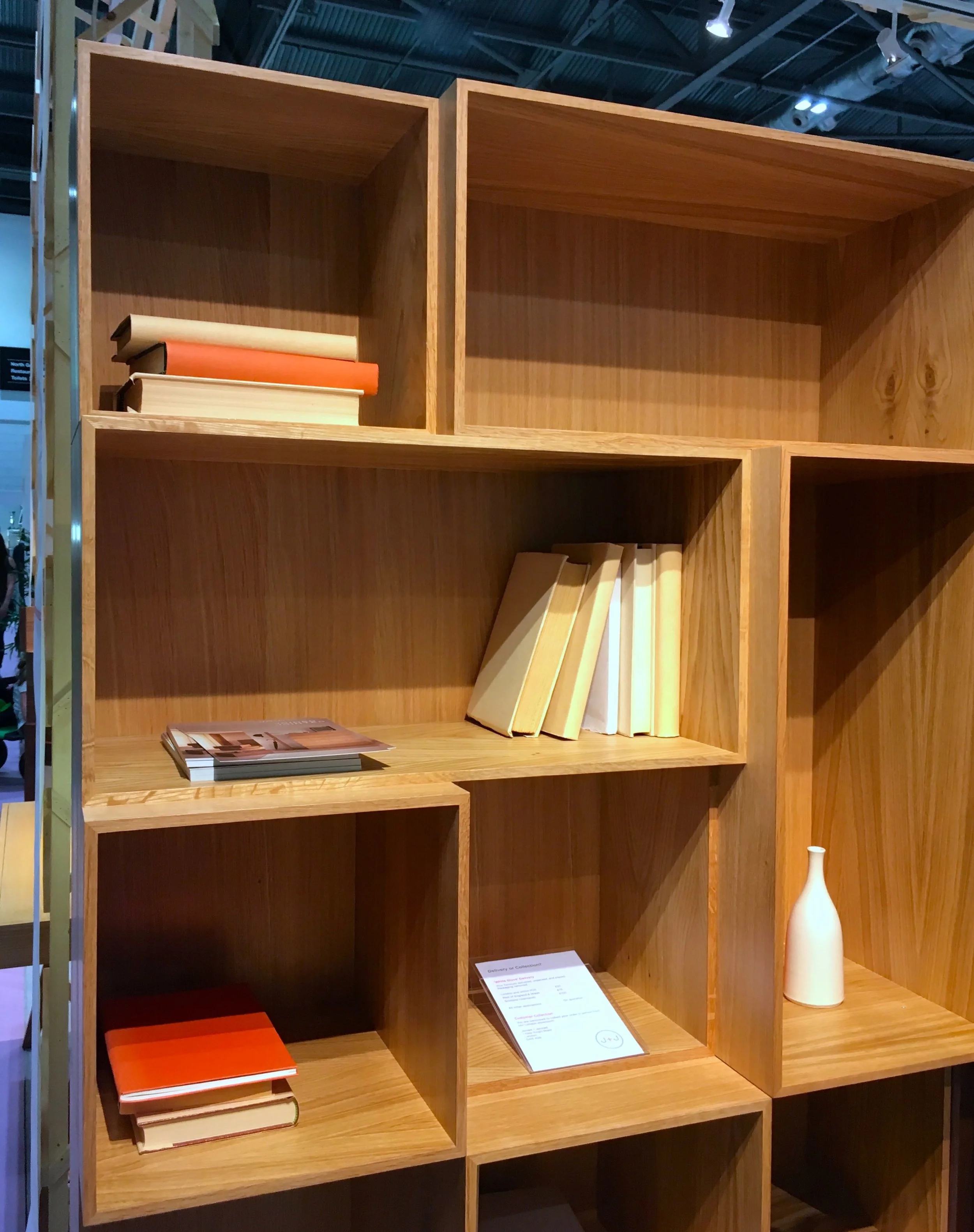
You’ve probably seen the contemporary concave shelving by Jointed & Jointed, but may not have known who it was by. You might not have seen some of their other designs though. They were at Grand Designs earlier this year and their stand was one that just encouraged you (or me at least) to walk around it ‘stroking’ the furniture, while trying not to of course.

I think it’s the grain on this bureau that makes it work and gives it its contemporary feel, and I think I’d definitely feel more organised. Perhaps momentarily, but I’m sure I would!

A wooden bureau or writing desk at Grand Designs Live 2018

The shelving unit with its boxed ‘zones’ also appeals to me. For me it’s the irregularity that appeals, for MOH it’s the irregularity that he’s not so keen on. If I thought it was something that would work in our house, then I think this would be worth the work that would be required to pave the way for this one.

There's something comforting about everything having its space

What I wasn’t expecting to see was a wooden desk lamp - well you wouldn’t would you? But after seeing it, I kind of wondered why not?

A light in wood, wouldn't be your first thought would it?

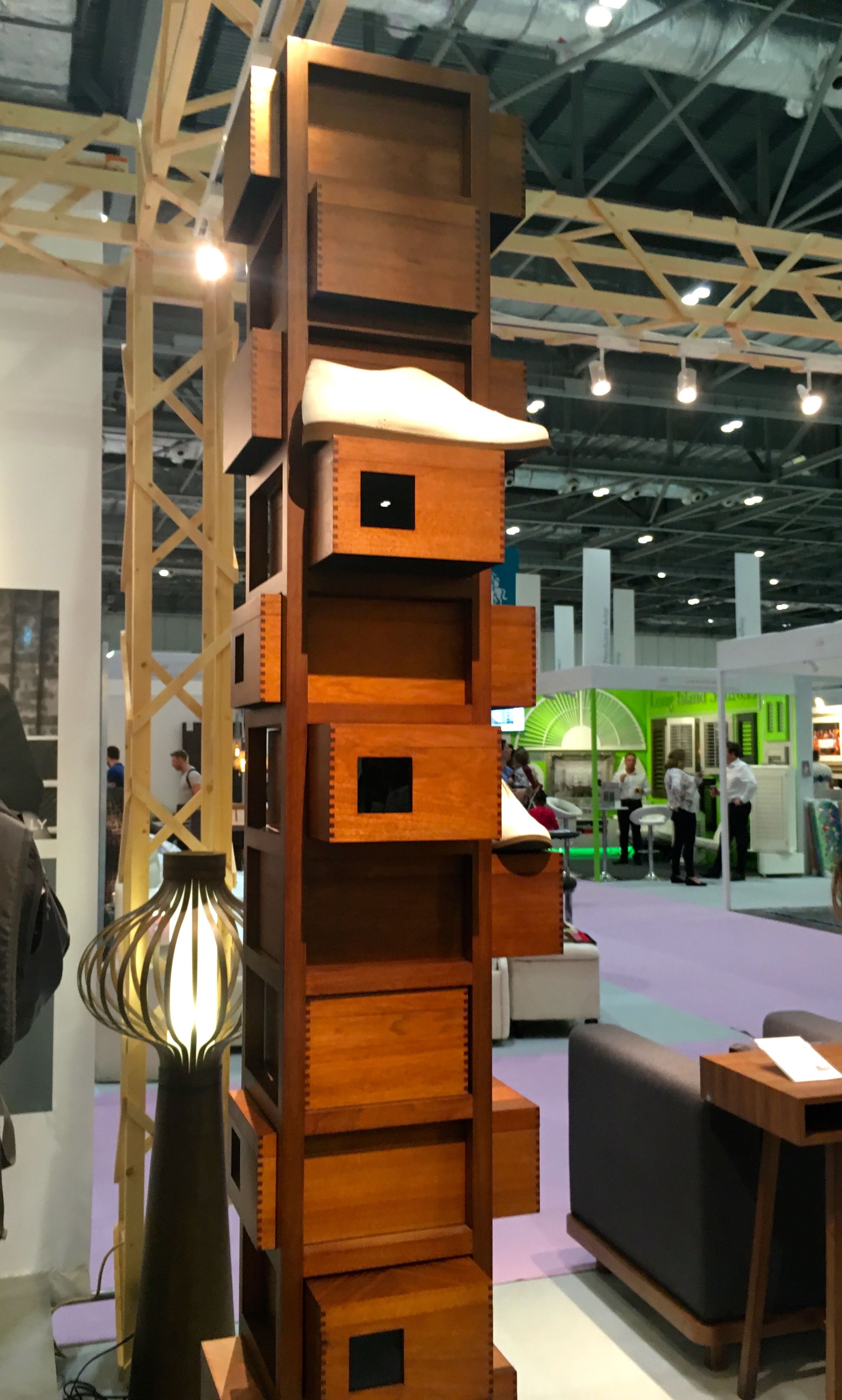
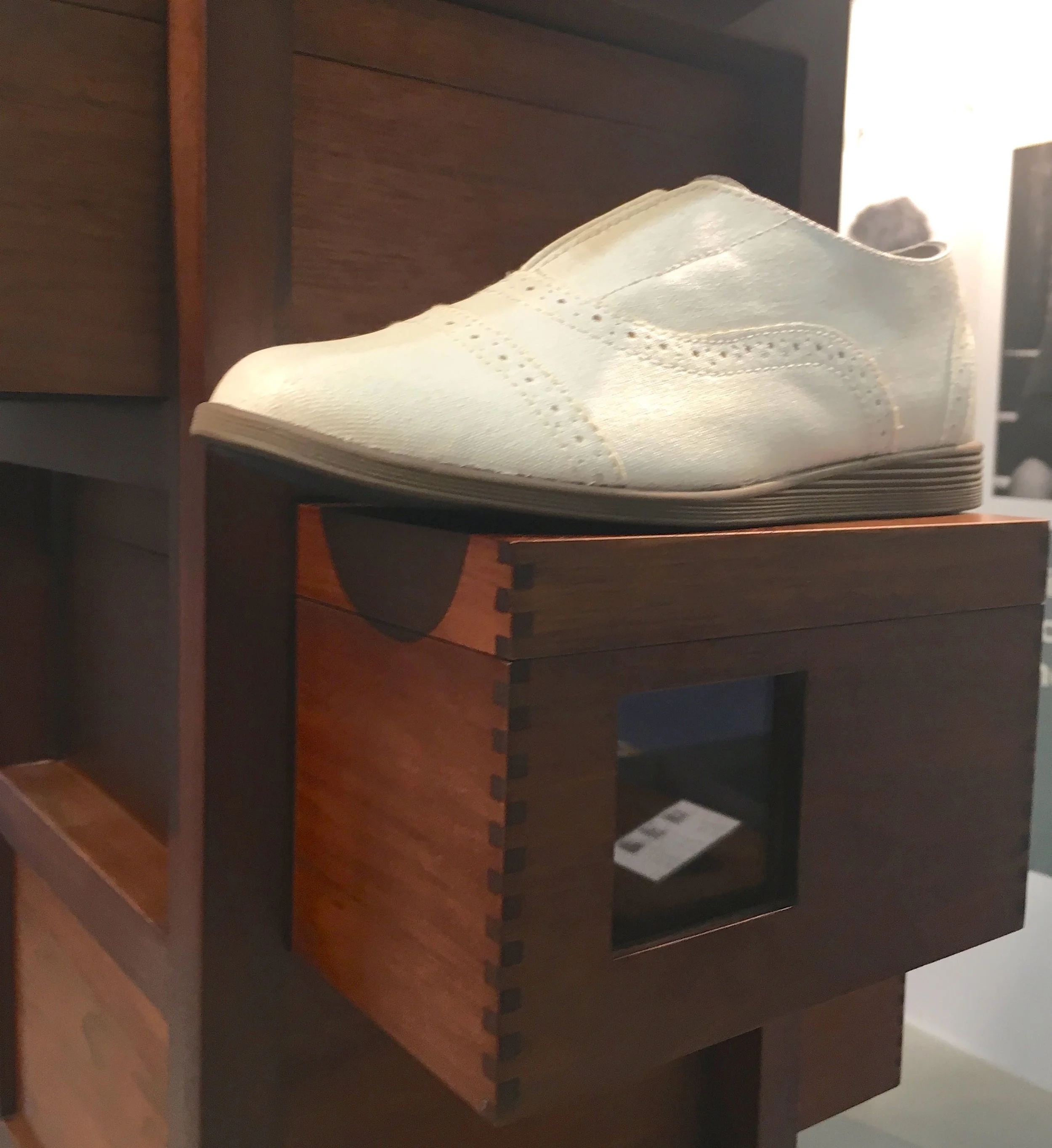
But the item that really captured my attention was this tower of wooden shoe boxes - I think the shoes could do with more work, but that’s by the bye. I spent a fair amount of time admiring this walnut tower of loveliness which was commissioned by Wallpaper* magazine for their Handmade series.

shoe boxes with a difference

MOH could spot the signs and moved quickly, pointing out that I’d need several of these or have to have severe clear out. He needn’t have bothered though as I’d already spotted the £4k+ price tag, and yet it was still lovely.

Nifty shoe storage at Grand Designs Live

There’s nothing else for it, I’ll need a dressing - or more appropriately - a shoe room, that makes perfect sense doesn’t it?

PoCoLo

Let's talk TV Units

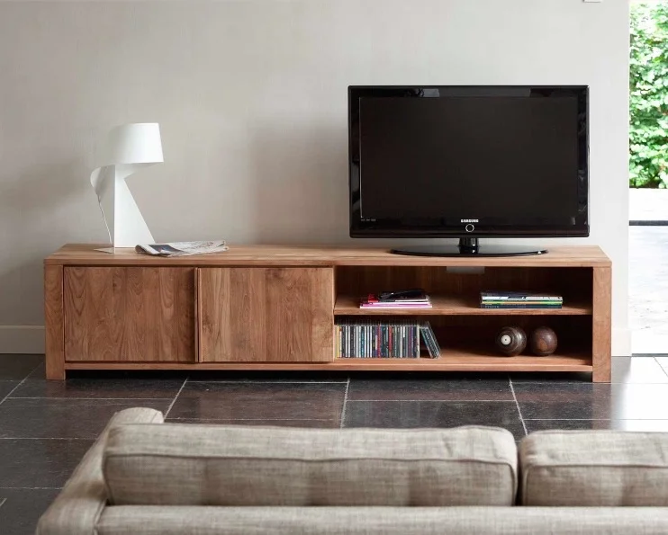
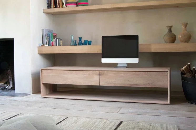
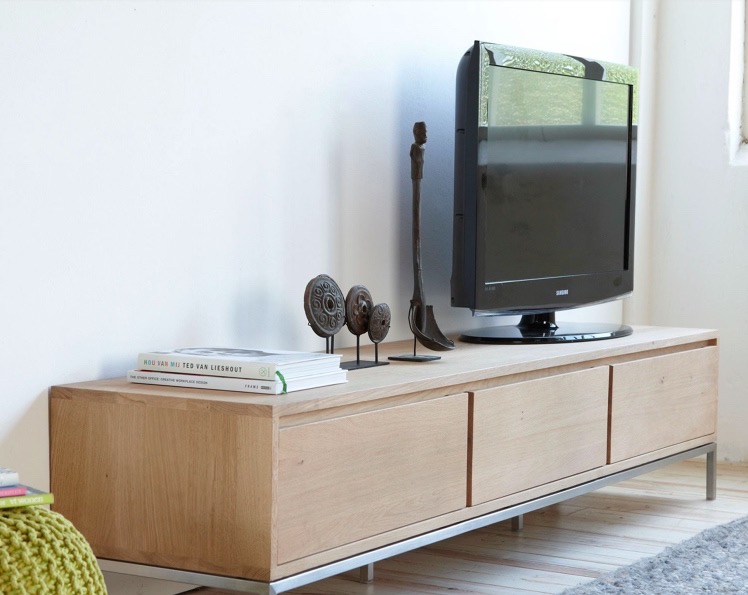
When AIF (or Adventures in Furniture) got in touch and asked me to preview their Living room furniture, I decided to take a look at their TV units and I make no apology for the sameness of items I've chosen from their site. AIF are a company that "specialise in contemporary designs that are crafted using solid materials and traditional techniques" which means their furniture is built to last, and I think that shows.

On their site there's a selection of TV units which I think are right and up to the job. You see, I have issues with the TV property shows that have TVs on a wall above a fireplace, I think the TVs are just too high.  

My rule of thumb is that the TV should be at eye-level , or lower when you're sitting on the sofa.  Often (but not always) having it above a mantelpiece means it's too high and therefore uncomfortable to watch. I also think it gives greater prominence than is necessary for a piece of electrical equipment which all too often we can plan our lives around.

For me, TV units should be at least twice the width of the TV itself and low-level. That means they aren't in your eye line as you watch the goggle box and therefore don't interfere with your viewing. Ideally, I'd have some open and closed space, because let's face it we could all do with the extra storage, and not all of it needs to be pretty!

So these are my picks from the Living Room section of their site:

TEAK LODGE TV CUPBOARDS FROM £1099Photo credit: AIF

TEAK LODGE TV CUPBOARDS FROM £1099
Photo credit: AIF

NORDIC OAK TV UNITS FROM £859

NORDIC OAK TV UNITS FROM £859

LOFT LOW SIDEBOARD / TV UNIT £826Photo credit: AIF

LOFT LOW SIDEBOARD / TV UNIT £826
Photo credit: AIF

LIGNA OAK TV UNITS FROM £979Photo credit: AIF

LIGNA OAK TV UNITS FROM £979
Photo credit: AIF

So what do we have?

Well you'll not be surprised to learn we have a low-level unit, that's just about double the size of our television which is hung on the wall - at eye level from the sofa. I've had to compromise on the style of our TV unit. It's wood and is open shelved, which was the requirement for MOH's hifi - and as that's a big thing for him - and the only place it could go - there really was no choice. The bigger compromise for me is having his record player on top of the unit; I've countered that though with three terracotta plant pots with a pine cone in!

On the whole, it works for us - it's not exactly what I'd choose, but it's close enough and well, life's about compromise right?


This is a collaborative post but all opinions are my own.