The Biba Story: Fashion Illustrations

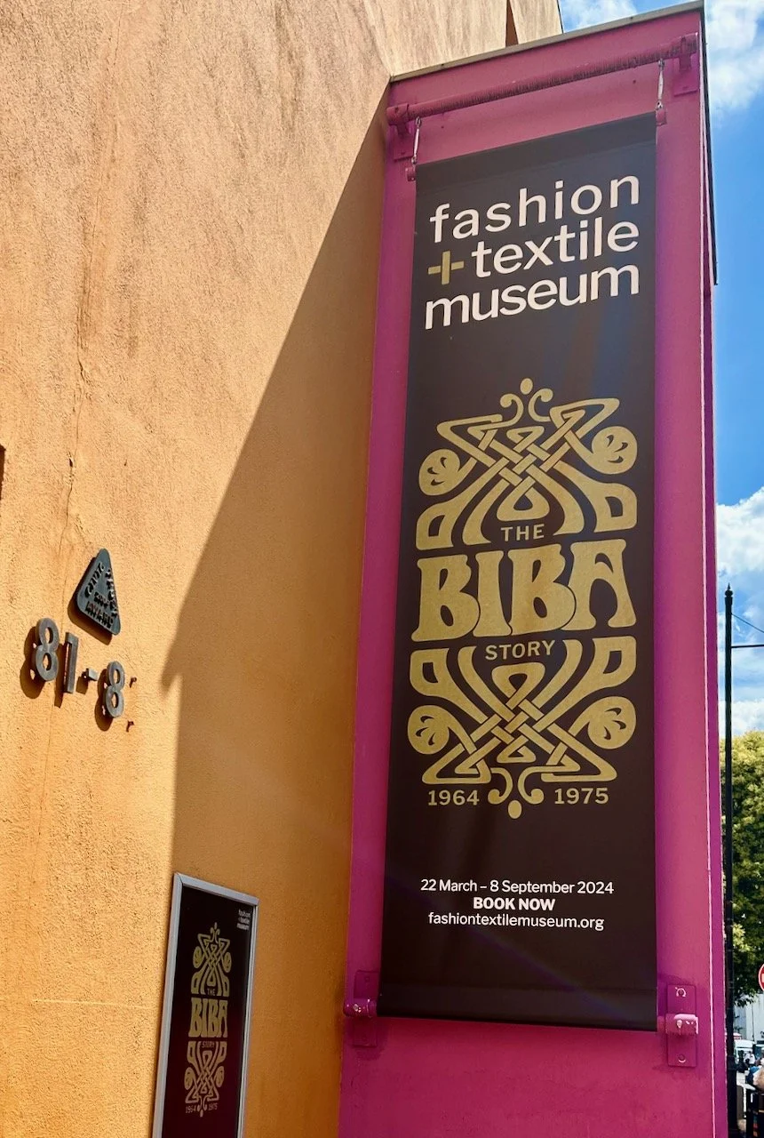
As you know when I pop down to London for a visit I like to combine the primary purpose of my trip with a bit of culture. Sometimes that’s a walk around the shops in Regent Street, and sometimes if I can I like to combine it with visiting an exhibition. Last summer (yes, I know it’s taken a while to share these) I was able to do just that and dragged MOH along to the Biba exhibition at the Fashion & Textiles Museum in Bermondsey. Which despite growing up and living in London until a year or so before I’d never been to, but that’s how it goes sometimes isn’t it.

It’s a great museum, and one I’m sure I’ll be back to in the future. If you’ve not discovered this already it’s ‘the only UK museum dedicated to showcasing contemporary fashion and textile design’ and was set up by Dame Zandra Rhodes in 2003, and is housed in a very distinctive, and very Zandra building - it’s definitely easy to spot as you approach it!

I’d heard of Biba, the shops and the clothes, but didn’t really know much more as in the mid-seventies I was under ten years old, which is a pretty good excuse I’d say! But I knew how iconic it was, and was keen to learn more - and while it wouldn’t be the number one thing that MOH would choose to go to, he was happy to come along, which was just as well as I’d got him a ticket!

The exhibition shares the Biba story from 1964 when the first Biba Boutique opened to 1975 when the legendary Big Biba closed its doors; it explores how Biba blossomed to become the world’s first lifestyle label which ‘sparked a revolution in how people shopped’ and how Biba became the brand that epitomises the 60s and 70s fashion.

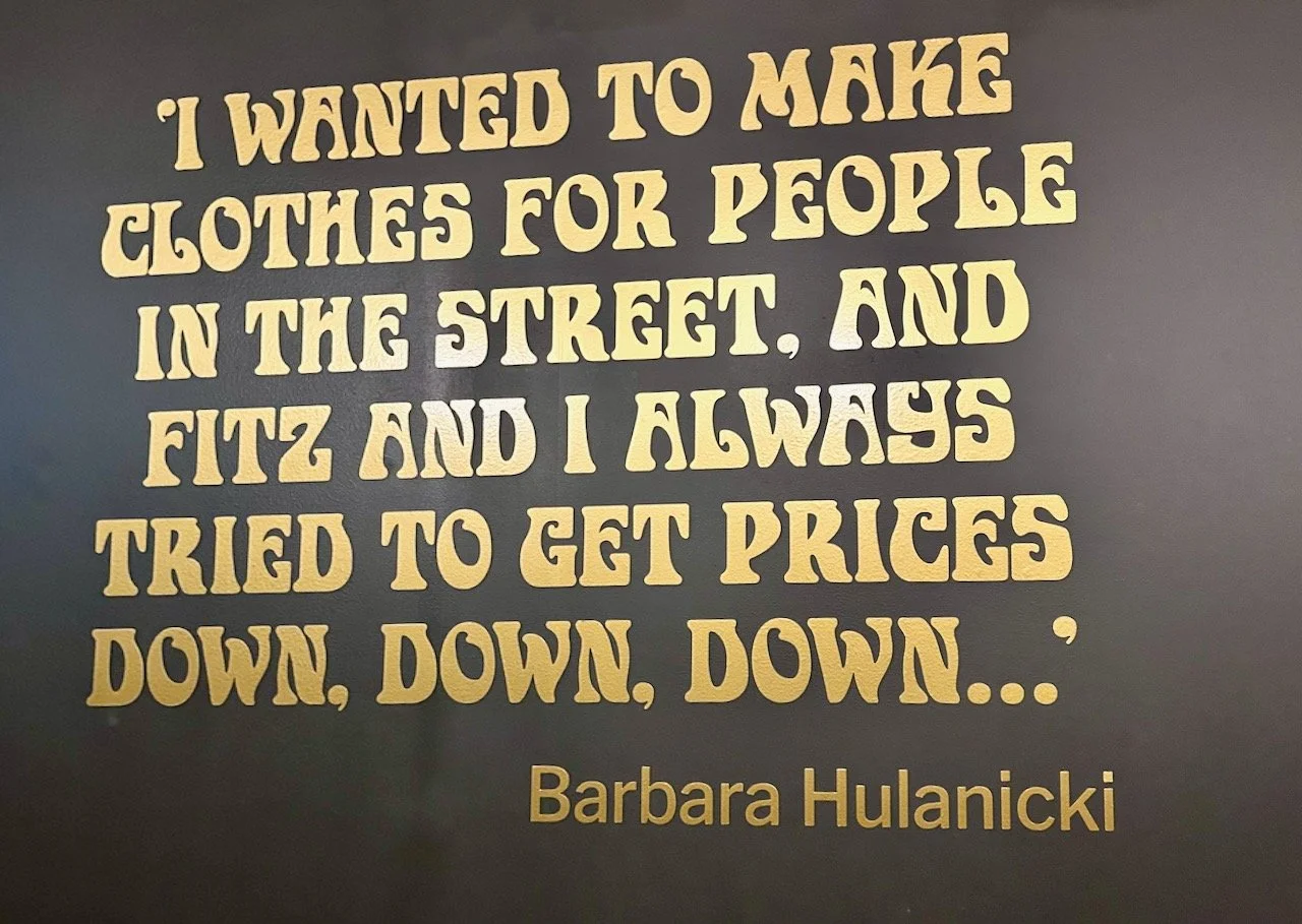
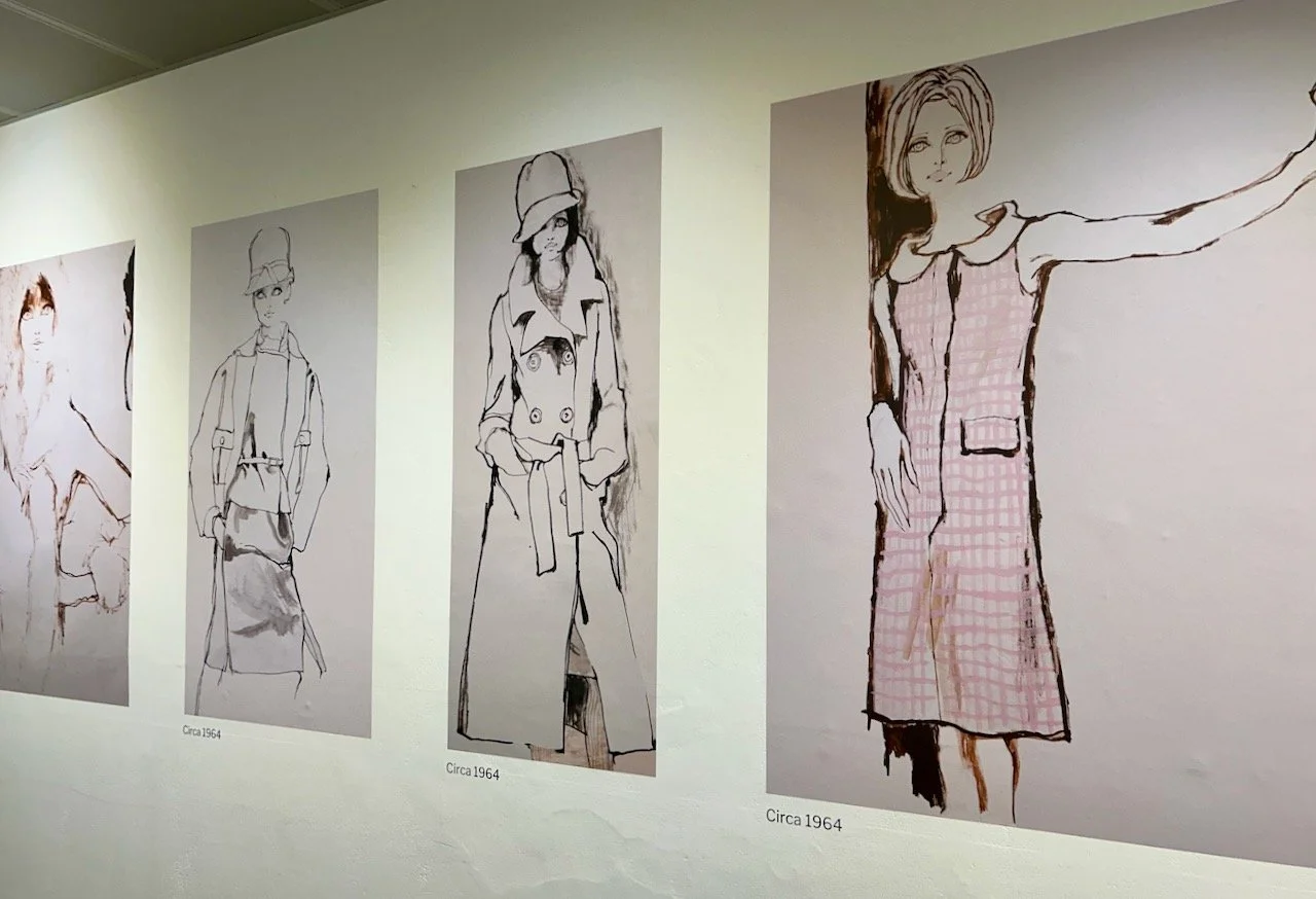
In this post I’m sharing some of the fashion illustrations by Barbara Hulanicki who established a mail-order company selling affordable fashion appealing to a new generation of young women. I’ll share more of the clothes and the lifestyle brand in future posts next month.

Barbara had a natural aptitude for art, and that became her refuge following the assassination of her father. She studied fashion at Brighton Art School (now the University of Brighton) and started her first career as a fashion illustrator in 1957 where she covered the Paris couture shows for publications such as Vogue and Harper’s Bazaar, as well as working on British newspapers.

The show notes said that ‘as one of the most in-demand fashion illustrators of the period’ she had close contact with those putting on the couture shows, and their collections and she realised ‘how out of step they were with the emerging world of youth culture and the lives of young women’.

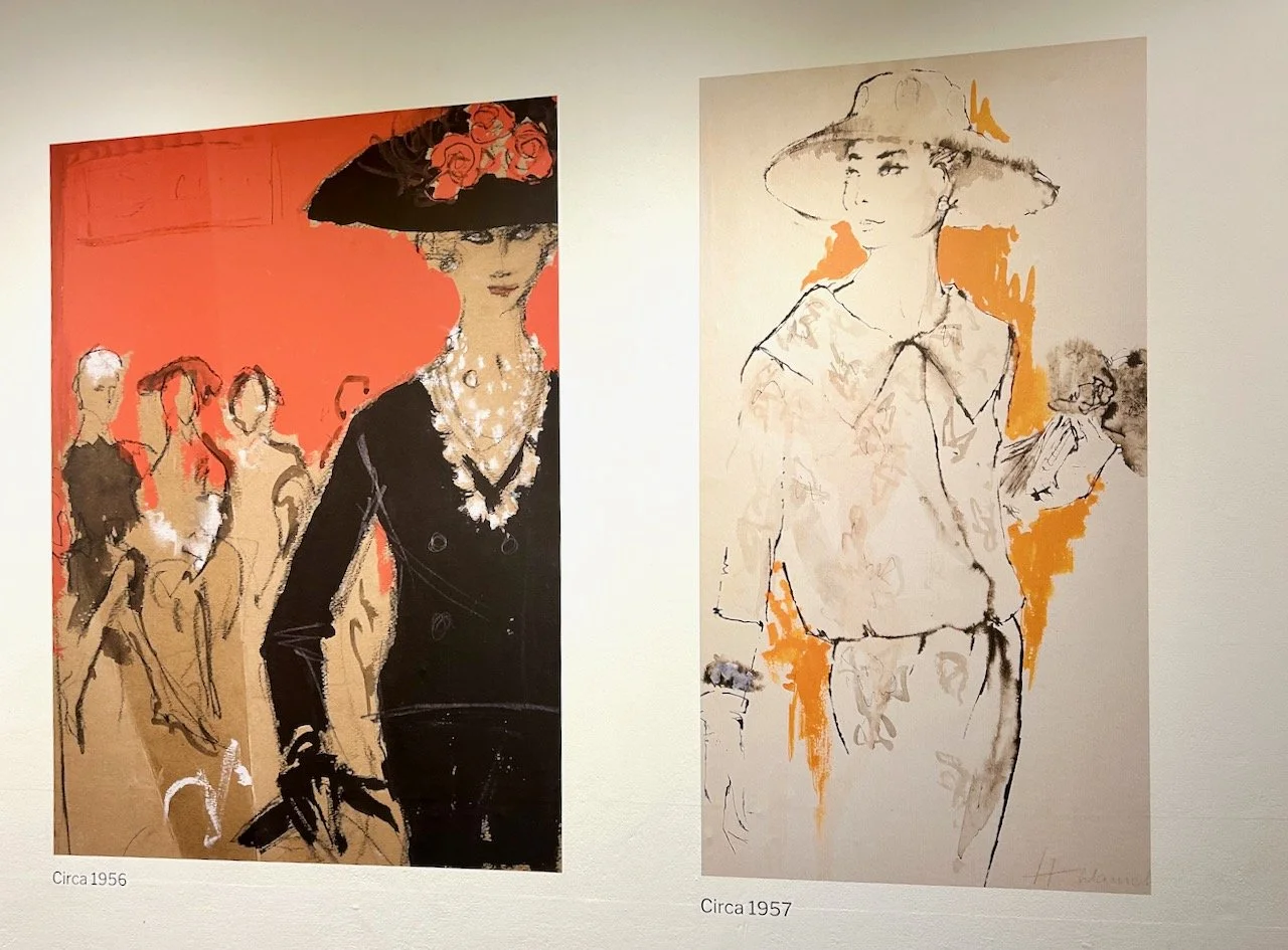
What’s interesting to me is seeing how the illustrations change, the earlier ones which I assume are from the couture shows are of designs which are much more formal - and very reminiscent of ‘Breakfast at Tiffany’s’ even though the film wasn’t released until 1961, based on the novella published in 1958, so I may need to revise my thoughts on who influenced who!

The illustration on the left below from circa 1963 still retains some of that formality, but the other two images are much more informal - and the central one especially includes bold colours and patterns.

Three illustrations by Barbara Hulanicki from c 1963

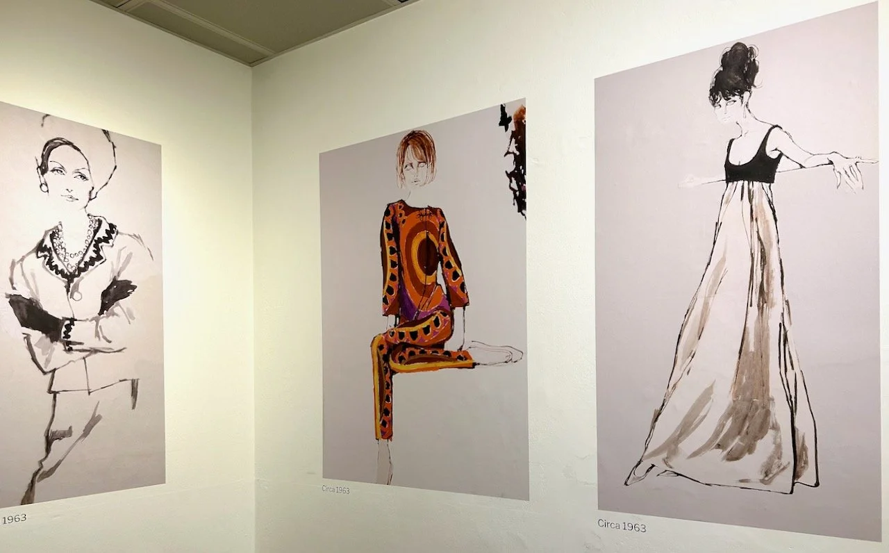
It was in 1963 that Barbara established Biba’s Postal Boutique whilst continuing with her career as a fashion illustrator - and what’s also fascinating to me is how many of these styles, both the formal and more informal designs, could still easily be worn today - and in fact probably are!

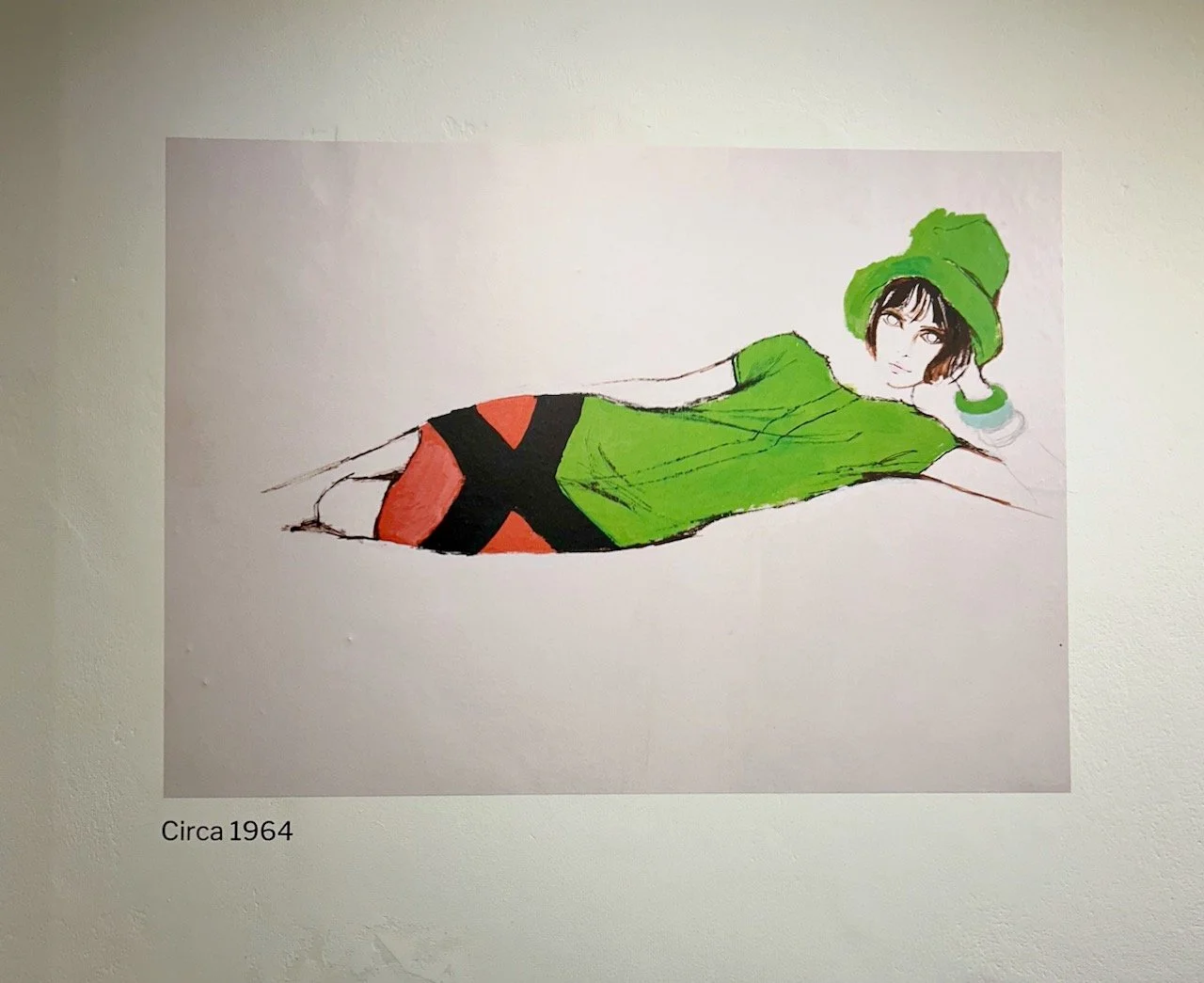
My favourite illustration from this part of the exhibition is the one above. Doesn’t the colour and the design just sing out, and oh to have that much talent for designing and drawing these too.

It was truly a fascinating exhibition, and looking back over my photos, it was great to be able to go along and see so much of the story first hand - I’ll share more next month of the clothes and the Biba lifestyle brand, and I’m sure some of the clothes influenced clothes I wore growing up as even though I wasn’t yet in double figures the styles were very familiar.

Traditional Quilts by Hopkin Rees at the Newark Quilt Show

I’m sharing some more quilts from this year’s Newark Quilt Show and the first few really did make me go wow - and it’s unusual for me to be so taken by the quilting alone, but it really is a work of art.

These whole cloth quilts really are beautiful, and the skill level really is in the quilting rather than the piecing, and then the quilting as the other quilts I’ve shared have been. What I also noticed is that the colour really does make a difference to its impact. By far my favourite was this mustard version, but I’ve also included a green quilt and a grey one - which are equally as detailed, and taking nothing away from them, but for me the impact is less. Take a look and let me know what you think.

But first let me share a little more about the maker, Hopkin Rees who says that craftmanship has been central to their upbringing, and that in their eighty-four years they have had several incarnations of which quilting is the latest.

They’ve been an English teacher specialising in children’s literature, a night school instructor in cabinet-making, a librarian, a marquetarian and a dressmaker. Which is quite a mix!

A 'one piece' quilt in mustard with ornate detailing in the quilting

MUSTARD SCALLOPED NORTHUMBRIAN, HOPKIN REES

They had been expected to go to art college whilst at school, but their father was not in favour, instead preferring going to university with their art being something they could do ‘on the side’, so that’s what happened.

It wasn’t until they married, when they were encouraged by their seamstress mother-in-law who taught them sewing when they expressed an interest, and the happy couple received a sewing machine as a wedding present with ‘which I made clothes for my wife and the children’.

MID-GREEN WELSH WHOLECLOTH, HOPKIN REES

In the show notes they said they couldn’t explain where their urge for quilting came from, but once it started they became addicted and learnt from YouTube and books. In the last ten years they have produced over two hundred quilt items, and latterly have ‘finally been able to express [their] early interest in art and design’ producing amongst other items these traditional wholecloth Welsh and Durham quilts.

A whole piece quilt by Hopkin Rees at the 2025 Newark Quilt Show

GREY SCALLOPED DURHAM, HOPKIN REES

The whole cloth colour totally changes the feel (or vibe if you will) of the quilt - you may not be able to tell from the photo above, but it’s not a plain grey cloth, it’s covered with small white polka dots.

And if you pick up on the fact that the green quilt above has feathers and is also Welsh then the maker says that they’ve included feathers because they love them, even though traditional Welsh quilts rare feature them, if at all. And I think that’s fair enough, your quilt - your rules!

I’ve also included two colourways of the Dahlia quilt, which I think are more my normal go to quilt designs, but even these aren’t straight forward as they had to work out how to extend the Dahlia design to make this into a rectangular quilt by enlarging and echoing the out petals of the template, taking the well known method of ‘hit and miss’ until they got it right - and isn’t it wonderful that they did?

RED DAHLIA, HOPKIN REES

BLUE DAHLIA, HOPKIN REES

The blue dahlia was made first, and blue was chosen as blue dahlias do not exist in nature - I’m sure that if they did, they’d look just as good as this one, and it was great to get the opportunity to view these quilts from a very talented, and versatile maker.

Dismantling a fabric sample book

Before we moved I stumbled across a bargain selection of fabric sample books, which I tried to ignore. But the fabric patterns and designs kept calling my name and so I became the proud owner of three fabric sample books, or as they became known - another b****y thing to move!

Well recently the time came when they called my name again, but obviously in the book they weren’t a whole lot of use to me - and so I decided to dismantle one, thinking how hard can it be?

The short answer is - quite hard.

In the end I needed some of MOH’s tools, some of his strength and also the encouragement to keep going.

There was a lot of strong glue, and multiple layers of staples. The middle ones were easier to remove than the end ones - and so they stayed and I cut the material around them.

But I got there, and it was worth it - just look at the material I freed!

And that’s from just one of the sample books, though I think I’ll leave the other two for another time!

There was still more to do though as even though I’d got the fabric out of the books I still needed to remove the paper border on the reverse of each piece. I was less successful here though as the paper I did get off didn’t come away cleanly. I tried soaking, and peeling carefully - but it was a lot of work, so in the end I settled for trimming the edges, which was a shame. Frustratingly one of the other books I tried the paper backing came off much more easily!

But I now have another pile of fabrics to refresh my stash, and right now which I don’t have any firm plans for - though the mustard ones are calling out to be a pouch, but I’ve not found the right question yet! The greys and neutrals may make their way into my ‘grey collection’ for my floral fancy extension, but I think I want to use some of the other pieces first before I commit.

But as ever, the possibilities are endless - and promise to be pretty creative too.