Chevrons and vertical spaces at the Ideal Home Show

This is the last post sharing the room sets from this year's Ideal Home Show and follows on from the kitchen and dining room last week and the bedroom and bathroom the week before.  So which two rooms are left, and which features chevrons, and which makes use of its vertical spaces?

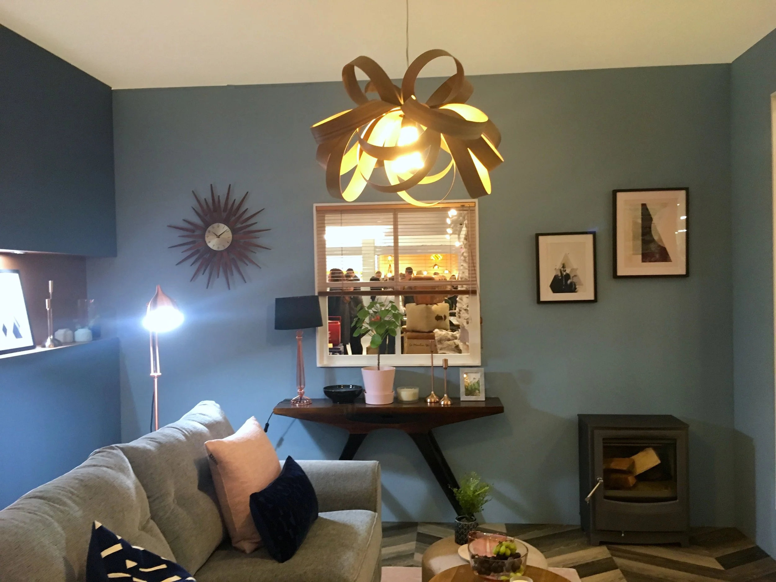
You might have guessed that one of the rooms is the living room, and you'd be right. This room set marries blues, greys, pastel pinks and copper accessories against a bold chevron patterned floor.

A cosy corner in the living room at the Ideal Home Show roomset

It's a room full of shapes too. The diagonals of the chevrons, the square and oblong cushions and the rounded table and pouffe. And there's plenty of places to put your nick-nacks; a trestle table and an inbuilt faux pastel pink shelf.

trestle storage under the window  in the living room at the Ideal Home Show roomset

I told you it was a bold floor didn't I? 

An armchair against the chevron floor  in the living room at the Ideal Home Show roomset

But somehow the floor is another way to add texture to the room without overpowering the space - it just goes to show that if you go bold with your flooring, then while you don't want to add too many patterns, you don't need to be ultra safe either.

Shedding some light  in the living room at the Ideal Home Show roomset

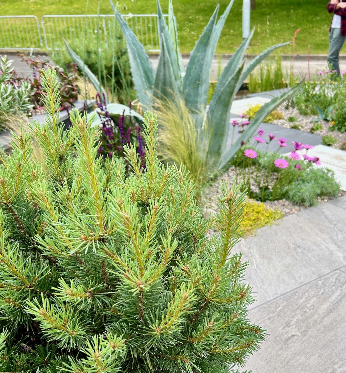
The final room set, could be classed a bit of a cheat, as it's an outside room. But it's a space that more of us would love to make better use of, weather permitting. You'll not be surprised to know that I loved the bright colours and it's a space that I feel would zing with energy. 

A colourful place to sit  in the living room at the Ideal Home Show roomset

It's also the space that makes good use of the vertical space in a way that many of us could adopt. I like the modern slats, although now I think of it they do also remind me of the old fashioned lath and plaster too!

making use of the vertical space  in the living room at the Ideal Home Show roomset

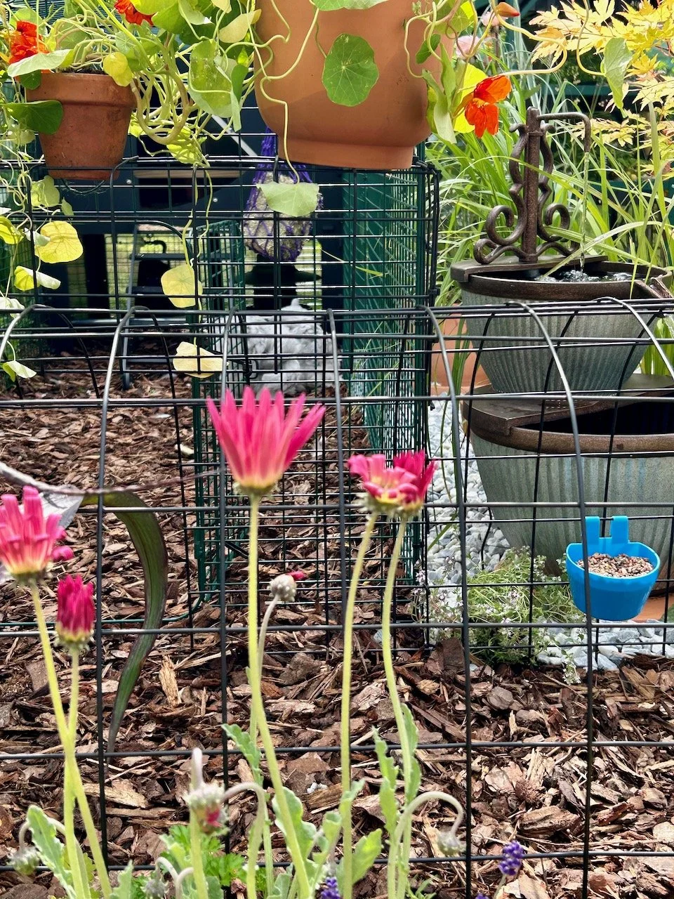
It was good to see that the copper trend is still strong, the longer it's here the more it grows on me. And while I've been slow to adopt this, now I think it's hard to avoid it.  I don't think this is the most practical space as where would you put all those cushions overnight?!

touches of copper and a barbecue  in the living room at the Ideal Home Show roomset

So there's all the room sets, there's been some great rooms and looking back I wonder why it took me so long to share them!  Of the six rooms, which was your favourite?

Aubergine, petrol blue and grey patterned tiles at the Ideal Home Show

After sharing the bedroom and bathroom room sets last week, this time it's the turn of the kitchen and dining room. Both of which have similarities, with deep colours, grey patterns and wood. Let's start in the dining room, where the wools have an aubergine feel to them. The unusual addition for me was the green chairs, initially I thought no, but they grew on me.

all of the roomset's features in one shot

It was the floor though that was the real winner for me - just look at those tiles. And actually it's the green chairs that make it all hang together, so it just goes to show that sometimes doing something out of the ordinary - and out of what you think your colour scheme is, or should be - makes it work.

Just look at that floor in the dining room set at the Ideal Home Show - isn't it gorgeous?

I liked the clever wood storage, close to the wood burner. I can see it would avoid arguments about whose turn it was to venture outside and get the next batch of wood for the fire!  Although if we had a wood burner, it would clearly be MOH's job, I mean... man, fire, enough said.

inbuilt wood storage that will prevent arguments about who has to go into the cold to get the logs!

You'll remember we contemplated many wooden tables and eventually ended up with a white glass table (yes, it makes no sense, but we fell in love with it), and we were also contemplating a mix of chairs and benches, so it was good to see them still around.  I liked the glass fronted storage too, and MOH renewed his campaign for new dining room lights.  I'll admit they would go in our space, with our table but I think it restricts how we could use the space, even more than our existing light.  

So he's still unsuccessful, but the room was a hit for us. And I knew if I tried for long enough I'd find a kind of aubergine he liked!

bench seating and storage in the dining room set at the Ideal Home Show

And a winner of a kitchen too

Our kitchens in this house have both been high gloss and they suit our space. This wooden unit and splash back is the closest we've seen to a kitchen that would work. I liked the nod to the grey tiled flooring behind the cooker, but MOH was bemused by the knobs that the chopping boards were hanging from, and the crockery spacers in the open draw.

Peeking into the kitchen roomset at the ideal home show

The big central island was a dream, and full of storage too. One day (I hope) I'll have a kitchen that can accommodate something like this. And a huge larder storage too.  I'm sure though my kitchen would never quite look so well put together, or as tidy, but I'm ok with that as it's a room set and not a real room...

A large central island in the kitchen roomset at the ideal home show

And everyone knows the best cooks are messy cooks, and those that use every utensil you own, right?  Well that's what MOH says anyway!

What do you think - could you live with either of these rooms, or elements from them?

Home Etc

The bedroom and bathroom room sets at this year's Ideal Home Show

Unbelievably I visited the Ideal Home Show almost five months ago - I'm not sure where the time has gone. Equally as unbelievable is I've shared very little from there, and from the Grand Designs show a month later, here until now.  Over the next few weeks I'll share the room sets, the houses and the garden sets from both shows, because, well because it's a great way to see the interior trends, and there's nothing better than having a look at how someone else decorates is there?

This week I'm starting with the bedroom and bathroom room sets and the rest of the rooms will follow.  I talk a lot about texture here on the blog so you can imagine my delight when I saw this bedroom stuffed full of textures, and with a yellow back wall to boot. The faux wall was an interesting idea that could work well in the right sized room.  It provides a great focal feature which you can frame, as they've done here, with a bold colour.  I'll not tell you what's behind there until later.

The bedroom room set at the Ideal Home Show
 
Textures galore in the bathroom room set at the Ideal Home show

Yes, this bedroom was all about snuggly texture. The throw on the bed is just insane isn't it?

I also liked the simplicity of the seedhead wallpaper and how the muted colours and patterns all worked together, but I think that string of pom poms on the headboard would be a real dust collector.  The bedside tables are also a design hit with me, the A frame works well doesn't it?

A side table by the bed at the Ideal Home Show

Every bedroom needs a mirror and somewhere to put stuff and this bedroom managed that stylishly too. Although not copper, the mirror perfectly complements the copper hairbrush and eyelash curlers. I never knew copper had become some entrenched, and it looks like it'll be around a while longer doesn't it, but... copper eyelash curlers?  I don't possess any (curlers not eyelashes) but I've a feeling I might need these...

A mirror above a chest of drawers at the Ideal Home Show

And behind the wall?

The cutest office space. With room for a desk and chair, and a brightly coloured rug it looks a completely different space doesn't it? And a very clever way of keeping a workspace out of sight. Although this one is pretty enough to actually be on display...

A false wall conceals an office space at the Ideal Home Show

The rug fits well with the seed head wallpaper too and I think brings the space together.  I'd happily find room for this in my house too. Along with that tower of white drawers, although I'd resist adding labels and then never remember which drawer I put anything in.

A closer look at that patterned rug at the Ideal Home Show

Even now looking back over these pictures I love that bedroom. MOH didn't like the big chunky throw, but he wouldn't need to have any of it would he?  So moving on...

To the bathroom

A completely different look here, and a dramatic one too. I've seen lots of black and white in bathrooms, and there's a good reason for that, and that's because it works. This one has touches of grey, wood and metallics as well as plants. Of course it's completely unrealistic size-wise but there's some great ideas here too.

Classic black and white in the bathroom room set at the Ideal Home show

I like the inbuilt tiled shelf for pots and jars - but only stylish ones obviously, and the black ladder towel rail against the black wall. You'd think it wouldn't stand out, but it does.

double black sinks in the bathroom room set at the Ideal Home show

With the bath in the centre of the room there's another faux panel to frame it and add decorative touches. We'd never be able to have such prettiness in our bathroom as I'm sure it wouldn't last too long before being knocked to the floor. I'm not usually a fan of standalone baths, but I like this one with its own wall close by.

the shower cubicle in the corner of the bathroom room set at the Ideal Home show

So there's the first two room sets, both inspiring, but both very different. What did you think? Would you - or do you - go for either of these styles?

Home Etc