This is the last post sharing the room sets from this year's Ideal Home Show and follows on from the kitchen and dining room last week and the bedroom and bathroom the week before. So which two rooms are left, and which features chevrons, and which makes use of its vertical spaces?
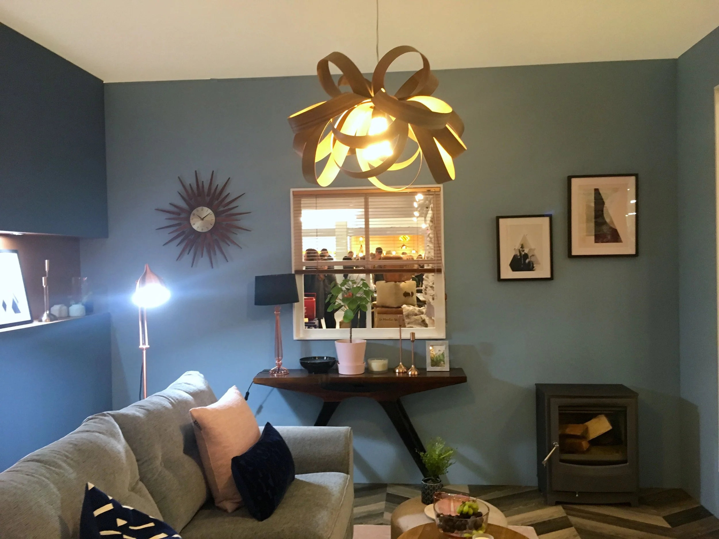
You might have guessed that one of the rooms is the living room, and you'd be right. This room set marries blues, greys, pastel pinks and copper accessories against a bold chevron patterned floor.
It's a room full of shapes too. The diagonals of the chevrons, the square and oblong cushions and the rounded table and pouffe. And there's plenty of places to put your nick-nacks; a trestle table and an inbuilt faux pastel pink shelf.
I told you it was a bold floor didn't I?
But somehow the floor is another way to add texture to the room without overpowering the space - it just goes to show that if you go bold with your flooring, then while you don't want to add too many patterns, you don't need to be ultra safe either.
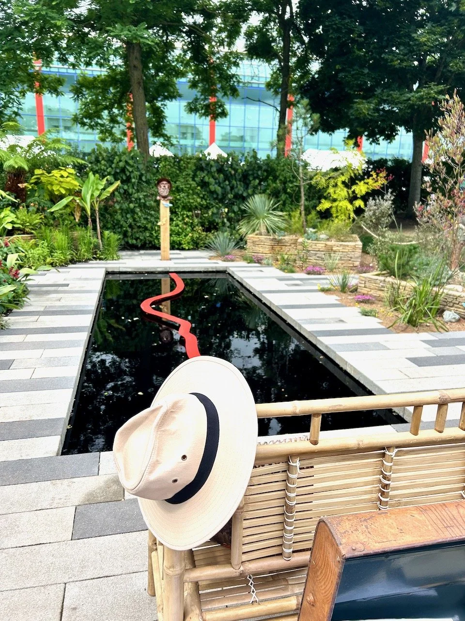
The final room set, could be classed a bit of a cheat, as it's an outside room. But it's a space that more of us would love to make better use of, weather permitting. You'll not be surprised to know that I loved the bright colours and it's a space that I feel would zing with energy.
It's also the space that makes good use of the vertical space in a way that many of us could adopt. I like the modern slats, although now I think of it they do also remind me of the old fashioned lath and plaster too!
It was good to see that the copper trend is still strong, the longer it's here the more it grows on me. And while I've been slow to adopt this, now I think it's hard to avoid it. I don't think this is the most practical space as where would you put all those cushions overnight?!
So there's all the room sets, there's been some great rooms and looking back I wonder why it took me so long to share them! Of the six rooms, which was your favourite?
