Inspiration at the Ideal Home Show

One of the challenges about writing a single post about my visit to the Ideal Home Show has been exactly what to put in it.  I mean, there was so much to see, and I tried my best to see most of it, which meant so many photos.  But I think I'm there with a highlights post, though there will be many more posts to come in the coming weeks, because you know how much I like a room set.

In fact I like them so much that the first set of photos were from the Good Homes Magazine room sets.  I might very well have been swayed by this yellowy-goldy-mustard chair in the bedroom room set, but that was my room set of choice. Throughout the show though there were brightly coloured armchairs, so watch out for those becoming a thing (if they're not already).

The bedroom room set at the Idea Home Show

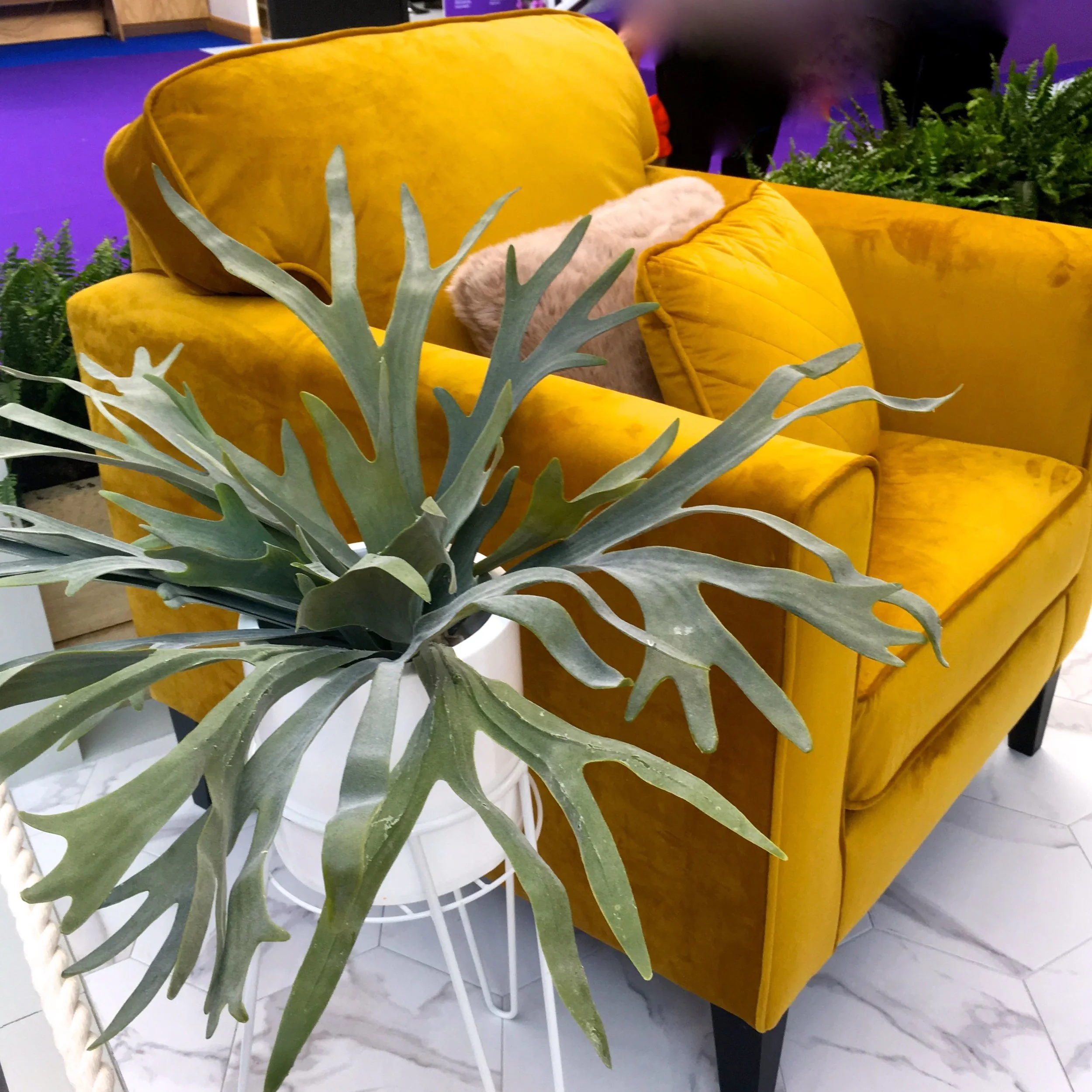
The picture below is also from the bedroom room set and as well as the pom poms - I've already said here that I expect these to be big this year, and my visit to the Ideal Home Show only confirmed that - there's the mix of textures that just make a room work. The suede footstools, the wooly blanket and the textured rug.  All of these calming colours might not be what you'd pair the yellow chair with, but it really did work. 

Pom Pom edging in the bedroom room set at the Ideal Home Show

I'm also partial to some clever storage and the kitchen room set had this built in on one of the ends of the kitchen cabinets. When storage is functional and stylish then that's a winner in my book.  I'll share more soon, but the kitchen was dark and moody so the copper and metallic accessories really did shine.

Stylish storage in the kitchen  room set at the Ideal Home Show

The room sets were just inside the main entrance so really were one of the first things you saw as you got into the show, and it was quite a welcome. The bathrooms are often my least favourite spaces as because they're often the most unrealistic space wise - there's a reason that bathrooms are often referred to as the smallest room, isn't there?

This year though I was blown away by the bathroom and it's feature wall -  I later discovered there were extra kitchen and bathroom room sets as a bonus, and I may be changing my mind about them being my least favourite room set.  The patterned feature wall was stunning and would work equally well in a less generous and more usual sized domestic space too, and really give some character to what can often be a functional and formulaic space. 

A SHOWER WALL WITH A DIFFERENCE

A SHOWER WALL WITH A DIFFERENCE

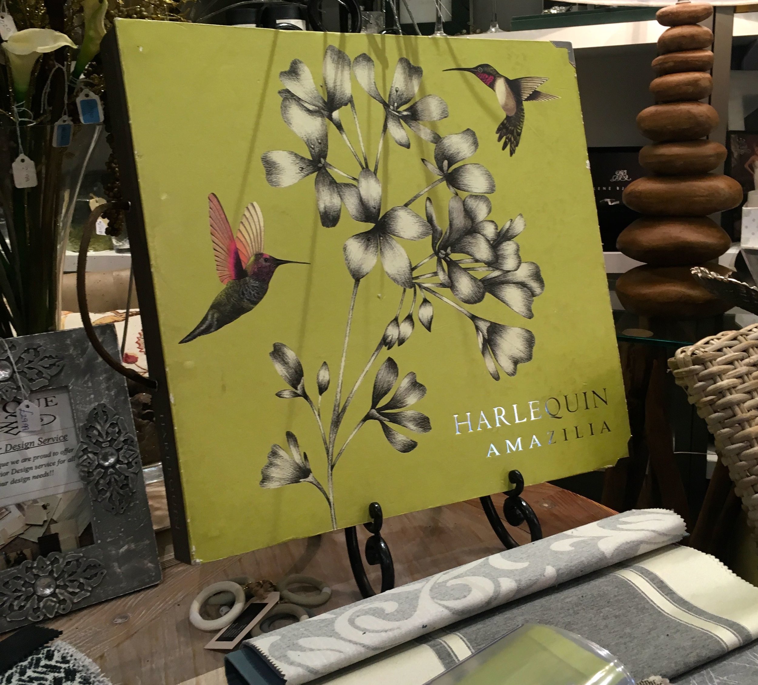
Before heading over to the houses to check out the length of the queues there, I found myself at the Furnish Your Home stand, which was full of ideas and items to live up to its name.  I thought I'd choose an item or two from their stand to share with you too, but as ever that was easier said than done.  There were items like these geometric lights which would make a great statement either in a hallway or over a dining area and bring a modern touch to any space. 

Geometric lights on the Furnish your home stand at the Ideal Home Show

Or maybe this sleek and stylish desk which would easily fit into and enhance a corner of most rooms, and double up as a console table when the laptop was put away.  I think it's the type of piece that I'll be trying to accommodate at a future date, as having somewhere so stylish to work could only improve my outputs, right?

A stylish desk that would add elegance to any space on the Furnish your home stand at the Ideal Home Show

I mentioned earlier that feature armchairs were very much a thing, and this bold patterned brass chair, brass unit and wallpaper really made a statement. It really does show that if you go bold, you should go really bold and reap the benefits.  This evokes a vision of a warm, snug and cosy room for me, perhaps a masculine room, but definitely one that would be great for cocktails - make mine a Manhattan!

Brass and bold patterns on the Furnish your home stand at the Ideal Home Show

The other thing I noticed at this year's show was mixed metallics.  There was the copper jars and gold patterned mugs in the kitchen photo above, but also on the Furnish Your Home stand there was a silver mirrored chair adorned with a gold fabric cushion right alongside a rose gold console table.  If you'd described that to me I might have scrunched my nose up, but it looks a whole lot better than I could have imagined.

Mixed metallics on the Furnish your home stand at the Ideal Home Show

Leaving the Furnish Your Home stand behind me I finally made it to the houses. The queues were short - phew - and I couldn't help but be reminded of the bubble hedge at Houghton Hall with this one outside the Innovation House with its interior designed by Sophie Robinson.  While it looks real, it's actually faux box and I think is a great way to add interest and kerb-appeal. 

A faux cloud hedge outside the Innovation Home at the Ideal Home Show

Inside there was a riot of colour,  and I'm saving that for another day. My favourite shot though was this one from the nursery, not quite what you'd call traditional either is it?

Love the colour on this wall in the Innovation Home at the Ideal Home Show

Elsewhere around the show there were many things that caught my eye, I've narrowed those down to just four:

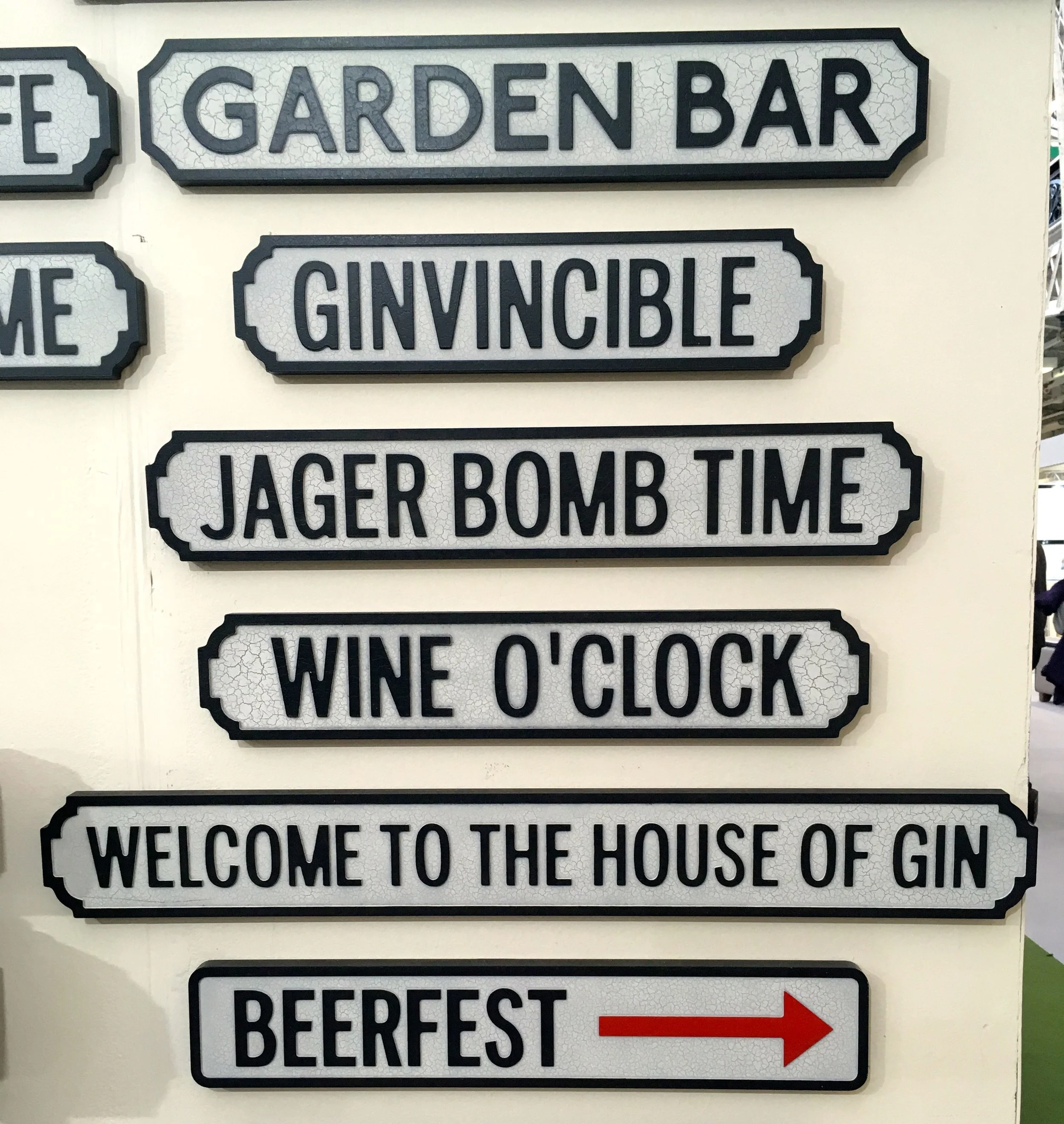
1. Fun garden signs, but which would would you choose?

Signs at the Ideal Home Show

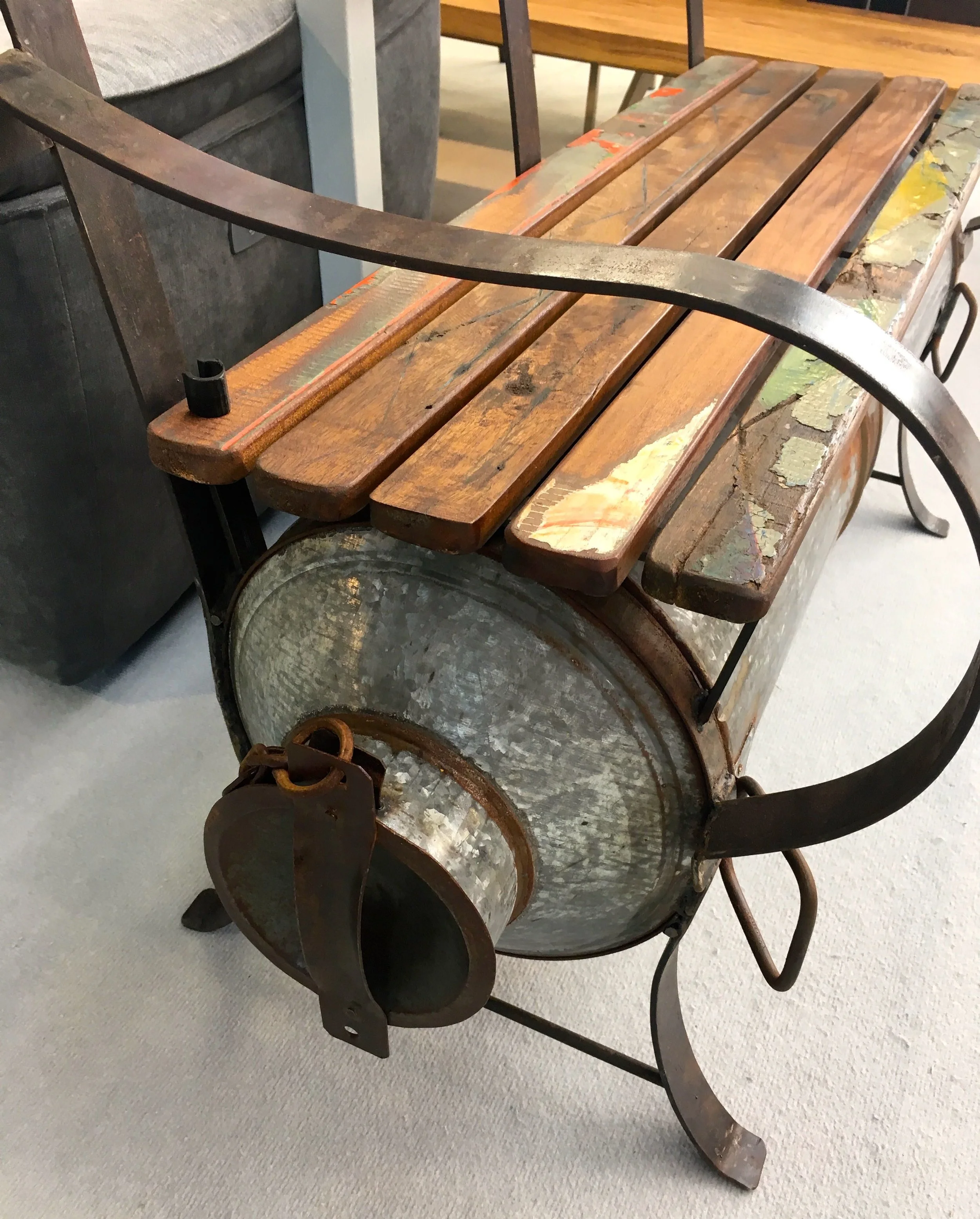
2. An upcycled bench incorporating a milk churn and recycled wood

An upcycled milk churn bench at the Ideal Home Show

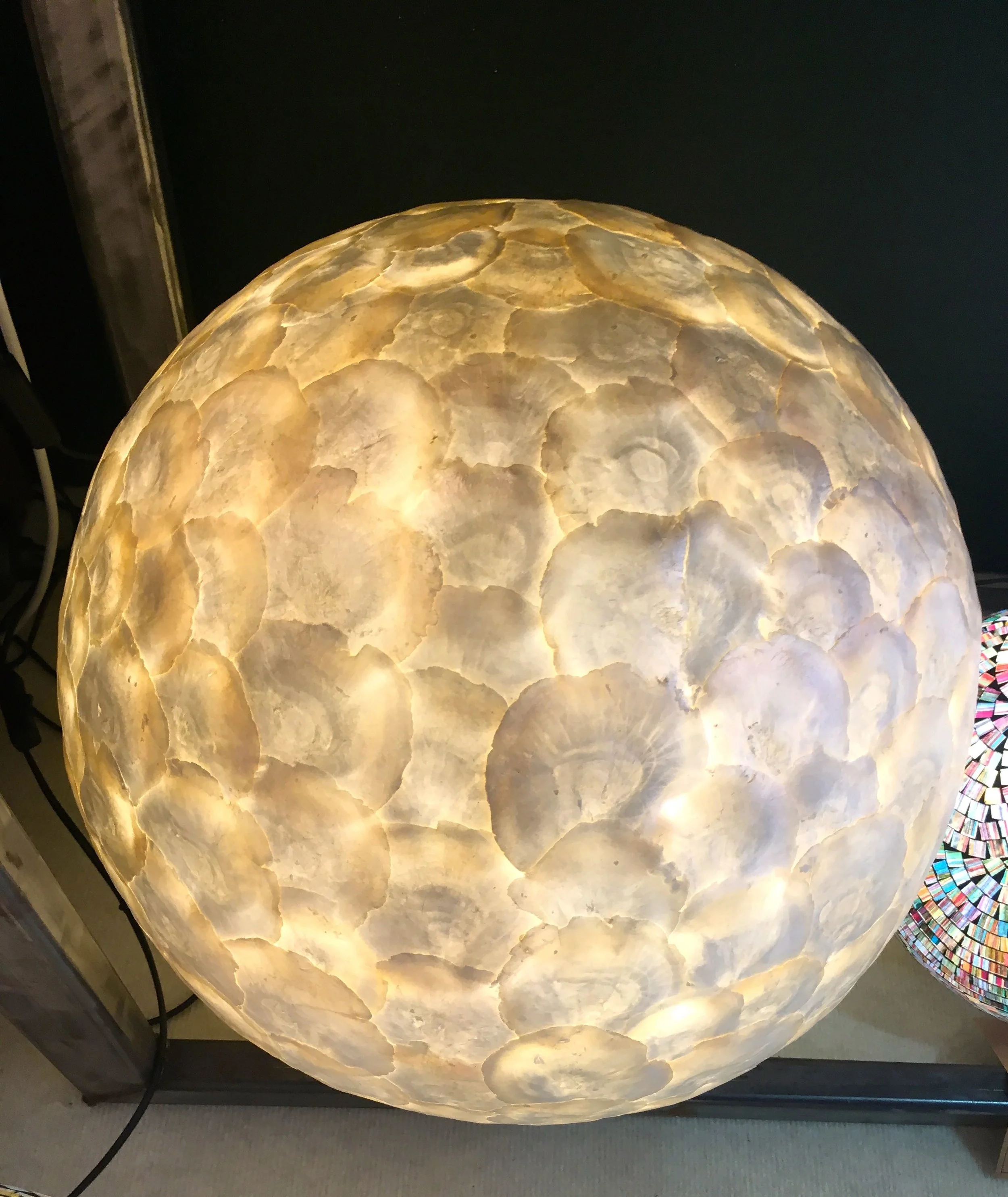
3. Handcrafted and responsibly sourced Oyster shell lights

Beautiful indonesian lights at the Ideal Home Show

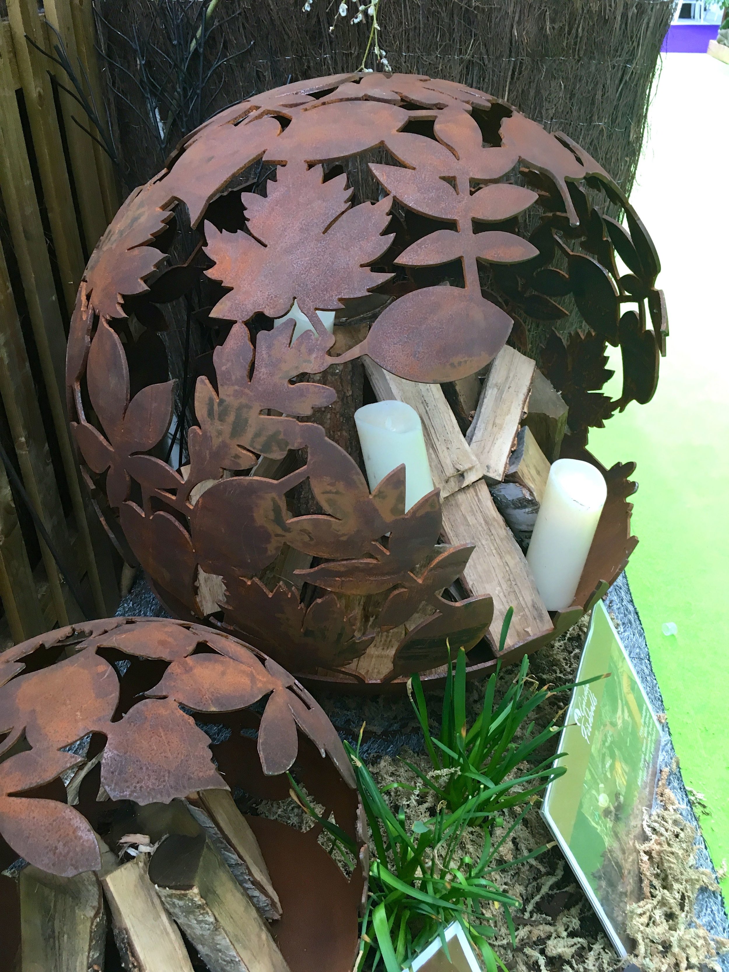
4. The stunning designs of the Garden Fireballs

Steel fire balls at the Ideal Home Show

So quite a visit, and that's only part of it - there's much more to come!

Home Etc


This is a collaborative post, but all views and opinions are my own.

Chock full of interior delights

Today I'm sharing another Norfolk gem, and one that's just down the road from my parents so it's always nice to find time to pop in and have a look around if I can. And last weekend, I could.  This interiors haven is Unique and is based at Norfolk Lavender in Heacham, one day I'll need to do a post about the lavender - but I'll need to time that right.

It's the type of place that is stuffed full of interiors goodness, from material books, pictures, lights, sofas, furniture and as you'll see even a bath. It's impossible to see everything, but somehow it just works - although on this visit I was sure it looked smaller, but mum was probably right when she said there was even more in the shop than normal. 

There's a single file trail which leads you around the shop, luckily we had the place to ourselves although a lady did time her welcome so as not to startle us.  It's that kind of place.

I was drawn to the chartreuse of this, what I thought was a picture, but as I got closer realised it was a harlequin sample book. I liked it nonetheless, and so it's in this post, and even now I think it would make a great picture.  I didn't look any closer as I knew that pausing, exploring and touching would make an emotional connection I couldn't commit to carry through.

Attracted by the chartreuse and humming birds
 
layers of accessories

And no sooner had I escaped the clutches of the Harlequin hummingbirds I was faced, head on, with a slipper bath.  It was gorgeous but not (well not for me anyway) an impulse purchase.

there was even a bath in the showroom

Leaving the bath behind my next magpie stop was this brightly striped and what I can only describe as funky bow-shaped chest. Isn't it gorgeous?  The top looked like lacquered teak and I couldn't help but have a stroke of this. I knew that while I loved this, I'd struggle to sell it to MOH, especially as when I got close up I could see the cream border to the top had a bit of shabby chic about it. We often joke that MOH thinks this style needs a good rub down and a proper paint...

A stripey upcycled chest caught my eye

It's not for this house (not that I have another house, or even one on the horizon) but it's definitely thought provoking and no less gorgeous for it.  As we carried on around the shop, single file as the displays permitted, I realised that pictures weren't just on the walls or leant on dressers, they were also on the floor.  This stag was taking refuge behind a modern white table, and he almost got away unnoticed.

pictures weren't just on the walls

As you can see, it's a sight for interior eyes - where to look first, and then where next. Now you understand why you can't possibly see everything on a single visit.

lights of all sizes and styles

It is a place where your senses are overwhelmed (in a good way) but even amongst this there are moments of calm and serenity.  This visit, like so many before it didn't dissapoint - I mean, with this much interiors goodness, how could it?

Intermingled were more calming spots too

You have to look up, look down, and look everywhere to see what's on offer - and just as we were leaving, looking down this pom-pom cushion caught my eye. I'd already walked past it on the way in, but had only spotted it on second viewing, so my tip for exploring places like this is to go regularly, and do at least two circuits of the shop.

Fun elements too - now I want a cushion with pom poms

They might think you mad, but I can guarantee you'll see more each walk round you do. 

...However to save my purse I was quickly ushered out of the door after the first round of viewings, this time - but who knows what may happen on another visit?!

Home Etc

Hello March!

And from the looks of things, or at least those things influenced by my stationery gift box, March is going to have a tropical, but pastel feel to it. If I'm honest, pastels aren't really my thing, they used to be. In the 80s they were a thing before the fluorescent trend, and I think I had my fill then. 

I loved wearing them at the time, but perhaps it was the scars from the pale pink dress I was wearing and refused entry to a nightclub I was trying to get into on Canvey of all places, that did it for me and pastels.  Nothing to do with the fact that I was way too young to be in the said nightclub, and despite being practice perfect on my fake date of birth I fluffed it when asked, no it was all to do with the pastel dress. Not even my white canvas boots helped, ah well, I'm sure I didn't really miss out...

A pastel ensemble for March's Papergang subscription box

There is so much detail in this month's Papergang box, the picture above was just the sleeve that it arrived in, sharing its Palm Springs look for anyone that cared to look.  The month card has a more prickly feel to it, the designs I mean, not the actual card as that would be wierd.

As I've come to expect - the month's view

I'm learning that these are boxes that I'll just need to start using, I've a couple of weekly jotters/planners now and they are just too pretty not to use. It might seem strange but the hit with me this month was the pencil, with it's gold lettering of "Road trip plans" as that really is on my to do list, as our holiday to the States this autumn won't plan itself will it?

A look at the contents of March's papergang box

Palm Springs isn't on our list for that trip, but if they have pink polar bears - that is a pink polar bear right? - then maybe it could be an addition...  I've no idea where or how I'm going to use these stickers, perhaps I should be adding them to my blog notebook, which I've diligently and rather obsessively drawn squares on, just to cater to my need to tick things off a list. 

I really do have tick boxes, I just need to work on those ticks...

What do you think of the March Papergang box?  It's the second of the boxes I've shared here, I've already shared the box for February and I'm waiting for the right time to share, the final box in my gift subscription, April. All I'll say is it's a bit pink, it arrived early again and I'm already wondering if I should continue with this for another few months.

I mean, I don't need more stationery, but need doesn't really come into it with pretty stationery does it?

PoCoLo