The final two - and my favourites - in the Grand Shed Project

Last week I shared some of the sheds from the Grand Shed Project - there was somewhere to read, somewhere to party and and indoor garden - today I'm sharing the final two, and I think I've saved the best until last.  Both are ideas that I can't see happening with MOH's shed, which is the traditional shed and despite me having several attempts at tidying and organising, somehow it still gets dishevelled and rummaged through, and he can't find a thing in it.  You'd think the labels on the plastic crates and storage boxes would help, well they would if things were put back in the right one!

1. The Sewing Shack

But anyway, maybe one day I'll have a sewing shed - how fabulous does that sound? And how luxurious?

Inside the Sewing shack - a shed in the grand shed project at grand designs live 2017

And it looked so spacious, even with a table, a wardrobe and an easy chair.  Plus some great ideas, look at the front of the wardrobe - or fabric store.

Looking into the grand shed project at grand designs live 2017

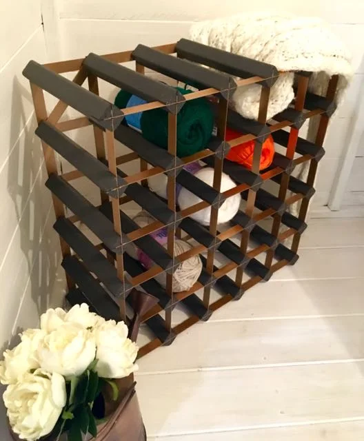
There was a novel storage for wool too, though I'm not sure I can see that catching on in this house. Our wine racks are used for more traditional items.

A novel use for a wine rack - but not sure it'll catch on!
Craft items in the sewing shack, one of the grand shed project at grand designs live 2017

That quote - I've had a couple of those unique creations!  I'll be getting my sewing machine out again shortly (in case you're wondering I've made little progress with my scrappy quilt and I'm hoping to get back to that soon) as I've plans to make some bunting, much to MOH's dismay and perpetual state of eye-rolling every time I mention it. It's because of this reaction that I'm determined to make some, not that I'm stubborn at all...

A blackboard is a great addition to the Sewing Shack, one of the grand shed projects

I think what really appeals to me about the Sewing Shack is having somewhere that is just dedicated to sewing and crafts. I call our study my craft room, but occasionally MOH makes a bid back for it as a study and a work from home space, which never goes well. 

He thinks it's cluttered (it is - I need a bigger space) and doesn't understand why I need all that junk. That is until he wants a piece of card, a bit of string or whatever and I disappear returning with the said item in hand.  It's organised to me, but just imagine not having to share it with anyone. Pure bliss.  

And I imagine a lot more productive than my current space.  I'll keep dreaming...

2. The Boutique Bedroom

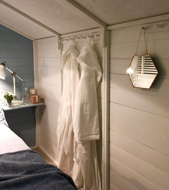
The last shed I'm sharing from this year's Grand Designs Live is a bedroom, and a rather stylish one at that. Totally impractical and without an en-suite I can't see it catching on. But the muted colours of the decor gives plenty of inspiration for the more usual kind of bedrooms. The thing that struck me about this shed as I leaned as far into it as I could, was the amount of texture in a relatively small space.

Inside the boutique bedroom, one of the grand shed projects at Grand Designs Live 2017

It was good to see hints of copper still in evidence, with the mirror hanging on the wall and the items on the bedside table. And those dressing gardens would come in handy wouldn't they for the hop up the garden.

Somewhere to hang your dressing gown in the boutique bedroom grand shed project
 
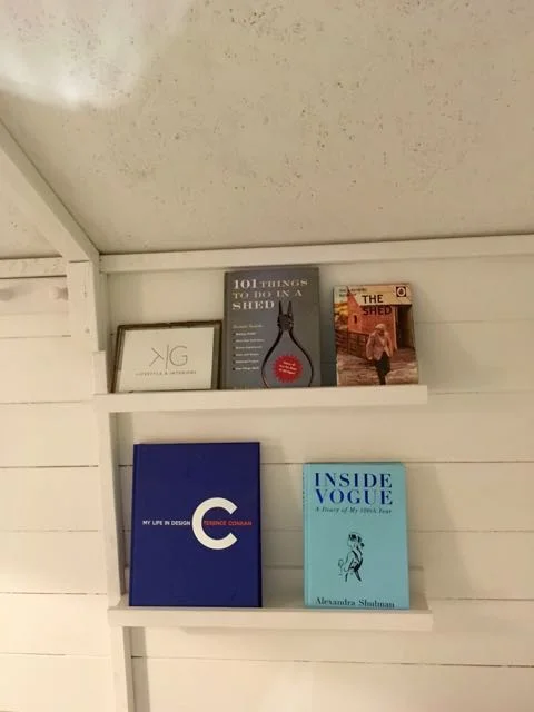
I was glad to see the 101 things to do in a shed book make an appearance in the grand shed project

There were bookshelves too, and I was pleased to see the title "101 things to do in a shed" which I bought once for MOH - I think I've cleared it out too, as the title was the most interesting thing about the book!  But a shed exhibition without it, it wasn't going to happen was it?

So now you've seen all the sheds, which is your favourite? 

Grand Shed Project: Somewhere to read

This shed screams pure indulgence doesn't it? A place to read undisturbed, and somewhere to lose yourself in a good book.  I think the snug effect is helped by the dark, chocolatey brown colour inside. The metallic touches add highlights and gives a luxe finish.

The reading snug one of the grand shed projects at Grand Designs Live 2017
 
Somewhere to read undisturbed, looking at the reading snug The reading snug one of the grand shed projects at Grand Designs Live 2017

I think it would be a great place to escape to, but it does seem rather indulgent, and I think I'd struggle to keep it for its intended purpose.

dark wood helps make this reading snug, well, snug

But I do like the idea of a dedicated space to read, and like the sheds in the first of this series of posts, it certainly challenges what a shed could be for doesn't it?

shelves of books and a birdfoot candlestick in one of the grand shed projects at Grand Designs Live 2017

What do you think, could you justify - and, or keep - a dedicated reading space?

Two of the Grand Shed Projects at Grand Designs Live

I love to visit Grand Designs at Excel and as you'd expect look forward to the gardens, this year though, there was something a little different. There were sheds, and while these were fab - some of them were beyond shed-tastic - I felt the garden element was missing this year. 

That said I'm still going to share two of the sheds here today, so you can see what you think.  I'll share the others in future posts, as they really were something quite different and shed-blowingly different.

1. Bringing the outdoors in, Liam Sapsford

Liam was last year's Grand Designs Designer of the Year and designed the garden space around each of the sheds. It was a lovely space, as you'll see, but not quite what I expected. His shed though, was something else which stood out for the moss "pictures". 

A 3D moss picture by Liam Sapsford at Grand Designs Live 2017
 
A 3D moss "picture' by Liam Sapsford at Grand Designs Live 2017

Aren't they great? 

A really unusual way of bringing some greenery indoors and adding texture at the same time, and the moss pictures especially are low maintenance too.  The shed itself aims to blur the lines between an indoor and outdoor space, hence the name, and aims to deliver a garden space that can be used all year round.

Bringing the Outside in  by Liam Sapsford at Grand Designs Live 2017

A nice idea and beautifully done, but I suspect the biggest problem about sheds in the winter is that they're often at the end of the garden, and it's the getting to them that's more of the problem.

2. South Beach Miami

This shed designed by Garden Hideouts is "a place for busy women to escape to" and transport themselves to Miami complete with a dose of colour, fun and escapism. And it certainly does look a good place for cocktails doesn't it?

Cocktails on the sofa in this South Beach Miami Grand Designs Shed project
 
Good times neon sign in the south beach miami shed project at grand designs live 2017
A look at the interiors of the South Beach Miami grand shed project at grand designs live 2017

Two very different sheds, and definitely decor to challenge our preconceived ideas of sheds - I think we should all have one, what do you think?