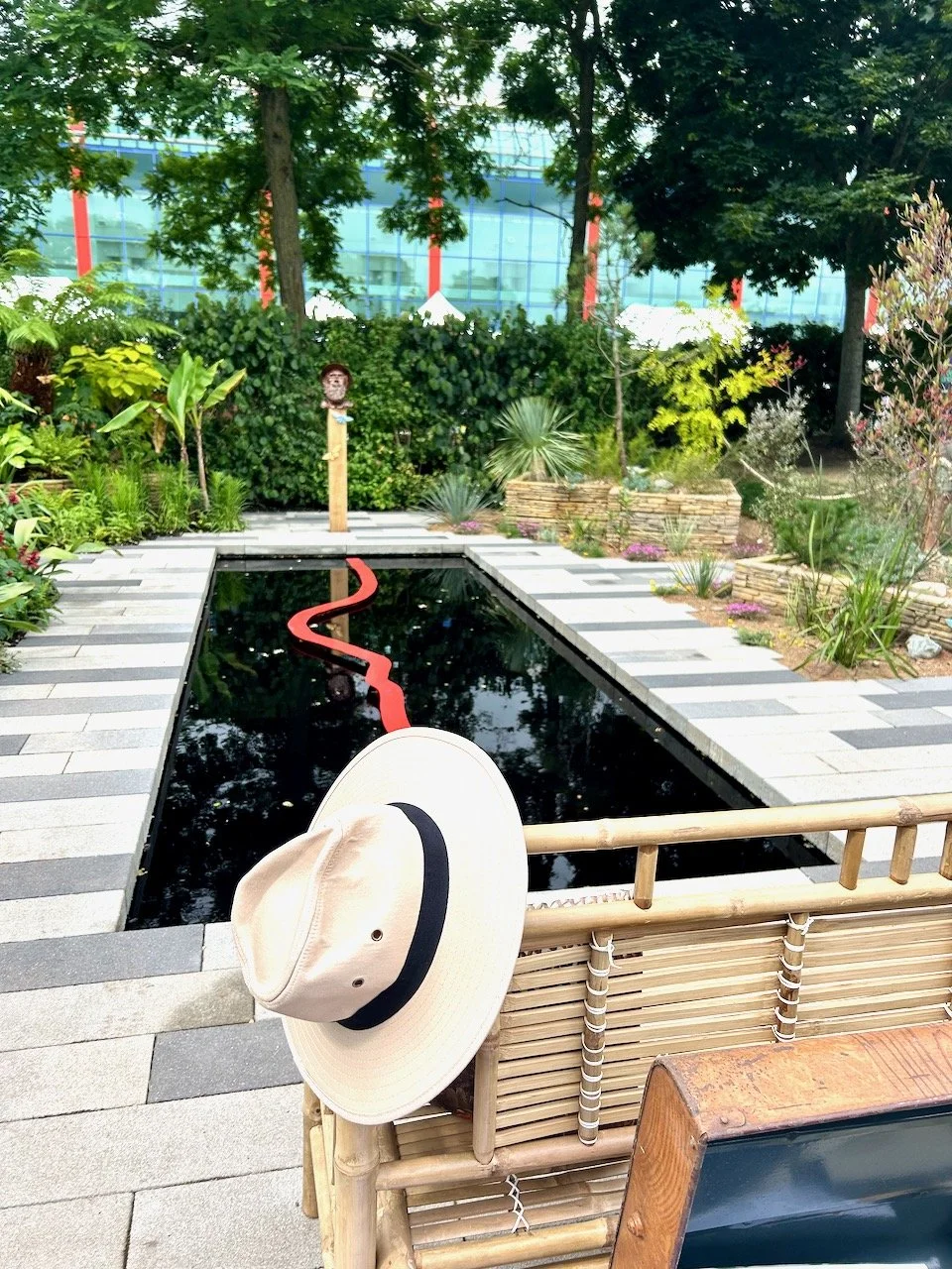
I love to visit Grand Designs at Excel and as you'd expect look forward to the gardens, this year though, there was something a little different. There were sheds, and while these were fab - some of them were beyond shed-tastic - I felt the garden element was missing this year.
That said I'm still going to share two of the sheds here today, so you can see what you think. I'll share the others in future posts, as they really were something quite different and shed-blowingly different.
1. Bringing the outdoors in, Liam Sapsford
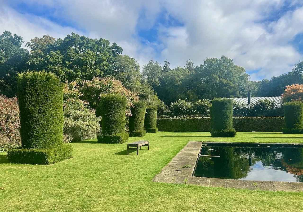
Liam was last year's Grand Designs Designer of the Year and designed the garden space around each of the sheds. It was a lovely space, as you'll see, but not quite what I expected. His shed though, was something else which stood out for the moss "pictures".
Aren't they great?
A really unusual way of bringing some greenery indoors and adding texture at the same time, and the moss pictures especially are low maintenance too. The shed itself aims to blur the lines between an indoor and outdoor space, hence the name, and aims to deliver a garden space that can be used all year round.
A nice idea and beautifully done, but I suspect the biggest problem about sheds in the winter is that they're often at the end of the garden, and it's the getting to them that's more of the problem.
2. South Beach Miami
This shed designed by Garden Hideouts is "a place for busy women to escape to" and transport themselves to Miami complete with a dose of colour, fun and escapism. And it certainly does look a good place for cocktails doesn't it?
Two very different sheds, and definitely decor to challenge our preconceived ideas of sheds - I think we should all have one, what do you think?

