Big Ideas: A pastel pink kitchen

I seem to be having a pink phase here at the moment, with three of my last four posts definitely having a rosy theme to them. Which bizarrely is completely unplanned. These type of happy coincidences are the kind of thing that completely fascinate me, strange how they can happen unexpectedly and then suddenly you’re very aware of them.

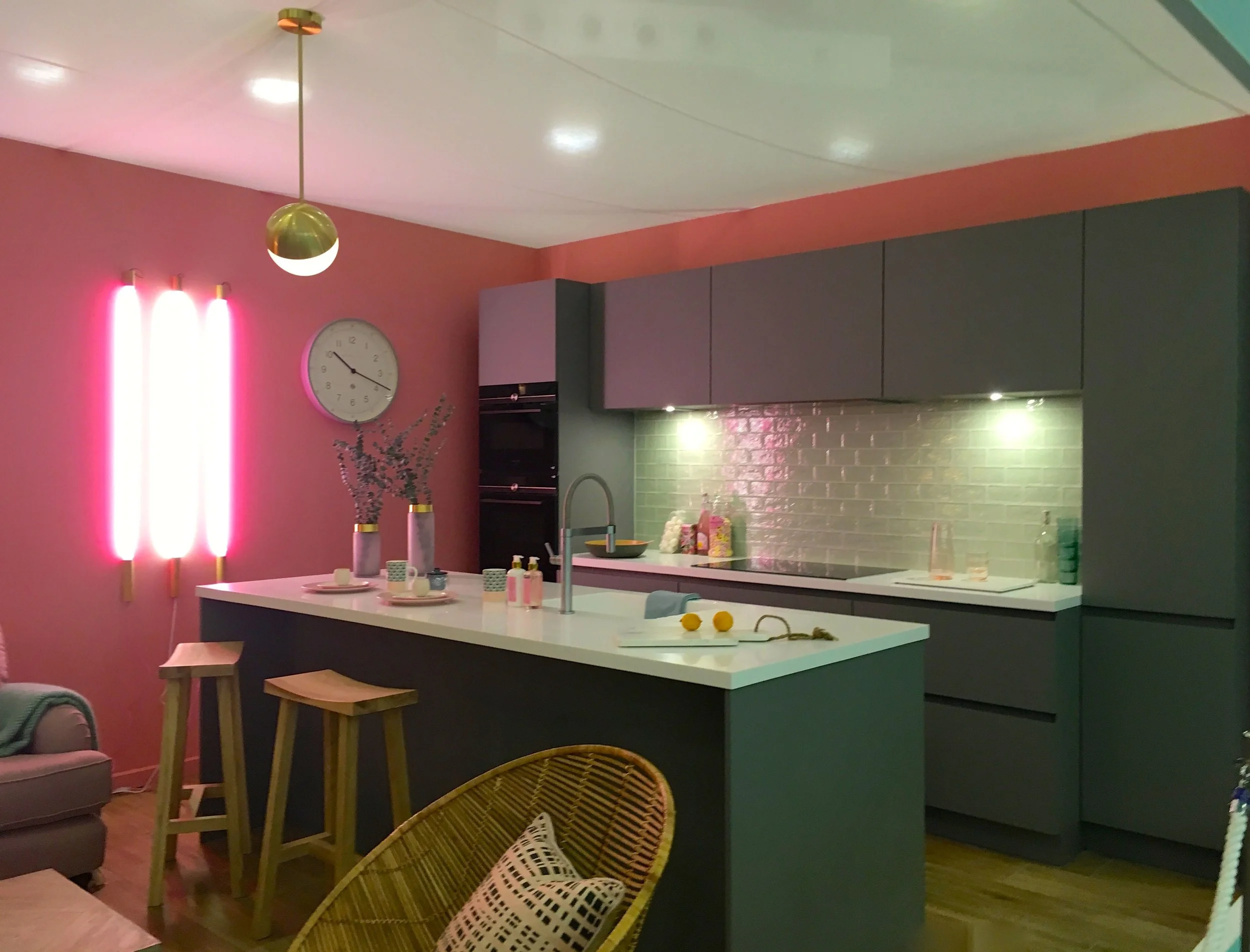
I’m back sharing the Big Ideas from the Ideal Home Show last year, when I stumbled across the extra room sets. So here’s the big ideas for this pastel pink kitchen:

  1. Neon lighting: a fun way to add atmosphere and highlights to dark areas

  2. Pink walls: a way to add warmth, and easy to make the change in your own space

  3. Wall art: because kitchens deserve pictures too, and provide a great space for a personalised picture

  4. Stylish sofa: oh, velvet, need I say more…

  5. Grey cabinets: a modern handleless design, which provides a sleek line.

neon lights in the room set at the ideal home show

What I like about this is the mix of textures, from the natural warmth of wood through to the classic marble and what looks like the modernness of corian for the worktop, something that works really well on these large types of islands. And a material that we seriously considered for our kitchen, but as you know, opted for a composite and glittering worktop instead, and one that was influenced in the end by the price. But it is gorgeous.

Just peachy and easy to achieve in an afternoon

I’m also a fan of handleless cupboards, while there’s plenty of handles to choose from and the handles you choose can change the feel of a kitchen, not choosing handles also does that and allows for your eyes to skim over the cupboard uninterrupted. The other thing to bear in mind is the drawer-line. We opted not to have the drawers on show as our kitchen designers suggested having just two drawers would mean having faux drawers all around our kitchen. Which sort of goes against the clear, sleek lines. We have ‘hidden’ internal drawers, in just two base units, and those drawers have very defined uses, so our drawer of junk has migrated elsewhere! Everyone has one right?

grey and pink - a winning combination

What else is nice is how kitchens are becoming more social spaces, with furniture to match. We spend so much time in kitchens - there’s a reason that they’re the heart of the home - that it makes sense for it to be comfortable as well as practical.

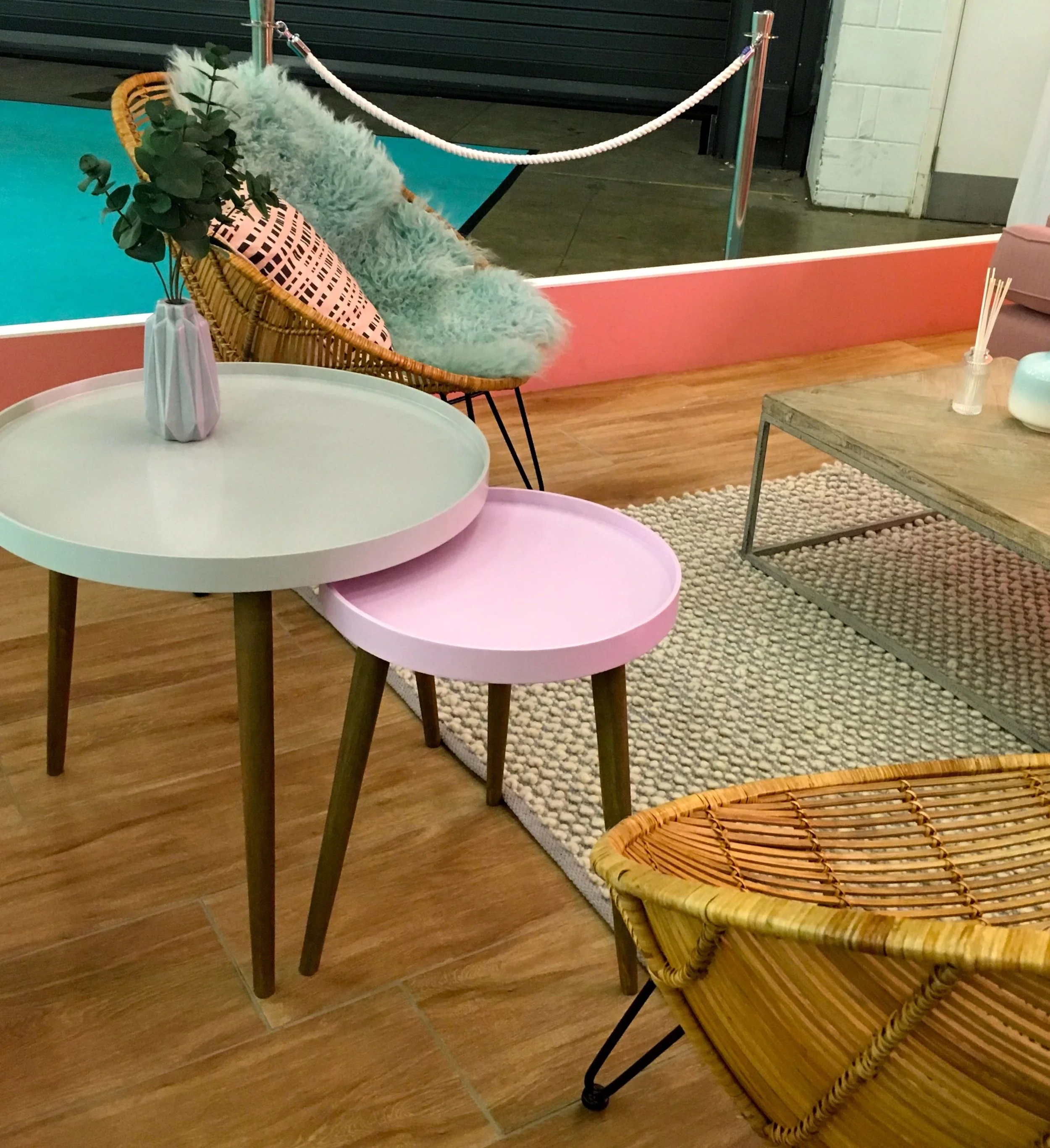
pastel side tables - practical and pretty

And I’m a fan of those side tables too; the colours, the shape, especially the lip that prevents things being knocked off easily - but also their style and the fact that it looks as if the smaller one slides under the larger one for easy storage. Practical and pretty, that’s a win for me - what about you?

The Wellness kitchen at Grand Designs

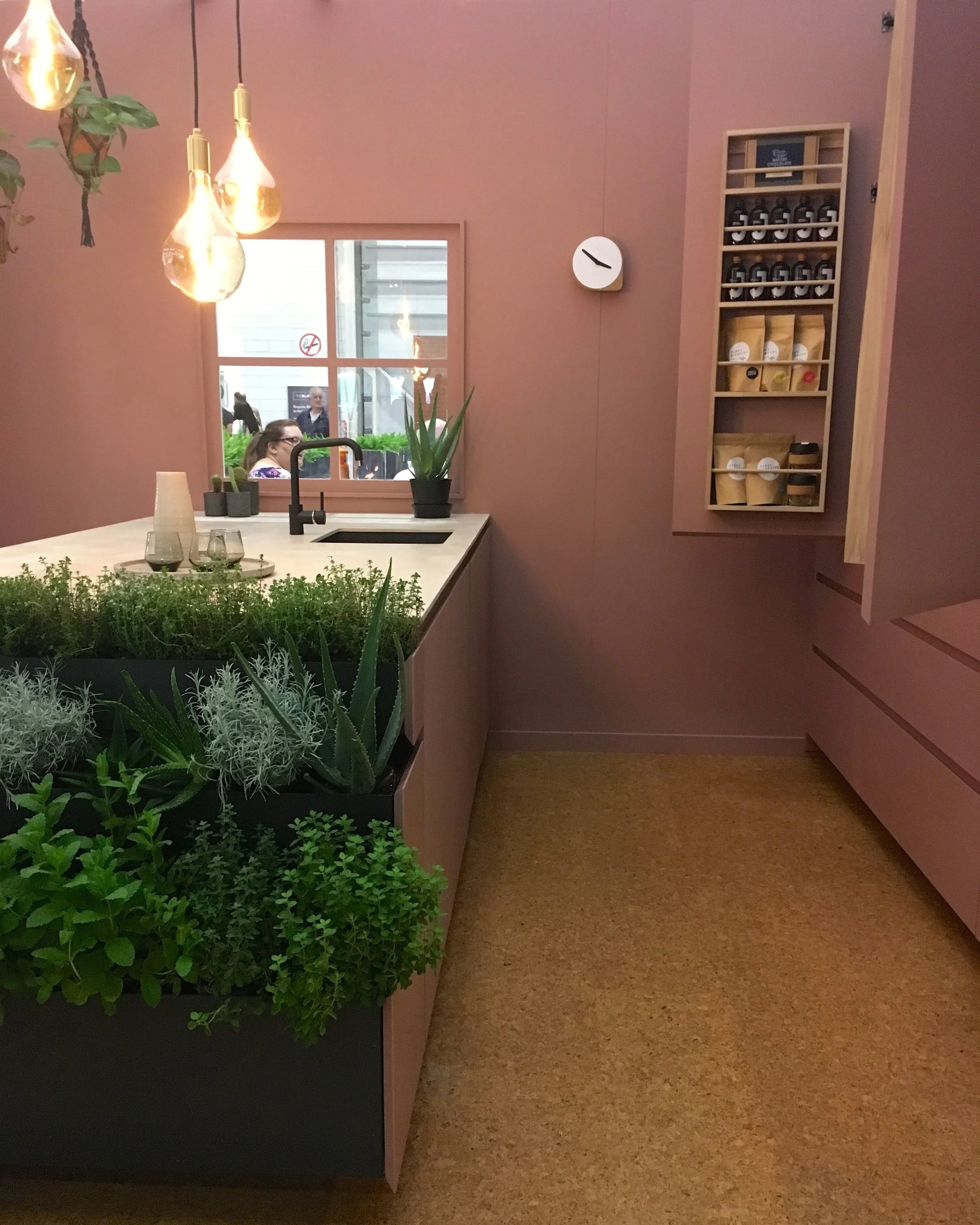
I saw this kitchen by FincH at Grand Designs earlier in the year, and it was clear from those also looking at the room set that it divided opinions. I was impressed by it, and while I might not go for this colour, the idea of a single colour throughout appealed, whereas for MOH and others close by us, they were less wowed. For MOH it was one element of the design that he thought impractical, but strangely it was one that I liked, even if on the whole I agreed with his impractical assessment.

But we’ll come onto that.

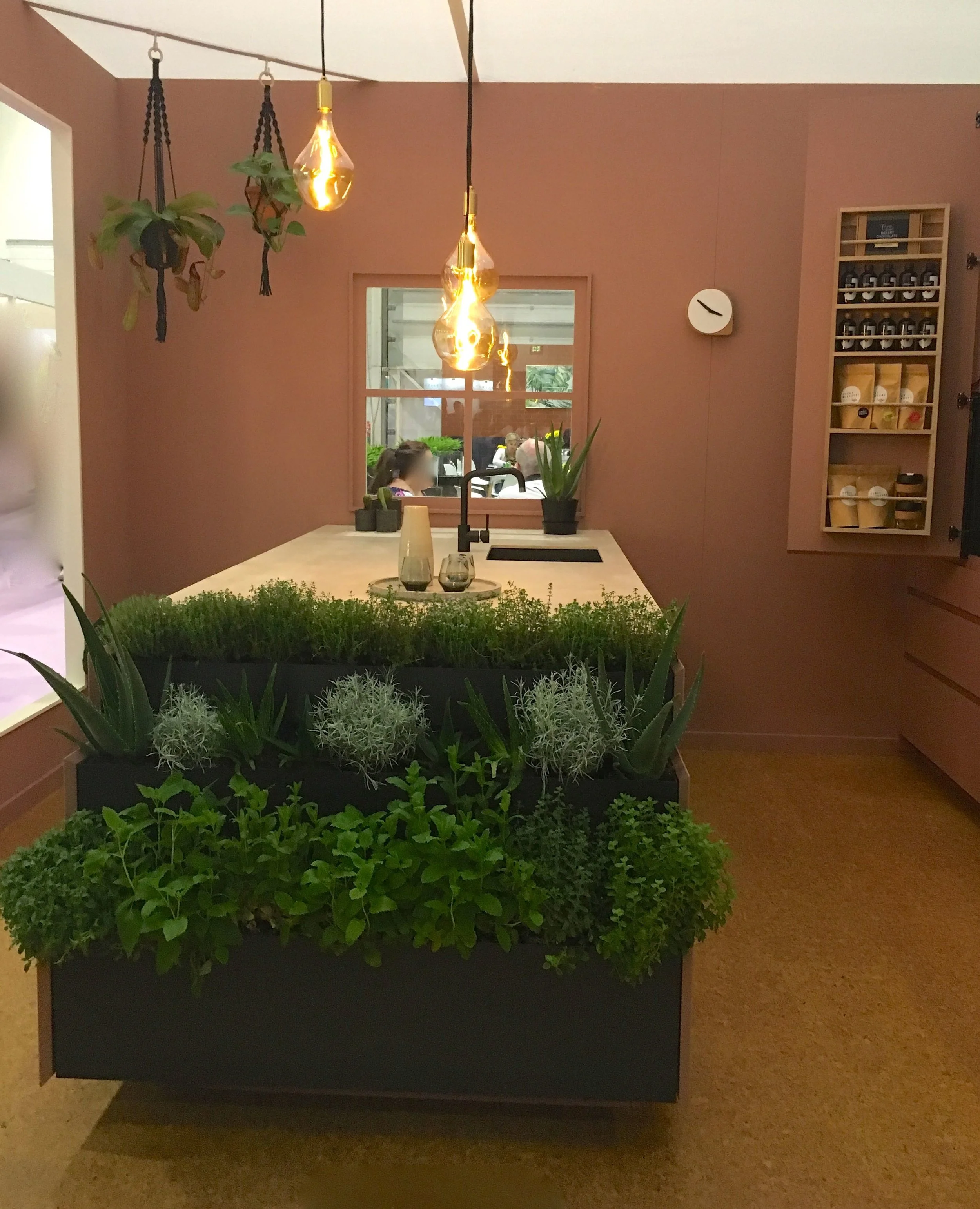
Dusky pink throughout with a touch of real greenery

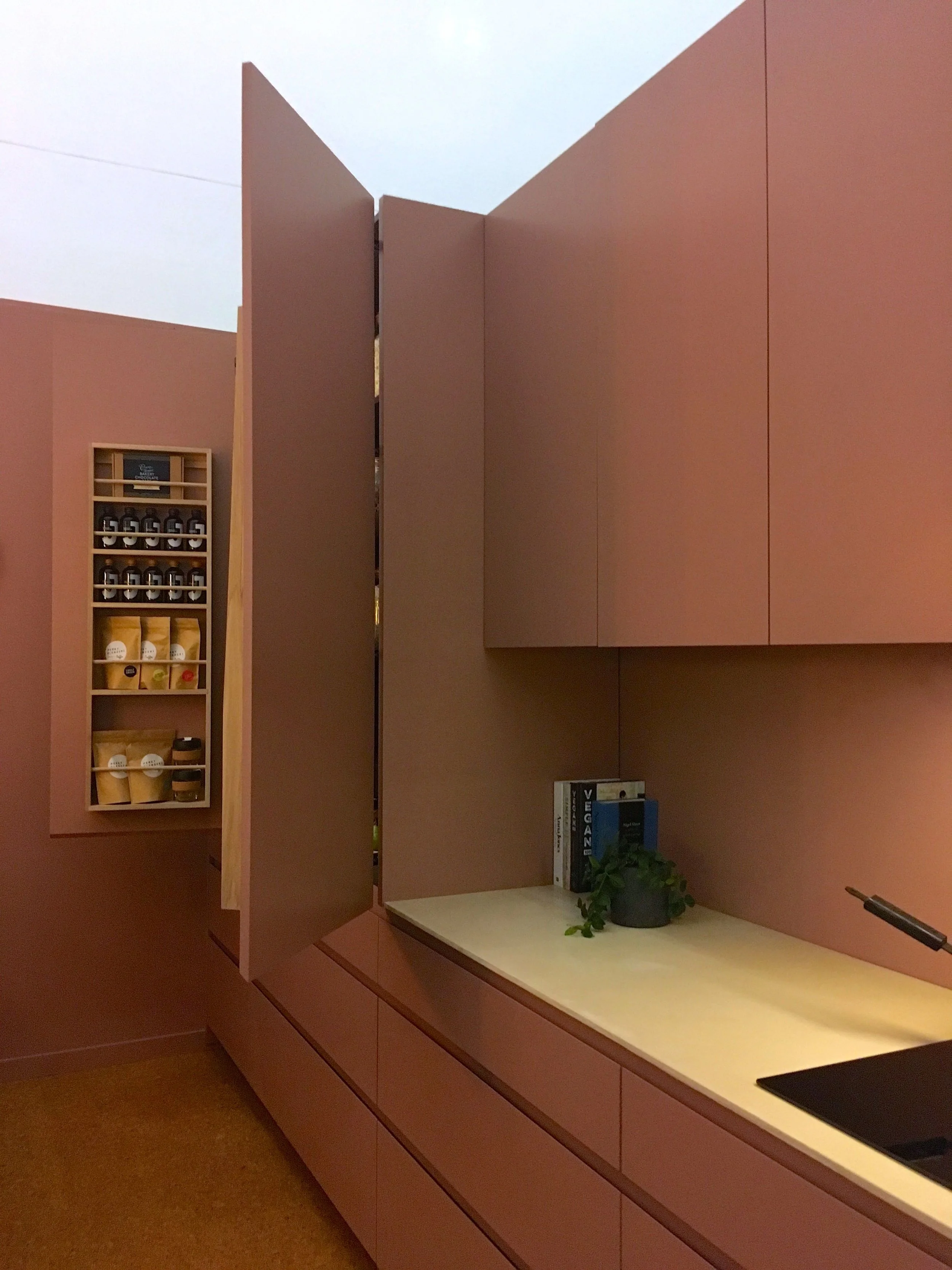
The units and walls were all dusky pink, the worktops provided contrast with a soft white finish. The units are made from Jesmonite, a gypsum-based material in an acrylic resin, which makes it a versatile material. The cork flooring, was one of my least favourite elements, but I know that’s down to my inbuilt dislike of the material on floors and walls - yes, I’ve seen it on walls and that just makes me shiver.

A single colour throughout - does that make the cupboards camouflaged?

I liked the unfussy lines and clean spaces, although in reality my kitchen is unlikely to ever look this clear - but a girl can dream, hey? As well as liking the clean spaces, I’m also a fan of stuff and I’m learning that these two things aren’t compatible. What tends to happen is it’ll start off relatively clear like this, and over time stuff accumulates and I get used to seeing it, and so it becomes part of the “furniture” - until I remember my plan was to keep the worktops clear, and so a tidy up follows. Only for the whole process to repeat, I do think that’s a good thing, or otherwise I’m not sure I’d have enough room to use the worktops to actually prepare food…

Herbs at hand in this roomset at Grand Designs Live

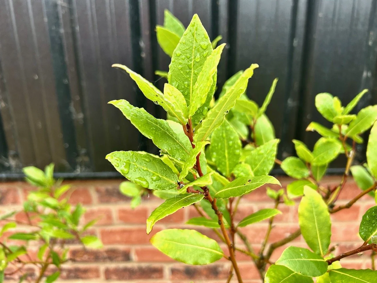
Ah yes, the living herb wall. I liked it, MOH thought it impractical. I agreed, but I still wanted one. Even though our kitchen has very little, if any, natural light. I knew it wouldn’t work in our space, but I liked the idea of walking to the end of the work bench to add herbs to my cooking. Often, gathering herbs is one of the tasks that I give MOH when he regrets asking if there’s anything he can do. And that’s usually followed by a description of the herb and its location, how much simpler would it be if the herbs were at the end of the kitchen?

I know, I’m living in a dream world…

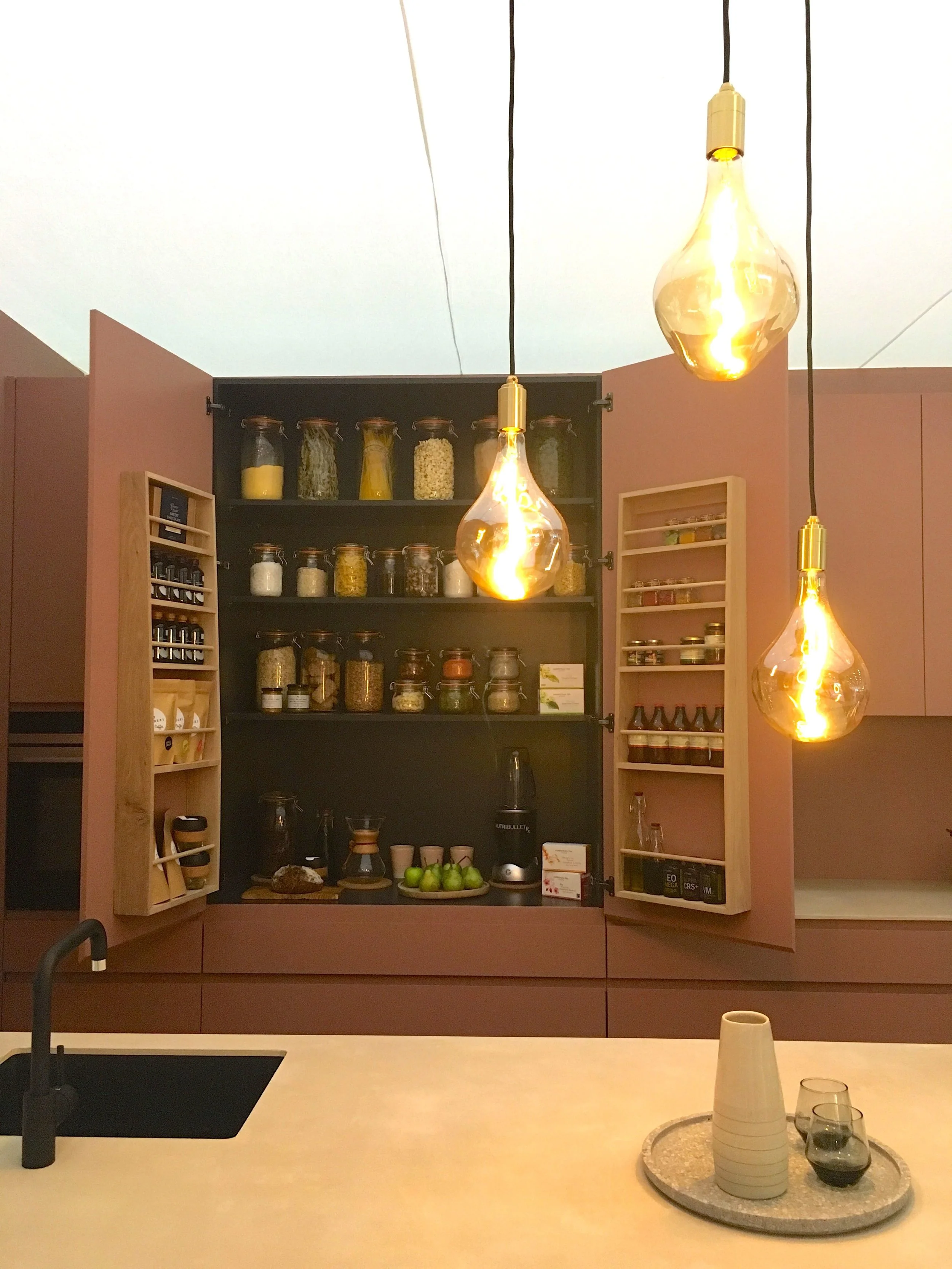
A peek into the cupboards at this roomset at Grand Designs

The other thing I admired in this kitchen was the tidy concealed cupboards. Mine would never be this empty, but they’d also never likely to be shut, or if they were it’d be because I’d crammed stuff in and wanted to keep that illusion of a clean, clear kitchen.

How would you cope with cupboards like these, or a one colour kitchen?

A dramatic kitchen room set

It’s been a while since I shared a room set, and today is the last of the main room sets at this year’s Ideal Home Show. But it’s not the last of the room sets from that show as there were some more, bonus, room sets towards the back of the show. They were smaller but all bathrooms and kitchens so there’ll be some more to ogle at at some point.

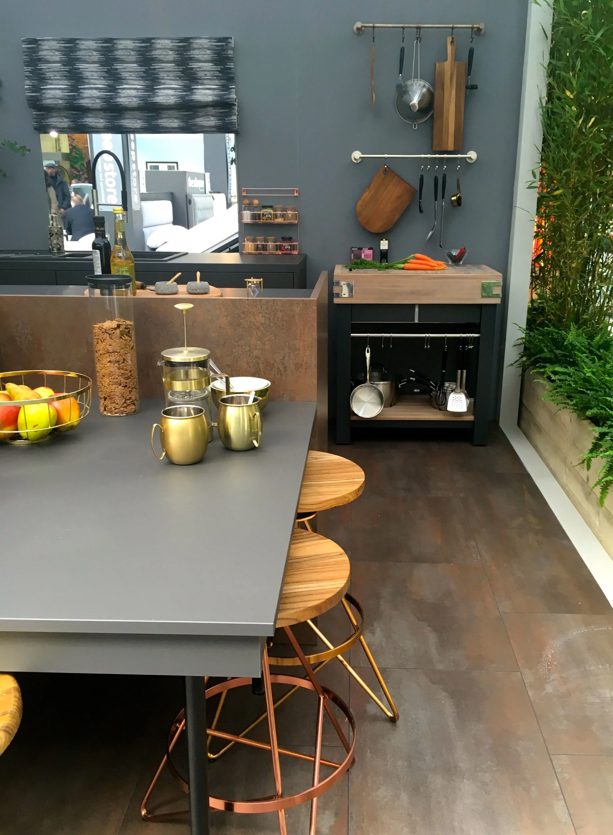
Looking through my pictures though I was surprised I’d not already shared this one, as it’s a beauty. And totally my colours. Sadly it’s too dark for our kitchen space, and we don’t actually need a new kitchen having replaced ours only in 2013. But a girl can lust, can’t she?

dark greys and earthy tones in this dramatic kitchen at the ideal home show

And when it’s as gorgeous as that, the answer to my question is obviously yes!

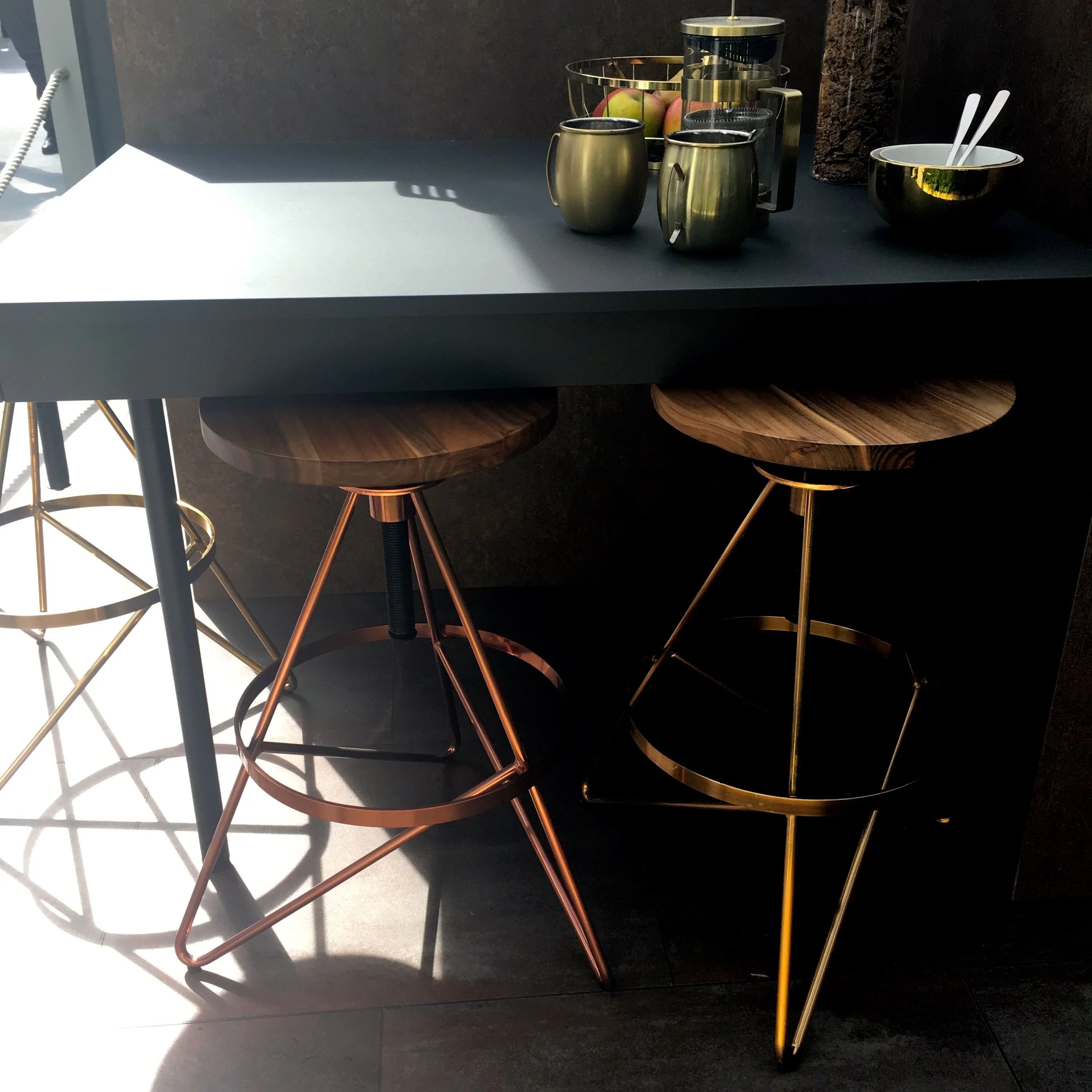
Earlier in the year “mixed metallics” was a thing, and maybe still is, but this kitchen is the best example I’ve found of that trend. Copper and brass mix together with ease, and while my natural inclination would be to scrinch my nose up at the thought of those together, they go a lot better than I ever imagined.

Copper and wood stools nestled under the breakfast bar

The stools though, aren’t they great? And the integrated breakfast bar is done well and I can see this being a really flexible and social space.

A great spot for breakfast

In fact, when can I move in?

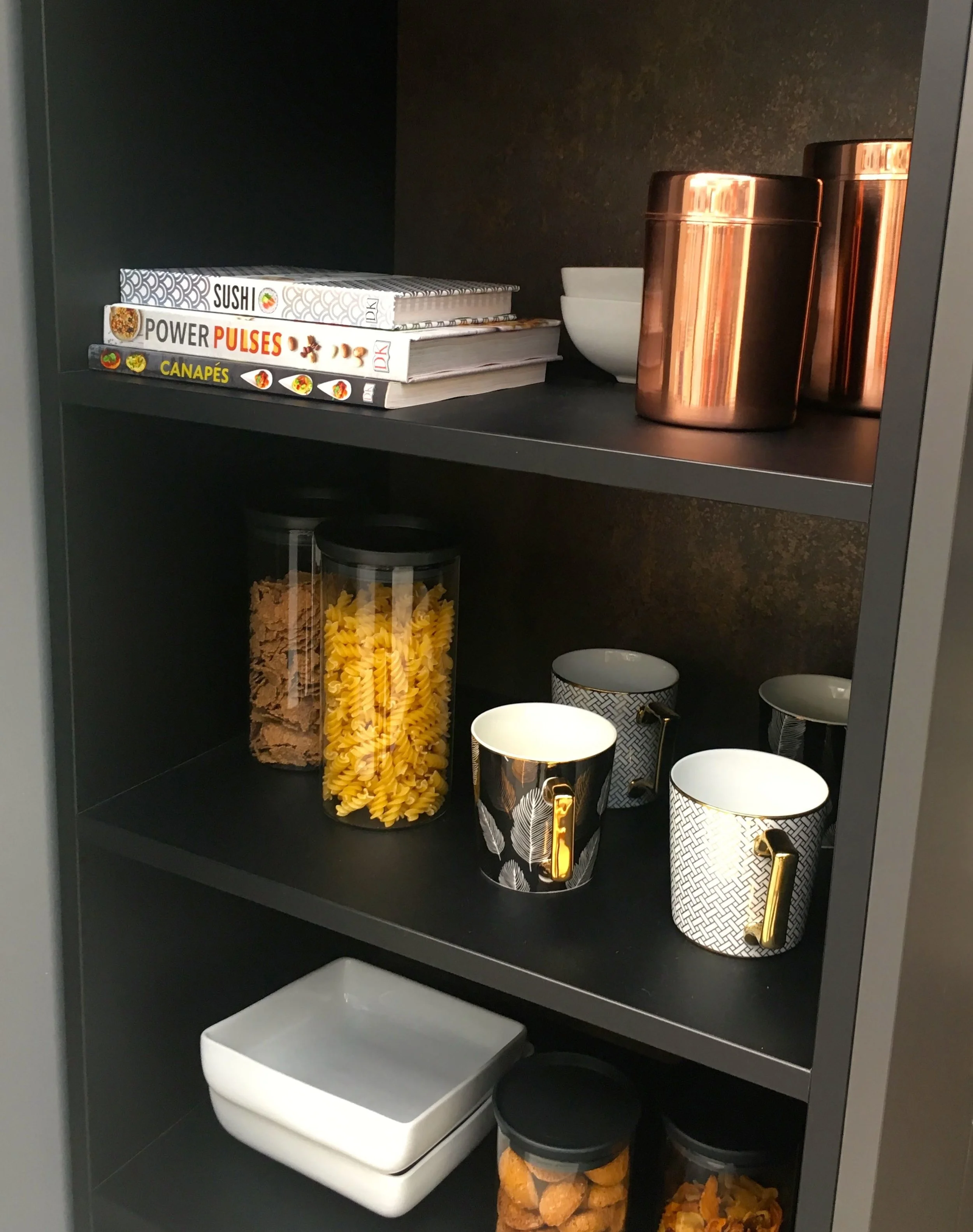
Copper and brass accessories add a pop to a dramatic kitchen

The metallics also lift the dark coloured units, and I think more of us should have some decorative areas in our functional spaces, because if we don’t like the look of somewhere we’re fickle things aren’t we and avoid spending time there. And in a space like this, that’d be a real shame.

open shelves for storage

So, what do you think - hit or miss for this dark and earthy with mixed metallics kitchen?