A calm coastal bedroom

So far you've seen the kitchen and bathroom room sets from this year's Ideal Home Show, and today we're moving into the bedroom.  It seemed the obvious choice to me, because after a bath I'm always ready for bed.  

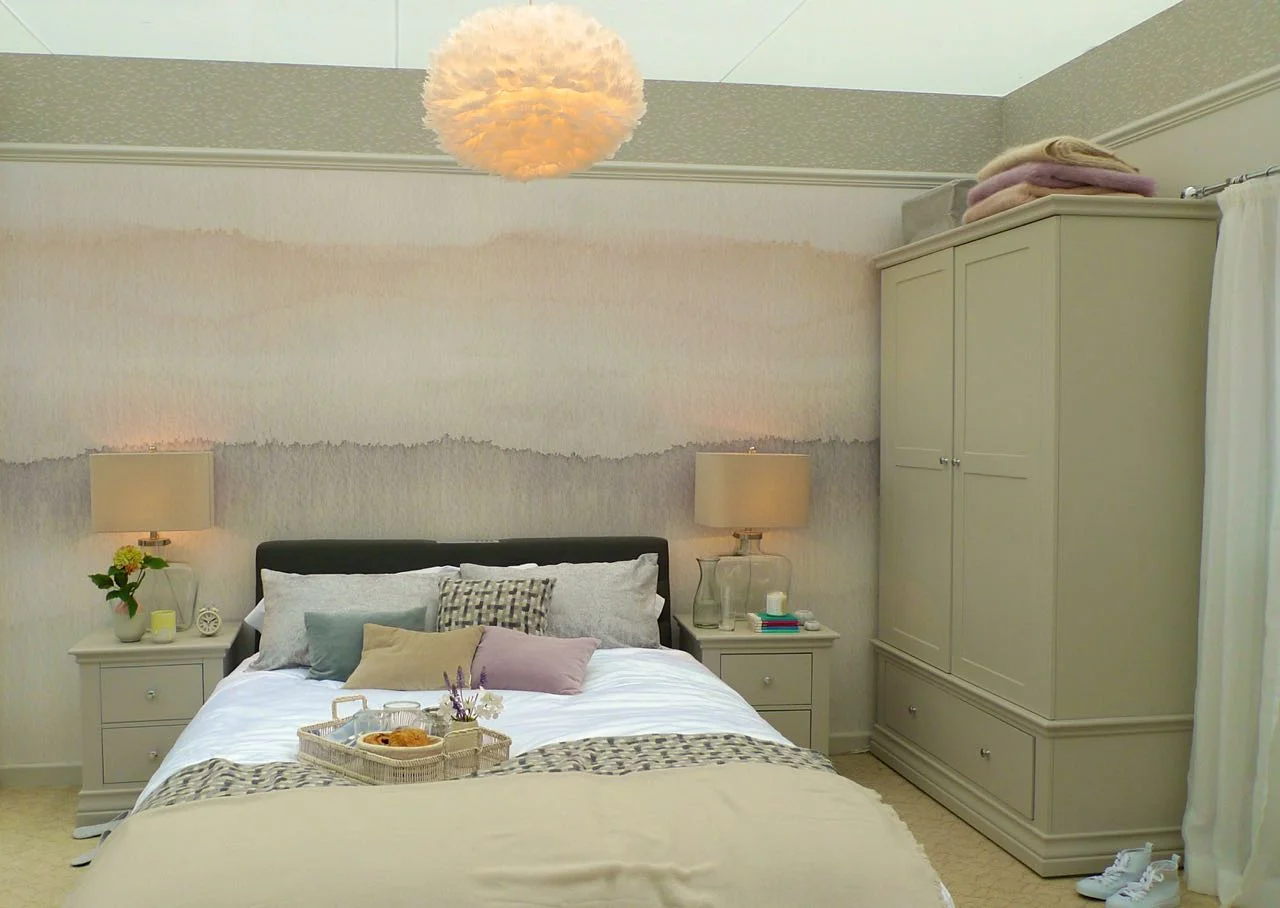
This bedroom was billed as coastal bedroom, but I think it's one of the calmest bedrooms I've seen in a while.  And there's more detail than you first think, look at the texture in the wallpaper above the picture rail.

a coastal bedroom roomset

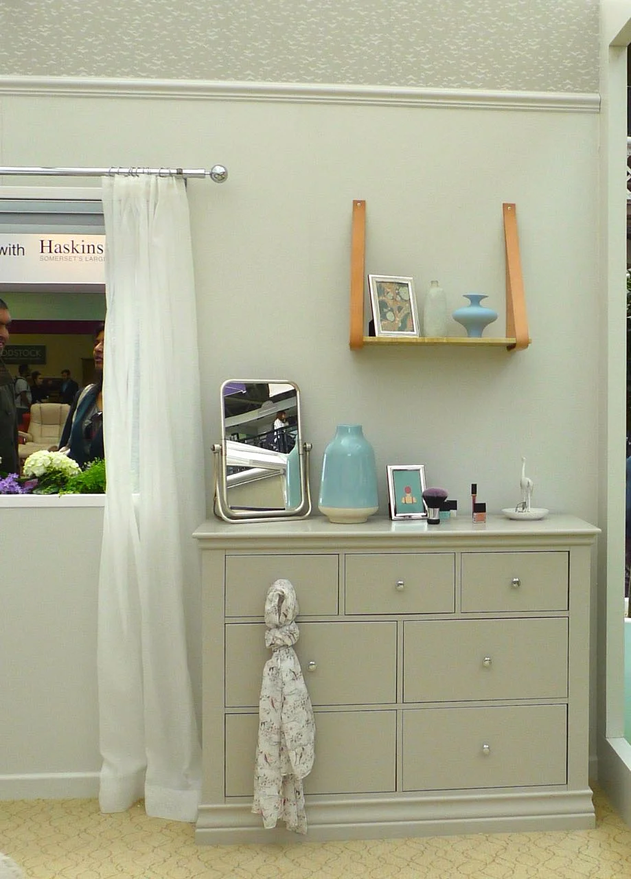
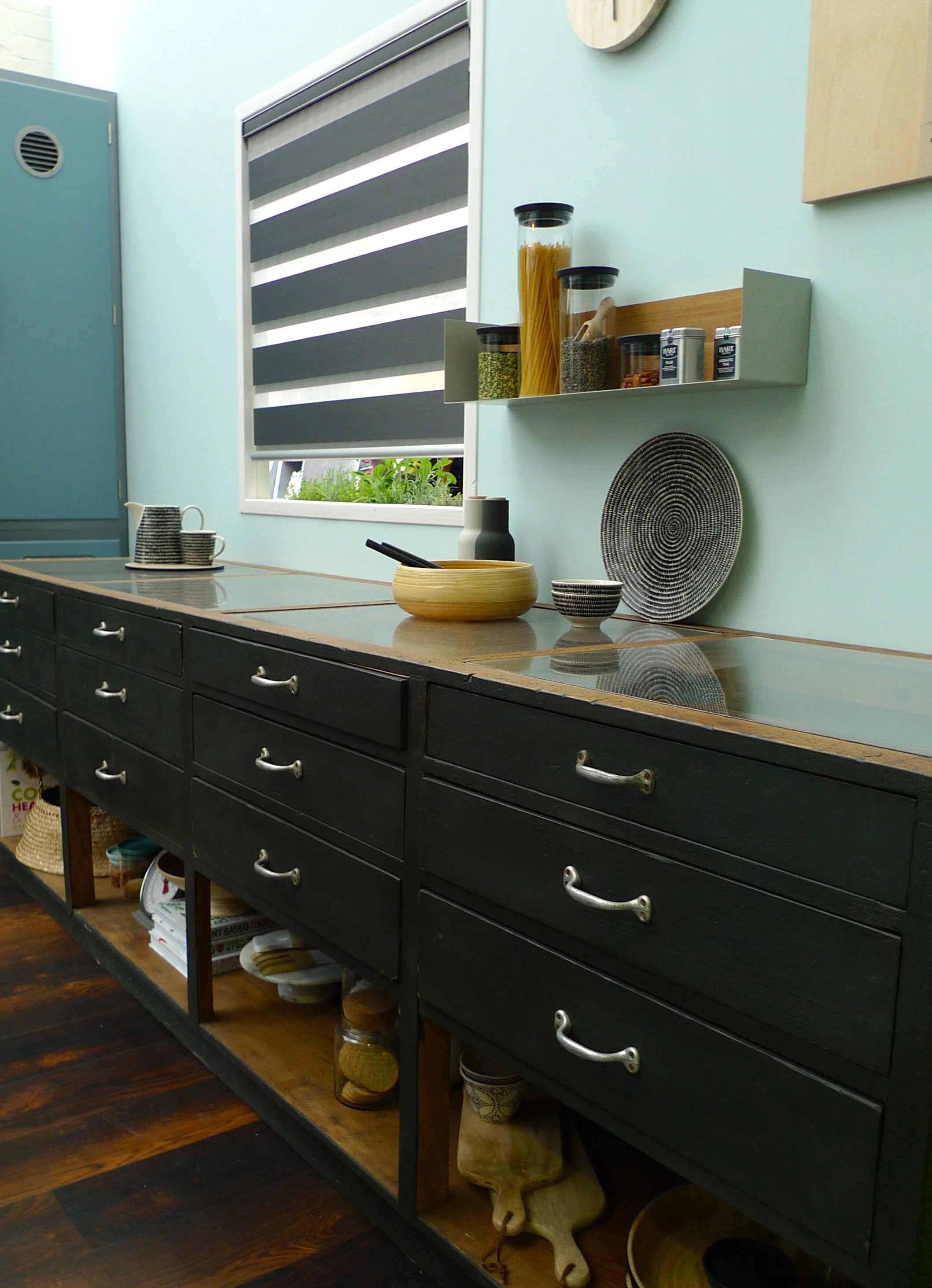
I didn't notice that to start with, all my attention was on those drawers - aren't they fantastic.  A simple and classic design, and very well done. The hanging shelf with its three items also works well, as do the collections of threes on top of the drawers.  The blue with this colour is I think a winning combination.

There was texture throughout this room, just look at the carpet.  And the ceiling light.  Yes feathers.  Actually, we saw lots of those, and while I like the texture it brings, another part of me thinks how much dust it would catch!

goodhomes roomsets 2016

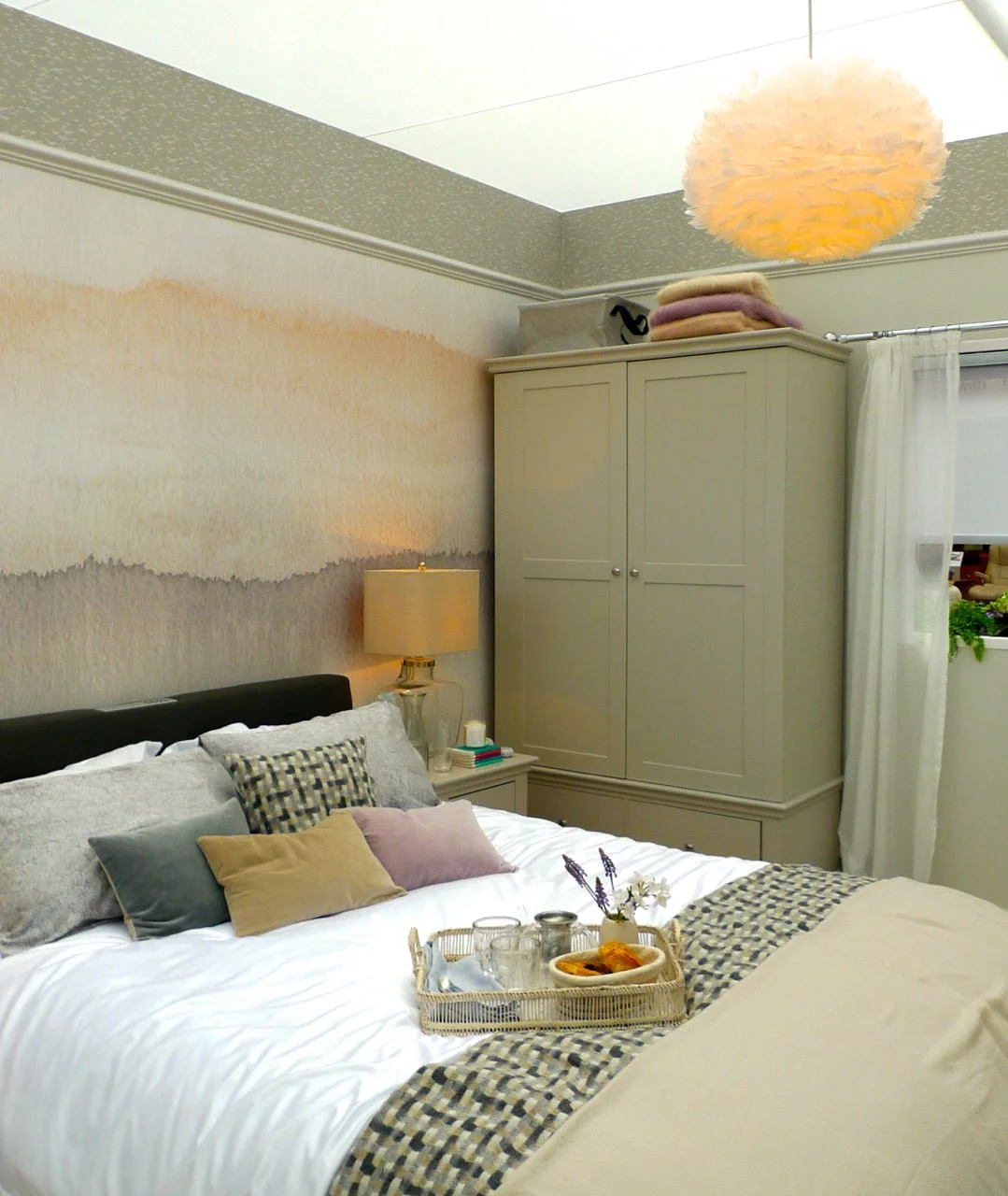
There's a few too many cushions on the bed for me, but I do like how they pick out the colours of the feature wall.  And so do the blankets on top of the wardrobe to.  There's texture again on the bed, as well as the velvet cushions there's the weave cushion and edging to the throw.  It's a room I'd be very happy to sleep in (not at the exhibition though, obviously!)

a comfy bed

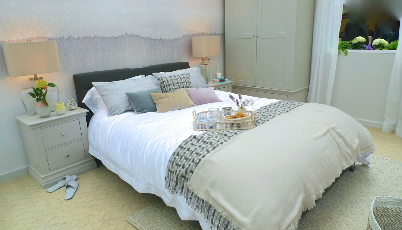
The feature wall makes this bedroom something special. When I saw it, it reminded me of the bathroom from last year's room sets.  But looking back it's quite different.  This is softer and more subtle, and for me adds to the calmness of the room.

jute basket

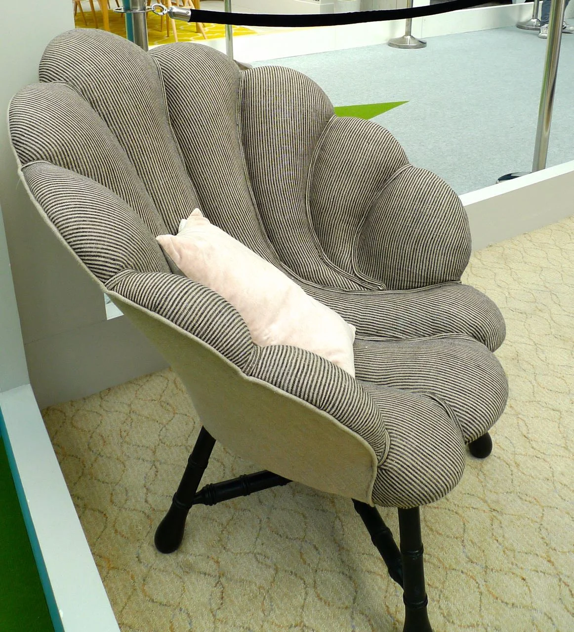
The textures continued - the large knit rug at the end of the bed and the storage basket - it makes you realise how much texture can add to a room doesn't it?  And lastly, there was a shell chair - on its own, I wouldn't go for it, but in this room it fitted in perfectly. Funny how that happens isn't it.

shell-shaped chair
a coastal bedroom goodhomes roomsets 2015

So yes, this is a bedroom I'd be very happy to have - I don't necessarily see the coastal them, but I do think it's somewhere to relax and be calm. What do you think?

A bathroom full of glamour

Today I'm sharing another room set from this year's Ideal Home Show.  I shared the kitchen last week, so thought I'd stick with functional rooms and show you the bathroom.  And it's a glamorous one at that, with a distinctive touch of Art Deco.

It's also huge - and that makes it unlike most of our bathrooms - but I think the concepts would work in the majority of bathrooms, whatever the size.  And as they say, the smaller the bathroom the bolder you should go.

two sinks marble and mirrors

The information about this GoodHomes Roomset said that it'd "been inspired by the soft colours of candy floss and putty."  Hmmm, I can see what they mean, but i wonder where they got that inspiration from?

glamour bathroom good homes roomsets

The Art Deco touches  - the brass fittings and shower head and the beautiful free standing, what looks like a trolley, used as storage - complete the room and give it personality and warmth.

round brass storage
loofah
glass jars

The marble-style flooring and modern tiles are a great backdrop for the standalone bath. I like the style of this one and think I much prefer the modern shaped baths to the claw footed ones.  Not that either of my bathrooms could accommodate either of these.  We looked at a house once that had a large bathroom, and while it was nice it did feel as if it was too luxurious on space.  We later discovered they'd converted a bedroom, and that made sense.  We didn't buy the house (obviously) the garden was a courtyard and I think we had bigger rugs than it.

bath taps and marble
a lovely relaxing bathroom

What do you think?  Is this style something you'd do in your bathroom?  Or like me, is your bathroom too small for much of this?

An industrial-chic - or beautility - kitchen

As well as The Houses at the Ideal Home Show there's also a series of Roomsets, which I think are one of my favourite parts of the show. This year was no different and today instead of showing you the next House, I'm skipping to the Beautility Kitchen - it's fab.

The Roomsets were created by Good Homes Magazine and there's some lovely things in each of the rooms. The kitchen - or Beautility Kitchen as they named it - has an industrial-chic look which is this season's trend. The blurb alongside the room said you could "create this chic look with a grown-up industrial edgy by mixing matt and metallic finishes with black details."

This is what they mean.

kitchen units

It's an unusual looking kitchen, but one I'm mostly a fan of - and I don't normally go for too much blue.  I like the dark sideboard above, but I'm not sure how practical it'd be.  There are a lot of drawers if you ask me - in my kitchen I have two drawers, and both of those are hidden drawers inside units.  So it's safe to say I'm not a fan of drawers in kitchens.  Our previous kitchen had several, one of which had unknown junk in, which we never knew what to do with.  (Well in the end we just threw it all out!)

I'm also not sure how practical the open shelf would be at the bottom of the units.  I think they look great, but agreed with MOH when he said they'd be a dust magnet - he's the master of dust in this house (yay!)

The wooden clock and picture, I think add texture and warmth, especially against the light turquoise walls.  And they're a nice quirky touch too, aren't they?

eat picture

A darker turquoise is used for a wall of units, and I think the handles on these emphasise the industrial look.  The wood flooring is darker than I'd have thought it would be too, but I think it needs something strong to complement the rest of the room.

kitchen units with sink

But that's not all that's industrial.  Just look at that extractor fan - isn't it fab.  Obviously it won't go in my high-gloss kitchen but it looks so right here.  In fact we were drawn to lots of rusty metal at the show, so perhaps our subconscious is telling us something.

rusty extractor fan

The worktop above looks like concrete - and it's absolutely right for this look. We considered a concrete topped table, and they're definitely worth a look and are much smoother than you'd expect.

hurricane light and garlic
open shelf storage unit

I also liked the unusual choice of under unit lights and the open shelf unit above it, for me they completed the look - and that Grains as Mains is a cookbook that appeals too.

What do you think of the kitchen? Is it a look you'd go for in your kitchen?

Home Etc