Reclamation at Grand Designs Live

One of the new additions at this year’s Grand Designs Live was a reclamation area with items from Lassco and English Rose kitchens on display. I would love to spend hours (and no doubt hours more) perusing a whole market like this, so was really pleased to take a legitimate wander around in a "well-we're-here-dear-we-should-take-a-look" kind of way.  You see MOH is much less of a ‘make do’ kind of person (and I mean that in a make do and mend way) and likes to have good quality items, that last. I think that's great, but for some items I like to think I’m more adaptable and open to reclaimed items, and have a much more flexible approach to fittings and furnishings with character, which at times can be tricky, but usually we end up with a compromise. 

I think the closest I've got him to a salvage yard is Maltby Street Market, but when it's been turned into a hip weekend market and usually involves a burger and cakes, actually we haven't even done that for a while...  

door knobs and tiles

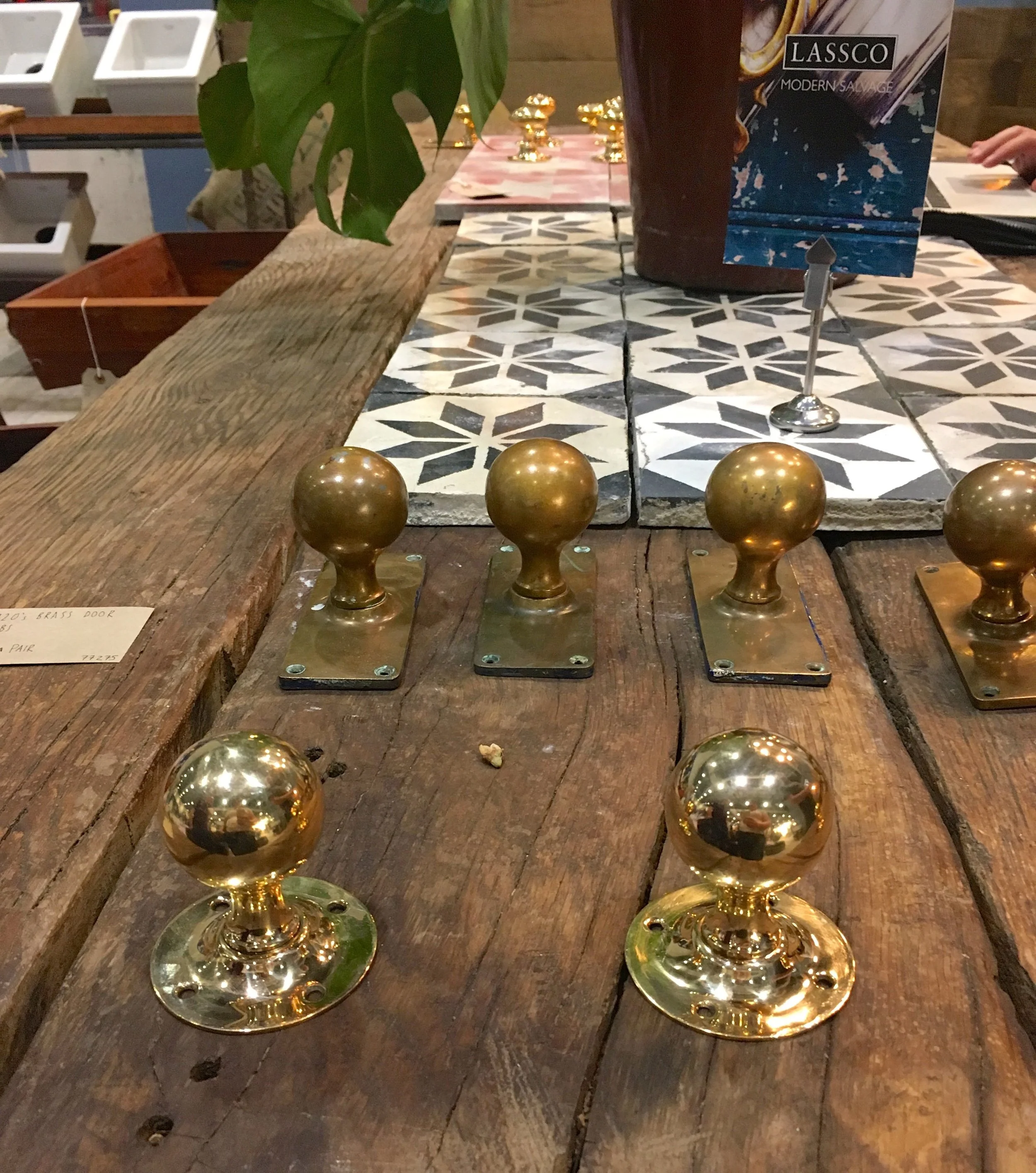
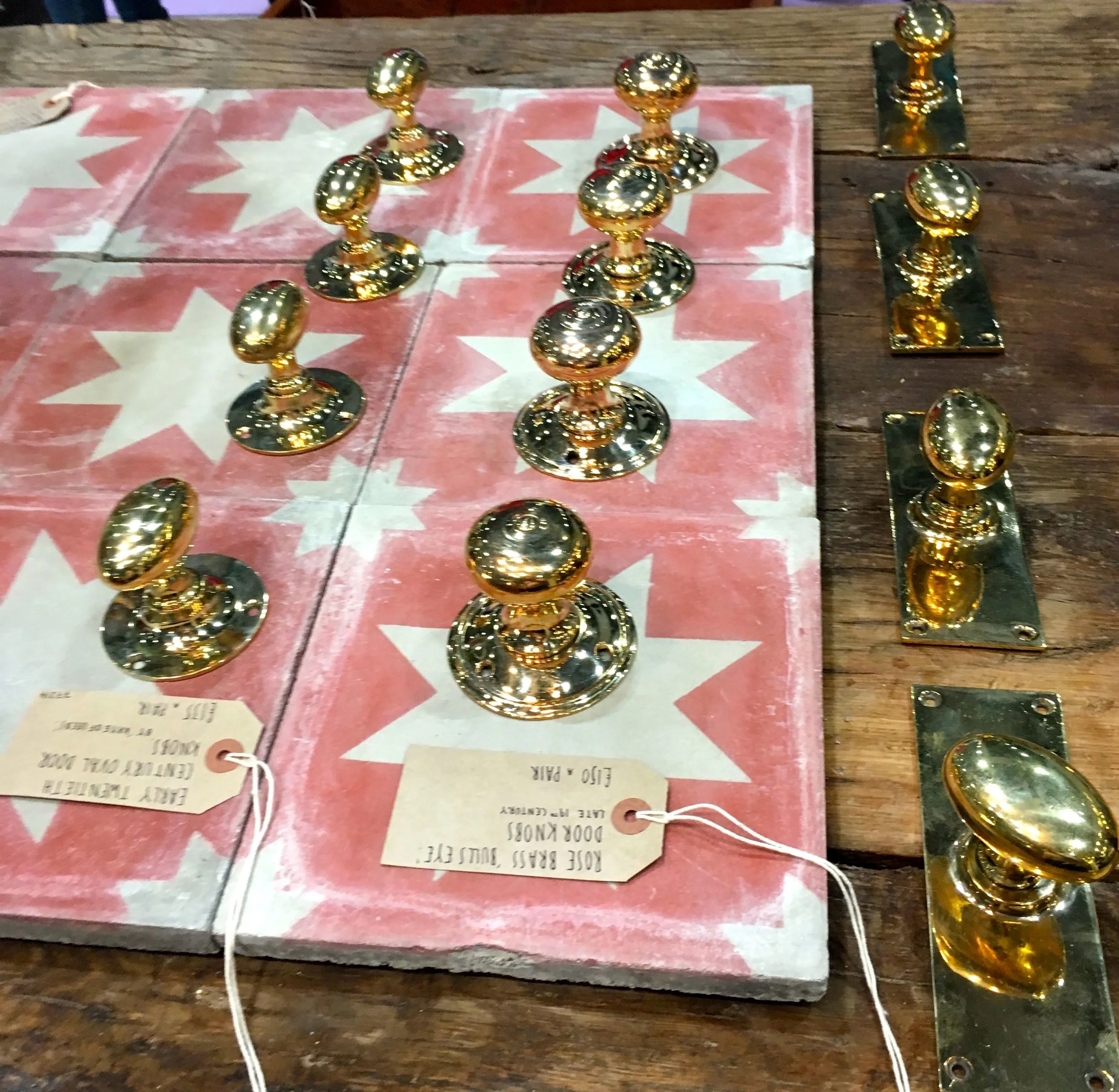
But presented with a whole area of the show dedicated to recycling and reuse I was keen to make the most of the opportunity.  I’d also been lured over by the brass knobs and pretty tiles, yes I can be such a magpie...

taps on sackcloth

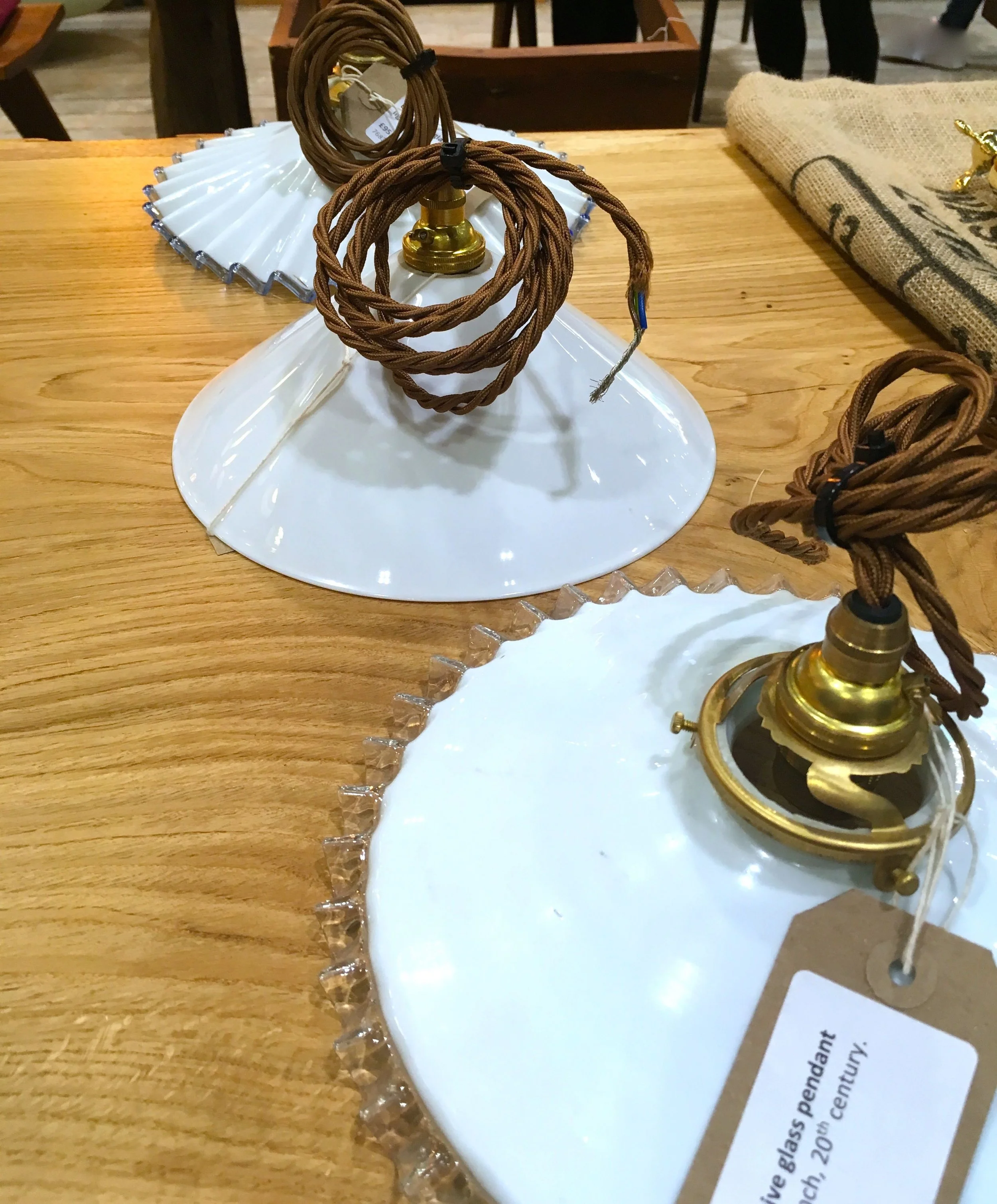
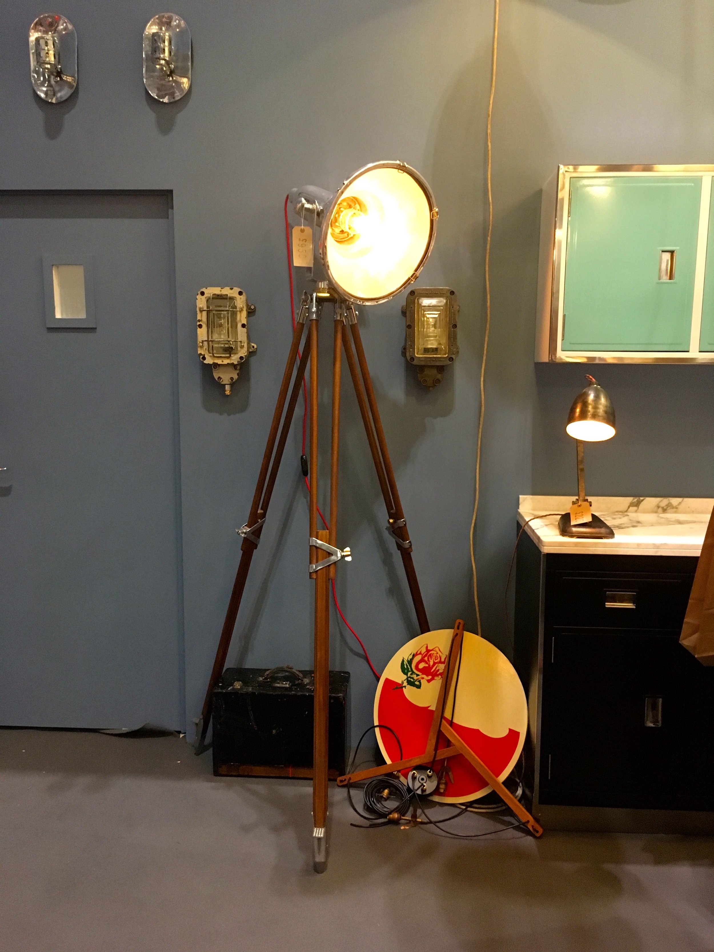
MOH soon picked up though when there were lights to look at, not necessarily these, as these are far too pretty, and too small for MOH’s big sell (to me) project.  I liked the fluted shade, and the brown wire though, but they wouldn’t do for our dining area, as they're too delicate, but would be great over a dressing table or as bedside lights. One day, we may find a light we agree on - I haven't given up hope!

porcelain pendant lights

I was enthralled by this old gymnasium flooring, MOH humoured me, and I know while he made sympathetic noises that really he’d be trying to peel or clean off the sticky markings around the red sections. Seriously. I once bought a bottle of wine that came covered in dust, on purpose, he dusted it...

a gymnasium flooring

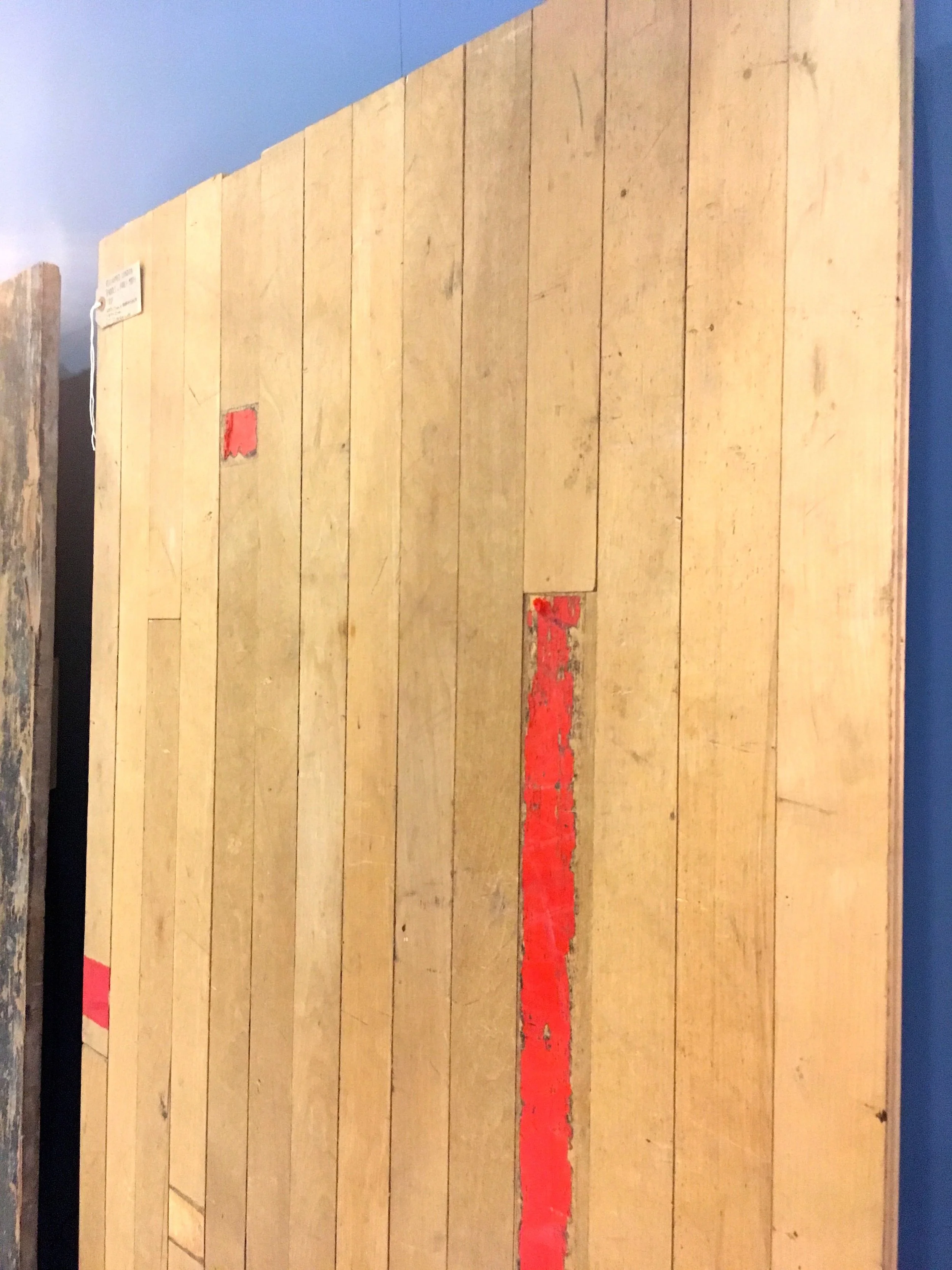
This would make great flooring in a high traffic area wouldn’t it?  I'd be wondering where it came from, what sports and sports men and women had played on it, and if it had played host to any famous trainers.  

Ah, more brass knobs!  Rose brass no less, I didn’t even know that was a thing - but it does look great, and so do the pink patterned tiles. 

brass door knobs

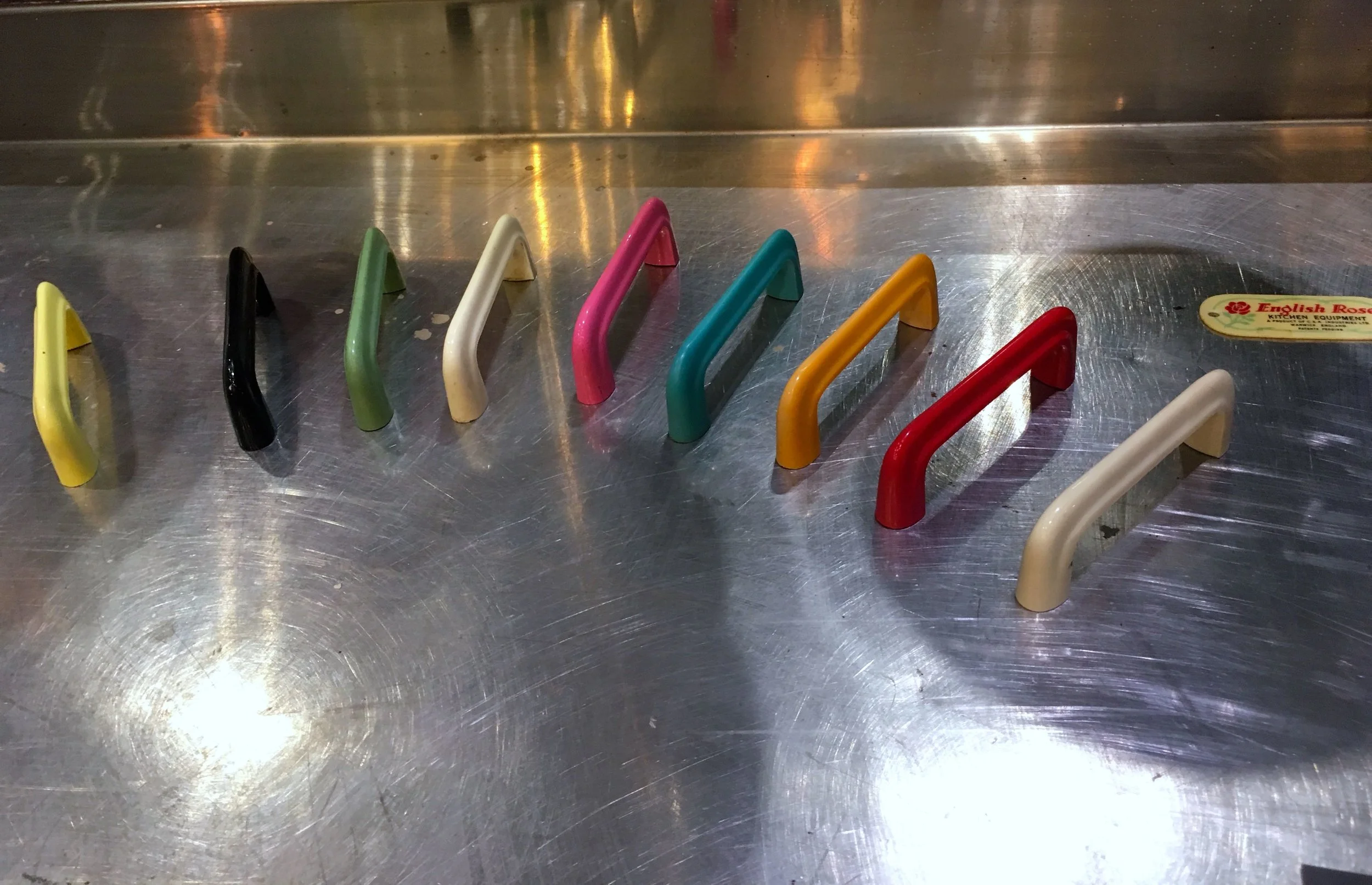
In the English Rose kitchen display, it was knobs of another kind that caught my eye.  These traditional shaped, but colourful handles made me smile - we don't have kitchen handles like this anymore do we?  Well in fact, I don't have any kitchen handles at all in our kitchen, and (obviously) I like that too.

english rose kitchen handles

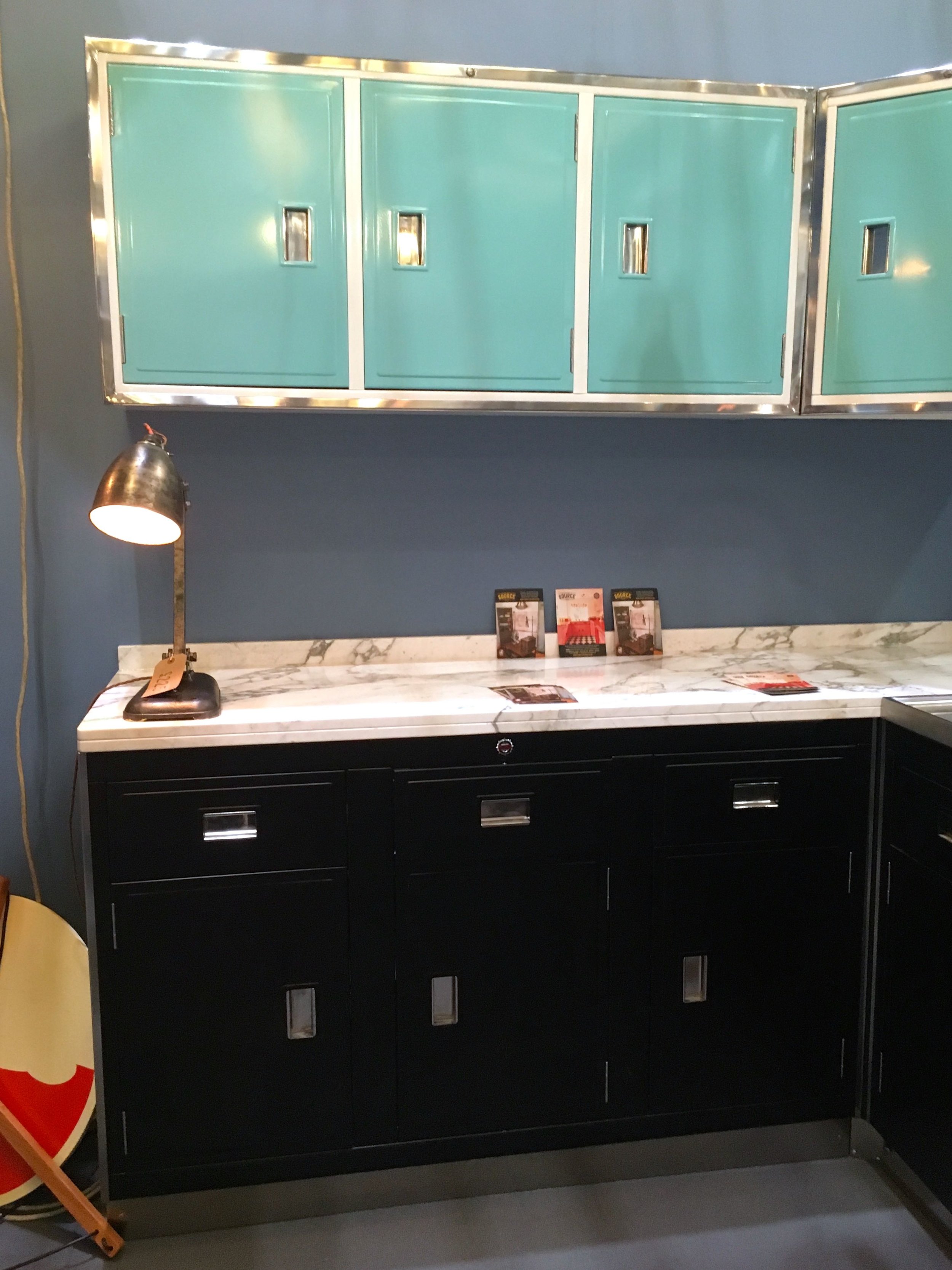
The kitchen units which had been spruced up looked great, it's not a kitchen that I would go for but I admired how it'd been given a new lease of life and brought up to date with a modern look and feel.

A refurbed kitchen

Clearly there's still some work to do on this one!

still some work to do on this kitchen!

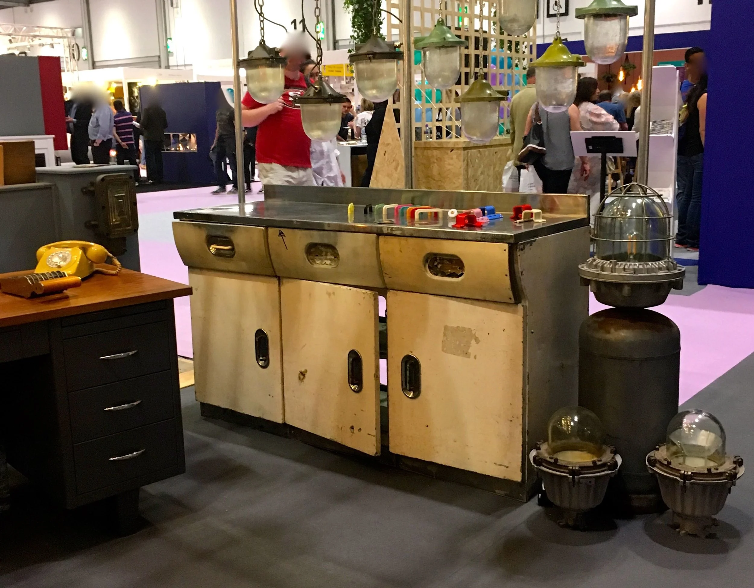
But look at the shape of the units above, our local kitchen shop has this very shape units in its window, so it just goes to show that quite often styles come back into vogue, even in homewares.

I mentioned lights before and this is the one thing that I think MOH would happily have a reclaimed piece without any questions, in fact we'd both happily have something like the one pictured below if we had the space, and if we didn't already have two standard lights.

a bulkhead light I'd happily find home for
 
lights of all kinds and the shiniest of kitchen cabinets

It's the style of lights pictured below that we disagree on.  It's not that I don't like them, but I'm not convinced by the amount of light they give out and think one chunky light while looking industrial above the table, isn't really the look I want - and I'd be concerned that it would fall on my table!  

industrial lighting at Grand Designs Live

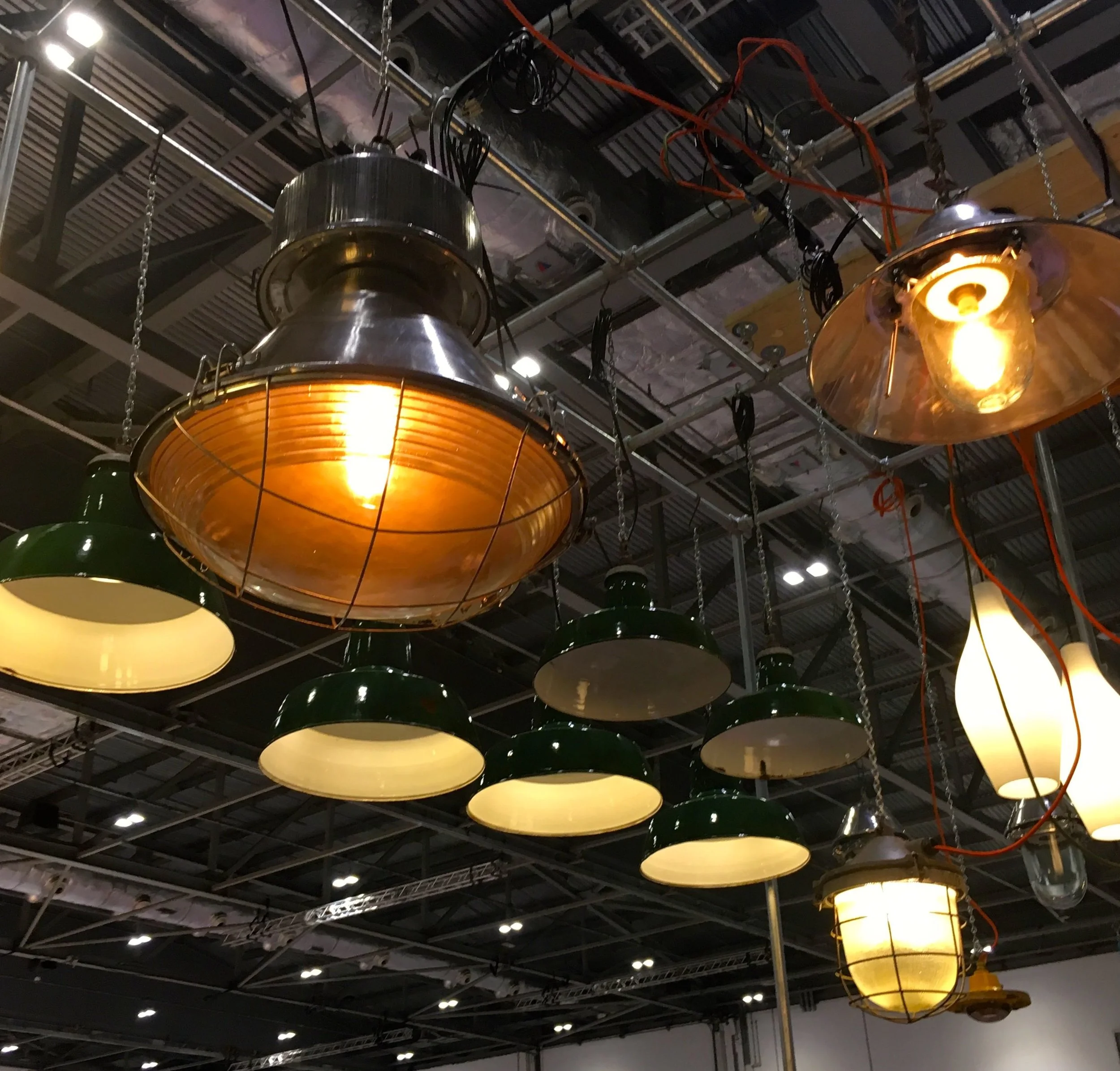
The green enamel type lights in the background are also good but I'd want to be convinced by the light a single pendant gives out, I think these would look better in a row of three, and that means more work and making holes in the ceiling which I'm less keen on.  That's really our dilemma, wanting something more modern than we currently have but not compromising how much light it gives out.

We'll get there, and in the meantime we'll have fun looking at many, many lights, reclaimed or not!

Let’s talk bathroom trends and dream bathrooms

At this year's Ideal Home Show, as well as the wellness bathroom room setbathrooms were much in evidence as I stumbled across a further three bathroom room sets towards the back of the show.  I wasn't expecting to find them, but it's always great to get as much inspiration as possible when at shows like this, and the extra room sets (there were two more kitchens too) did go some way to make up for there not being any garden “room sets” at the show. 

I've been sorting through my photos from the past few months - there are too many, I'm starting to think I should show some restraint, but I also know that's unlikely to happen - and I saw the photos and thought they would fit in nicely with a post on my dream bathroom.  You know how much I like a loo or two, so it makes a change to think about the rest of the room.

In case MOH is reading I should say I'm not looking to update either of our bathrooms in the near future before he has a bit of a cold sweat, but of course that doesn't stop me looking and taking a whirl around the trends in bathrooms this year.  I also know that if we were even thinking about updating our bathrooms, he'd be pushing for a wet room.

We toyed with the idea of a wet room before, but although we were keen it was a while ago (more than ten years!) and the concept wasn't as normal as it is now, and the relative newness in a domestic setting dissuaded us, along with the additional work that we were sure our bathroom would need. Instead we opted for the shallowest shower tray we could get (and afford).  It's not as shallow as the one in the photo below, from one of the extra room sets I mentioned above, in the Industrial bathroom and would, I think, still be in the running for our bathroom.

THE INDUSTRIAL BATHROOM ROOM SET AT THIS YEAR'S IDEAL HOME SHOW

THE INDUSTRIAL BATHROOM ROOM SET AT THIS YEAR'S IDEAL HOME SHOW

I like the geometric patterns, and the mix of tiles too.  So I'd be keen to adopt something similar in a future bathroom, and black and white in bathrooms is just a classic isn’t it?  All three of those were in the trends for this year, and like many of the interiors trends you’re probably more aware of them than you think you are.

Mixing tiles appeals to the patchwork loving me, but in our shower room we've gone for another classic approach with the same tiles for floor and walls in a natural colour, and while it's a smaller room than any of these room sets looking at these photos, while it’s still perfectly lovely, it does now feel kind of dated. 

I need to be careful here, or else by the end of this post I'll have convinced myself we need to update our bathrooms!

House & Home magazine say that matte black finishes are one of the bathroom trends you'll see everywhere in 2018 and I tend to agree with them.  The finish was used in the open plan bathroom in the Houzz of 2018, as the photos below show and I was quite taken with it at the time (less so with the open plan approach though) and while it's quite a step away from the traditional chrome it is something I'd consider, and something I think would be a relatively easy sell to MOH too.

IN THE HOUZZ OF 2018

IN THE HOUZZ OF 2018

 
THE BATHROOM IN THE HOUZZ OF 2018

THE BATHROOM IN THE HOUZZ OF 2018

His and Hers showers and metallic glamour were two of the trends the Ideal Home tipped to be big this year and while you might think the His and Hers showers is unrealistic - and maybe it is depending on the space you have available - I think I prefer this than a double shower, but perhaps I just like my own space!  

If you have the space, the aqualisa electric shower might be one of the ways you could make it work, and incorporate some of the other trends at the same time, as on their site they have the shower, what I call "control boxes" in both a graphite and chrome finish.

METALLIC GLAMOUR AT THIS YEAR'S GRAND DESIGNS LIVE

METALLIC GLAMOUR AT THIS YEAR'S GRAND DESIGNS LIVE

I couldn’t end this post without including a shot of what is probably my favourite example of the metallic glamour trend. It’s from this year’s Grand Designs Live and part of their lavatory project, which I’ve yet to share here but made me smile, and I couldn’t help but think that Kevin and his team were jumping on my loo bandwagon...

But it’s gorgeous isn’t it? 

* This is a collaborative post but all views are my own.

On loving maps, and the fear of wallpaper

Fear, it’s a funny thing isn’t it? And before I go on I should let you know the fear isn’t actually the wallpaper, but more of being a little bit scared of something new.  And in this case, the actual putting it on the wall part, as that’s something I’ve not done before, or unsupervised anyway; dad was a decorator by trade and so I've never needed to know. I'm sure he tried to teach me on more than one occasion, but...  

But I do like maps.  

A lot.  

I can't tell you the number of rooms and room sets I’ve seen online, in magazines and in real life that I’ve pored and lusted over. I think maps have a timeless charm, they're full of intrigue, the unknown and the anticipation of adventure.  So when the opportunity arose to work with Wallsauce, who create made to measure wallpaper murals I jumped at the chance, immediately forgetting how much wallpapering was an unknown, because, well because, maps! 

Exactly.  

But which to choose?

Despite overlooking the actual wallpapering - again, our brain's are funny things - I knew exactly which wall my map would go on.  For maximum impact it needed to be a wall without pictures, or obstructed by furniture and so the obvious choice was the curved wall which encloses our spiral staircase. 

When I told MOH he immediately shook his head, not only because he's also a wallpapering novice but because if you can choose any wall, of course you'd choose a curved wall, wouldn't you.  Well, yes dear.  And so of course, it's going on the curved wall, but which one.

It's not as simple as just wanting a map though, oh no.  There's many to choose from on the Wallsauce site, and if maps aren't your thing then there's plenty of other mural options to, and you can even upload a photo of your own.  I didn't even go down that option as I've way more pictures than its possible to choose, and of course, maps!

Grabbing a cup of tea, I settled in for a map browsing session. 

  • I'm a classic kind of girl, deep down and so was immediately drawn to the Classic World Map (see below left), MOH nodded but deemed it safe.  I disagreed and as I've said before classics are classic for a reason.
Classic World MapImage credit: Wallsauce

Classic World Map
Image credit: Wallsauce

18th Century World MapImage credit: Wallsauce

18th Century World Map
Image credit: Wallsauce

  • MOH is more of a traditionalist and was more taken with the 18th Century World Map (see above right), which while attractive, I thought was a little dark for the space we had.  And on closer inspection I spotted that part of the Americas had yet to be discovered and I wanted a full map on our wall.

So that was two discarded, although I still had the Classic Map on my reserve list.  Next I tried a different tack, not a world map, but London.  We live in London and so I thought that might work.

  • The vintage map (below left) was a real contender, although I was after a bit more detail so then I saw 
  • The detailed map and I was smitten.  It's just my colours too, but as we live where the plant is in the picture (below right) and being a confirmed South London girl, after some consideration I thought I'd want a bit more South London on my walls.
Vintage map of LondonImage credit: Wallsauce

Vintage map of London
Image credit: Wallsauce

Detailed Map of LondonImage credit: Wallsauce

Detailed Map of London
Image credit: Wallsauce

So it was back to the drawing board - or website - again.

My next couple of choices took a completely different approach, and rather than a traditional map they're both a more modern take.  I knew they might take some work to convince MOH (the traditionalist, remember) but while I'm a classic kind of girl, I do also like a modern touch - they say opposites attract, don't they?!

So while I liked both the Fly Away Map and the Colour Splash World map (both pictured below) they didn't fit my brief, which I didn't know I even had.  I briefly waved them in front of MOH and he even looked quite impressed, I decided though to save the campaign for either of these for another day, and most likely another house. 

Because as the best advice goes, you need to know when to open negotiations, don't you?  (I think the advice is actually about choosing battles, but I prefer my less confrontational version)

Fly Away MapImage credit: Wallsauce

Fly Away Map
Image credit: Wallsauce

Colour Splash World MapImage credit: Wallsauce

Colour Splash World Map
Image credit: Wallsauce

All of these maps are works of art in their own right, and would enhance the right space.  In the end though while these were all contenders our choice isn't one of these - you'll have to wait to see what we chose in the next post - sorry, for being a tease!

Choosing a finish for our wallpaper

I’d seen on the website there were three different finish types: textured peel & stick, classic paste the wall and premium paste the wall.  Not knowing where to start, I decided samples would be the way forward.  My wallpaper-putting-up-phobic self thought the peel & stick approach might be an option.  I've used wall stickers before successfully, but realised that before they'd been a much smaller surface area, so a whole wall length might not be the same.

When the samples arrived, I'll admit to rethinking the whole map thing and just going with a zing of colour instead, but I think not having the actual design (or designs) we were considering helped as it was easy to focus on the finish and feel of each sample.

Samples from Wallsauce, the same but different - trust me

We decided against the peel & stick finish, as MOH also thought it might not be as easy as we first imagined, which left the classic and premium options.  As you'll have realised by now, I'm no wallpaper expert and nor is MOH, but to us we preferred the feel of the premium sample, it feels lighter and more pliable. 

I've no idea if that will help us or not, but I don't think we'll have long to find out as the Wallsauce website says that orders are shipped in 1-2 days, which doesn't give us long to swot up on techniques, so if you've got some wallpapering tips or tricks that you swear by, now would be a really good time to share them with me...

* This is a collaborative post, but all views are my own.

Home Etc