The Biba Story: The outfits

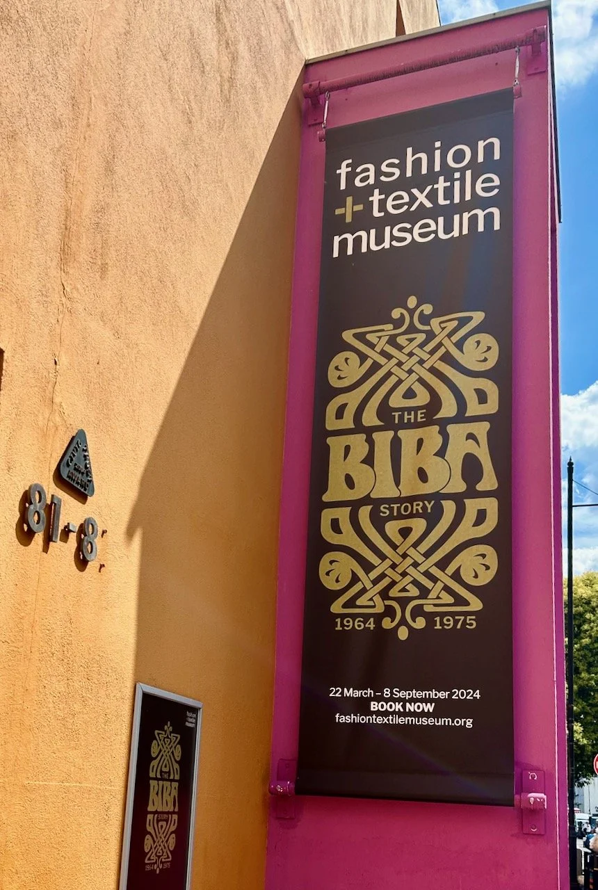
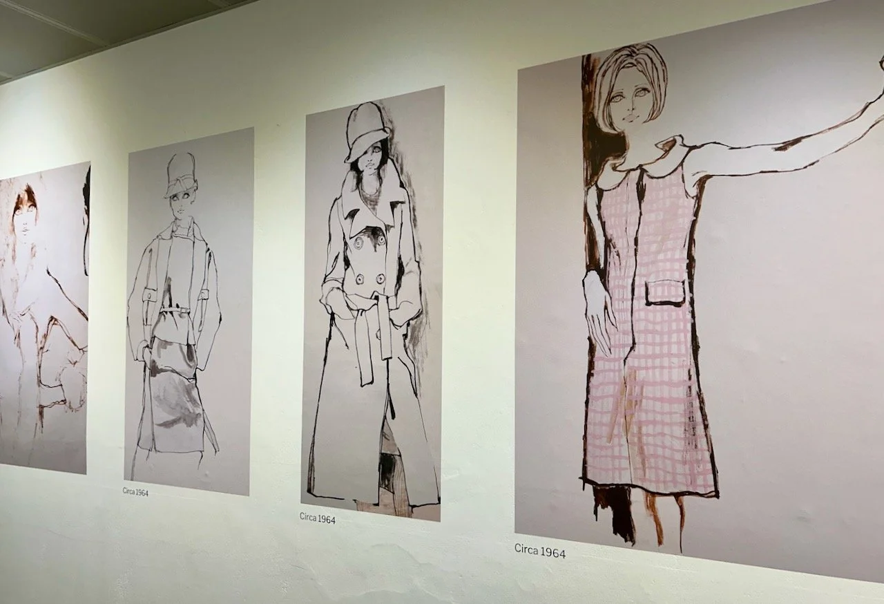
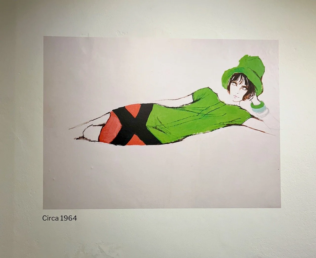
So after sharing the fashion illustrations and wishing I could draw as well today I’m sharing some of the outfits on display. The exhibition, which we saw last summer shared the Biba story from 1964 when the first Biba Boutique opened to 1975 when the legendary Big Biba closed its doors; it explored how Biba blossomed to become the world’s first lifestyle label which ‘sparked a revolution in how people shopped’ and how Biba became the brand that epitomises the 60s and 70s fashion.

So even though I was only in double figures towards the end of the 70s many of the designs on display looked familiar and I’m sure influenced the clothes I wore growing up. There were also designs that I’d happily wear today, but I guess that’s part of what makes a great design.

The first Biba boutique opened in Kensington in 1965 and was quickly a success for fashion-savvy teenagers and young women with its inexpensive and fashionable, but low-cost clothing. The interior of the boutique had a nightclub feel with dark interiors, Art-Nouveau inspired wallpaper and curtains which obscured the outside world - which in a way seems similar to the Hollister store in Stratford when that opened in the late 2000s.

At the centre is a black and white geometric patterned jumpsuit and matching hat, which is quite a statement

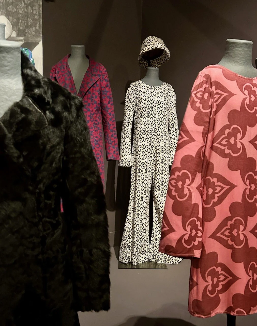
The black and white print jumpsuit is quite a statement isn’t it? It was worn by the artist Jill Richter for her wedding in May 1965, and while trousers had become acceptable as informal wear for women in the 30s, in the 60s trousers were still considered inappropriate for women’s professional lives or for formal occasions. Which seems unimaginable today.

The blue and green chiffon dress in the photo above dates from the summer of 1967 when it was sold and worn, Barbara said that they were determined that customers would be able to buy summer clothes in summer and autumn clothes in autumn, something we take for granted today. But it was interesting to learn that before the revolution of 1960s London fashion, clothes were investments, and this was a new way of thinking.

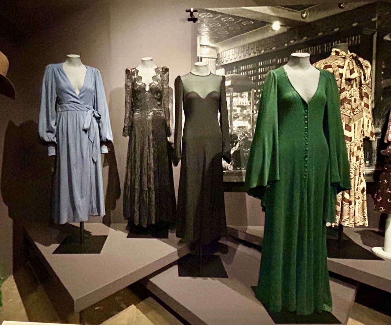
These dresses have a different feel don’t they - the blue one on the left is from 1970 and the exhibition notes say that it ‘captures the new mood at biba with the development of the Biba “Dolly Bird” of the mid-1960s into the Biba woman’ - language of its time, but definitely a more refined look. These were part of the Biba couture department which was dedicated to selling the high-end Biba range, and costing around ten times of standard Biba clothing - it only lasted for eighteen months though, closing in 1971.

It’s the second outfit (from the left) in the photo below that brings back memories - I’m sure mum made both herself and me a similar outfit to this for a wedding, though in different material to this, and to each other. I’m sure mine was a much simpler version, but I remember being proud to be wearing something so grown up!

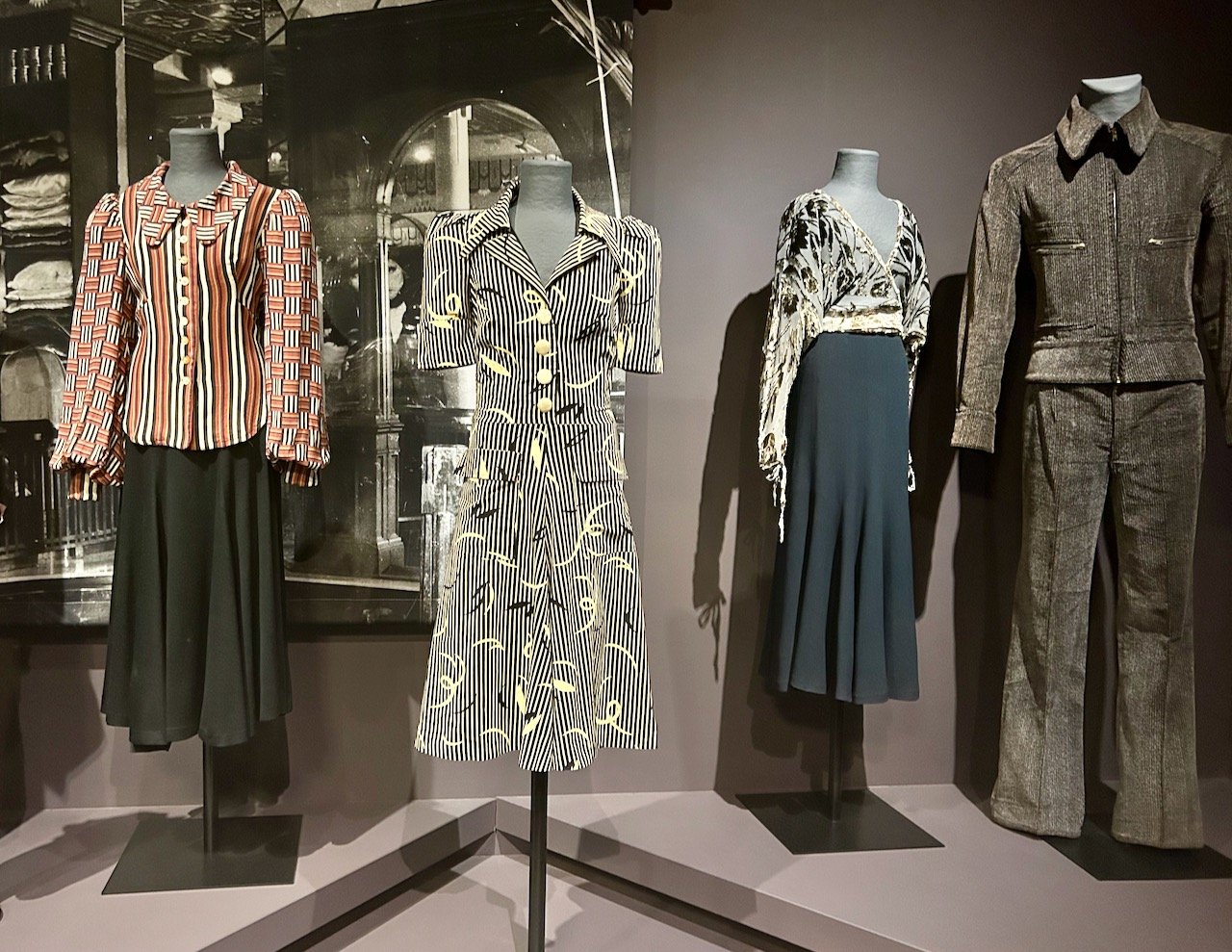
The outfit next to it - the wrap-over top and skirt, is one of those I’d be happy to wear today, but actually it dates to 1972. The trouser suit on the right though, not so much!

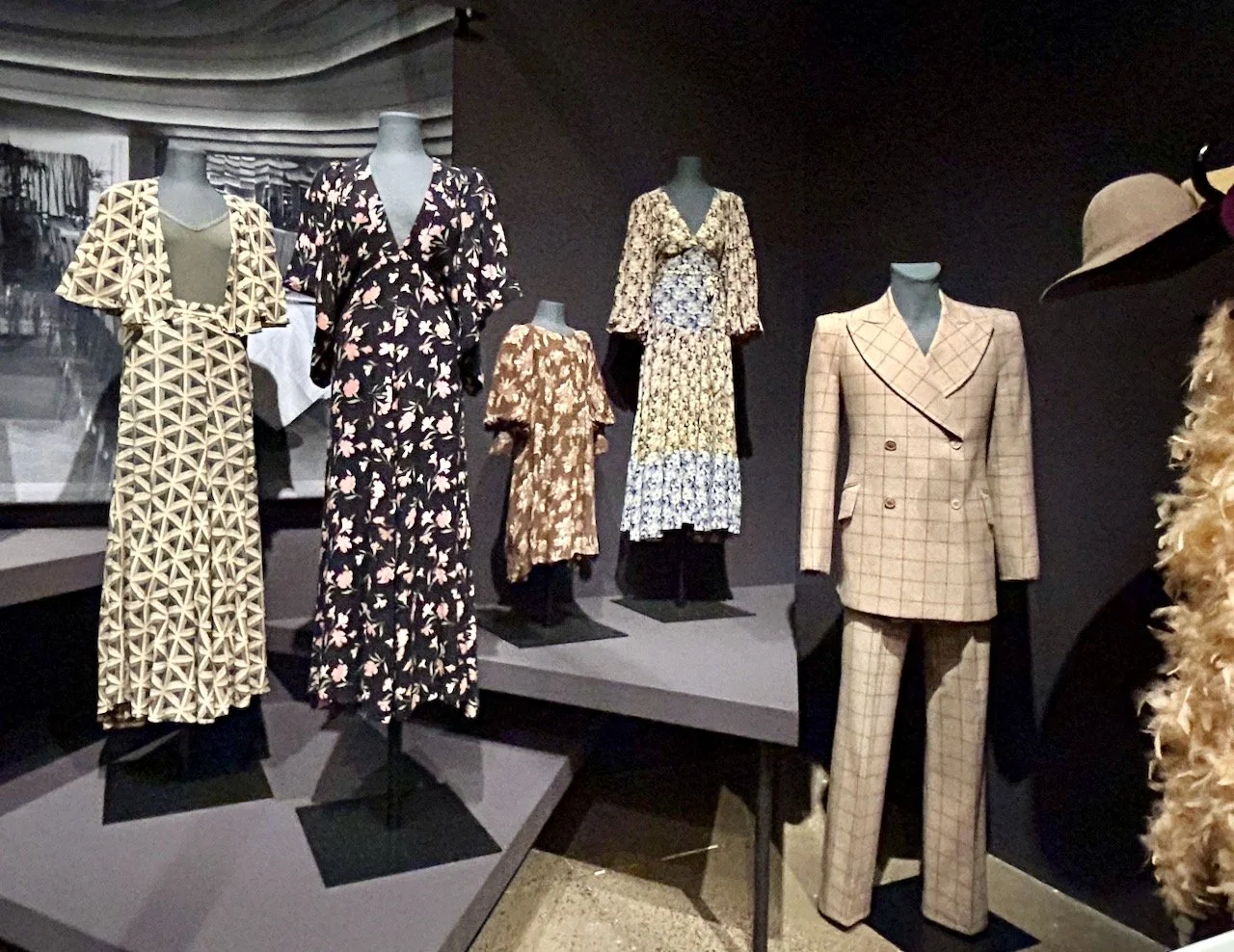
These outfits are later, with the black dress printed with a carnation design dating to 1974 as does the floral dress in three colourways at the back of the photo. Again both designs that wouldn’t look out of place today, but also captures Hulanicki’s ideal Biba look of the period - almost reminiscent of the Cadbury’s Flake advert too, if you’re of a certain age!

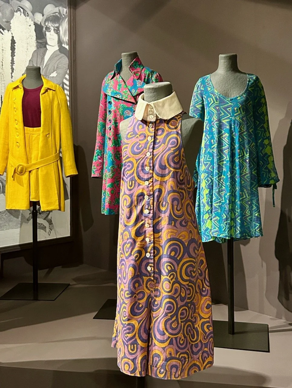
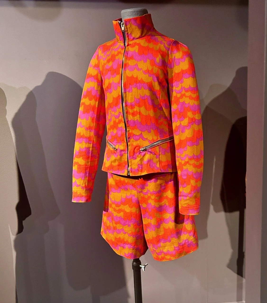
And I’ll leave you with one final outfit - it’s bright and fun and no doubt made whoever wore it feel a million dollars.

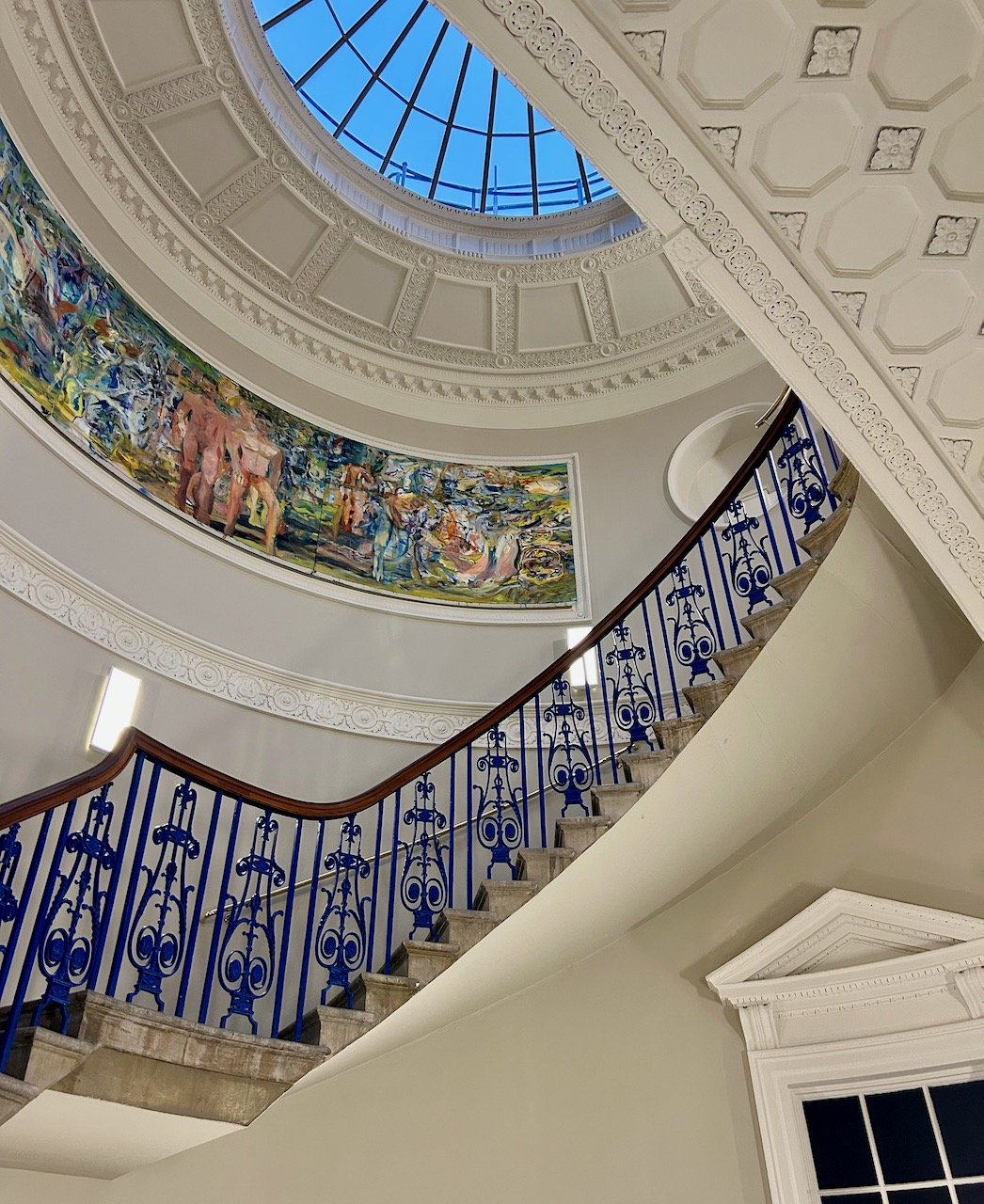
Barbara Hulanicki and the Biba story started by dressing the girl on the street, but more was to come and the next part of the exhibition was dedicated to Biba as the world’s first lifestyle label - more on that soon.

The Biba Story: Fashion Illustrations

As you know when I pop down to London for a visit I like to combine the primary purpose of my trip with a bit of culture. Sometimes that’s a walk around the shops in Regent Street, and sometimes if I can I like to combine it with visiting an exhibition. Last summer (yes, I know it’s taken a while to share these) I was able to do just that and dragged MOH along to the Biba exhibition at the Fashion & Textiles Museum in Bermondsey. Which despite growing up and living in London until a year or so before I’d never been to, but that’s how it goes sometimes isn’t it.

It’s a great museum, and one I’m sure I’ll be back to in the future. If you’ve not discovered this already it’s ‘the only UK museum dedicated to showcasing contemporary fashion and textile design’ and was set up by Dame Zandra Rhodes in 2003, and is housed in a very distinctive, and very Zandra building - it’s definitely easy to spot as you approach it!

I’d heard of Biba, the shops and the clothes, but didn’t really know much more as in the mid-seventies I was under ten years old, which is a pretty good excuse I’d say! But I knew how iconic it was, and was keen to learn more - and while it wouldn’t be the number one thing that MOH would choose to go to, he was happy to come along, which was just as well as I’d got him a ticket!

The exhibition shares the Biba story from 1964 when the first Biba Boutique opened to 1975 when the legendary Big Biba closed its doors; it explores how Biba blossomed to become the world’s first lifestyle label which ‘sparked a revolution in how people shopped’ and how Biba became the brand that epitomises the 60s and 70s fashion.

In this post I’m sharing some of the fashion illustrations by Barbara Hulanicki who established a mail-order company selling affordable fashion appealing to a new generation of young women. I’ll share more of the clothes and the lifestyle brand in future posts next month.

Barbara had a natural aptitude for art, and that became her refuge following the assassination of her father. She studied fashion at Brighton Art School (now the University of Brighton) and started her first career as a fashion illustrator in 1957 where she covered the Paris couture shows for publications such as Vogue and Harper’s Bazaar, as well as working on British newspapers.

The show notes said that ‘as one of the most in-demand fashion illustrators of the period’ she had close contact with those putting on the couture shows, and their collections and she realised ‘how out of step they were with the emerging world of youth culture and the lives of young women’.

What’s interesting to me is seeing how the illustrations change, the earlier ones which I assume are from the couture shows are of designs which are much more formal - and very reminiscent of ‘Breakfast at Tiffany’s’ even though the film wasn’t released until 1961, based on the novella published in 1958, so I may need to revise my thoughts on who influenced who!

The illustration on the left below from circa 1963 still retains some of that formality, but the other two images are much more informal - and the central one especially includes bold colours and patterns.

Three illustrations by Barbara Hulanicki from c 1963

It was in 1963 that Barbara established Biba’s Postal Boutique whilst continuing with her career as a fashion illustrator - and what’s also fascinating to me is how many of these styles, both the formal and more informal designs, could still easily be worn today - and in fact probably are!

My favourite illustration from this part of the exhibition is the one above. Doesn’t the colour and the design just sing out, and oh to have that much talent for designing and drawing these too.

It was truly a fascinating exhibition, and looking back over my photos, it was great to be able to go along and see so much of the story first hand - I’ll share more next month of the clothes and the Biba lifestyle brand, and I’m sure some of the clothes influenced clothes I wore growing up as even though I wasn’t yet in double figures the styles were very familiar.

Exploring more of the Courtauld Gallery

Whilst we were at the gallery for the Monet and London exhibition we made the most of seeing other exhibits and the spaces that held them

The staircase is pretty spectacular, and was conceived as a symbolic ‘journey to enlightenment’ - with visitors progressing upwards through the building and moving from the dark to light to reach the top-floor landing. We hadn’t realised that and went straight to the top, I guess fast forwarding and possibly missing the enlightenment on offer. It’s a narrow space and the rooms on each floor have narrow ceilings, so the stairs do rise quite steeply on the final stretch.

VASE OF FLOWERS - CLAUDE MONET

As we know Monet painted so much more than the views of the Thames, and just outside the exhibition we stopped alongside this painting which he started in 1881, but signed and sold around 1920. Clearly a different subject and brighter, more floral colours but equally as impressive.

A BAR AT THE FOLIES-BERGERÈ - EDOUARD MANET

This was the painting that was the most recognisable to me from our visit - which I learnt is considered one of the iconic paintings of modern life, and was completed a year before he died in 1883. And while the barmaid is recognisable, I’d not seen the legs and green boots of a trapeze artist in the top left corner, which the blurb says ‘hint at the exciting musical and circus acts entertaining the audience’.

LILIES IN A JAR, 1914 - MATTHEW SMITH

The painting above by Matthew Smith was painting in 1914. Entitled Lilies in a Jar was one of my favourites from the whole day, and he was encouraged by Henri Matisse to ‘paint in a more intense and liberated way’ which makes this still life anything but still - and I’d happily have this one at home.

Ivon Hitchens' Balcony View, Iping Church

BALCONY VIEW, IPING CHURCH - 1943 - IVON HITCHENS

The painting above by Ivon Hitchens was painted at the height of the Second World War and after his London home was bombed during the Blitz in 1940. He moved to West Sussex where he painted this view looking towards the church from the balcony of a house. I think this is one you could easily have in your own home, and one that you could spend time looking at, and looking at some more.

Adam and Eve by Lucas Cranach the Elder

ADAM AND EVE, 1326 - LUCAS CRANACH THE ELDER

Another image which may be familiar, and most certainly the subject matter is - but also one that I wouldn’t have been able to name the artist of.

We moved onto the ceramics section and here it was the lustred ceramics that caught my eye. The lustred ceramics would have been a must-have luxury item in the fashionable Renaissance homes, and it’s easy to see why. Lustre is made when a glazed and fired ceramic is painted with metal oxide pigments and fired again at a low temperature with restricted air supply, and results in a metallic film that shimmers in candlelight.

Outside in the December early evening we were now heading off to complete our other plans, but not without stopping and admiring this new-to-us rainbow snake of seating in a part of the Strand which is now pedestrianised, and which I’m sure on warmer days will be much used by both visitors and people working in the area alike.

We enjoyed our visit to the Courtauld Gallery, so if you’re in London and looking for something to do then definitely put this one on your list, and soak up some culture new and old while you’re there. There’s nearly always something going on at Somerset House too - when we visited the Festive ice rink was in full swing, but in the summer it’s also a great place to sit and people watch, it’s just one of those places that is constantly changing and is better for that.

I’m hoping that next time we’re in the area, it’s much warmer so I can try out at least one of the colourful seats!