The Wellness kitchen at Grand Designs

I saw this kitchen by FincH at Grand Designs earlier in the year, and it was clear from those also looking at the room set that it divided opinions. I was impressed by it, and while I might not go for this colour, the idea of a single colour throughout appealed, whereas for MOH and others close by us, they were less wowed. For MOH it was one element of the design that he thought impractical, but strangely it was one that I liked, even if on the whole I agreed with his impractical assessment.

But we’ll come onto that.

Dusky pink throughout with a touch of real greenery

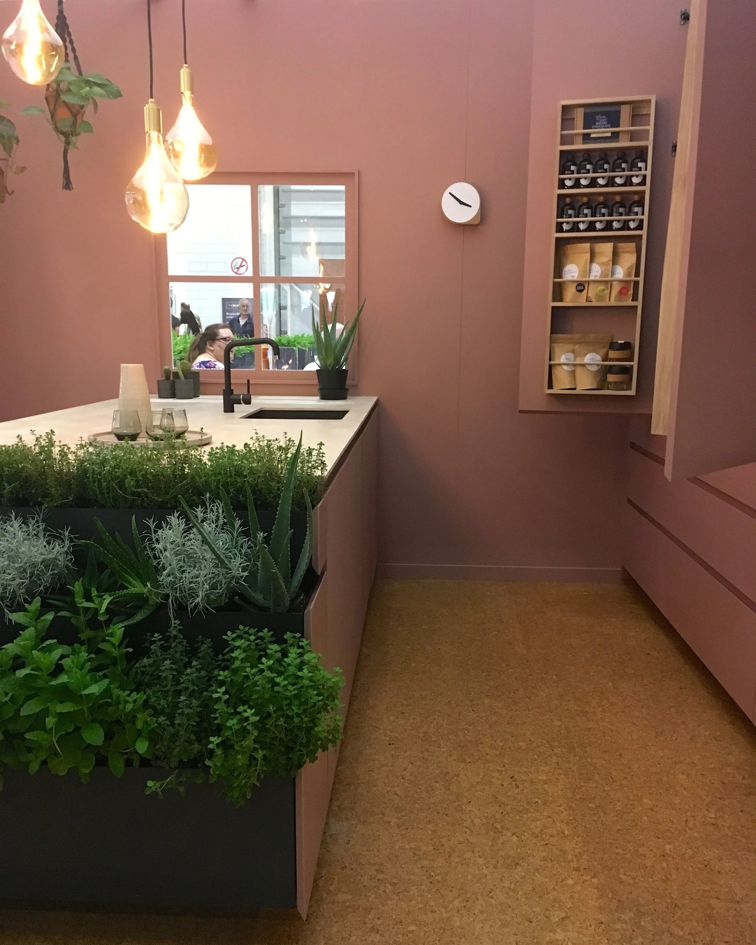
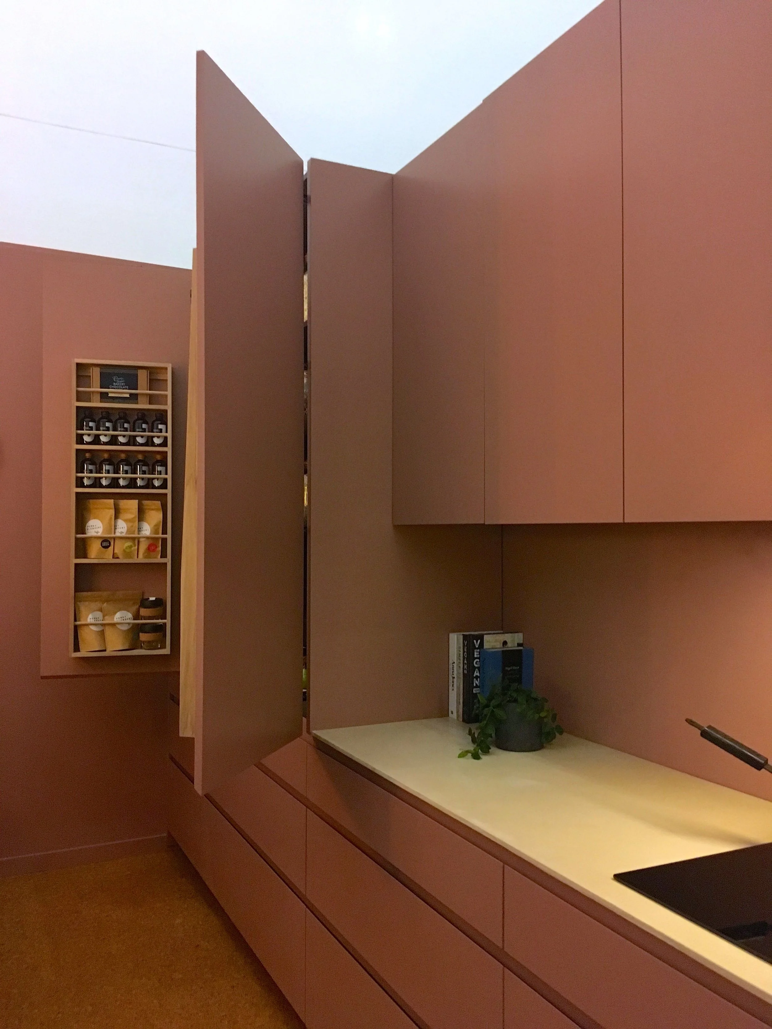
The units and walls were all dusky pink, the worktops provided contrast with a soft white finish. The units are made from Jesmonite, a gypsum-based material in an acrylic resin, which makes it a versatile material. The cork flooring, was one of my least favourite elements, but I know that’s down to my inbuilt dislike of the material on floors and walls - yes, I’ve seen it on walls and that just makes me shiver.

A single colour throughout - does that make the cupboards camouflaged?

I liked the unfussy lines and clean spaces, although in reality my kitchen is unlikely to ever look this clear - but a girl can dream, hey? As well as liking the clean spaces, I’m also a fan of stuff and I’m learning that these two things aren’t compatible. What tends to happen is it’ll start off relatively clear like this, and over time stuff accumulates and I get used to seeing it, and so it becomes part of the “furniture” - until I remember my plan was to keep the worktops clear, and so a tidy up follows. Only for the whole process to repeat, I do think that’s a good thing, or otherwise I’m not sure I’d have enough room to use the worktops to actually prepare food…

Herbs at hand in this roomset at Grand Designs Live

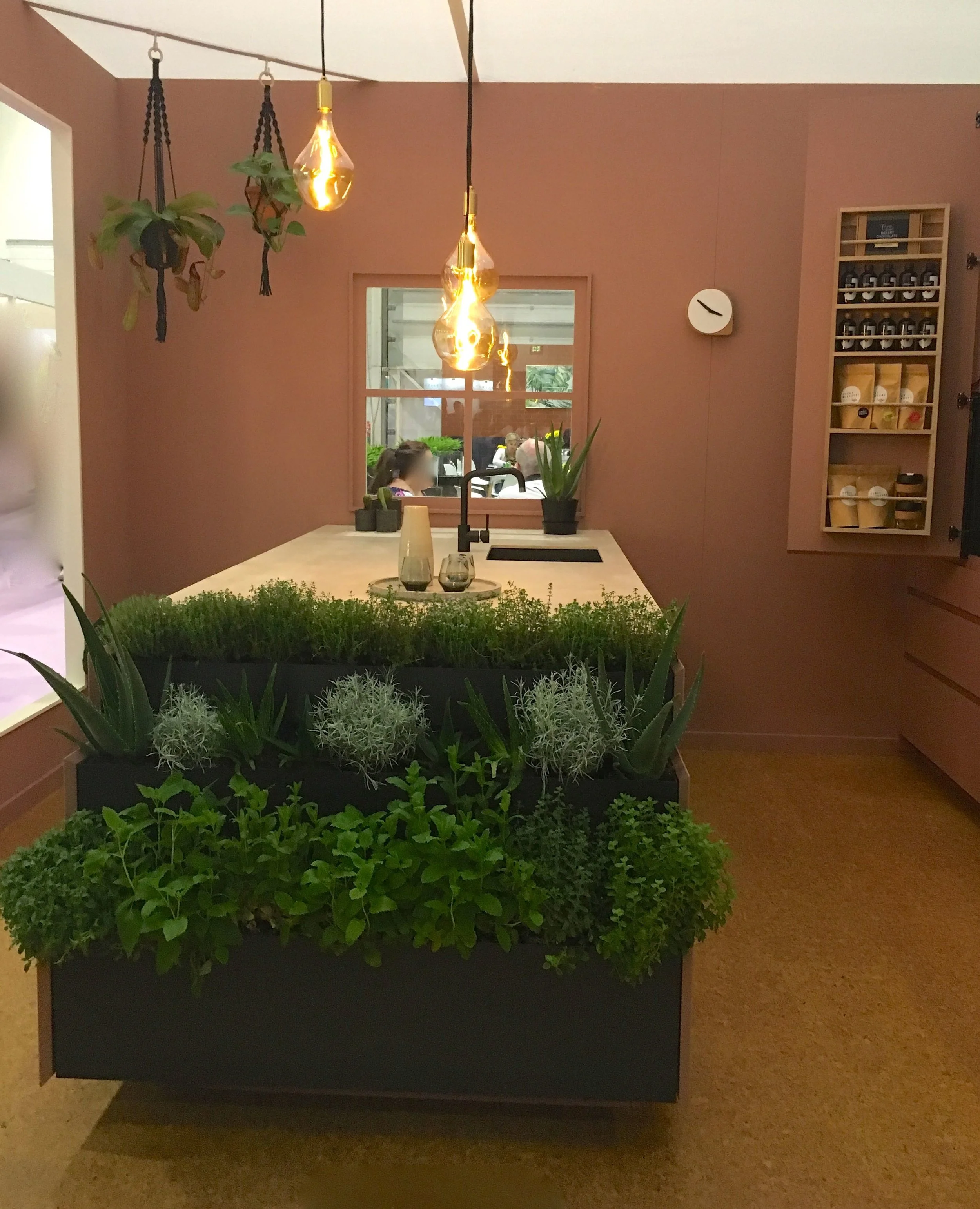
Ah yes, the living herb wall. I liked it, MOH thought it impractical. I agreed, but I still wanted one. Even though our kitchen has very little, if any, natural light. I knew it wouldn’t work in our space, but I liked the idea of walking to the end of the work bench to add herbs to my cooking. Often, gathering herbs is one of the tasks that I give MOH when he regrets asking if there’s anything he can do. And that’s usually followed by a description of the herb and its location, how much simpler would it be if the herbs were at the end of the kitchen?

I know, I’m living in a dream world…

A peek into the cupboards at this roomset at Grand Designs

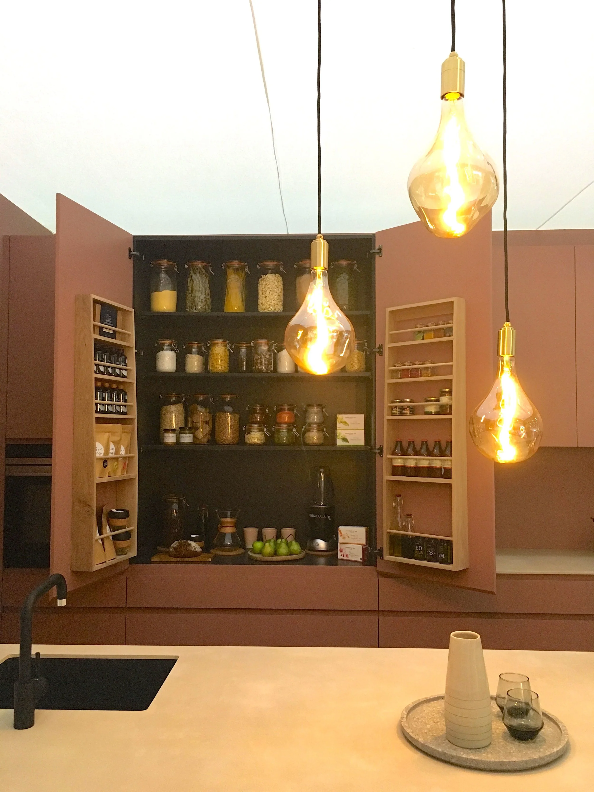
The other thing I admired in this kitchen was the tidy concealed cupboards. Mine would never be this empty, but they’d also never likely to be shut, or if they were it’d be because I’d crammed stuff in and wanted to keep that illusion of a clean, clear kitchen.

How would you cope with cupboards like these, or a one colour kitchen?

An art inspired lounge

Pale green and pale pink is a great colour combination and it was great to see this at Grand Designs Live earlier in the year. There they mixed in some art and the whole room set had a feeling of art deco about it. I’m not sure about the vertical battens on the wall though.

dusky pink and pale green in the lounge room set at Grand Designs Live

I am a fan of the freestanding boxed shelf unit, not only because it matches the room so well, but also because it’s not a uniform shape and because it’s so versatile, it could work in many rooms.

Dusky pink, prints and geometric designs

Look at the fringing on those cushions, and the screen. There’s definitely a 1920s feel, isn’t there, which is only accentuated with the geometric patterned rug.

soft furnishings in the lounge at grand designs live

I do like the lamp above the light box, it makes me smile in an unexplainable way. And (with clothes) it’d be a great fancy dress costume, and relatively easy to achieve. I have costumes on the mind at the moment as we’re off to a celebration of the First World War this coming weekend, and the dress code is of the era. After much research and looking at images on Google, I’ve realised it’s an era that isn’t as easy as it sounds, and it’s certainly not as fun (obviously) as the 1920s. For men, most often it was uniform, which is harder for MOH to source than a longish skirt, white blouse and hat that I sourced in the charity shops this weekend.

I’ve some final touches to put to the hat to dress it up a bit - I was thinking fabric flowers, and I’ve a suffragette ‘hunger strike’ medal to finish my outfit, and I’m sure I’ll share more here if I manage to make it work, and if I manage to persuade MOH to buy anything from a charity shop that he’ll actually wear. I got him to buy a flat cap, and it suits him, and I’ve a feeling he quite likes it too, but isn’t letting on too much just yet. Ideally with a brown coloured waistcoat and a neckerchief he could pass as a gardener, or similar, which is a lot easier than anything military. I’m not sure I’ll persuade him to wear wellies out on a Saturday night, but you never know…

a different angle of the room set at GDL18

But I digress, what do you think of this room?

A dark and citrus living room

Room sets are a great way to get an idea of how colours go together, or how they might work in your own rooms without actually doing the hard work of decorating. And they’re also somewhere where you’ll find me drooling over them at the home shows, such as Grand Designs Live. At the show earlier this year, the room sets were, shall we say, provocative and often a bit marmite. The rich in colour and pattern bedroom, which I shared a while back emphasises that point, I think.

Today’s room set, a living room, is also bit more out there than those at the Ideal Home Show, which are generally (but not always) more traditional. Grand Designs Live has it’s own USP which in some ways is a bit more edgy and encourages bolder decoration, with colour - or dark walls in this case, and soft furnishings that really have some zing.

And when they said citrus, they really meant it.

A tangerine chair against a grey background with storage from the roomset at Grand Designs Live

Yes, orange, yellow and green mixed with the grey - that has citrus covered doesn’t it? Or actually perhaps the colours are tangerine, lemon and lime to be more accurate. It’s the use of those three colours together, that gives it the zing, and makes you grateful for the grey. And it’s the grey that makes it work and pulls all the brighter colours together.

A different view of the dark and citrus living room set at Grand Designs Live 2018

It’s the rug though that my eyes keep coming back to. The orange tub chairs have the zing, but the rug. Its pattern. My eyes are constantly trying to work it out. What is that pattern? What era does it come from? Is it a pattern, or just splodges? Do I like it, or am I just intrigued by it?

… so many questions, and for that last one I’m really not sure if I like it, think I should like it or don’t like it at all.

a lime green occasional chair, a patterned rug and comfy throw

There is a touch of the seventies about it isn’t there?

And maybe that’s it, maybe it reminds me of something from our first home. I remember that the living room was yellow and orange at one point, and I’m certain we also had a grey and pink carpet much later on when the walls weren’t quite so citrus. Maybe this room has a bit of everything my mind’s eye remembers from my childhood home.

Dimming the lights for effect in the room sets at Grand Designs Live

For me, the lights have a touch of murano about them too. And the matching vases.

Again that could just be reminiscing, as our first family holiday abroad was to Italy - how cosmopolitan were we?

A closer look at the table lamps

The sofa though, now I have grey sofas (many of them) but back in my childhood there was an orange one (yes really) and one finished in brown velour, but I don’t remember anything grey.

What do you think of the room set, and what evokes memories of the decor in your childhood home?