A wow shower in the wellness room set

There seems to be a water theme to my recent posts, with one on Poolside at John Lewis and showing you my new swimming costume in yesterday's post, so today completing the three I'm sharing photos from the Wellness Bathroom, one of the room sets at this year's Ideal Home Show.  Often I think the bathroom room sets are uninspiring and quite unrealistically large. 

But not this one, one element had me completely wowed.

A stunning bathroom at the ideal home show

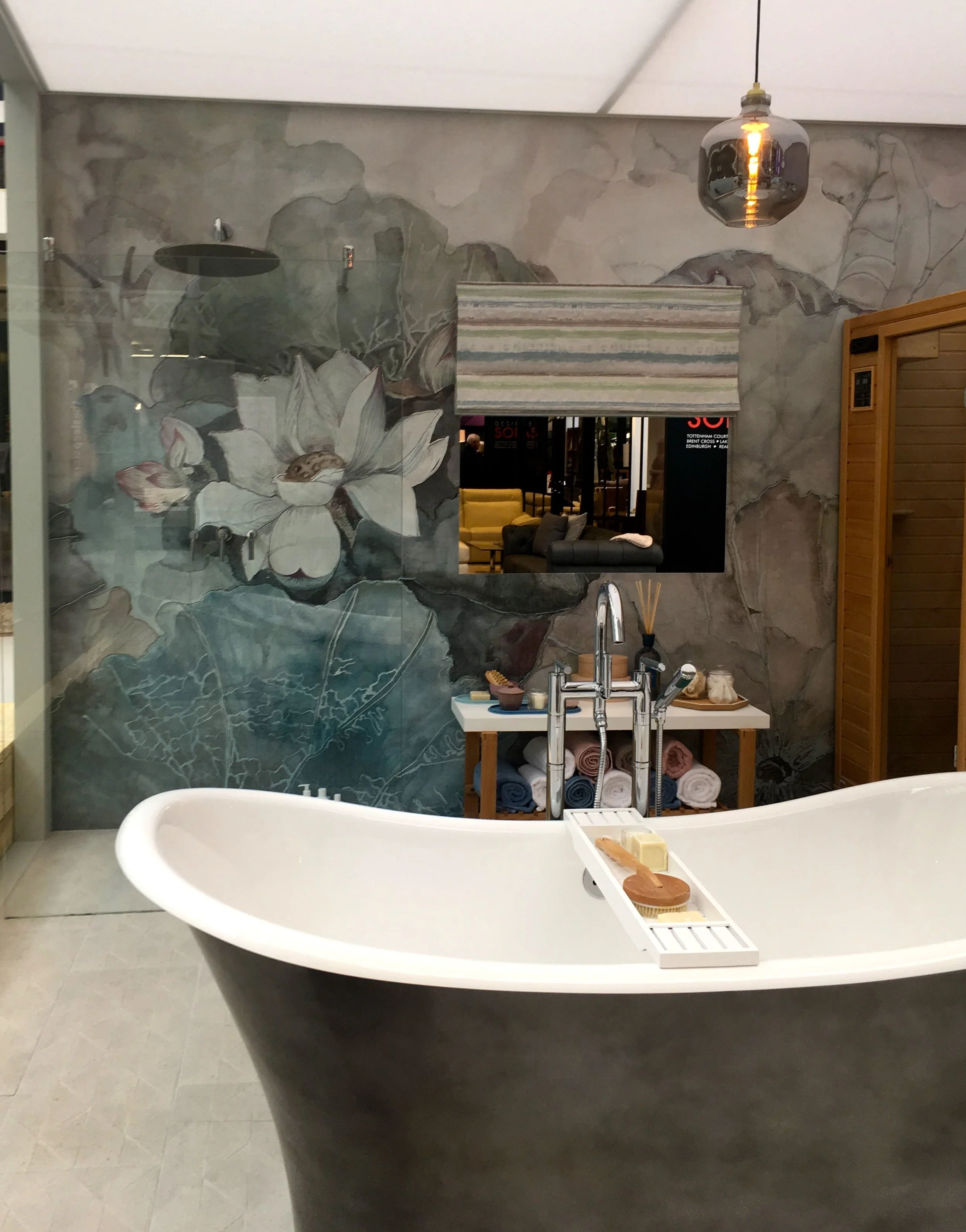
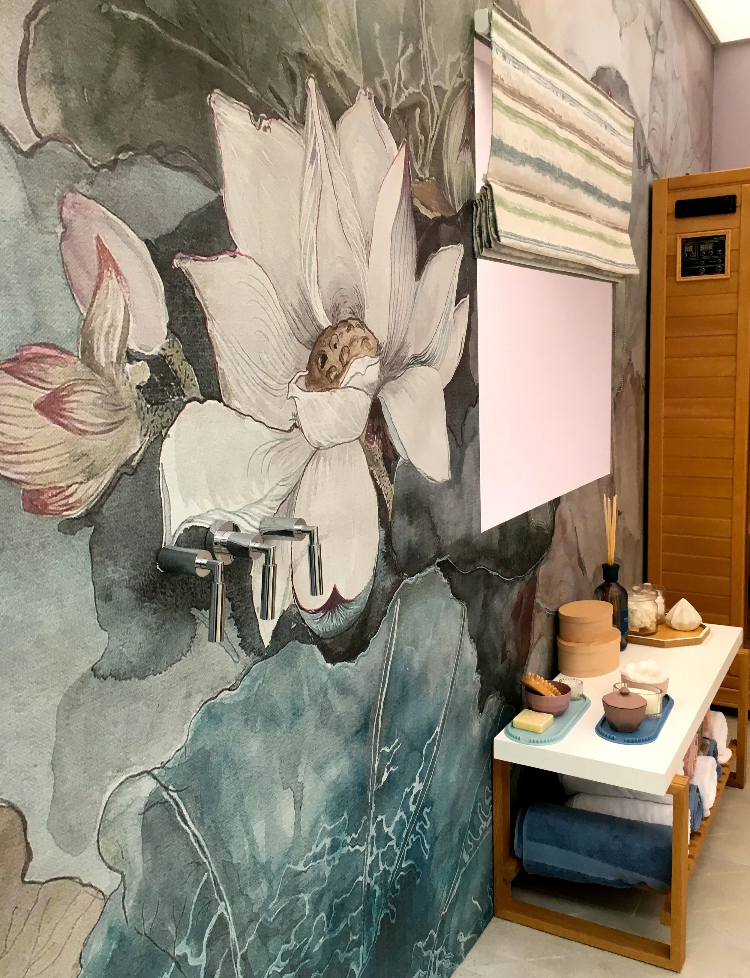
It wasn't the free-standing bath, nor the sauna in the corner of the room (just visible in the photo above), but the shower wall.  It's quite simply like nothing I've seen before, and you'll never believe me when I tell you it's wallpaper.

It really is.

It's waterproof wallpaper, the wet system technical wallpaper from Wall & Deco which combines the waterproof-ness of liquid membranes with the patterns of wallpaper.  And I think the results are stunning.

A free standing bath and some pamper items

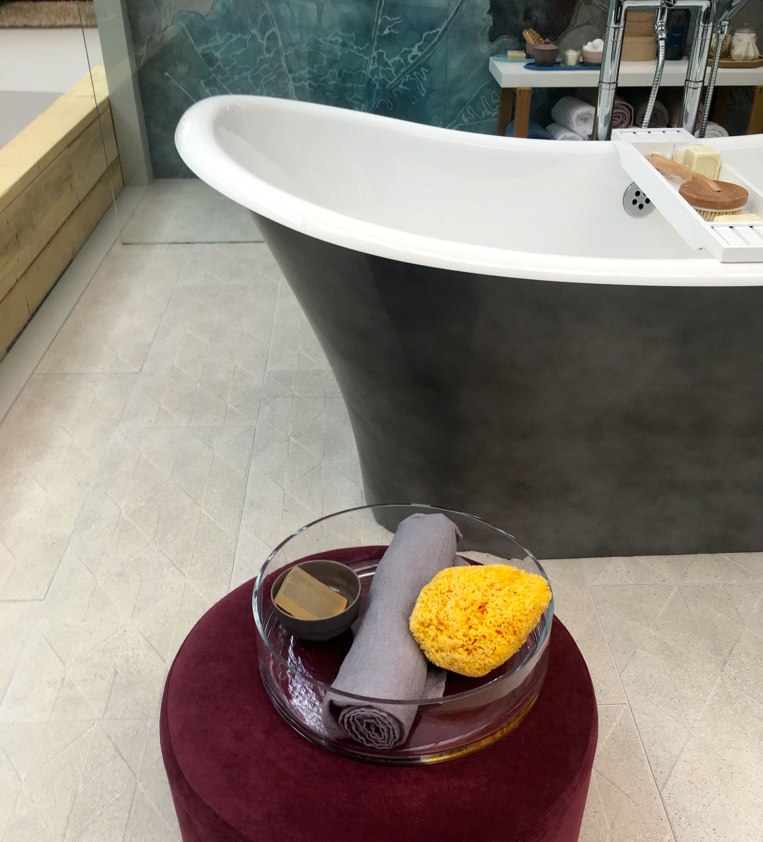
So much so, that in pretty much every photo I took of this room set I've managed to sneak it in somewhere.

A shower with a difference in the wellness bathroom room set at the Ideal Home Show

Not even the sauna, which I'm a fan of, can overshadow it.  Although if I had a bathroom this large I'd seriously be considering adding an infrared sauna, but luckily for my purse, or rather MOH's wallet, we don't. 

A sauna in the corner of the wellness bathroom roomset

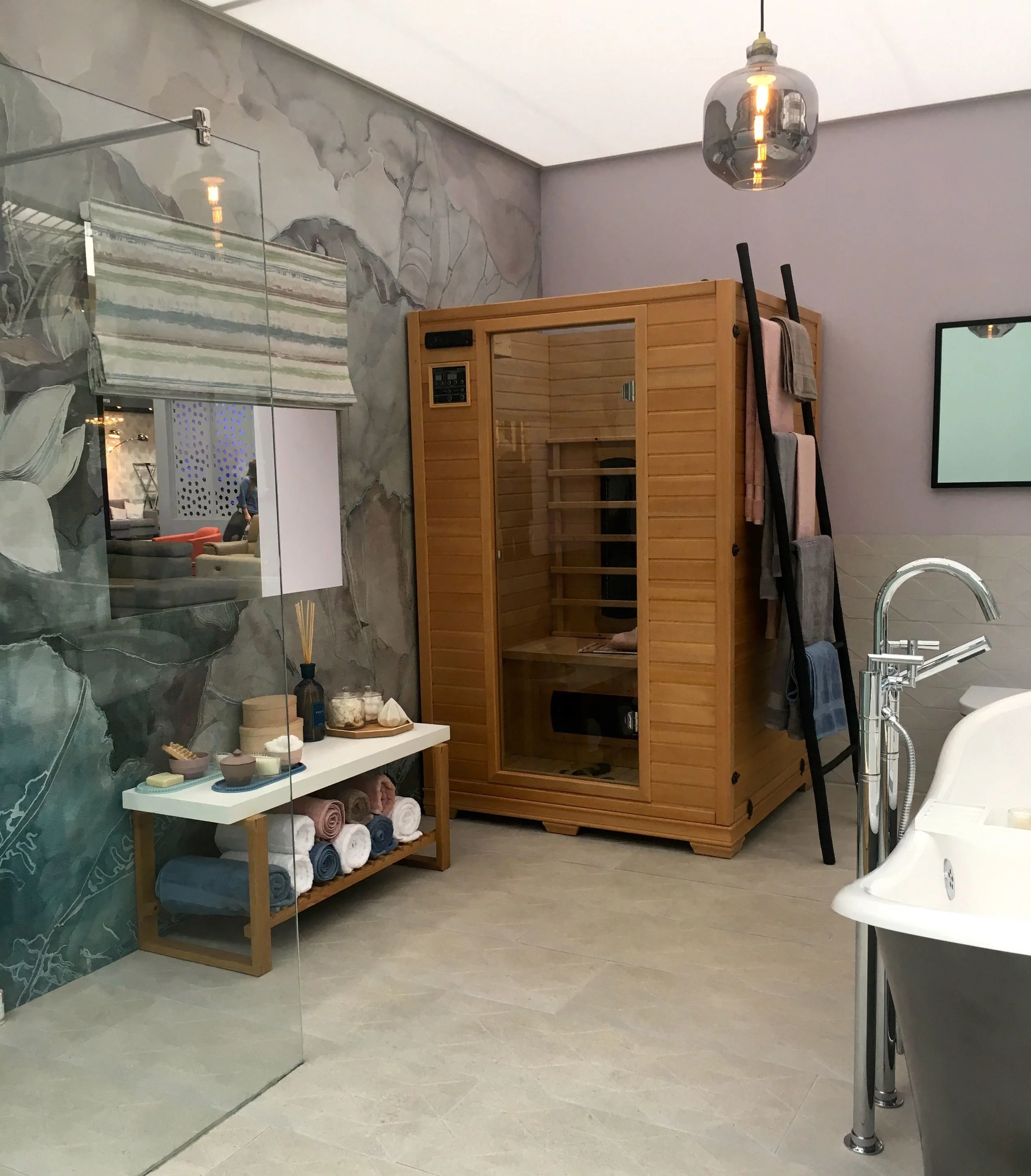
The other striking feature in this bathroom was the size of the mirror (and yes, even that shot managed to capture the wallpaper), but I guess if you've got the space then, why not? 

A huge mirror in what is a huge bathroom, so why not

So what do you think?  And would you go for this kind of wallpaper in your bathroom or shower?

Home Etc

A family room, with a lot going on

I'm in two minds about this room set at this year's Ideal Home Show. I like stuff and things around me so it should be my thing, but I'm not sure if it is, and I'm not really sure why.  There's nothing in here that really offends me, but other than it having a real lived in feel, there's not much in here that really grabs me either.  

Perhaps it's fallen into that betwixt and between, and is neither one or the other - I'd be interested to know what you think after you've seen the photos. So, onto the room set.

a look at the family room at this year's ideal home show

Perhaps it's because too much of it is neutral in my opinion. But I do know that the standout item is the wall hung bureau or writing station - it reminds me of the bureau we had when growing up. The idea of closing the flap (writing table) and shutting away the office for the evening is almost completely alien to us now, now that we've developed the 'always on' mentality.  Somehow just the flap of that piece of furniture harks back to a time less frantic, peculiar hey?

a corner fireplace and walls with abstract painted shapes

It does make good use of the wall space though, there's the corner fireplace above and the wall mounted drawers below.  There's plenty of shelf space too.

Lots of momentos in the family room at the ideal home show

As I've said in previous Ideal Home posts from this year, there was often a brightly coloured armchair bringing a pop of colour, and this room set was no different.  This time orange. 

A fern, a succulent and a comfy corner to sit
A pop of colour and pompoms on the cushion (again)

And there was another pompom trimmed cushion.  I tell you, they're everywhere.

a side view of the family room at the ideal home show

So what do you think, are you smitten or a bit take it or leave it, like me?

A woodland guest room

Like Toblerone and Dairylea, things that come in triangles are often pretty good, and this woodland guest room at this year's Ideal Home Show, designed by Black Parrots Studio is definitely up there with those two other triangular goodies.  

It's been designed as a flexible space transitioning from office to bedroom and "capturing the spirit of an off-the-grid garden retreat in the Scandinavian forest."

Like toblerone this triangle shaped woodland guest room was a hit

For a small space it was full of colour, textures and pattern - most notably that wallpaper, which I warmed too.  Although paired with the orange I did briefly think I might have been back in the 1970s, but the whole effect felt more modern than vintage.

Natural chairs in the garden pod at the Ideal Home Show

As you've probably spotted there's a bit of a jungle theme going on which aims to bring the outside in.  I think the space works, because although there's a lot in here, the restricted colour palette gives it a stylish, rather than cluttered finish.  Although if you do look at the wallpaper from a certain angle, it does have the look of OSB about it. 

Modern lights and pops of orange

As you can see it was busy outside, but inside because there was just a small viewing space I had the place almost to myself.

The woodland guest room at the Ideal Home Show

What I particularly liked was the geometric brass tables with their grouping of pots and plants.  It's simple, but striking and effective isn't it?  And even better it's something that would be easy to replicate.

Dark and sultry works just as well alongside the woodland theme

What do you think, would you have a garden pod and decorate it in a similar style, or would you it be something entirely different?