The sputnik in the loos at the Nevile Arms

It’s been a while since I’ve shared a post in the Loo Series, and as you’d expect often I don’t know when I’ll find a loo worthy of sharing. So when it happens, who knows, but here I am sharing a loo from after our circular walk from Kinoulton to Hickling.

At first I didn’t notice what you’ll come to see dominates my pictures, but once I’d spotted the light fitting I was mesmerised. I mean it’s a great light fitting, and it totally gives the small space (they’re mostly a small space aren’t they?!) it’s character.

Looking up at the light fitting which has multiple silver balls (maybe 50+) in a sphere shape

I told you it was a great light fitting, didn’t I?

Simple but classic - stone coloured brick tiles and a gold oblong mirror - which shows a reflection of that light fitting again

The rest of the decor was pretty classic and smart, but the sputnik light fitting added the character. Though while it caught my attention, it wasn’t the only design feature.

A selfie in a mirror adorned with a pink and white flower garland

Both the cherry blossom-like garland around the mirror and the floor tiles would usually have captured all the attention - and the floor tiles especially are just fab (shame I don’t need any new tile inspiration for my new house!). But the three together - garland, tiles and light - made a small space pretty special.

bluey/grey and white patchwork effect floor tiles - and my trainered feet!

Here’s to the renewed energy to this series of this posts, who knows when I’ll share one next!

PostCommentLove

You will never want to leaf

* I was invited to the press preview for and provided with a pair of tickets to Gardeners’ World Live so I’m marking posts from the show as 'Ad’ - as usual my views and opinions are very much my own. Be sure to check out all of my posts from the show.

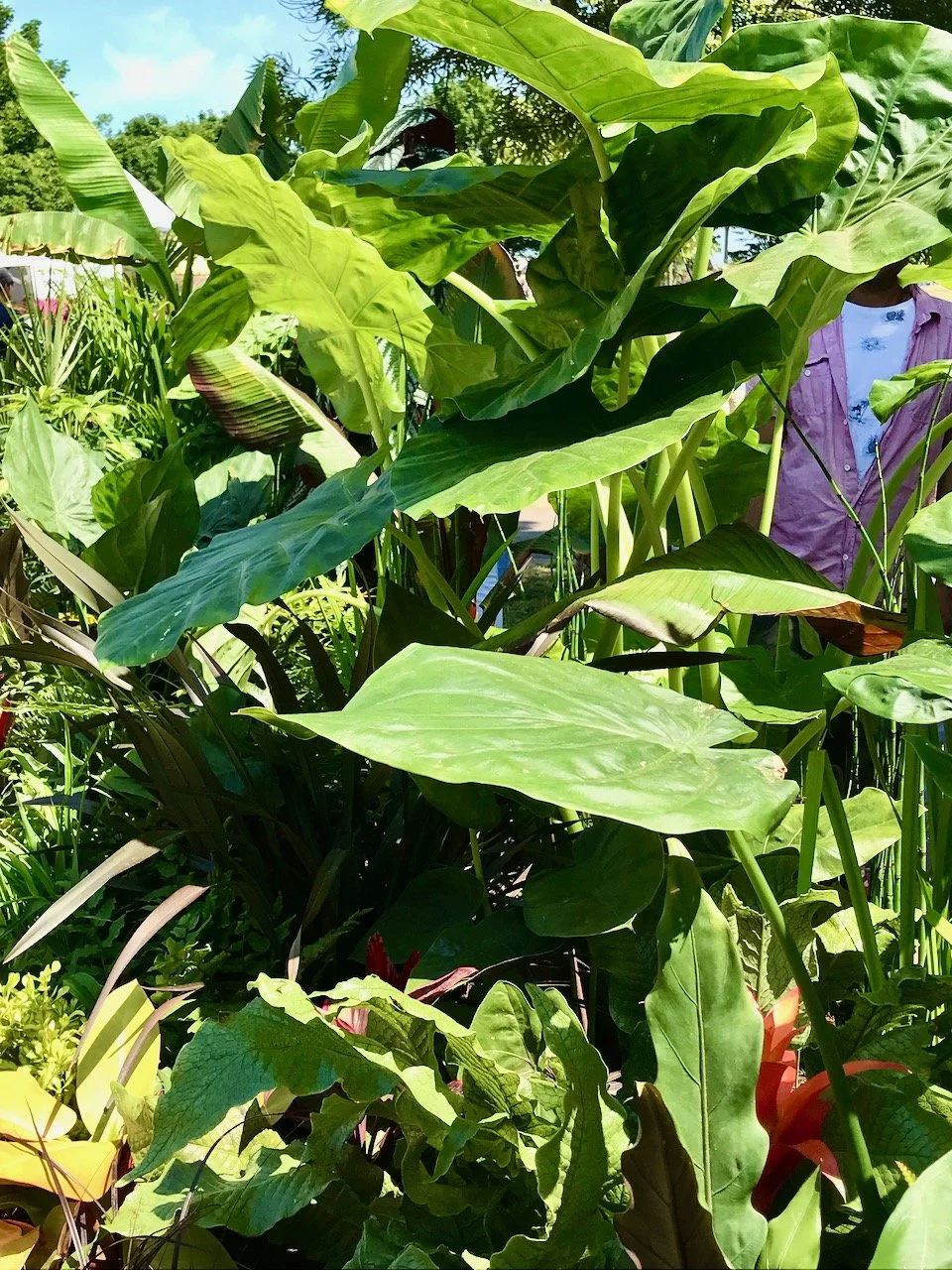
The banana plant we saw recently at the Newark Garden Show reminded me of this beautiful border at last year’s Gardeners’ World Live, and once I dug the photos out I had another mixed smile and groan at the garden’s cheesy title. The theme for the Beautiful Borders at the show was ‘My Garden Escape’ and I think I’d quite happily escape to this garden, despite the cheese, and who knows maybe I wouldn’t want to leave…

This garden, designed by Kiran Vaidya, invites us to escape to our very own slice of tropical paradise. By just using foliage the garden shows the versatility and variety of leafy plants ‘whilst highlighting the important role of greenery in relieving stress and promoting positive mental health, especially in urban communities where access to green spaces is limited.’

And I don’t know about you, but just looking at these photos makes me want to breathe more deeply and breathe in the fresh air. In my mind’s eye that breath is cool, but not cold and warm enough to be comfortable.

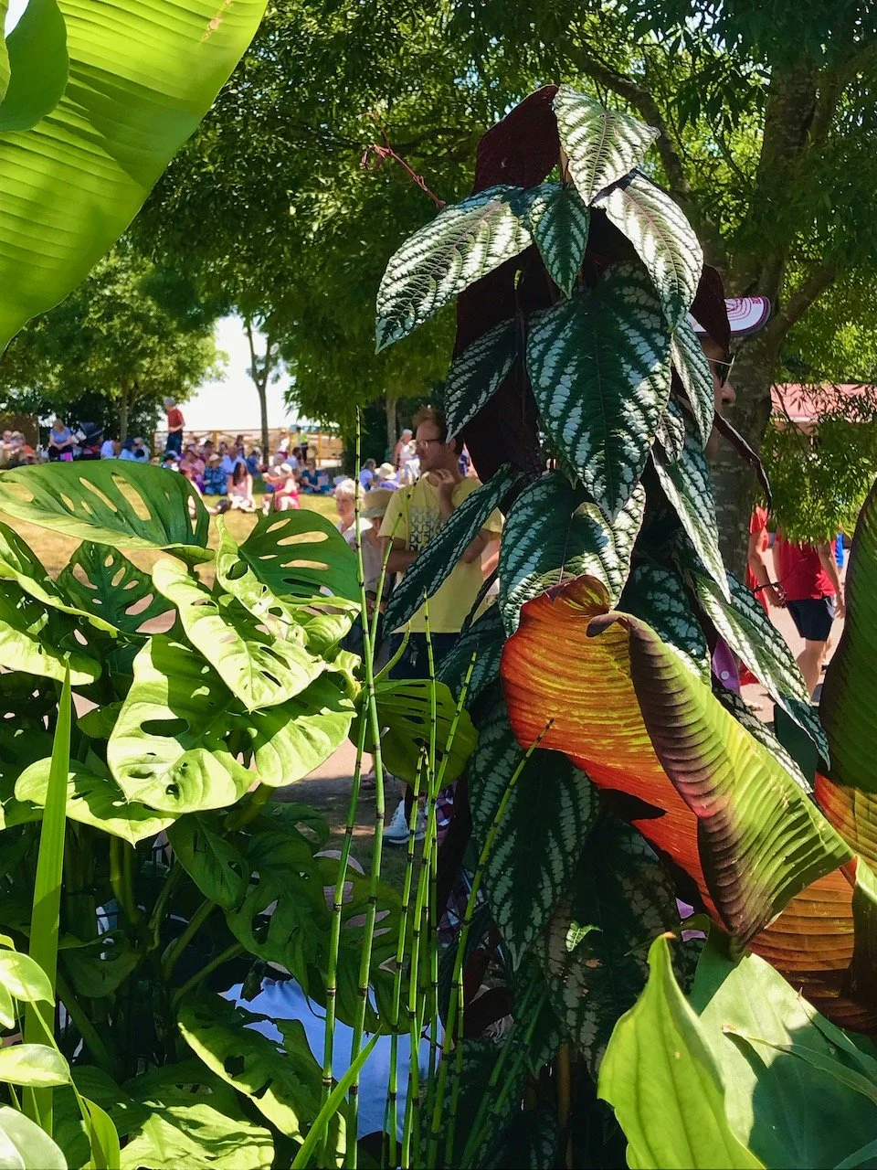
variegated tropical leaves under a tree's canopy

I love the textures and colours that you can get through foliage, along with the drama. Though of course having these plants in your garden is likely to come with the need for additional care and attention over the cooler months, but I can’t help but think it’d be worth it.

* With thanks to Gardeners’ World for inviting me to Gardeners’ World Live, it was as fabulous as ever!

It's a rainbow wrap!

It’s been a while since I shared my rainbow squares on here, 2020 in fact, so quite a while! But I recently rediscovered them, and thought that it probably wouldn’t take me too much effort to finish this project off, and if I got my skates on I could take it on my travels next month.

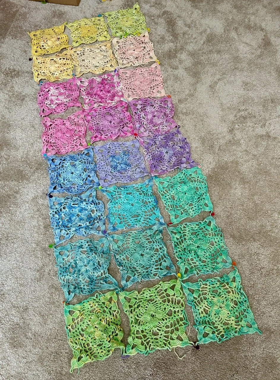
After this post I shared a layout post on Instagram, convinced that I’d nailed the layout and I’d ‘pinned’ it together with stitch markers to save me having to remember what I’d decided on, which was helpful.

THE ORIGINAL LAYOUT

But the more I looked at this layout, the less convinced I was. And then I realised that with a simple switch I could have a different look - and well, there was no harm in trying was there, if I disliked it I could switch it back again as it’s not like I had attached them permanently.

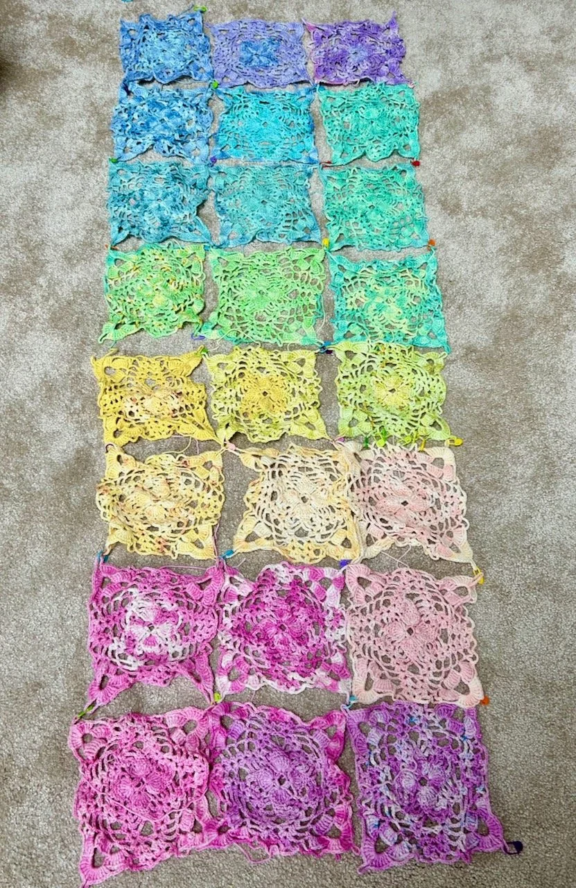
And so I took the yellow and green ‘ends’ and switched them into the middle:

switching colours - now blues and purples at the top, to greens, yellows and ending on pinks

For me this layout just popped, and just this small change made me feel instantly better about the whole thing - and more importantly, it made me want to finish it. Isn’t colour a strange thing?

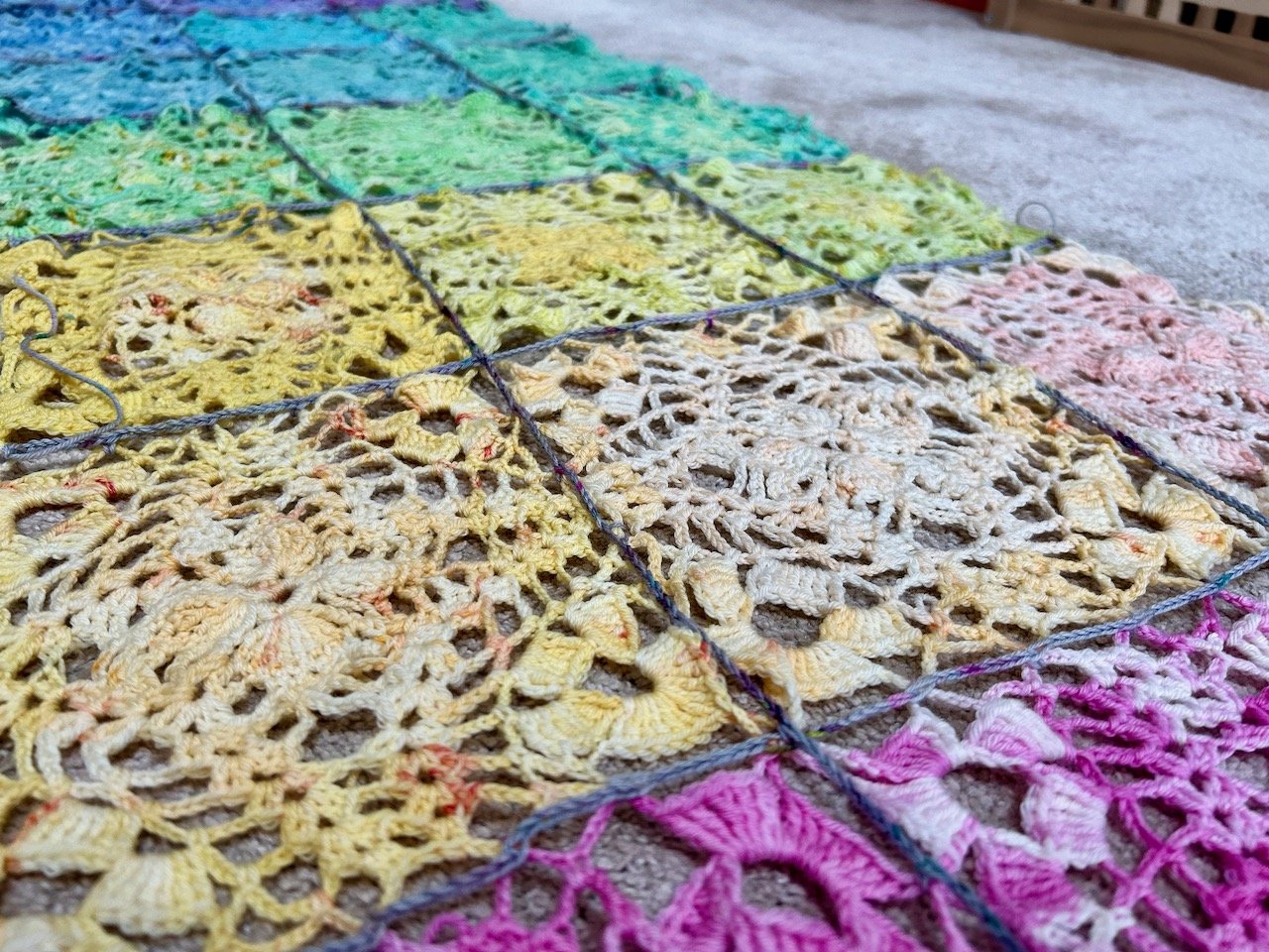
Anyway to finish it I needed to permanently attach the squares to each other, I’d initially thought I’d do that sewing them together rather than by joining as per the vintage pattern and crocheting. But now that I’d come to actually join them, the sewing together option was a non-starter; I didn’t have leftover wool in each colour and I’d lose some of the laciness, so it was back to the quite sparse instructions in the vintage pattern, and working out a new plan.

That new plan involved a new purchase

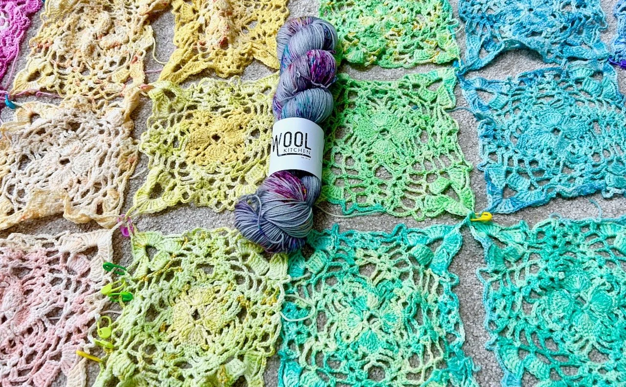
I thought about a white or a silver, but neither grabbed me when I tried those colours alongside my rainbow squares, so I checked out my usual online wool shops and got lucky. This ‘skyfall’ colourway from The Wool Kitchen is a perfect match to the original wool which came as part of the mini-skein club by Vicki Brown Designs.

The new grey & multi colour flecked addition laid in the middle of the yellow and green squares

With a bit more head scratching, lots more ‘pinned’ stitch markers and a bit of trial and error I worked it out, and quite quickly the short lengths and then the longer lengths were attached to each other.

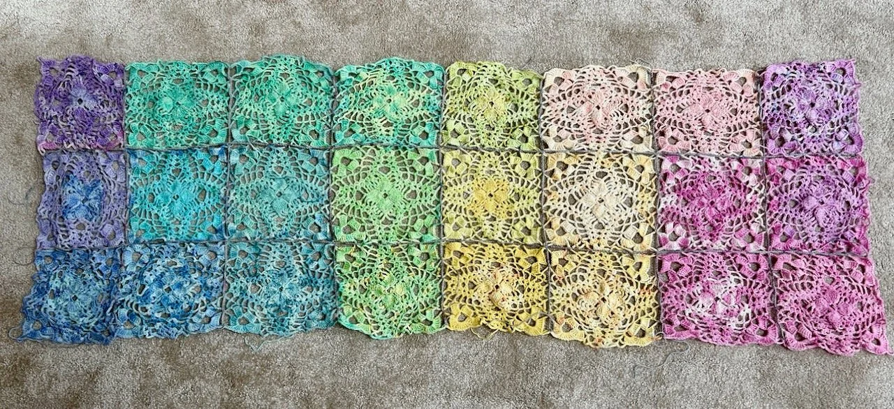
My rainbow squares attached to each other with a light grey chain stitch

ATTACHED!

A CLOSER LOOK AT THE JOIN

It already looks so much better than I could have imagined - and there’s a real chance I may just finish it soon too. I just need to add a row of double crochet around the edge and finish with a row of picot stitches - the pattern for this is just as sparse, but I’m confident it’s within my grasp.